Nature doesn’t need a filter—and the best nature websites know it.
I’ve seen a lot of online experiences that try to capture the outdoors, but very few that actually feel like being outside. The sites I’ve collected here don’t just show landscapes—they create digital spaces that reflect the stillness, scale, and raw clarity of the natural world.
They’re not built for scrolling past. They’re built for stopping, breathing, and maybe seeing your screen a little differently.
Here’s what you’ll find in this post:
- Layout choices that let images do the heavy lifting
- Color palettes and typography that borrow from the outdoors
- Subtle animation that adds life without distraction
- Content strategy that invites quiet curiosity over flashy claims
- Design decisions that make space for stillness
If you’ve ever tried to make a website feel “natural” and ended up with a photo gallery and a green background, this might help reset your thinking.
1. NCX
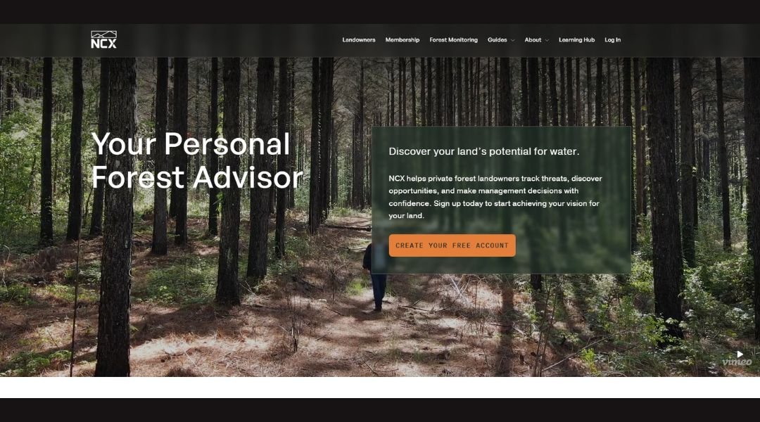
NCX takes a different approach to environmental action—one that’s less about lofty slogans and more about real-world accountability. The website reflects that mindset. Clean layout. Straightforward structure. No extra polish, just purpose.
Their About page doesn’t just talk about values—it explains how they work. NCX connects landowners, businesses, and data science to build trust-backed forest carbon programs. And unlike platforms that bury you in policy language, this one stays clear. You know what they do within the first minute.
One standout feature? Their use of maps and metrics. Instead of buzzwords, you get results. You see how many acres were protected. You understand who benefited—and why it matters.
Even the visuals stay honest. No dramatic landscapes. Just working forests and real partnerships in motion. It feels intentional—like they know their audience wants transparency more than flash.
NCX isn’t trying to win you over with style. They’re showing their work. And in this space, that’s refreshing.
2. Museo Nacional Thyssen

“Back to Nature” is more than an exhibition—it’s an invitation to look closer. This digital experience from the Museo Thyssen doesn’t just show you art inspired by nature; it encourages you to explore how nature still shapes the way we see and feel today.
The site is thoughtfully built. Navigation is simple, and the pacing feels intentional. You move through themes like light, silence, and connection—not with heavy text, but with guided cues, calming visuals, and short reflections. It’s interactive, but quiet. Introspective without being abstract.
Each artwork is paired with a question or prompt that shifts the focus inward. You’re not just observing landscapes—you’re rethinking your relationship with the natural world.
What makes this site stand out is its tone. It doesn’t instruct or overwhelm. It gently encourages. And in a space often filled with noise, that kind of calm design feels… grounding.
“Back to Nature” is art as a pause. Digital, yes—but human at its core.
3. WCS
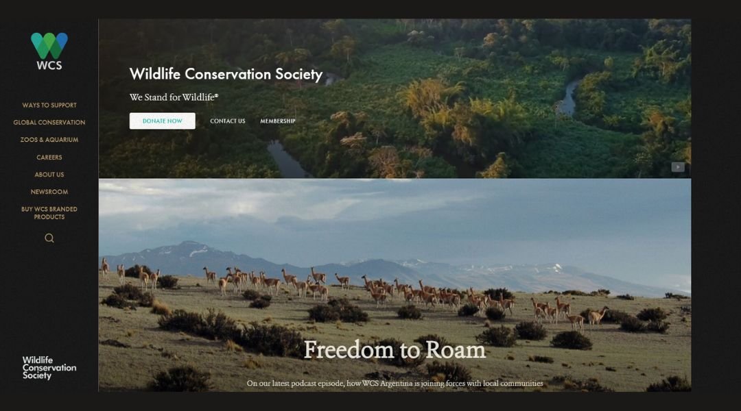
The Wildlife Conservation Society doesn’t just protect animals—it protects the ecosystems they depend on, and the people who live alongside them. The website reflects that scale and purpose with clarity and direction.
From the homepage, the layout is clean and action-driven. Whether you’re looking to donate, explore global conservation programs, or learn about field research, the site guides you there without distraction. Big images. Clear calls to action. No wasted space.
Each section focuses on a specific region or species, backed by science and fieldwork. You’re not just reading headlines—you’re seeing long-term commitments in action, from the Amazon to the Arctic.
What stands out most is the balance between urgency and hope. The tone is steady. It doesn’t dramatize—but it also doesn’t downplay the stakes.
WCS isn’t chasing attention. It’s doing the work. And the site gives you a clear view of how, where, and why that work matters.
4. The Nature Conservancy
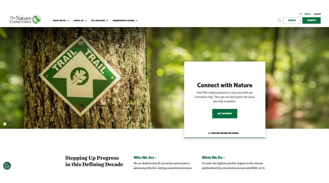
The Nature Conservancy’s website reflects the scale of its mission—global, grounded, and focused on results. From forests and oceans to cities and farmlands, the work is wide-reaching, and the site makes it easy to understand how it’s all connected.
The design is clean and structured, with striking imagery that feels respectful rather than performative. The homepage immediately offers a way in—donate, learn, act. The navigation is intuitive, making it easy to move from big-picture issues to on-the-ground solutions.
What’s especially effective is the way science and storytelling come together. Whether you’re reading about climate solutions or habitat protection, the language stays accessible without losing credibility. The message is consistent: nature can thrive—and so can we—if we act wisely and collectively.
There’s no unnecessary noise. Just clear information, backed by real action, and an invitation to be part of it.
The Nature Conservancy isn’t just talking about saving nature. It’s showing the work—and showing how you can help.
5. Photoscoper
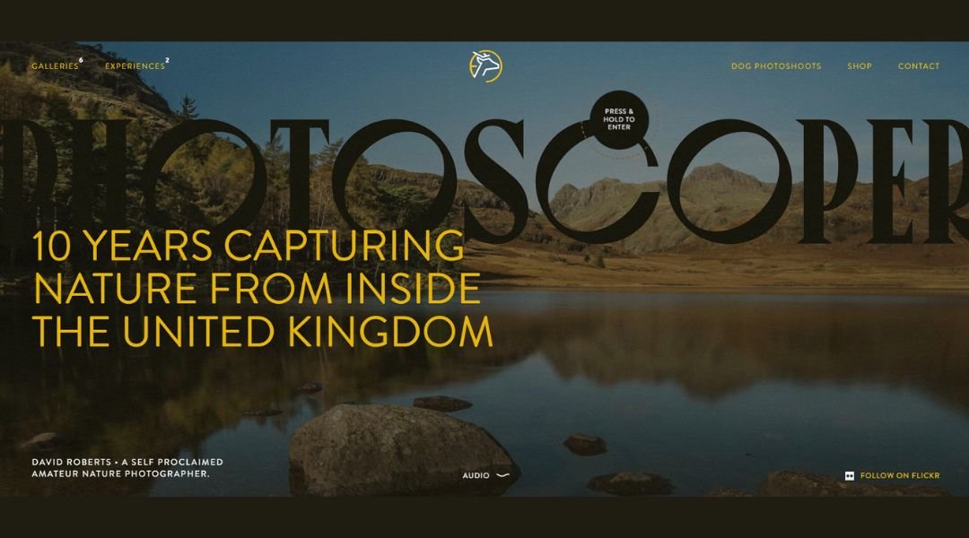
Photoscoper is the photography portfolio of David Clapp—but it doesn’t feel like a portfolio. It feels like an open invitation to slow down and see the landscape differently. The site is clean, image-led, and intentional from the first click.
The homepage sets the tone. Crisp typography and minimal distractions give the work space to breathe. Large, high-resolution images draw you in without needing explanation. Categories are smartly organized—landscape, travel, architecture, astrophotography—all curated with care, not just dumped in for volume.
Each gallery reflects a steady eye and a deep respect for place. There’s no visual noise, no over-editing. Just quiet, focused compositions that reward a second look.
The About section adds depth, but keeps it simple. You get a clear sense of the photographer’s background and approach, without the need for a long bio.
Photoscoper doesn’t shout. It guides. And it does so with precision, restraint, and a clear appreciation for light, texture, and timing.
6. GalataWind
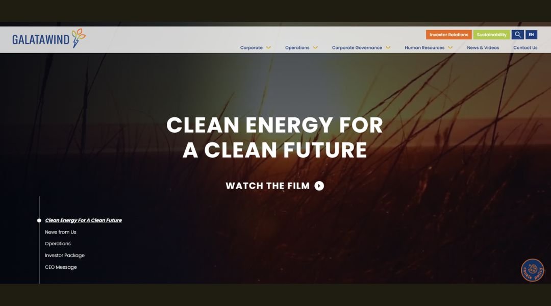
Galata Wind Enerji doesn’t just talk about sustainability—it builds it into every kilowatt. The website reflects that focus with a clean layout, straightforward messaging, and an emphasis on measurable progress.
From the homepage, you’re met with real data: installed capacity, emission reductions, and expansion plans. It’s not buried in jargon. It’s clear, confident, and backed by action.
The company specializes in wind and solar energy, with active operations across Turkey and plans to grow into Europe. Each project page offers more than names and locations—it shows how much energy is produced and how much carbon is avoided. It’s design that supports transparency, not showmanship.
What stands out is the tone. There’s no overstatement or greenwashing. Just steady reporting on goals, results, and forward momentum.
Galata Wind Enerji’s site is built like the company itself: stable, focused, and moving with purpose. It doesn’t try to impress—it delivers.
7. Bronx Zoo

The Bronx Zoo’s website makes one thing clear—it’s more than a place to see animals. It’s a space where conservation, education, and experience come together. The design is friendly, easy to navigate, and focused on helping you plan a meaningful visit.
From the homepage, you get what you need fast: hours, tickets, exhibits, and events. The layout is clean and colorful, with photos that feel authentic—less stock, more storytelling.
Each exhibit page offers just enough detail. You learn what to expect without being overwhelmed. Whether it’s the Congo Gorilla Forest or Tiger Mountain, the tone stays inviting and informative.
The site also highlights its mission. Behind the scenes, the Bronx Zoo is part of the Wildlife Conservation Society, and that commitment to protecting wildlife runs through every section—from field conservation updates to species survival programs.
What makes the site work is its balance. It’s visitor-friendly but mission-driven. Whether you’re going with kids, curious about animals, or just looking for a day outdoors, the Bronx Zoo’s website gives you a clear, engaging place to start.
8. Central Park Conservancy
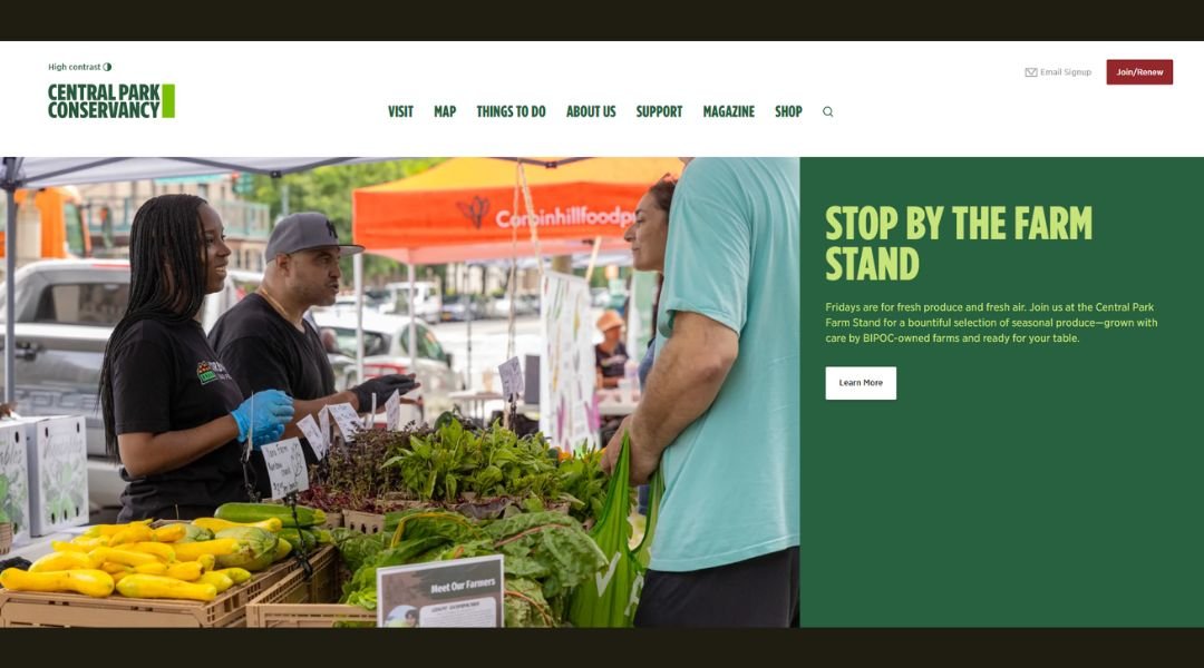
The Central Park Conservancy’s website does what the Park itself does best—it welcomes everyone. Whether you’re planning a visit, exploring its history, or looking for ways to support, the site is structured to guide, not overwhelm.
Right from the homepage, it’s all there: maps, events, seasonal tips, and stories about the people and work that keep the Park running year-round. The design is crisp and light, with photography that feels personal rather than polished.
What stands out is how well the site balances utility with heart. You can easily find the best walking routes or restrooms, but you can also learn how thousands of volunteers help maintain 843 acres of public space with quiet dedication.
The tone is friendly but respectful. It doesn’t rush to impress. It takes its time—much like a walk through the Park itself.
This isn’t just a website for a city park. It’s a reflection of one of New York’s most iconic public spaces, built to serve and inspire the people who use it every day.
9. Visit Adirondacks

Visit Adirondacks makes planning a trip feel effortless. Whether you’re a hiker, paddler, foodie, or winter adventurer, the site guides you to the right experience with ease and confidence.
The homepage greets you with bold imagery and crisp navigation. You can instantly explore by season, region, or activity. It’s clean, organized, and built to help you decide — quickly.
Each section delivers just what you need. Summer brings lush trails and island camping. Fall highlights vibrant foliage and scenic drives. Winter features snowshoeing, carnivals, and skiing. You won’t get lost in text — just clear calls to action and practical info with photos that make you want to go.
Tooltips, guides, and interactive maps help you plan every detail. Even first-time visitors can find their way without confusion or fluff.
What stands out most is the balance. It’s a tourism site with heart. It shows the magic of the Adirondacks — from high peaks to hidden waterfalls — but it also invites you to chart your own path.
Visit Adirondacks doesn’t just present ideas. It helps you explore—and get there.
10. Outdoors
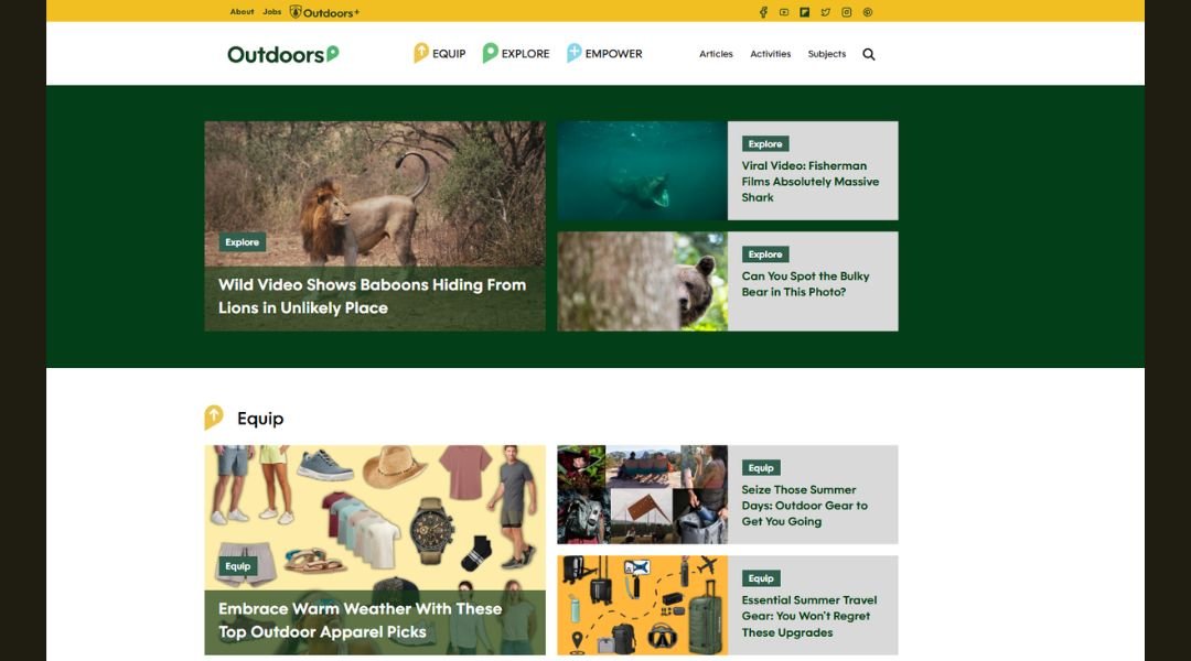
Outdoors.com is built for people who’d rather be outside. Whether you’re planning a weekend hike, learning how to start a campfire, or just looking for gear that actually holds up in the wild, the site keeps things simple and useful.
The homepage is clean and well-paced. Sections are split by interest—adventure, gear, how-tos, and outdoor news. Each article gets straight to the point. No long intros, no fluff. Just solid info written by people who clearly spend time outdoors, not just behind a screen.
What’s refreshing is the mix of content. You’ll find beginner tips next to expert advice, gear reviews that cut through the noise, and stories that make you want to pack a bag and get moving. The tone is practical, not preachy. Friendly, but focused.
Navigation is smooth, and visuals support the content without overwhelming it. It feels built for mobile users who might be reading from the trail—or planning from the trunk of their car.
Outdoors.com isn’t trying to sell the outdoors. It’s just helping you get out there smarter.
11. Think Bioscience
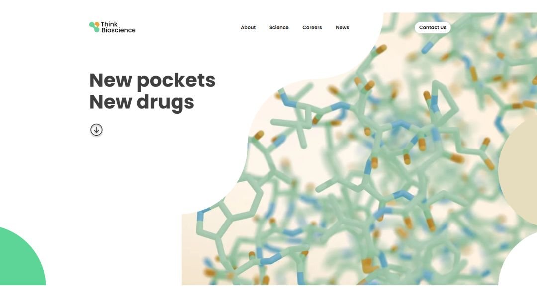
Think Bioscience doesn’t just talk about innovation—it builds it from the cell up. The website reflects that mindset with clarity, focus, and a steady sense of purpose. No marketing gloss, just science in motion.
The homepage introduces a bold idea: using living systems to unlock drug targets others have overlooked. It’s a clean, direct pitch, supported by thoughtful design and strong language. You’re not left guessing what they do—you’re pulled in by how they think.
Digging deeper, the site keeps that rhythm. The science section breaks down complex ideas—protein motion, hidden binding sites, synthetic biology—into something readable without oversimplifying. You can tell it’s written by people who care about both accuracy and accessibility.
What stands out most is tone. It’s serious without being stiff. Transparent without oversharing. It invites collaboration while staying grounded in research and results.
Think Bioscience doesn’t waste time on flash. It focuses on function—just like its science. And that’s what makes it work.
12. Climate Cymru
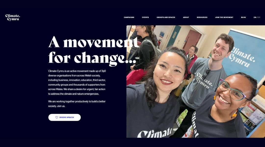
Climate Cymru is built on one simple idea: climate action should reflect the voices of Wales. The website delivers that message with clarity and urgency—inviting individuals, organizations, and communities to speak up and take part.
The homepage gets to the point quickly. Bold messaging, accessible navigation, and Welsh and English language options make the platform feel inclusive and direct. Whether you’re signing the Climate Cymru pledge or exploring partner stories, the journey is simple and user-focused.
What stands out is how the site balances policy with people. It doesn’t just talk about targets—it highlights the voices behind them. You see farmers, students, business owners, and artists—real people, all calling for meaningful change.
Campaigns and resources are easy to access, and the tone is hopeful without losing momentum. It’s not about blame. It’s about building a future that works for everyone.
Climate Cymru isn’t just a campaign hub—it’s a gathering point. And the site makes it easy to feel part of something bigger, with every voice adding to the message.
13. Another Escape
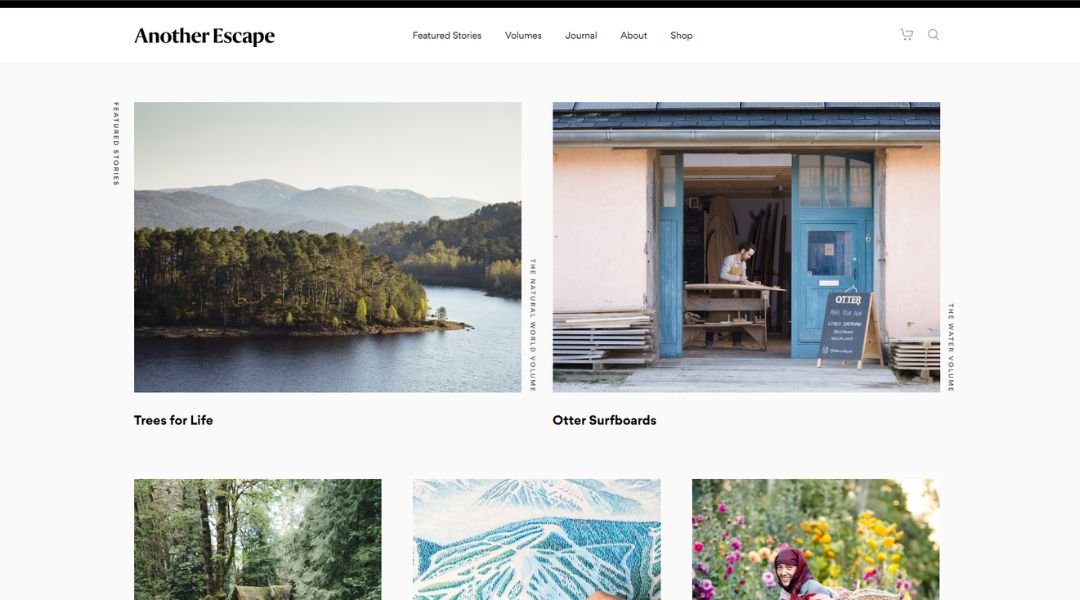
Another Escape isn’t just a magazine—it’s a mindset. The website invites you to slow down, look closer, and reconnect with nature, craft, and purposeful living. It’s minimal by design, giving space for ideas, photography, and storytelling to breathe.
From the homepage, you’re met with soft visuals and intentional pacing. There’s no rush to click through. Instead, each section encourages quiet curiosity. Whether you’re browsing volumes, reading features, or learning about contributors, the tone stays consistent—gentle, grounded, and thoughtful.
What makes the site stand out is its balance. It’s editorial but personal, structured yet fluid. The writing is reflective without drifting into abstraction. The photography doesn’t just support the stories—it is the story.
Navigation is simple. Purchase options are clear. And the ethos—sustainability, creativity, and deep attention—is woven through every page.
Another Escape isn’t trying to compete for your attention. It’s offering a pause, a perspective, and maybe even a shift in pace. And that’s what makes it memorable.
14. Global Climate Change – NASA
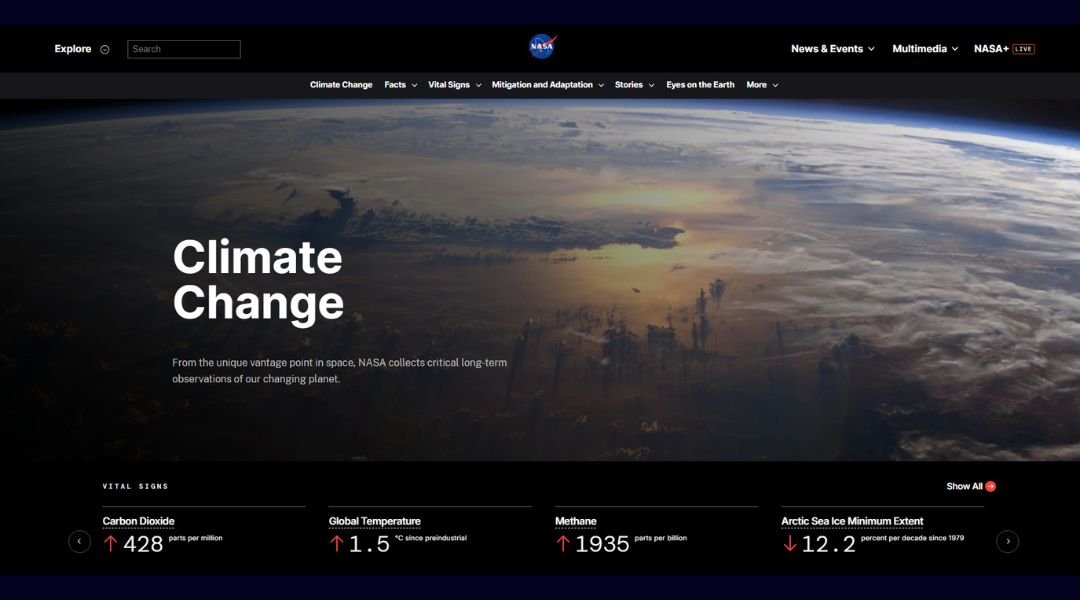
NASA Climate is where data meets clarity. The site takes decades of Earth science and presents it in a way that’s not just digestible—but compelling. From rising temperatures to shrinking ice sheets, every section is designed to inform without overwhelm.
The homepage is direct. Real-time stats on CO₂ levels, sea level rise, and global temperature sit front and center. It’s not buried in reports—it’s right there, backed by the same science used to guide global decisions.
Navigation is smooth, with clear paths for students, educators, and curious minds. Visuals are strong and purposeful—satellite imagery, charts, and animations that support understanding rather than distract from it.
What stands out is the tone. It doesn’t dramatize. It doesn’t downplay. It presents the facts, explains the methods, and offers insight into how NASA monitors climate from space.
This isn’t a campaign site. It’s a trusted resource. And it’s built for anyone who wants to understand what’s happening—and what the data actually says.
15. National Park Service – Grand Canyon

The Grand Canyon’s official site is exactly what it should be—focused, informative, and built to help you make the most of your visit. It doesn’t try to compete with the canyon’s scale. Instead, it gives you what you need to explore it with confidence.
The homepage keeps things simple. You’ll find alerts, park hours, and travel guidance right up top. Whether you’re planning a hike, booking a campsite, or just learning about the South Rim versus the North, the site makes the basics easy to access.
What’s especially helpful is how the site balances logistics with education. Beyond maps and permits, you’ll find geology overviews, cultural history, and even stargazing tips—all written in a tone that’s approachable without losing authority.
It’s not flashy, and it doesn’t need to be. The focus stays where it belongs: on helping people experience a landscape that’s larger than words.
Grand Canyon National Park’s site doesn’t try to outshine the view. It simply helps you get there—and understand why it matters.
16. Bird Malaysia

Bird Malaysia is a quiet but valuable resource for anyone interested in the country’s rich birdlife. The website doesn’t overwhelm—it informs. Whether you’re an experienced birder or just starting out, it offers a grounded view into one of Southeast Asia’s most diverse ecosystems.
The layout is simple, with content organized by region, species, and birdwatching locations. Descriptions are straightforward, and the tone is welcoming. Instead of glossy promotion, the site shares knowledge clearly—helping visitors understand where to go, what to look for, and why Malaysia matters in the global birding landscape.
Each page highlights key species and habitats, from the dense rainforests of Borneo to the wetlands near Kuala Selangor. You’ll also find practical tips for respectful observation, including the best times to visit and how to move quietly through bird-rich areas.
This isn’t a flashy tourism site. It’s a guide built by people who know and love the field. And in that way, Bird Malaysia feels like a trusted companion—for those looking, listening, and learning in the trees.
17. August
August doesn’t just build digital products—it builds with intention. The website reflects that mindset with sharp design, focused messaging, and a tone that respects both the work and the user.
From the homepage, you’re met with clarity. There’s no pitch-heavy language, just confident statements and clean structure. The site guides you through their approach—strategy, design, engineering—without unnecessary noise. It’s smart and self-aware.
Project pages offer more than visuals. Each case study walks through challenges, decisions, and results. The writing is straightforward, but thoughtful—less about buzzwords, more about process. You get the sense this team isn’t interested in trends for their own sake—they’re building for real outcomes.
The tone across the site is consistent: grounded, curious, and quietly bold. Even the “About” section avoids the typical agency fluff. Instead, it focuses on people, values, and long-term thinking.
August’s site doesn’t need to oversell. It reflects a team that knows its craft—and lets the work speak first.
18. Cassotis
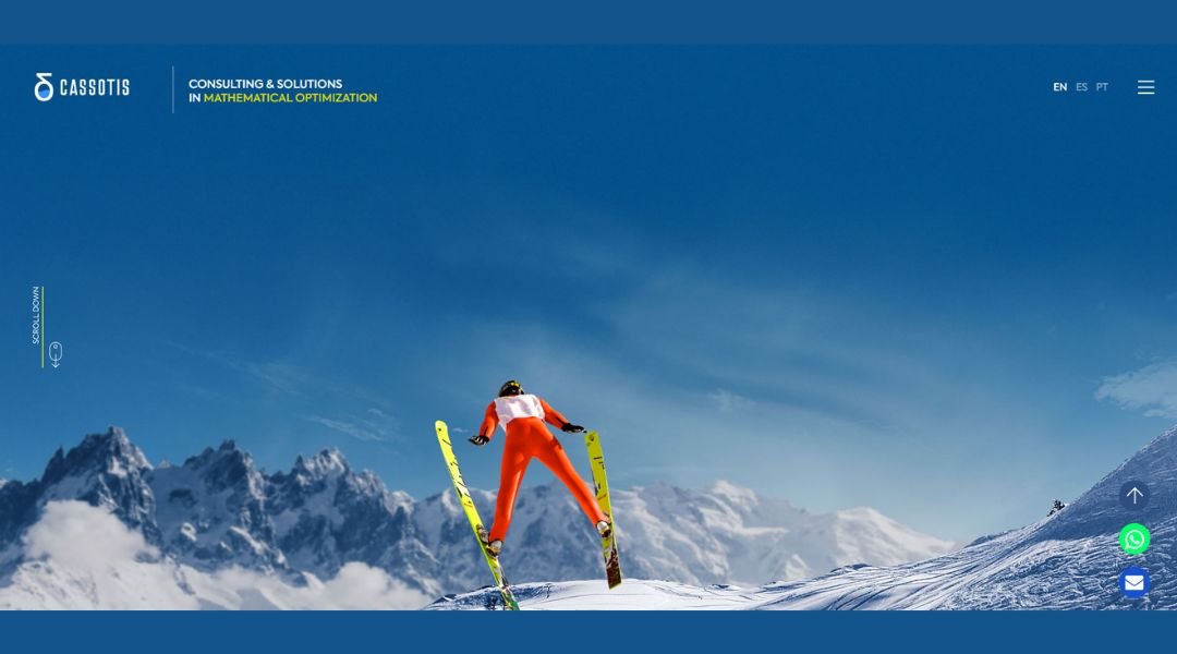
Cassotis specializes in airport consulting, and their website reflects that same focus—precise, efficient, and built for people who value clarity over flash. From planning and operations to data analysis and simulation, everything is presented with a sharp sense of purpose.
The homepage keeps it clean. Service areas are laid out in plain terms, and the navigation helps you move from expertise to application without friction. Whether you’re an airport operator, a regulator, or a project partner, the path through the site is clear.
Case studies are well-organized and straight to the point. You’re not reading marketing copy—you’re seeing how the work gets done, how problems are solved, and what results follow. It’s consulting without the ego.
What stands out is the tone. Cassotis doesn’t try to impress with style. It leads with substance. The language is technical where it needs to be, but always accessible to the right audience.
For an industry that depends on timing, data, and reliability, this site does exactly what it should—it delivers the information that matters, and nothing more.
19. Nrplp
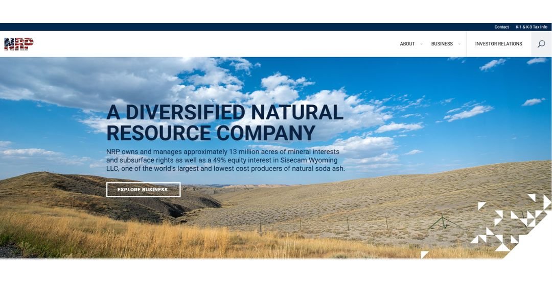
NRP’s website reflects exactly what the firm delivers—property management with structure, accountability, and attention to detail. It’s designed for homeowners associations, condominium boards, and commercial properties that want more than just maintenance—they want a long-term partner.
From the homepage, the message is direct: local expertise, strong communication, and full-service management. There’s no vague language or filler—just a clear breakdown of services and what clients can expect.
Navigation is straightforward, with sections for residential and commercial clients, testimonials, and leadership. Each part of the site speaks to real-world concerns—budgeting, vendor oversight, community engagement—not buzzwords.
What stands out is the tone. It’s professional, but approachable. You can tell the company is used to solving problems and answering questions, not just collecting fees. The site gives you reasons to trust NRP—through experience, transparency, and results.
NRP doesn’t oversell. It communicates value through stability, responsiveness, and a commitment to property success—something that shows in every part of the site.
20. Templetonprize
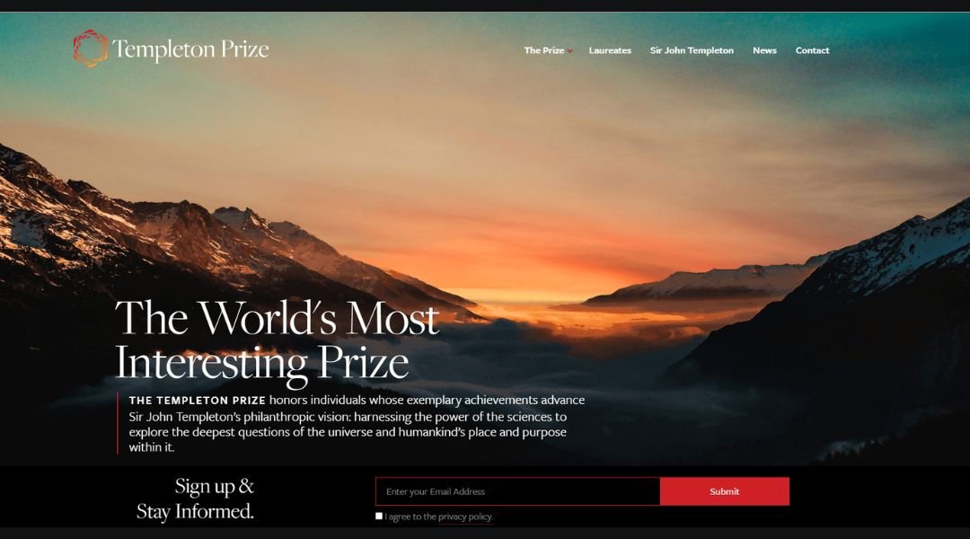
The Templeton Prize celebrates ideas that reach beyond boundaries—recognizing individuals whose work connects science, philosophy, and spirituality in meaningful ways. The website reflects this mission with elegance and focus. It’s not about spectacle—it’s about substance.
From the homepage, the experience is clear and intentional. You’re introduced to the purpose of the prize, its founder’s vision, and a legacy of laureates whose ideas have shaped how we understand humanity, purpose, and discovery.
Each laureate profile is detailed but accessible, offering insight into their achievements and the deeper questions their work explores. Whether it’s a physicist, philosopher, or humanitarian, the stories are grounded in real-world impact and thoughtful inquiry.
The design is quiet, respectful, and informative. No distraction, just a sense of depth and clarity. Even the visuals serve a purpose—supporting the content, never overshadowing it.
The Templeton Prize site doesn’t aim to impress with flash. It invites you to explore work that inspires reflection—and challenges how we think about progress, meaning, and human potential.
Conclusion
Designing for nature isn’t about adding texture or looping videos of trees. It’s about knowing when to hold back—and when to let the subject speak for itself.
The sites I shared don’t rely on tricks. They focus on presence, clarity, and trust. That’s what good nature design asks of us, too: less noise, more attention.
If one of these examples made you pause, then it’s doing what nature always does best—quietly changing the way we look at things.

