As someone who designs with both intention and instinct, I know how critical it is for a portfolio site to feel like the work it represents. Your online presence isn’t just a gallery—it’s the digital handshake, the quiet confidence before the first meeting.
In this guide, I’ve rounded up practical, design-forward inspiration to help you refine your site—not just to look good, but to feel authentic. Whether you’re an interior designer, a studio owner, or somewhere in between, these ideas are built for clarity, impact, and connection.
Here’s what you’ll discover:
- How layout and visual pacing can strengthen your portfolio’s message
- Why minimal copy sometimes says more than lengthy bios
- The difference between showing work and telling a story
- How to create an online experience that reflects your design voice
- Subtle choices (like typography and spacing) that influence perception
No jargon, no filler—just what works, and why.
1. Cathie Hong Interiors
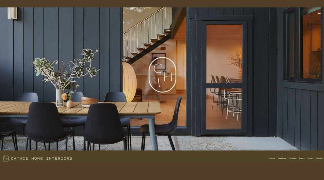
Cathie Hong’s interior design portfolio is a study in calm confidence. Based in the Bay Area, her site feels like walking into a perfectly styled room—one that speaks softly but leaves an impression. Right from the homepage, the layout is clean, the colors intentional, and the photography does most of the talking (the good kind of quiet).
Her About page goes further than a simple intro. We get a sense of her philosophy—thoughtful, restrained, and distinctly modern. Rather than listing services line by line, she lets her work speak through visuals and minimal copy. It’s a smart move that feels authentic, not overly curated.
A subtle highlight? Her use of white space. It’s not just decoration—it lets the projects breathe. And for those of us who’ve ever stared at a blank wall wondering what to do, her site quietly offers answers without shouting.
Cathie’s portfolio doesn’t try to impress with noise. It invites you in and makes you want to stay a while—preferably with a cup of something warm.
2. Martin Kemp Design
Martin Kemp’s portfolio feels like walking through a private gallery—one where every detail is deliberate, and nothing is trying too hard. Based in London, his studio specializes in high-end residential and commercial spaces, but what sets the tone is the quiet confidence throughout the site. No loud claims. Just well-crafted work with room to breathe.
The homepage welcomes you with striking visuals. Rather than overload with text, each project is given space—like it’s earned the spotlight. You’ll find a mix of modern refinement and classic structure, with just enough edge to keep things interesting.
The About section tells a story without oversharing. We’re introduced to a team that values discretion, creativity, and, yes, a touch of drama—but the good kind, like a perfectly placed chandelier.
Navigation is simple. Content is clear. And even the typography feels like it’s been through a few rounds of fine-tuning.
Martin Kemp Design doesn’t shout luxury. It whispers it—confidently, and with just enough pause to make you lean in.
3. Tyler Karu
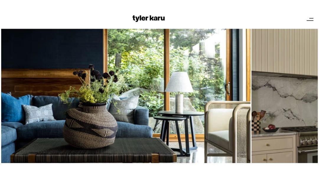
Tyler Karu’s portfolio has a kind of lived-in elegance that feels both refined and relaxed. Based in Maine, her studio blends interior design and renovation with a focus on spaces that feel genuinely personal—not showroom-perfect, but the kind of homes you actually want to be in.
The website reflects that philosophy. It’s clean without being cold, with large imagery that tells you everything you need to know—before you’ve even read a word. Rooms feel intentional but never stiff, with just enough texture to keep things grounded.
The About section gives us more than a resume. We get a clear sense of Tyler’s design perspective—down-to-earth, creative, and refreshingly straightforward. There’s no overexplaining, just the right amount of insight into her process and values.
Even the way the projects are presented feels accessible. You’re not just looking at pictures; you’re stepping into spaces shaped by experience and instinct.
Tyler’s work doesn’t try to chase trends. It focuses on what lasts—and makes you wonder if maybe less really is more (especially when it involves really nice wood floors).
4. Suzy Hoodless
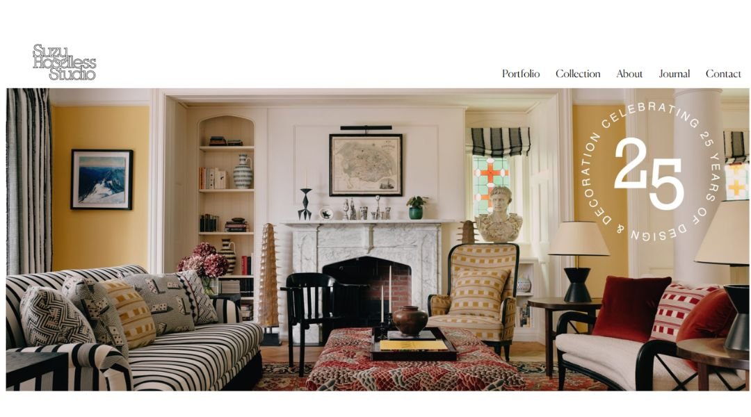
Suzy Hoodless’s design work speaks in bold, confident tones—without ever raising its voice. Her London-based studio brings a modern edge to interiors that are anything but predictable. The website captures that same energy: sleek, curated, and full of color without feeling loud.
From the moment you land on the homepage, it’s clear—this isn’t about playing it safe. Projects are showcased with big, expressive visuals and minimal text. But what’s shown is purposeful. Rooms are layered with texture, personality, and just enough surprise to keep things interesting.
The About section doesn’t stretch too far. It introduces Suzy’s background and philosophy with clarity and ease. No filler, just a sharp point of view and an eye for art, design, and the spaces in between.
Even the site’s layout feels designed with rhythm—each scroll feels like turning the page in a high-end editorial spread.
Suzy’s portfolio doesn’t just show interiors; it captures attitude. It’s for people who appreciate good design—and aren’t afraid of a little velvet or a strong pattern.
5. Karageorgiou
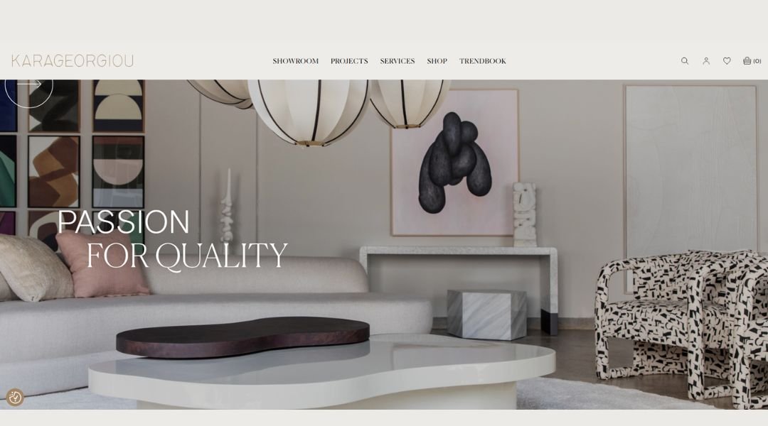
Karageorgiou Architecture doesn’t waste time with distractions. The website opens with clean lines, strong visuals, and a sense of clarity that reflects the studio’s design values—refined, thoughtful, and quietly ambitious.
Based in Greece, the firm specializes in residential and commercial architecture with an emphasis on form, light, and function. Each project is presented with minimal fuss—just enough information to understand the concept, while the imagery does the rest. Think less noise, more precision.
The About section keeps it grounded. We get a clear picture of the studio’s philosophy: architecture that respects place, responds to context, and avoids the unnecessary. It’s calm confidence in built form.
What stands out is the consistency. From typography to layout, everything is measured and intentional. There’s no over-selling—just honest work, beautifully framed.
If you’re looking for design that doesn’t feel like it’s trying too hard, this is it. The site isn’t flashy, but it’s sharp—and that quiet sharpness is what gives it strength.
6. Soane Britain
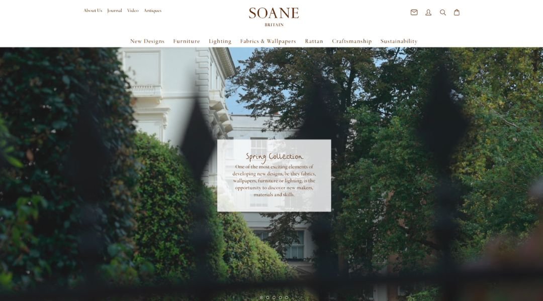
Soane Britain’s website feels like stepping into a well-appointed room—everything in its place, nothing trying too hard, and somehow, it all feels timeless. Known for handcrafted British furniture, lighting, and textiles, the studio blends tradition with a confident modern sensibility.
From the first glance, the site feels tactile. Rich product imagery, layered textures, and restrained colors create a browsing experience that feels more like exploring a physical showroom than scrolling a screen. It’s elegant, but not stiff—more inviting country house than sterile catalog.
The About section offers a clear glimpse into the brand’s philosophy: craftsmanship, materials, and a love for longevity. There’s reverence for heritage, but not at the expense of creativity. You sense that every piece has a story—and that the makers are as valued as the materials.
Navigation is simple, the layout is clear, and the tone is confident without slipping into luxury clichés. Soane doesn’t have to announce its quality. It lets the details—and the brass hardware—do the talking.
This isn’t just design you look at. It’s design you live with.
7. Studio Jari
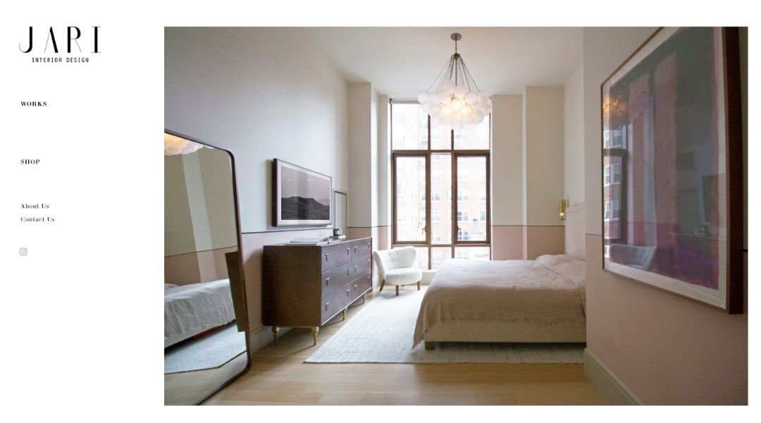
Studio Jari doesn’t follow trends—it curates atmosphere. The site, much like its interiors, is composed with care: calm, intentional, and quietly confident. Based in Copenhagen, the studio brings a Nordic sensibility to spaces that feel both grounded and elevated.
The homepage sets the tone immediately. Large-format imagery and minimal text allow the work to breathe. There’s nothing rushed or crowded here—just a soft rhythm of texture, light, and form. It’s design that gives you space to look and think.
The About page is refreshingly understated. No dramatic mission statements—just a clear expression of values: collaboration, detail, and creating places that feel genuinely lived in. The voice is personal, but never overly casual.
Even the navigation feels part of the aesthetic—pared-back but thoughtfully structured, like one of their interiors. There’s a quiet confidence in showing less, and letting the work do the talking.
Studio Jari’s portfolio doesn’t aim to impress at first glance. It invites you to slow down, look closer, and stay awhile. And that’s exactly the point.
8. Elite Design Studio

Elite Design Studio delivers spaces that are sleek, sculpted, and unapologetically refined. From the first scroll, the website sets the mood: bold imagery, clear structure, and just enough detail to keep things moving without losing clarity.
Based in Qatar, the studio brings a strong architectural eye to both residential and commercial projects. The tone is contemporary, but not cold—there’s structure, yes, but also softness in the way materials, light, and space are handled. It’s luxury, but lived-in.
The About section gets to the point. There’s no overexplaining—just a clear statement of values: creativity, innovation, and a commitment to crafting elegant environments that feel intentional. It’s a studio that knows what it’s doing and doesn’t need to overstate it.
Navigation is seamless. The site is as visually curated as the spaces it showcases, making the experience feel effortless.
Elite Design Studio isn’t about noise or flash. It’s about form, balance, and getting the details right—without needing to say it twice.
9. Kati Curtis Design
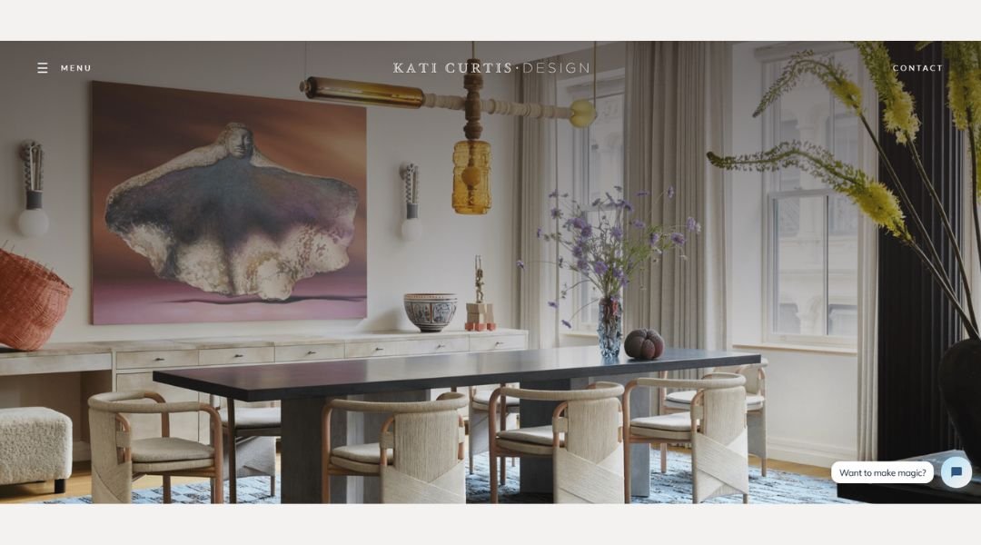
Kati Curtis doesn’t design spaces that whisper—they speak clearly, with charm, character, and a little bit of boldness. Based in New York, her studio is known for interiors that mix global influence with a strong architectural backbone. The website reflects that energy: vibrant, polished, and full of personality without ever feeling chaotic.
Right from the homepage, you’re pulled in. Large, expressive images do most of the talking, while concise copy provides just the right amount of context. Color, texture, and pattern are everywhere—but they’re placed with care, not just for show.
The About section gives a quick but compelling picture: Kati’s background in architecture, her global perspective, and her belief that interiors should tell stories—not just look good in photos. It’s a balance of creativity and strategy that comes through in both her work and her words.
Navigation is clear, the tone is confident, and the portfolio feels like a curated world tour of style. Each space is layered, livable, and unmistakably hers.
Kati Curtis Design doesn’t hold back—and that’s exactly why it works.
10. Studio Hollond

Studio Hollond doesn’t decorate—it composes. Based in Houston, the firm creates interiors that feel deeply considered, but never overdone. The website reflects that same approach: graceful, minimal, and intentional in every detail.
From the first view, the visuals speak volumes. There’s a rhythm to the site—projects are displayed with room to breathe, allowing material, color, and form to quietly unfold. It’s not about making a splash; it’s about lasting impressions.
The About section is brief but well-structured. It introduces Molly Hollond’s vision with clarity: classic foundations, modern touches, and a focus on emotional connection within each space. The tone is thoughtful without drifting into excess.
Nothing on the site feels rushed or noisy. The navigation is clean, and the layout follows the same design values found in the work—order, elegance, and restraint.
Studio Hollond doesn’t try to show off. It shows up—with work that feels calm, confident, and quietly luxurious. The kind of design that lingers, even after you’ve left the room.
11. Infinite Bespoke Interiors
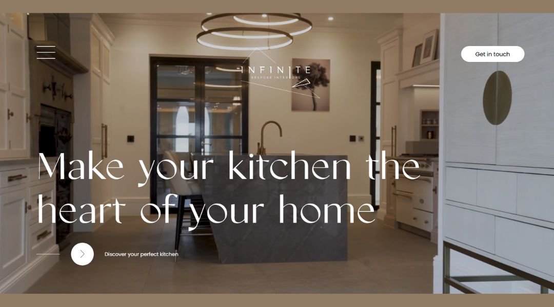
Infinite Bespoke Interiors is proof that precision and personality can live in the same space. Based in the UK, the studio delivers high-end interiors that are both finely crafted and deeply personal. Their website reflects that balance—structured, bold, and inviting without being showy.
From the outset, the homepage draws you in with striking visuals and sharp presentation. Projects are showcased with confidence—clean lines, rich materials, and a clear sense of purpose in every image. There’s no guesswork here. You immediately understand the studio’s commitment to detail and finish.
The About section gets to the heart of it: collaboration, craftsmanship, and an eye for design that’s equal parts bold and considered. It’s not just about making spaces look beautiful—it’s about making them feel like they belong to the people who live in them.
Navigation is simple. The flow is intuitive. And like their interiors, the site feels tailor-made without trying to prove it.
Infinite Bespoke Interiors isn’t just designing homes—they’re building experiences, one well-fitted detail at a time.
12. Studio 397

Studio 397 Architecture doesn’t overstate—because the work does the talking. Based in Atlanta, the firm focuses on modern residential and commercial spaces with a strong architectural backbone and a clear point of view. The website mirrors that clarity: clean design, thoughtful structure, and just the right amount of information.
From the homepage, you’re met with bold imagery and minimal text—sharp angles, natural light, and honest materials take center stage. The layouts are quiet but intentional, giving each project space to speak for itself.
The About section gives a clear sense of the studio’s philosophy: architecture rooted in context, purpose, and craft. There’s an emphasis on collaboration and clarity—not just in design, but in how clients experience the process.
What stands out is the calm precision. The site feels measured, not flashy. Navigation is smooth, content is focused, and everything feels like it belongs—just like the spaces they create.
Studio 397 isn’t trying to impress with noise. It builds trust through restraint, balance, and really good design.
13. Taylor Howes

Taylor Howes doesn’t just create beautiful interiors—they create presence. Based in London, the studio’s work is sophisticated, confident, and distinctly elevated. The website matches that tone: refined visuals, structured layout, and an air of quiet luxury that doesn’t try to oversell.
From the homepage, you’re met with high-impact imagery—grand rooms, rich textures, and design choices that balance opulence with restraint. The site flows like one of their interiors: intentional, layered, and built for experience.
The About section offers more than credentials. It presents a clear design ethos—elegance with soul, where every project is crafted with care, clarity, and creativity. It’s less about following trends and more about defining a lasting, personal style.
Navigation is seamless, content is tight, and the portfolio is extensive without ever feeling overwhelming. Each space feels curated, not catalogued.
Taylor Howes brings design that’s confident without being cold. It’s interiors that know how to make an entrance—and just as importantly, know when to let the details speak for themselves.
14. Renner

Renner Interior doesn’t chase attention—it earns it through quiet elegance and considered craftsmanship. Based in Belgium, the studio focuses on bespoke interiors that are calm, precise, and deeply rooted in material quality.
The website reflects that same design philosophy. From the first glance, it’s clear: everything has its place. Clean lines, soft tones, and carefully framed photography set the tone—no clutter, no distractions. Just space, light, and intention.
The About section is concise yet meaningful. It outlines a commitment to craftsmanship, collaboration, and enduring design. There’s a sense that nothing is rushed here—every project feels like the result of thoughtful decisions, not fleeting trends.
Navigation is intuitive and the pacing feels deliberate—just like their interiors. Each click moves you deeper into a portfolio defined by balance, warmth, and natural texture.
Renner Interior doesn’t shout to be noticed. It draws you in slowly—with design that’s subtle, sophisticated, and built to last.
15. Elizabeth Hay
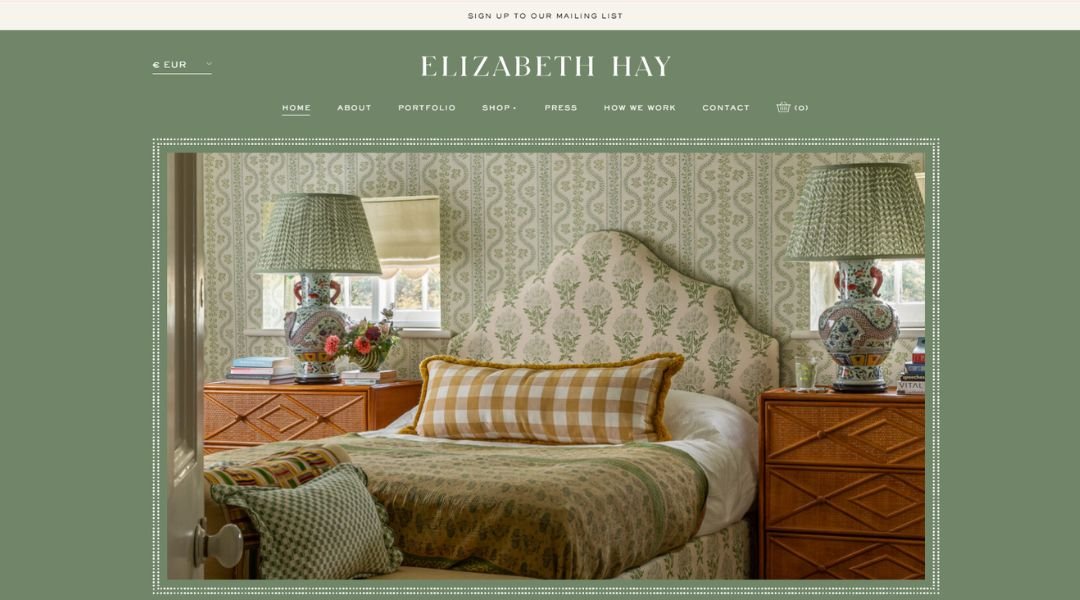
lizabeth Hay Design is anything but shy. Based in Singapore and known internationally, the studio brings bold colour, layered pattern, and British charm to interiors that feel both joyful and refined. The website reflects that spirit perfectly—lively but controlled, with just the right touch of whimsy.
From the start, the homepage makes an impression. Rich visuals showcase spaces full of character—walls that speak, textiles that pop, and rooms that feel like they’ve been collected over time rather than styled in a hurry.
The About section gives a clear picture of Elizabeth’s background and creative voice. There’s a confidence in her approach: mixing old with new, formal with playful, and always putting comfort at the centre of it all.
The site is easy to navigate and thoughtfully designed, just like the interiors it features. Each project feels personal, never formulaic.
Elizabeth Hay Design isn’t about quiet minimalism. It’s about spaces that smile back—and somehow still manage to feel perfectly put together.
16. Chan + Earys
Chan + Eayrs isn’t just a design studio—it’s a philosophy. Based in London, the duo creates deeply personal homes, each shaped with care, patience, and a strong sense of place. Their website echoes that ethos: quiet, restrained, and beautifully composed.
From the very first page, the experience feels intentional. No unnecessary text, no distractions—just still, thoughtful imagery that invites you to slow down. Each project is presented like a chapter: layered, contemplative, and clearly lived-in.
The About section reads more like a manifesto than a biography. It speaks to process, intimacy, and craft. There’s an emphasis on doing less—but doing it better. The idea of building with a space, rather than simply placing things inside of it.
Navigation is sparse but purposeful. The design reflects their work: considered, emotional, and timeless without being stuck in tradition.
Chan + Eayrs doesn’t design for attention. They design for connection—for homes that feel human, grounded, and quietly extraordinary.
17. Format Furniture
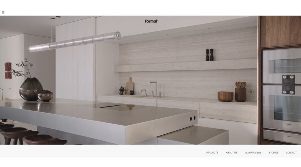
Format Furniture doesn’t try to impress with noise—it invites you into a space where every detail has meaning. Based in Amsterdam, the studio focuses on creating complete living environments that are built to last, both in form and feeling.
The website sets the tone immediately. Clean visuals, minimal copy, and a soft rhythm guide you through spaces that feel balanced and lived-in. There’s no rush—just time to observe good design, quietly doing its job.
Their approach is grounded in craftsmanship. Natural materials, solid construction, and honest textures define the work. Whether it’s marble, metal, or carefully chosen wood, everything feels intentional—not decorative, but essential.
The About section is concise but purposeful. Format makes it clear: their work isn’t about filling space, but shaping it. The result? Interiors that feel calm, resolved, and personal.
From the digital layout to the physical details, Format Furniture values clarity over clutter. It’s design that doesn’t shout for attention—but earns it through precision, warmth, and the kind of simplicity that’s anything but basic.
18. Amhad Freeman Interiors
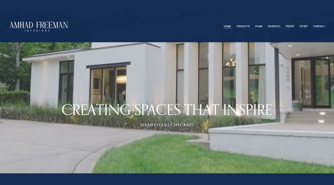
Amhad Freeman Interiors delivers spaces that feel sharp, grounded, and deeply personal. With studios in Nashville and Chicago, the firm specializes in high-end residential design with a focus on clean lines, thoughtful materials, and a refined, masculine sensibility.
The website makes a quiet yet confident entrance. Large-scale imagery takes the lead—inviting, structured, and full of depth. There’s no rush of text. Just a curated visual experience that gives each project the space it deserves.
In the Story section, Amhad’s approach becomes clear. He designs for how people live, not just how they want to be seen. Each space balances form and function, drawing from contemporary, classic, and modern influences without leaning too hard in any direction.
What stands out is the restraint. Every finish, fixture, and furnishing feels chosen—not for effect, but for fit. It’s design that respects the room and the person who inhabits it.
Amhad Freeman Interiors doesn’t follow formulas. It creates quietly powerful environments built for real life, lived well.
19. AphroChic
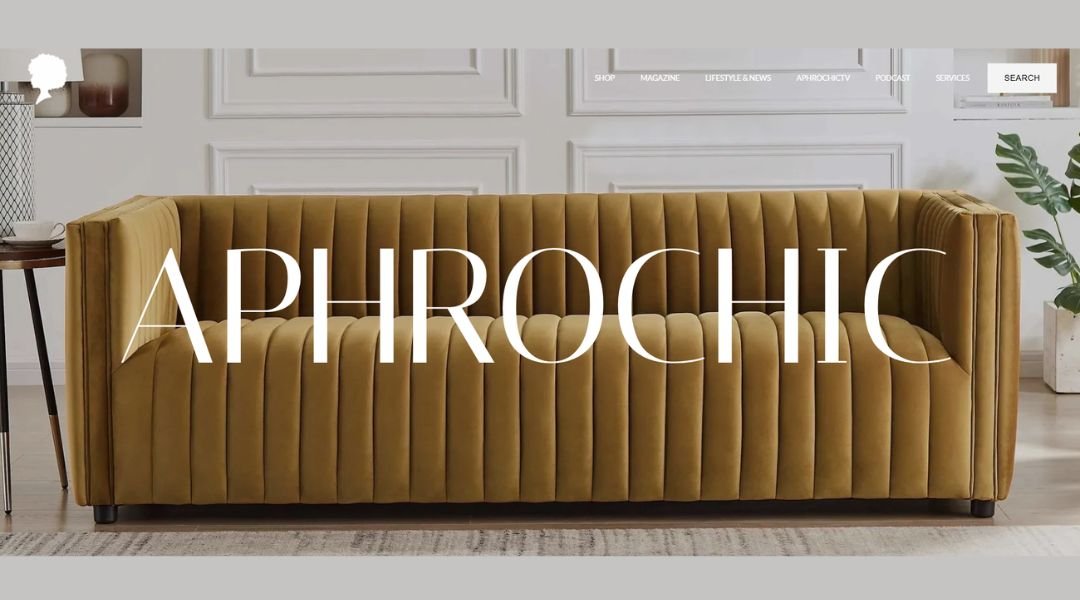
AphroChic is more than a design studio—it’s a cultural statement. Founded by Jeanine Hays and Bryan Mason, the brand sits at the intersection of interior design, storytelling, and Black culture. The website reflects this mission with depth and clarity: bold visuals, rich editorial content, and a clear voice that doesn’t shy away from meaning.
From the start, it’s clear this isn’t just about beautiful spaces—it’s about identity, history, and representation. The imagery is powerful, but so is the message. AphroChic brings texture not just to walls and fabrics, but to the broader conversation around culture and design.
The studio’s work blends global influences with a modern, soulful aesthetic. Every detail—whether a curated product, editorial piece, or home project—feels intentional and expressive.
The site is both design portfolio and platform. It’s where interiors meet activism, where form meets story. And through it all, AphroChic creates space—literally and figuratively—for underrepresented voices to be seen, heard, and celebrated.
This isn’t just design that looks good. It’s design that matters.
20. Krane Home

Krane Home brings art and ancestry into the heart of the home. Founded by Sharon Lee Clark, this Dallas-based studio reimagines traditional Korean symbolism through hand-painted wallpaper, textiles, and art prints that feel both modern and meaningful.
The website reflects that same philosophy—clean, bold, and visually rich. Each page showcases vivid patterns and painterly motifs, from cranes to peonies, without crowding the eye. It’s a space that feels curated, not commercial.
What sets Krane Home apart is intention. These aren’t just decorative pieces—they’re cultural expressions translated into everyday design. Sharon’s fine art background and Korean heritage are woven into every product, adding depth to every print and pattern.
The shopping experience is seamless. Whether you’re browsing wallpaper or pillows, the flow is thoughtful and personal. Product stories are clear, the design details matter, and everything feels considered.
Krane Home isn’t chasing trends. It’s offering a deeper connection—to heritage, to art, and to the spaces we live in.
Conclusion
Your website should feel like a space you’ve designed—purposeful, personal, and hard to forget. After all, it’s often the first project a potential client will ever “walk through.”
The good news? You don’t need to rebuild everything from scratch. Small shifts in layout, image curation, or tone can quietly elevate how your work is experienced.
I built this list not just to inspire, but to remind you: thoughtful design doesn’t have to shout. Sometimes, it’s the silence between the elements that says the most.

