Every great business begins with a simple idea. But how does that idea evolve into a recognizable and trusted identity? That’s where strategy and creativity come together.
I don’t just design logos or select colors—I build visual identities that tell a story, connect with people, and create lasting impressions.
Good design isn’t about making things look pretty; it’s about crafting an identity that resonates with an audience. When done well, it establishes credibility, builds trust, and helps businesses stand out in crowded markets.
In this guide, I’ll walk you through how I take an idea and transform it into a powerful, memorable presence.
What You’ll Learn:
How to define a brand’s personality and purpose
The impact of colors, typography, and imagery
Why consistency is essential across platforms
Common mistakes that weaken visual identity
How to keep a brand’s presence fresh over time
Let’s get started.
Building the Foundation: Defining Identity
Before designing anything, I start by uncovering the essence of the business. Every company has a unique purpose, and understanding it is key to creating an authentic identity.
Clarifying the Core Message
- What values does the business stand for?
- Who is the ideal audience?
- What emotions should the identity evoke?
A strong presence isn’t just about visuals; it’s about having a clear and consistent message.
Related Read: Building a Strong Brand Identity
Creating a Distinct Visual Identity

A business needs to be instantly recognizable. That’s where elements like logos, colors, and typography work together to establish trust and credibility.
Why a Logo Matters
A strong logo should be:
Memorable – Instantly recognizable, even in black and white.
Versatile – Works across various platforms and sizes.
Timeless – Avoids short-lived trends that require frequent updates.
Think about logos like Nike or Apple—they go beyond aesthetics and evoke strong emotional connections.
Related Read: The Role of a Logo
The Psychology of Colors: Setting the Right Tone
Colors influence emotions and play a huge role in perception.
- Red → Passion & energy (Coca-Cola)
- Blue → Trust & professionalism (Facebook)
- Yellow → Optimism & warmth (McDonald’s)
Choosing the right palette helps a company establish the right mood and message.
Related Read: Choosing the Right Colors
Typography: More Than Just Letters
Typography is often overlooked, but it’s a key component of identity and readability.
- Serif fonts → Traditional & trustworthy (The New York Times)
- Sans-serif fonts → Modern & clean (Google)
- Script fonts → Elegant & creative (Luxury brands)
The right typeface ensures a business looks both polished and professional.
Related Read: Typography in Branding
Consistency: The Key to a Cohesive Image
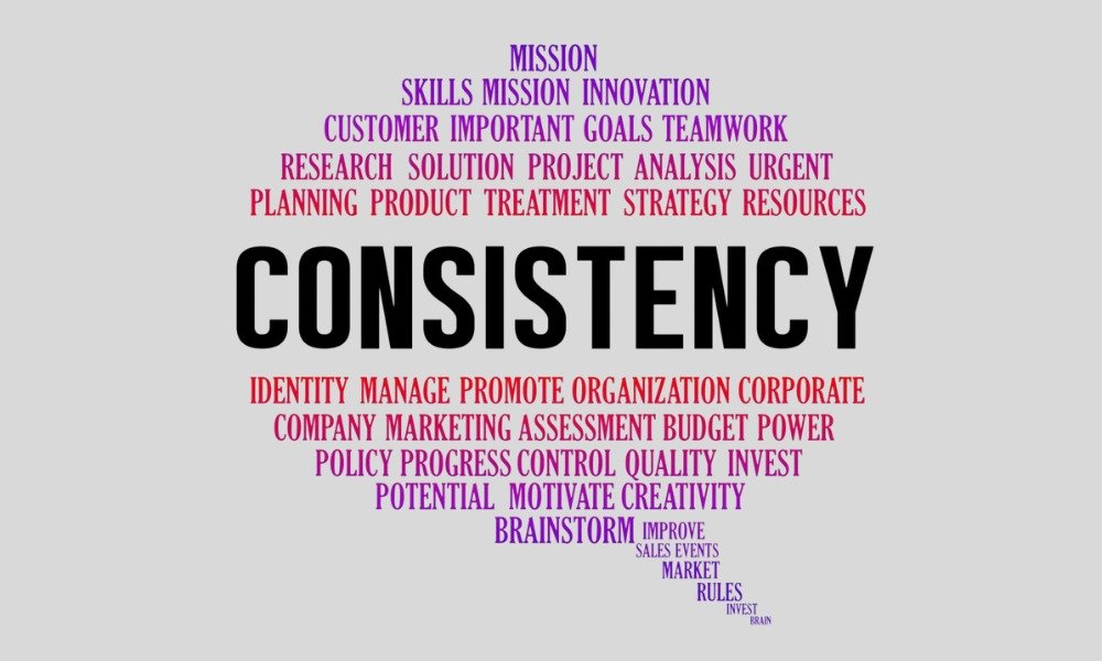
A strong identity isn’t just about design—it’s about maintaining uniformity across all platforms.
Why Consistency Matters
- Builds trust and recognition.
- Makes the business look established and reliable.
- Creates a seamless experience for customers.
Related Read: Brand Guidelines & Why They Matter
Storytelling: Connecting with an Audience Emotionally
People don’t just buy products—they connect with stories.
- Apple sells innovation.
- Nike sells determination.
- Tesla sells the future.
A brand’s narrative should engage the audience, making them feel like they’re part of something bigger.
Related Read: How Branding Builds Trust
Common Mistakes to Avoid
Even the best businesses make branding mistakes. Here are some of the most common ones:
Inconsistency – Using different styles, colors, or messages confuses customers.
Overcomplicating the Logo – Simple designs are more versatile and memorable.
Ignoring the Target Audience – A business should align with the people it serves.
Lack of Guidelines – Without a playbook, identity falls apart.
Related Read: Branding Mistakes to Avoid
When to Refresh an Identity
Even the most iconic brands evolve over time. Companies like Google, Starbucks, and Instagram have refined their visual presence without losing their core identity.
Signs It’s Time for a Refresh:
The company has expanded or changed direction.
The current identity feels outdated.
Competitors appear more modern and polished.
An identity should evolve without losing what makes it special.
Why Visual Identity is a Long-Term Investment
A powerful visual presence is an investment that continues to pay off. It builds:
Recognition – Customers remember the business.
Trust – A professional identity instills confidence.
Loyalty – Strong connections keep people coming back. Great branding isn’t just about aesthetics—it’s about creating genuine connections.


