Finding art websites that actually feel inspiring—not just “nice”—can be a task. I’ve spent time digging through portfolios that blur together, hoping to stumble across something that sticks. And occasionally? I do.
In 2025, I’m looking for more than visual noise. I want portfolios that tell stories, showcase process, and reflect real creative thought. Whether you’re building your own art site or just browsing for ideas, a well-made artist website can reset your perspective.
Here’s what you’ll find in this guide:
- A handpicked list of inspiring artist websites across mediums
- Why each one works—from layout to tone to content
- Visual approaches that balance personality and clarity
- Tips you can steal (ethically) for your own portfolio
- Notes on what not to do when building your site
No fluff. No filler. Just creative fuel worth scrolling.
1. Zaria Forman
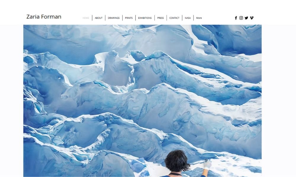
Zaria Forman’s work doesn’t shout—it speaks in waves. Literally. Her large-scale pastel drawings of glaciers, oceans, and ice formations feel as immediate as they are still. You’re not looking at a moment frozen in time. You’re watching it melt.
Her About page shares more than formal accolades. It gives insight into why she draws what she draws. Her connection to climate and place is clear—personal, even. There’s no overused language, no vague metaphors. Just real stories tied to real landscapes, some of which may not be around much longer.
The site itself is quiet but powerful. Clean layout. Large images. No flashy distractions. Her drawings take center stage—and rightly so. They’re detailed enough to be mistaken for photos, yet soft enough to make you pause.
What’s refreshing is that it all feels honest. Nothing is trying too hard. It’s thoughtful work with a clear purpose, made by someone who understands both beauty and urgency.
Zaria doesn’t just draw scenery. She documents change. And she does it with chalk.
2. Ellen Von Wiegand
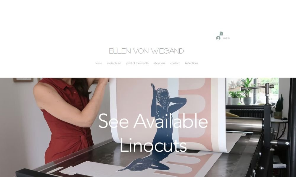
Ellen Von Wiegand paints silence—and somehow, it feels loud. Her portraits are soft, still, and inward. Women with steady gazes, often alone, often in shadows or sunlight. You don’t just see the figure—you feel the space they’re holding.
Her website reflects that same calm. The layout is minimal. White space does most of the talking. You move through her work slowly, and that’s the point. These aren’t paintings made for quick likes. They’re meant to linger.
The About section reads like a quiet confession, not a press release. She shares her path to art through personal growth, vulnerability, and a desire to be fully seen. It’s refreshingly honest, like her paintings.
Each piece captures a pause. A moment before or after something unnamed. There’s a strength in the stillness—like the figures are aware you’re watching, but they’re not performing for you.
Ellen doesn’t over-explain her work. She doesn’t need to. The paintings do enough. They ask you to slow down. And in a world that rarely does, that’s a bold ask.
3. Alex Garant
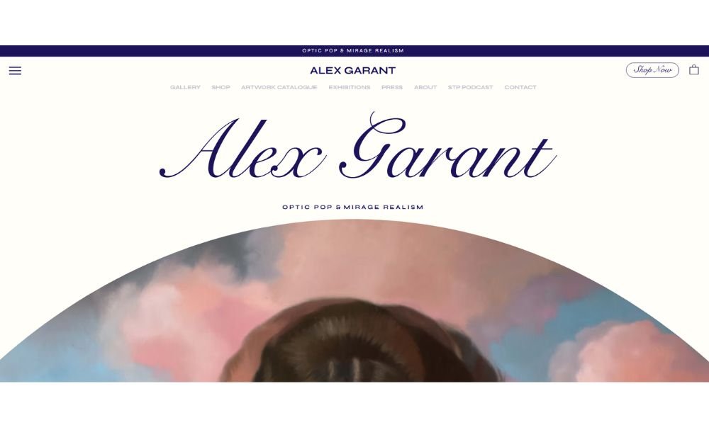
Alex Garant paints faces that feel alive—if you look too long, they might just wink back. Layered, surreal, and almost breathing, her portraits blend sharp realism with dreamlike flair. You don’t just view them—you sense something shifting beneath.
The site layout is clean and bold. Large images fill the screen. Minimal text gives breathing room. It’s a no-nonsense showcase of powerful work. That first scroll? It hits.
Her About section isn’t just a CV. Alex shares how her fascination with dual vision and mirrored themes informs each piece. It’s personal, but measured. Smart without feeling forced.
Each series has intent—whether exploring symmetry, psychology, or identity. And the visuals? They’re precise. Every glance catches something new: a flicker of color, a detail that jars just enough.
Her galleries aren’t about trending effects or gimmicks. They’re about presence. They don’t shout. They hold steady. And that tension—between calm and uncanny—that’s where the work lives.
Alex doesn’t follow you. She stops you. And sometimes, that’s all an image needs.
4. Charly Palmer

Charly Palmer’s art doesn’t whisper—it speaks. Bold, vibrant portraits and layered scenes connect deeply with history, identity, and emotion. Each piece feels alive, teeming with texture and visual narrative. You don’t want to just view his paintings—you want to listen.
His About page reads like a storyteller’s introduction. He shares personal roots—from growing up in Alabama and Chicago to carrying cultural memory through his acrylic work. It’s honest. It’s grounded. And you gain insight into why his art matters.
The site keeps the spotlight on the visuals. Clean navigation, stunning full-screen images, no clutter. The work demands attention. And you give it willingly.
What stands out? His skillful blend of fine art and activism. A Grammy-winning album cover for John Legend’s Bigger Love, a Time magazine cover on racial justice, award-winning children’s book illustrations—his projects carry weigh.
Charly’s home page isn’t just a gallery—it’s a showcase of conviction. His art doesn’t merely decorate walls. It changes the atmosphere. And that’s powerful.
5. David Milan
David Milan’s portfolio is a playground for the eyes. His lettering wraps, folds, and glows in vibrant tones that feel bold and playful all at once. Whether sketched in marker or rendered in 3D, every piece pulses with motion and personality.
The homepage wastes no time—big visuals, minimal text. It’s like stepping into a studio where color and form are the loudest voices. You absorb the work before you even read a word.
His About section reveals his roots in graffiti, which still guide his work. He talks in simple terms: he started at 15 and never stopped playing with letters. That background drives both technique and attitude.
Projects are crisp and clear—logos, animations, editorial pieces. No jargon. Just skill and energy. Clients like Adobe, Facebook, and Pepsi choose him for lettering that doesn’t just look good—it stands out.
David’s work isn’t about fitting in. It’s about bursting through. And in a sea of fonts, that kind of confidence is hard to miss.
6. Lirona Ashkenazi
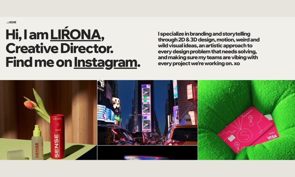
Lirona’s portfolio doesn’t feel like a website. It feels like stepping into someone’s brain—if that brain were wired with code, motion, and a very specific sense of humor.
Right away, you’re met with glitchy visuals, animated chaos, and interactive moments that don’t take themselves too seriously. It’s weird. It’s fun. It’s intentional. Lirona isn’t just showing what she can do—she’s showing how she thinks.
Her About section reads like a self-aware tech diary. You get bits of who she is (developer, creative coder, professional chaos architect) without drowning in bio fluff. She builds tools, experiments with motion, and clearly loves breaking things in ways that look amazing.
Every project has personality. Whether it’s a motion graphic, a browser-based experiment, or a quirky tool you didn’t know you needed, the work feels alive. It’s not polished in the traditional sense—and that’s the point.
Lirona’s site doesn’t just showcase skills. It broadcasts identity. And in a field full of safe portfolios, that boldness is refreshing.
7. Irina Pandeva
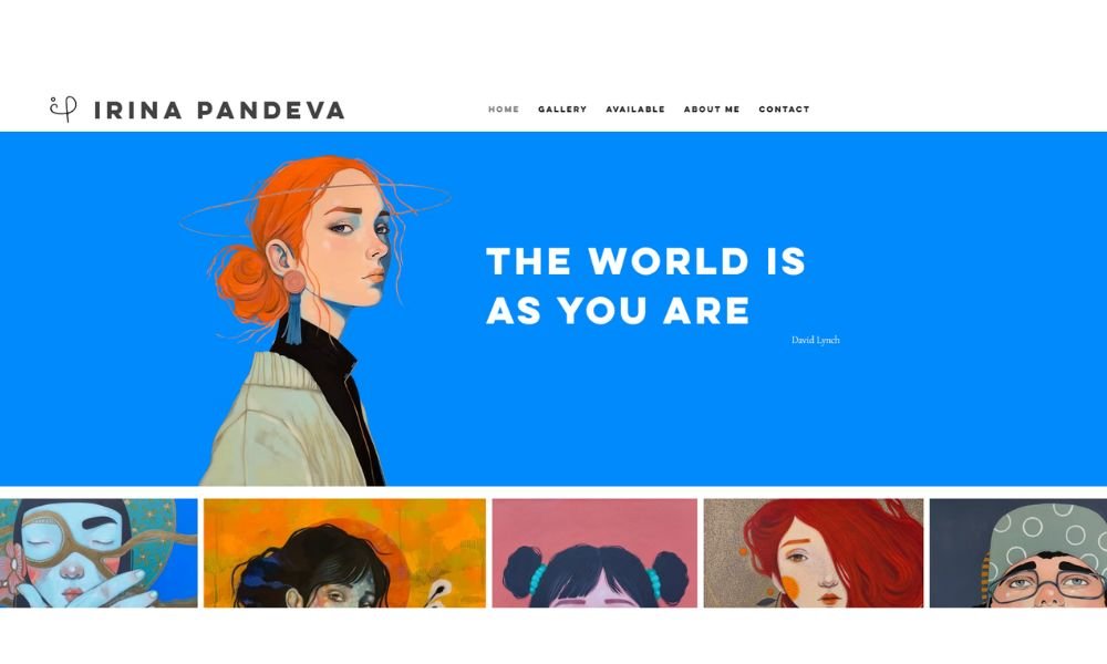
Irina Pandeva’s work doesn’t shout. It waits. And that’s what makes it powerful. Her portraits blend tradition, emotion, and just the right amount of silver and gold. Each one feels like it carries a history—even if you can’t quite name it.
The site reflects that same stillness. Clean layout. Big imagery. Minimal distractions. You’re invited to slow down and look. Not skim—look.
Her About section tells a personal story, not just a list of achievements. She shares her roots in a family of icon painters, her return to art after years away, and how painting became a kind of rebellion and release. It’s personal, honest, and clear.
Each face she paints holds something back. There’s mystery in the stillness. Her use of leafing adds a soft glow, but never steals attention. It just lingers—like the gaze of her subjects.
Irina doesn’t paint for the quick scroll. Her work asks you to pause, sit with it, and maybe see yourself in the silence.
8. Piergiorgio Del Ben

Piergiorgio Del Ben paints people—but he’s really painting questions. His portraits are intense, bold, and a little unsettling in the best way. Faces blend with fashion, identity blurs with anonymity, and beauty sits right next to discomfort.
His website reflects this tension. Big images, minimal words. The design doesn’t get in the way. It gives the work space to breathe—and hit.
Each series has a voice of its own. Mind Vogue explores how style masks emotion. Lost Men strips that back, showing vulnerability beneath polished appearances. There’s always something beneath the surface, and it’s never simple.
What stands out is his ability to paint people who look both familiar and unreachable. You recognize something, but you’re not sure what. That feeling? It stays with you.
His artist statement doesn’t over-explain. It invites. It lets the viewer decide what’s real, what’s performance, and where the line might be.
Piergiorgio’s work doesn’t just ask to be seen—it asks to be considered. And in a world of fast visuals, that pause feels rare.
9. Lili Arnold
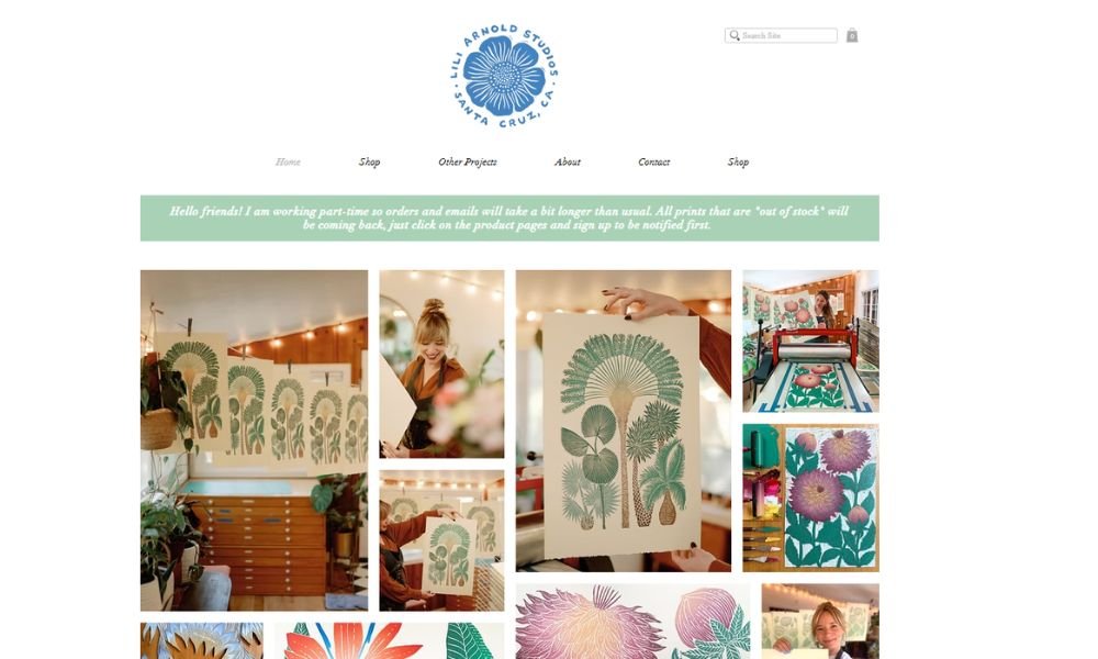
Lili Arnold’s work feels alive. Her botanical prints are anything but quiet—they’re bold, textured, and full of motion. Every leaf, petal, and stem is pressed with purpose. You can almost feel the paper.
Her site reflects that same balance of order and creativity. Clean layout, natural colors, and large imagery give the prints space to speak. No excess, no noise—just thoughtful design and clear storytelling.
What makes her work stand out is the process. Lili hand-carves her designs into linoleum blocks, rolls each one with ink, and presses them herself. It’s slow, tactile work in a fast digital world. That care shows up in every finished piece.
The About page adds depth. She shares how her background in design meets a lifelong love of plants, and how printing became her way to connect with both nature and craft. It’s honest and focused—just like her work.
Lili Arnold doesn’t just capture plants. She elevates them—turning organic forms into statement pieces that are both grounded and graphic.
10. Jessica Bearden
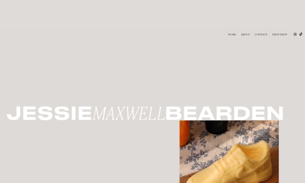
Jessie Bearden doesn’t stick to one medium—she turns them all into something unexpected. From portraits made of crushed candy to landscapes built from cereal and paper scraps, her work lands somewhere between fine art and pop culture remix. It’s playful, but it’s smart. And it definitely makes you look twice.
Her site is clean and image-first. Big visuals, crisp layout, and just enough information to give context without slowing you down. You get in, get inspired, and probably leave wondering why your own snack drawer never sparked anything this creative.
The work spans commercial campaigns, editorial spreads, and gallery pieces—all with that unmistakable Jessie signature: clever materials, vibrant color, and a sense of fun that’s completely intentional.
Her About section is straightforward. No over-explaining. Just a short nod to where she’s been and what she’s building. Which, judging by the work, is something entirely her own.
Jessie doesn’t just create visuals. She flips familiar things into surprising, memorable statements. And that’s exactly why her portfolio sticks with you.
11. Timothy Goodman
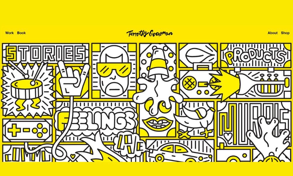
Timothy Goodman doesn’t just design—he declares. His portfolio is packed with punchy words, handwritten murals, books, branding, and raw honesty. Whether it’s painted across a city wall or scribbled in the corner of a journal, his work blends graphic design with personal storytelling like no one else.
His site? Direct. Black-and-white. No fluff. The homepage hits fast with client projects, personal essays, collaborations, and love letters—literally. It’s part portfolio, part confession booth.
What sets Timothy apart isn’t just the visuals—it’s the voice. He’s not afraid to get messy, emotional, political, or romantic. His words carry weight, and his design gives them space to land.
He’s worked with big names—Nike, Netflix, MoMA—but never loses the intimacy in his style. You feel like you know him, even if you’re just scrolling.
Timothy Goodman makes work that looks good, yes—but more importantly, it feels like something. And in a feed full of polished silence, that’s rare.
12. Anya Butler
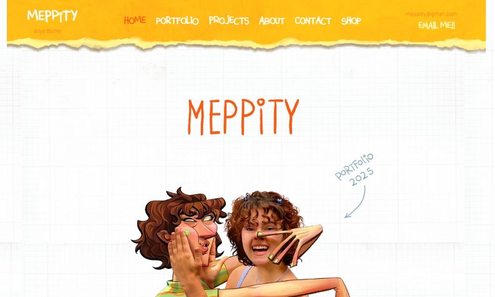
Meppity’s site doesn’t just show work—it feels alive. Purposeful colors, friendly fonts, and curated images greet you from the first scroll. It’s not flashy, but it feels well-thought-out.
Each case study is short and sharp. You see the problem. You see the solution. You see the outcome. No fluff, no filler—just how the design made a difference.
What really stands out is the tone. It reads like a friendly chat. You get insights about audiences, iterations, and impact—all spoken clearly, not jargon-heavy. And that tone? It reminds you this is work made by real people.
The About section is personal. It explains Meppity’s story, values, and what drives their creative decisions. You come away knowing who they are—and what kind of clients they click with.
Meppity doesn’t do noise. They do thoughtful design that connects. And in a field full of splashy portfolios, that humble confidence is refreshing.
13. Dayday Key

Dayday Key’s website doesn’t follow rules. It embraces them—then breaks them with a grin. It’s part visual diary, part poetry feed, and all personality. You never know what you’ll scroll into next, and that’s the point.
The homepage warns with “Don’t expect anything. Might not be spell-checked. Look at your own risk.” It sets the tone. And yes, it’s playful and a little chaotic—but it’s honest. Every glitch, every shift, every bold line of text feels intentional.
You’ll find animations that loop like thoughts on repeat, snippets of poems that land like whispered truths, and work-in-progress imagery that invites you behind the curtain. There’s humor too—sharp, self-aware lines that poke at both artist and audience.
The About page doesn’t boast. It questions. “What is art anymore?” “Am I pretentious or just tired?” It’s part manifesto, part confession. And oddly comforting.
Dayday Key’s site isn’t polished—it’s probing. It doesn’t ask you to like or buy. It asks you to think. Maybe laugh. Possibly even ask questions about the noise in your own head. And that’s rare—and refreshing.
14. Steven Kozar
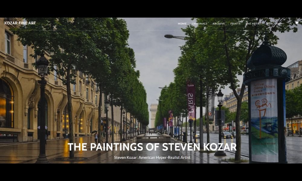
Steven Kozar paints photos you wish you took—but didn’t. His hyper‑realistic watercolors transport you to misty barns, winding roads, and quiet farm scenes. You don’t just see light on paper. You feel the chill, the calm, the moment. It stays with you.
The site is no cluttered gallery. Just raw images with breathing room. You scroll through originals, then prints, then archives filled with art that still surprises. That space and clarity matter here.
His About section tells a simple story. Left art school in 1986, picked up a brush, and kept painting. No gimmicks. Just years of focus. He works mostly in watercolor—occasionally oil or acrylic—but only with brushes. That dedication shows in every piece.
Whether he’s teaching workshops or updating his YouTube channel, the tone stays humble. He’s inviting without inflating things. Want to buy a painting? He’ll frame it, ship it—or better yet, have you visit his studio (and say hi to Lucy, his dog).
Steven Kozar’s portfolio isn’t about flashy effects. It’s about quiet moments that look deceptively simple—and feel anything but.
15. Robert Wilson
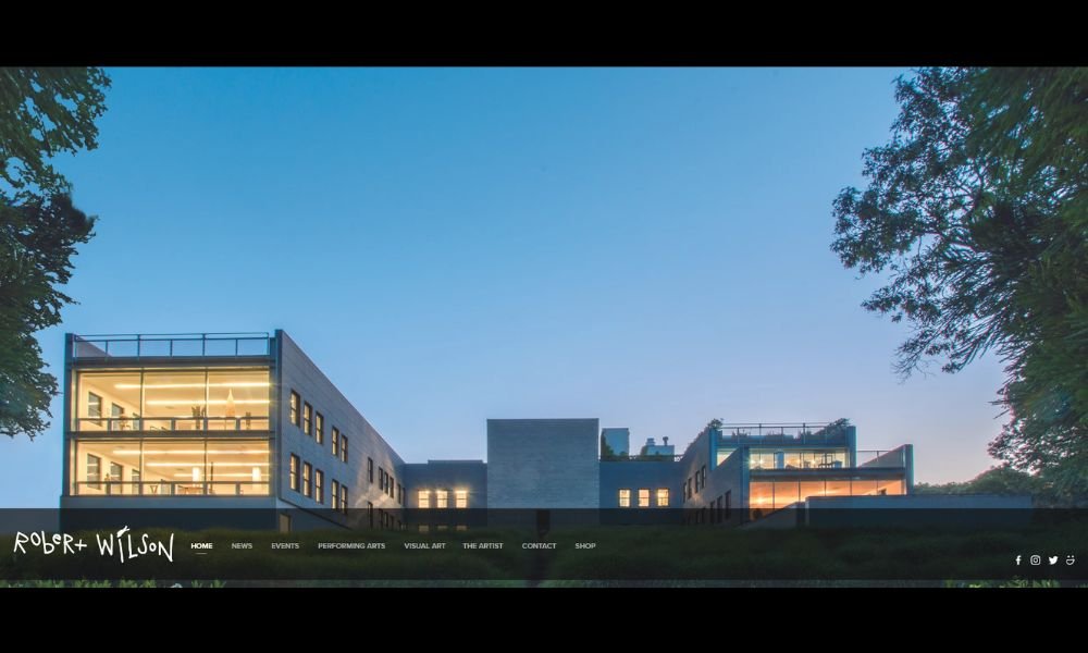
Robert Wilson isn’t just a visual artist—he’s a storyteller. His portfolio, anchored by arresting stage and video portraits, feels immersive from the first scroll. High-definition stills of people, animals, and installations occupy full-screen canvases. They don’t demand to be understood instantly. They invite you in quietly.
The site’s dark background and bottom-of-screen navigation give priority to work, not buttons. It’s thoughtful design that lets each image breathe and resonate. Wilson’s art spans theater direction, sculpture, lighting design, and more—one portfolio, many disciplines.
His Video Portraits capture tiny gestures and hushed moments: a hand sketching in slow motion, an owl paused mid-motion. The stillness becomes a narrative. It lingers longer than most photos. That deliberate pace is Wilson’s trademark.
On stage, he treats light as a sculptural material, shaping time and space with minimalist precision. His biography hints at global influence, but the sites let visuals convey his voice—no heavy text needed.
Wilson doesn’t show off. He offers space to watch, to feel, to wonder. And in doing so, he transforms passive viewing into quiet engagement. In a fast-scroll era, that restraint speaks volumes.
16. Smex
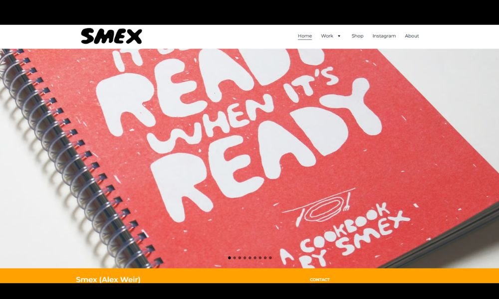
Smex’s portfolio is a vibrant celebration of daily moments, seen through an artist’s curious, playful lens. Based in Glasgow, Alex Weir brings humor, color, and texture to familiar scenes—through painting, printmaking, zines, and more.
His homepage grabs attention with a full-screen slideshow of murals, drawings, and installations. It’s bold but welcoming, with a simple navigation that makes exploration easy.
What really shines is his storytelling. The About section ties his work to community and identity—and adds a lighthearted tone. Projects like Smex Café pop‑up events and Drawing a Day blend art with life, inviting the viewer into his process and world.
The Work section is expansive: paintings, works-on-paper, wearable art, zines, digital designs. Each category is clearly labeled and offers just enough info to engage without overload. And yes, there’s a shop where you can buy prints, pins, or artist books—a smooth mix of creativity and commerce.
Smex doesn’t present perfected galleries. He shares slices of life with personality and intention. The result? A portfolio that connects visually and emotionally—and it sticks with you.
17. Dana Harel
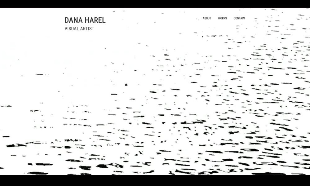
Dana Harel paints emotions with a gentle roar. Her canvases feel quiet from a distance and rich up close. Layers of ink, pigment, and line build worlds we recognize before we fully feel them.
The site reflects that balance. Simple design and soft textures let the images breathe. You scroll, and each piece unfolds a new moment: a tilted chair, a half-open door, a glimpse of sky. No explanations—just invitations to feel.
Her About section is quiet honesty. Dana shares how painting became a way to hold onto memory, to balance sadness and joy. It’s personal, but not performative. It reads like a journal entry you’re allowed to peek at.
Each project group—sketches, larger works, studies—feels curated, calm, and cohesive. You sense a rhythm. A painter’s pause. And it works.
Dana’s art doesn’t shout. It suggests. It doesn’t overwhelm. It lingers. And in a gallery of flash, her work stands out by softening everything around it.
18. Farrah Fisher Art
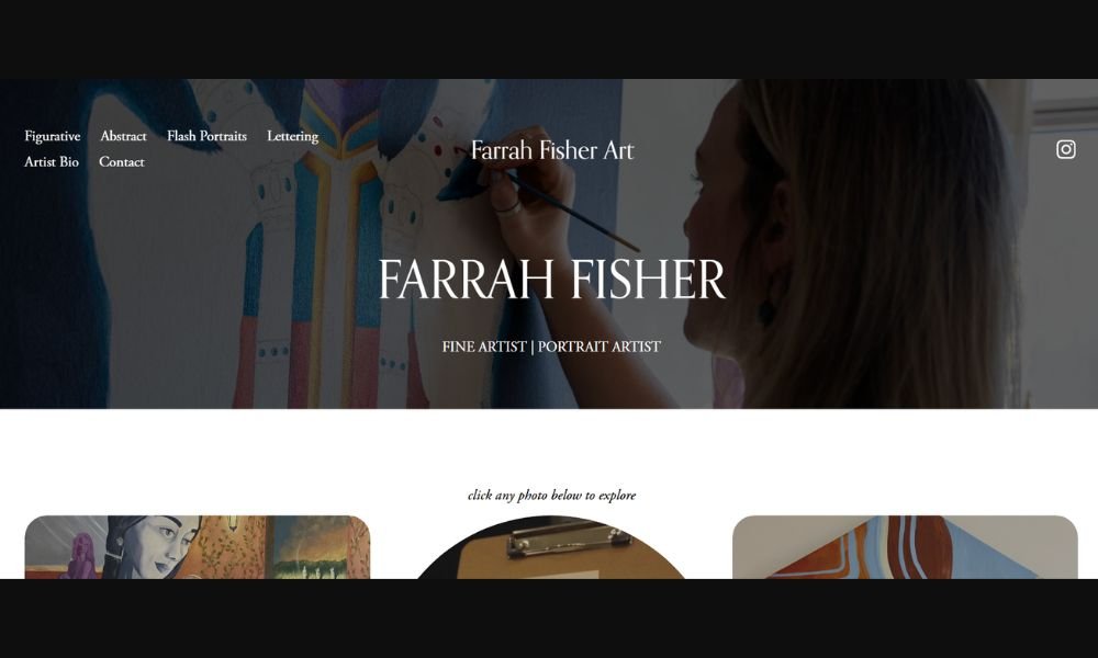
Farrah Fisher’s work is like a whisper that pulls you closer. Her portraits mix soft brushwork with bold palettes, highlighting emotion and depth. Faces emerge and recede, and every gaze seems to hold a story you might miss if you blink.
Her site mirrors that feeling. Full-screen images, gentle transitions, and precise layout invite a deliberate scroll. There’s no rush. You’re encouraged to sit with each painting and take it in.
The About section feels real. Farrah writes about her love for storytelling and her journey through figurative art. She speaks simply about themes that matter—identity, memory, presence—without sounding abstract or distant. That honesty gives her work more weight.
Each gallery reveals consistency and depth: commissions, editorial pieces, and personal experiments. Colors shift, textures layer, and the emotional pull is always there. You don’t just see a face—you feel its nuances.
Farrah doesn’t slap drama onto canvas. She builds it slowly, through tone and texture. And her portfolio? It’s quieter than most—but what it says is unforgettable.
Conclusion
There’s no one way to design an art website—but the best ones have a few things in common: clarity, intention, and just enough personality to make you remember them.
As I looked through these sites, I didn’t just see good design. I saw ideas worth returning to. A color choice that lingered. A sentence that made me smile. A layout that felt smart without trying too hard.
If even one of these sites gave you a new direction or helped you rethink your own, then this list did its job.
Keep building, keep sharing—and maybe make someone pause mid-scroll the way these artists did for me.


