I’ve seen firsthand how the right website idea can flip a slow quarter into steady sales. It’s not magic (although, I won’t lie, sometimes it feels that way). It’s about building something that connects—something smart, simple, and a little unexpected.
In this guide, I’m sharing website concepts that aren’t recycled from your average “Top 10” list. These are practical, creative ideas I’ve either used or watched succeed for real businesses—without the fluff or fake promises.
Here’s what you’ll find inside:
- Ideas that bring more eyes (and clicks) to your site
- Simple formats that encourage action, not just browsing
- A few clever twists that can set you apart from the copy-paste crowd
- Website features that help turn visitors into repeat customers
If you’re building from scratch or just tired of a site that’s… polite but invisible, these ideas are for you.
1. Ception
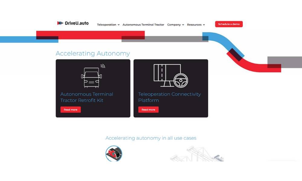
At first glance, Ception.ai feels sleek and quiet—like it’s thinking before it speaks. And that’s fitting, considering the company is all about smarter perception for autonomous vehicles. Based in Tel Aviv, Ception isn’t just building sensors; they’re rethinking how machines understand the world around them.
What makes their site stand out isn’t flashy graphics or tech jargon. It’s clarity. The homepage leads with a short, punchy headline that tells you exactly what they do. No guesswork. Scroll a bit and you’ll get real-world use cases—mining, construction, heavy industry. It’s not just theory. It’s happening.
Their visuals? Clean. Their message? Confident. Even their career page feels intentional—like they’re inviting problem-solvers, not just résumé collectors.
There’s even a subtle charm in how they explain complex systems without turning it into a science lecture. You’ll leave feeling smarter, not confused.
This site doesn’t oversell. It just shows. And that’s probably what makes it so effective.
2. Fat Cat Creamery
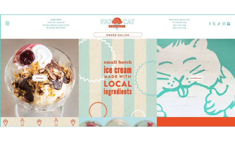
Fat Cat Creamery isn’t shy about its sweet side—or its love for good old-fashioned ice cream. From the moment you land on the site, you’re met with playful energy and colors that feel like summer break. And yes, they take their dairy seriously, but not themselves.
The About page tells a story, not a résumé. You’ll find everything from their sourcing philosophy (local and thoughtful) to the names of their pints—clever enough to make you pause mid-scroll and grin. “Cat’s Meow Mexican Vanilla”? Hard to argue with that.
The photography is bright, real, and a little messy in the best way. No sterile food shots here. You get creamy drips, scoops mid-melt, and smiles that look genuine—not stock-photo stiff.
But what truly works is the honesty. It’s a small business that acts like one—in a good way. There’s heart, humor, and just enough information to make you want to swing by or order a pint (or five).
In short? This site doesn’t try too hard. It doesn’t need to.
3. Loro Eats
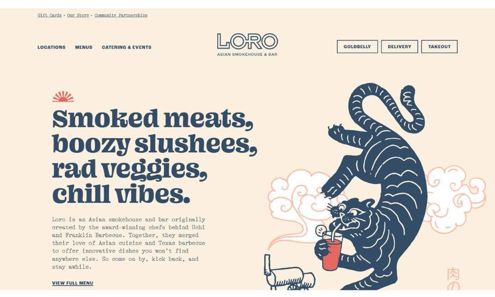
Loro is the kind of place that feels honest from the first click. It’s an Asian smokehouse and bar created by award-winning chefs blending Texas barbecue with bright Southeast Asian and Japanese flavors.
Their “Our Story” page goes beyond chef names—it tells you how the flavors came together and why sharing is part of the fun. You order at the bar, grab a seat inside or under shady trees, and just relax.
The menu? Real food, cooked right. Meats slow-smoked overnight over post-oak, veggies that shine just as much, and slushees that probably deserve their own fan club.
Photos on the site feel lived-in: steam rising off corn fritters, bark on brisket, friends laughing. Nothing feels staged.
There’s charm in the casual rules: no reservations, dog-friendly patios, family-size meals, happy hours with cocktails—and zero pressure.
It’s clear, it’s honest, and it’s welcoming. Loro doesn’t oversell. It just invites you to stay, try a bite, and maybe bring the gang next time.
4. Livso
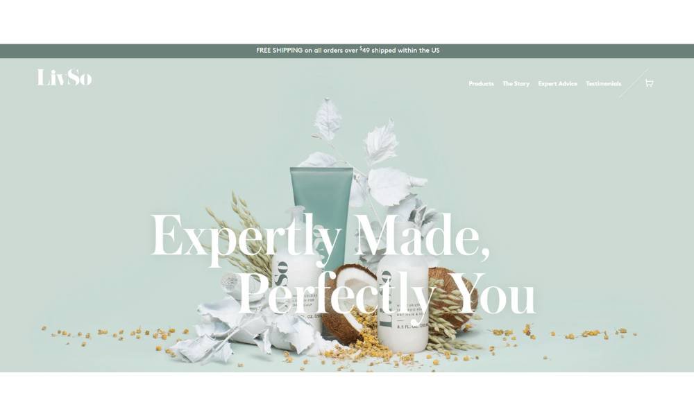
LivSo knows it’s all about roots—literally. Right up front, their “Our Story” page tells you they’re made by a dermatologist who saw dry, itchy scalps in clients with kinky and curly hair. No fluff, just purpose.
They share who they are. Dr. Shari Hicks‑Graham isn’t just a name on a label; she’s part of the story. The explanation of their science-backed formula reads smooth, not clinical. And yes, they mention real stats—97 % of users saw results in 12 weeks—that’s confidence in numbers.
The visuals are simple and honest. Think gentle shampoo lather, lotion bottles, no slick marketing shots—just real products, real results. The tone? Warm and comforting, yet straightforward.
There’s a touch of lightness, too. They talk scalp lotion doubling as beard care—because who doesn’t like an unexpected perk?
Bottom line: LivSo doesn’t overpromise. They show clear intent: treat your scalp, smooth your curls, and let you feel like yourself again. And on that, they deliver.
5. The Cheshire Lawn Care
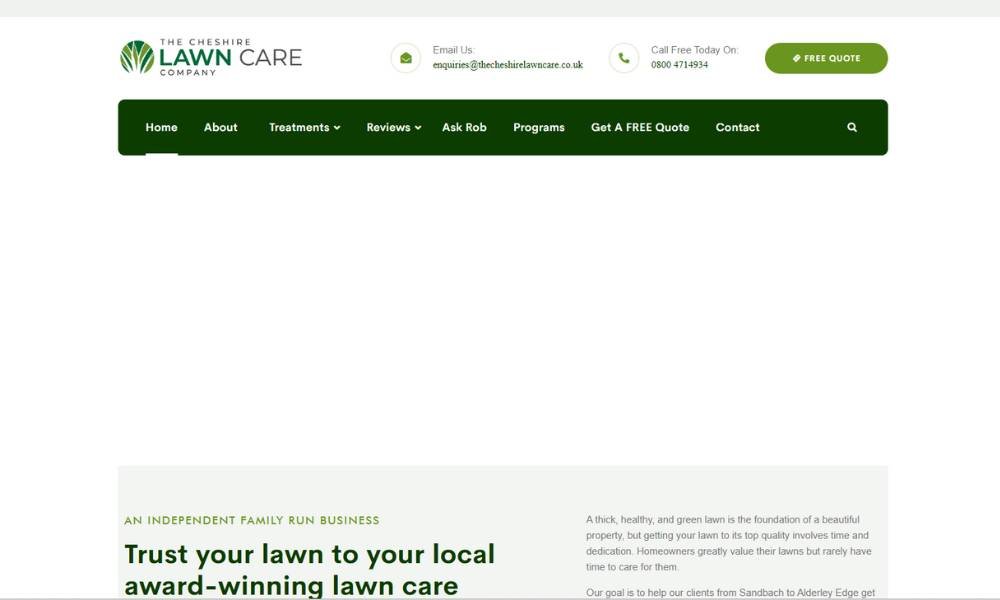
You land on their site and know immediately this is no faceless franchise. It’s a family-run service based around Northwich, Sandbach, Alderley Edge — where the owner, Rob, is just a call away.
Their “about” section doesn’t regurgitate jargon. Instead, it tells you they’ve won awards, aim for lawns people actually use, and adjust care through the seasons.
They break treatments into seasonal programs—spring feeding, summer weed control, autumn nutrients, winter prep—and aeration too. Clear, concise bullets make it easy to scan.
Photos feel real: stripes on trimmed grass, aerator in action. No over-polished imagery—just grass that looks cared for. Testimonials reinforce that—Rob’s team “made our grounds absolutely beautiful.” There’s even a section “Ask Rob,” offering free lawn analysis. It’s personal without pressure.
In short? The Cheshire Lawn Care Company doesn’t oversell. They show up, explain clearly, and do the job. If you want a green lawn and a friendly chat with an expert, it feels right.
6. Islango

Islango opens with an inviting snapshot of yacht cruising—blue seas, sleek vessels, calm vibes. It feels like a few clicks away from your next getaway.
Their “About Us” page? Crisp and clear. Built by seasoned sailors from Via Maris yacht club with 20 years of sea stories behind them. They don’t just list options—they promise personal fit: the right boat, route, and destination.
Special deals appear early—a catamaran in Seychelles, a five‑cabin beauty in Athens. You get pricing at a glance. No surprises. And they highlight their strengths: around‑the‑clock support, smooth booking, expert planning.
The site feels thoughtful. A live‑chat widget follows as you browse. FAQs answer common questions. The design is simple—big photos, minimal text—and lets the experience speak.
Again and again, Islango shows rather than tells. It looks like they’ve sailed the routes themselves, and that confidence comes through. No grand promises. Just a friendly guide to your next voyage.
7. Casa Mami
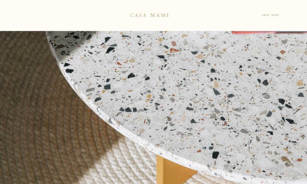
Perched on 2.5 acres of desert in Pioneertown, this eco-friendly retreat feels like a secret design showroom you can actually stay in. It’s not just a place to sleep—it’s a curated experience, crafted by the duo behind Working Holiday Studio.
The About section tells you who created it and why—no vague fluff. You learn that every piece—from painted walls to vintage furnishings—is part of the art. And yes, you can buy the items you love onsite. That’s flair with function.
Photos capture more than rooms. You see sun-dappled patios, starlit skies, and french doors opening to endless dunes. It’s real life meets aesthetic mood board.
There’s gentle charm, too. Solar power, minimal clutter, and color blocking nod to desert modernism without preaching. No fluff, just honest design.
8. Sonos
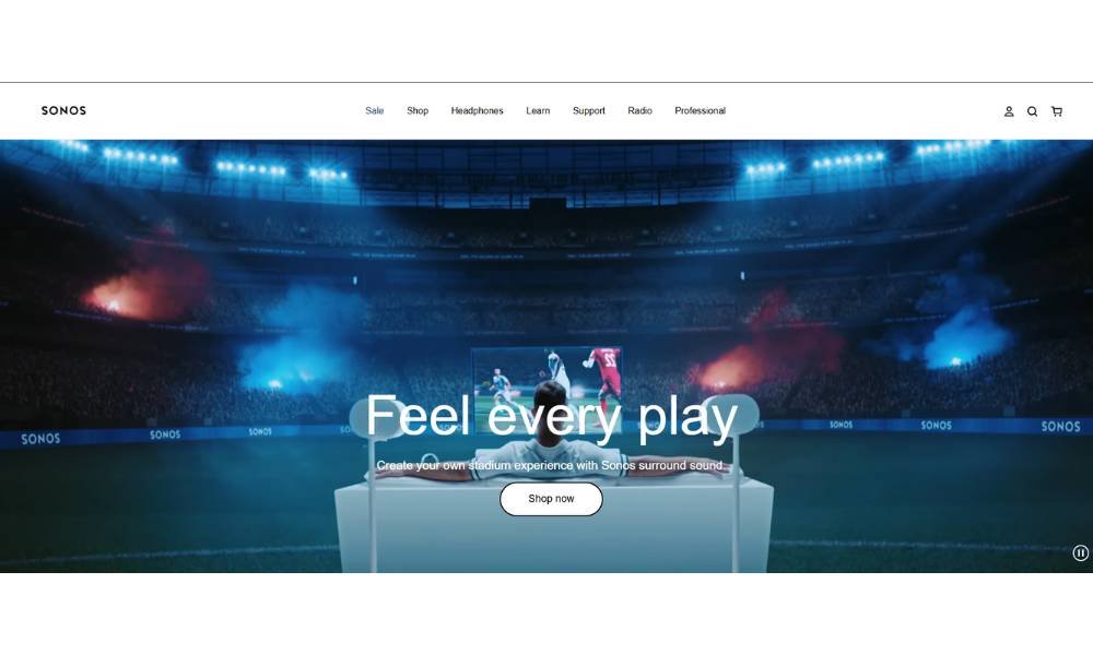
Sonos greets you with big, beautiful speaker shots—no clutter, no noise. It feels like stepping into an audio demo room. Their About and How It Works pages tell a simple story: they pioneered multi-room wireless sound back in 2002—and they’ve been refining that ever since.
The design is clean. Bold headlines. Clear CTAs. Scrolling feels smooth, functional, even fun. No jargon overload—just phrases like “Beautifully balanced” and “Trueplay tuning adapts to your room”.
They sprinkle in tech where it matters: Dolby Atmos soundbars, a 125-watt Amp, spatial audio speakers—presented as tools, not buzzwords. Specs are clear, but not overwhelming.
Visuals feel real: high-res speaker layouts, scenes of home setups, even outdoor use with Roam 2. The vibe is confident, not flashy.
A live-chat widget, setup guide, and FAQs offer help without pressure. They don’t overpromise—they show. Sonos invites you to imagine sound in your space.
9. Bowery
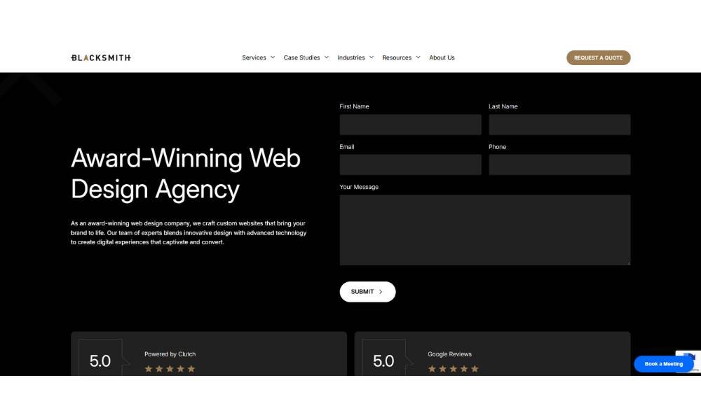
Blacksmith Agency introduces itself with bold visuals and a no-nonsense layout. The homepage feels like stepping into a workshop—tools are out, craftsmanship on display. It’s clear they build sites that get noticed.
Their Web Design section dives right in: custom designs, platforms like WordPress, Shopify, and so on. It’s straightforward—no fluff, just solutions that match each brand’s voice .
Scrolling through industry pages—like restaurant or construction sites—you’ll note crisp headlines and simple bullet points. They present why each design works in plain language: boosting credibility, driving conversions, winning bids.
They sprinkle in proof points too. Logos from clients like Voss Water and Rao’s Homemade boost confidence without shouting. And real case studies—like Mulligan Funding—show what goes into sites that perform.
The tone? Confident but approachable. A live-chat and clear CTAs nudge you forward without high-pressure sleaze. Blacksmith isn’t trying to wow with noise. They show expertise—and invite you to work together.
10. The Wild Rabbit
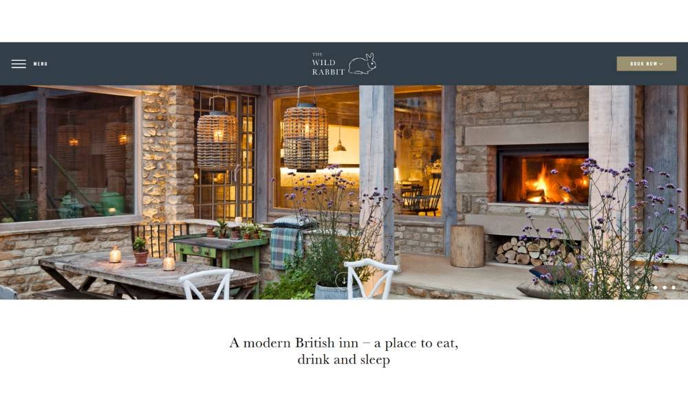
Right away, this isn’t some corporate getaway—it’s a 17th-century farmhouse turned cozy British inn in the Cotswolds, now part of the sustainable Daylesford estate.
The “Eat” section shows honest food—fresh-picked produce from the farm and local game, plus an open kitchen where you can watch the chefs at work .
At the bar and terrace, expect a lovely mix of artisan beers, independent wines, and seasonal cocktails—served by a double-sided fireplace or under leafy shade.
Rooms feel like countryside homes—named after local fauna, each room is different, yet all include cloud-soft beds, luxury bathrooms, and warm, pared-back design.
Real touches abound: live acoustic nights, happy hours, a supper club showcasing foraged fare, and cottages scattered through Kingham village.
They don’t boast—they show. Warm stones, slow meals, and village charm. It feels genuine—and that makes The Wild Rabbit feel like a true Cotswolds escape.
11. Puffin
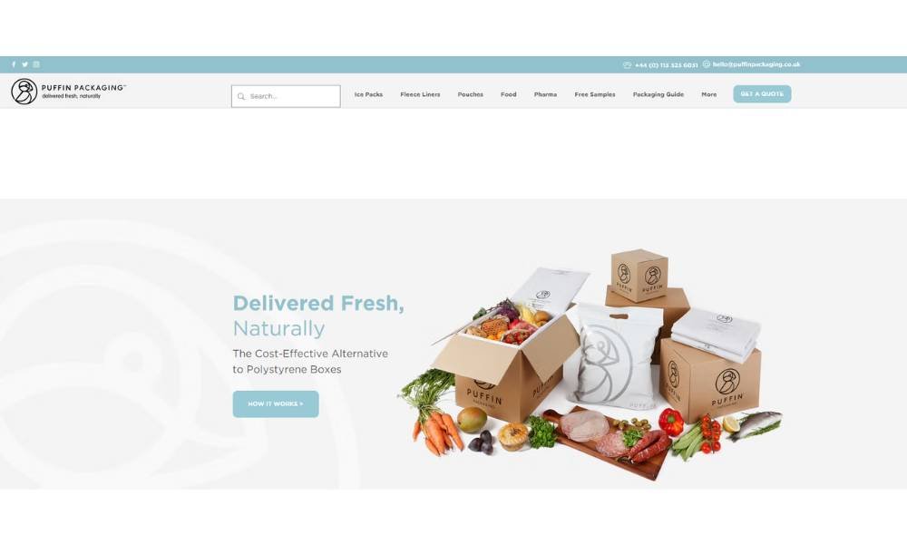
Based in the UK, Puffin Packaging isn’t your average eco-brand. They’ve taken the cold, hard world of food delivery and made it… well, a little warmer. Literally. Their wool-based insulation isn’t just clever—it’s quietly genius. It’s the kind of solution that makes you wonder why bubble wrap was ever invited to the party.
The About page does more than sell a product. It shares the story behind the idea, one that blends science, sustainability, and a solid sense of purpose. There’s no corporate fluff—just facts, values, and a team that seems to genuinely care about what arrives on your doorstep.
Visitors are greeted with crisp visuals and a clear message. The layout? Simple. The language? Straightforward. It’s refreshing to see a brand that doesn’t overcomplicate things. Puffin lets its product speak, or rather, insulate, for itself.
This isn’t just packaging—it’s proof that good design and good sense can actually get along. Even in the freezer aisle.
12. Ratio
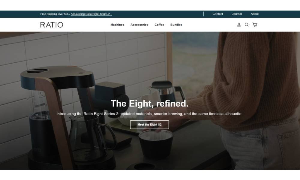
Ratio isn’t just making coffee gear—it’s rethinking how we make coffee at home. Designed in Portland, their machines skip the blinking lights and tech overload. Instead, you get something that looks good, works beautifully, and makes a brew that actually tastes like what you paid for.
The philosophy? Coffee should be thoughtful, not complicated. That’s why every Ratio brewer focuses on the ritual, not the rush. One button. No apps. No guesswork. Just a quietly brilliant system that lets you enjoy the moment between pouring water and sipping the result.
Their About page reads more like a design story than a sales pitch. Materials matter. So does longevity. These brewers aren’t churned out—they’re crafted. It’s a slow coffee movement, in the best way possible.
There’s also an appreciation for how life unfolds around a good cup. Whether you’re dialing in your weekend routine or powering through emails, Ratio’s gear shows up with style, purpose, and zero drama.
Because if you’re going to drink coffee every day, it might as well be excellent—and just a little beautiful.
13. Shwood Eyewear
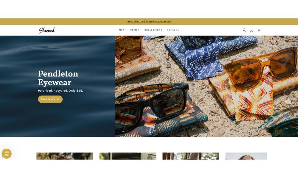
Shwood doesn’t follow trends—it carves its own. Born in Oregon, the brand started with a pair of handcrafted wooden sunglasses and a simple idea: nature and design can actually get along. Years later, they’re still proving that good style doesn’t have to come from plastic and flash.
Each frame is made with real materials—wood, stone, acetate, even seashells—shaped with care and a serious eye for detail. But don’t mistake the craft for fragility. These pieces are built to go places: through city streets, road trips, and maybe the occasional hike that got a little out of hand.
The brand story reads like a workshop journal: no fluff, no corporate gloss. Just honest design, made by people who clearly like what they do. The result? Sunglasses and eyeglasses that feel personal, not mass-produced.
Even the packaging has that “someone actually cared” energy. Shwood makes eyewear that does more than look good—it tells a story before you say a word.
Because your face deserves better than off-the-shelf.
14. Solo Salon

Solo Salon is more than a place for a haircut—it’s a space where your personality meets your look. Founded in Chicago’s West Loop by Kristine Singer in 2005, the salon grew from a simple idea: bring together passionate stylists and clients who feel like friends.
The team is hand‑picked and coached with care. Each artist brings real talent and real joy to their chair. They’re dedicated to their craft, committed to ongoing education, and genuinely love helping clients feel their best.
Services at Solo go beyond a cut. Think color, bridal styling, treatments, waxing, spray tan and more—each tailored to suit your lifestyle and enhance your natural glow. They’re big on straightforward quality, zero fluff.
The salon’s vibe is lively yet inviting, fueled by the energy of real relationships and authentic care . Whether you’re dropping in for a quick trim or prepping for a big event, Solo makes the experience feel personal—and yes, a little fun too.
Good hair day? Always. Solo Salon helps you walk out feeling like yourself, but better.
15. Ohm Studio
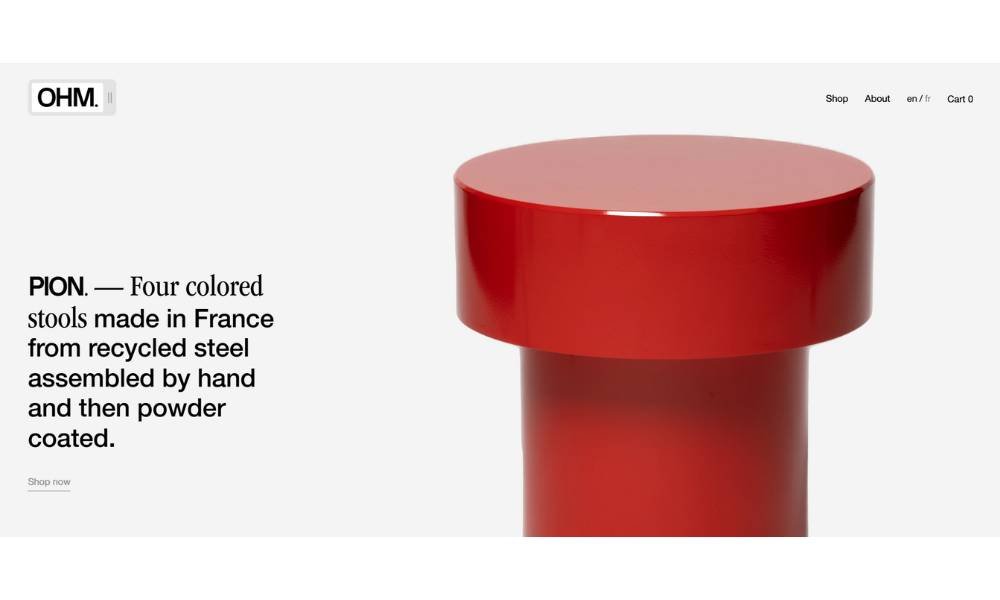
OHM Studio is a Paris-based collectible furniture brand crafted by two brothers who blend traditional craftsmanship with thoughtful modern design. Their pieces—like the hand-assembled PION stools, modular BLOC chairs, and the multifunctional BRO vase—are simple in form yet rich in purpose.
Each item is made in-house, with manufacturing happening in their own workshop. That hands-on process ensures quality and reveals the care behind every weld and coat of powder finish. The brand champions clarity and honesty—no over-design, no excess. You get pieces that feel personal, not mass-produced.
The site’s look mirrors their ethos: minimal color palette, crisp typography, and smart navigation that lets the products shine. It’s straightforward. It’s confident. And it invites you to appreciate the story behind what you bring into your space.
OHM Studio proves that furniture can be both functional and collectible. It’s design you can live with—and remember.
16. Postevand
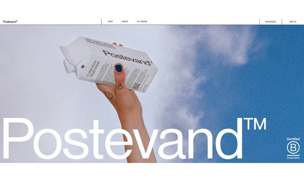
Postevand puts Denmark’s top‑quality tap water into cartons and cans—and then quietly changes the rules. Named after the Danish word for tap water, their goal is simple: promote drinking local water first, and offer a smart backup when you’re out and about.
Their cartons are over 96 % plant‑based and slash climate impact by about 18 % compared to recycled plastic bottles. That’s not marketing fluff—it’s third‑party verified by sustainability experts.
The site keeps things light. Clean visuals. Friendly text. A clear message: refill a reusable bottle or choose their carton—it’s all the same, reliable water. They back it with action too: certified B Corp status and a 3 % pledge from sales to local climate initiatives.
Postevand isn’t flashy. No gimmicks. Just honest design, sensible sustainability, and a gentle nudge to rethink bottled water. Even better? It tastes exactly like what it is—good old tap water, thoughtfully packaged.
17. Cocokind
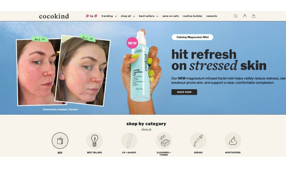
Cocokind creates plant-powered skincare that feels like a high-five for your skin—and your values. Founded by Priscilla Tsai, the brand grew from her own struggle with sensitive skin and a finance background. She swapped steroids and prescriptions for natural ingredients that gently work, not punish.
At its core, Cocokind keeps things simple: hydration and barrier support. Every formula delivers what it promises—whether that’s moisture, cleansing, or calming—without confusing labels or inflated prices. These products are vegan, cruelty-free, and labeled with their carbon footprint, so you know exactly what’s inside—and how it impacts the planet.
The website matches the mission: clean, bright, and easy to browse. No over-promising, just honest info about ingredients, benefits, and impact. You’ll see mindful pricing too: most items land under $25, and the focus stays on quality, not fluff .
Whether you need a gentle cleanser, a soothing serum, or a hydration hero, Cocokind shows that smart skincare can be kind—to both your skin and the world.
18. Piboco
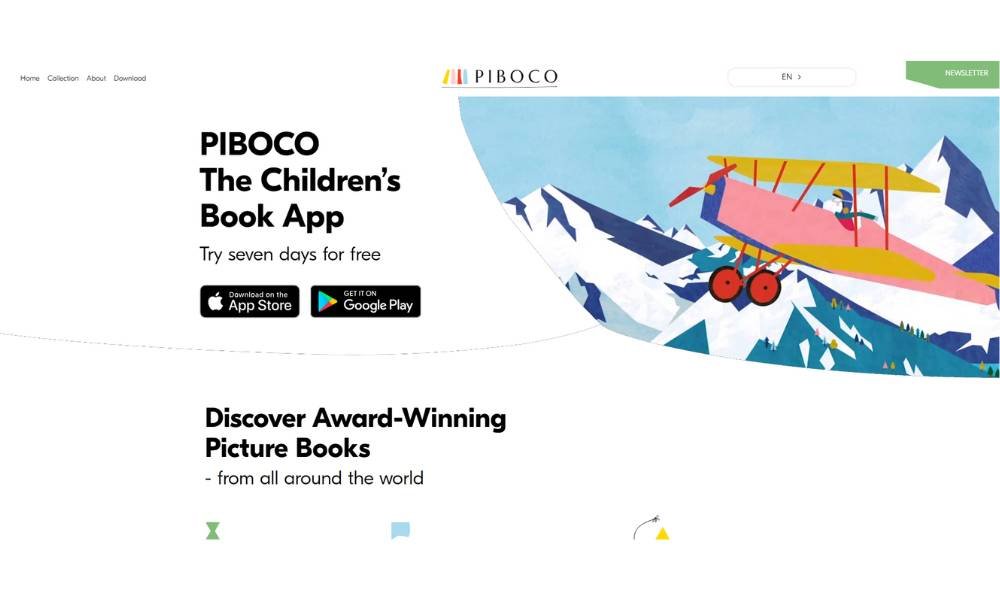
Piboco brings picture books to life—but not just for children. Based in Copenhagen, they create animated digital storybooks that blend rich illustration, gentle voice narration, and engaging puzzles into a smooth reading experience.
Their About page keeps it simple: they pick award‑winning books and enhance them with thoughtful animations, multi‑language narration, and original soundtracks . It feels handcrafted—not slapped together by a random app algorithm.
The storytelling is playful and purposeful. Each book “opens the horizon” of a child, weaving art, interaction, and learning into a single experience. The goal? Encourage kids to read, tap, learn—and smile along the way.
On the site, the interface is clean and inviting. Navigation is intuitive, visuals pop, and little animations hint at the fun inside. No clutter. No ads. Just immersive stories designed for curious minds .
Testimonials seal the deal: parents praise its ease, charm, and educational edge—some children even with reading challenges love it .
Piboco isn’t just a digital library. It’s a weekly surprise that reminds us reading can be interactive, gentle, and joyful.
19. Magic Spoon
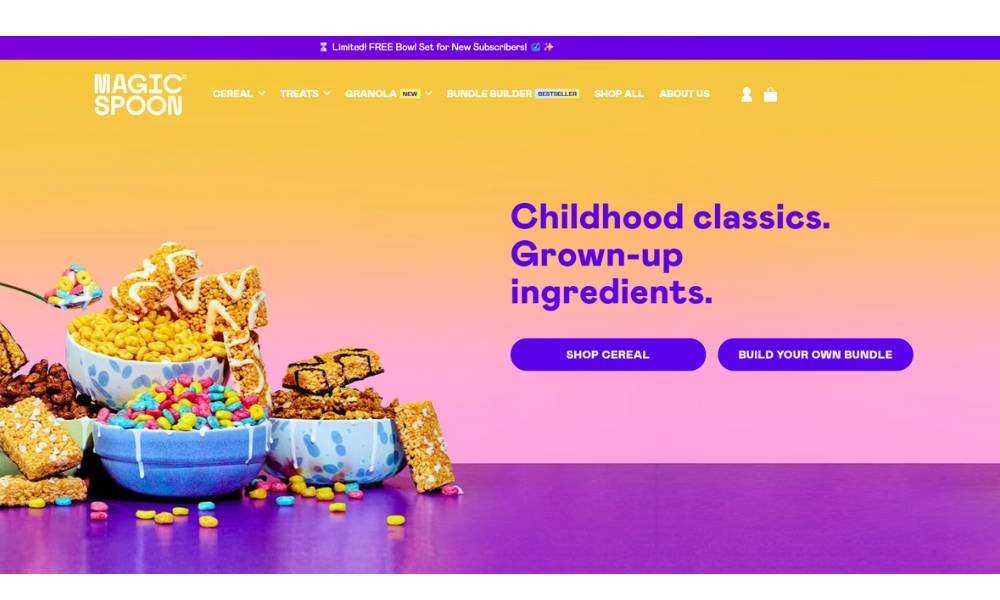
Magic Spoon flips breakfast on its head by bringing back nostalgic cereal flavors—with none of the sugar or grains. Launched in 2019, their high‑protein, low‑carb boxes spark the kind of joy you felt pouring those Saturday‑morning loops—but now with 13–14 g protein, 0 g sugar, and just 4 g net carbs per serving.
The About page tells it straight: they spent over a year crafting a cereal that tastes like childhood but fuels you like an adult. No flashing lights or apps—just bold, playful packaging and flavors that include Fruity, Cocoa, Peanut Butter, and Frosted.
Nutrition wins are solid: gluten‑ and grain‑free, zero cane sugar, and sweetened with monk fruit and allulose. Reviews are mostly enthusiastic. Good Housekeeping calls it “making waves in the cereal world” with 140–170 calories per bowl, while Reddit users note it “didn’t taste any more artificial… than Fruit Loops”.
Yes, prices are a step up from your usual grocery aisle. But if you want a breakfast that’s fun and functional, Magic Spoon delivers the nostalgia—with nutrition to match.
Final Thoughts
I’ve worked with enough businesses to know that a great website doesn’t need all the bells and whistles—it just needs a purpose, and a little personality. Whether you try one of the ideas here or mix a few into your current site, the goal’s the same: real traffic, real engagement, and yes—real sales.
Don’t wait for the perfect layout or a stroke of branding genius. Start with one good idea, test it, tweak it, and build from there.


