When I design a corporate website, I don’t aim for “nice.” I aim for sharp, functional, and built with intent. Businesses that mean business don’t need digital fluff—they need a platform that works as hard as they do.
Over the years, I’ve seen too many companies pour resources into websites that look polished but feel hollow. My goal is different: design with a backbone. That means a website that performs, presents, and keeps pace with your actual goals—not just your homepage slider.
In this guide, I’ll walk through:
- What separates an effective corporate site from a generic one
- Design choices that support growth, not just style
- How structure builds trust faster than clever copy
- Why mobile experience isn’t optional (and never was)
- Smart content placement that moves users—not just pixels
If you’re building for credibility, function, and future growth, let’s get into what actually matters—no filler, no filters.
1. RSNL Creative
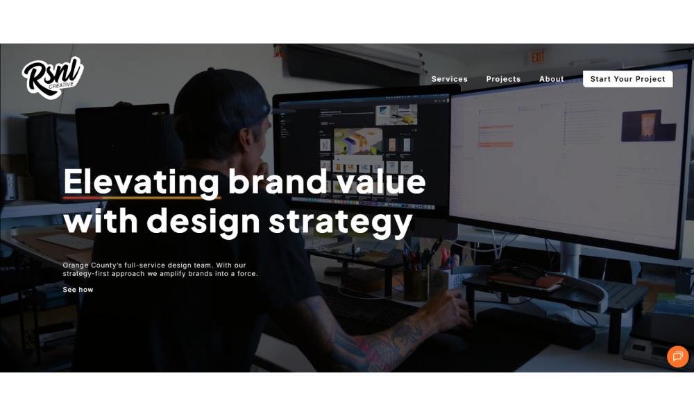
RSNL Creative doesn’t feel like an agency. It feels like a studio with a point of view—and good lighting. Right from the homepage, there’s a certain confidence: bold typography, smart color, and just enough motion to keep you leaning in.
The About section goes deeper than the usual bio-and-buzzword mix. You get a real sense of who they are, how they work, and why they’d rather build something meaningful than just pretty. The language is clean, but the thinking behind it isn’t surface-level.
Case studies are well-paced. No fluff. Just the challenge, the thinking, and the result—with visuals that do half the talking. It’s storytelling with a strong design instinct.
Even the team page says a lot without saying too much. It’s personal but not overdone. Just enough to make you want to send them an email. Or maybe your entire brand.
RSNL Creative isn’t chasing trends. It’s designing with focus—and probably sipping good coffee while doing it.
Because at the end of the day, making things look great is expected. Making them mean something? That’s the part that sticks.
2. Doup
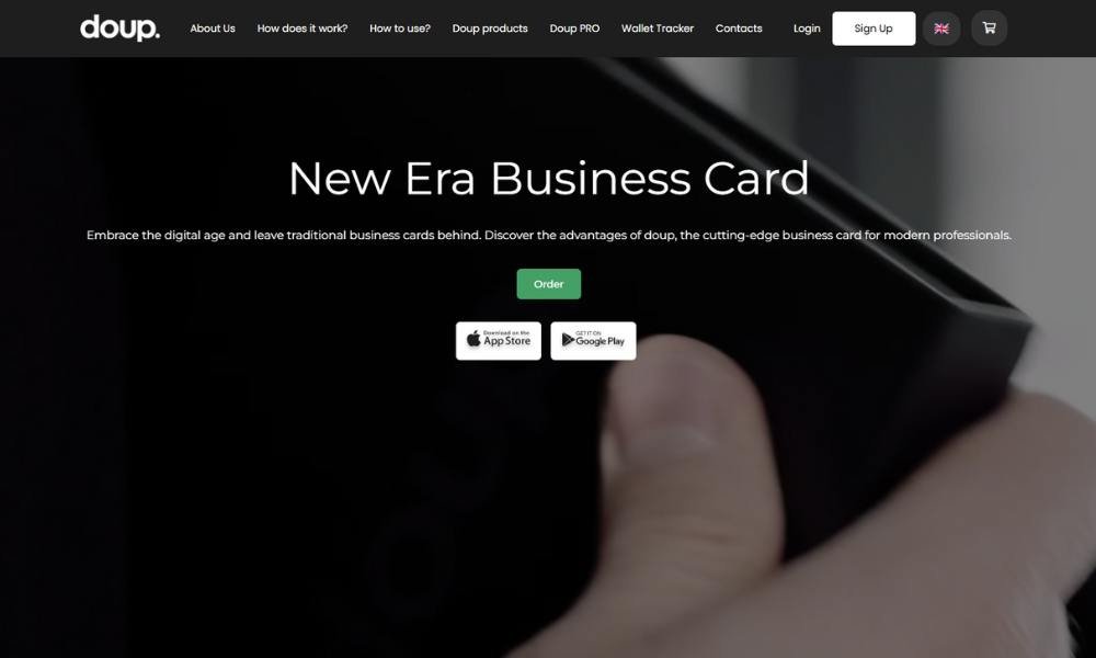
myDOUP doesn’t look or feel like your average gift shop—and that’s the point. From the homepage, it’s clear this is a place built on personality, not product overload.
The vibe is playful but sharp. Clean design, easy navigation, and clever copy that doesn’t try too hard. Everything feels considered—from the category names to the colors on the checkout button.
What stands out? The curation. These aren’t random things tossed into a digital basket. Every product feels like it was chosen by someone with great taste and a good sense of humor.
The brand doesn’t just want you to buy a gift. It wants you to enjoy picking it out. Even the tone of the site feels like a helpful friend—one who’s cool but not intimidating.
And the best part? You can shop by mood, occasion, or just because Tuesday needs cheering up.
myDOUP keeps things light but intentional. It’s not about having everything. It’s about having the right things—wrapped in personality and delivered with just enough sass.
3. Adobe
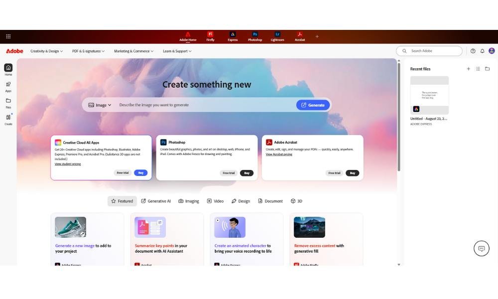
Adobe doesn’t just make software—it builds the tools that fuel half the internet’s creativity. Open the site, and you’re met with a calm confidence. No shouting, no chaos—just options that work and branding that knows it’s already part of your workflow.
From Photoshop to Premiere Pro, the product pages focus on capability without drowning you in jargon. You’re not reading a manual—you’re seeing what’s possible.
The navigation is clean, almost surgical. Whether you’re here to download, upgrade, or just poke around for inspiration, you’re in and out without friction.
And Adobe knows its users. Creative professionals, students, marketers, developers—they’re all represented. But it doesn’t try to be everything to everyone. It gives you just enough to get started, then gets out of the way.
Even the messaging stays grounded. No overused words, no digital pep talks. Just tools, laid out with intention.
Adobe doesn’t need to prove itself. It just needs to stay sharp. And clearly, it knows that.
4. Microsoft
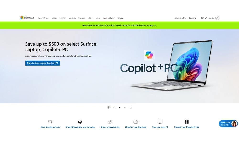
Microsoft doesn’t need to shout. The moment you land on the site, everything feels balanced—smart, functional, and built for people who want their tech to work without fuss.
The layout is clean, but not empty. Navigation is direct. Whether you’re grabbing Office, checking out Surface devices, or just updating your PC, it’s all laid out like it should be—organized, intentional, and refreshingly non-chaotic.
Each product page gets to the point. You won’t find long-winded features lists or clever filler. Instead, it’s all about clarity: what it does, who it’s for, and how it fits into your day.
Microsoft isn’t trying to reinvent itself every five minutes. It’s focused on solving actual problems—productivity, connection, security—with tools that feel solid and familiar.
There’s a quiet confidence in every corner of the site. And that’s the brand, really: dependable, sharp, and quietly everywhere.
It’s not trying to be trendy. It’s trying to be useful—and that’s something most of us can get behind.
5. Coca-Cola
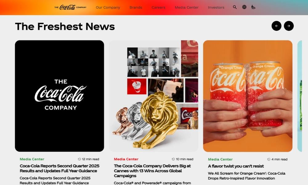
The Coca-Cola Company isn’t just selling beverages—it’s running on legacy and brand muscle built over a century. The site reflects that. Clean, polished, and composed like a boardroom that knows its history and its audience.
Right away, the homepage balances storytelling with business. You’ll find sustainability reports sitting next to seasonal campaigns—because yes, this is a company that can talk about global impact and limited-edition flavors in the same breath.
It’s corporate, sure—but not cold. The design is clean, with large type and intentional space. It’s not here to dazzle. It’s here to inform, and it does that with quiet precision.
You won’t get hit with clever copy or casual tones. What you’ll find is clarity. Brand family, investor updates, social initiatives—it’s all where it should be, laid out like a company that’s been refining its message for decades.
And while the red and white still show up strong, the real focus now is growth, partnerships, and how a soda brand became a global portfolio.
Coca-Cola doesn’t need to remind you it’s iconic. The site says it all without saying too much.
6. Tesla
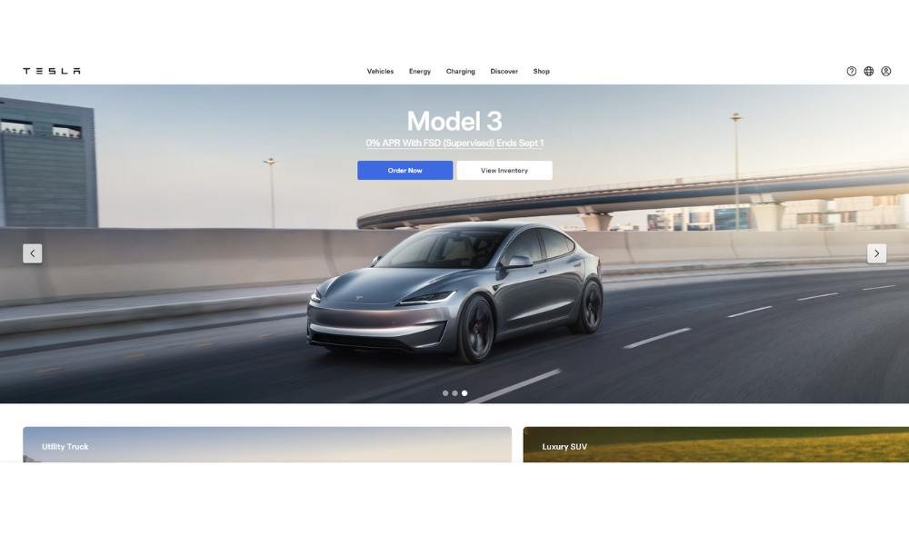
Tesla’s site doesn’t waste time. Like its cars, it moves fast and keeps things sharp. No long intros, no corporate jargon—just bold images, clean lines, and a quiet flex.
The homepage feels like stepping into a showroom with no small talk. Scroll a little, and you’re inside the future—or at least what the future looks like when it’s built with confidence and a carbon fiber edge.
Product pages are stripped down but purposeful. Specs, features, booking options—it’s all there, but nothing’s shouting. You don’t need convincing. You just need a few clicks and maybe a charger.
Even the language is minimal. Tesla doesn’t tell you why it matters. It assumes you already know. And strangely, that works.
From cars to energy solutions, everything feels like it belongs in the same ecosystem. Sleek, efficient, slightly mysterious. Like if a spaceship had a homepage.
Tesla’s not here to explain itself. It’s here to deliver—and maybe disrupt a few more industries while it’s at it.
No filler. No fluff. Just forward.
7. IBM
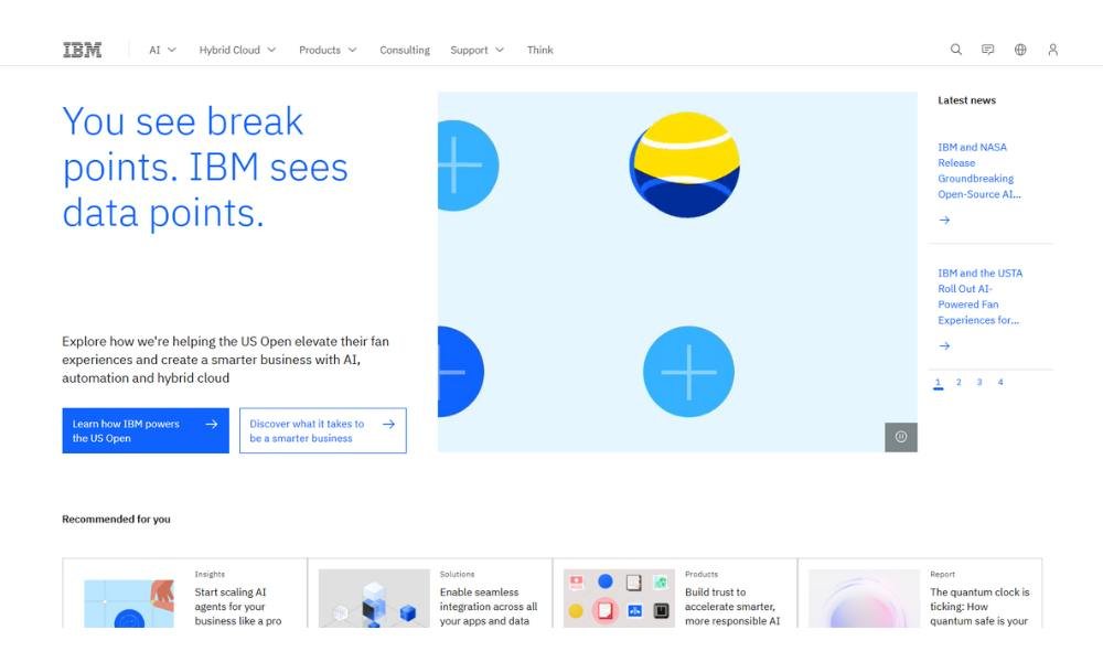
IBM doesn’t chase buzz—it builds backbone. The site feels exactly how you’d expect from a company that’s been thinking about big problems longer than most startups have existed.
It’s clean, measured, and built for readers who want answers, not fluff. Whether it’s AI, cloud infrastructure, or business automation, everything is laid out with a quiet sense of control.
There’s no need for noise. The design is structured, the messaging is focused, and the voice says: “We’re already doing the work.”
Pages move between industries, services, and solutions with the ease of a company that’s had time to refine its pitch. And while the topics are complex, the language stays clear—more grounded than glossy.
Even the product descriptions avoid showmanship. You won’t find dramatic taglines or buzzword parades. Just real tools, doing real work, at enterprise scale.
IBM isn’t trying to be trendy. It’s building what everything else runs on. Quietly. Reliably. Still here.
8. Pfizer
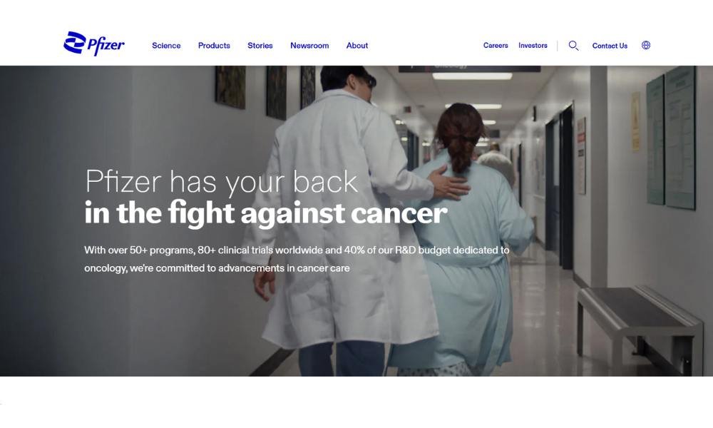
Pfizer doesn’t try to dazzle with design—it leads with responsibility. The site opens with calm precision: clean layout, strong headlines, and a clear focus on science that matters.
You won’t find dramatic animations or over-the-top messaging. Instead, there’s clarity. Vaccines, treatments, research—it’s all presented with intention and structure. Every section feels like it was built for people who want real answers, fast.
The language is measured but never cold. It’s confident, concise, and grounded in purpose. From pipeline updates to global health partnerships, the message is clear: this isn’t about hype—it’s about work.
Even the news section avoids the usual spin. The updates are factual, well-organized, and leave space for the science to speak for itself.
Pfizer doesn’t frame itself as a disruptor. It presents itself as dependable—focused on progress, public health, and getting the job done without shortcuts.
It’s not flashy. It’s not trying to be. And that’s exactly what makes it feel trustworthy.
9. Airbnb
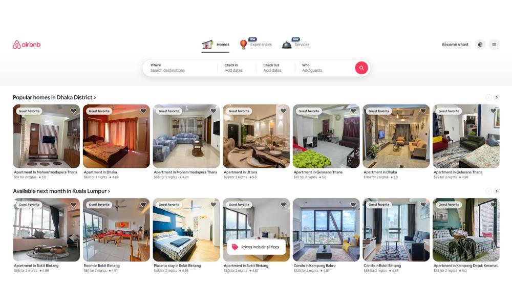
Airbnb doesn’t just help you book a place—it lets you borrow a life, even if just for a weekend. The site makes that clear from the first click. Big visuals, clean navigation, and just enough curiosity baked into the design to keep you scrolling.
Everything feels personal without being precious. Whether you’re looking for a treehouse in the woods or a townhouse in Tokyo, the layout gets you there quickly—without pressure, without noise.
The language is casual but intentional. It doesn’t oversell. It just nudges. Stay here. Try that. Maybe book something you didn’t even know you wanted.
Even the filters feel smart. You can sort by vibe, not just price. That matters when your idea of “getaway” means an off-grid cabin and someone else’s dog.
And it’s not just about places anymore. Experiences, events, hosting—it’s all tucked in, clean and calm, waiting for your click.
Airbnb’s not pretending to be travel’s future. It just quietly redesigned how we think about home—and made room for more stories in the process.
10. Starbucks
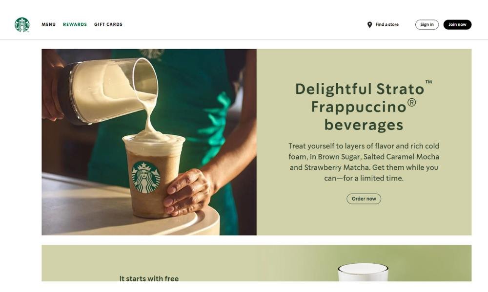
Starbucks doesn’t need to introduce itself—and the website knows it. The design is simple, sharp, and refreshingly calm for a global brand that serves millions of cups a day.
From featured drinks to loyalty perks, everything is right where you’d expect. No guesswork, no endless scrolling. Whether you’re reloading your card or chasing a seasonal favorite, the site gets you in and out like a good barista—fast, friendly, and efficient.
The copy avoids fluff. It’s warm, never sugary. You get real info: what’s new, what’s brewing, and where to find it. The voice feels like a well-trained regular—familiar, casual, and just caffeinated enough.
What stands out? The balance. Starbucks weaves in sustainability, community work, and behind-the-scenes sourcing without turning the homepage into a mission statement. It’s all present—but it doesn’t get in the way of the coffee.
And yes, even if you’re just here for a mobile order, the design keeps things smooth.
Starbucks online feels like Starbucks in person: consistent, inviting, and still somehow managing to smell like espresso—even through a screen.
11. Nike
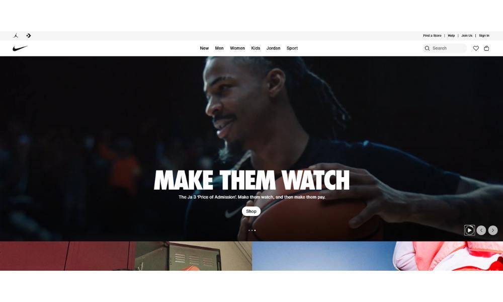
Nike doesn’t try to sell shoes. It sells momentum. The website reflects that energy from the first scroll—bold visuals, sharp typography, and a rhythm that keeps you moving, even when you’re just browsing.
The layout is sleek, like a good sprint—no wasted motion. Whether you’re hunting down the latest drop or just restocking socks, it all feels smooth and purposeful.
Copy stays tight. Confident, but not loud. You won’t find dramatic taglines on every page—just smart guidance, clear calls to action, and the occasional nudge that makes you feel like getting off the couch.
Product pages are clean, with just the right amount of detail. Sizes, specs, and colorways laid out without friction. It’s all designed to get you from want to checkout with zero drag.
But there’s more beneath the surface—sustainability, innovation, athlete stories—woven in without slowing down the flow.
Nike’s site feels like its gear: modern, fast, and built to perform. No extra steps. Just forward.
12. General Electric
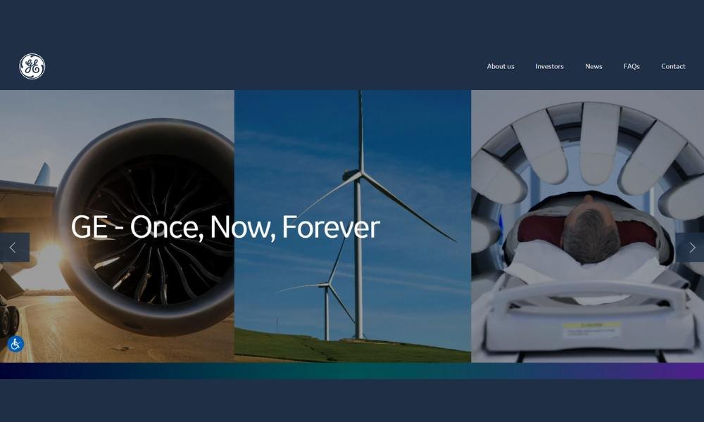
GE doesn’t flash gimmicks—it builds foundations. From the moment you land on the site, there’s a sense of purpose: clean sections, precise imagery, and messaging that says the big work is already in motion.
The homepage moves you through industries—energy, aviation, healthcare—with smooth navigation and no guesswork. You’re not overwhelmed by options. You’re offered clarity.
Each division page gets right to it. What GE does. How it does it. Who it helps. No buzzword overload. Just facts backed by visuals that feel intentional, not staged.
The tone is direct and grounded. You don’t get lofty promises. You get how things work—and why they matter. It’s a straight line from tech to impact, without the fluff.
Even the news section feels purposeful. Updates are well-organized and easy to skim. You don’t need a background in engineering to see why a new turbine or ultrasound innovation matters.
GE’s site doesn’t aim to dazzle. It aims to deliver substance. And it does—quietly, efficiently, and without pretending to be anything other than essential.
13. Walmart
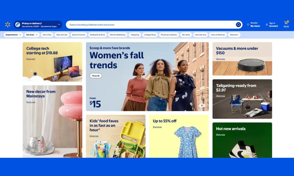
Walmart’s homepage doesn’t overwhelm—and that’s exactly the point. From the first glance, everything is laid out clearly, logically, and with an eye toward helping you get what you need—fast.
You won’t get lost in bells and whistles. Featured deals, fresh finds, and easy navigation across categories make shopping feel straightforward, even on snack runs or sofa splurges.
Product pages keep it simple: you see the item, the price, reviews, and add‑to‑cart. No jargon, no fluff. Just the facts—so you can move on to what matters.
The tone is friendly but practical—a voice that says, “We’ve got your back.” Whether you’re restocking groceries, upgrading tech, or picking out gear, you’re treated like someone with important things to do.
Even special sections—Rollbacks, Pickup & Delivery, Savings Catcher—are presented with calm clarity. It’s less about sales noise and more about delivering value.
Walmart doesn’t try to wow you with flash. It sticks to what matters: convenience, variety, and decent deals.
Here, shopping doesn’t have to be a chore. It just needs to work—and Walmart makes sure it does.
14. Johnson & Johnson
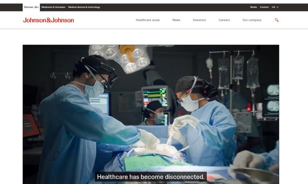
Johnson & Johnson doesn’t overhaul its site daily—it holds steady. From the first click, you sense a company balancing care with clarity—soft color, structured layout, and content aimed at people who want health solutions, not hype.
The homepage moves you through areas such as consumer health, medical devices, and pharmaceuticals with clean navigation. You’re not lost in options—you’re guided. Every section has a purpose.
Each product or therapy page delivers what matters: what it treats, how it works, and who it helps. No impressive buzzwords. Just explanations that feel respectful and easy to follow.
The tone feels reassuring. You’re not being dazzled by flashy promises. Instead, you get transparency. Clinical data sits alongside patient stories—solid facts and real people.
Even press updates stay grounded. Laid out clearly, they show progress without spin. You don’t need a science degree to understand why a vaccine milestone matters.
Johnson & Johnson’s site doesn’t try to steal your attention. It builds trust. Calmly. Consistently. With a sense of purpose that matches its long history in health.
15. McDonald’s
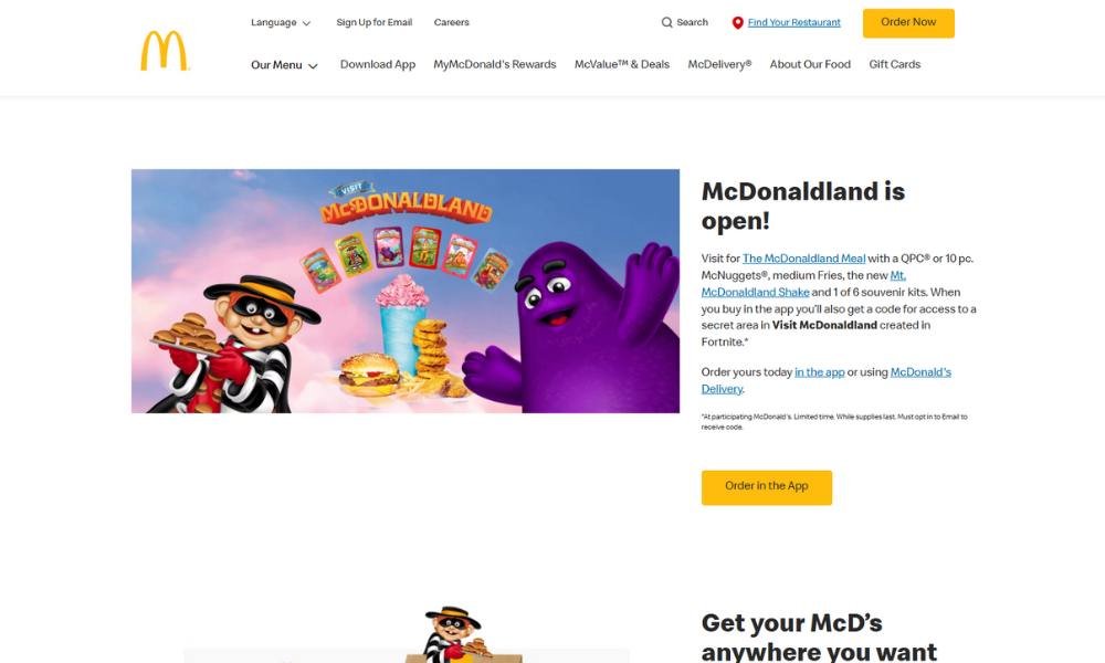
McDonald’s website doesn’t try to reinvent the wheel—it keeps it rolling smoothly. From the first click, you sense clarity: bold visuals, clean navigation, and a familiar vibe that feels like your local spot—digital version.
The homepage serves its staples—menu highlights, deals, and a clear call to order or find your nearest restaurant. You’re not overwhelmed by choices. It’s structured, intuitive, and aimed at getting you that Big Mac without second-guessing.
Product pages stay short and visual. Ingredients, pricing, and nutritional info are laid out clearly—no excessive marketing copy, just the essentials. You see what you’re getting.
The tone is friendly and helpful, without being overly promotional. It’s like a crew member asking “Would you like fries with that?”—but in text. That balance between warmth and efficiency carries through the site.
Even the app and rewards sections are straightforward. Helpful details, clean visuals, and zero fluff. Same with community programs and sustainability—they’re in place, easy to access, and not shoved in every banner.
McDonald’s designs its site like its service—familiar, fast, and reliable. No frills. Just good, dependable experience.
16. Goldman Sachs
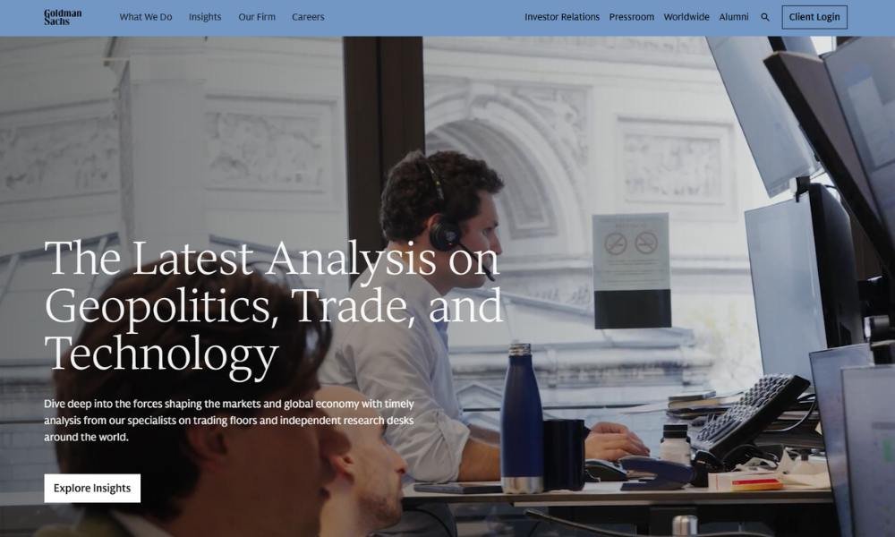
Goldman Sachs doesn’t dress up its site in buzzwords—it shows substance. From the first click, you find a site that’s polished, structured, and geared for clarity.
The homepage lets you explore sectors—investment banking, asset management, consumer banking—with minimal fuss. Navigation is crisp, guiding you straight to the information that matters.
Each section communicates purposefully. You’ll find firm insights, strategy briefs, and leadership details. There’s no fluff—just precise language aimed at professionals who value depth without distraction.
Reports and research are presented clearly. No jargon-dense PDFs hidden behind walls. Instead, streamlined summaries and downloadable assets make it easy to grasp big ideas fast.
Even the news and thought-leadership sections keep it tight. Articles read like well-edited op-eds—insightful, focused, and relevant. No dramatic fluff—just valuable perspective.
Goldman Sachs designs its online experience like it approaches deals: deliberate, confident, and clear-cut. The site doesn’t chase trends—it builds trust, one considered click at a time.
Let me know if you’d like a version focused more on their client tools, consumer banking, or leadership messaging!
17. Uber
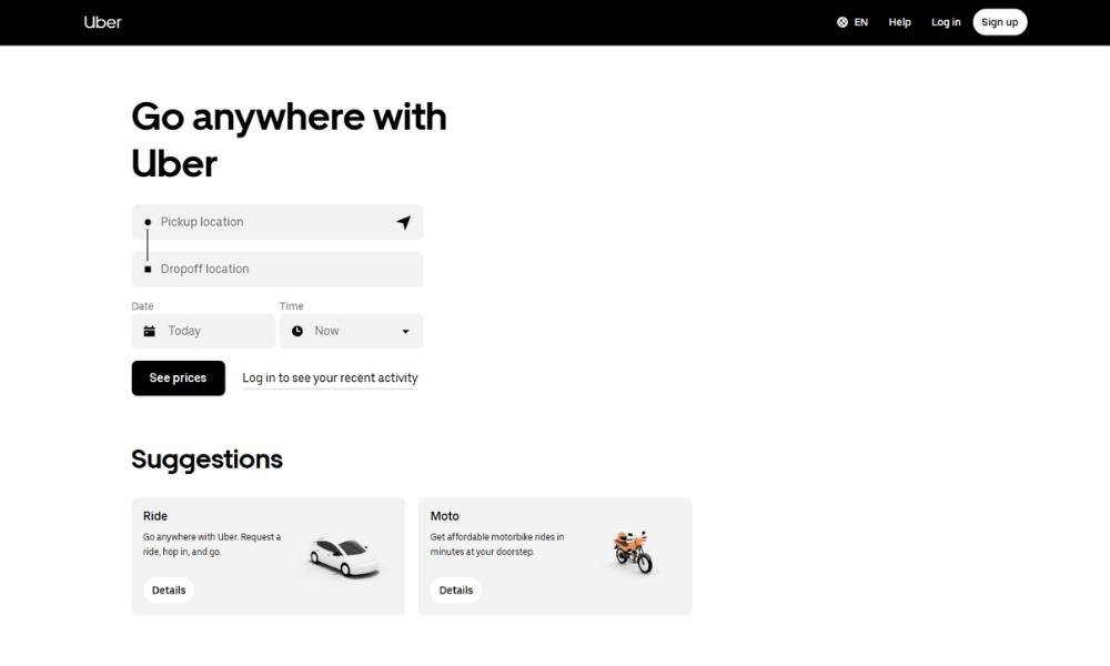
Uber doesn’t overthink its site—it moves you fast and clearly, just like the service. From the first tap, you’re met with clean visuals and straightforward navigation. It’s not flashy. It just works.
The homepage cuts to the chase: Ride, Eat, Business. Pick your need. Each section speaks exactly to that. No fluff, no extra clicks. You know where you stand—then you’re on your way.
Driver and rider pages feel personal. They address real questions—earnings, safety, onboarding—without jargon or pep talks. Just answers that make sense.
The tone is confident and human. You get help, not hype. Whether you’re a passenger looking for a ride or a courier delivering dinner, Uber’s site treats you like someone with places to go.
Even the global pages are tidy. Country settings, local features, and simple updates—neatly organized.
Uber doesn’t need to impress you. It just needs to start your trip. And its website does that well: clean, direct, and ready when you are.
18. Canon
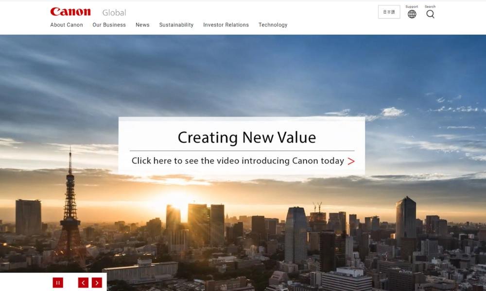
Canon doesn’t just sell cameras—it captures possibility. From the moment you land on the site, you sense precision: clean layout, sharp visuals, and a sense that each product belongs in a creator’s toolkit.
The homepage guides you swiftly. Want a mirrorless camera? A printer? A projector? It’s neatly organized. You’re not overwhelmed. You’re offered meaningful choice.
Product pages are focused and clear. You get specs, real-life samples, and straightforward comparisons. No buzzwords—just the details you need to feel confident in your pick.
The tone across the site is skilled and approachable. It’s like talking to someone who’s made hundreds of photos but still gets a kick out of the simple ones. You’re informed, not sold to.
Even the educational content stays grounded. Tutorials, inspiration, and support are presented in bite-sized pieces that respect your time.
Canon doesn’t boast about being the best—it shows it. With tools that power professionals, hobbyists, and students alike, they let the work speak for itself.
19. Shell
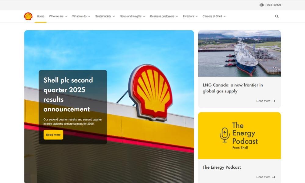
Shell doesn’t sell energy with flash—it delivers infrastructure. From the moment you land on the site, everything feels purposeful—clear navigation, strong visuals, and information that’s built to inform, not dazzle.
The homepage walks you through their world: fuels, lubricants, renewables, and innovation. Each section is cleanly laid out, helping you find what matters without guessing. It feels like you’re navigating a clear pathway, not a maze.
Their messaging is grounded. You’ll find facts about emissions, partnership work, and future-ready tech—but it’s never buried in jargon. Instead, it’s written for people who just want to know: what they do, why they do it, and how it helps.
Even sustainability and innovation get space—soft color, clear headings, and visuals that stay focused on progress. It’s genuine without being performative.
The tone is steady and confident. It’s not flashy. It’s reliable. Whether you’re checking out retail fuels or exploring low-carbon projects, the site feels like a company ready to move forward.
Shell’s online presence doesn’t promise reinvention. It promises delivery—built on decades, built for tomorrow.
Conclusion
Good design isn’t decoration. It’s direction. A corporate website should feel like walking into a well-run office—clear signage, confident tone, and no broken doors.
Everything I’ve shared here comes from building for results, not awards. The design should support your sales team, represent your leadership, and quietly impress visitors who don’t have time for scroll-heavy intros.
And if you’re wondering whether it’s worth investing in something this structured—ask yourself one thing: would you show up to a client meeting in flip-flops? Your website shouldn’t either.
Build smart. Speak clearly. And let your site carry weight, even before your team does.

