I’ve spent years designing websites that help people stand out—clean layouts, smart structure, no nonsense. But even as a professional, I still love looking at great portfolio websites. Why? Because sometimes, a well-placed font or a bold homepage image says more than a thousand strategy meetings ever could.
Whether you’re building your own site or just collecting ideas for your next revamp, real examples can spark fresh thinking—and help you skip the “blank page” anxiety.
Here’s what I’ll share:
- A hand-picked selection of 18 portfolio websites that actually do the job
- Quick takeaways on what works (and what doesn’t try too hard)
- Tips on layout, messaging, and visual flow
- Why these examples succeed without overcomplicating things
You don’t need a design degree to get inspired—just a few minutes and a little curiosity.
1. Enrico Deiana
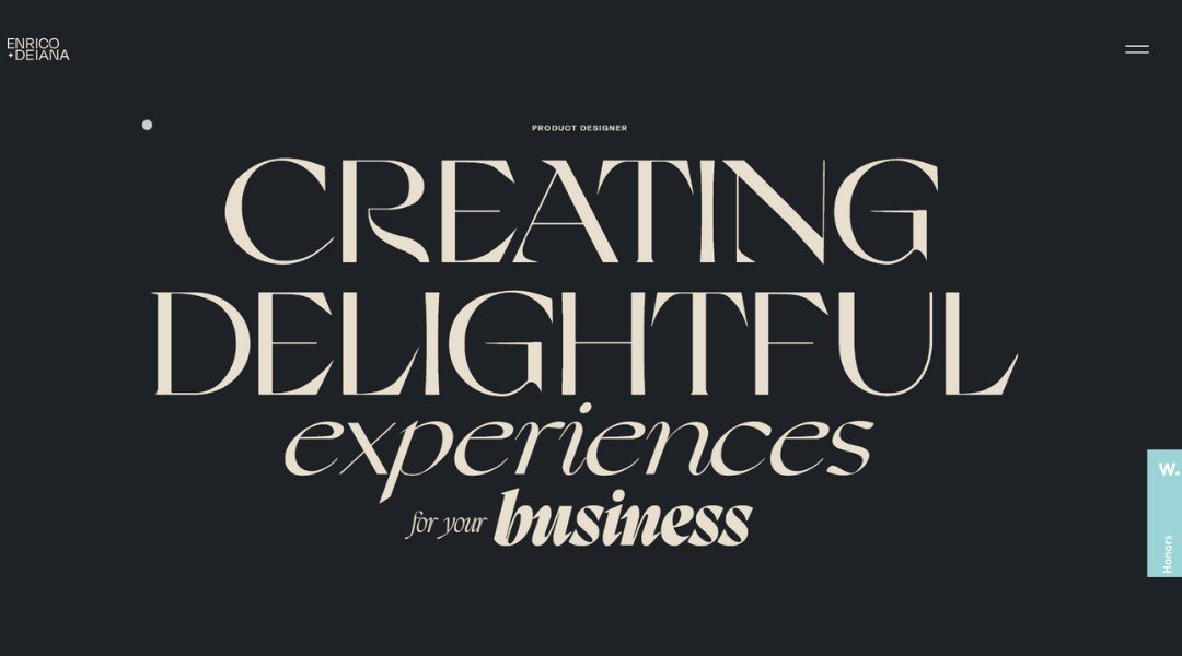
Italian designer Enrico Deiana doesn’t just build interfaces—he crafts digital experiences that feel like they’ve had a double espresso and a seaside breeze.
His homepage? A bold declaration: “Creating delightful experiences for your business.” It’s not just a tagline—it’s a promise. The dark-themed layout, punctuated by vibrant gradients and playful micro-interactions, invites visitors to explore without feeling overwhelmed.
Dive into his “About” page, and you’ll find more than a résumé. Enrico shares his journey—from his early days at IED to his current role at Microsoft’s Web Experience Collective. He’s also a jury member at Awwwards, which might explain his knack for award-winning designs.
His portfolio showcases a range of projects, from the immersive “Pura Pharma” landing page to the dynamic “Sports Bros” app. Each project reflects his commitment to user-centric design and visual storytelling
And just when you think he’s all business, his footer playfully suggests: “Let’s create something meaningful together (but not forever).” A gentle reminder that while digital experiences can be impactful, they don’t have to be eternal.
Enrico’s site is a testament to thoughtful design, blending professionalism with a touch of whimsy. It’s clear he understands that in the digital world, a little personality goes a long way.
2. Sean O’Brien
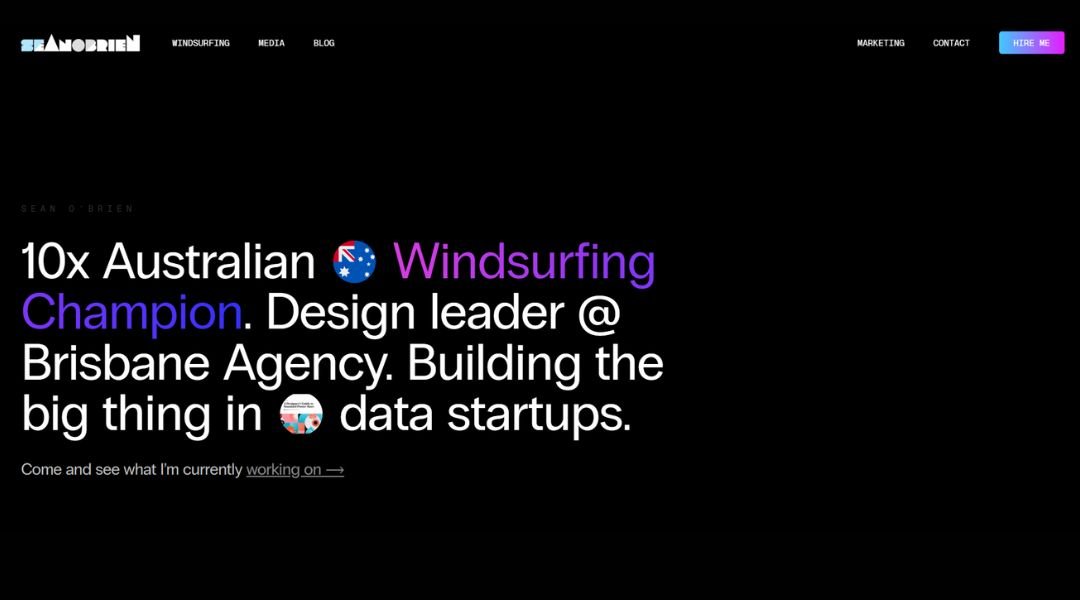
Sean O’Brien’s website wastes no time telling you who he is: a professional water sports athlete who knows how to ride waves—and ride them well. Based in Australia, Sean brings the same energy to his online presence that he does to the open water: sharp, fast, and focused.
The homepage greets you with high-impact visuals—bold photography and a clean layout that puts his athletic achievements front and center. You’re not guessing what he does; you’re witnessing it. His portfolio doesn’t just list wins—it shows them, with action shots that speak louder than stats.
What sets the site apart is its no-frills approach. The design is minimal but effective. You’re not distracted by fluff, and that’s intentional. It mirrors Sean’s professional ethos—get to the point, stay sharp, move fast.
A subtle touch of humor in his blog posts adds personality without pulling focus. This is a site that knows its audience: sports fans, potential sponsors, and curious onlookers who want a peek into a high-speed lifestyle.
Overall, it’s clear, confident, and streamlined—like Sean on a raceboard.
3. Helena Bowen
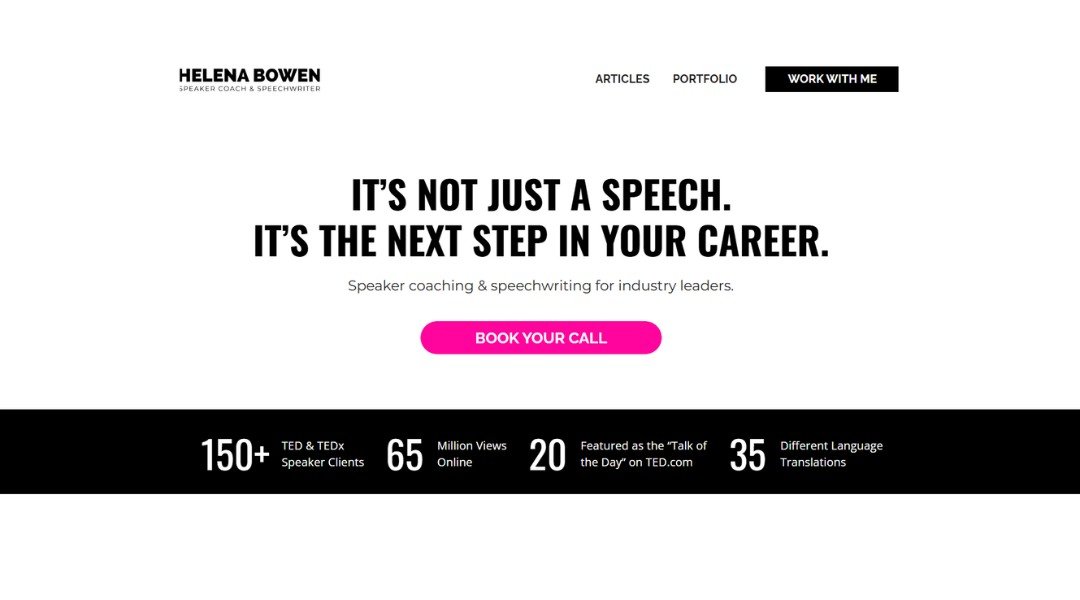
Helena Bowen’s website feels like a quiet conversation with someone who knows exactly what they’re doing—and isn’t trying to shout about it. As a speechwriter and executive coach, Helena leads with clarity. The homepage is stripped of noise, featuring a calm color palette, clean typography, and a confident opening line: “Helping leaders tell better stories.”
Rather than overload you with credentials, she lets her work speak. Client logos (Netflix, Google, TED) sit comfortably on the page—no bragging, just facts. Her “About” section is personal without oversharing, blending a professional résumé with a touch of warmth. It’s approachable, yet assured.
Her service pages are direct. Whether you’re prepping for a keynote or refining a pitch, she’s clear about what you’ll get—and why it matters. She doesn’t bury you in jargon or fluff. Every line has purpose.
What stands out most is the calm confidence the site projects. It doesn’t try to impress with flashy design. Instead, it reflects the kind of storytelling Helena helps her clients achieve: focused, authentic, and memorable. In short, it’s a masterclass in saying more with less.
4. Baron
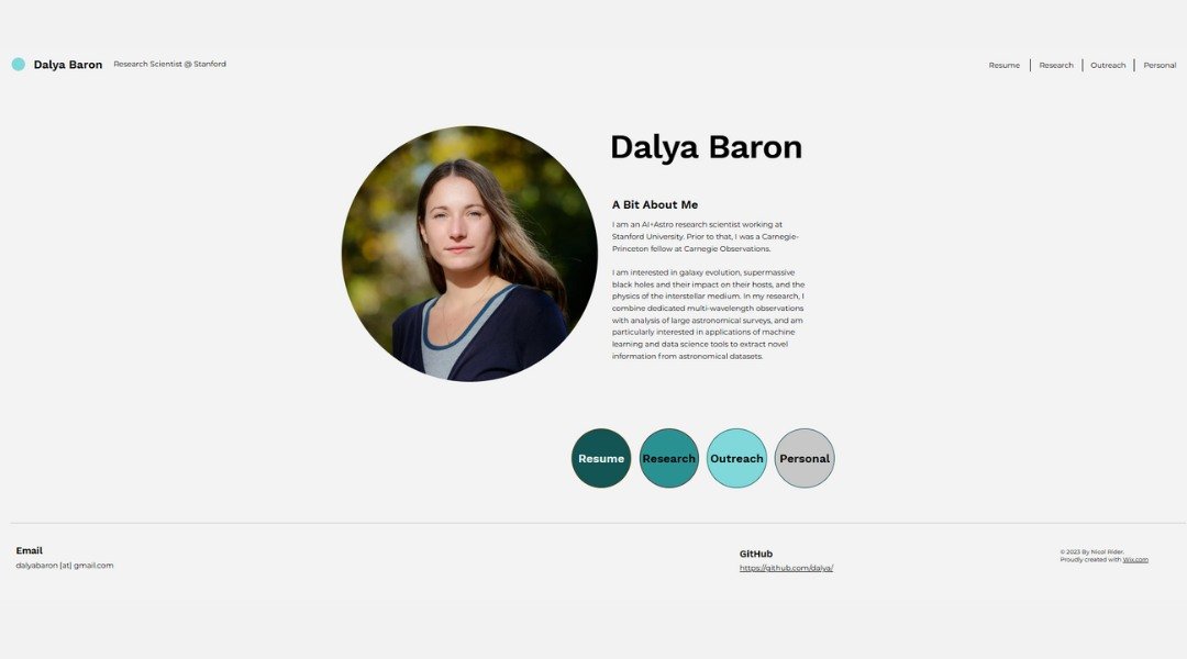
Dalya Baron’s website opens with a sense of clarity and purpose—just like her photography. A creative director and photographer based in NYC, Dalya specializes in capturing real people with real stories. Her homepage sets the tone quickly: bold visuals, clean lines, and a quiet confidence that lets her work take the spotlight.
Rather than overwhelming you with text, the site guides you visually. Her portfolio is front and center, showcasing portraits that feel natural, honest, and beautifully human. You’re not just seeing faces—you’re sensing personality.
The “About” page keeps things personal but professional. Dalya shares her process in a way that’s approachable, not performative. No buzzwords, just straight talk about what it means to make people feel seen through a lens.
Navigation is intuitive, the color palette is understated, and every page feels intentional. There’s even a touch of lightness—like her simple, friendly call to connect—reminding you there’s a real person behind the camera.
Overall, it’s a site that mirrors Dalya’s style: calm, confident, and quietly powerful. The message is clear—if you want honest photography with heart, you’re in the right place.
5. Chipie Designs
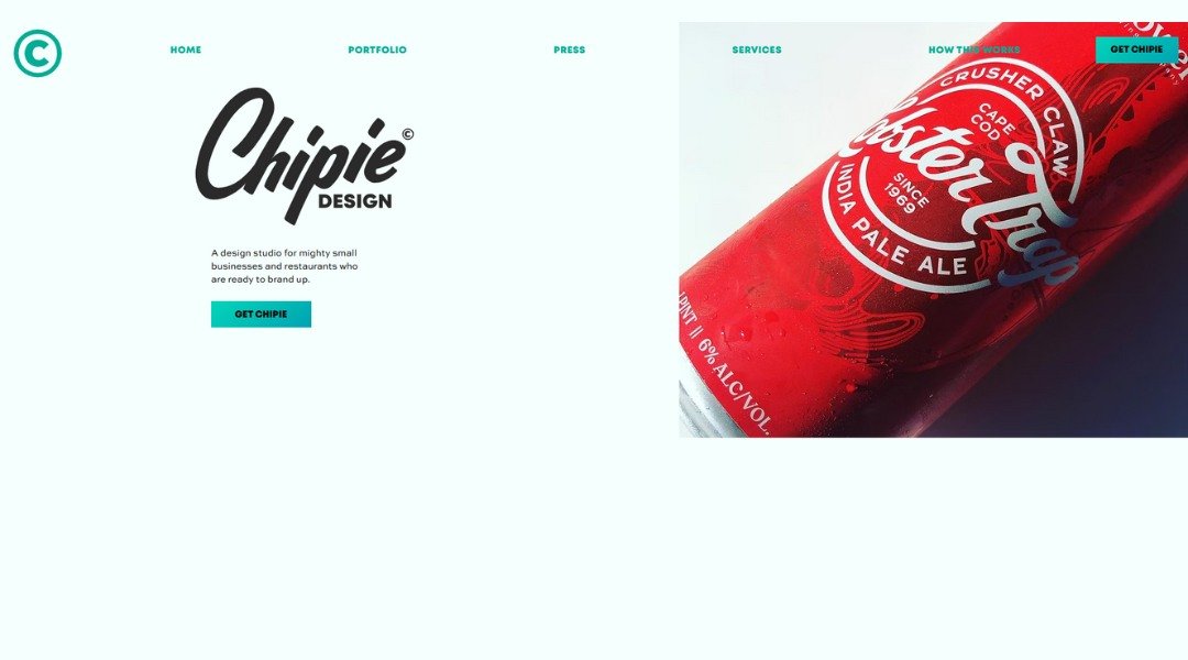
Visiting Chipie Design’s website feels like stepping into a quirky, well-organized sketchbook—with a sense of humor and a sharp eye for detail. Run by French designer Tiphaine David, this site doesn’t just show design work—it is a design experience.
The homepage is bold and playful, with bright colors, cheeky animations, and typography that doesn’t take itself too seriously. Right away, it’s clear: this studio thrives on personality. But don’t let the fun aesthetic fool you—every element is thoughtfully placed, and every project shown reflects serious design chops.
Click into the portfolio and you’ll find branding and web design that balances creativity with clarity. The case studies are refreshingly straightforward, offering a peek into process without the buzzword bingo. Even the “About” page keeps things light, with just enough personal flavor to make you feel like you’ve met the designer—without needing to know her favorite pizza topping.
Chipie’s site walks the line between professional and playful with ease. It’s charming, a little rebellious, and very well put together—just like the work it represents. If you’re looking for design that’s bold but smart, this studio doesn’t miss.
6. Studio Bagaz
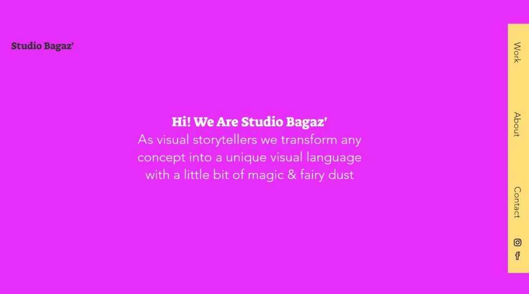
Studio BGZ’s website doesn’t just showcase architecture—it makes a statement. From the moment you land on the homepage, the aesthetic is sharp, deliberate, and modern. The layout is minimal, but every element feels intentional, like a well-placed beam in a well-considered structure.
Based in Brooklyn, the studio blends design and storytelling with a focus on cultural and community spaces. Their projects aren’t just buildings—they’re environments with a purpose. The photography is front and center, capturing angles, textures, and lived moments that speak louder than any mission statement.
The “About” page avoids overused buzzwords and gets to the heart of their work: thoughtful architecture that responds to its surroundings. There’s a clear sense that this studio listens first, then builds.
Navigation is smooth, with each project page offering just enough context to draw you in without distracting from the visuals. There’s also a quiet confidence throughout—no unnecessary flair, just smart, honest design.
In short, Studio BGZ’s site reflects the kind of architecture they create: purposeful, people-focused, and built to last. It’s a digital space that respects your time—and leaves a strong impression.
7. Lena Steinkühler
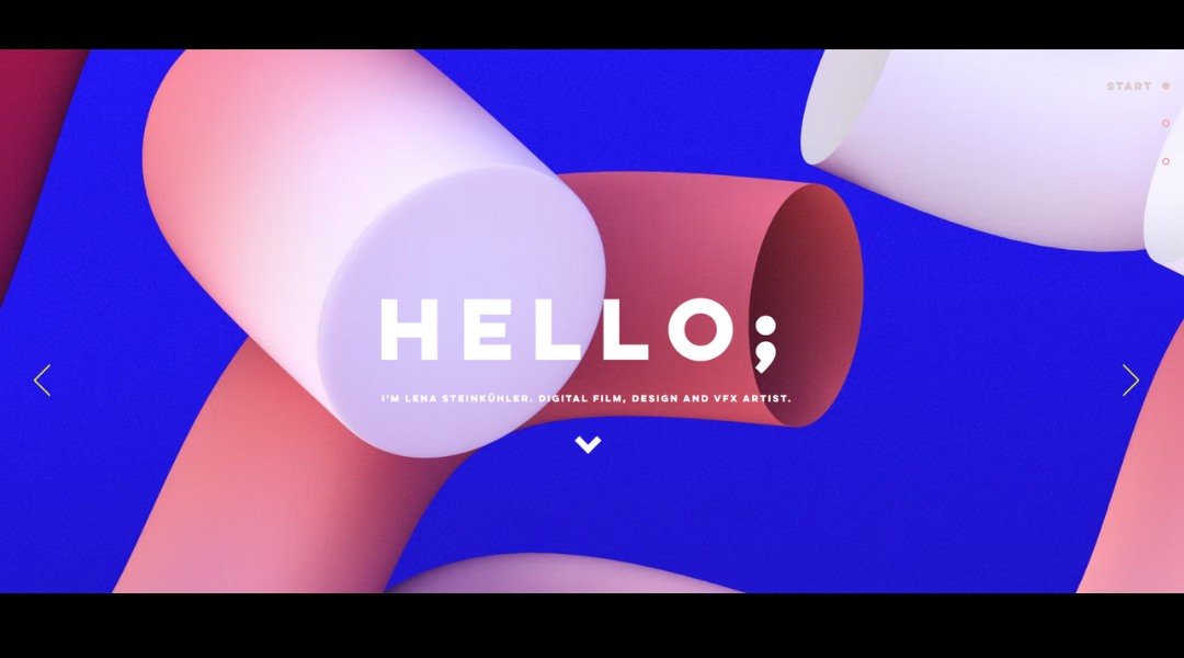
Lena Steinkühler’s website feels like stepping into a world built from imagination—but grounded in precision. A Berlin-based art director and motion designer, Lena doesn’t just create visuals—she constructs atmospheres.
Right from the homepage, you’re met with dynamic reels that showcase her signature style: cinematic, immersive, and meticulously crafted (without feeling overworked). The layout is minimalist, which gives her vibrant, animated work room to breathe. No clutter, just movement and mood.
The portfolio is the star here. Projects span futuristic cityscapes to surreal motion sequences, each one revealing Lena’s flair for visual storytelling. There’s no hard sell—just excellent work, displayed with quiet confidence.
Her “About” page is brief but effective. It strikes a balance between personal and professional, giving a glimpse of the artist behind the screen without turning it into a diary.
Overall, the site is clean, fast, and focused—like Lena’s animations. It doesn’t try to explain everything. It shows you enough to make you curious, then lets the work do the talking. And frankly, it talks loud—in the best way.
8. T Sakhi
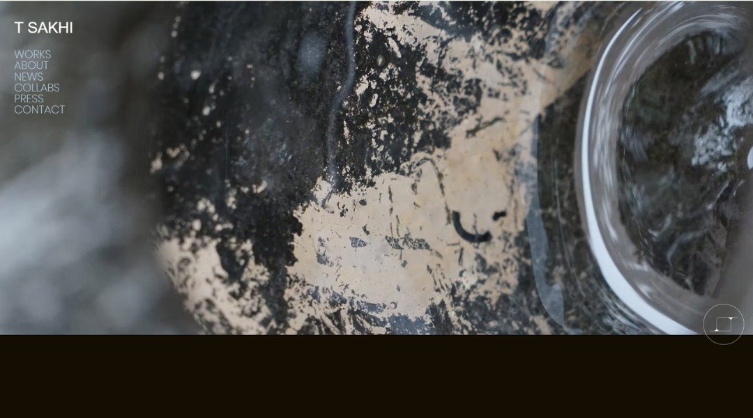
Tsakhi Architects’ website doesn’t just showcase architecture—it reflects it. Minimalist, structured, and visually striking, the design mirrors the studio’s philosophy: thoughtful spaces with a strong sense of identity. From the moment you land on the homepage, you’re met with clean lines, balanced layouts, and crisp imagery that tells a story without saying too much.
The portfolio section is front and center, featuring a curated collection of projects ranging from urban homes to commercial interiors. Each project is presented with clarity—photos, brief descriptions, and just enough context to let the work speak for itself. No overexplaining, no distractions.
The “About” page is refreshingly straightforward. It introduces the Tel Aviv-based studio’s approach with a mix of confidence and humility. You get a clear sense of who they are and how they think—simple, practical, and design-focused.
There’s no unnecessary flair here, and that’s exactly the point. The site communicates a quiet authority, much like their architectural work: precise, intentional, and grounded in purpose. Whether you’re an architect, a potential client, or just someone who appreciates beautiful design, it’s a space that invites you in—and then lets the work do the talking.
9. Bilge Nur Saltik
Bilgenur Saltık’s website is a visual breath of fresh air—elegant, minimal, and deeply intentional. As a designer and art director, she creates experiences that blend aesthetic clarity with strategic thinking, and her site reflects that balance beautifully.
The homepage greets you with soft tones and clean typography, immediately inviting you in rather than overwhelming. Projects are presented with care, not clutter—each one thoughtfully laid out with just enough detail to draw you in without saying too much.
Click into her work, and you’ll find a portfolio that’s as refined as it is expressive. Whether it’s branding, editorial, or digital design, Bilgenur’s style is consistent: quiet confidence, strong concepts, and a clear eye for detail. There’s no need for heavy-handed explanations—her visuals do the talking.
The “About” section reads like a calm conversation—clear, concise, and quietly confident. It gives a glimpse into her creative process without overcomplicating it.
Overall, the site is exactly what you’d expect from someone who understands both beauty and function. It’s graceful, focused, and leaves you with a sense that every pixel was placed with purpose. If design were a language, Bilgenur speaks it fluently—and with intention.
10. Rafael Varona
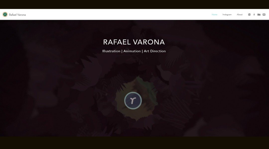
Rafael Varona’s website is like stepping into a dream you didn’t know you wanted—playful, surreal, and bursting with motion. As an illustrator and animation director, Rafael leads with color, rhythm, and a style that’s unmistakably his own.
The homepage wastes no time pulling you in. Loops of whimsical animations greet you instantly—each one a self-contained world. The layout is minimal, but the visuals? Anything but. It’s clear he lets the work do the talking, and it talks loud—in the best way.
His portfolio is thoughtfully organized, showing off a mix of commercial projects, personal explorations, and lush editorial pieces. Whether it’s looping GIFs or full-blown animated sequences, there’s a sense of wonder running through it all.
The “About” page is short, sweet, and efficient—much like his visual storytelling. There’s a quiet confidence in how little explanation he needs. If you’re here, you’re here for the art—and there’s plenty to dive into.
Overall, the site feels like a living sketchbook: dynamic, bold, and a little bit magical. Rafael’s style isn’t just seen—it’s felt. And it makes you want to keep scrolling just to see what moves next.
11. Cinematographer
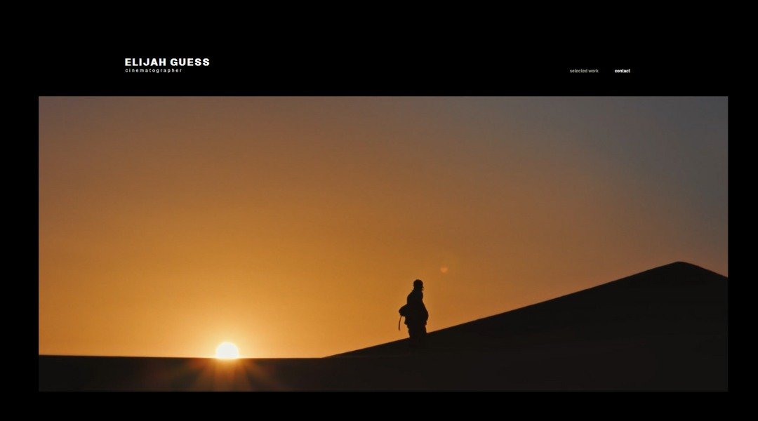
Elijah Guess’s website is as sleek and intentional as his design work. From the moment the homepage loads, you’re met with bold typography, clean spacing, and a strong creative presence that doesn’t need to shout to be heard.
A designer and creative director based in New York, Elijah brings a refined eye to branding and digital design. His portfolio is presented with clarity—each project gets room to breathe, and nothing feels crowded or overdone. There’s an elegance to the layout that mirrors the sophistication of his work.
The “About” page is short, sharp, and self-assured. He’s not trying to win you over with buzzwords—just a clear outline of what he does, who he’s worked with, and what drives his creative process. It’s minimal, but not cold.
Even the tiniest details feel considered—from the hover effects to the type hierarchy. Everything works in quiet harmony, showing you Elijah understands design at both the macro and micro level.
In all, his site delivers the same experience he offers clients: refined, thoughtful, and built to last. It’s not just a portfolio—it’s a reflection of a designer who knows how to make ideas look good without overcomplicating them.
12. Media Group
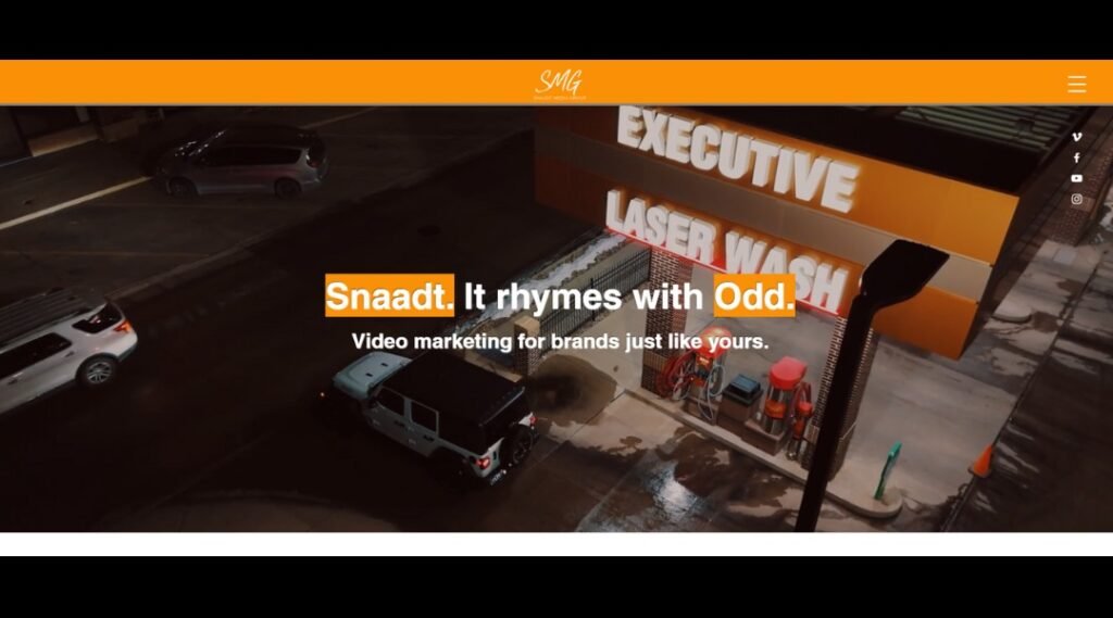
Snaadt Media Group’s website makes one thing clear from the start: they mean business—creative business. Led by content creator and strategist Will Snaadt, the site blends professionalism with energy, showing visitors that high-quality video and branding don’t have to feel stiff.
The homepage hits fast with a sleek reel that showcases everything from drone footage to social content. It’s high-impact but polished, giving potential clients a quick taste of what they can expect—clean visuals, strong messaging, and a smart sense of pacing.
What’s refreshing is the tone. It’s confident, yes, but never overbearing. Will speaks directly to business owners and brands without falling into the trap of tech-speak or vague marketing fluff. You get the feeling he’s more interested in solving problems than just showing off gear.
Service descriptions are clear and to the point, and the “About” page feels personal without veering off course. There’s even a casual, approachable edge—like working with someone who’s both serious about results and easy to collaborate with.
Altogether, Snaadt Media’s site is sharp, direct, and client-focused. A strong first impression that says: your brand is about to look a whole lot better.
13. TH Media
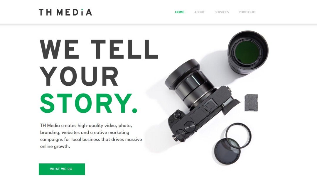
TH Media’s website hits you with energy the moment it loads—bold colors, sharp text, and visuals that don’t wait around for your attention. This is a creative studio that knows its audience: modern, fast-moving brands that want content with punch.
From the first scroll, it’s clear they mean business. The tagline? Straightforward. The layout? Clean but full of personality. Their portfolio doesn’t just show finished work—it shows variety, momentum, and a strong understanding of visual storytelling. Whether it’s video, branding, or social content, the vibe is consistent: vibrant, polished, and built for impact.
The “About” section is brief but confident, and that’s all it needs to be. TH Media isn’t trying to overexplain—they’re showing you what they do best through the work itself. There’s a casual, conversational tone throughout the site, which adds approachability without sacrificing professionalism.
Even the contact form keeps things light and human. No long bios. No unnecessary fluff. Just a creative team that’s clearly good at making things look and feel fresh.
In short, the site feels like the kind of pitch that gets a quick “yes”—confident, fast, and visually sharp.
14. Chromatone Studios
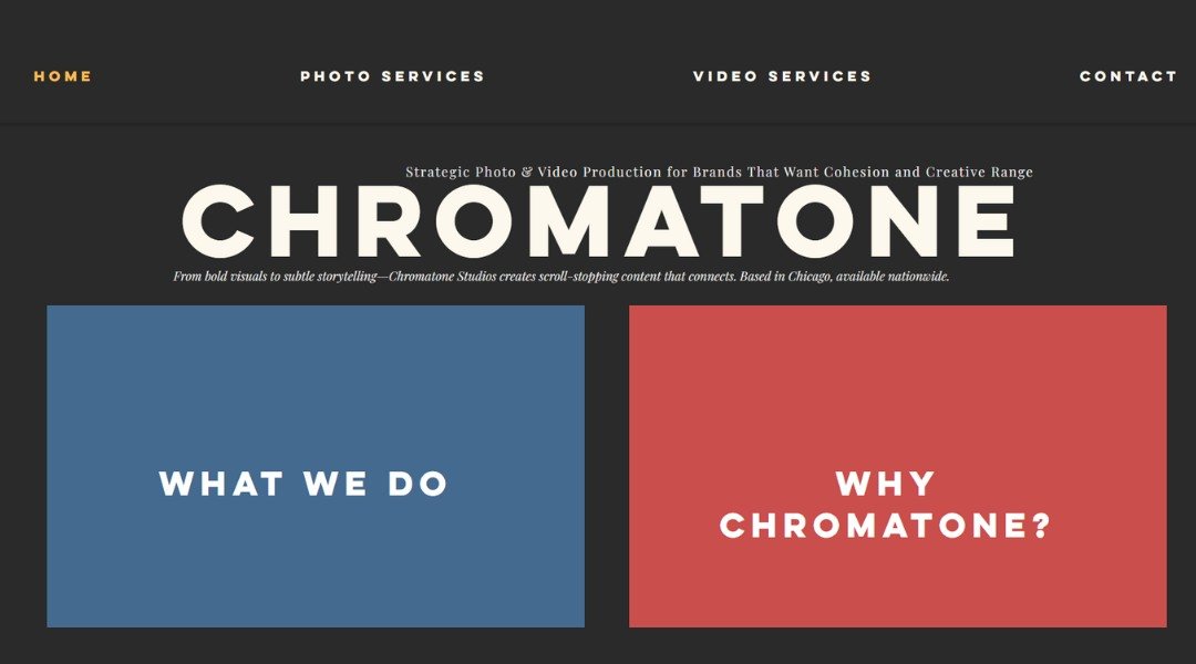
Chromatone Studios doesn’t whisper its presence—it pulses. From the first scroll, you’re dropped into a world where sound and visuals collide with purpose. Based in LA, this creative studio blends music, motion, and story into experiences that don’t just look good—they feel alive.
The site’s design is kinetic, modern, and confidently minimal. Bold type, dynamic transitions, and layered visuals make it clear: this team knows how to build moments that move. Their reel plays like a fast-cut symphony of color and rhythm—proof before promises.
What’s refreshing? They skip the sales pitch. Instead, you get real insight into their process: collaborative, experimental, and deeply tuned into the emotional core of each project. Whether it’s a music video, brand launch, or experimental short, they make it clear they’re not just pressing buttons—they’re shaping sensations.
Their “About” page keeps it grounded, introducing a diverse team with distinct creative voices. It’s equal parts tech-savvy and artistically driven—exactly the balance you’d expect from a studio at the intersection of sound and story.
In short, Chromatone isn’t just a studio. It’s a vibe. And the site captures that—loud, clear, and in perfect sync.
15. Media Team
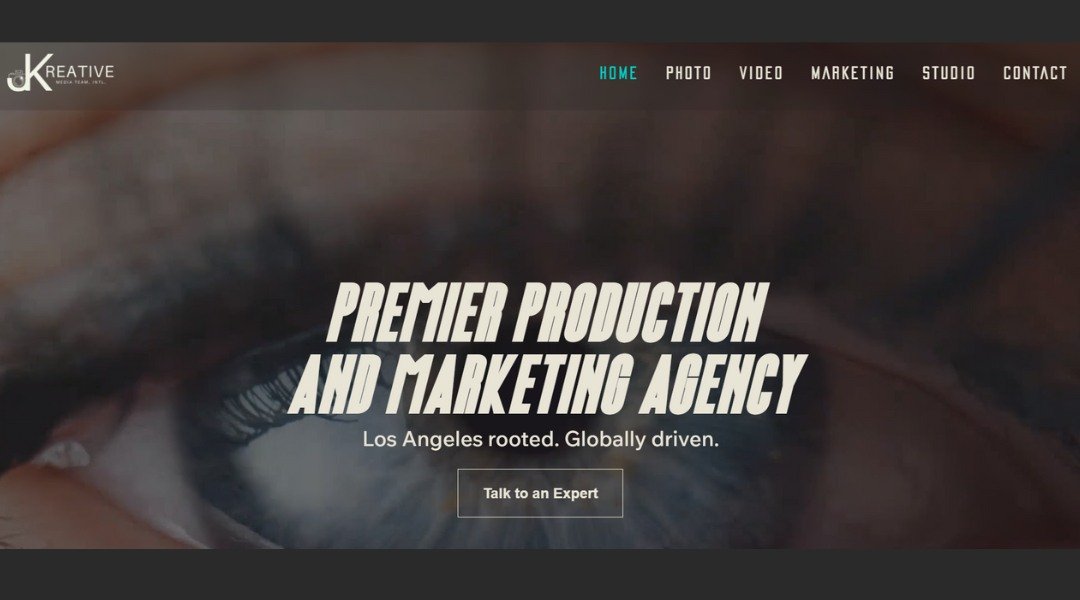
JKreative Media Team’s website makes one thing clear from the start: this is where strategy meets style. Specializing in branding, content creation, and digital storytelling, the team delivers a sharp, professional presence that feels both modern and approachable.
The homepage grabs attention with a bold headline and sleek visuals. No clutter, no confusion—just a confident pitch and a portfolio that backs it up. Scroll down, and you’ll find clean sections outlining services, past work, and client testimonials—all presented with clarity and polish.
What stands out is how the site balances creative flair with business sense. Each service is explained in straightforward language, focusing on what clients actually care about: results. The branding is cohesive, the tone is friendly but focused, and the design reflects the kind of aesthetic they promise their clients.
There’s also personality throughout—subtle but effective. The copy is conversational, and the team’s passion comes through without trying too hard. It’s the kind of site that says, “We know what we’re doing—and we’re fun to work with.”
In short, JKreative Media’s site reflects their mission: helping brands show up looking their best, with a clear message and a creative edge.
16. Flavor Media
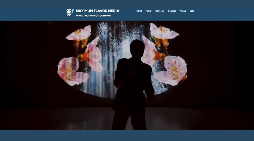
Maximum Flavor Media doesn’t just tell stories—it throws them on the grill, turns up the heat, and serves them sizzling. From the moment the homepage loads, you know you’re in for something bold. With punchy copy, high-energy visuals, and a name that promises nothing bland, this Brooklyn-based creative studio brings serious flavor to video production.
The site wastes no time. “We make videos people actually want to watch” is the kind of straight-up pitch that hits harder than a cold open. Their reel? Fast, fresh, and full of personality. Whether it’s branded content, doc-style storytelling, or something in between, the team’s knack for sharp visuals and quick wit is everywhere.
Each section is clean, concise, and well-seasoned—no filler. The “Work” page skips the jargon and jumps straight into action, showing off projects that feel human, not corporate.
There’s even a playful edge throughout the copy—just enough to keep things fun without losing the plot. Maximum Flavor Media knows its audience: brands that want content with bite, not fluff.
In short, the site does what good video should—it grabs attention, keeps it, and leaves you wanting more.
17. UMBR Media
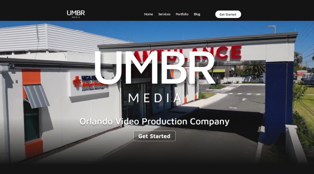
UMBR Media’s website hits with cinematic flair right from the first scroll. This is not your average production company—and they’re not trying to be. The dark, moody visuals and full-screen video instantly set the tone: bold, intentional, and built for storytellers who want to stand out.
Their homepage is clean but packed with impact. Instead of flooding you with copy, it guides you with sharp headers and striking visuals. Each section feels curated, like a scene in a film—everything in its place, nothing extra.
The “About” page leans into their vision: helping creators, brands, and agencies bring big ideas to life. It’s not puffed-up talk—just clear insight into their process, values, and creative edge. Their reel does most of the talking (as it should), and it doesn’t disappoint.
Service offerings are framed with clarity, not clutter. Whether it’s concept development, shooting, or post, you know what they do and how they do it. The tone is confident, with just enough edge to keep it interesting.
UMBR’s site doesn’t just showcase their work—it mirrors it. Polished, modern, and built with care. It feels like a brand that gets the creative process—and isn’t afraid to own its style.
18. Reggio Productions
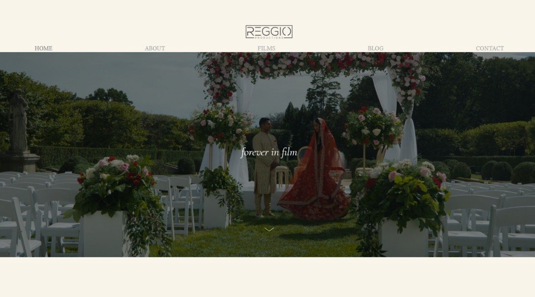
Joe Reggio’s website jumps straight into motion—literally. The moment it loads, you’re pulled into a reel of fast-paced visuals that make one thing clear: this is a storyteller who works in frames, rhythm, and feeling. Based in New York, Joe is a director and editor who brings cinematic flair to commercial, branded, and music content.
The homepage layout is bold and modern, featuring full-screen video and sharp typography that set a high-energy tone. There’s no fluff—just a quick, immersive showcase of what he does best: crafting visuals that move, both emotionally and physically.
His portfolio is cleanly organized and easy to explore, covering a range of styles from raw and edgy to sleek and stylized. Each project speaks to a strong directorial eye and an instinct for pacing.
The “About” page offers a brief, grounded introduction. Joe keeps it concise but personal—enough to make you feel like you’re not just hiring a director, but collaborating with someone who gets it.
Overall, the site mirrors Joe’s work—fast, clean, and creative without trying too hard. It’s built for clients who want results that hit hard and look good doing it.
Conclusion
If you’ve made it this far, you probably have a few ideas brewing. Maybe it’s a new homepage layout. Maybe it’s the quiet confidence in someone else’s “About” page. Or maybe—just maybe—it’s the realization that your site doesn’t have to be perfect. It just has to be honest, clear, and a little bit you.
The best portfolio sites aren’t trying to be loud. They’re just well thought out, with personality in the right places. I hope these 18 examples gave you some solid direction (and maybe even made you smile once or twice).
Now? Your turn.
Build something that tells your story—no fluff, no fuss.
Absolutely! Here’s a full breakdown of the correct headings, a strong SEO-friendly title, and a meta description tailored for your blog “Portfolio Website Sample: 18 Real Examples for Inspiration”, optimized for clarity, keyword balance, and user intent:


