When I started collecting examples of standout marketing websites, I didn’t want a gallery of pretty pages with clever slogans. I wanted sites that work. Pages that guide users, speak clearly, and convert without confusion. The kind of websites that make you say, “Ah, so that’s how it’s done.”
So, I pulled together 20 real marketing websites that know how to do their job—and do it well. Some lean into bold branding. Others keep it clean and data-driven. A few manage to pull off both, which honestly deserves applause (or at least a bookmark).
Here’s what you’ll find in this list:
- Homepage layouts that drive attention to the right places
- Clear messaging that doesn’t sound like a buzzword soup
- Conversion paths that feel more helpful than pushy
- Use of visuals, spacing, and typography that support—not distract
- Ideas you can borrow, adapt, and actually use
1. CHI Overhead Doors
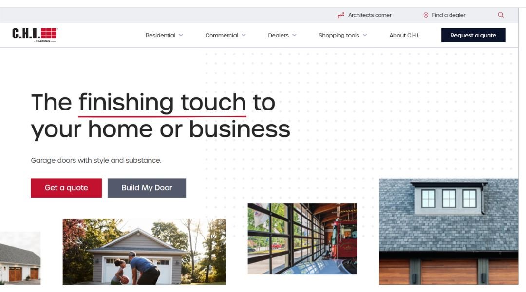
The C.H.I. Overhead Doors website knows its audience. Right from the homepage, you’re met with clean visuals, clear calls to action, and just enough product detail to keep both contractors and homeowners interested. It’s not trying to win design awards—it’s trying to get you to the right garage door, fast.
What’s smart is how the site balances form and function. Need to find a dealer? That’s front and center. Want to explore door styles? There’s a visualizer tool that lets you try before you buy (without hauling anything around). The product pages are neatly arranged with specs, options, and finishes—all practical, no fluff.
And while garage doors might not be the flashiest topic, the site doesn’t try to overcompensate. Instead, it keeps things straightforward and helpful. Even the branding feels solid—reliable, professional, and quietly confident.
In short, C.H.I. delivers a website that works like their doors: smooth, strong, and built to get the job done without the drama.
2. Partful
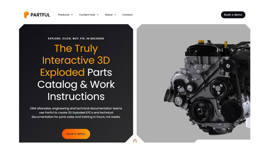
Partful’s website is a sharp blend of tech precision and real-world problem solving. Built for manufacturers and teams managing complex products, it focuses on turning traditional manuals and exploded diagrams into interactive 3D experiences. It’s clear from the start: this isn’t just about parts—it’s about making them easier to understand, order, and work with.
The layout is clean and modern. Navigation is quick, with smart use of visuals to explain a highly technical product without making visitors feel like they’re stuck in an engineering textbook. The explainer videos do heavy lifting here, showing how interactive 3D diagrams can replace outdated PDFs—and maybe a few headaches.
One thing that works especially well? It talks to both engineers and business decision-makers. It avoids buzzwords and sticks to real benefits—fewer errors, faster training, and better customer experience.
In a space where many websites feel dry or overloaded, Partful keeps things approachable. It takes something complex and makes it feel clear, useful, and even kind of cool. A rare win for both tech teams and the folks footing the bill.
3. Wavenet
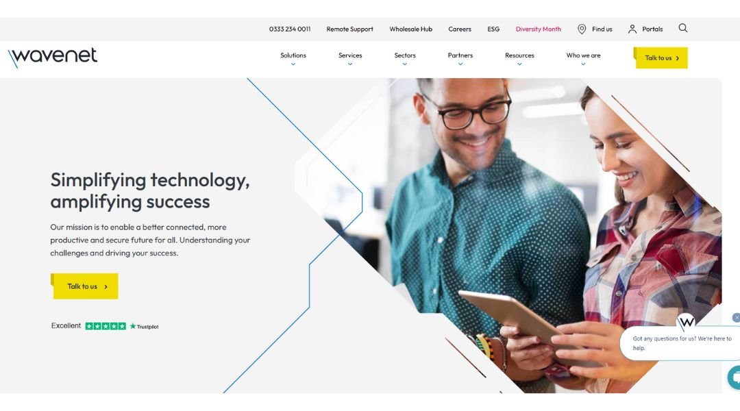
Wavenet’s website speaks directly to businesses that need reliable connectivity, communication, and cybersecurity—without a sales pitch that sounds like it was written by a robot. The layout is sleek and modern, but it’s the content that stands out: straight answers, clear benefits, and zero jargon overload.
From cloud telephony to managed networks, Wavenet lays out its offerings in a way that feels organized and approachable. The homepage guides you by industry and service, which is helpful when you’re short on time (or patience). And if you’re the type who actually likes digging into details, their resource center is refreshingly helpful—not just a dumping ground of buzzwords.
What’s also nice? The site doesn’t try to wow you with flash. It focuses on function, trust, and solutions that actually solve something. The tone is calm but confident—like a service provider who’s been through the messy tech stuff and knows how to keep things running smoothly.
Wavenet manages to feel both technical and human, which is no small feat. It’s the kind of site that says, “We’ve got this,” without needing to shout it.
4. BioStrata
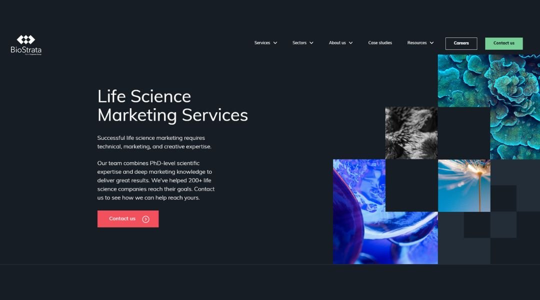
Biostratamarketing.com speaks directly to life science companies—and it doesn’t waste time doing it. The site is clear about its focus: helping scientific brands grow through specialized marketing that actually understands the science behind the product.
Right from the homepage, it’s obvious who this is for. No vague messaging or fluffy buzzwords. Instead, it’s straight talk about lead generation, content strategy, and branding—all wrapped in a deep understanding of biotech, pharma, and diagnostics.
The structure is smart and easy to navigate. Services are broken down clearly, case studies are easy to find, and the tone stays professional but never stiff. The visuals are clean, and the copy balances technical accuracy with accessible language—ideal for scientists who need results but don’t want to read a novel about it.
What really stands out is credibility. You can tell this isn’t a generalist agency trying to fake its way through industry terms. Biostratamarketing.com delivers clarity, focus, and a confident tone that reflects years of niche expertise. If you’re in life sciences and tired of explaining your field to marketers, this site will feel like a breath of fresh air.
5. C2a Card
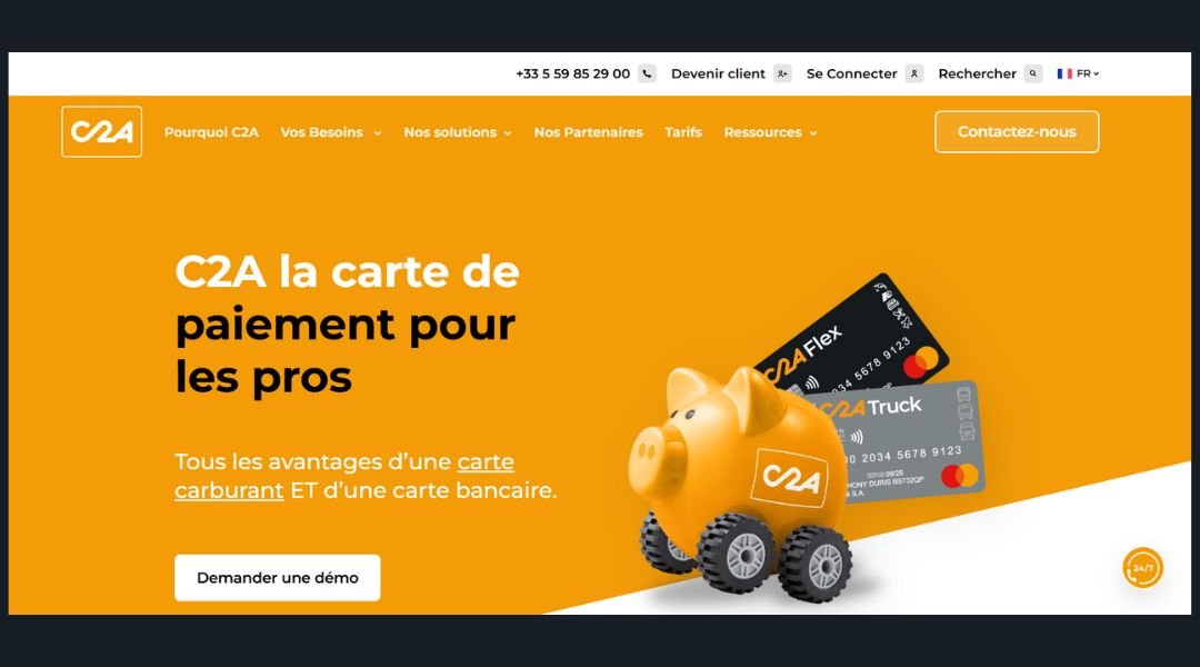
C2A Card offers a refreshingly straightforward solution in the often-confusing world of business travel and expense management. The website gets straight to the point: one card, multiple services, and a simpler way to manage corporate spending—especially for transport and logistics companies.
What stands out is the no-nonsense layout. You’re not overwhelmed with features on the homepage. Instead, C2A walks you through what matters—how the card works, who it’s for, and why it’s more practical than juggling multiple accounts or outdated paper trails. It’s clean, efficient, and doesn’t waste time (just like the product).
The platform clearly caters to fleet managers, drivers, and finance teams alike. The language is accessible, and the visuals make it easy to understand how fuel payments, tolls, and expenses are streamlined into one system. There’s even a focus on European compliance and real-time monitoring, which adds peace of mind for companies on the move.
C2A’s site reflects the product itself: organized, functional, and ready to solve everyday problems. It’s not trying to impress with flash—it’s built to help businesses stay in control and keep moving.
6. Arbor Day Carbon Foundation
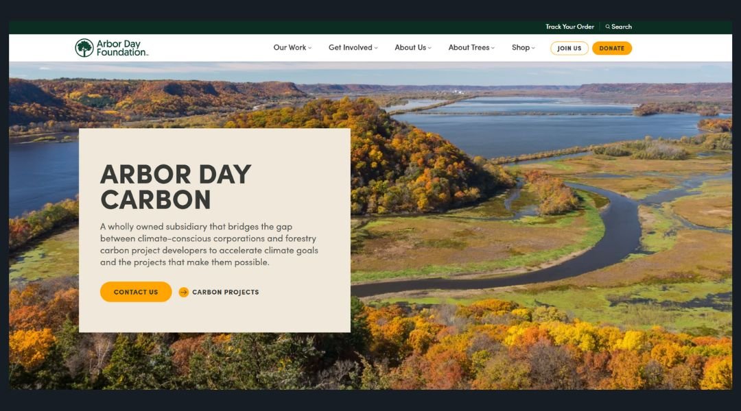
The Arbor Day Carbon Program website gets straight to the point—planting trees isn’t just good for the planet; it’s a smart, trackable way to reduce carbon. The site is built for businesses and individuals who want their climate actions to actually mean something, and it delivers that message without overcomplicating things.
From the homepage, the value is clear: measurable impact, verified reforestation, and transparent results. There’s no guilt-tripping or greenwashing here—just straightforward options to support reforestation projects across the U.S. with real data behind every tree.
Navigation is clean, the content is well-organized, and the design strikes a balance between mission-driven and professional. Whether you’re a sustainability lead at a company or just someone curious about carbon offsets, it’s easy to find what you need without digging through jargon.
The interactive project maps and clear metrics add trust, and the tone feels empowering, not preachy. It’s all about action—practical, meaningful steps you can take right now.
In short, the Arbor Day Carbon site shows how technology, trees, and transparency can actually work together. No fluff, just growth—in more ways than one.
7. Atlantech Voice Fiber and Data
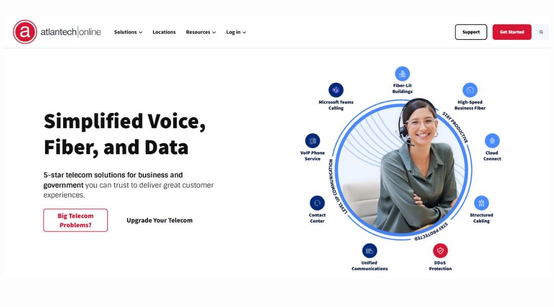
Atlantech Online’s website gets straight to the point—fast, reliable internet and communication services for businesses that can’t afford downtime. From cloud voice to high-speed fiber, everything is laid out with clarity, which is refreshing in a space that often feels overcomplicated.
The homepage speaks to its target audience: IT managers, business owners, and anyone tired of playing phone tag with outdated providers. Navigation is simple, and service pages are structured to highlight benefits first—like uptime, local support, and scalability—without burying you in jargon.
What really stands out? The local focus. Atlantech isn’t trying to be everything to everyone. Instead, it leans into being a dependable, D.C.-area provider with a strong presence and real people behind the service.
There’s no flash or fluff—just practical content that builds trust. Whether you’re looking to upgrade office bandwidth or future-proof your phone system, Atlantech’s site gives you the information you need without wasting your time. It’s thoughtful, efficient, and clearly built by a team that values both performance and people.
8. Care New England
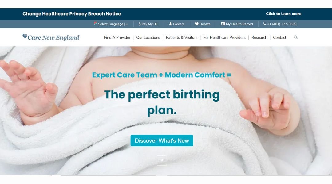
The Care New England website delivers exactly what you’d hope from a healthcare system—clarity, trust, and a calm user experience. Whether you’re looking for a doctor, scheduling an appointment, or exploring services, the site is designed to guide you without confusion or stress (something healthcare could use more of).
Right away, the homepage highlights key actions: finding care, accessing patient portals, and checking health services. The layout is straightforward, with clean navigation and helpful search tools that don’t bury users in medical jargon. It feels like a site built for real people, not just professionals in lab coats.
The site also does a good job of showing the human side of healthcare. Patient stories, community updates, and clear explanations of specialties help visitors feel supported—not just processed.
Care New England’s digital presence mirrors the values you’d want from any provider: reliable, compassionate, and easy to work with. In an industry known for red tape and confusing forms, their site keeps things simple. And that simplicity? It’s a welcome relief.
9. Deel For Global Teams
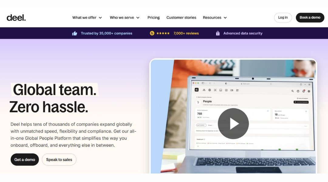
Deel’s website wastes no time getting to the point—it’s all about making global hiring easier. Whether you’re bringing on a contractor in Brazil or a full-time employee in Germany, Deel gives companies the tools to do it legally, quickly, and without drowning in paperwork.
The design is sleek and clean, with a confident tone that says, “We’ve done this before.” Key features are highlighted without being overwhelming: compliant contracts, automated payments, local tax support. Even if you’re not an HR expert, the site makes it clear what you’ll get and why it matters.
What stands out is the balance between professionalism and clarity. The language is straightforward. No heavy jargon, no filler. Just answers to real hiring challenges—and a smooth path to get started.
It also earns trust fast. Logos from big-name clients, compliance badges, and helpful guides are placed just right. Deel knows its audience: busy teams that want to hire globally without taking on global stress.
If you’re scaling across borders and want fewer headaches along the way, Deel feels like a partner that gets the job done—without the usual HR red tape.
10. Eclipseoa An Eclipse Advantage Company
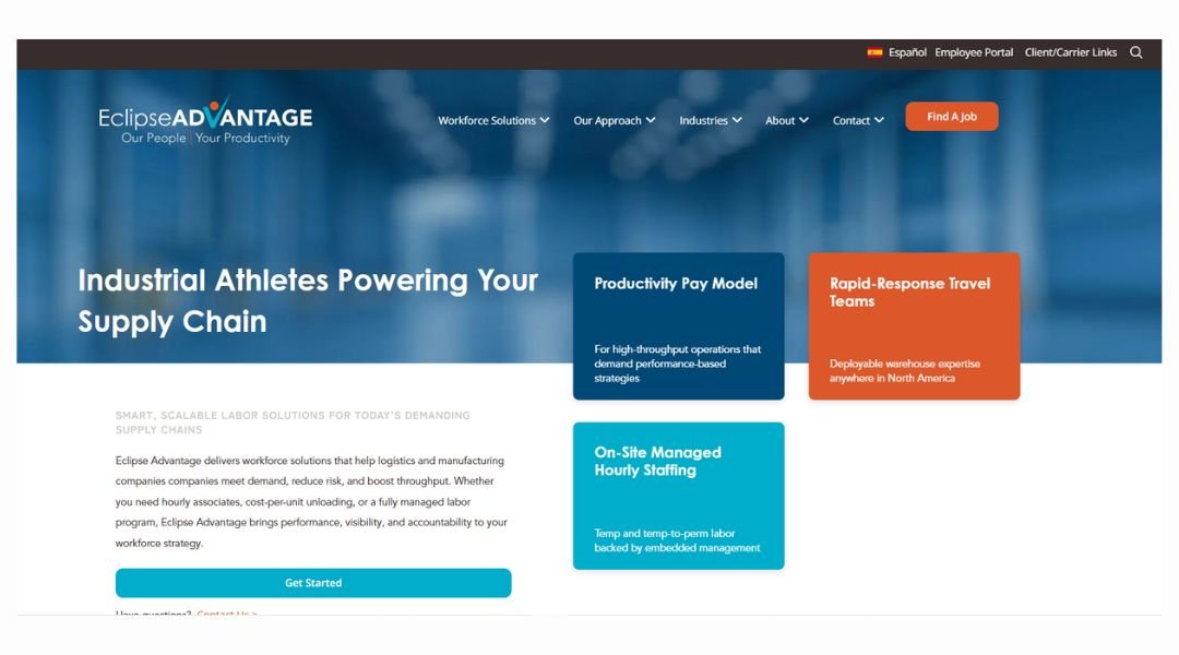
Eclipse IA’s website delivers exactly what you’d expect from a logistics workforce partner—clarity, structure, and a strong focus on results. From the first scroll, it’s obvious they’re not here to impress with fluff. They’re here to get things moving—literally and operationally.
The layout is direct and professional. Each section explains what Eclipse does, who they help, and how they add value to supply chain operations. Whether it’s managed services, freight handling, or labor optimization, the content speaks to logistics managers who want efficiency and accountability—not endless buzzwords.
What stands out is the emphasis on people. Eclipse makes it clear that while logistics is about systems, success comes from the workforce behind it. They highlight recruiting, training, and performance with confidence, showing they’re hands-on, not just high-level.
And the site experience? Smooth, no clutter, and easy to navigate—even if you’re browsing on your phone between loading docks.
If you’re in distribution, retail, or transportation and need a partner who values precision and people equally, Eclipse IA makes its case clearly—on screen and in action.
11. Design Fathom HQ
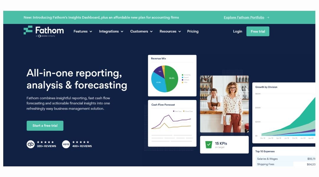
Fathom takes financial reporting and turns it into something far more digestible—maybe even enjoyable (yes, really). Built for accountants, CFOs, and business owners, the site positions itself as a smarter way to track performance, measure growth, and make better decisions—without drowning in spreadsheets.
The website is clean, modern, and focused. Right away, you’re met with bold statements, short demos, and real product visuals—not vague promises or endless buzzwords. It gets to the point fast: connect your data, get insights, and actually understand what’s happening in your business.
What stands out is how the platform speaks clearly to professionals. There’s no need to decode jargon. Fathom explains complex tools—like KPI tracking, benchmarking, and forecasting—in a way that feels practical and doable.
The design supports the product: it’s structured, confident, and just flexible enough to guide you without overwhelming you. Even the color palette leans into clarity over flash.
In short, Fathom knows its audience. It’s built for people who want data that makes sense—and a platform that doesn’t overcomplicate the process. It’s like having a numbers nerd in your corner, minus the stress.
12. FIT Foundation IT

Landingi’s website speaks directly to marketers, entrepreneurs, and businesses looking to launch landing pages—without waiting on a developer. It’s fast, focused, and does a great job of showing what the product actually does. No fluff, just tools built to help you build.
Right from the homepage, the message is clear: you can create, test, and optimize landing pages all in one place. The platform highlights ease of use, offering a drag-and-drop editor and pre-built templates that actually look modern. Whether you’re running ads or collecting leads, everything feels geared toward speed and simplicity.
The site also includes use cases, feature breakdowns, and customer stories—all laid out in a way that’s easy to skim. You won’t get lost in jargon, which is a relief for anyone just trying to hit “publish” on a campaign.
Landingi doesn’t try to be everything—it stays focused on what it does best. If you’re tired of complicated tools that make launching a page feel like building a spaceship, this one’s refreshingly down-to-earth.
13. Fitting Box
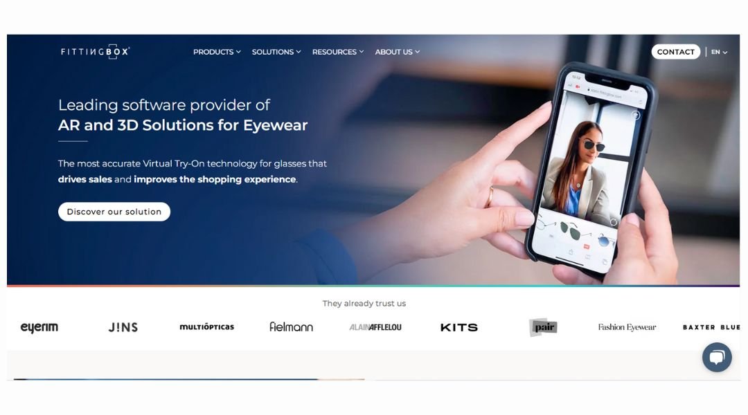
FittingBox brings eyewear into the future—no measuring tape or guesswork required. Their website introduces a powerful virtual try-on technology that helps users see how glasses actually look on their face, in real time. It’s built for both eyewear brands and retailers, but the interface keeps things surprisingly light and user-friendly.
What stands out is how quickly the site explains a complex product. In just a few clicks, you understand what FittingBox does, who it’s for, and how it fits into the optical industry. The visuals do most of the talking, with clean layouts and interactive demos that make the tech feel tangible—even if you’re not the technical type.
It’s clear the platform is designed with both user experience and sales in mind. By letting customers “try before they buy,” it reduces returns and boosts confidence—without anyone having to leave home (or sanitize frames).
FittingBox isn’t flashy, but it’s smart. The site does what good digital tools should: it solves a real problem, makes it look easy, and makes you wonder why everyone isn’t using it already.
14. Fyzical Therapy and Balance Centers
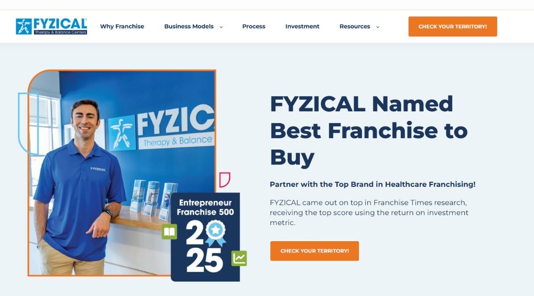
The FYZICAL Franchise website is built for professionals who want more than just a business—they want to make a real impact. From the first scroll, it’s clear this isn’t just about owning a clinic. It’s about joining a movement focused on health, independence, and quality care.
The site does a solid job of walking you through what FYZICAL offers—both as a business opportunity and as a healthcare model. It balances business facts with purpose-driven messaging. Whether you’re a physical therapist looking to expand or an entrepreneur new to the space, the content feels welcoming and informative.
Navigation is straightforward, and the layout keeps things focused. You’ll find franchise benefits, support details, and startup requirements without needing a map. Video testimonials and real clinic success stories give it an extra layer of credibility.
What stands out most is the clarity. FYZICAL doesn’t drown you in jargon or fluff. Instead, it keeps the focus on real growth potential and a system built for people who want to lead with purpose—while building something sustainable. It’s a franchise pitch with heart and business sense.
15. Harvest Time Tracking
Harvest keeps time tracking simple—and that’s the point. From freelancers to full teams, the website clearly lays out how tracking time can lead to better planning, smarter billing, and fewer “where did the day go?” moments. It doesn’t overcomplicate things. The message is direct: track time, get paid, stay on top of your projects.
The site’s design is clean and focused, with a calm color palette and copy that gets straight to the benefit. You’re not digging through fluff to find out what Harvest does. Features like invoicing, reporting, and integrations are explained clearly, with quick visuals that show the product in action.
One clever detail? The tone stays friendly, not robotic. It feels like it’s written by someone who’s actually worked under a deadline (and maybe missed a few too). The “Try it free” button is never far away—just enough push without being pushy.
For anyone who bills by the hour or manages a team’s time, Harvest makes a strong case. It turns a necessary task into something efficient—and maybe even satisfying.
16. Hive Strategy
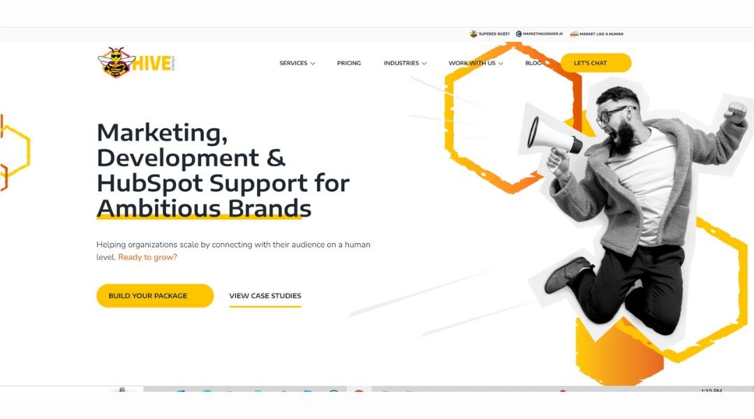
HIVE Strategy’s website makes one thing clear—they’re not your average digital marketing agency. From the bold visuals to the crisp messaging, it’s designed to speak directly to businesses looking for real growth, not just fluff-filled reports.
The layout is clean, with a sharp mix of professionalism and personality. They highlight their specialties—HubSpot solutions, inbound marketing, and web design—without drowning visitors in jargon. What stands out is how they explain services in plain language, with a focus on outcomes rather than buzzwords.
One clever touch? The site introduces team members and company culture right alongside service offerings. It builds trust fast. You’re not just hiring a vendor—you’re teaming up with real people who seem to genuinely care (and maybe have a solid coffee habit).
HIVE also does a good job showcasing client results, which adds credibility without overselling. Everything from navigation to contact forms feels purposeful and friction-free.
If you’re looking for an agency that brings strategy and execution together—with a bit of personality—HIVE’s site sets the tone right from the first scroll. It’s confident, focused, and knows exactly who it’s speaking to.
17. Just Eat For Business
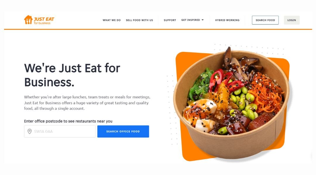
Just Eat for Business takes the hassle out of workplace meals by connecting companies with local restaurants and caterers—all through a platform that’s easy to use and even easier to like. Whether it’s a team lunch, client meeting, or late-night project fuel, the site helps businesses feed their teams without relying on stale sandwiches or guesswork.
The homepage is straightforward, with clear benefits laid out: flexible ordering, group coordination, and food choices that go way beyond the usual suspects. You can tell it’s built for busy professionals—people who don’t want to scroll endlessly or make five calls to place one order.
What really stands out? The focus on flexibility. Whether your team is in-office, remote, or hybrid, Just Eat for Business offers solutions that fit. And yes, there are perks—like simplified billing, employee allowances, and a whole lot of cuisines to choose from.
In short, it’s food for work made smarter. No chaos, no cold pizza—just one less thing for office managers and team leads to worry about. Which, let’s be honest, is kind of a big deal.
18. Pet Wants Franchise
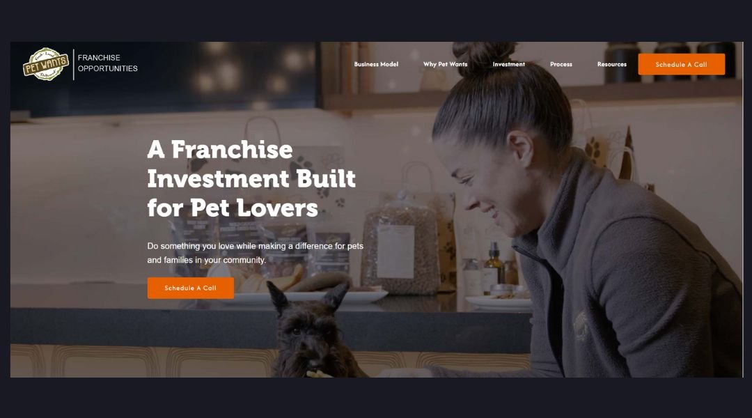
The Pet Wants Franchise website speaks directly to aspiring business owners who love pets and want to build something meaningful. Right from the start, it sets a warm, energetic tone—less corporate pitch, more “here’s your chance to do work you care about.”
The layout is clean, with key info broken into bite-sized sections. Curious about startup costs? Market potential? How the franchise works? It’s all there—no digging required. Even better, the tone stays friendly without talking down to the reader. You feel like you’re having a real conversation, not reading a brochure.
What really stands out is how the site balances passion and practicality. It highlights both the emotional reward (helping pets live healthier lives) and the business opportunity (recurring revenue, community support). You’ll also find testimonials, a day-in-the-life breakdown, and an FAQ section that actually answers real questions.
Pet Wants doesn’t just pitch a franchise—it presents a lifestyle shift with purpose. Whether you’re a seasoned entrepreneur or just starting out, this site makes the idea of running a pet nutrition business feel accessible, fulfilling, and yes—even fun.
19. Piktochart
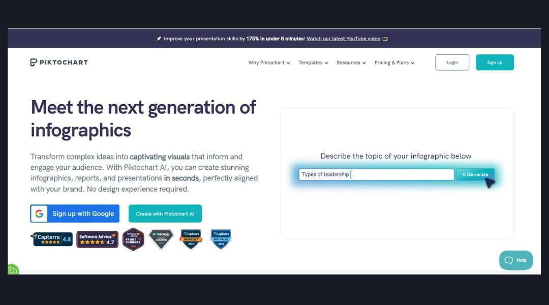
Piktochart makes visual storytelling feel less like a design project and more like a creative shortcut—with polished results. From infographics to pitch decks, it gives non-designers the power to create professional visuals without battling complicated software (or begging the design team for help).
The website itself reflects that mission: clean layout, bold typography, and clear examples of what users can create. Whether you’re building a report, a resume, or a social media graphic, Piktochart makes it easy to get started with templates that are more “wow” than “meh.”
One standout feature is how the platform focuses on communication, not just decoration. The tools are built to help people share data, ideas, and messages clearly—whether you’re in marketing, HR, or education.
Navigation is smooth, and feature breakdowns are written in plain language. You don’t need to speak “designer” to figure out how it works.
In short, Piktochart is like a helpful friend who makes your presentations look better than you imagined—without the need for a design degree or three hours of YouTube tutorials.
20. Schools Magoosh
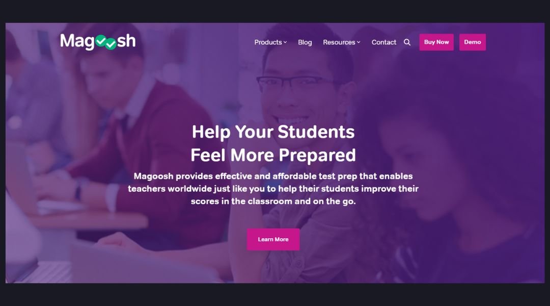
Magoosh for Schools takes the stress out of test prep—for educators and students alike. Built with schools in mind, the platform offers digital tools that make it easier to support learning, track progress, and actually boost scores. Whether it’s SAT, ACT, GRE, or beyond, Magoosh delivers prep that fits into busy school schedules without adding more work for teachers.
The website is clear and purposeful. Right away, it explains what schools get: engaging video lessons, practice questions, and simple dashboards for monitoring student performance. No confusing menus, no buried info—just the essentials, presented well.
One standout? The tone. It’s friendly and supportive, not overly academic or dry. It feels like a partner, not a platform. There’s even a helpful FAQ section that answers the big questions before you have to ask.
Overall, Magoosh for Schools makes the case that quality test prep doesn’t need to be complicated or costly. It’s built for classrooms that want real results—and a smoother way to get there.
Conclusion
After going through these 20 marketing websites, one thing became obvious: design matters, but clarity wins. A good marketing site doesn’t just look good—it guides, informs, and builds trust fast. If it makes people pause and say, “This brand gets me,” it’s doing its job.
My advice? Focus on clear goals, clean structure, and a voice that feels human. Oh, and a few subtle CTA buttons never hurt.

