I’ve seen a lot of ecommerce websites. Some are slick and stunning. Others—well, they try. The truth is, building a site that sells and feels right isn’t easy. That’s why I put together this collection of 20 real ecommerce websites that actually work. No theory. Just practical design in action.
Each example has something to teach—whether it’s layout, flow, or the way they make “add to cart” feel oddly satisfying. I’ve handpicked these with professionals in mind—folks who care about the look and the business end of things.
Here’s what you’ll find:
- Clean designs that make browsing feel natural
- Creative product presentation (without the fluff)
- Smart, user-focused features that actually help conversions
- A few surprises that made me stop and go, “Okay, that’s clever”
No jargon. No recycled advice. Just honest examples from brands doing ecommerce right.
1. Vivi et Margot
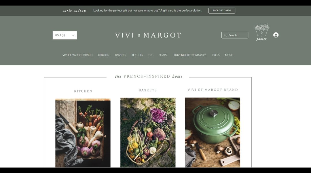
Step into Viviet Margot, and you’re stepping into a home, not a showroom. This Hamptons-based brand isn’t shouting for attention—it’s whispering calm, timeless taste. The About page is more than a bio; it reads like a quiet conversation with someone who knows what they love and why they do it. That kind of clarity is rare.
The homepage greets visitors with sunlight streaming through rustic French doors and just enough imperfection to feel real. There’s elegance here, but not the kind that asks you to take your shoes off. Think layered, lived-in, and honest.
The site’s layout follows its ethos: clear, thoughtful, and warm. Product pages focus on story just as much as style. And while everything is curated, nothing feels stiff. Even the photography invites you to breathe out.
Is it retail? Yes. But it also feels like you’re browsing a friend’s house—one with excellent taste and probably really good coffee.
2. Izzy Wheels
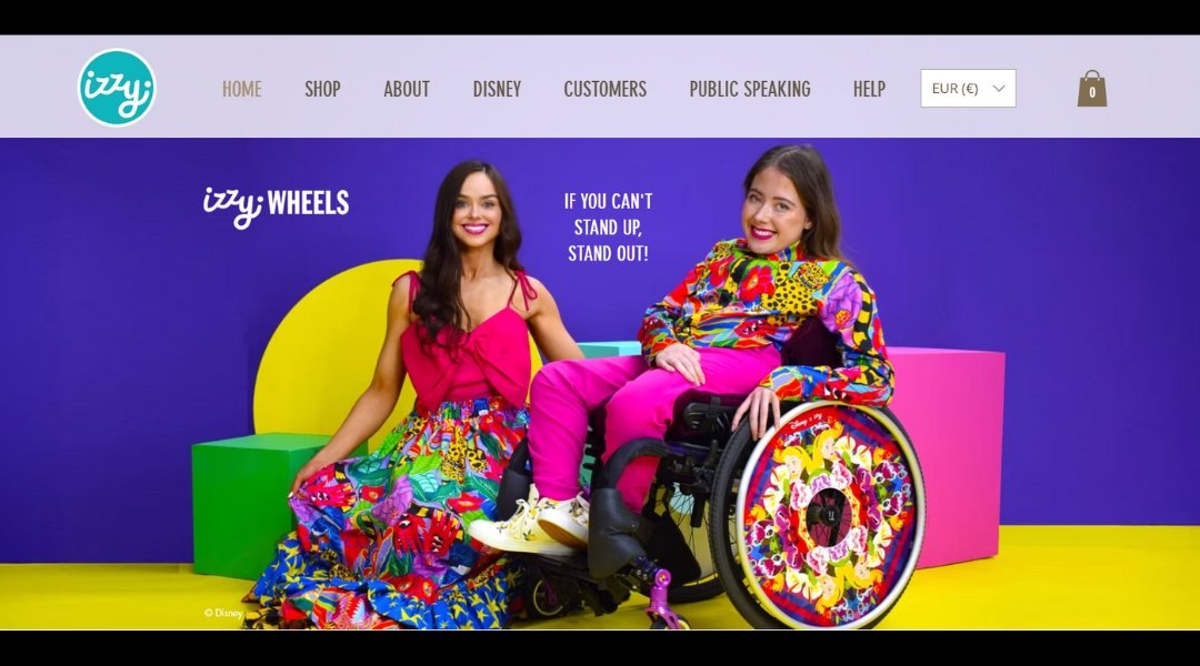
Izzy Wheels proves that mobility aids don’t have to blend in—they can stand out, turn heads, and spark joy. Right from the homepage, it’s clear: this isn’t just a brand, it’s a celebration. With bright colors, bold patterns, and a message that’s anything but muted, the site instantly radiates personality.
The About section offers more than backstory. It’s a glimpse into two sisters turning a personal experience into global creativity. You’re not just learning who they are—you’re seeing what drives them (pun fully intended).
Each product page is packed with designs that don’t take themselves too seriously, even though the message behind them absolutely matters. There’s real heart here, mixed with clever branding and a serious sense of style.
From collabs with major designers to empowering taglines like “If you can’t stand up, stand out,” the brand doesn’t tiptoe—it rolls forward with flair. The site is easy to explore, but it never feels basic.
It’s not just about wheels. It’s about choice, voice, and a splash of fabulous along the way.
3. Gay’s The Word
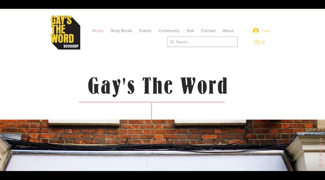
There’s a reason this bookstore feels different the moment you land on the homepage. Gay’s The Word isn’t just a shop—it’s a slice of history still being written. Nestled in London since 1979, it’s one of those places that doesn’t have to try too hard. The mission is clear, and the shelves say as much.
The site captures the charm of the physical space without losing its edge. It’s clean, straightforward, and refreshingly human. No clutter, just books—and plenty of heart. You’ll find everything from LGBTQ+ fiction and memoirs to thought-provoking essays that stay with you long after you’ve closed the tab.
The About page reads more like a quiet tribute than a pitch. And the events section? It’s proof that a bookstore can still feel like a meeting place. There’s a gentle pulse running through the whole experience—welcoming, defiant, and proud.
If bookstores had personalities, this one would be the friend who hands you a novel, raises an eyebrow, and says, “Trust me.”
4. The Spice Suite
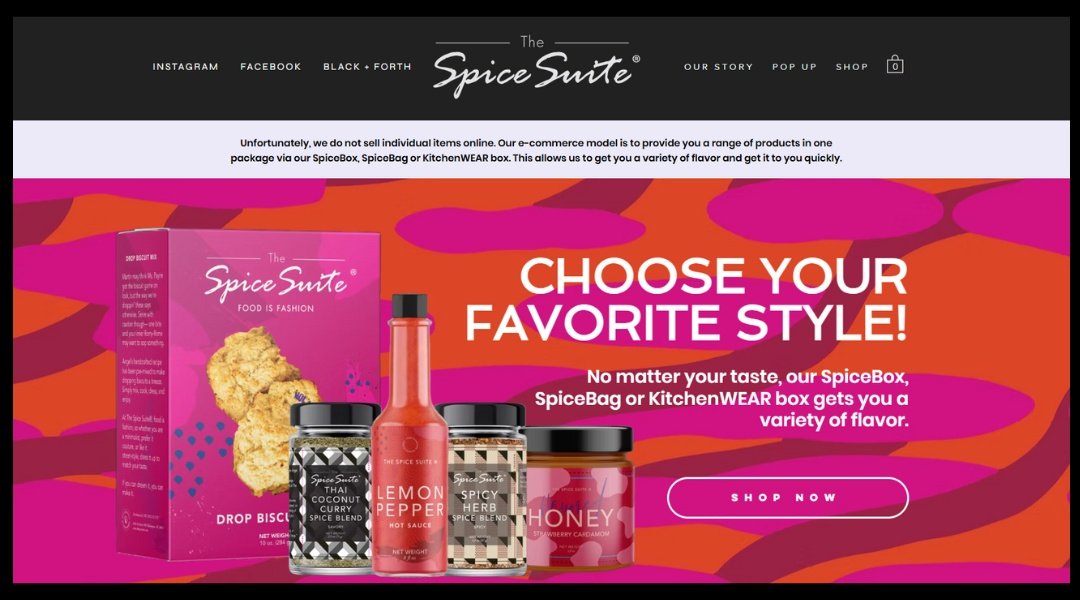
Walking into The Spice Suite—digitally or otherwise—feels more like entering a vibe than a shop. Founded by Angel, a self-proclaimed “spice girl” with chef energy and boutique flair, this DC-based space is as much about flavor as it is about freedom.
The About page doesn’t just list achievements—it tells a story. A teacher turned culinary curator? That’s not your everyday pivot. But nothing here is ordinary. The brand’s personality spills into every scroll, with bold fonts, rich visuals, and products that practically tell you to try something new (and maybe spicy).
This isn’t just a store. It’s a movement—one that blends community, culture, and cinnamon in the same breath. The Shop page? It’s a mix of bold blends and seasoning combos that sound like music.
Even the site’s imperfections (a little scroll quirk here, a slightly offbeat layout there) feel intentional. It’s raw, real, and impossible to forget.
And no, you don’t have to cook like a pro. Just bring curiosity—and maybe an apron.
5. T. Patterson Surfboards
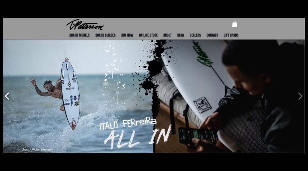
This isn’t just a surfboard site—it’s a ride through decades of wave-making history. T. Patterson Surfboards, straight out of San Clemente, captures the energy of the ocean without overexplaining it. The About page? Short, sharp, and rooted in legacy. You’re not reading a resume—you’re catching the story behind the shape.
Right off the bat, the homepage pulls you in with boards that don’t just look fast—they feel fast. There’s grit in the design, but it’s paired with precision. Each model gets its own space to breathe, complete with specs for those who speak fluent foam and rail.
You won’t find flashy gimmicks here—just clean layout, bold imagery, and that unmistakable west coast confidence. And the team section doesn’t boast. It nods. These are shapers and surfers who let their work talk first.
Whether you’re hunting your next high-performance shortboard or just admiring the craft, this site makes one thing clear: surfing isn’t a product here. It’s the point.
6. Evolve Clothing Gallery
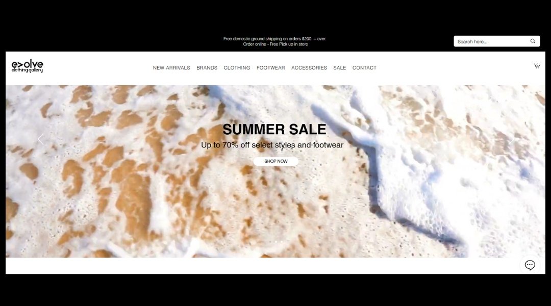
Evolve Clothing Gallery isn’t just a retail space—it’s a mood. Based in New Jersey, this shop feels more like an underground studio than a store. Walk in (or scroll through), and you’re hit with confidence. Not flashy, not forced—just cool that doesn’t try too hard.
The homepage leads with strong visuals and bold energy. Collections are presented like statements, not suggestions. You’re not just buying clothes here; you’re buying attitude. The layout? Clean and direct. No filler, no confusion—just strong pieces and a clear sense of purpose.
Their About page gives you just enough to know where they’re coming from. You get a sense of the hustle, the pride, and the street-smart edge that defines their vibe. It’s fashion, yes, but with a point of view.
Even the product shots feel intentional. Models don’t pose—they own the space. And every brand they carry? Carefully chosen, but not in a “we try too hard” way.
This is for people who want their clothes to speak before they do—and probably already do.
7. Papier Patate
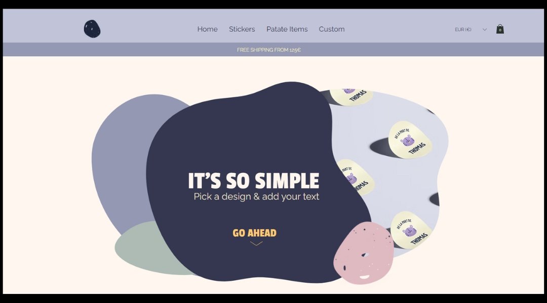
Papier Patate doesn’t take itself too seriously—and that’s what makes it brilliant. Based in Montreal, this playful creative studio offers stationery that’s equal parts charming and cheeky. From the moment you land on the homepage, you’re met with doodles, bold color, and the quiet confidence of designers who know that “fun” doesn’t mean “unprofessional.”
The About page? Delightfully human. It tells a story of two illustrators who turned their inside jokes into a full-blown brand. It’s not polished to perfection—and that’s kind of the point.
The shop feels like a treasure hunt. Greeting cards, prints, and pins come packed with personality. You’ll find a cat with attitude, a dancing hot dog, and phrases that make you smile before you even hit “Add to Cart.”
This isn’t design for the sake of aesthetics. It’s joy, printed and packed. And while the look is lighthearted, the craft behind it is serious. Every product feels considered, without feeling calculated.
Papier Patate proves that good design doesn’t need to wear a tie. Sometimes, it just needs googly eyes and a sharp wit.
8. Adamapple
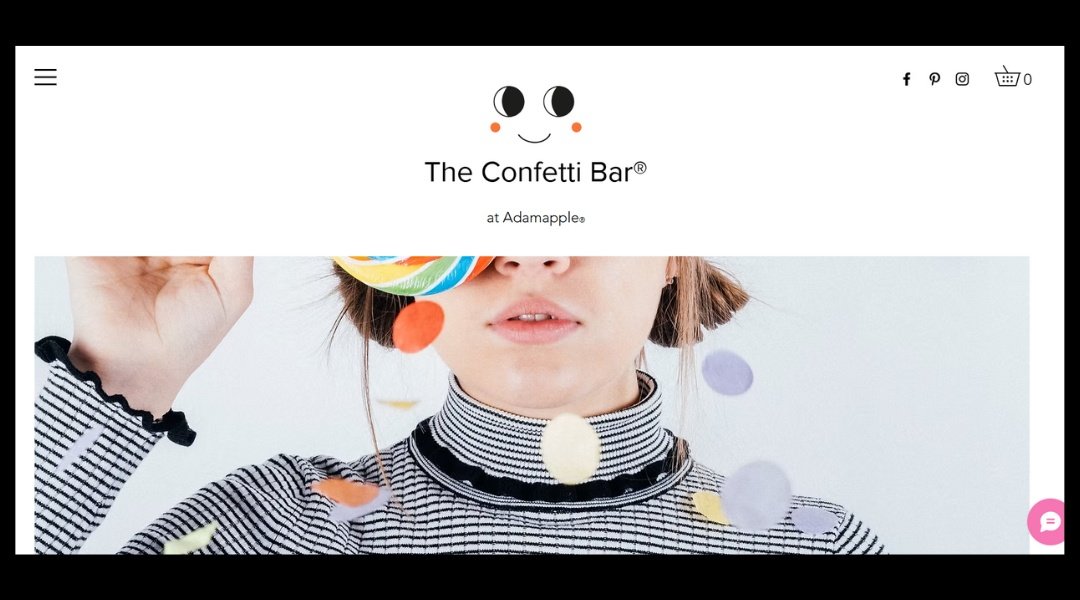
Adam Apple isn’t just a wedding shop—it’s a reminder that small details can have a big personality. Based in the UK, this family-run business blends charm with just the right amount of sparkle (and we’re not just talking glitter).
Click through the site and you’ll notice something: it’s refreshingly straightforward. No clutter, no chasing trends. Instead, the focus is on thoughtful touches—from ribbon-tied signage to keepsake table plans—all made with heart and a hint of humor.
The About page doesn’t feel like a corporate pitch. It feels personal. Like you’re talking to the team over tea while picking out favors for your big day. The copy is warm, friendly, and skips the fluff. And yes, there’s even a chicken named Doris in the mix—because why not?
The design supports the vibe: light, easy to browse, and focused on celebration. Whether you’re planning a full wedding or just need one perfect sign, it’s all here—without the stress.
In a sea of overly styled wedding sites, Adam Apple feels like a breath of fresh, confetti-scented air.
9. Lauren Simpson Art
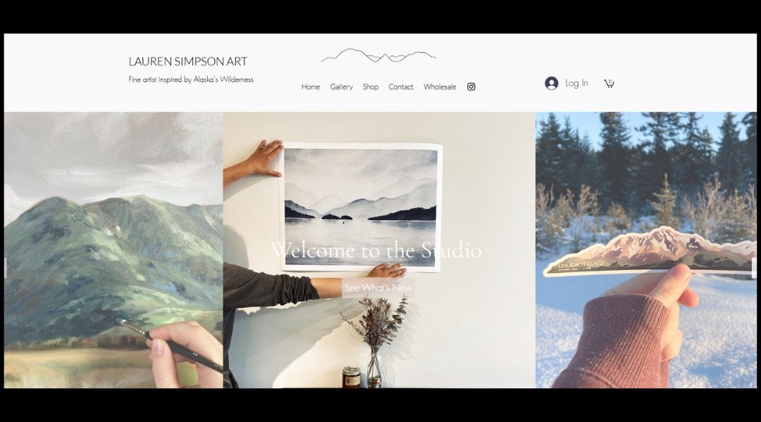
Lauren Simpson’s site doesn’t need fanfare—it draws you in quietly, like a well-placed brushstroke. Based in Oakland, her work balances softness with structure. And her website? It does the same.
The landing page keeps things simple. No clutter. Just art, front and center, letting color and texture do the talking. Click into the portfolio, and you’ll find a rhythm—shapes, layers, and an almost meditative feel. It’s the kind of browsing experience where you stop scrolling and start staring.
Her About page avoids the usual “art school-to-studio” script. Instead, it offers a quick, personal note that feels human. Not too polished. Just right.
Every image is crisp, but never cold. You’re invited to look closely—without being told how to feel. It’s a subtle confidence, the kind that doesn’t explain itself.
This is a site made for pausing. For wandering a little. And maybe for remembering what it feels like to really look at something.
10. Boho Birdy
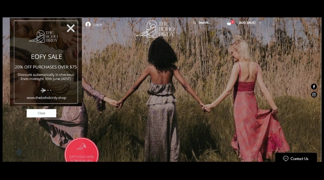
The Boho Birdy doesn’t just sell jewelry—it sells a mood. Right from the landing page, there’s a sense that this shop was made for the carefree, the sun-chasers, the ones who believe accessories should tell stories, not shout slogans.
This isn’t your typical online boutique. The site’s earthy tones and airy layout reflect the brand’s personality: relaxed but purposeful. And while the pieces are small, the vibe is anything but. Rings, necklaces, and bracelets sit against natural textures, making it feel more like a personal collection than a product lineup.
The About section keeps it light but meaningful—just enough backstory to feel a connection, without veering into autobiography. You get the sense there’s a real person behind the brand, one who probably owns a few too many linen shirts and knows their way around a farmers market.
Overall, it’s not just about what you buy—it’s about how it makes you feel. A little playful, a little earthy, and 100% intentional.
11. Beck & Cap
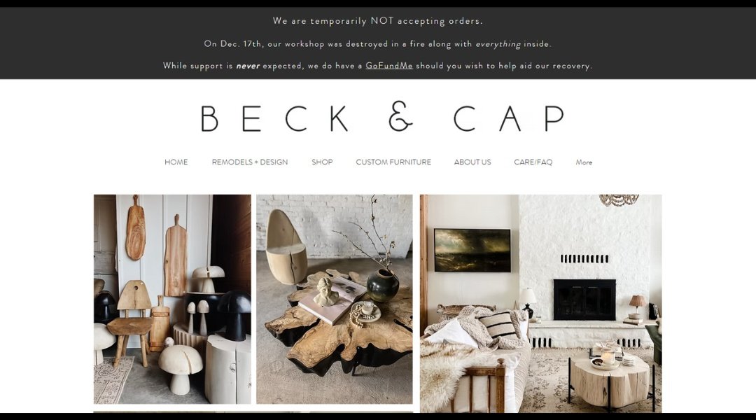
Beck & Cap doesn’t just furnish spaces—they set a tone. This Philadelphia-based studio brings depth to interiors without ever over-explaining. Their About page skips the jargon and gets to the point: they care about materials, relationships, and making things that last.
Visitors are welcomed by a homepage that’s deliberate but unfussy. Projects are shown in soft light and natural tones, where texture does most of the talking. There’s no pushy sales pitch—just strong visual storytelling and a quiet confidence in the work.
What’s refreshing is the balance. Their pieces feel bold but not loud, grounded but not heavy. You can sense the hand of the maker without losing the elegance of the design. Even the photography reflects that intention—crisp, warm, and with space to breathe.
And the name? Beck & Cap. No mystery. Just two people building thoughtfully, one piece at a time.
It’s not trying to be everything. It’s trying to be right. That’s enough.
12. Hydrascape
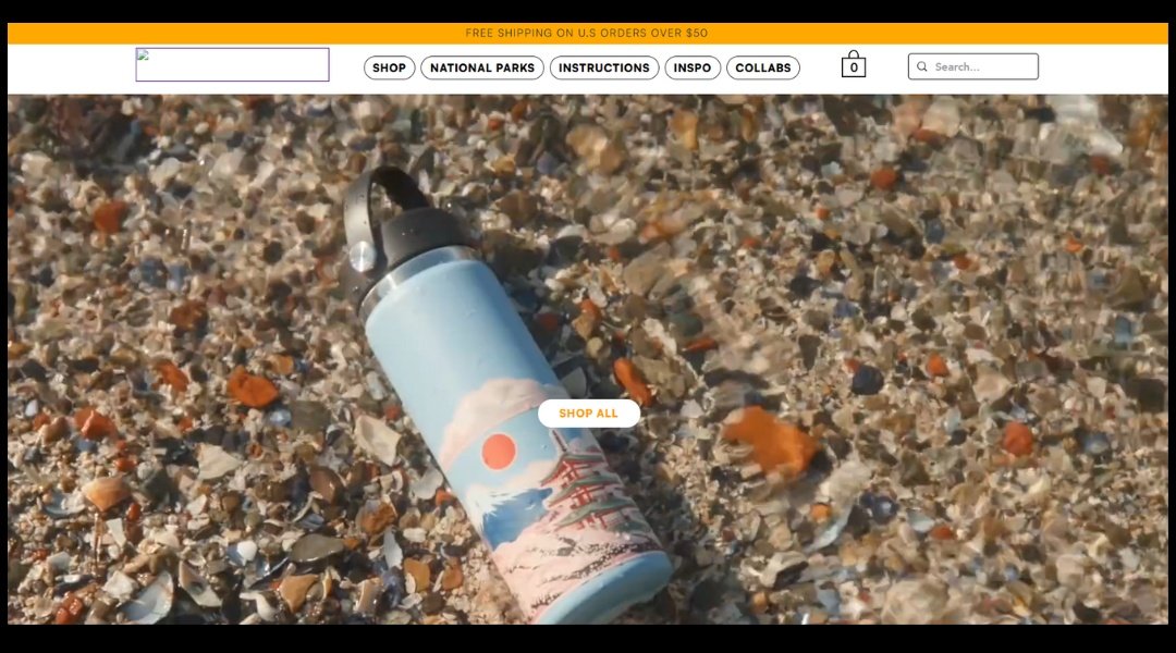
Hydrascape Stickers isn’t just selling decals—it’s framing the wild. Built for the outdoors, their landscape-inspired designs stretch across water bottles, gear, and even laptops with the kind of quiet drama you’d expect from a view at 10,000 feet.
The site feels clean and direct, just like the product. No fluff. You land on sweeping visuals and are quickly drawn into winding rivers, peaks, and desert trails—all wrapped up in their signature infinity loop format. It’s a clever idea, but more than that, it’s well-executed.
What stands out is how each sticker isn’t just a product—it’s a place. Each design includes a bit of backstory, a personal touch that adds meaning to the art. It’s not trying to do everything—just one thing, done really well.
Whether you’re mid-expedition or just dreaming about one from your kitchen table, these stickers feel like a nod to the places that stay with you. And let’s be honest—they look cooler than your old park pass.
13. Handlebend
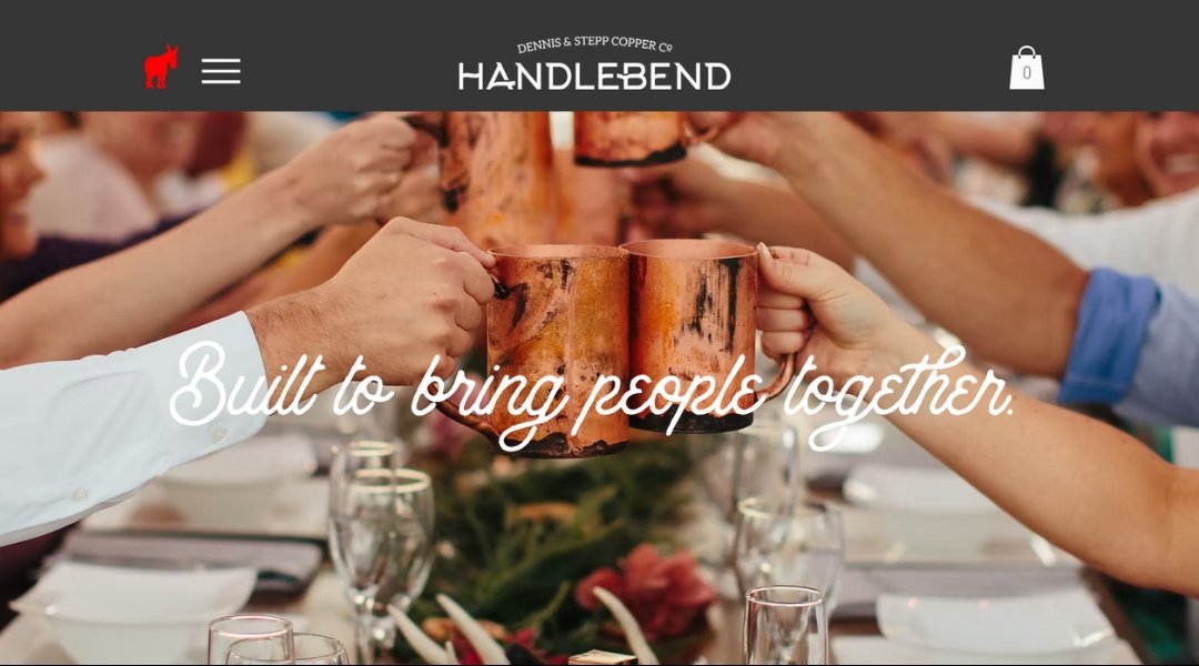
Handlebend doesn’t just sell copper mugs—they sell stories you can hold in your hand. Based in Nebraska, these guys could’ve gone the mass-production route. Instead, they stuck with hand tools, a small shop, and a shared belief that drinks taste better from something made with intention.
Right away, the site feels personal. The About page reads like a fireside chat, not a corporate memo. There’s dirt under their fingernails and pride in their work—and somehow, that shows up in the copy too. You’re not just learning about the product; you’re meeting the people behind the torch.
Product pages are clean, direct, and refreshingly human. No filler. Just solid craftsmanship and the occasional nod to local flavor. And don’t miss the event space—because of course they turned their shop into a gathering place. Why wouldn’t they?
This isn’t polished for the sake of pretty. It’s polished because that’s how copper shines best—after some effort, a little fire, and a good story.
14. Oak & Willow
Oak & Willow doesn’t just sell decor—it sells a feeling. The kind you get when the house is quiet, the light is golden, and the world slows down for a second. Based in Australia, this store is a soft nod to cozy minimalism, where every item seems to say, “You’re home.”
The site’s layout is clean without being cold. Categories are simple, the fonts are gentle, and nothing feels like it’s trying too hard. Even the product descriptions feel like a friend giving you honest advice—not a sales pitch.
What stands out? Texture. From linen throws to hand-woven baskets, this shop leans into natural materials and tones that feel like a deep exhale. No clutter. No chaos. Just calm.
One of the loveliest details? You’re not just shown what to buy—you’re shown how to live with it. Every room featured feels warm, lived-in, and achievable.
Oak & Willow may be a store, but it behaves more like a sanctuary. The kind that lets your space breathe—and lets you do the same.
15. Fieldstone
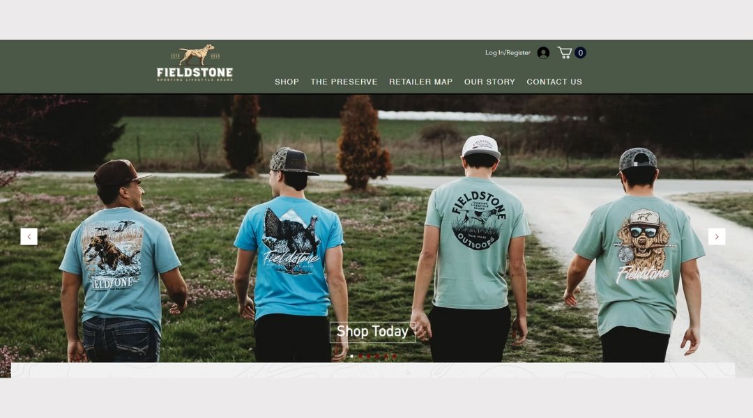
Fieldstone Outdoors doesn’t just sell outdoor gear—they live it. The moment you land on the homepage, it’s clear: this is for folks who take their time outside seriously, but not too seriously. You’ll find fishing rods, hunting tools, and apparel that’s built to be used—not just admired.
The About page reads like a chat at a local bait shop. No jargon. Just good people who know their stuff and want you to enjoy the outdoors as much as they do. There’s a sense of pride here—not flashy, just earned.
Products are well-organized, but the site doesn’t lose its character to clean lines. There’s a warmth that comes through in the branding—part small-town charm, part backwoods grit.
What stands out? The balance. Tough gear, friendly voice. You’ll get expert-level equipment without the gatekeeping. Even if you’re more “weekend hike” than “backcountry survival,” you’ll feel welcome.
Because here, outdoors is for everyone—with a little mud on your boots, and maybe a story or two to tell after.
16. Home & Patio Gallery
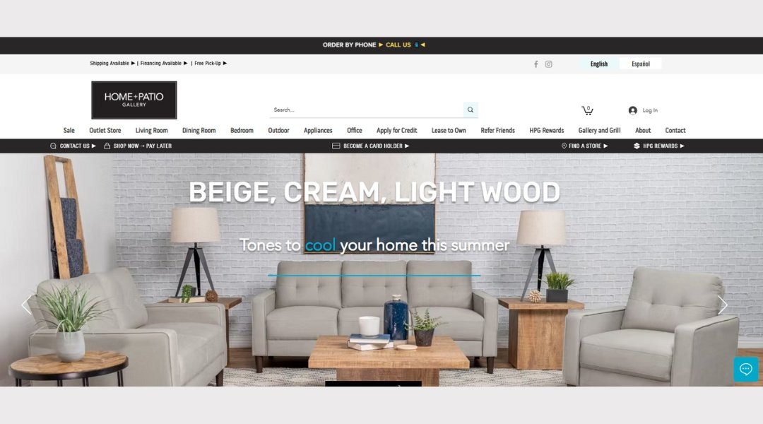
HPG Store isn’t just selling furniture—it’s curating comfort. Right away, the homepage sets the tone: bold, modern, but approachable. There’s no clutter, no loud distractions—just well-made pieces presented with quiet confidence.
Scroll a little, and you’ll notice the details. Each product page is clean and focused, with imagery that feels intentional. There’s no over-the-top styling here. Just good design, doing its job. Even the descriptions are short and to the point—like a designer who’s confident in their work and doesn’t need to explain too much.
What stands out most is how easy the site feels to use. From categories to checkout, it flows without friction. It’s not trying to impress with bells and whistles—it’s letting the products speak.
And they do speak. In wood grains. In upholstery tones. In that sleek, “yes, I’d like that in my living room” kind of way.
This is furniture for people who know what they like—and know where to find it.
17. Furry Necks
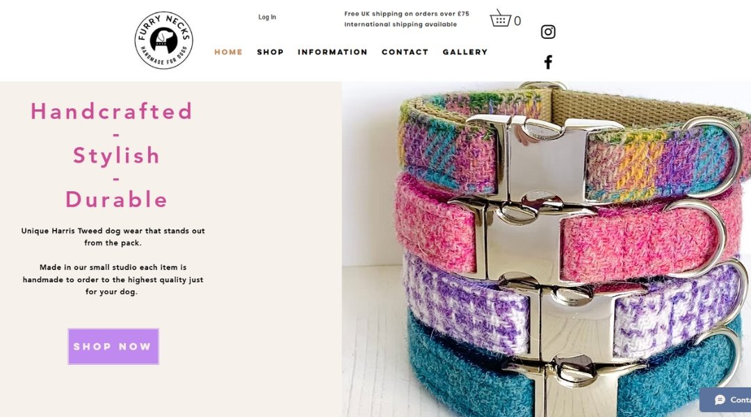
Furry Necks doesn’t sell accessories. It sells statements—fluffy, bold, unapologetically glamorous ones. From the moment you land on the homepage, you’re greeted with a confident wink (and probably a plume of faux fur).
This UK-based brand knows exactly who it’s talking to: those who like their winters warm and their style louder than a whisper. But behind the fluff? There’s serious craft. The site’s About section tells that story, not with fanfare, but with honesty. It’s clear someone here cares about quality—and having a little fun.
Product pages keep things simple: big images, clean design, and just enough detail to help you pick the piece that says, “Yes, I do own the pavement.” Even the color names flirt a little.
What makes it work? The site doesn’t try too hard. It’s stylish without being snooty, playful without losing focus. And whether you’re after a bold pop of color or something quietly fierce, you’ll likely leave smiling. And slightly more fabulous.
18. Healthy Eating
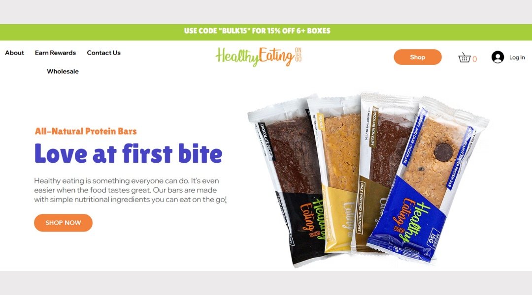
Some snack brands talk wellness. Healthy On-the-Go lives it—right down to the last cashew. From the first scroll, this site serves up more than convenient bites. It offers a lifestyle that’s practical, clean, and surprisingly fun.
The homepage leads with bold visuals—crisp ingredients, bright packaging, and just enough white space to breathe. You won’t get lost in endless scrolls or cluttered banners. Instead, it’s straight to the point: fuel that fits real life.
Dig into the product pages and you’ll find snack descriptions that skip the jargon. No lectures, no guilt-trips—just simple info about what you’re eating and why it matters. It’s healthy without being preachy.
What really stands out? The brand’s tone. It’s confident, not clinical. More friend-who-reads-labels than personal trainer. Even the blog feels like it was written on a lunch break—quick, helpful, and maybe a little hungry.
For anyone trying to snack smarter without overthinking it, this is the kind of straightforward, feel-good brand that sticks.
19. Sena Runa
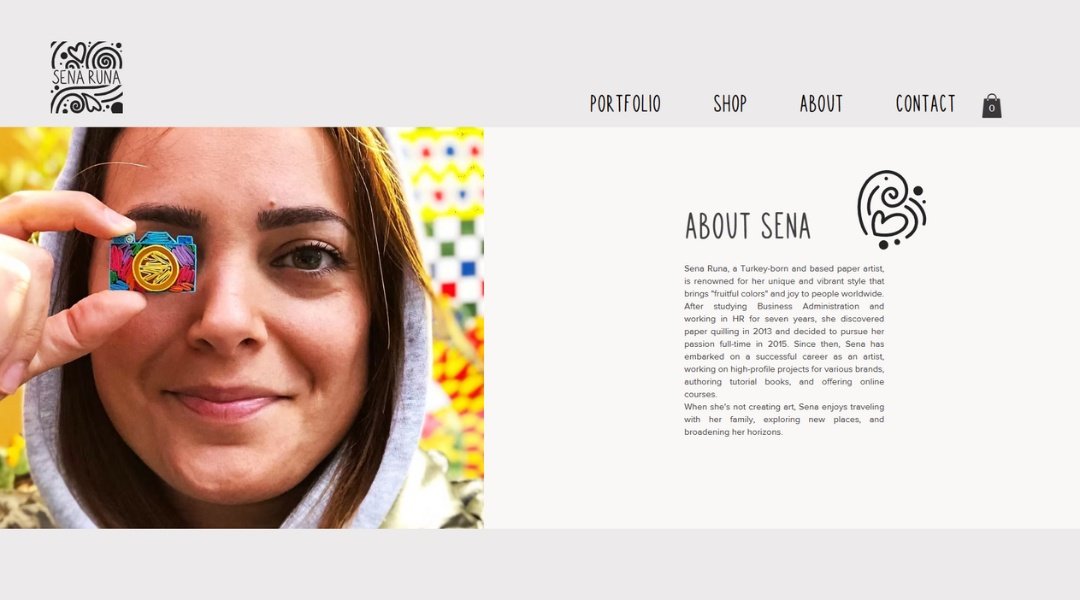
Sena Runa doesn’t just make paper art—it gives paper a second life. The moment you land on the site, you’re met with color, curves, and the kind of precision that somehow still feels playful.
Based in Turkey, this artist has turned quilling—a centuries-old craft—into something that feels entirely fresh. Her homepage is clean, with pops of vibrant artwork that draw your eye, but don’t compete for attention. Nothing is loud, yet everything stands out.
The product pages do what they need to—clear images, minimal fuss, and just enough detail to make you lean in. And then there’s the best part: watching paper turn into something emotional. A heart, a bird, a splash of color—it’s less about the medium, more about the mood.
The site itself mirrors the artwork: simple, elegant, and quietly confident. There’s no overexplaining, no gimmicks. Just one artist, her hands, and a whole lot of paper turned poetry.
Looking for something made with patience and purpose? You’re in the right place.
20. Brave Sunglasses
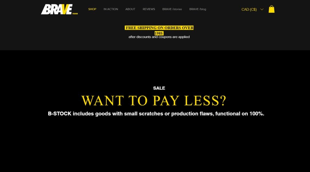
BStock doesn’t just offer images—it offers presence. Right away, you’ll notice this isn’t your average photo site. No staged coffee cups. No painfully cheerful stock models. Just raw, bold visuals that actually look like someone meant them.
Scroll through, and it’s clear the focus is on real people, real emotion, and real edge. These images aren’t trying to please everyone—and that’s the point. Whether you’re building a brand, telling a story, or just tired of the same old smiling group shots, BStock delivers something different.
The site is clean and easy to explore, with each collection carrying a distinct energy. No fluff, no filler. Just visuals that punch through the noise.
And while the tone is serious, there’s a spark of fun in how fearless it all feels. Even the name—BStock—feels like a quiet challenge: be bold, be better, be you.
For creatives who want their visuals to stand up and say something, this is the library you didn’t know you were waiting for.
Conclusion
If you’re anything like me, you learn best by seeing how others pull it off. These examples don’t pretend to be perfect—but that’s part of what makes them useful. Each one shows a different angle, a different approach, and maybe even a little inspiration for your next move.
Use them as reference. Borrow ideas. Just maybe don’t copy the homepage that plays auto-music. Nobody likes that.
At the end of the day, building a better store isn’t about guessing—it’s about seeing what works, then making it yours. And if these samples help spark your next big idea, then this list did its job.


