Let’s face it: phones have taken over. Whether you’re reading emails, shopping online, or planning your next vacation, mobile devices are the first choice for most of us. In fact, they’re no longer just an option—they’re the priority.
In this article, I’ll show you why designing with smaller screens in mind isn’t optional anymore. Here’s what you’ll learn:
- What mobile-first design really means.
- How this approach beats outdated methods.
- Key advantages for businesses and audiences.
- Practical steps to create a mobile-focused site.
- Common mistakes and how to avoid them.
Let’s get into it.
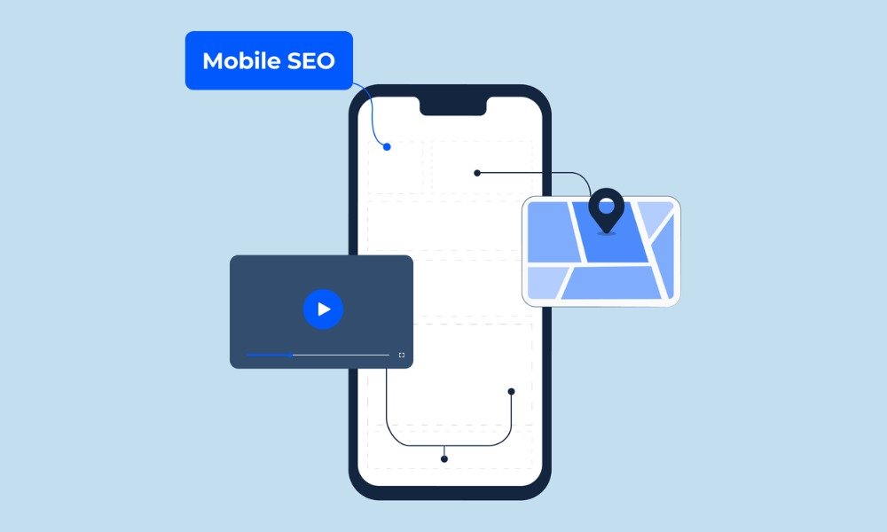
What Is Mobile-First Design?

Simply put, mobile-first design means creating for small screens before thinking about larger ones. You focus on essential features first, ensuring everything is user-friendly and easy to navigate. Once that’s done, you can enhance it for tablets or desktops.
Think of it like starting with a strong foundation when building a house. By prioritizing core elements, you end up with something solid that works everywhere.
Why Mobile-First Design Is Smarter
Back in the day, websites were designed for desktop screens first, and mobile users were an afterthought. That’s no longer practical. Here’s why focusing on smaller screens is the smarter move:
Phones Are Everyone’s Go-To Device
Most online traffic comes from smartphones. People are browsing, shopping, and even working on the go. Catering to this majority makes sense.
Search Engines Prefer Mobile-Friendly Sites
Platforms like Google now evaluate your site’s performance on smaller devices to decide how visible it will be. If your design isn’t optimized, your rankings will suffer.
Better Engagement
A mobile-first design makes navigating your site easier. Happy visitors are more likely to stick around, explore, and convert.
Benefits of Prioritizing Mobile Users
Designing for small screens first offers major perks for both businesses and audiences:
1. Streamlined Experience
When you build for phones, you naturally focus on what’s important. This keeps the layout clean, navigation simple, and pages easy to use.
2. Faster Loading Times
Mobile-first designs often reduce unnecessary elements, resulting in faster load speeds. And let’s be honest—nobody sticks around for a slow site.
3. Improved Search Visibility
Since search engines prioritize smaller-screen optimization, this approach gives your site an advantage without extra effort.
4. Accessibility Across Devices
A mobile-first strategy ensures your site works seamlessly on everything from smartphones to tablets. This means you reach more people, regardless of how they access your content.
5. Long-Term Relevance
Mobile technology is here to stay. By starting small, you’re prepared for the future while keeping up with current trends.
How to Implement a Mobile-First Approach
Switching to mobile-first might sound intimidating, but it’s easier than you think. Here’s how I recommend tackling it:
1. Focus on What Matters Most
Think about what your audience needs when accessing your site on a phone. For example:
- Restaurants: Show operating hours, locations, and menus.
- Online stores: Make products and checkout processes front and center.
2. Design for Touch
Big screens rely on clicks, but small ones depend on taps. Use touch-friendly buttons and intuitive menus that are easy to navigate.
3. Keep It Lightweight
Large images and complex code can slow everything down. Compress visuals, use clean scripts, and test your site’s performance on various devices. Need help? Check out How to Optimize Your Website for Speed and Performance.
4. Test Across Devices
Simulators are great, but nothing beats testing on real devices. Check how your site works on multiple brands and screen sizes to ensure it performs well everywhere.
5. Start Small, Scale Up
Focus on creating a solid experience for smaller screens first. Once that’s in place, add enhancements for larger screens to create a polished look on desktops.
Common Mistakes to Avoid
Even with the best intentions, it’s easy to fall into these traps:
1. Overloading Pages
Less is more. Don’t cram too much into small spaces—it overwhelms visitors. Focus on essential features instead.
2. Intrusive Pop-Ups
Pop-ups on a phone can quickly frustrate users. If you use them, keep them subtle and easy to close.
3. Ignoring Load Speed
A slow site will drive visitors away, no matter how good it looks. Make speed a top priority.
What’s Next for Mobile-First Development?
Mobile-first design isn’t just about fitting everything onto a smaller screen. It’s about creating an experience tailored to how people use their devices. As technology advances, integrating trends like voice search and AI-driven personalization will become essential.
Voice search, in particular, is gaining traction. A design that works well for spoken commands ensures your site remains user-friendly. Want to know more? Take a look at The Role of API Integration in Modern Web Development.
Mobile-first isn’t
a trend—it’s the new standard. Designing with smaller screens in mind isn’t just about keeping up with user expectations. It’s about future-proofing your website and business for a world where mobile is king.
If you’re ready to transform your site, check out Choosing the Perfect Web Development Partner for Your Business. You’ll find practical advice for building something that truly stands out.
So, what are you waiting for? Let’s make mobile-first the foundation of your digital strategy. Your users—and your search rankings—will thank you!

