Introduction
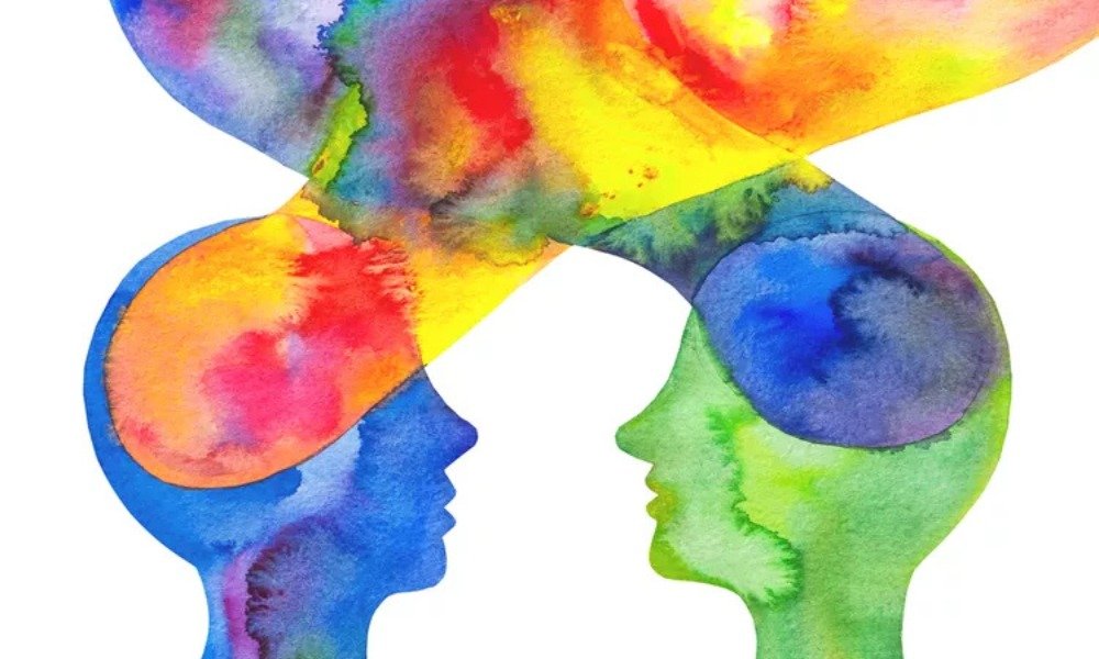
Every design choice in a company’s identity influences how people feel about it. The way a business presents itself—through color schemes, typography, and overall style—creates an immediate, subconscious impression.
I’ve worked with companies that focused only on visuals without considering the emotions they evoke. A sleek logo might look impressive, but does it inspire trust? Does it match the personality of the business? These elements matter more than most realize.
Understanding the psychology behind design choices ensures that every visual decision aligns with the desired perception. Let’s explore how colors, fonts, and overall composition shape consumer experiences.
What You’ll Learn:
- How different colors influence emotions and decision-making.
- The role of typography in shaping personality.
- Why perception is key to recognition and trust.
- Practical ways to apply psychology to a visual identity.
The Psychological Impact of Color Choices
Color is more than just decoration—it’s an emotional trigger. Studies show that people form opinions about a company within 50 milliseconds of seeing its visuals. The hues used in a design influence these judgments on a subconscious level.
How Different Shades Influence Consumer Behavior
Each color evokes distinct feelings. Here’s a look at how successful companies use them strategically:
🔴 Red – Energy, passion, urgency (e.g., Netflix, Coca-Cola)
🔵 Blue – Trust, stability, dependability (e.g., Facebook, IBM)
🟢 Green – Nature, health, sustainability (e.g., Whole Foods, Starbucks)
🟡 Yellow – Optimism, warmth, creativity (e.g., McDonald’s, IKEA)
⚫ Black – Elegance, luxury, authority (e.g., Chanel, Apple)
Since 90% of first impressions are based on visuals, choosing the right palette is crucial for building recognition.
Related Read: Learn more about choosing the right colors for a brand.
How to Choose the Right Colors for a Business
Match Colors to Personality
A finance company benefits from calming blues for reliability.
A creative agency might lean into bold yellows to showcase innovation.
Stick to a Limited Palette
The best identities use two to three primary hues for consistency.
Test Combinations for Effectiveness
Adjust contrast and saturation to enhance readability and impact.
When selected thoughtfully, colors create an emotional connection before a single word is read.
Typography and Its Role in Brand Perception
Typography does more than just display words—it communicates personality. The shape and weight of letters influence how people interpret a message.
Imagine The New York Times using a handwritten font. It wouldn’t carry the same authority, would it?
Serif vs. Sans-Serif: What’s the Difference?
Serif Fonts – Traditional, formal, authoritative (e.g., Times New Roman)
Sans-Serif Fonts – Modern, clean, approachable (e.g., Helvetica)
When to Use Script & Decorative Styles
Script – Elegant, artistic, high-end (e.g., Coca-Cola’s flowing letters)
Decorative – Bold, unconventional, playful (e.g., Disney’s stylized type)
Best Practices for Selecting Fonts
- Use no more than two typefaces for consistency.
- Prioritize readability—avoid overly stylized options for body text.
- Establish hierarchy—headlines should stand out from supporting text.
Related Read: Learn how typography impacts visual identity.
The Power of Perception in Branding
First impressions are lasting. A business may offer high-quality services, but if its identity doesn’t reflect that, people won’t believe it.
Why Consistency Builds Recognition
People feel more comfortable engaging with familiar visuals. When an identity is structured and consistent across platforms, it becomes memorable and reliable.
Take Apple, for example. Its clean, minimalist approach isn’t just stylish—it reflects innovation and simplicity.
Minimalist vs. Bold Design Styles
Minimalist – Clean, simple, professional (e.g., Apple)
High-Impact – Vibrant, energetic, attention-grabbing (e.g., Red Bull)
Each approach has its place, depending on the audience and industry. A tech startup benefits from a refined look, while a sports brand thrives on bold visuals.
Related Read: See why consistent branding builds trust.
Applying Psychology to a Branding Strategy
1. Align Visuals with the Audience
- Younger demographics respond well to dynamic and playful designs.
- Luxury markets require sophisticated, refined aesthetics.
- Sustainability-focused businesses thrive with natural, muted tones.
2. Use Emotion to Strengthen Identity
A successful brand should evoke emotions—trust, excitement, comfort, or exclusivity.
- Apple’s sleek design makes technology feel effortless.
- Red Bull’s high-contrast imagery builds a sense of adventure.
3. Maintain Consistency Across All Platforms
- Use the same colors, typography, and imagery on ads, websites, and packaging.
- Establish clear guidelines to keep branding uniform.
- Conduct A/B testing to refine visuals based on audience response.
Related Read: See why brand guidelines are essential.
Common Branding Mistakes to Avoid
Using Too Many Colors or Fonts – Creates confusion and weakens recognition.
Ignoring Psychological Triggers – Choosing design elements without considering audience perception.
Overcomplicating the Visuals – Simplicity often leads to stronger recognition.
An identity that lacks cohesion or clarity will struggle to gain trust.
Final Thoughts
Branding isn’t just about looking appealing—it’s about making an impact. Every color, font, and design choice triggers an emotional response. The most successful businesses understand these psychological factors and use them to create visuals that connect with customers on a deeper level.


