When I was searching for the right look and feel for a wedding website, I realized one thing fast: there’s no shortage of options—but finding one that actually feels like you? That takes some digging.
That’s why I pulled together this list.
Each website here stood out for one simple reason—they’re built with care, not clutter. Whether you’re planning something low-key or going all in on the details, these examples offer real ideas that work.
Here’s what you’ll find in this guide:
- Clean layouts that keep things guest-friendly
- Themes that match different vibes—classic, modern, or casual
- Smart features that make RSVPs, schedules, and info easy to manage
- Real examples that show what works (and why)
- Designs that feel personal—without being complicated
If you’re ready to build a wedding website that looks great and actually helps your guests, you’re in the right place.
1. Weddings By Lisa Nicole
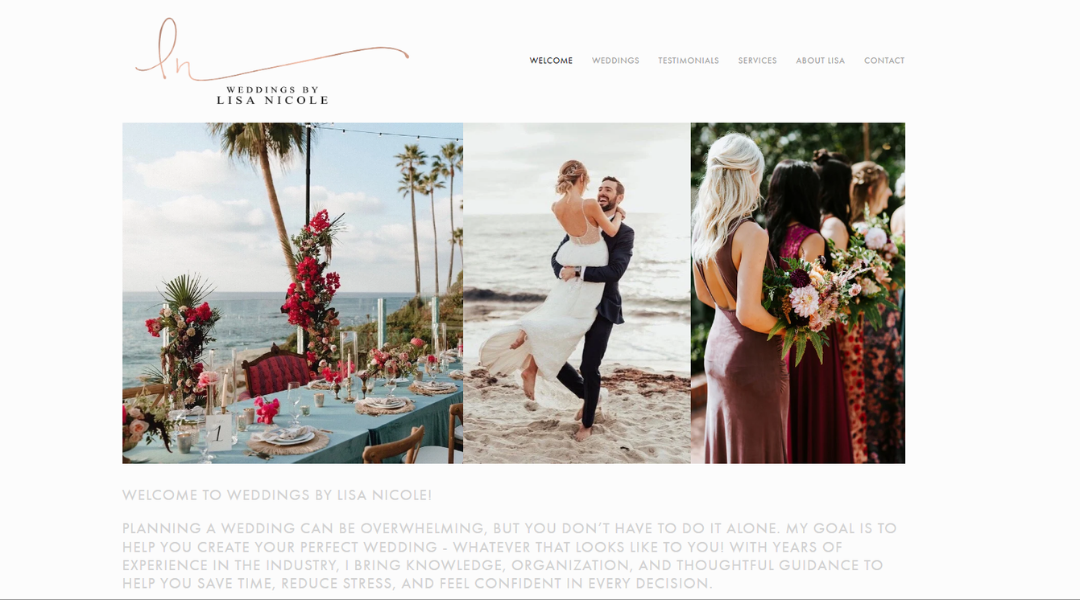
Weddings by Lisa Nicole feels like what every couple hopes for on their big day—organized, beautiful, and stress-free. The site opens with confidence. No overdone sparkle. Just clear visuals, calm messaging, and a strong sense of purpose.
Lisa doesn’t just offer planning. She offers direction. Her About page gives you more than a title—it shares her story, her approach, and why she’s so committed to creating events that feel personal and intentional. You’re not left guessing who’s behind the clipboard.
The site itself moves smoothly. Services are clearly listed, galleries are well-chosen, and there’s just enough detail to build trust without overwhelming anyone. It’s efficient, but still warm.
What really stands out? Lisa’s focus on her clients. Her work reflects them—not just her style. And that’s the real trick: designing weddings that look effortless without skipping a beat behind the scenes.
If you’re looking for a planner who leads with care and clarity, this site sets a pretty strong tone from the start.
2. Sarah & Stephen
Wix’s small business tools offer exactly what most business owners need—just enough power, without the pressure. The landing page keeps things clean and focused. No long explanations or tech talk. Just a clear path to getting your site off the ground.
From service-based startups to local shops, this platform gives you the essentials: customizable templates, built-in marketing tools, and the flexibility to scale at your pace. You don’t need a background in design or code. You just need a goal—and a few minutes to start.
What’s nice is how approachable it feels. Everything is framed for real-world use, not abstract features. You’re shown how the tools can help your business get found, look good, and stay organized.
The layout and copy are both to-the-point, and that’s a good thing. It respects your time and speaks in solutions, not sales pitches.
If you’re building a brand or just tired of holding off on your website, Wix for Small Business offers a smart way to finally start.
3. Alison Bryan
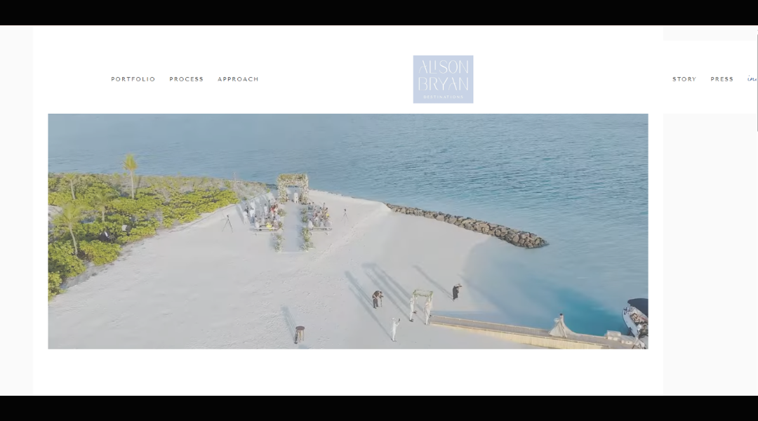
Alison & Bryan’s website sets the tone before a single click. It’s calm, refined, and fully focused. There’s no loud branding or cluttered pages—just thoughtful design and a clear respect for detail.
From the first scroll, you’re invited into a portfolio of work that doesn’t scream for attention—it holds it. Projects are presented like chapters. Each one feels distinct, yet carries the same quiet confidence in material, proportion, and flow.
The copy is minimal, but it doesn’t feel lacking. It gives just enough to understand the vision, while letting the images carry the weight. The design of the site itself mirrors the work: polished, understated, and deeply considered.
Alison & Bryan aren’t simply creating interiors. They’re building experiences. Spaces with restraint, emotion, and structure that feels lived in—not staged.
This is a studio that speaks through its work. And the site does a perfect job of stepping back and letting that voice be heard, clearly and confidently.
4. Bridal Bliss
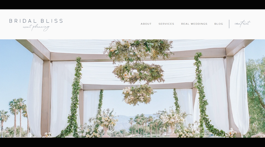
Bridal Bliss doesn’t just plan weddings—they manage every detail so couples don’t have to. The website reflects that same balance of polish and calm. Clean layout. Easy navigation. Clear messaging from the very first scroll.
You’re not overwhelmed with options—you’re guided. Whether it’s full planning, partial coordination, or something in between, services are clearly outlined with just the right amount of explanation. It’s built for busy couples who want results without the guesswork.
The tone is confident but kind. Testimonials and featured work offer proof, not promotion. Each gallery tells a story, showcasing celebrations that feel thoughtful and personal—not copy-pasted.
Bridal Bliss has offices in multiple cities, but the experience still feels personal. You’re not being handed off to a generic team. You’re connected with planners who listen, execute, and stay calm when things get noisy.
The site is clean, efficient, and just warm enough to make you feel like you’re in good hands. And honestly—that’s what great planning should feel like.
5. Engaged & Inspired
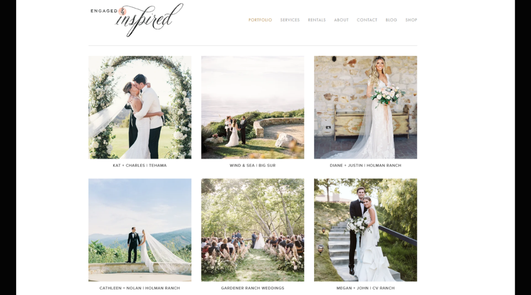
Engaged & Inspired feels like sitting down with a friend who’s been through it—and happens to have great taste. The site skips the overdone wedding talk and gets straight to what couples really need: ideas, direction, and a bit of calm in the planning chaos.
The layout is straightforward. No glitter overload, no pop-ups chasing you. Just clean sections that walk you through real wedding features, planning advice, and helpful resources. It’s easy to navigate and genuinely helpful—especially for couples looking for guidance without the pressure.
What stands out most is the voice. It’s grounded, clear, and focused on real experiences. This isn’t about chasing trends—it’s about finding what fits and making it work beautifully.
The inspiration here isn’t just visual—it’s practical. Budget tips, vendor insights, and honest planning breakdowns all live comfortably next to gorgeous galleries.
If you’re looking for a wedding resource that’s as smart as it is stylish, Engaged & Inspired delivers without trying too hard. It simply works—and that’s the real charm.
6. The Arroyos
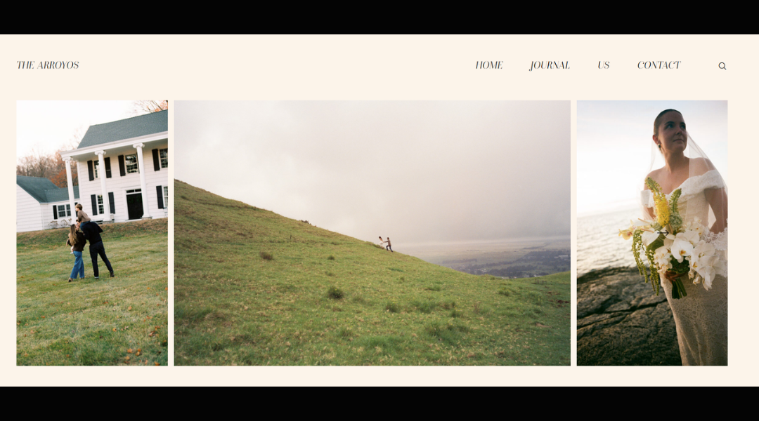
The Arroyos don’t just film weddings—they capture the quiet glances, the in-between laughter, the atmosphere you didn’t know could be preserved. Their website reflects that same sensitivity. Clean, understated, and deeply intentional.
The homepage is warm without trying to be too polished. You’re introduced to their approach quickly: heartfelt storytelling through honest, cinematic film. No overdone effects. No dramatic gimmicks. Just real moments, presented beautifully.
Navigation is simple and direct. Each section flows naturally, guiding you through their process, portfolio, and philosophy. You feel their calm presence throughout the experience—like they’ve thought through not just how to shoot a wedding, but how to make couples feel seen.
Their films don’t try to be trendy. They focus on meaning. And the site backs that up with visuals and copy that feel authentic and personal.
If you’re looking for wedding filmmakers who care more about the story than the spotlight, The Arroyos have built something that speaks quietly—and stays with you.
7. Piper & Muse
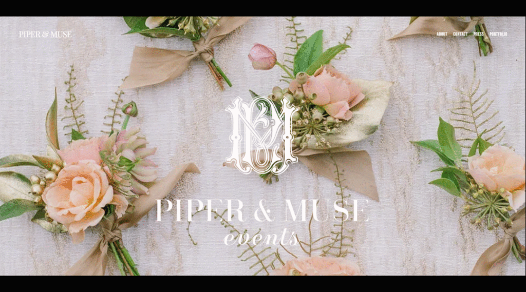
Piper & Muse approaches wedding planning with a sense of calm clarity—and their website reflects that from the start. It’s soft, focused, and free of unnecessary noise. Just a clear message: meaningful weddings start with thoughtful planning.
The design is clean and modern. Plenty of space, warm tones, and carefully chosen words guide the experience. You’re not being pitched—you’re being welcomed. Services are laid out with care, giving potential clients just enough to know what to expect without feeling overwhelmed.
What stands out most is the tone. It’s personal but never overdone. The writing feels like it comes from someone who truly listens first—and plans second. And the visuals? Real, emotional, and stylish without chasing trends.
Piper & Muse isn’t about planning the “perfect” wedding—it’s about helping couples create a celebration that actually feels like them. And the website does a beautiful job of showing that kind of quiet confidence.
If you’re drawn to intentional design and planning with heart, this one stands out for all the right reasons.
8. Jenna Brisson
Jenna Brisson’s website opens with heart. It doesn’t rush to impress—it invites you in with calm confidence and a clear sense of purpose. From the tone to the visuals, everything feels intentional and rooted in real relationships.
The layout is soft but structured. Images are front and center, framed by thoughtful copy that tells you exactly what she values: storytelling, trust, and capturing what actually matters. No hype, no buzzwords—just grounded, honest photography.
Jenna’s about page doesn’t just list credentials. It shares her approach, her personality, and what clients can expect beyond the lens. She doesn’t just shoot weddings—she documents people, moments, and quiet in-betweens that might otherwise be missed.
Galleries are easy to navigate, and each one feels like a complete narrative—natural, emotional, and full of life. The site reflects her work: clean, heartfelt, and built on connection.
If you’re looking for a photographer who leads with empathy and delivers with skill, Jenna’s site quietly proves she’s the real thing.
9. Ryan Flynn
Ryan Flynn’s website feels like a deep breath. No forced trends. No filler. Just calm, intentional design that lets the work take center stage.
The homepage opens with soft tones and strong imagery. It’s clear this isn’t just about beautiful photos—it’s about meaningful ones. Ryan’s style is both grounded and cinematic. His portraits feel lived-in, not posed. His landscapes breathe. Every gallery gives space for the moment to speak.
The copy is minimal, but it does its job well. It tells you what Ryan values: connection, storytelling, and a respect for the in-between. Whether you’re planning a mountain elopement or an intimate celebration, the message stays the same—this is about people, not just pictures.
The site flows effortlessly. It doesn’t try to impress with flash. Instead, it builds quiet trust through consistency, tone, and thoughtful pacing.
If you’re looking for a photographer who brings a calm presence and a sharp eye, Ryan Flynn’s work—and his site—say more than enough.
10. Weddings By Shannon
Weddings by Shannon doesn’t try to overdo it—and that’s exactly why it works. From the first glance, the site feels calm, welcoming, and focused. No overload of sparkle or pressure—just honest, thoughtful guidance for couples who want a celebration that feels like them.
The homepage is clean and clear, with just enough visual warmth to invite you in. Shannon’s approach is front and center: kind, experienced, and genuinely collaborative. It’s less about checking boxes and more about creating space for personal stories to shine.
Her services are clearly outlined without sounding templated. You know exactly what’s offered, and you get a strong sense that everything will be handled with care. The testimonials? Direct and sincere—much like the rest of the site.
Weddings by Shannon isn’t here to impress with volume. It’s about connection, trust, and helping couples enjoy the planning process as much as the day itself.
If you’re looking for a planner who leads with heart and knows how to keep things grounded, this site makes that clear from the first scroll.
11. KC Events
Building a website for your business shouldn’t feel like a full-time job. That’s exactly why I like what Wix offers for small business owners. It’s clear, flexible, and designed to help you launch without needing to become a tech expert overnight.
The landing page gets right to it. No long scrolls. No complicated language. Just real tools that help you do the basics really well—like booking clients, selling products, or promoting your services. You don’t need to know code, and you definitely don’t need to hire a whole team.
Templates are clean and easy to customize. Features like contact forms, online payments, and email marketing are built right in. It’s a setup that helps you focus on running your business, not fixing your site.
If you’re starting from scratch or just need a site that actually works for your day-to-day, this is a solid option. It’s quick to get going and surprisingly capable.
Simple, straightforward, and business-friendly—that’s a good start in my book.
12. Blush + Bowties
Blush + Bowties brings a fresh, grounded approach to wedding planning—equal parts calm, style, and intention. The website mirrors that same energy. It’s soft but confident, with a clean layout that makes everything easy to follow.
Right away, you get a sense of their philosophy: weddings should reflect the couple—not just what’s trending. From full planning to partial support, the services are clearly outlined without overcomplicating things. You’re not sold a package—you’re offered a process.
The imagery is modern and refined, but never cold. Real moments. Real people. Celebrations that feel honest, not staged. It’s a strong visual message that this team knows how to handle both the aesthetics and the logistics.
What sets Blush + Bowties apart is tone. The copy is friendly but focused, polished without being stuffy. It feels like you’re in capable hands—and you are.
If you’re looking for planners who bring design sense and a sense of calm to the table, this site delivers that message from the very first scroll.
13. A Day To Cherish
A Day to Cherish lives up to its name—from the first click, you’re met with calm visuals and a clear message: they’re here to make wedding planning feel manageable, meaningful, and even enjoyable.
The layout is clean and well-organized. Services are broken down clearly, whether you need full planning, partial guidance, or day-of coordination. There’s no guesswork here—just helpful details, warm tone, and a sense that this team truly knows what they’re doing.
What stands out most is how approachable the site feels. The language is confident, never pushy. Testimonials are woven in naturally, giving prospective couples a peek into real experiences. And the galleries? Filled with celebrations that feel authentic, personal, and thoughtfully executed.
This isn’t just about pretty weddings—it’s about smooth planning, genuine care, and creating a day that reflects each couple’s style and priorities.
If you’re looking for planners who are as organized as they are kind, A Day to Cherish sets the tone beautifully—and backs it up with real results.
14. Nicole George
Nicole George Events brings a sense of calm clarity to high-end event planning. From the first scroll, the site feels effortless—refined but not flashy, with an intentional focus on thoughtful design and real connection.
The homepage delivers a clear promise: events that feel personal, elevated, and well-executed. Every section is built to guide, not overwhelm. Whether it’s full-service planning or creative direction, the offerings are laid out with just the right balance of detail and simplicity.
Visuals take the lead here, and for good reason. The featured weddings and celebrations speak volumes—timeless style, understated luxury, and a deep respect for what matters most to the couple.
What makes the experience stand out is Nicole’s tone. The copy is sincere, professional, and grounded. There’s no noise, no over-promising—just quiet confidence backed by beautiful results.
If you’re looking for a planner who leads with intention and knows how to make elegance feel effortless, Nicole George Events sets that tone right from the first click.
15. Flawless Weddings & Events
Flawless Weddings & Events lives up to its name—organized, thoughtful, and ready to handle the details so couples can stay present. From the moment you land on the site, you feel the steady guidance of a team that’s done this before—and done it well.
The layout is clean, and the message is clear. Whether you’re looking for full-service planning or day-of coordination, the site walks you through your options without the overwhelm. Each service description is practical, not padded, giving just enough insight into how things get done.
What sets this team apart is their blend of professionalism and warmth. Testimonials speak to trust and calm, not just timelines and checklists. The events they feature are polished, but not impersonal—every one feels like a true reflection of the couple behind it.
If you’re looking for planners who will keep things running smoothly without taking over the spotlight, Flawless Weddings & Events is a strong example of planning done right—and done with care.
16. Jaime and Meli
Jaime & Meli’s wedding website is a great example of how personal and practical can work side by side. It’s simple, beautifully organized, and full of the kind of thoughtful details guests actually need—without turning into an information dump.
The tone is warm and welcoming, with just enough personality to feel like you’re getting a glimpse into who they are as a couple. From travel tips to weekend timelines, every section is clear and easy to follow—no scrolling through paragraphs to find where the ceremony is.
What stands out is the balance. The site shares what matters (and skips what doesn’t), while still feeling genuinely inviting. Whether you’re RSVP-ing or just curious about the venue, it all feels effortless.
Design-wise, it’s clean and calm—no visual clutter, no distractions. It feels like Jaime and Meli: thoughtful, intentional, and ready to celebrate.
If you’re building your own wedding site, this is a quiet reminder that simple, well-structured, and personal often wins.
17. Leah and Matt
Matt & Leah’s wedding site is exactly what a guest-friendly page should be—clear, personal, and easy to use. From the first scroll, everything feels intentional. There’s no clutter, no confusion—just a warm welcome and all the details you actually need.
The layout is clean and well-paced. Sections are broken down clearly: event schedule, travel info, RSVP—all laid out with enough context to be helpful, but not overwhelming. Whether you’re attending from out of town or just checking dress code details, it’s all right there.
The tone is personal without trying too hard. Short notes, subtle design choices, and a touch of personality make the site feel more like a conversation than a formal invitation. It’s efficient, but not cold.
What stands out most? It respects your time. Guests aren’t left guessing. And that makes all the difference.
If you’re looking for inspiration for a wedding site that keeps things warm, organized, and focused, Matt & Leah’s is a strong example of getting it just right.
18. Colleen and Andrew
The Simpsons’ wedding site gets right to the point—with warmth, clarity, and just the right amount of personality. From the moment you land, it feels welcoming and well thought out. No frills, no fuss—just the info guests actually want, presented in a clean and thoughtful way.
Each section flows naturally. Event details are easy to find, and RSVP instructions are laid out without any guesswork. Whether you’re checking times, looking up travel tips, or just getting excited for the big day, the site delivers everything smoothly.
The tone is friendly and laid-back, matching the kind of celebration you can already tell it’s going to be—genuine, joyful, and full of intention. Even the smallest details, like wording choices and photo placement, feel considered.
If you’re building a wedding website and want a reference that balances practical information with personal charm, The Simpsons’ site is a great place to start.
It’s clear. It’s kind. And it does exactly what a great wedding site should—bring people together, one scroll at a time.
19. Alex & Bailey wedding website
Alex & Bailey’s wedding site does exactly what it should—it informs, welcomes, and adds a personal touch, all without making guests dig for details. It’s clean, thoughtfully laid out, and refreshingly easy to navigate.
From the moment you land, it’s clear what matters: the couple, the celebration, and the people they’re sharing it with. The design is elegant without being fussy. Every section—from the welcome note to the RSVP—is crafted to make the guest experience smooth.
What stands out is the tone. It’s sincere, upbeat, and genuinely personal. You get the essential info (schedules, travel, registry) without feeling like you’re reading a brochure. The layout does its job quietly, letting the couple’s story lead.
Whether you’re attending in person or just sending love from afar, the site gives you everything you need—and nothing you don’t.
For anyone planning their own wedding site, Alex & Bailey’s is a great example of how simple structure and real personality go a long way.
20. Charlotte & Will wedding website
Maura’s website keeps things simple—and that’s exactly why it works. Built on Wix, the layout is clean and easy to navigate, with each section offering a clear look into who she is and what she offers.
Whether this is a personal project, portfolio, or passion-driven platform, the site feels intentional. There’s no clutter or confusion. Just straightforward design choices that highlight content without getting in the way.
What stands out most is the authenticity. The tone is honest and inviting, which gives the entire site a friendly, down-to-earth feel. It’s clear Maura is building something meaningful—whether for clients, collaborators, or simply to express her creativity.
The site may still be growing, but the foundation is solid. It shows an understanding of how to communicate clearly and visually, even without flashy effects or heavy design.
If you’re just starting out with a personal website and want a reminder that simple and thoughtful still goes a long way, Maura’s site is a great example of how to begin—with clarity and confidence.
Conclusion
I believe a great wedding website should feel like a quiet extension of your celebration. Not overdesigned. Not full of noise. Just clear, personal, and helpful.
The examples I’ve shared weren’t chosen for flash. They were chosen because they do the simple things right: good structure, thoughtful tone, and enough flexibility to match your day—not someone else’s trend board.
If even one of these sites sparked an idea or helped you think through your layout, this list did its job.
Now it’s your turn to build something that feels like you—because that’s what your guests will remember long after the RSVP.


