I’ve spent countless hours studying websites that made me stop scrolling—not because of flashy animations or wild colors, but because they nailed the header. That first visual impression? It matters. A well-crafted header quietly does a lot of heavy lifting. It sets the tone, frames your message, and gets visitors where they need to go—without confusion or 14 dropdown menus.
If you’ve been staring at your site’s header wondering why it feels flat or forgettable, you’re in the right place. I’ve pulled together 19 sharp, scroll-stopping ideas to help you rethink that top section of your site. No fluff, no buzzwords—just smart design moves that speak louder than 12 lines of code.
Here’s what you’ll find in this guide:
- Clever header layouts that speak volumes with less.
- Smart use of typography and space (because cramming isn’t a strategy).
- Real-world examples that actually work—and why.
- Design ideas that give your brand more edge without losing clarity.
- Light touches of interactivity that feel thoughtful, not gimmicky.
Whether you’re designing from scratch or tweaking what’s already there, these ideas are built to inspire action—and maybe even a few compliments.
1. Incorporate White Space
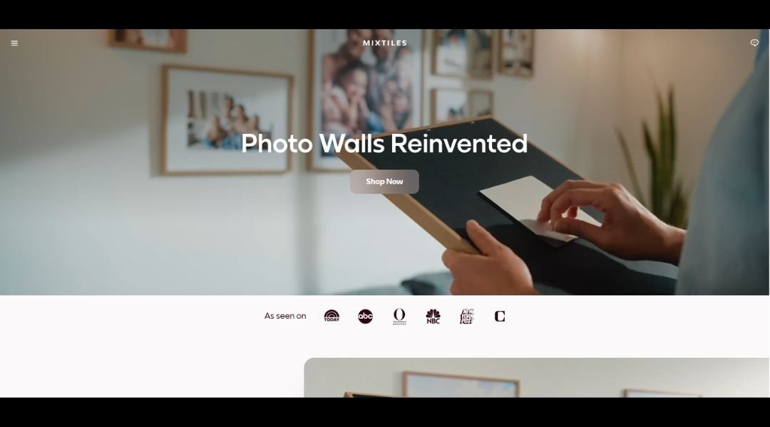
Mixtiles keeps things simple—and that’s the magic. Instead of letting your favorite photos sit buried in your phone, this service turns them into lightweight, stickable tiles that arrive ready to hang. No nails. No tools. No guilt from that empty wall you’ve been meaning to decorate for six months.
What’s clever is how casual the whole experience feels. The website doesn’t overwhelm you with choices. You pick your photos, choose a frame style, and checkout. That’s it. It’s clean, fast, and oddly satisfying—like the digital version of getting a haircut and suddenly feeling ten pounds lighter.
There’s a lightness to the brand too. The tone is friendly, even playful, but never pushes too hard. It’s like getting help from a creative friend who actually follows through.
And the product? Surprisingly solid. Tiles are printed with clarity, arrive in smart packaging, and stick without ruining paint. If you mess up the placement (we all do), you can move them. Multiple times.
Mixtiles doesn’t just print photos—it solves a modern problem with a smile. And finally, your cat’s thousand daily naps have a proper gallery.
2. Asana
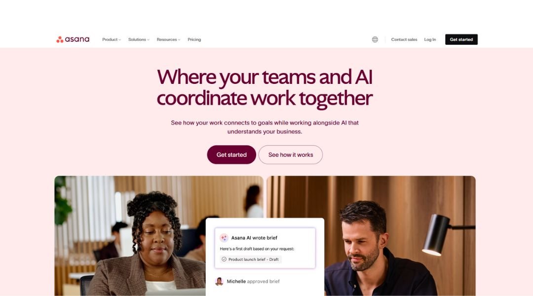
Asana is what happens when productivity meets clarity—and finally gets along. It’s a work management platform that helps teams track tasks, projects, and deadlines without turning into a digital jungle. No chaos, no constant “just checking in” messages. Everyone knows who’s doing what, by when.
The layout is clean and calm. You open it, and instead of panic, you get structure. Tasks are organized. Priorities are clear. Even the colors make sense (a rare thing in software these days). You can switch views—calendar, list, board—depending on how your brain likes to function before coffee.
But the real win? Asana quietly keeps your team accountable without turning into a taskmaster. It’s more like a project-savvy assistant who remembers everything, gently nudges, and never takes a day off.
Whether you’re managing a product launch, onboarding new hires, or just trying to keep your to-dos from becoming to-don’ts, Asana offers a smoother way to work. Less juggling, more doing.
And yes, there are unicorns. Occasionally. Because progress should feel good too.
3. Zendesk
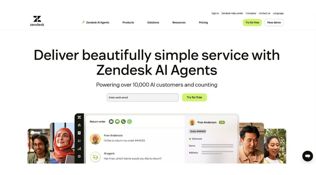
Zendesk takes the mess out of customer service. It’s a platform designed to help businesses talk to their customers like humans—not ticket numbers. Whether it’s email, chat, social, or smoke signals (okay, maybe not those), Zendesk pulls every conversation into one place. No more hunting through five inboxes to solve one simple problem.
What stands out is how it scales. Small teams can use it to stay organized; larger companies can build entire support ecosystems without needing a whiteboard the size of a garage door. It’s flexible but not fussy.
The interface? Surprisingly friendly. You don’t need to be a tech wizard to set it up or train your team. And customers get fast, consistent help—without feeling like they’ve been dropped into a robot maze.
Zendesk isn’t trying to be flashy. It just does the job, and does it well. If your team’s drowning in scattered tickets, delayed responses, and “who’s handling this?” emails, this might be your life raft.
Bonus: Agents stay sane, customers stay loyal, and nobody has to say “Did you try turning it off and on again?” more than necessary.
4. Trello
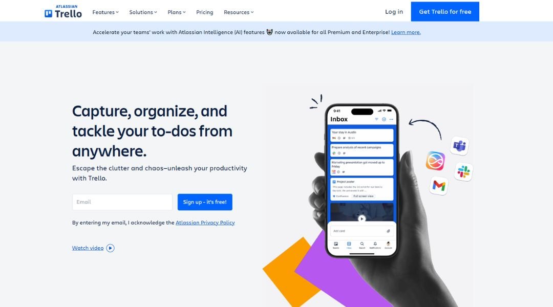
Trello is like your favorite corkboard—but digital, smarter, and way easier to clean up. It helps teams and individuals organize tasks using boards, lists, and cards. Whether you’re planning a product launch, managing content, or just figuring out what’s for dinner this week, Trello keeps it visual and stress-free.
The charm is in the simplicity. Drag a card here, check off a task there—it all feels natural. No steep learning curve, no “how do I even use this?” moments. Even first-timers can build a board in minutes and feel like a productivity pro.
Customization is where Trello quietly shines. Add deadlines, labels, comments, attachments—you can even bring in Power-Ups (yes, that’s what they’re called) to sync with tools like Slack or Google Drive. It plays well with others.
And for teams? It’s a sanity-saver. Everyone sees what’s going on without endless meetings or message ping-pong.
Trello doesn’t try to be everything. It just helps you get things out of your head and into action. Simple. Visual. Surprisingly effective. And no sticky notes falling behind your desk.
5. Slack
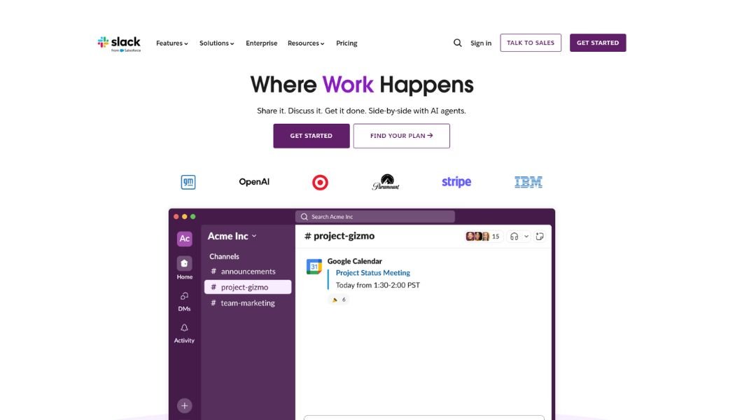
Slack takes the chaos of workplace communication and makes it—well, manageable. It’s a messaging platform built for teams who are tired of endless email threads, scattered chats, and wondering if anyone saw that important update buried under a GIF of a dancing cat.
At its core, Slack organizes conversations into channels. One for projects, one for teams, one for random lunch poll debates—it’s all sorted. You know exactly where to look, and more importantly, where not to.
It’s fast, flexible, and surprisingly fun. You can drop in files, tag teammates, start huddles, and even integrate your favorite tools. Think of it as your digital office: everything and everyone, just a click away. Minus the breakroom coffee smell.
But it’s not just about speed. Slack helps teams stay aligned without feeling robotic. You get real-time updates, but also breathing room. Notifications don’t scream; they nudge.
Whether your team’s in one building or spread across time zones, Slack makes collaboration feel connected. And yes, the emoji reactions help—because sometimes a thumbs-up is all you need to keep things moving.
6. Florida Aquarium
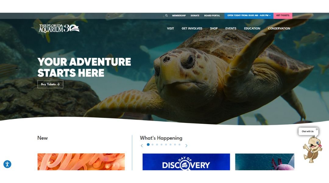
The Florida Aquarium isn’t just about fish tanks—it’s about immersion. From the moment you walk in, you’re surrounded by habitats that feel alive: wetlands with free-flying birds, coral reefs buzzing with sea life, and even a touch tank where stingrays glide up like they’re saying hello.
It’s built for everyone. Kids can crawl through tunnels beneath tanks, adults can linger at panoramic displays, and no one leaves without learning something cool—like how sea turtles navigate thousands of miles or why mangroves matter more than they look.
The experience flows smoothly, both indoors and out. There’s a splash pad for younger visitors, a 4-D theater that adds extra splash (literally), and conservation efforts happening behind the scenes that actually make a difference in Florida’s waters.
It’s educational, yes—but not the boring kind. Every exhibit is hands-on, story-driven, and built to spark curiosity. Whether you’re local or just visiting, this place makes the underwater world feel close enough to touch.
7. Festela
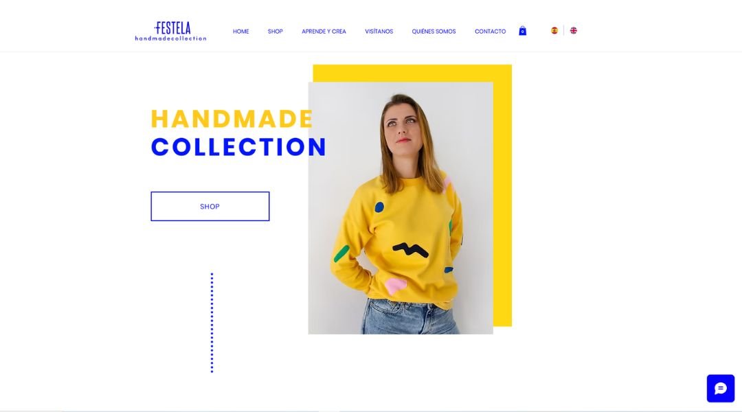
Festela isn’t just a party store—it’s your event’s secret weapon. From balloons and banners to themed tableware and décor, they’ve got everything you need to turn “just a get-together” into something people actually post about.
The best part? It’s all thoughtfully curated. Nothing feels generic or slapped together. Whether you’re planning a baby shower, birthday bash, or holiday dinner, Festela helps you find pieces that match your vibe—fun, festive, and just the right amount of extra.
Shopping the site is easy, too. Categories are clear, images are sharp, and you’re not buried in a hundred nearly identical options. It feels less like scrolling a warehouse and more like getting help from someone who gets parties.
And if you’ve ever scrambled last minute (haven’t we all?), you’ll appreciate their fast delivery and reliable service. No more midnight trips to a half-stocked store.
Festela delivers the kind of charm and color that makes celebrations pop. Because every occasion deserves more than plastic forks and crossed fingers.
8. Generation She
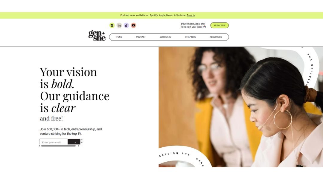
Generation She isn’t just a program—it’s a movement. Built for young women ready to lead, build, and break barriers, it offers real-world experience through entrepreneurship, tech, and community-driven innovation. It’s less about textbook lessons and more about launching big ideas with confidence.
From high school hackathons to hands-on startup challenges, participants aren’t just learning—they’re doing. The vibe is energetic, ambitious, and unapologetically driven. Whether you’re into coding, design, marketing, or pitching your next big idea, Generation She gives you the space—and support—to own it.
What makes it stand out? The network. You’re not in this alone. Mentors, industry pros, and peers come together to share insight, offer feedback, and cheer each other on. It’s collaboration with a purpose.
The platform empowers young women to step into roles they’ve often been left out of—and do it early. Because leadership isn’t something you wait for. It’s something you start now.
And yes, the energy is contagious. This is where future founders get their start—and where they realize they’ve got more power than they thought.
9. Dopple Press
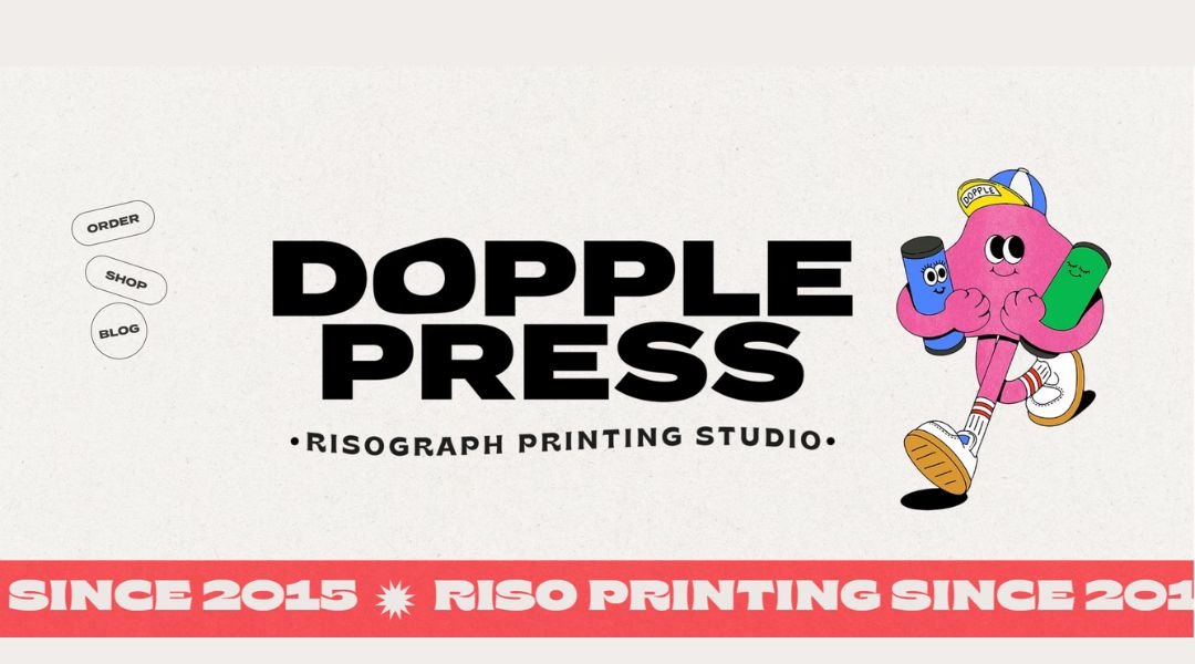
Dopple Press brings personality to the press—literally. Specializing in custom letterpress printing, this women-owned studio turns your words, designs, and wild ideas into beautifully tactile prints that feel as good as they look.
Everything here is hands-on. You won’t find cold templates or cookie-cutter designs. Whether it’s wedding invitations, business cards, or a cheeky postcard, Dopple adds texture, charm, and just the right amount of ink-smudged character.
The style? Clean with a wink. You’ll see bold colors, crisp impressions, and designs that aren’t afraid to stand out. It’s printing with attitude—and a whole lot of craft.
What makes it feel different is the care behind every piece. There’s real passion here, from selecting the right paper stock to making sure every press is just-so. You can tell this team loves what they do.
If you want your print to say something before anyone even reads the words, this is the place. Dopple doesn’t just print—they press with purpose.
10. Katie Mai
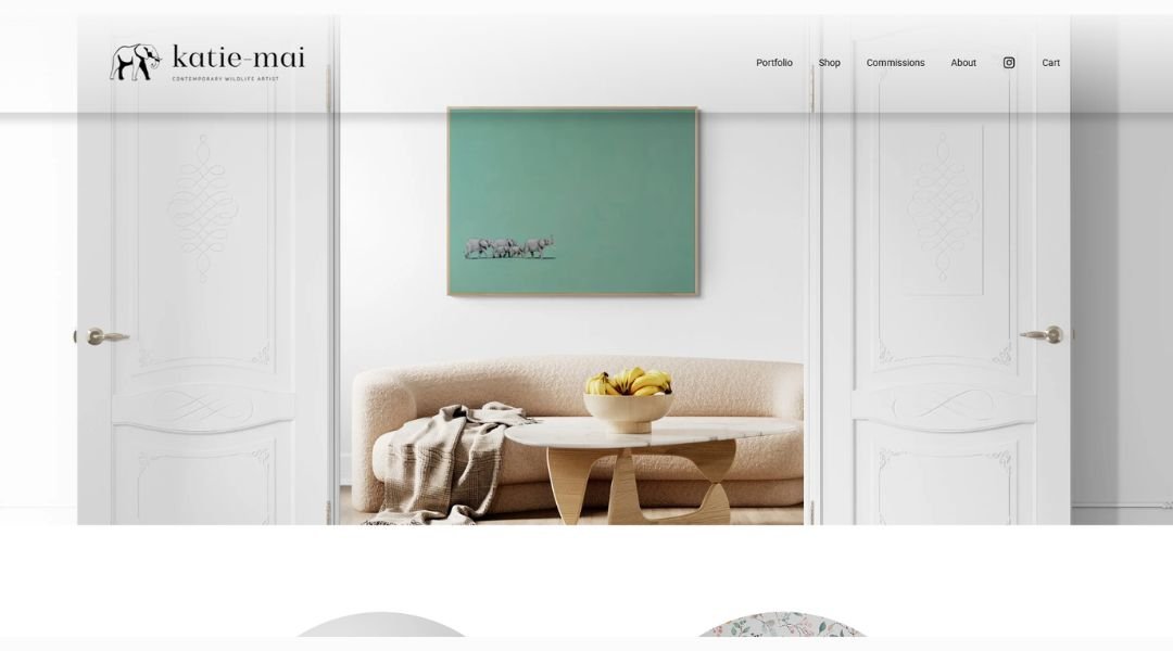
ns with colorful originals—animals, plants, whimsical scenes—all lined up like happy guests at a gallery show.
Her About section is refreshingly simple. She shares a childhood diary entry about drawing dreams, her switch from psychology to full-time art, and her messy, vibrant creative process. It’s honest. It’s charming. It makes you smile.
Work samples are easy to browse. Originals, limited-edition prints, commissions—each piece sits neatly with crisp photos and neat prices. No fluff. Just artwork you’d want to hang on your wall.
Katie also offers behind-the-scenes content and “happy mail” via Patreon. Think monthly videos, mailed bookmarks, and tiny moments that brighten your day. Plus, her studio assistant Miso the dog makes regular cameos. Spoiler: Miso naps a lot and isn’t great at emails.
The site is playful but grounded. It’s the kind of place that makes you want to slow down and look. Whether you’re browsing prints or just getting a peek into an artist’s life, Katie’s site feels like a friendly chat—colorful, easy, and full of heart.
11. Mission Zero
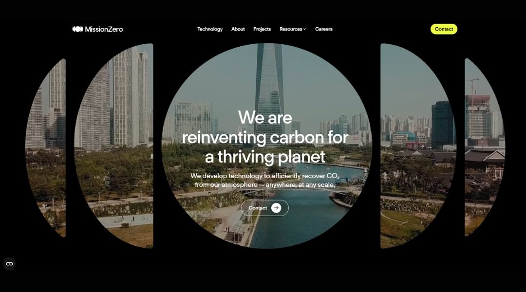
Mission Zero is all about smart tech powered by purpose. Their platform connects companies with verified carbon credits to offset emissions—no guesswork, no greenwashing. Just clear dashboards and data you can trust.
First impression: sleek and confident. The homepage rolls out with bold metrics and digestible visuals. You get the what and the why right away: emissions matter—and solving them should be simple.
Each section is clear and purposeful. You learn about how the offsetting works, who they partner with, and why real projects beat vague promises. There’s a quiet confidence here—this isn’t about hype; it’s about honest impact backed by numbers.
The About page digs into their mission and team. It’s not a laundry list. Instead, you get stories of founders rolling up sleeves, dealing with real climate challenges, and seeing early wins in forests, grids, and communities. They’re thoughtful, precise, and aware of the hard truths—without sounding preachy.
Mission Zero feels like a partner, not a sales pitch. They guide you, track progress, and hold themselves to high standards. It’s tech with accountability, and in a climate-focused world, that kind of clarity goes a long way.
12. IEG4
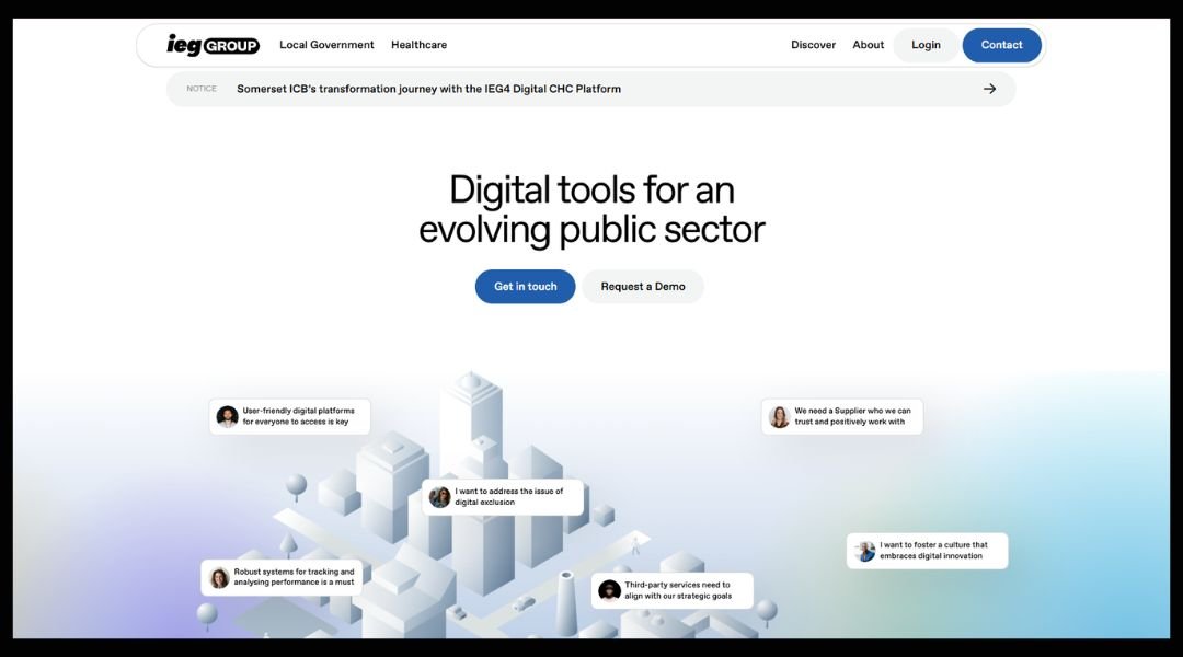
IEG4 gives businesses an easier way to manage supplier payments. Their platform handles invoices, approvals, and payments without the usual headache. You upload invoices, route them for review, and the system ensures nothing slips through the cracks.
The interface is clean and direct. You won’t get lost in menus or buried under buttons. Approval flows are visual—drag, drop, done. It’s the kind of tool you actually want your team to use.
What sets IEG4 apart? It keeps things human. Instead of forcing your process into a rigid mold, it adapts to your needs. You can customize workflows, set reminders, and even track spend trends—all while avoiding endless email chains.
For finance teams, it’s a breath of fresh air. No more chasing signatures or fielding questions about payment status. Everyone knows where their invoice stands and why. Plus, the system sends friendly nudges when action’s needed—no guilt trips required.
IEG4 doesn’t just digitize payments—it makes them smarter, faster, and a little more pleasant. After all, managing money shouldn’t feel like a chore.
13. Clear Street
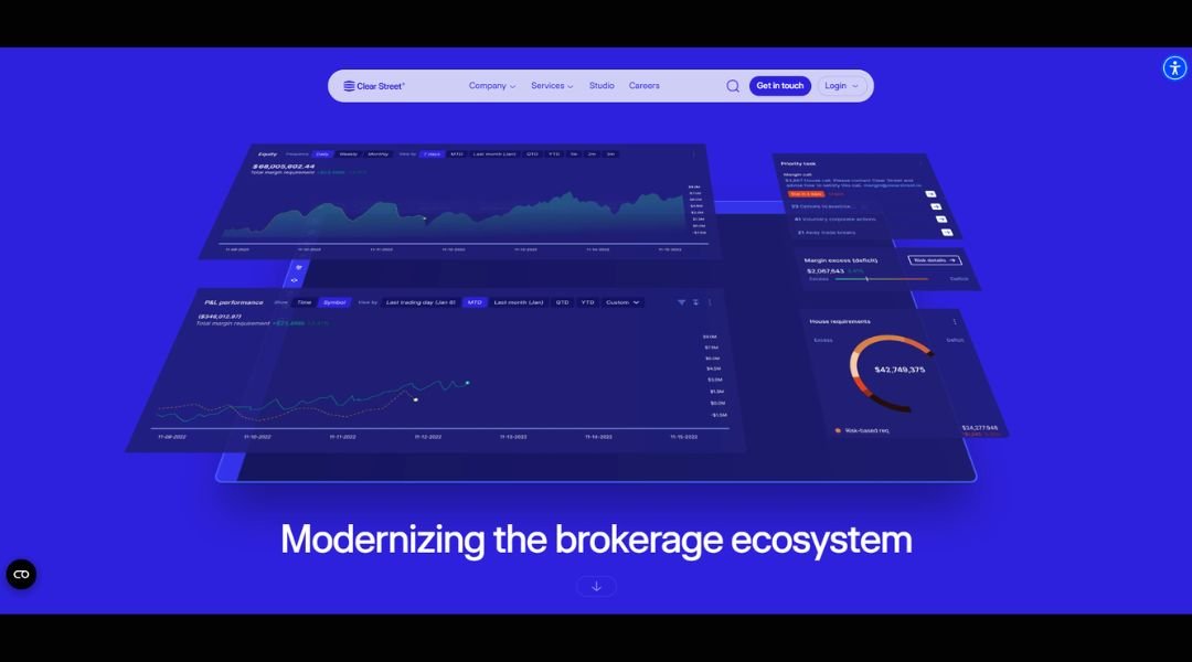
Clear Street is rebuilding the backbone of capital markets—without the outdated tech. Designed for today’s fast-paced trading world, it’s a prime brokerage platform that delivers real-time data, seamless clearing, and end-to-end transparency, all from a single, cloud-native system.
This isn’t just another patch on legacy infrastructure. From day one, Clear Street set out to replace the fragmented tools that slow down institutional trading. The result? A streamlined experience where execution, custody, clearing, and risk management all work together—finally.
The interface is fast, intuitive, and built for scale. Whether you’re a hedge fund, prop shop, or algo-driven trader, the platform adapts to how you work—not the other way around. No more waiting hours for data or chasing down middle-office answers.
What sets it apart is the tech-first mindset. APIs, automation, and modern architecture make it feel like the future—not finance with a facelift.
Clear Street isn’t just improving how trades get processed—they’re redefining the infrastructure beneath them. And in a world where milliseconds matter, that difference is everything.
14. Jamie Oliver
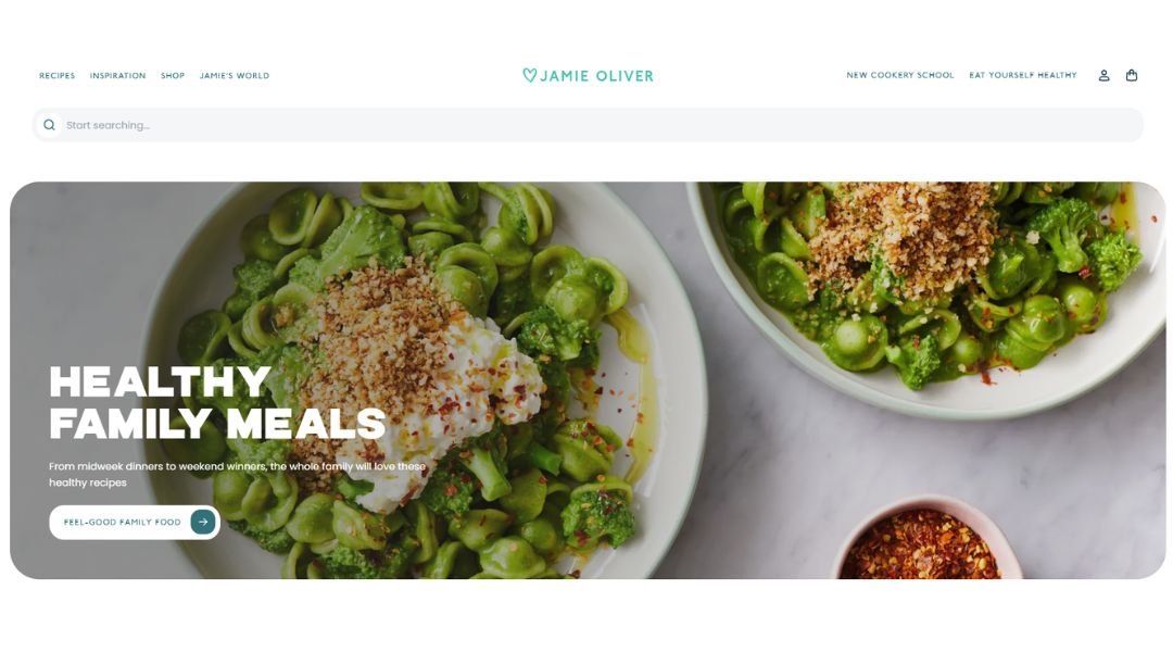
Jamie Oliver makes cooking feel doable—and fun. He’s the guy who turns simple ingredients into mouth-watering meals that everyone can actually pull off. From turning pantry odds and ends into comfort classics to inspiring you to try something bold on a weeknight, he brings joy back to the kitchen.
First impression: warmth. You get recipes that speak plainly—no fuss, no five-dollar words. Think spaghetti that takes ten minutes longer because you sneaked in fresh herbs. He nudges you toward better food without turning into a drill sergeant.
The site flows naturally. You click a recipe, see clear steps, colorful photos, and handy tips—like how to swap an ingredient or save leftovers for tomorrow’s lunch. He even sneaks in a fun fact or two—“Did you know olives were once worth their weight in gold?”—just enough to make you smile.
Jamie’s charm is in the balance: real food, served with personality. It’s cooking that respects your time, tastes, and maybe your sense of humor. If you’ve ever felt daunted by a dinner plan, Jamie Oliver’s here to show you it doesn’t have to be.
15. EB Suite
EB‑Suite takes corporate ethics training out of the lecture hall and into real-world scenarios. Instead of dry slides and legal jargon, employees walk through dozens of bite-sized, case-based modules that feel like conversations—not lectures. Each one delivers practical insight without wasting time.
The site introduces you to a living library of lessons: anti‑bribery, workplace conduct, data privacy—all presented clearly and conversationally. You won’t get lost in legalese. Instead, EB‑Suite focuses on what matters: helping people make better choices in everyday situations.
What’s refreshing is the wrap-around support. Admin dashboards let compliance teams monitor progress, identify knowledge gaps, and download simple reports—no fuss. Employees get reminders before deadlines, with a tone that’s helpful rather than nagging.
EB‑Suite adapts to your culture. You can tweak content, add local references, even adjust the length to fit team needs. It’s ethics training designed to fit your workflow, not disrupt it.
Simple, smart, and surprisingly human. EB‑Suite proves you don’t need endless compliance modules to build a strong ethics culture. You just need training that talks with people—not at them.
16. Junior Achievement of Southern California
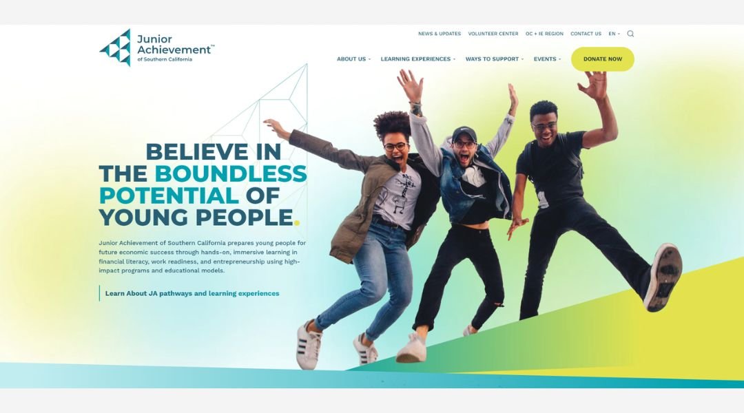
Junior Achievement of Southern California (JASoCal) delivers real-world learning that empowers students across Southern California. Focused on financial literacy, career readiness, and entrepreneurship, their programs reach learners from elementary school through age 25.
What makes JASoCal stand out? It blends classroom fundamentals with hands-on experiences. Students aren’t just memorizing terms—they’re running simulated storefronts, managing budgets, and pitching business ideas. It’s practical learning that sticks .
The site highlights easy ways for businesses and individuals to get involved. Whether sponsoring a school, hosting a finance park storefront, or joining a golf tournament, supporters become part of a movement that invests in youth success.
Events add energy to the mission. Think family-friendly 5K races, Hall of Fame galas, and charity golf classics—all designed to raise funds and awareness in fun, community-driven settings.
Backed by measurable impact and active volunteer support, JASoCal connects classrooms to career skills—building confidence and competence in young people statewide. It’s education with purpose, community at its heart, and futures firmly in sight.
17. Grow Better
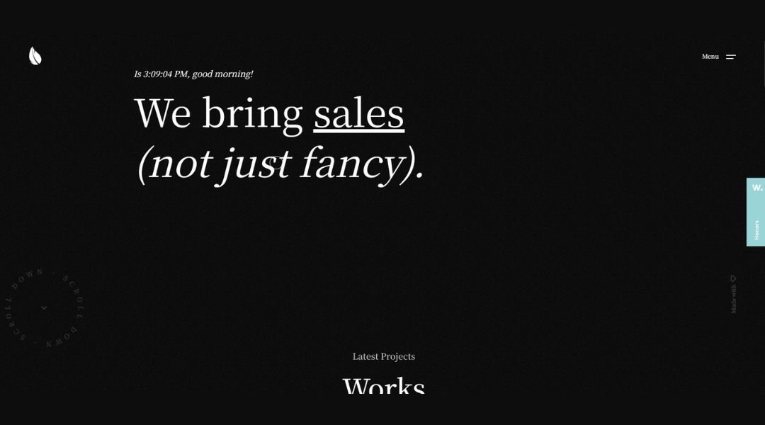
Grow Better Studio is a Milan-based creative shop that does more than make things look good—they make them sell. This isn’t just design and coding: it’s a full-marketing lineup delivered by digital natives who know how brands grow .
Straight off the bat, the site promises clear value. No fluff, no jargon—just marketing, design, coding, and social media services that aim for ROI, not just applause. You’d expect this from a studio of young pros, and Grow Better doesn’t disappoint.
Their portfolio pops with real-world projects—like a sleek site build for a Bitcoin travel brand in El Salvador—showing they can blend UI/UX, visuals, and conversion strategy into something that clicks.
What stands out? The promise to “bring sales, not just fancy.” It shows up in their tone: smart, direct, and no-nonsense. If your brand needs more than just pretty pixels—if you want measurable growth—this studio has your back.
Simple pitch: strategy-led creativity that moves the needle. For teams ready to grow, it’s a partner built on purpose and proof.
18. Viseversa
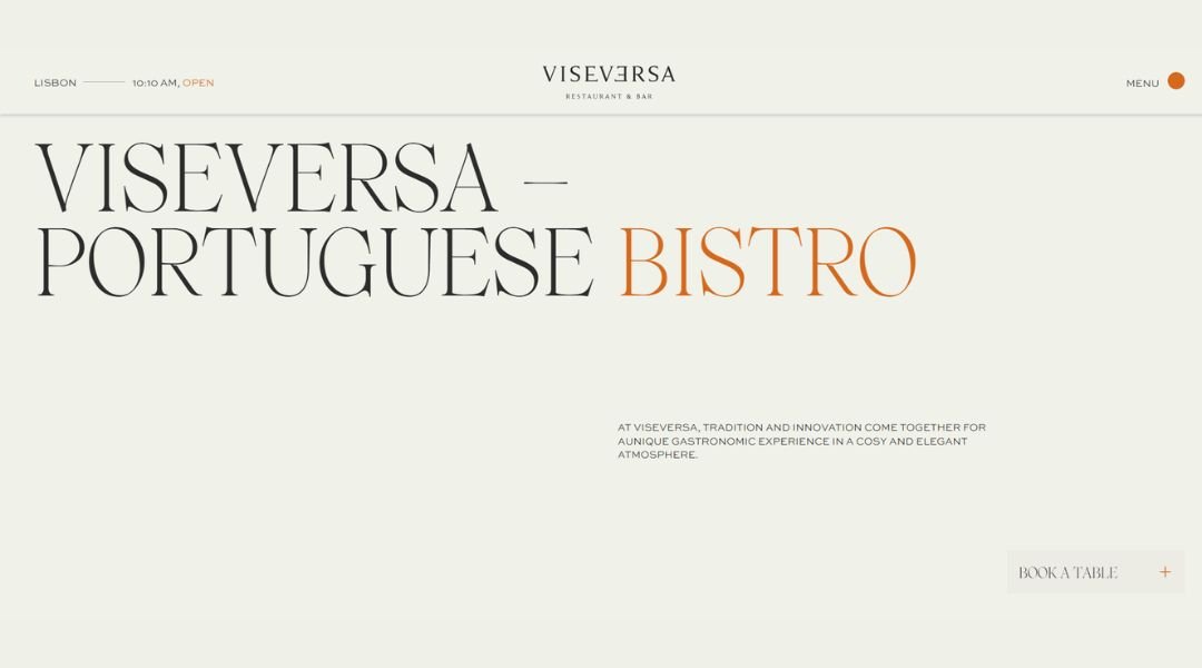
Step into Viseversa, a stylish bistro nestled inside Lisbon’s Hyatt Regency. The moment you arrive, you’re greeted by an elegant “grand café” vibe—airy, cosmopolitan, and inviting.
The menu delivers local flavors with a creative flair. Think seafood dishes, shrimp salads, octopus plates, hearty mains, and indulgent desserts—all based on fresh, seasonal produce. Each dish feels grounded in Portuguese tradition, with thoughtful nods to French café culture and global influences.
The bar is just as compelling: a curated cocktail list and select wines round out the experience, making evening visits feel both relaxed and refined . Service leans friendly and attentive, aiming to create memorable moments whether you’re here for breakfast, brunch, lunch, dinner—or a glass of wine under Lisbon’s skyline.
This is more than a hotel eatery. It’s a thoughtfully designed space where décor, menu, and atmosphere come together. Viseversa doesn’t just serve meals—it feels like a warm invitation to linger, sip, and savor.
19. Surge AI
Surge AI builds the human-side of AI by supplying high-quality, hand-labeled data for large language models, content moderation, and search systems. Their cloud-native platform, backed with modern APIs and rigorous quality controls, helps teams scale data annotation across over 40 languages—without losing nuance in context or tone.
The interface is sharp and developer-friendly. Clients launch jobs like running a cluster—without managing freelancers or contractors—which is a huge time-saver. Reports from the field say Surge AI often doubles high-quality label volume in mere weeks.
Their value shines through real-world impact. Organizations like Anthropic and OpenAI rely on Surge for RLHF pipelines that power safer AI assistants and content filters. The results speak for themselves—faster launches, sharper model performance, and cleaner moderation tools.
No fluff, no hype—just real infrastructure for real AI needs. Surge AI takes data labeling seriously so models can excel creatively, contextually, and responsibly.
Conclusion
After exploring these 19 header styles, one thing’s clear: small design choices have a big say in how people experience your brand. And I’m not just talking about logos or navigation bars. The magic is in the little things—the spacing, the tone, the smart layout that makes someone think, “These folks get it.”
My advice? Don’t overthink it, but definitely don’t ignore it. Your header might only take up a few hundred pixels, but it’s doing a lot of work. Let it reflect what your brand stands for—clearly, confidently, and without unnecessary fuss.
If any of these ideas sparked something, good. That’s the goal. And if your current header just sighed in design shame? Even better. It means change is coming—and it’ll look great up top.


