I’ll be honest—footers don’t usually get the spotlight. Most of us scroll past them like they’re the credits of a movie we’ve already seen. But as a designer, I’ve learned that footers can quietly do a lot of heavy lifting.
From guiding navigation to reinforcing your brand voice, the footer is where function meets final impression. When done right, it can tie your entire site together and keep users engaged—even after they’ve reached the bottom.
In this guide, I’ll walk you through 20 website footer ideas that actually work—not because they look fancy, but because they’re thoughtful, clear, and surprisingly useful.
Here’s what you’ll get from this article:
- Smart ways to organize footer content
- Design choices that improve usability
- Ideas for keeping things clean without feeling empty
- Subtle touches that make your footer feel intentional
- A few examples that may make you say, “Wait, that’s a footer?”
Let’s dig into the details—no fluff, just practical inspiration that respects both form and function.
1. Alias Communications
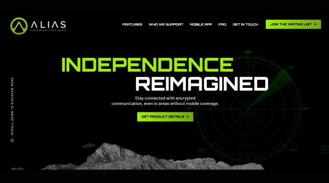
Alias Communications doesn’t just build brands—they give them a voice that actually sounds like someone you’d listen to. Right from the start, the site sets a tone that’s sharp, clever, and unapologetically human. You’re not met with buzzwords or marketing clichés. You’re met with clarity.
Their homepage wastes no time. Crisp text, punchy statements, and a confident layout say: we know who we are—and who you could be. It’s not about dressing things up. It’s about stripping away the noise.
The About section reads like it was written by people who care about language as much as results. You learn how they work, why they work that way, and who they work with—all without the usual agency fluff. There’s a sense of intention behind every word.
Even the case studies lean more on storytelling than jargon. They show process without preaching, results without bragging.
Alias isn’t loud, but it’s memorable. It feels like sitting across the table from someone who listens, thinks, and then delivers something better than you expected—but not what you thought you wanted.
It’s smart branding, minus the attitude.
2. Alliance Exposition
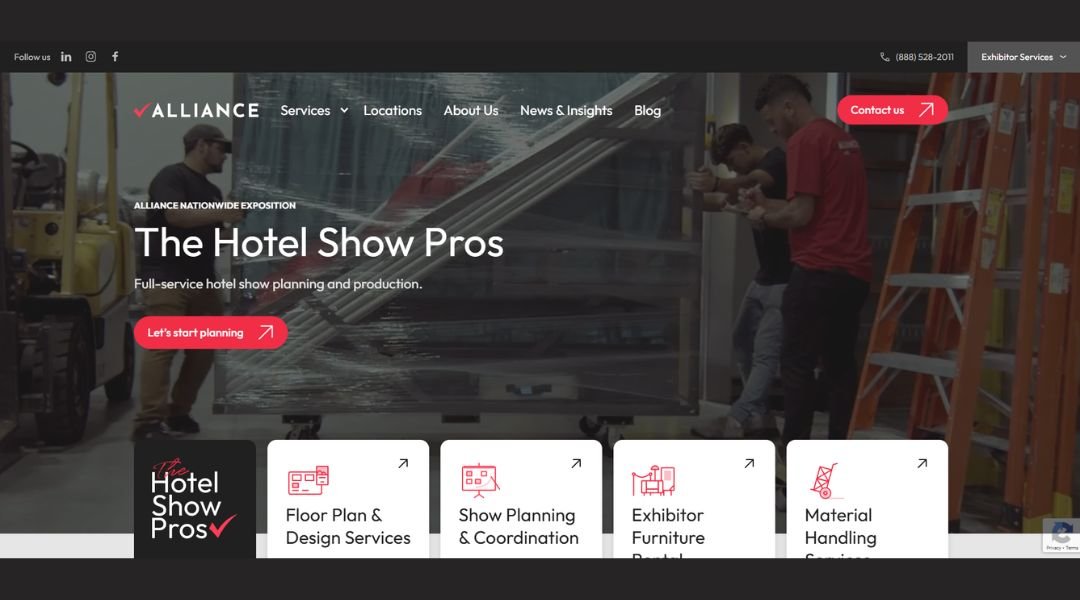
Alliance Exposition isn’t trying to reinvent the trade show—they’re just making it work smarter. From the moment you land on the site, it’s clear: this team knows logistics, and they know how to keep things moving without overcomplicating the process.
The homepage is clean and confident. It speaks directly to event organizers, cutting through the usual industry lingo. You’re not met with vague promises—you get real, actionable service details that show they understand the challenges behind the scenes.
Their model is simple: focus on smaller shows, deliver nationwide, and do it with precision. No unnecessary extras, no fluff—just what’s needed, done right and done fast. Even the site design mirrors that approach. It’s easy to navigate, light on distractions, and heavy on clarity.
Their story isn’t about big gestures—it’s about getting the basics right every time. And they don’t just say it—they show it, with straightforward service descriptions and real-world impact.
Alliance doesn’t make trade shows glamorous. They make them happen—with less stress and fewer surprises. That’s the difference.
3. Analyst
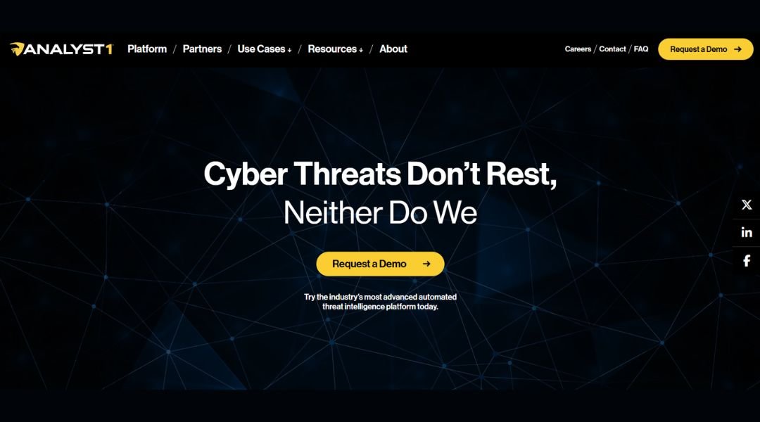
Analyst1 doesn’t just collect threat data—they make it make sense. Their platform is built for security teams that are tired of juggling intel across tools, tabs, and time zones. Right away, the site tells you what it is, what it does, and why it matters—with zero buzzword filler.
The layout is sleek and focused. No fluff, no rabbit holes. You’re guided through their approach without having to guess what any of it means. It’s designed for analysts, by people who clearly understand the job’s real pressure points.
What stands out is the platform’s ability to connect the dots. Instead of just flagging threats, Analyst1 helps users prioritize, act, and stay ahead. The case is made without shouting—just clear examples, smart visuals, and practical benefits.
Even the messaging feels deliberate. It’s technical without being cryptic, and serious without being stale. The voice throughout the site sounds like someone who’s done the work—not someone selling it from the outside.
Analyst1 isn’t about flash. It’s about focus. And for security professionals, that’s exactly what you want.
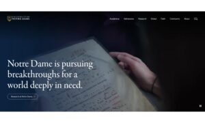
4. American University in Bulgaria
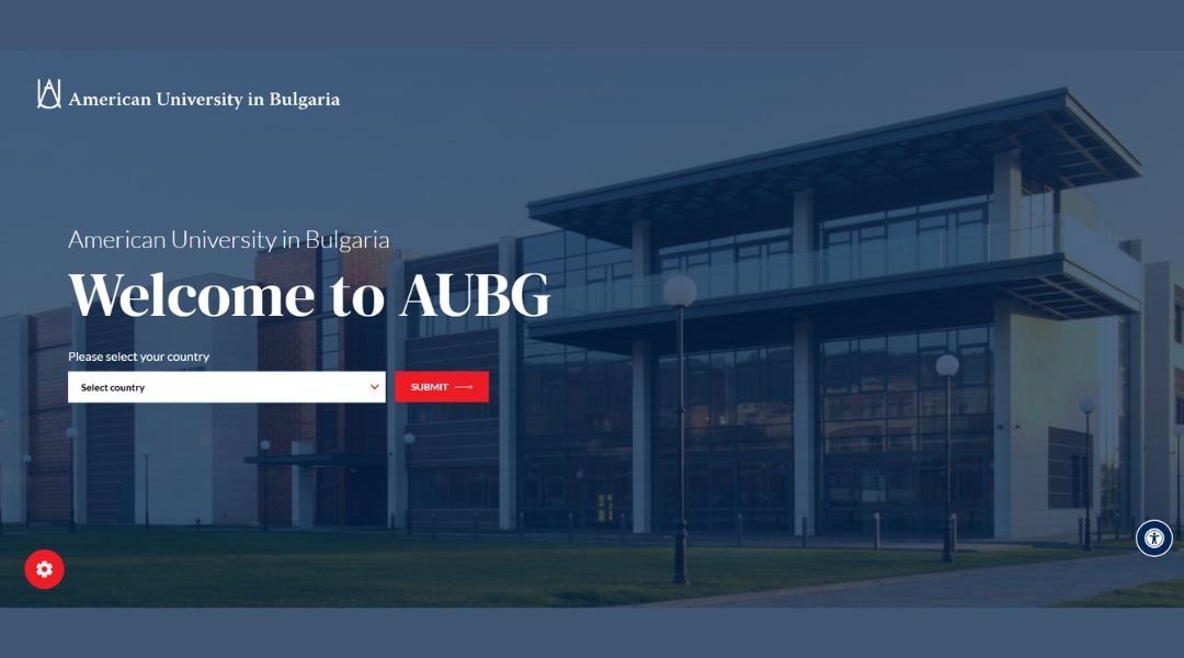
AUBG isn’t just a university—it’s a crossroads. Nestled in Bulgaria, the school blends American liberal arts education with an international student body that feels more like a global think tank than a typical campus.
From the start, the site makes its priorities clear: academics, diversity, and impact. You won’t find long-winded mission statements. Instead, there’s a focus on what students actually experience—cross-cultural classrooms, real-world skills, and a community that feels both tight-knit and far-reaching.
The layout is clean and purposeful, reflecting the school’s modern approach to education. Whether you’re exploring programs, faculty, or student life, it’s all a few clicks away—no maze, no confusion.
What makes AUBG stand out is its balance. It’s rigorous without being rigid, and global without losing its roots. You get the structure of a U.S. curriculum paired with the perspective of a European setting.
It’s not about checking boxes—it’s about opening doors. And AUBG gives students the tools, connections, and confidence to walk through them.
5. Barton G
Barton G. Restaurants
Barton G. doesn’t just serve dinner—they stage it. Every dish is a headline, and every table feels like the front row to something wildly unexpected. From presentation to plating, this isn’t just a meal—it’s a full sensory performance.
The website captures that spirit without trying too hard. Clean layout, bold imagery, and just enough flair to hint at what’s coming. You’re not lost in menus or mission statements. You’re pulled into the experience, one oversized fork or flaming dessert at a time.
There’s a fine line between gimmick and genius—and Barton G. walks it like a tightrope. The food is genuinely good (not just camera-friendly), and the theatrics somehow never overshadow the flavors.
Whether it’s dinner, drinks, or a private event, the restaurant delivers spectacle with structure. It’s playful, but not chaotic. Polished, but not stiff.
Barton G. is where serious dining meets serious fun. If you’ve ever wanted your entrée with a side of drama—you’ve come to the right place.
6. Buddha Brands
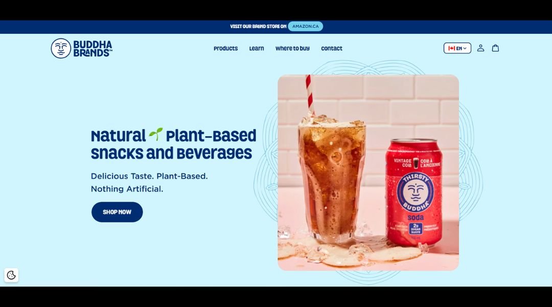
Buddha Brands takes snacking seriously—without taking itself too seriously. The message is clear from the first scroll: clean ingredients, bold flavor, and zero guilt. This is plant-powered fuel with personality.
The website delivers a fresh, uncluttered experience. Products are front and center, backed by ingredient transparency and a clear commitment to better choices. No long-winded health claims or buzzword overload—just honest food that tastes good and makes sense.
Each product line has its own vibe, but the brand voice stays consistent—light, confident, and refreshingly human. It’s wellness without the preachy tone. Think less “cleanse your soul,” more “eat well and keep moving.”
Sustainability and balance are baked into the story, but it never feels forced. Whether you’re curious about monk fruit, coconut chips, or clean hydration, everything’s explained in plain language—no dictionary required.
Buddha Brands isn’t chasing trends—it’s creating space for mindful snacking that fits real life. Tasty, clean, and just a little cheeky. That’s the energy.
7. Devensoft
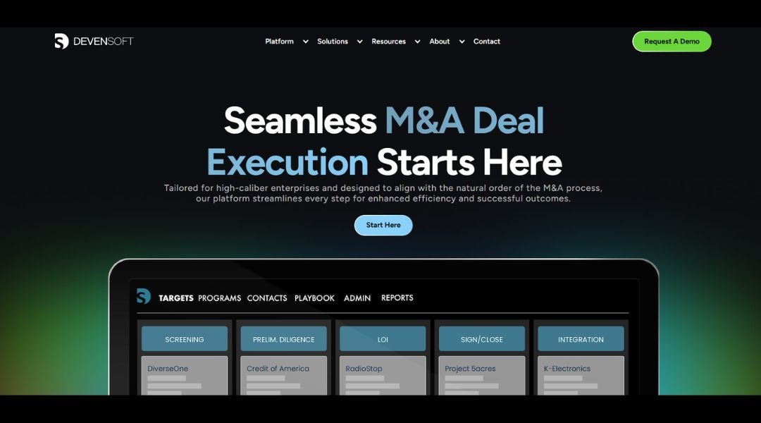
Devensoft doesn’t just manage mergers and acquisitions—it brings clarity to the chaos. From diligence to integration, their platform is built to keep teams aligned, informed, and moving forward without tripping over spreadsheets or scattered tools.
The website reflects that same no-nonsense approach. It’s straightforward, focused, and clearly designed with busy professionals in mind. You’re not stuck parsing buzzwords—you’re guided through what the software does, how it helps, and why it works.
Every feature speaks to real-world friction: managing multiple deals, tracking tasks, securing data, and staying on top of communication. It’s all handled in one place—with just enough customization to feel personal, not overwhelming.
The tone throughout the site is confident but approachable. There’s no hard sell, just a clear message: this platform was built by people who understand the pressure and pace of M&A.
Devensoft isn’t about flashy dashboards or trying to do too much. It’s about helping deal teams focus on what matters—making smart decisions, not chasing scattered data.
8. Ghayath
Ghayath Almadhoun doesn’t just write poetry—he distills experience into language that stays with you. His work isn’t framed by borders or easy definitions. It moves between places, between silences, between the things said and the things left behind.
The website reflects this quiet power. It’s minimal, with space to breathe. Each section feels intentional, almost like a pause in a poem—inviting you to slow down and listen.
You’re introduced to Ghayath’s work not just as a writer, but as a voice shaped by displacement, memory, and witness. Whether in written lines, recorded performances, or translated works, there’s a clarity that cuts through.
This isn’t poetry made for decoration. It’s poetry as presence—as survival, as resistance, as truth told without apology. And yet, the tone is never bitter. It’s human. Deeply so.
Ghayath’s site doesn’t shout. It doesn’t need to. Like his poetry, it speaks in a language that resonates long after the final word.
9. EV Universe
EV Universe isn’t just another electric vehicle marketplace—it’s a full-on ecosystem for drivers who want more than just a plug-in car. Whether you’re EV-curious or fully committed, this platform meets you where you are.
From the first scroll, the site feels clean and direct. Inventory is front and center, but the experience goes far beyond listings. You get tools, insights, and real guidance—not just specs and price tags. It’s built for people who want to make smart decisions without spending hours decoding car jargon.
There’s a strong sense of purpose running through the platform: make EV ownership easier, smarter, and more accessible. Whether you’re browsing used Teslas, looking for financing, or figuring out your home charging setup, it’s all under one digital roof.
The tone is refreshingly down-to-earth. Informative without being pushy. Helpful without pretending to be your best friend. EV Universe understands that buying an electric vehicle is a big step—and they make that step feel less like a leap.
It’s the future of car buying—with fewer wires crossed.
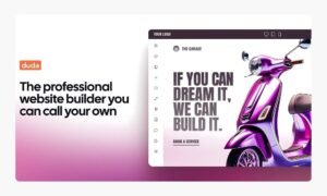
10. Dorik AI
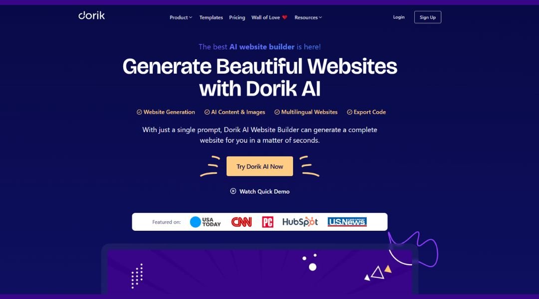
Dorik’s AI Website Builder isn’t here to dazzle with buzzwords—it’s here to get things done. Whether you’re a freelancer, startup, or small business, this tool strips away the usual headaches of web design and lets you launch something sharp in minutes.
The platform is built for speed and clarity. You give it a few prompts; it gives you a full website—no dragging, dropping, or decoding templates. It’s clean, intuitive, and refreshingly free of technical clutter.
What stands out is the balance. The AI handles the heavy lifting, but you still get full control. Tweak the layout, adjust content, or customize styles without needing to call in a developer. It’s smart tech that doesn’t box you in.
The site itself mirrors the product—minimal, direct, and focused on helping you move forward. No fluff, just clear value.
Dorik isn’t trying to be everything to everyone. It’s focused on making simple, fast, professional websites possible for people who don’t want to overthink the process.
Easy to start. Easy to manage. Hard not to like.
11. Airtable
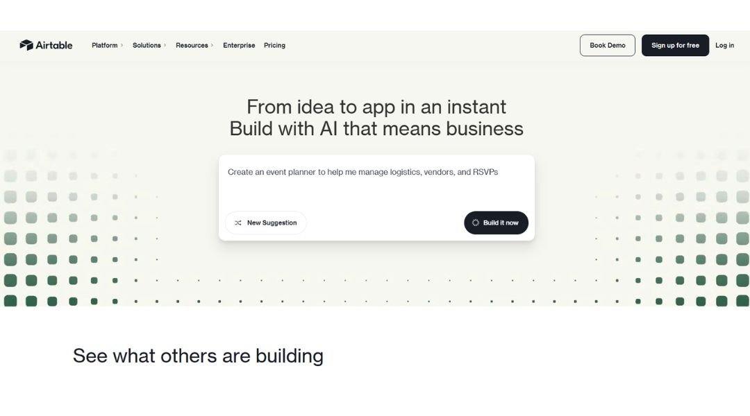
Airtable doesn’t look like a spreadsheet—but it works like one, if your spreadsheet suddenly got smarter, prettier, and way more helpful. It’s the platform for teams who need structure but don’t want to build from scratch.
From the first glance, Airtable feels light—yet powerful. Whether you’re managing a marketing campaign, product roadmap, or hiring pipeline, everything lives in one place, connected and customizable without feeling like a science project.
It’s part database, part collaboration tool, part visual playground. You can switch between grid, kanban, calendar, gallery, and Gantt views without breaking your workflow—or your brain.
What sets Airtable apart is flexibility without overwhelm. You’re not locked into rigid templates or buried in settings. It grows with your team, adapts to your process, and lets you focus on the actual work—not figuring out how to organize it.
The site echoes that same ease: clear layouts, bold visuals, and just enough interactivity to show you the “aha” without a full demo.
Airtable makes complex work feel simple. Which, let’s be honest, is no small win.
12. Zapier
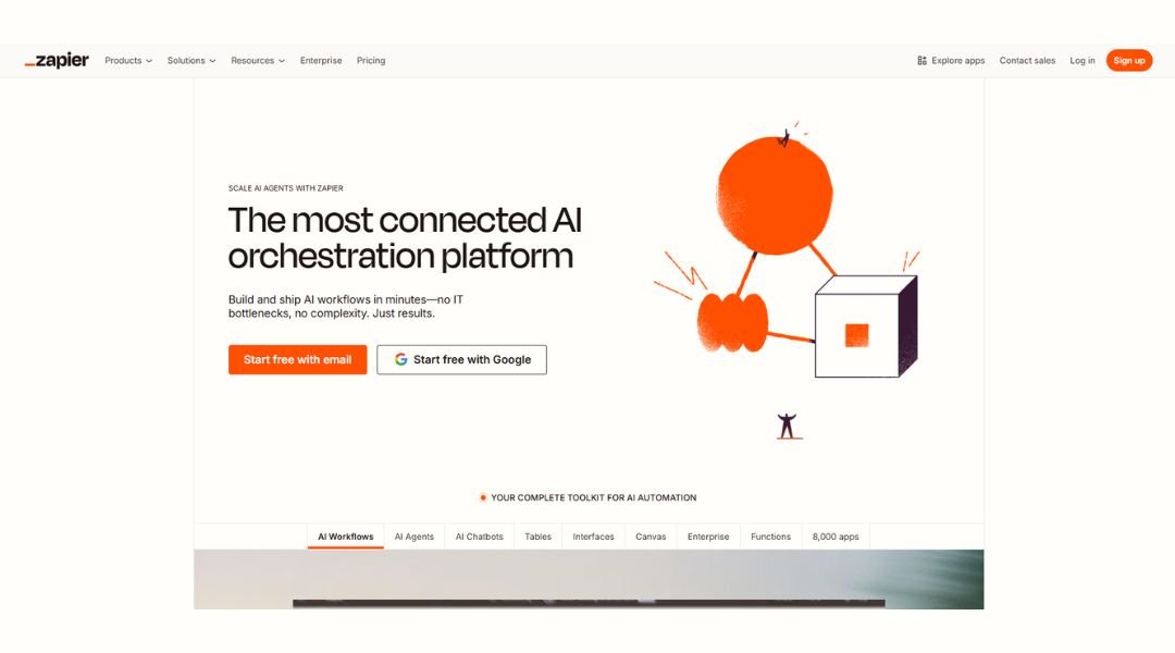
Zapier is what happens when your apps finally start talking to each other—and stop making you do all the busywork. It connects the tools you already use, automates the stuff you do every day, and quietly makes your workflow way less chaotic.
The site gets to the point fast. You pick your apps, set your triggers, and Zapier handles the rest. No coding, no IT tickets, no back-and-forth with support just to move data from A to B.
Whether you’re syncing leads from a form to your CRM, automating email updates, or running complex multi-step workflows, Zapier scales to match. It’s flexible enough for power users, but simple enough for the rest of us.
The platform is clean, fast, and doesn’t get in your way—which is kind of the point. Even the site’s design reflects that: focused, frictionless, and quietly efficient.
Zapier doesn’t try to do everything. It just makes the tools you already trust work better—together.
13. Notion
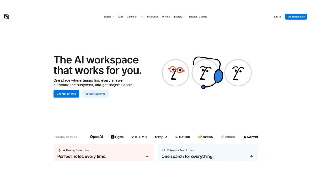
Notion isn’t just a workspace—it’s your workspace, your way. It combines notes, tasks, wikis, and databases in one flexible platform that works like a blank canvas for organized minds (and those trying to be).
From solo creators to full teams, Notion scales effortlessly. You can start with a simple to-do list and end up building an entire company knowledge base—without switching tools or losing your mind in tabs.
What makes Notion stand out is its modular design. Everything’s built with blocks you can move, nest, or reformat in seconds. Pages are clean, lightweight, and fully customizable—without feeling like you need a design degree to use them.
The site reflects that same ease: modern layout, calm visuals, and guided flows that help you get set up fast. Templates, integrations, and collaboration features are all right where you need them.
Notion doesn’t force a system on you. It hands you the tools and lets you build what actually works for your brain—and your team.
It’s digital clarity in a world full of clutter.
14. Brevo
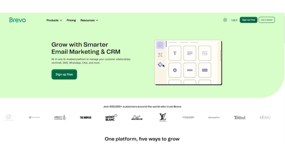
Brevo helps businesses communicate like they mean it. From email and SMS to live chat and marketing automation, it brings all your customer messaging into one clean, easy-to-manage platform.
The site makes one thing clear from the start: Brevo is built for growth, whether you’re a solo founder or scaling fast. The interface is user-friendly, but packed with depth. You can set up a welcome series, segment your contacts, and launch campaigns—without calling in a developer or drowning in menus.
What stands out is the all-in-one approach. Instead of stitching together five different tools, Brevo gives you one workspace where your customer journey actually makes sense. The automation is powerful but not overwhelming. The CRM is lightweight but practical. And everything is designed to help you build stronger relationships, not just send more messages.
The website itself mirrors that philosophy—focused, clear, and friction-free. Brevo doesn’t oversell. It just delivers.
If you’re looking for a smarter way to connect with your audience—without the tech headache—this is where you start.
15. Elle
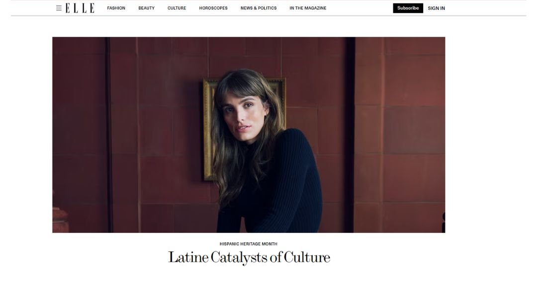
ELLE is more than a fashion magazine—it’s a global voice for style, culture, and the conversations shaping modern womanhood. From runway looks to real-world issues, it strikes a rare balance between trend-forward and thoughtfully grounded.
The site feels like its own curated experience. Sharp headlines, striking visuals, and a steady mix of fashion, beauty, politics, and pop culture—each piece chosen with purpose. You can scroll for inspiration or dig deeper into stories that actually have something to say.
What sets ELLE apart is range. It covers what’s hot without being hollow. One moment you’re exploring the season’s top beauty edits, the next you’re reading an intimate interview or cultural commentary that hits just right.
It’s bold without shouting. Smart without talking down. And always on time with what’s now—and what’s next.
In a crowded media landscape, ELLE still manages to feel personal. It doesn’t just follow trends—it frames them in ways that matter.
16. Briteweb
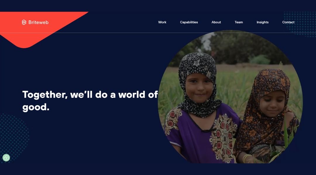
Briteweb builds brands and digital experiences for organizations that are here to make a difference. Their focus is clear: nonprofits, foundations, and social impact groups that need more than a good-looking website—they need strategy that moves people.
The site itself reflects that clarity. Clean layout, strong visuals, and a tone that’s both grounded and purposeful. You won’t find vague promises here. You’ll find real partnerships, thoughtful process, and work that respects the mission behind the message.
Briteweb isn’t just a creative agency—it’s a collaborator. From brand strategy to web development, their team understands the unique needs of values-driven organizations. They speak the language of impact, without watering down the design or the technology.
The work is beautiful, yes—but also built to last. Their digital products are designed to be scalable, accessible, and easy to manage by real teams with real day-to-day demands.
If you’re trying to connect with your audience and stay aligned with your mission, Briteweb helps you do both—with clarity, purpose, and a little creative spark.
17. Yoga Journal
Yoga Journal is more than a publication—it’s a trusted companion for anyone on a yoga path, whether you’re just unrolling your first mat or have decades of practice behind you. It blends tradition and modern life in a way that feels thoughtful, not forced.
The site offers a steady rhythm of content: practical how-tos, mindful insights, and wellness resources that don’t push perfection. From poses and sequences to meditation tips and Ayurvedic advice, everything is designed to meet readers where they are.
What stands out is balance. There’s real respect for yoga’s roots alongside a modern awareness of how people live today. The writing is accessible without oversimplifying, and the tone is calm but never dull.
The experience is curated but not crowded. Whether you’re seeking spiritual depth, physical strength, or just a better way to breathe through the day, Yoga Journal creates space for it.
It’s not about trends or extremes. It’s about cultivating a practice that supports real life—on and off the mat.
18. Seven Grams Caffe
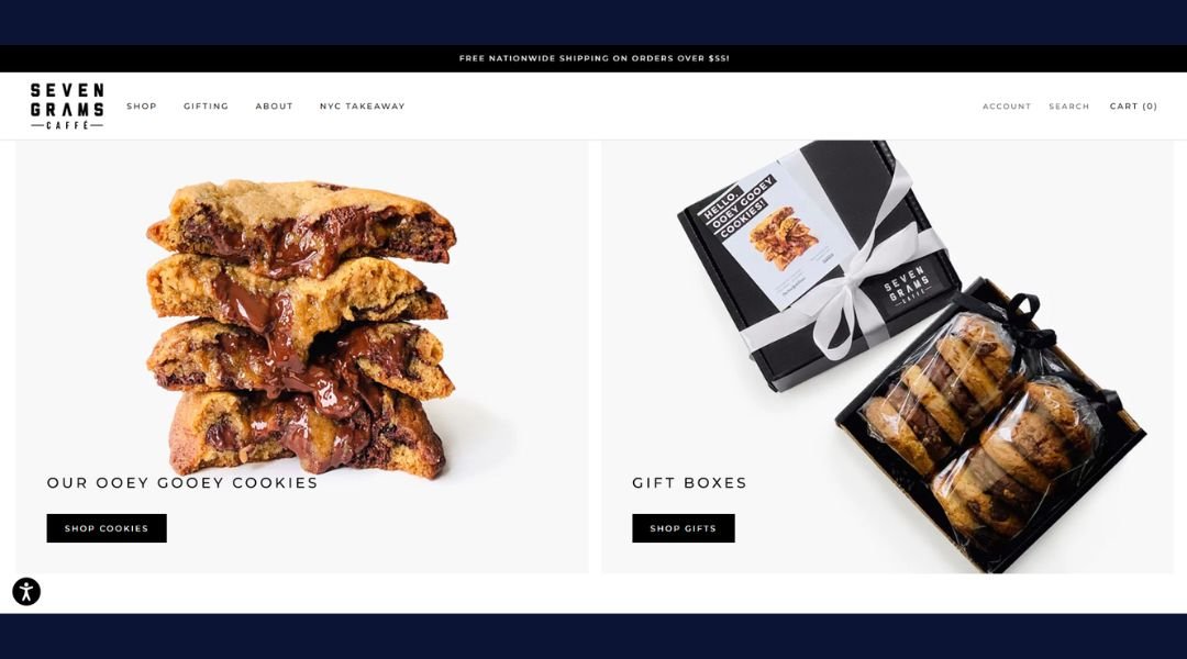
Seven Grams Caffé isn’t just about coffee—it’s about precision, passion, and a little bit of obsession in every cup. From their beans to their brownies, everything is crafted with care, but never feels overdone.
The name itself nods to the exact weight of a perfect espresso shot. That same attention to detail shows up in every part of the experience. Their roasts are bold and balanced, their baked goods genuinely crave-worthy, and the atmosphere walks the line between cozy and confident.
The website mirrors that vibe—sleek, no fuss, and focused on quality. Whether you’re browsing their menu, ordering a gift box, or diving into their story, it’s all clear, inviting, and thoughtfully built.
There’s nothing flashy here. Just seriously good coffee, a deep respect for craft, and a brand that knows taste comes first. Whether you stop by in person or ship a box to your door, Seven Grams delivers the kind of quality you remember—and go back for.
Because when coffee’s done right, seven grams is all it takes.
19. Mitchell Adam
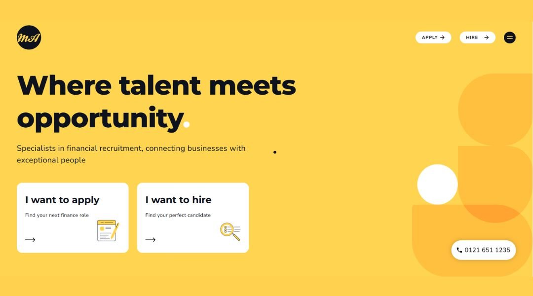
Mitchell Adam isn’t just a recruitment agency—they’re a finance and accounting talent partner with a sharp eye for long-term fit. Based in Birmingham, their team focuses on connecting the right professionals with the right roles, minus the usual recruitment noise.
The website speaks the same language as their clients: clear, confident, and outcome-driven. Whether you’re hiring or job-hunting, the process is streamlined, human, and rooted in deep market knowledge. No guesswork, no generic pitches—just smart matching and real results.
What sets Mitchell Adam apart is their focus on relationships over transactions. They know that good hiring isn’t just about ticking boxes—it’s about finding someone who actually fits the team, the pace, and the future of the business.
They work across a range of sectors, but never lose sight of the individual. You’re not just a candidate or a client—you’re part of a process built on trust, clarity, and consistency.
For finance professionals and companies ready to grow with the right people, Mitchell Adam makes recruitment feel less like a search—and more like a solution.
20. Oishii
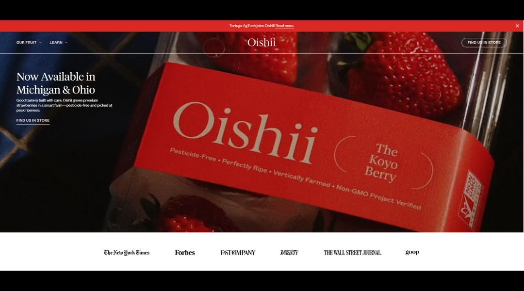
Oishii isn’t just growing fruit—it’s redefining what fruit can be. Known for its perfectly sweet, intensely flavorful strawberries, Oishii blends Japanese tradition with precision indoor farming to deliver something rare: produce that feels like a luxury.
From the first glance, the site reflects that philosophy. Clean design, minimal distractions, and a tone that values quality over hype. You’re not bombarded with claims—you’re invited into a story of innovation, sustainability, and quiet excellence.
What makes Oishii stand out is its obsession with detail. Every berry is grown in a controlled environment that mimics natural perfection—without pesticides, without compromise. It’s farming built for flavor, not just yield.
And it’s not just about strawberries. It’s about changing how we think about food. Transparent practices, thoughtful packaging, and a product that speaks for itself with every bite.
Oishii isn’t trying to be everywhere. It’s trying to be unforgettable—one perfect berry at a time.
Conclusion
So, that’s my take on 20 footers that go beyond filling up blank space at the bottom of the page.
Whether you lean minimalist or have a little fun with flair, the best footer isn’t just about checking boxes—it’s about finishing strong. I’ve seen firsthand how small changes down there can lead to better engagement, smoother navigation, and a site that just feels more complete.
Don’t overthink it. Don’t overlook it either.
If your footer feels like an afterthought, it’s probably time to give it some love. Hopefully, these ideas give you the spark to do just that—without needing a total redesign or a three-hour brainstorm.
A good footer doesn’t have to shout. But it should say something.
And now, yours will.