Typography isn’t just about picking a pretty font—it’s the voice of your website before a single word gets read. I’ve seen great design fall flat because the type felt off. And I’ve also seen simple layouts come to life with the right letterforms.
In this list, I’ve pulled together 19 typography inspiration ideas that helped me rethink how I approach type in web design—and they might do the same for you.
Here’s what you’ll find:
- Fresh font pairings that actually work
- Layouts that use space like a pro
- Smart ways to play with contrast and size
- Sites that prove less type can say more
- And a few ideas that made me go “wait… can I steal that?”
If you’re stuck in a Helvetica rut or just need a little spark, this list is built to help. Let’s talk type.
1. PACT Media
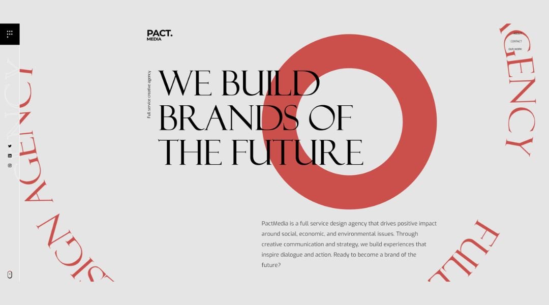
PACT Media doesn’t just produce films—it curates purpose. From the moment you land on their site, you’re pulled into a world where story and social impact meet in bold, cinematic fashion. The layout is clean but far from quiet. Full-screen video loops showcase raw footage and human moments, reminding visitors that behind every campaign is a cause worth amplifying.
The About section skips the generic bio fluff. Instead, you get a snapshot of their philosophy, creative method, and why they do what they do. It’s informative, honest, and a little gutsy—kind of like their work.
Even the font choices feel intentional. No over-designing here. Just strong visuals and a sense that the people behind the lens actually care.
And yes, the projects speak for themselves—but it’s the framing (pun intended) that sets them apart. Real-world issues, approached with clarity and respect.
PACT’s site doesn’t shout. It speaks. And that makes all the difference.
2. Bathyscaphe
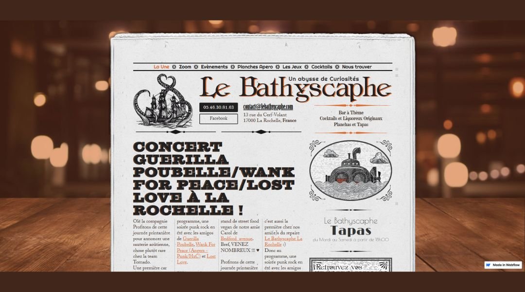
Bathyscaphe’s website drops you straight into the deep end—in a good way. No filler, no fuss. Just sharp design, bold statements, and a clear creative pulse. The homepage feels less like browsing and more like stepping into a concept.
Rather than listing off services in predictable blocks, the content is shaped to intrigue. There’s a confident minimalism at play—each section says just enough, then lets the visuals take over. It’s a bit like their approach to branding: deliberate, distilled, and never trying too hard.
Their About page? It’s brief but packed. You won’t find buzzwords or inflated promises. Instead, you get a direct sense of who they are and why they care about doing design right.
The design system carries a lot of weight here. Fonts, motion, spacing—it’s all carefully controlled, yet it never feels sterile. There’s texture. There’s mood. And yes, a little mystery.
Bathyscaphe doesn’t try to be everything for everyone. That’s the point. It’s focused, thoughtful, and just edgy enough to stay memorable without trying to impress too hard. A rare mix.
3. AJ Design
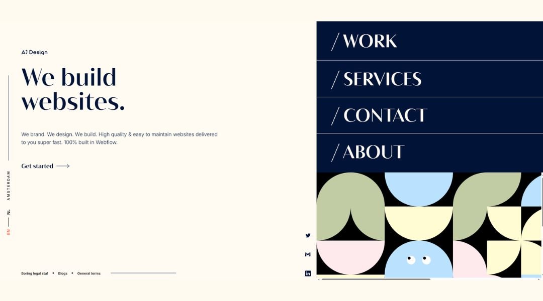
Ali Jamal’s site doesn’t waste time. You arrive, and the message is clear: this is someone who designs with purpose—and restraint. The homepage is stripped back, but intentional. Every scroll feels like a quiet nudge forward, not a sales pitch.
Instead of flooding you with buzzwords or design clichés, Ali gives space to the work. Case studies are well-paced, with just enough detail to understand the thinking without slowing things down. You’re not asked to decode jargon. You’re invited to observe clarity.
His About page is refreshingly direct. No overinflated claims or emotional monologues. Just a brief, well-written profile that reflects a designer who knows what he’s doing and doesn’t need to shout about it.
Even the typography plays a role. Sharp, clean, and modern—like the projects themselves. The layout respects your attention, which, ironically, makes you want to spend more time exploring.
Ali’s site isn’t trying to be flashy. It’s focused, confident, and built to reflect a simple idea: good design speaks quietly, but with impact.
4. Wholeness Collective Therapy Group
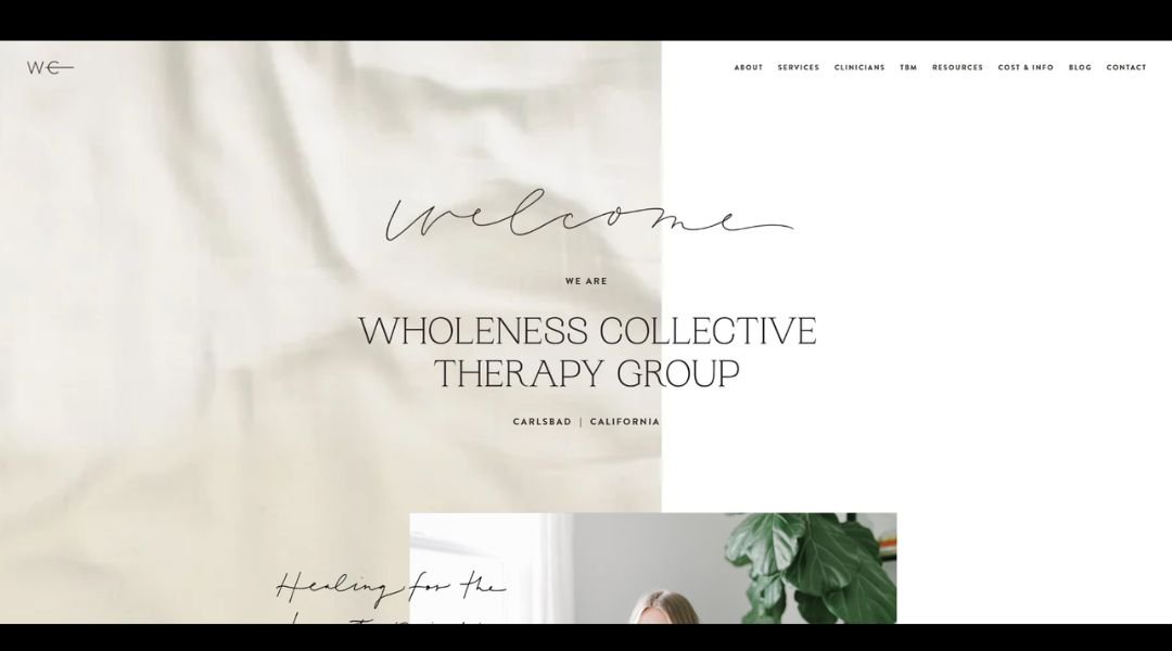
Wholeness Collective Therapy doesn’t just talk about healing—it makes space for it the moment you land on the site. Soft colors, spacious design, and grounded language all work together to create a sense of calm before you’ve even booked a session.
Instead of listing credentials in tight-packed paragraphs, the site offers clarity. Each therapist’s bio reads like a conversation—not a résumé. You get a sense of who they are, how they approach care, and more importantly, how they might support you.
Navigation is simple. No digging through dropdowns or decoding wellness jargon. Services, scheduling, and contact info are exactly where you’d expect them—because ease matters when you’re already feeling overwhelmed.
The overall design feels therapeutic in itself. Thoughtful spacing, supportive phrasing, and images that actually feel human. There’s no rush here. Just reassurance.
What stands out most? The tone. It’s kind, but not overly sweet. Professional, but never clinical. Wholeness Collective offers more than therapy—it offers a place that feels ready to meet you exactly where you are.
5. Readymag
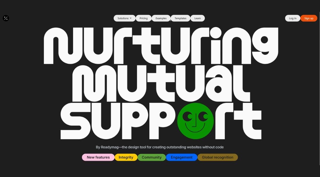
This isn’t your average product recap. Readymag’s 2024 roundup reads like a design-forward highlight reel—with just enough context to inform, and just enough style to keep you scrolling. No dense paragraphs. No filler. Just straight-to-the-point updates, each with its own visual punch.
The layout reflects what Readymag does best: structure with personality. You get crisp typography, smart spacing, and motion that feels subtle but deliberate. It’s all designed to showcase progress without shouting about it.
Each feature update is explained in plain terms. There’s no need to squint through industry speak. Whether it’s performance tweaks or interface upgrades, everything is clear, short, and refreshingly honest.
What really lands is the tone. It’s confident, but not smug. Friendly, without overdoing it. Think: designer-to-designer conversation, not corporate announcement.
Visually, it’s a smooth scroll—intuitive, lightweight, and engaging from top to bottom. The whole experience feels like a nod to the people who use the product: creators who appreciate clarity, efficiency, and maybe a little polish along the way.
6. Hourly App
Hourly keeps things simple—and that’s exactly the point. From the first glance, you know what it does and who it’s for. No buzzwords. No over-promising. Just a clean, confident platform built for businesses that want to get payroll, time tracking, and workers’ comp under control.
The homepage speaks with clarity. Large type, smart layout, and just enough breathing room. Every section is built to reduce friction—because managing teams is hard enough without a messy interface.
Rather than overload you with features, Hourly introduces tools as solutions. Real-time syncing? Covered. Automatic calculations? Done. The tone is practical, not pushy. You get answers, not a sales pitch.
The voice throughout feels like someone who’s been in the back office too—who knows that chasing down hours or adjusting pay rates isn’t glamorous, but it matters.
Design-wise, it’s sharp and functional. Friendly, but never cutesy. Every click feels like it’s helping you get one thing done faster.
Hourly doesn’t try to wow you with complexity. It respects your time—and that might be the smartest feature of all.
7. Angela Milosevic
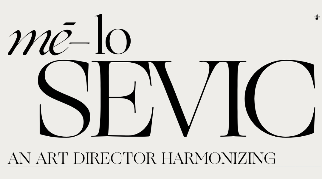
Angela Milosevic’s site is quiet confidence in motion. No loud colors, no clutter—just thoughtful design that puts the work at the center. It’s the kind of portfolio that doesn’t over-introduce itself. Instead, it invites you in, piece by piece.
The homepage layout is crisp and intentional. Projects get their own space to breathe, with clear imagery and sharp captions that let the visuals speak first. But dig in, and you’ll find detail where it matters—how a project was approached, what problem it solved, and why it looks the way it does.
Angela’s About section avoids the usual fluff. It’s brief but personal, striking a balance between professional credibility and creative voice. You get the sense she’s not designing to impress—she’s designing to communicate.
The entire experience feels measured. Fonts are clean, movement is minimal, and the tone stays steady throughout. It’s not trying to win you over with flash. It earns your attention by staying focused and polished.
This is design that respects your time—and your eye.
8. MadSavvy Creative
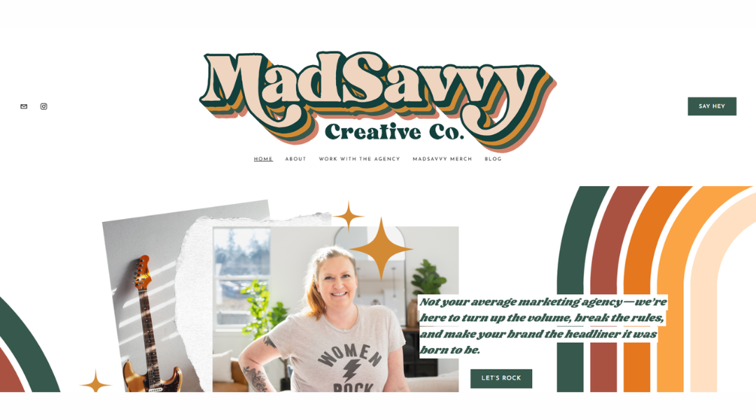
Mad Savvy Creative isn’t here to blend in—and neither are their clients. From the first scroll, the site delivers a clear message: bold strategy meets fearless branding. It’s sharp, colorful, and unafraid to show some personality.
The homepage leads with energy. Big type, confident copy, and visuals that feel alive. It’s not just about making things look good—it’s about making them work hard. You can tell this studio thinks deeply about positioning, voice, and how brands show up in the real world.
Each section is lean but loaded. The services page? Direct. No fluff. You get what they do, why it matters, and how they’ll do it differently. The tone is smart, slightly cheeky, but always professional—like working with someone who knows the rules but isn’t afraid to break a few (on purpose).
And the design? It’s structured, but never stiff. There’s rhythm in the layout and just enough play to keep it fresh without losing focus.
Mad Savvy doesn’t just build brands. It builds attitude—with strategy baked into every pixel.
9. Sea Harvest
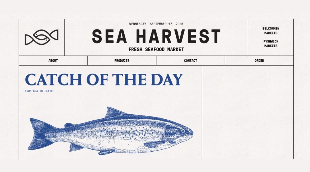
Sea Harvest doesn’t just supply seafood—it brings the ocean to the table with care, consistency, and a deep respect for quality. The moment you arrive on the site, you’re met with crisp visuals, clean navigation, and a straightforward message: fresh, honest seafood from people who know the business.
The homepage is all function, no fluff. Key offerings are front and center, whether you’re a distributor, wholesaler, or just curious about where your fish is coming from. The tone is professional but approachable—more conversation than corporate.
Each section serves a purpose. From product listings to processing capabilities, everything is laid out with clarity. You won’t need to dig for details. It’s all right there—easy to find, easy to trust.
What stands out most is the pride. Sea Harvest isn’t just selling fish. It’s showcasing decades of experience, built on strong industry relationships and a focus on doing things the right way.
No distractions. No gimmicks. Just solid, straightforward seafood supply—with a business that runs as clean as its product line.
10. Divina Lingua
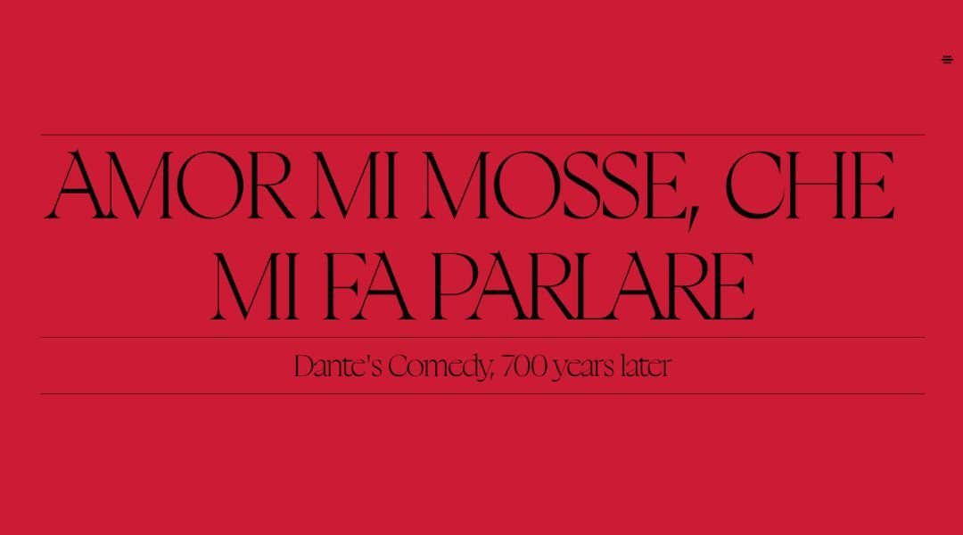
Divina Lingua isn’t your typical language school—it’s more personal, more intentional, and way less textbook. From the first click, the site feels welcoming. Think cozy, not corporate. It’s clear this isn’t just about grammar—it’s about connection.
The homepage gives you the essentials fast: who they are, what they offer, and why it matters. Whether you’re learning Italian for life, love, or work, the message is simple—you’ll be guided with heart and know-how.
The design is light but grounded. Soft tones, clear type, and friendly visuals set the tone without over-decorating. It’s a digital space that feels human—probably because the team behind it clearly is.
Course descriptions are straightforward and flexible. There’s structure, but also room to breathe. Whether you’re a beginner or brushing up, the approach is built around you—not the other way around.
What’s refreshing is the tone. It’s calm, confident, and quietly passionate. You won’t find hard sells or overstatements here. Just a clear path to learning that feels… well, a little divine.
11. Red Collar
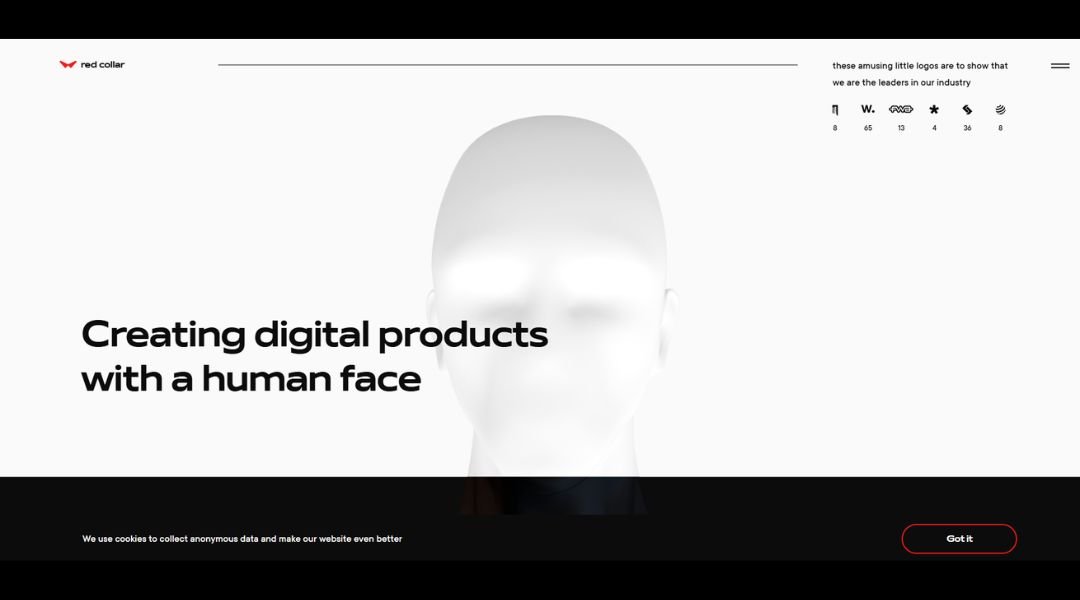
This isn’t just a type specimen—it’s a flex. Red Collar’s font site feels more like an experience than a showcase. From the first screen, it’s clear: this team doesn’t just design fonts—they design feelings.
The site is sleek, high-contrast, and unapologetically bold. Animations are smooth but purposeful, guiding you through the anatomy of each font with just the right amount of flair. There’s no guesswork here—every detail, from spacing to weight, is on display and easy to digest.
What really stands out is the tone. Confident without being arrogant. Playful, but grounded in solid design thinking. You get the sense that these fonts weren’t built to sit quietly in the background—they were made to lead.
Navigation is fast, focused, and refreshingly minimal. The experience feels designed for designers. You can explore, experiment, and test without friction.
Visually, it’s sharp. Conceptually, it’s tighter. And functionally? It just works. If you’re after typography with attitude—and a site that knows exactly what it’s doing—this one delivers, point by point, pixel by pixel.
12. Lyst Denim
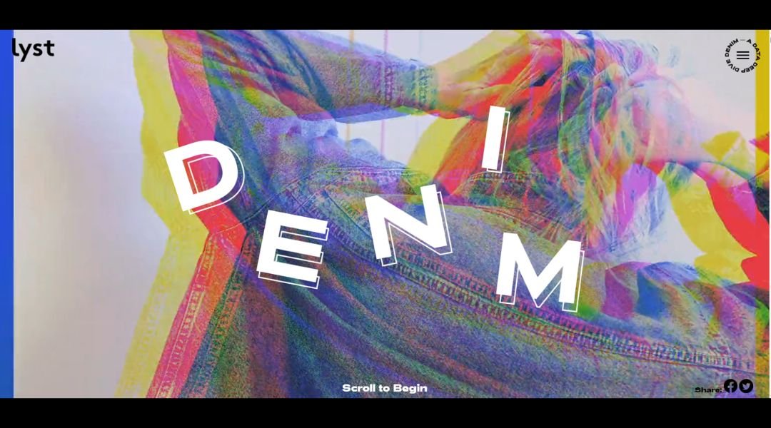
The Lyst Denim Report skips the fluff and gets straight to what matters. Built on machine-powered insight—over 60 million searches—the report breaks down denim’s top trends with clarity and confidence. You know where the data comes from; you’re not left guessing.
Each breakout trend gets its moment. Expect deep dives into shapes like barrel-leg and bootcut revivals. Think polished looks—pleated accents, puddle jeans—and even flared styles, thanks to cultural moments like Kendrick Lamar’s Super Bowl flared Celine moment that sent those searches up 412%.
The display is sharp and functional. Clean visuals and clear labels make it easy to grasp shifts in washes, silhouettes, and global preferences. It feels designed for anyone who cares about denim—not just designers, but everyday wardrobe curators.
What stands out? This is denim explained without pretension. Data-backed, trend-smart, and visually easy to absorb. If you want to know where jeans are heading next—or just need the lowdown on what to wear—this report has your back.
13. Fat Choy NYC
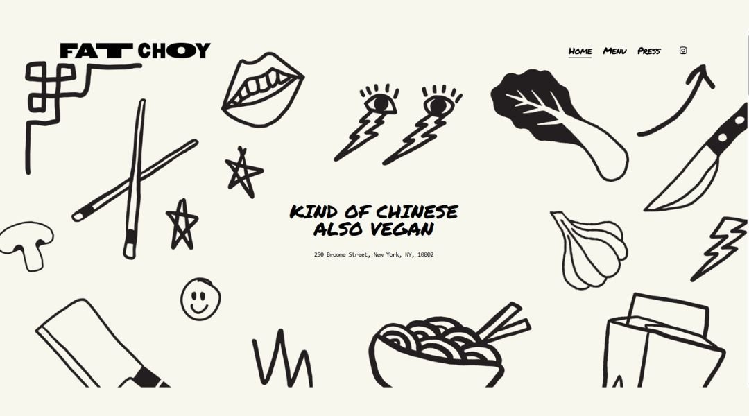
Fat Choy doesn’t play by the rules—and that’s exactly why it works. Tucked into the Lower East Side with a vibe that’s more casual hangout than buttoned-up bistro, this “kind of Chinese, also vegan” spot brings serious flavor without taking itself too seriously.
The website matches the vibe. Bold, minimal, and full of personality. You won’t find flowery food descriptions or long chef bios. Just the essentials: the menu, the hours, and a clear invitation to come hungry.
Every dish feels like a remix—familiar, but with a twist. Think sticky rice dumplings, smashed cucumbers, and mushroom sloppy baos that somehow manage to taste nostalgic and totally new at the same time.
Design-wise, the site keeps it tight. No endless scrolls. No guesswork. Just clean fonts, punchy colors, and a layout that makes you feel like you’ve already found your new go-to.
Fat Choy isn’t trying to be everything. It’s doing one thing—bold, feel-good food—with a lot of heart (and no meat). And honestly, that’s more than enough.
14. Allta
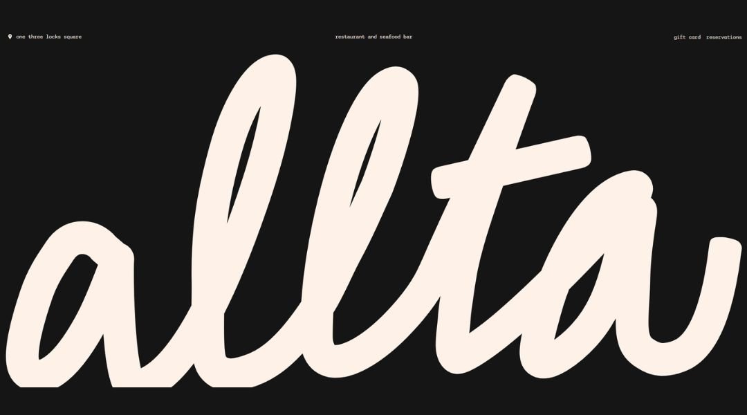
Allta doesn’t just serve food—it crafts an atmosphere. The website opens with confidence: sleek visuals, understated elegance, and a mood that feels more like a curated experience than a restaurant pitch.
Everything is deliberate. From the typography to the photography, each element reflects Allta’s balance of precision and creativity. There’s no overselling here—just a quiet assurance that what’s happening in the kitchen is worth your attention.
The menu isn’t spelled out in paragraphs. It shifts with the seasons and speaks through ingredients. Local sourcing is a focus, but it’s not shouted about. It’s just how they operate—thoughtfully and with respect for craft.
Navigation is intuitive. Bookings, location, and concept all fall into place without friction. Even the tone of the text mirrors the food: minimal, but rich in flavor.
This isn’t dinner and a table. It’s rhythm, timing, and intention—every course, every detail. Allta doesn’t aim to be trendy. It simply is what it is: confident, refined, and quietly unforgettable.
15. Ansley and Jonathan
Ansley and Jonathan’s site feels like stepping into a quiet, cinematic love story—told in soft tones, warm film, and thoughtful pacing. From the first scroll, it’s clear: this isn’t wedding photography for the sake of pretty pictures. It’s about memory, mood, and meaning.
The layout is spacious and slow by design. There’s no rush here. Just time to absorb the work—frames full of texture, emotion, and the kind of stillness that says more than posed smiles ever could.
Their approach is clearly intentional. Each gallery feels like a world of its own—personal, honest, and artfully restrained. They’re not chasing trends. They’re telling human stories with grace.
The copy is minimal but intimate. You get just enough to understand their perspective—quiet observers, deeply invested in the people they photograph, but never trying to control the moment.
Design-wise, the site does what their photos do: it holds space. It breathes. And in doing so, it lets the work speak clearly.
Ansley and Jonathan don’t just document weddings. They distill them into something lasting.
16. Charlie Lemaignan
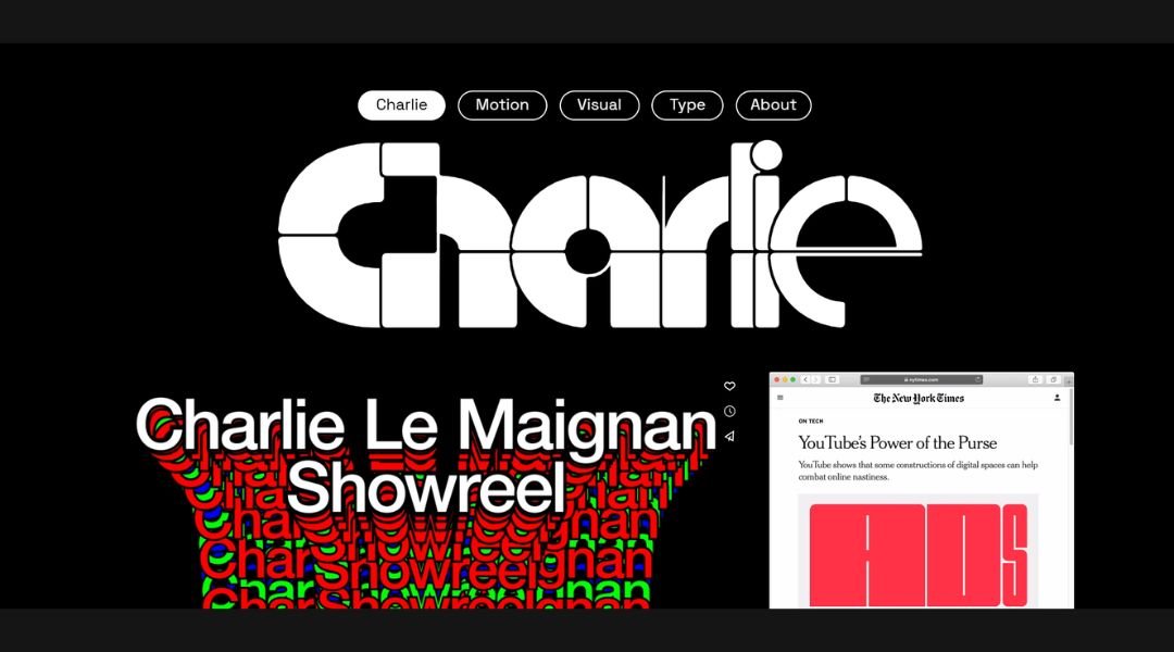
Charlie Lemaignan’s site doesn’t introduce itself with noise. It opens with restraint, clarity, and a quiet kind of confidence. Minimalist design meets sharp intention—no clutter, no distractions, just work that speaks for itself.
The homepage is bare, but not empty. Every project has room to breathe. Each case study unfolds with precision: context, concept, execution. It’s thoughtful without oversharing—just enough to show the thinking behind the polish.
Charlie’s approach to design is clear: simplicity isn’t a lack of effort, it’s the result of it. Layouts are balanced, typography is tight, and interactions are kept to a functional minimum. The site moves like his design—clean, measured, and fully under control.
What sets this portfolio apart is the tone. There’s no bragging. Just carefully selected work, consistently delivered. Whether it’s digital products or brand systems, everything feels resolved—like someone who understands when to push and when to stop.
Charlie Lemaignan doesn’t make noise to get attention. He builds design that earns it quietly.
17. Monograph Communications
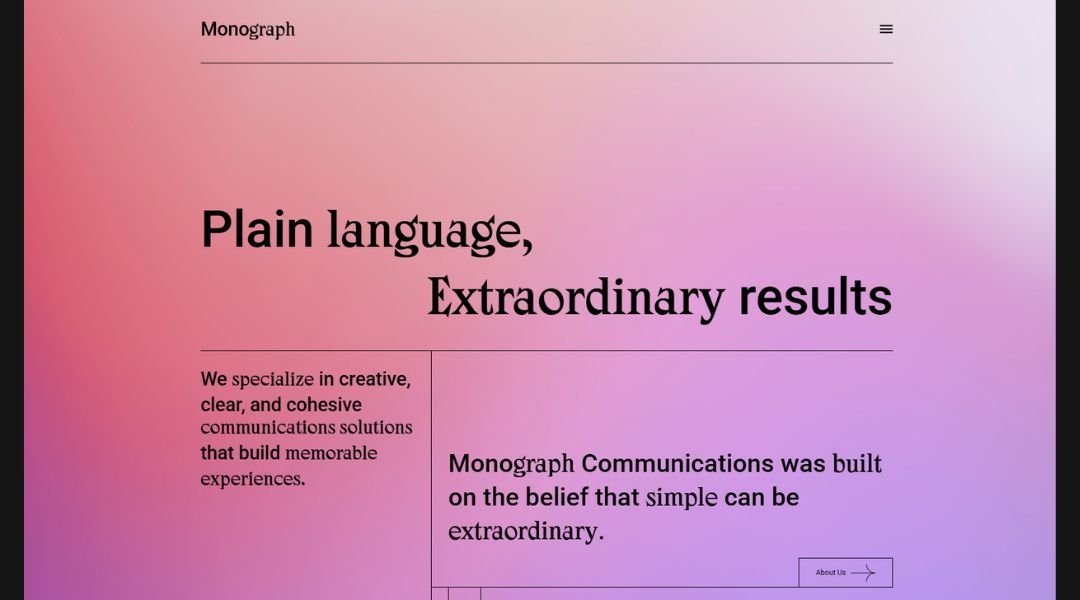
Monograph Communications leads with clarity—and keeps it that way. The site is polished, minimal, and sharply written, much like the work it represents. No fluff, no filler. Just a clear sense of purpose: strategy-driven storytelling for brands that want to be understood.
From the first scroll, you get a feel for their approach—measured, focused, and quietly confident. The language is precise, yet warm. Services are clearly outlined, and each section flows with intent. There’s no overexplaining, just enough to show they know their craft and respect your time.
Design-wise, it’s understated but deliberate. Neutral tones, clean typography, and careful spacing let the words carry the weight—exactly as a communications studio should.
What stands out is the tone. It’s not trying to charm or dazzle. It’s here to communicate—effectively, strategically, and with just the right amount of personality.
Monograph doesn’t shout. It speaks clearly and on-message, proving that good communication starts with how you present yourself.
18. Henry Northington
Henry Northington’s site doesn’t ask for attention—it earns it. From the first screen, it’s clear this is design with discipline. Sparse, structured, and strikingly restrained, every detail feels considered. Nothing is here by accident.
The layout is almost architectural. Space is treated with respect. Typography is sharp, neutral, and quietly assertive. There’s no color noise or flashy motion—just work, clarity, and a strong point of view.
Each project is presented with precision. No long-winded breakdowns or buzzword-heavy intros. Just the essentials: what it is, how it functions, and why it matters. You’re not overwhelmed—you’re invited to look closer.
Henry’s approach is rooted in systems and logic, but never feels cold. There’s warmth in the simplicity. A quiet confidence in every composition. It’s the kind of design that doesn’t need to explain itself—it works on contact.
This is a portfolio that respects design—and the viewer. Direct, distilled, and intentionally understated. The message is clear: less, when done right, says a lot more.
19. Bibenda
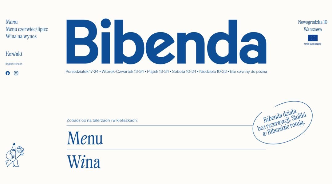
Bibenda isn’t just a restaurant—it’s a mood. From the first glance, the site pulls you into a space that feels lived-in, local, and quietly intentional. The tone is relaxed but refined, with just enough detail to tell you what matters: good food, natural wine, and an easy atmosphere.
The design is warm and unfussy. Soft colors, clean type, and no unnecessary noise. The layout flows like a conversation—no overloading, just small bites of information served with care.
The food philosophy? Seasonal, simple, and rooted in real ingredients. There’s no lecture, no over-promising—just an invitation to sit down and enjoy what’s in front of you. The wine list leans natural, but the tone never drifts into pretension.
Bibenda feels like a place where locals and visitors both end up by word of mouth—not ads. And the site reflects that. It doesn’t try to sell the experience. It just shows it, quietly and confidently.
This is a restaurant that knows exactly who it is—and doesn’t need to shout to be heard.
Conclusion
Typography has this quiet way of running the whole show. When it works, most people won’t even notice—it just feels right. But when it doesn’t, it’s the first thing that makes a site feel off.
I’ve tried, tested, and bookmarked more than I care to admit, and these 19 ideas stand out for a reason. They’re smart, bold (sometimes literally), and easy to build on—no gimmicks, just good design choices.
If even one of these ideas gives you that “aha” moment, I’d say this little typography tour was worth the scroll.
Now, back to obsessing over kerning.
