Your restaurant’s food might be unforgettable, but if your website feels like a half-baked afterthought, potential guests might never walk through the door. I’ve seen too many beautiful menus buried beneath clunky navigation and slow-loading sliders.
In 2025, your online presence is the appetizer—and it needs to hit the table hot.
Whether you’re building from scratch or refreshing what you’ve already got, I’ve rounded up 19 website design ideas that actually work. Not just pretty pictures—real strategies that bring your space, your story, and your food to life online.
Here’s what you’ll find:
- Layout ideas that reflect your restaurant’s personality
- Smart design moves that keep people clicking (and booking)
- Visual styles that match your vibe—whether it’s rustic, modern, or moody
- Menu presentation that doesn’t make visitors squint or scroll endlessly
- Real-world examples you can actually learn from
Let’s get your online table set right. Spoiler: it won’t include flashing banners or music that auto-plays.
1. Bresca
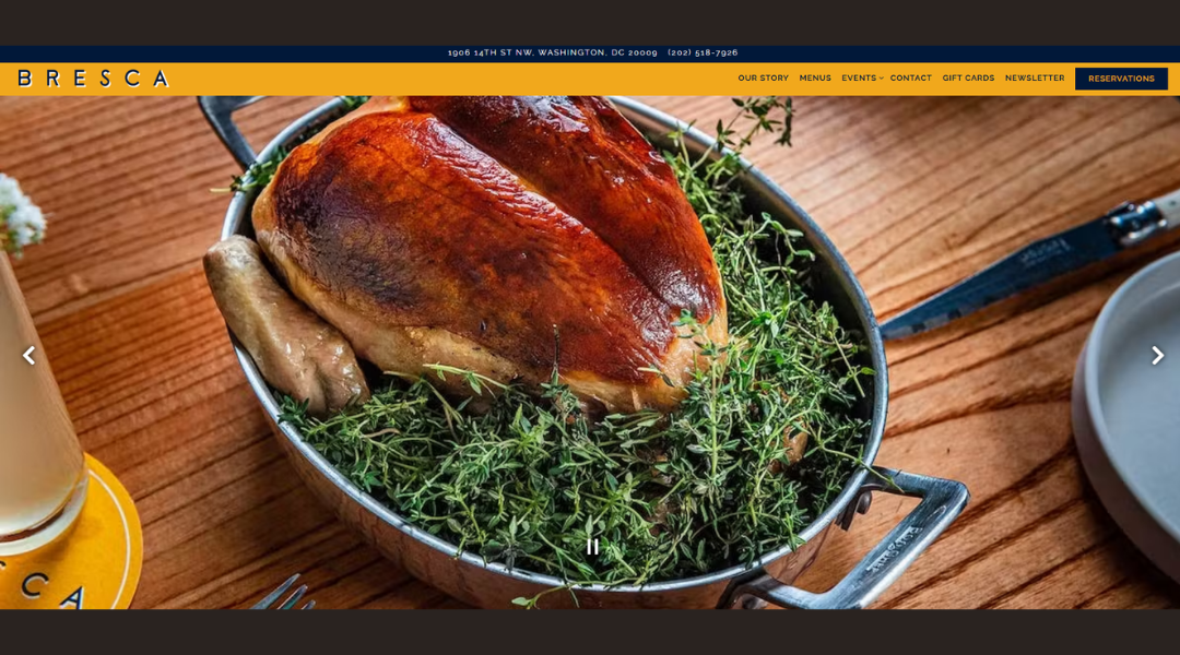
Bresca doesn’t try to impress you with flash—it wins you over with intent. From the homepage to the final scroll, every detail is sharp, elegant, and thought through.
This isn’t your typical “chef with a dream” website. It’s focused. It’s clean. And yes, it’s visually delicious. The photography gives just enough. The language is confident but never loud. You get the sense they know what they’re doing—and that they’d rather show than tell.
The About section is compact but gives you what you need: who’s behind the kitchen, what drives them, and why it matters. No fluff, just flavor.
Menus are presented simply, which lets the ingredients and creativity stand on their own. There’s even a bit of personality sprinkled in, like the unexpected color pops or the naming of their bar program. It’s subtle, but intentional.
Bresca’s site doesn’t push—it invites. It’s the digital version of a restaurant that’s booked weeks out but still makes you feel welcome the second you step in. Or click in.
2. Sono
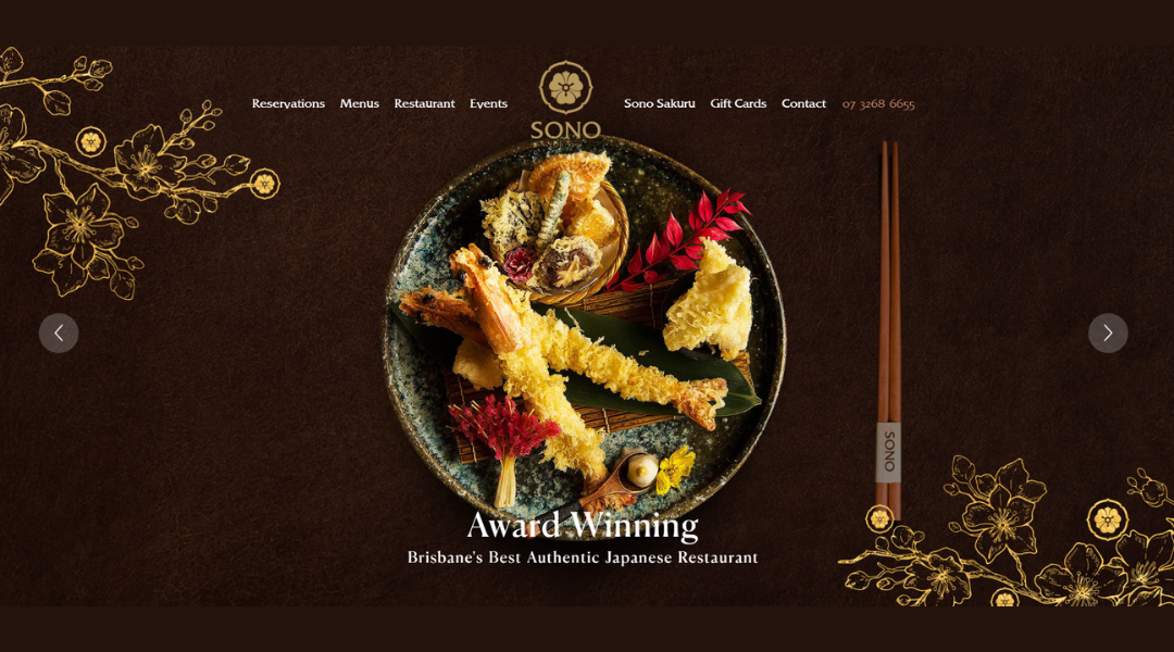
Sono Restaurant doesn’t rush to impress—it lets the experience unfold. From the moment the site loads, it’s clear this is fine dining with focus. Clean visuals, soft movement, and just enough space between each section. It feels like breathing room, but for your eyes.
The photography is crisp and elegant. You’re not overwhelmed with plates—just teased with thoughtful shots that suggest precision and care. The design doesn’t scream luxury, but it doesn’t need to. It’s quiet confidence, done well.
The About section introduces tradition with modern balance. You learn about technique and philosophy without getting lost in a chef’s monologue. It’s straightforward, and yes, it makes you want to book a table.
Navigation is effortless. Menus, location, and booking details are all within easy reach. No guesswork. No distractions. Just polished function.
What stands out is the restraint. Everything feels intentional. No overcrowded pages, no overused adjectives. Just a sense that this is a place where details matter—from the cut of the sashimi to the font on the page.
Sono’s website is more than a preview—it’s a promise: elegance, tradition, and a table worth dressing up for.
3. JB Restaurant
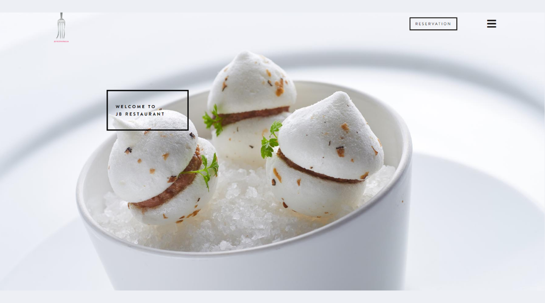
JB Restaurant doesn’t overstate its presence—it simply delivers it. From the first scroll, the site speaks with quiet confidence. Crisp visuals, minimal layout, and a tone that suggests one thing: the food is serious, and the experience is curated.
The homepage doesn’t overwhelm. Instead, it leads you in gently, with warm photography and just the right amount of space. The color palette is refined, matching the mood of the dining room.
The About section offers a short glimpse into the restaurant’s identity—rooted in Slovenia, shaped by global sensibilities. It’s not overly poetic, just honest. And that’s refreshing.
Menus are presented clearly and uncluttered. Each dish reads like it’s been considered, not just listed. There’s a rhythm to how things are introduced—starter, story, invitation.
Booking is simple, and the site keeps distractions to a minimum. The feeling is intentional and elegant, like the restaurant itself.
JB doesn’t try to be trendy. It focuses on substance. The website reflects that, down to the final detail. Understated design, confident voice, and a strong sense of place—this isn’t just a meal, it’s a statement.
4. Colonia Verde
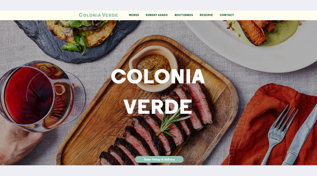
Colonia Verde feels like that cozy spot you stumble into—and never want to leave. The website captures that same atmosphere. It’s relaxed but thoughtful. Earthy, yet polished.
From the start, the site welcomes you in with textured visuals, soft colors, and a layout that feels handcrafted. Nothing flashy. Just warmth, charm, and clear intention.
The About section is brief but rich. It doesn’t try too hard. A few lines in, and you already understand the spirit behind the place—Latin-inspired roots, Brooklyn soul, and a love for gathering around food.
Menus are presented with clarity and just the right amount of personality. You can almost hear the sizzle from the open-fire grill. And while the design stays understated, it leaves room for flavor—both literal and visual.
The booking process is easy, and location info is right where you expect it. No digging. No distractions.
Colonia Verde’s site is more than a lookbook—it’s an invitation. Come for the food, stay for the energy. It’s local, intimate, and just a little wild—in the best way.
5. Restaurante Baobab
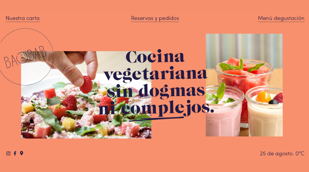
Restaurante Baobab doesn’t feel like a place trying to impress—it feels like a place that already knows who it is. The website reflects that. It’s clean, grounded, and quietly bold.
Right away, you’re met with earthy tones and warm photography. The visuals do the talking. There’s no overload of text, just a few well-placed words that point to something deeper: a strong culinary identity rooted in African tradition and local connection.
The About section is short and intentional. It tells you just enough—Baobab is not just a restaurant; it’s a voice, a presence, a plate with perspective.
Menus are simple to explore. Ingredients speak for themselves. The dishes sound like stories—familiar, but told with flavor you haven’t met yet.
Everything from navigation to reservation is smooth. The design keeps your focus where it belongs—on the food and the values behind it.
Restaurante Baobab doesn’t follow trends. It honors roots. And that comes through in every line, every photo, every dish.
6. Protein
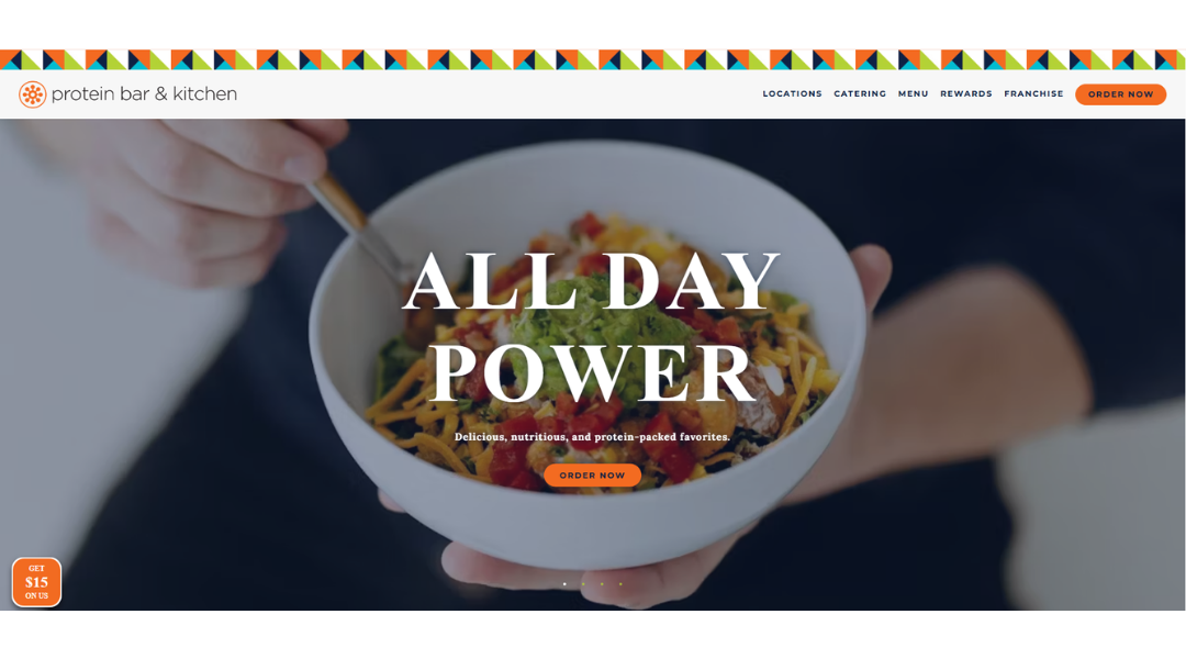
The Protein Bar & Kitchen gets straight to the point—just like its menu. The website is fast, friendly, and refreshingly easy to navigate. From the colors to the copy, it’s clear this is a brand that values clarity, speed, and feel-good food.
The homepage delivers the essentials upfront: what they serve, why it matters, and how to get it. Bright visuals and bold fonts make it all pop, without overwhelming the senses.
The About section shares the mission in simple terms—fueling busy people with food that’s both good and good for you. No lectures. No overcomplication. Just a clear goal and a smart way of getting there.
Menus are front and center, sortable, and packed with clean options. Whether you’re looking for a low-carb bowl or a smoothie with a purpose, the site helps you find it fast.
Ordering is streamlined, and locations are easy to spot. The whole experience feels built for people on the go—because it is.
This isn’t just a health food place. It’s a fast-casual brand with focus, flavor, and a website that moves as quickly as its customers.
7. Quay
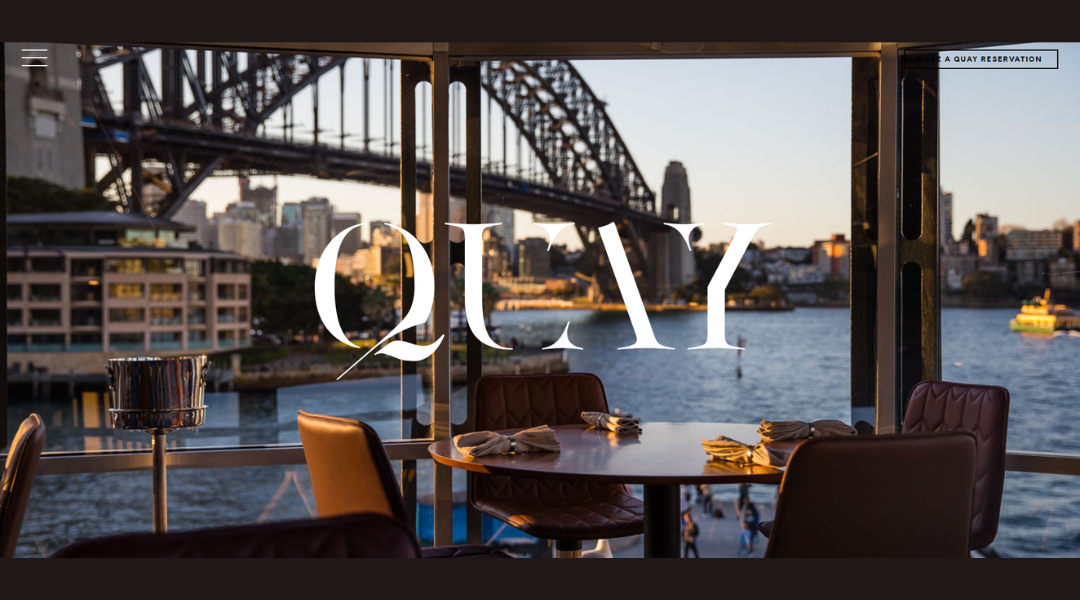
Quay doesn’t just present itself as a fine dining destination—it feels like one from the first click. The website is restrained, polished, and visually striking. It doesn’t rush to impress, because it doesn’t have to.
The homepage is built around atmosphere. Moody photography, elegant typography, and just the right amount of white space create a calm, immersive experience. It’s refined, but never stiff.
The About section gives a glimpse into the philosophy behind the plate—focused, thoughtful, and built around Australia’s landscape and ingredients. It reads more like a conversation than a pitch.
Menus are presented with clarity and care. Each dish reads like a statement. The imagery doesn’t try to oversell—it invites you to look closer.
Booking is simple, and everything you need—location, hours, wine info—is exactly where it should be. No extra steps. No distractions.
Quay’s website mirrors the dining experience itself: refined, intentional, and quietly unforgettable. It’s less about selling you dinner and more about showing you why it’s worth dressing up for.
8. Quince
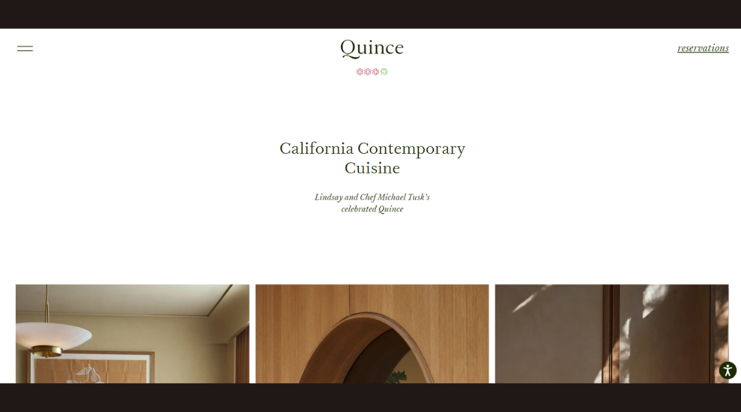
Quince doesn’t shout for attention—it earns it through precision and presence. The website reflects that same approach: clean lines, minimal text, and visuals that do their job quietly but confidently.
From the first scroll, you get the sense that every detail matters. The imagery is soft but focused. Typography is elegant without trying too hard. The experience is curated—much like the food.
The About section is brief but meaningful. It shares a philosophy rooted in connection—to the land, the seasons, and the people who make it all happen. There’s no overexplaining. Just clarity and purpose.
Menus are organized with care. Ingredient-driven dishes are presented without fuss. You’re left curious—in a good way.
Navigation is effortless, and the reservation system is right where it should be. The design doesn’t distract; it guides.
Quince’s site doesn’t overdecorate or overpromise. Instead, it reflects what the restaurant offers: a refined experience built on craft, calm, and quiet confidence.
9. Pastaria
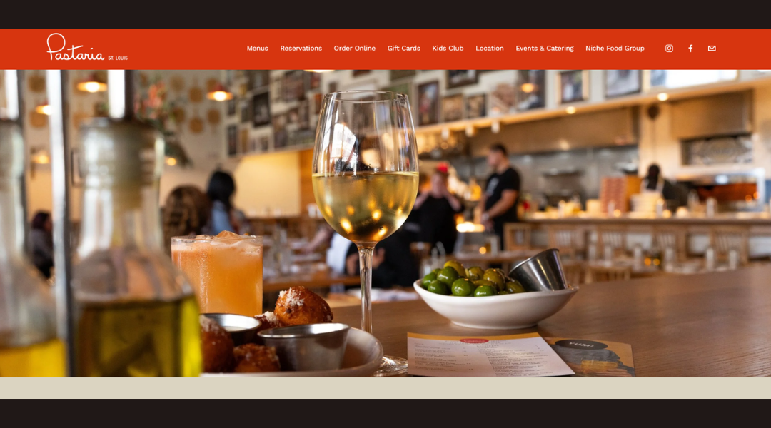
Pastaria doesn’t just serve pasta—it serves community. From the moment you land on the site, it feels genuine, welcoming, and focused on the simple joy of good Italian food. The design is clean, approachable, and easy to navigate.
The homepage highlights what you care about: menu, location, and vibe. You won’t get lost in fluff. Instead, you see handcrafted pasta, fresh cocktails, and just enough crisp visuals to whet your appetite.
The About section is light and friendly. You learn a bit about the team and the story behind opening in St. Louis—no overcooked backstory, just heartfelt intent.
Menus are clear and well-organized. You can tell that every dish—whether it’s a seasonal special or a classic cacio e pepe—gets attention. The layout reflects that: neat, thoughtful, and let-the-food-do-the-talking.
Booking a table or ordering to-go is straightforward. Everything you need is right where you expect it.
Pastaria’s site feels like the restaurant itself: warm, with a casual shake of style. It doesn’t try to be fancy. It just wants you to feel at home—plate first, heart next.
10. Ilili
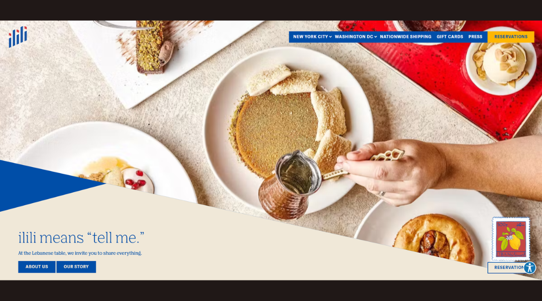
Ilili feels like a stylish conversation around a Middle Eastern table. The website reflects that—airy, elegant, and easy to explore. Warm photography, generous layout, and a quiet sense of occasion blend together softly.
From the homepage, you get a clear sense of purpose: Lebanese roots, shared plates, and modern energy. No clutter. Just context. The About section reinforces the mood—this isn’t just a meal. It’s a gathering rooted in tradition yet refreshed for today. No overwriting, just intent.
Menus are easy to digest. Mezze, mains, brunch—everything’s organized and visible. The smart design leaves the food to speak for itself. You can almost taste the hummus swirl or hear the pita crackle.
Booking, catering, private events—everything’s laid out clean and clear. Whether you’re planning a cozy table for two or an event for 500, the site handles it without the clutter.
What stands out is restraint. Ilili doesn’t try too hard. It trusts its food, space, and heritage. And honestly? That trust shows. The site isn’t a sell—it’s an invitation. Pull up a chair.
Sources
11. Au Cheval
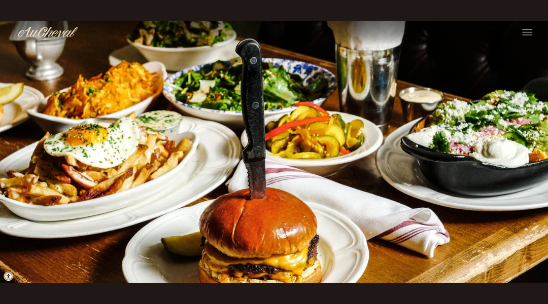
Aucheval Diner feels like a friendly nod to diner classics—with a modern twist. The website sets the tone: welcoming, neat, and easy to navigate. Warm photos, clear navigation, and just enough personality to feel more than “just another site.”
The homepage delivers essentials upfront: menus, location, and atmosphere. Nothing hidden. You get a sense of the food—hearty breakfasts, lunchtime favorites, maybe a twist of something unexpected—without needing a salesperson.
The About section is short and straightforward. You learn who they are and what they’re about—serving honest food with a casual twist. No long-winded origin story. Just clarity and friendliness.
Menus are laid out cleanly, with categories that make choosing simple. The design keeps the appetite front and center.
Booking and location details are easy to find. No extra steps. No clutter. It’s practical—like the diner itself.
Aucheval Diner doesn’t aim to be fancy. It’s about comfort and consistency. The website reflects that—simple, inviting, and a spot you’d happily (and easily) revisit. Pull up a chair and dig in; the site already makes you feel at home.
12. Fox
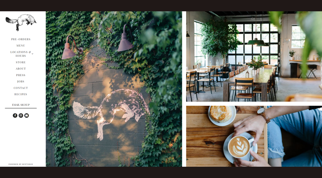
Fox in the Snow isn’t flashy—it’s familiar, in the best way. The website greets you with clean design and inviting visuals that feel like a gentle hug with your morning latte. It’s rustic elegance without trying too hard.
You immediately sense the care. Large photos of golden pastries, the kitchen behind glass, casual seating—all hint at comfort and craft. No clutter. Just a warm welcome.
The About section shares a small story: local roots, Brooklyn beginnings, and an obsession with baking. It’s simple—but enough to show why this place feels more like home than a coffee shop.
Menus are easy to explore. Egg sandwiches, galettes, morning buns—they all sound thoughtful, not gimmicky. And yes, the famous souffled egg sandwich gets its moment—light, hearty, and worth the hype.
Ordering ahead or browsing locations is seamless. No search hoops required.
Fox in the Snow’s site doesn’t oversell. It just shows you what makes it special: scratch-made quality, relaxed vibes, and a community feel. It’s a place that quietly says: come as you are.
13. 4 Rivers
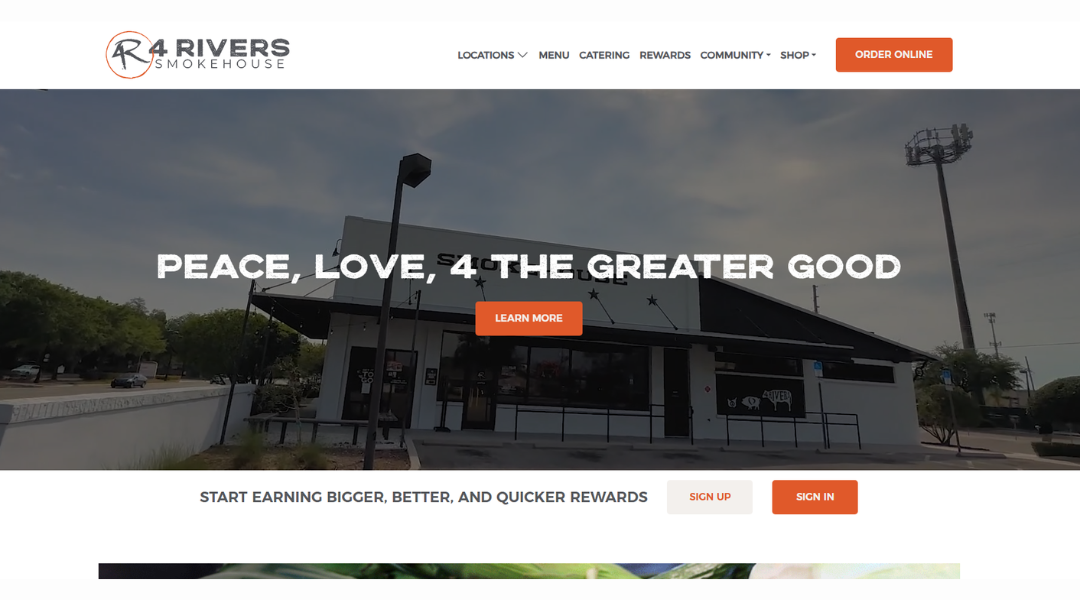
4 Rivers Smokehouse starts strong—and it keeps going. The website opens with clear visuals of spacious interiors and scattered picnic tables. It sets the tone: casual comfort meets thoughtful layout.
The navigation is straightforward. Locations, menu, catering, rewards—it’s all easy to find. No endless scrolling. The site gives just enough room to breathe.
The About section shares a story that matters—how a charity cookout in 2004 grew into a full-fledged BBQ ministry. It adds weight without preaching. And yes, burnt ends got the memo.
Menus are front and center. Options range from hand-sliced brisket to vegan burnt ends and sides like mac ‘n cheese or collards. There’s something for everyone—picky eaters included.
Catering and rewards info are organized simply, with clear calls to order. Whether you’re planning a family feast or hitting the drive-thru, you’re not stuck searching.
The site isn’t flashy—and that’s the point. It reflects their brand: hearty, dependable, built on community. No gimmicks. Just good BBQ—and a solid online experience that invites you back.
14. Moxhe
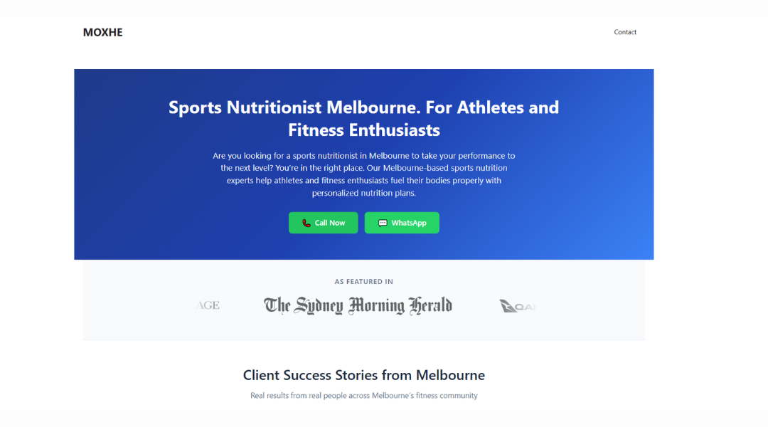
Moxhe’s website opens with a breath of fresh air—clean visuals, vibrant accents, and an easy layout that feels energizing yet approachable. Right away, you sense this is a place where quality meets creativity.
The homepage highlights what matters most: stunning hats crafted with care. Images are crisp and engaging. The design isn’t flashy—it’s confident. Each shot lets the materials and shape speak for themselves.
The About section is concise and warm. You learn about the founders, their passion for craftsmanship, and how they bring a modern spirit to a timeless accessory. It never gets lost in marketing speak. Just intention and character.
The shop is smartly organized. Filters for style, color, and fit help you find what suits your vibe—fast. Product pages are clear and informative. You see fabric details, measurements, and good photography angles. It feels thoughtful without being overwhelming.
Navigation, sizes, and support are all easy to find. No dead ends. No guesswork.
Moxhe’s site doesn’t try to sell with noise. It sells through presence—refined hats, clean design, and a sense that this brand knows what it stands for. Pull up a hat. And your look already feels done.
15. Bon Bouquet Café
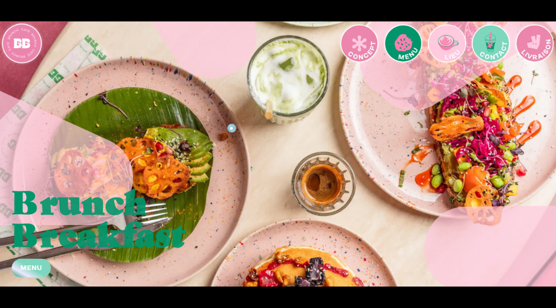
Bon Bouquet Café feels like brunch with a passport. The website is bright, playful, and designed to draw you in without trying too hard. Think bold pastels, layered textures, and photos that practically smell like fresh espresso and warm pancakes.
From the start, the visuals do the talking. Stacks of colorful plates, leafy interiors, and just enough pink to keep things fun—but balanced. The layout flows easily, guiding you from vibe to menu without friction.
The About section doesn’t ramble. It’s short, sweet, and full of personality. You instantly get what the place is about: bold flavors, big energy, and brunch that doesn’t hold back.
Menus are front and center, filled with colorful twists on classics. Avocado toast? Yes, but make it Parisian. Everything is clear, scrollable, and photo-supported—no mystery items here.
Booking, locations, and hours are easy to find. The entire site feels like a digital extension of the café itself: lively, charming, and very camera-ready.
Bon Bouquet isn’t just another brunch spot—it’s a mood. And the site nails it.
16. Girl & The Goat
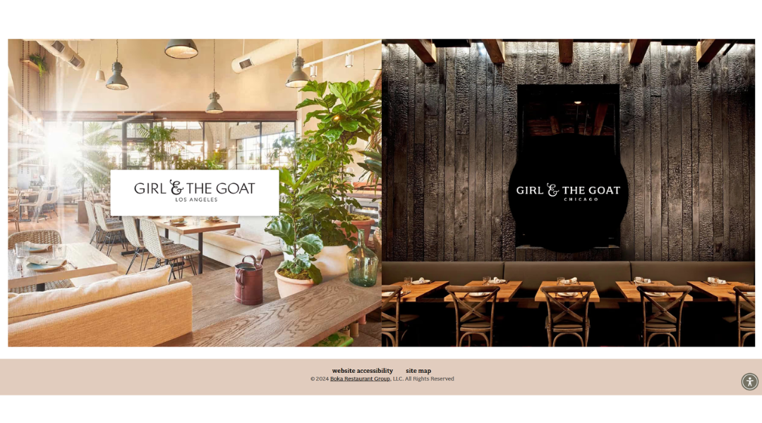
Girl & the Goat isn’t just a restaurant—it’s a personality. The website captures that instantly. Bold typography, earthy textures, and rich photography create a look that’s both grounded and spirited. It feels chef-driven without being overly polished.
The homepage hits the essentials quickly—menus, locations, and reservations. But it also leaves room for mood. You get a strong sense of what you’re walking into: big flavors, shared plates, and a dining experience that doesn’t take itself too seriously.
The About section gives you a peek behind the curtain. You learn the story, but it’s told with style—just enough backstory to feel connected, without turning it into a novel.
Menus are smartly laid out, with dishes that read like they’re meant to be passed, tasted, and talked about. It’s approachable, a little quirky, and totally confident.
Everything works the way it should—booking, navigation, and location info are right where you need them. The site doesn’t overdo it. It just delivers—like the restaurant itself.
Girl & the Goat’s online presence is sharp, flavorful, and impossible to forget. Just like the food.
17. Bevri
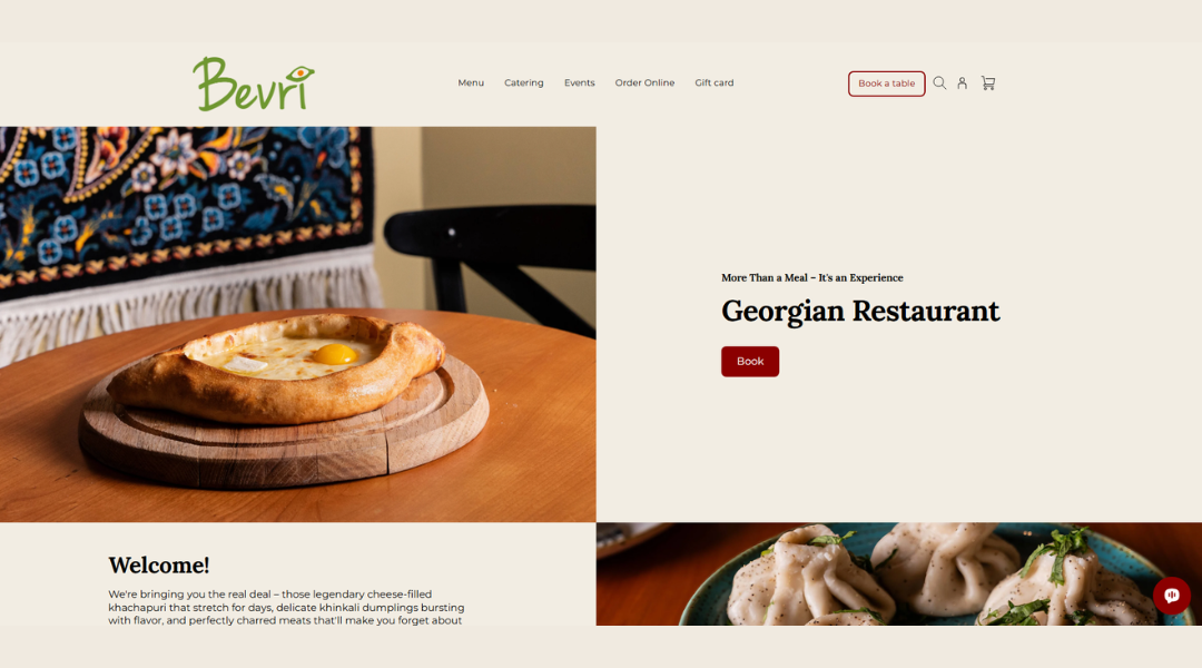
Bevri isn’t just a restaurant—it’s a generous table, set with heart. The website reflects that spirit right away. Simple design, rich visuals, and warm tones create a space that feels inviting before you’ve even ordered.
The homepage does what it should: introduces you to Georgian cuisine without overexplaining it. There’s elegance in the restraint—photos of khachapuri, wine, and shared plates do the talking.
The About section is clear and human. You learn about the team’s love for food, culture, and connection. It’s not a marketing pitch—it feels like someone pulling out a chair for you.
Menus are easy to browse, offering bold, comfort-driven dishes without fuss. From savory dumplings to rich stews, everything feels like it came from someone’s home kitchen—with a little extra finesse.
Booking and location details are easy to find. The layout is intuitive and clean, with just the right amount of visual flavor.
Bevri’s site doesn’t shout tradition—it lives it. Thoughtful, honest, and full of warmth, it invites you to stay awhile. Or at least long enough to order seconds.
18. Ammolite
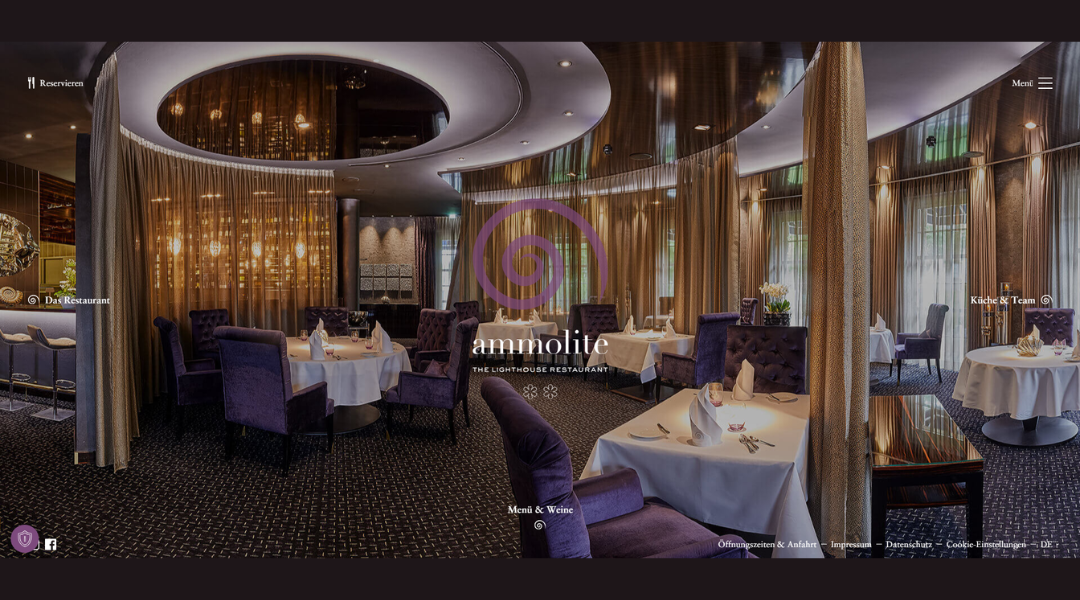
Ammolite doesn’t follow trends—it defines its own rhythm. From the first glance, the website exudes precision. Clean lines, subtle motion, and refined typography reflect a dining experience rooted in excellence.
The homepage sets a quiet, confident tone. No distractions. Just rich visuals, thoughtful pacing, and an atmosphere that feels more like an invitation than a promotion.
The About section is concise yet refined. You get a sense of the restaurant’s philosophy—technique-driven, ingredient-focused, and executed with care. It doesn’t overwhelm. It builds trust.
Menus are structured clearly, with a spotlight on tasting experiences and seasonal creativity. Each course reads like a statement—artful, deliberate, and carefully composed.
Booking and location details are where you expect them, with no guesswork or clutter. Even the smallest details on the site feel intentional—much like the plates themselves.
Ammolite’s website mirrors its dining room: polished, quiet, and precise. It doesn’t try to impress with volume. It does it with restraint, focus, and a steady sense of calm.
19. Le Bernadin
Le Bernardin’s website feels exactly like the restaurant itself—elevated, focused, and composed. There’s no unnecessary flash, just elegant design and confident restraint. Every element is where it should be, with nothing to prove.
From the homepage, the tone is clear: world-class seafood, delivered with precision and purpose. The visuals are understated but rich—plated artistry, ambient lighting, and quiet luxury all around.
The About section is minimal, yet meaningful. It tells a story of legacy and craft without slipping into cliché. You don’t need paragraphs—you feel the heritage in every line.
Menus are structured with care. Prix fixe and tasting options are presented cleanly, with enough detail to inform without overwhelming. Each dish hints at intention, balance, and refinement.
Reservation tools, dress code, and contact details are easy to find. Navigation is seamless, echoing the polished experience of the restaurant itself.
Le Bernardin’s site doesn’t sell drama. It offers confidence. The kind of confidence that comes from decades of discipline, creativity, and consistency—quietly served, course after course.
Conclusion
I’ll keep this short—just like your guests hope the wait time is.
A well-designed restaurant website isn’t about bells, whistles, or buzzwords. It’s about clarity. Clean layout. Intuitive flow. A reflection of the experience you’ve built inside your four walls.
If one or two of these ideas got your wheels turning—or made you scroll back up—that’s the goal.
Use what fits. Tweak what doesn’t. The perfect site doesn’t need to be loud. It just needs to show who you are, what you serve, and why it’s worth showing up hungry.
And if you’re still deciding between two homepage fonts… pick the one that makes your food photos look even better.
