As someone who’s spent countless hours studying what makes property websites actually work, I can tell you—most of them aren’t broken, they’re just…boring. And boring doesn’t sell homes.
If your real estate brand feels stuck in digital autopilot, you’re not alone. I’ve worked with plenty of professionals who had the listings, the market knowledge, and the drive—but their websites whispered when they should’ve spoken up.
In this guide, I’ve pulled together 20 real estate website ideas that stood out to me—not for being flashy, but for being smart, sharp, and human. These aren’t trends for the sake of it. They’re ideas that make sense, load fast, and leave a mark.
Here’s what you’ll find inside:
- Real examples that do more than just look pretty
- Design cues that help users stick around (and click)
- Content tips that connect without the hard sell
- Smart layout moves that simplify decision-making
- Visual touches that make property pages feel personal
Let’s dig into the good stuff—ideas that can quietly do the heavy lifting for your property brand.
1. Belville
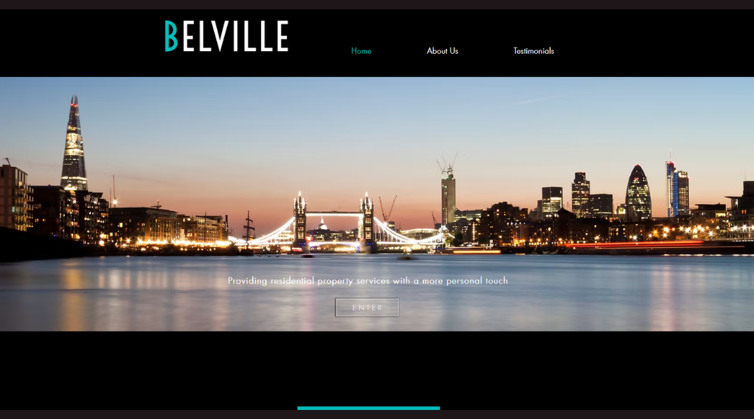
Belville Studio’s online presence says a lot—without shouting. This London-based architecture and design firm isn’t trying to dazzle you with buzzwords. Instead, they let the work speak. Right on the homepage, a grid of projects welcomes visitors. It’s structured, minimal, but far from cold.
Their About page is where things get personal. We learn about the team’s creative philosophy, not just their titles. The language is calm and clear. You’re not left guessing what drives them.
There’s a subtle cleverness to the site’s design too. Navigation is quick and direct, with just the right amount of flair. Think sharp visuals without the circus.
Interestingly, one project image even includes a ladder and half-finished space. Could they have picked a more polished shot? Sure. But this choice feels intentional—like an invitation to see the work while it’s becoming. It’s honest. And a little charming.
Belville doesn’t oversell. They invite. And that’s what makes their site stand out.
2. REX Real Estate
Rex Real Estate doesn’t do drama. Instead, they keep things smart and straightforward—just like their website. From the moment you land on the homepage, it’s clear: this team knows property, and they’re not trying to sell you a fantasy. Just real results.
The layout is clean, with well-organized listings and zero visual chaos. It’s the kind of site where you can actually find what you’re looking for—without playing hide-and-seek with filters.
Their About section avoids the usual corporate buzz. Instead, it reads like people who genuinely enjoy what they do (and happen to be good at it). There’s confidence, but no chest-thumping. Just a team committed to helping clients make smart moves in real estate.
What stands out most? The clarity. Whether you’re buying, selling, or just browsing during your lunch break, the experience feels refreshingly human. No jargon storm. No hard sell. Just helpful, professional support with a laid-back edge.
It’s property without the pretension—and that’s rare.
3. Toll Brothers City Living
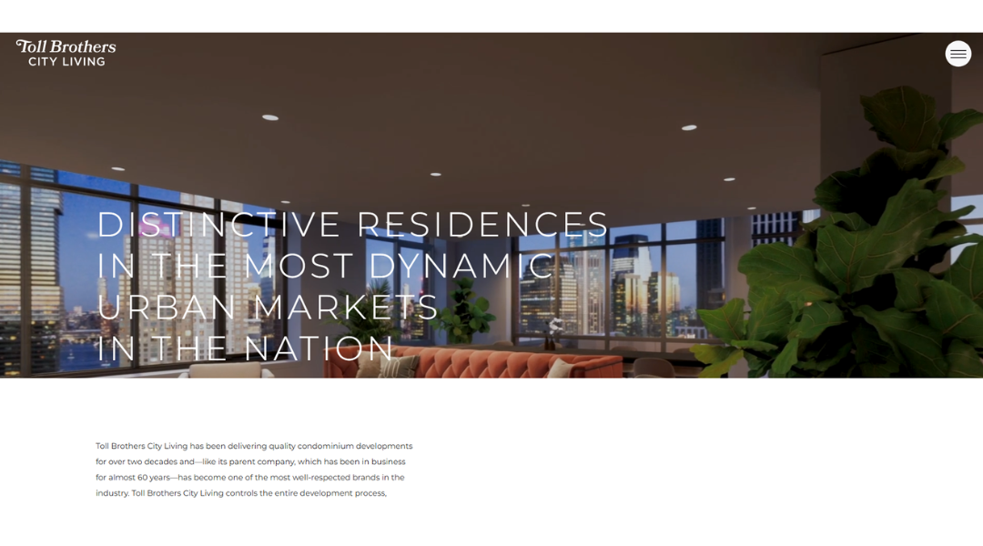
Toll Brothers City Living knows their audience—and their website shows it. Polished but not pushy, the site balances luxury with practicality. Think high-end real estate presented without the ego trip.
From the homepage, you’re greeted with striking visuals of urban properties that actually look lived-in, not just staged for a catalog. It’s modern, yes—but it doesn’t shout about it. The layout flows easily, helping users explore listings, neighborhoods, and amenities without a scavenger hunt.
Dig a little deeper, and the attention to detail becomes clear. The Neighborhoods section feels more like a curated guide than a sales pitch. And the descriptions? More storytelling, less spreadsheet.
What’s refreshing is the sense of realism. The site highlights finishes and features without treating them like museum pieces. You get the luxury, but also the livability.
Even the site’s tone feels considered—friendly, informative, and a bit aspirational, but never overdone. It’s a rare blend: upscale, but approachable.
Toll Brothers isn’t just selling condos. They’re showing how city living can feel like home.
4. Home Light
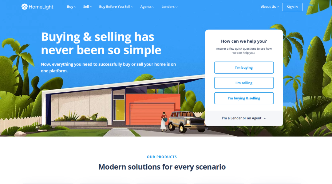
HomeLight isn’t trying to reinvent real estate—they’re just fixing what’s broken. The site gets straight to the point: connecting buyers, sellers, and agents in a way that actually makes sense.
Right from the homepage, it’s clear they value clarity. No clutter, no endless scroll of buzzwords. Just clean options that speak to real needs—like finding a top agent or understanding your home’s value without decoding a spreadsheet.
What sets them apart? Simplicity. The platform guides users without hand-holding or hype. Each step—from matching with agents to exploring selling options—feels designed for people who don’t have time to dig through fine print.
Even their copy strikes a rare balance: friendly, but not chatty. Helpful, but never condescending. It’s like getting advice from someone who knows the market and respects your inbox.
And yes, the design helps. Thoughtful layouts, quick tools, and plain-English explanations keep things moving without the usual eye-roll.
HomeLight makes the real estate process feel less like a maze—and more like a plan.
5. My Agent Finder

MyAgentFinder skips the sales pitch and gets to work. The site’s purpose is simple: connect you with a real estate agent who actually fits what you need—not just the first one with a polished headshot.
From the start, the interface feels refreshingly no-nonsense. There’s no jargon storm or endless scrolling. Instead, users are gently guided through a short set of questions that lead to agent matches based on data—not guesswork.
The layout is clean and focused, with minimal distractions. It’s all about speed and clarity, which is exactly what most people want when buying or selling a home: answers, not obstacles.
What stands out? The transparency. You’re shown real agent performance stats, not just glowing bios. That honesty is rare—and welcome.
Even the tone of the site feels like it respects your time. It’s professional, direct, and easy to follow. No pressure. Just a practical tool for making smarter choices in real estate.
In a space full of noise, MyAgentFinder keeps it clear—and useful.
6. Foxtons
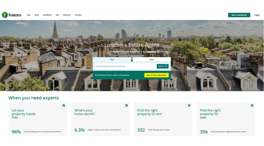
Foxtons doesn’t waste time telling you they’re “different”—they just are. From the first click, the site delivers a crisp, confident experience that feels more like a service than a sales pitch.
Property search is front and center, as it should be. Whether you’re buying, renting, or just browsing aspirational flats you’re not quite ready for (no judgment), the interface is fast and intuitive. Filters are smart, the layout is clear, and yes—those listing photos are sharp enough to make you want to schedule a viewing on impulse.
What really stands out is the balance between function and polish. This isn’t flash for the sake of it. It’s design that respects your time.
The brand’s tone is professional with just a touch of London attitude. It’s efficient, but never cold. And their market insight pages? Surprisingly readable—even if you’re not a property analyst.
In short, Foxtons does what a lot of agencies promise: they make the property game feel a little less like a gamble, and a bit more like a plan.
7. Brookfield Residential
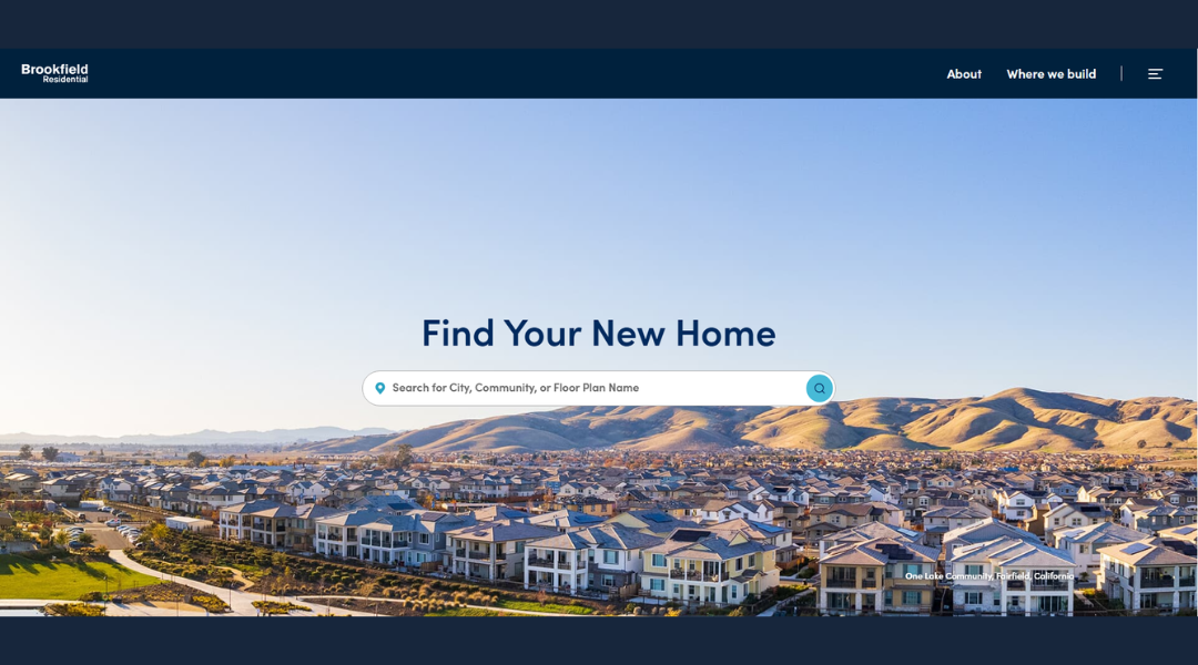
Brookfield Residential doesn’t just build homes—they build trust, too. From the homepage, the site feels calm, organized, and thoughtfully laid out—kind of like the communities they showcase.
Navigation is easy. Whether you’re hunting for your first home or eyeing your next move, everything’s mapped out clearly. Filters actually work. Photos are real, inviting, and refreshingly free of unnecessary polish.
Dig into the details and you’ll notice something rare: transparency. From pricing ranges to floor plans to community features, it’s all there—without the runaround.
What sets them apart? The tone. It’s confident without overselling. Warm, but not fluffy. You feel like they respect your decision-making process, not try to rush it.
Even the neighborhood guides are helpful without being salesy. They highlight schools, trails, and amenities with a tone that says, “Here’s what’s nearby—see if it fits your life.”
Brookfield’s site reflects the company’s values: practical, people-first, and quietly polished. No gimmicks. Just homes designed for real life.
8. Fisher Real Estate
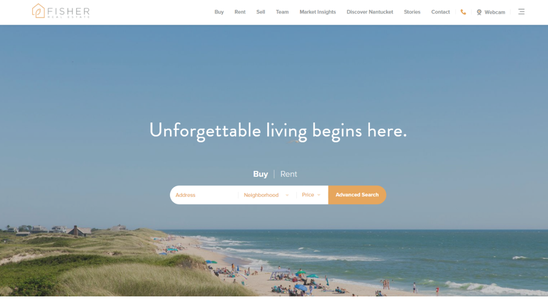
Fisher Real Estate doesn’t just sell Nantucket—they live it. From the first glance, the site delivers exactly what it promises: sharp listings, a clean layout, and a genuine feel for the island lifestyle.
The homepage gets straight to the point. Search tools are intuitive, photos are stunning without feeling staged, and the listings include the kind of details actual buyers care about—like outdoor space, walkability, and whether you’ll need to know how to parallel park.
What really works is the balance between professionalism and personality. Their team bios don’t read like résumés; they read like people who know the island well enough to tell you where to get the best lobster roll and the best mortgage advice.
The blog and local guides offer a quiet bonus—helpful, not heavy. You’re not being sold to. You’re being informed.
Fisher doesn’t overcomplicate things. The tone is calm, the design is polished, and the overall experience feels more like a conversation than a transaction.
9. JOHN TAYLOR
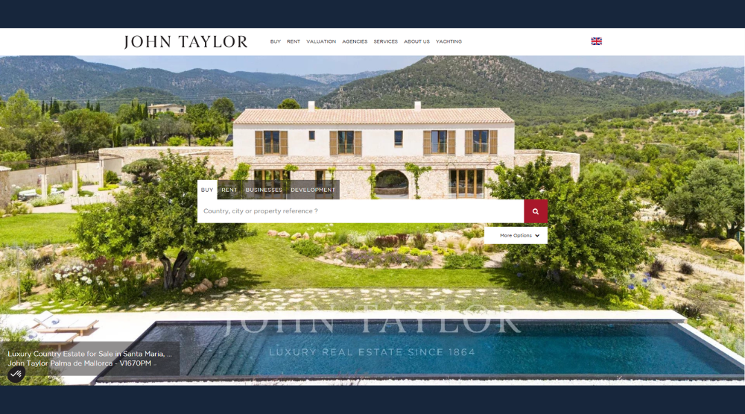
John Taylor isn’t chasing trends—they’re setting a standard. From the moment you arrive on the site, it’s clear this is luxury real estate with restraint. Clean visuals. Thoughtful structure. No unnecessary noise.
The homepage speaks softly, but confidently. Whether you’re browsing waterfront villas or alpine escapes, listings are beautifully presented—with enough detail to inform, not overwhelm. High-res images, crisp layouts, and intuitive filters make the experience feel less like a search engine and more like a private showing.
The About section reads like a company that knows who it is—and doesn’t need to prove it. Heritage and expertise are there, but never forced. Just a steady presence in high-end property since, well, before it was called high-end.
What’s refreshing? The tone. It’s calm, informed, and global without being distant. You feel guided, not pitched.
Whether you’re buying, selling, or just daydreaming about a villa in Provence, John Taylor’s site keeps it elegant, efficient, and quietly confident—just as you’d expect.
10. Residences-Immobilier
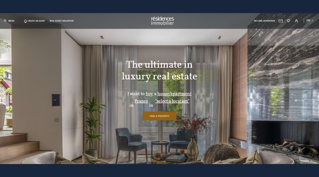
Résidences Immobilier doesn’t just list luxury homes—it curates them. From the first click, the site feels composed, like it knows exactly who it’s speaking to. The design is minimal, but not cold. Refined, but accessible.
The property search is where the site shines. Browsing is smooth, with filters that actually help rather than overwhelm. Each listing feels intentional—crisp visuals, essential info, and just enough description to spark interest without overselling.
Beyond the homes, the tone remains grounded. Whether you’re exploring Monaco or Saint-Tropez, the site isn’t trying to impress you with flashy language. Instead, it lets the locations and architecture do the talking.
Their editorial section adds subtle value—market insights, lifestyle content, and area highlights written with clarity and ease. No fluff. No filler.
Résidences Immobilier feels like a calm conversation in a busy market. It gives you space to explore, and just enough direction when you need it. Sophisticated, but never stiff.
11. Domain
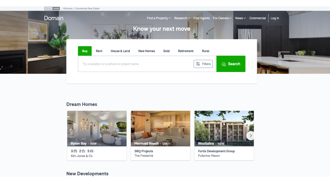
Domain keeps things practical—and that’s what makes it stand out. From the homepage, it’s clear the site was built for users who want to get on with it. Whether you’re buying, renting, or just seeing what your neighbor’s house sold for, the tools are fast, clean, and to the point.
Property search is intuitive, with smart filters and interactive maps that don’t make you guess where the listing actually is. Suburb guides and price trends are built in, so you don’t have to open five tabs just to understand the market.
What’s great is how the site balances efficiency with just the right amount of personality. The tone is straightforward, informative, and easy to follow—like advice from a savvy friend who happens to be obsessed with real estate.
Extra features like auction results, school zones, and calculators add real value without getting in your way.
Domain isn’t trying to dazzle—it’s here to help. And in a market full of noise, that’s a welcome relief.
12. Real Estate
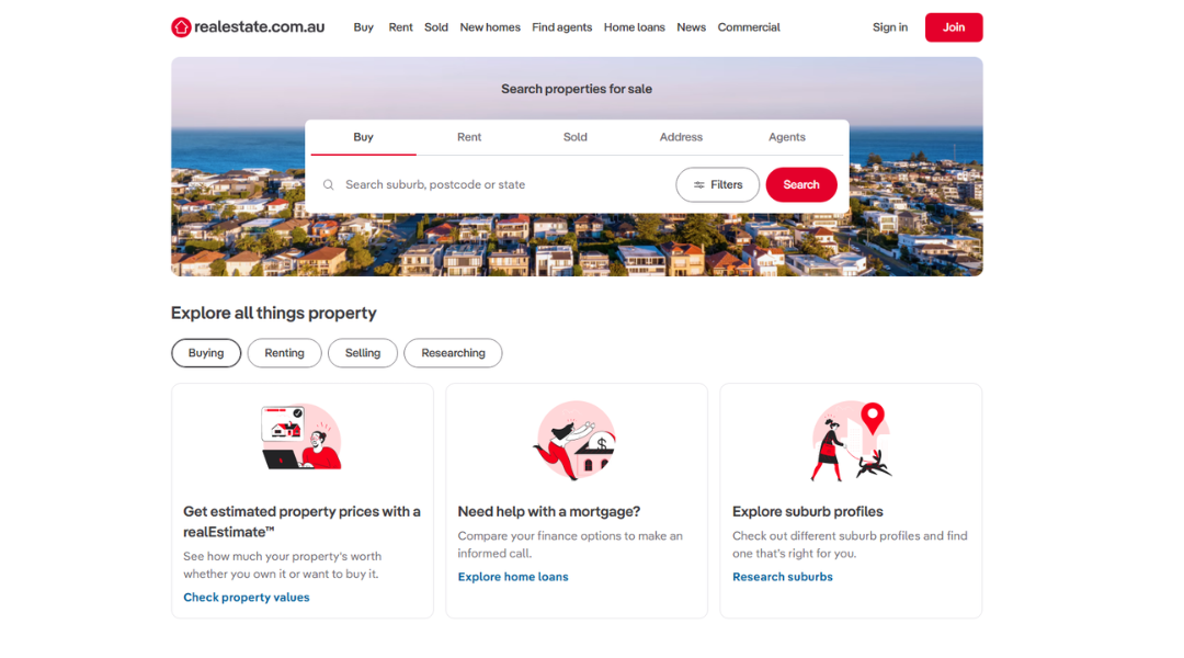
If you’re in the market to buy, realestate.com.au makes the process feel a lot less… exhausting. The layout is sharp, the tools are responsive, and everything you need is right where you’d expect it—finally.
Search is fast and flexible, with filters that help you narrow things down without making it a part-time job. Whether you’re hunting for a fixer-upper or a forever home, the listings are thorough and regularly updated—no mystery properties or outdated prices.
What works especially well is how the site treats the buying process like the big decision it is—without turning it into a lecture. There’s data when you want it (hello, suburb insights), and space to scroll when you just want to browse.
The tone? Clean, no-nonsense, and respectful of your time. It’s like someone built this platform with actual buyers in mind, not just advertisers.
From first-home dreams to next-home upgrades, realestate.com.au keeps things clear, functional, and buyer-focused—just as it should be.
13. Tommy’s Real Estate
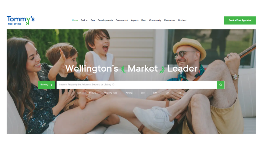
Tommy’s Real Estate doesn’t try to overcomplicate things—and that’s exactly the appeal. From the first scroll, the site feels approachable, organised, and genuinely local. It’s Wellington-focused, and proud of it.
Search functions are clear and fast, whether you’re browsing by suburb, price, or just curious what that house down the street is going for. Listings are detailed without being overwhelming, with high-quality images and the key facts buyers actually want up front.
The tone across the site strikes a solid balance: confident but not pushy, helpful without hovering. You get the sense that Tommy’s knows the market—and the people in it. There’s a strong community thread throughout, from the agent profiles to the blog, which adds a layer of trust that feels real, not manufactured.
Even the small touches, like auction alerts and property appraisal tools, feel like they were built for actual humans—not just page views.
Tommy’s doesn’t just sell homes. They make the process feel straightforward, and maybe even enjoyable. Imagine that.
14. The Home Like
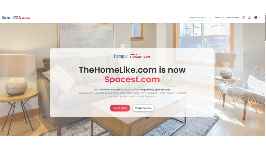
The Homelike gets it—sometimes you need more than a hotel, but less than a 12-month lease. That’s exactly the gap they fill, and their site reflects that clarity.
From the homepage, the purpose is obvious: furnished apartments for medium- to long-term stays. Whether you’re relocating, working abroad, or just between places, it’s easy to filter by city, budget, and must-haves (yes, Wi-Fi makes the list).
The design is modern but not overdone. Listings are cleanly presented, with real details—not just square footage and vague phrases. You see what you’re booking, what’s included, and what it’ll cost. No fine print treasure hunt.
Helpful extras like flexible cancellation policies, verified properties, and invoice-ready booking make this feel more like a business tool than a travel app—and that’s a good thing.
The tone is straightforward and efficient, but not cold. It’s built for busy people who still want a place that feels like home, at least for now.
In short: if you need to live somewhere that’s not “forever,” Homelike makes it feel easy—and actually livable.
15. Verde Real State
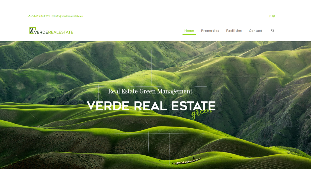
Verde Real Estate keeps things refreshingly grounded. From the first look, their site avoids the usual real estate flash and focuses instead on what matters: solid listings, straight answers, and a clear sense of place.
The homepage is clean and intentional. You’re not bombarded with jargon or oversized claims—just a focused search experience that works. Whether you’re exploring residential or commercial spaces, everything’s easy to browse, compare, and understand.
Listings are well-detailed without feeling bloated. Photos show the space as it is—not overly staged—and descriptions strike that rare balance between informative and honest.
The tone across the site reflects Verde’s wider approach: experienced, steady, and tuned into the European market without overpromising. There’s a quiet confidence here that says, “We know what we’re doing—let’s find what works for you.”
In short, Verde Real Estate delivers a digital experience that feels professional but human. No fluff. No pressure. Just real property for real decisions.
16. HAR
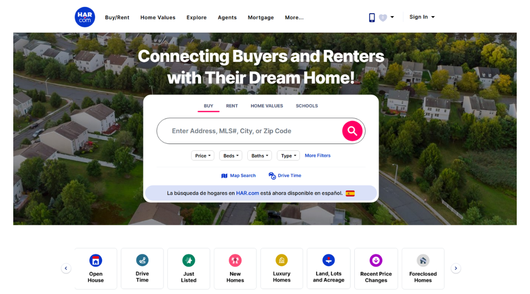
HAR.com doesn’t try to reinvent real estate—it just makes it work better. As the go-to platform for buying, renting, or researching property in Texas (especially Houston), the site is built for people who want reliable info fast—and it delivers.
The search tools are powerful but easy to use. Whether you’re browsing homes, looking up school zones, or checking market trends, everything’s within reach in just a few clicks. Listings are detailed, updated often, and include more than just pretty pictures—think tax history, neighborhood stats, and even flood risk.
The tone? Straightforward and practical. There’s no sales push or glossy distractions. Just a strong focus on helping users make informed decisions, whether you’re a first-time buyer or seasoned investor.
What sets HAR apart is its credibility. It’s powered by the professionals who know the market best—local realtors—which gives it an edge over generic property platforms.
In a space filled with noise, HAR.com keeps it local, accurate, and refreshingly no-nonsense.
17. This Is Neat Cleaning
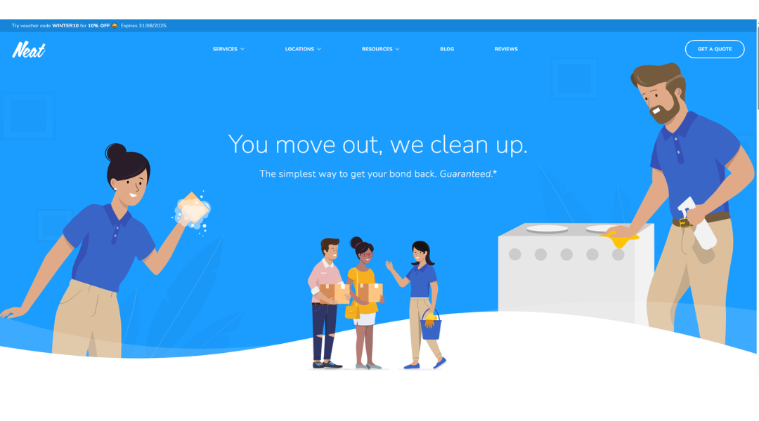
Neat lives up to its name. From the moment you land on the site, it’s clear this is a service built for people who don’t have time for clutter—literal or digital. The layout is sleek, the messaging is tight, and the process? Surprisingly straightforward.
Whether you’re prepping a home for sale or just finally clearing out the garage you’ve been ignoring since 2020, Neat offers professional decluttering and styling without the fluff. The site does a great job of walking you through what to expect—real services, real timelines, real results.
What sets it apart? Simplicity and trust. There’s no vague “custom packages” or confusing pricing trees. Just clear offerings, before-and-after examples, and a team that seems more interested in helping you move forward than showing off.
The tone is approachable, with a quiet confidence that says, “We’ve done this before. You’re in good hands.” And honestly, sometimes that’s exactly what you need.
Neat doesn’t just clean up spaces—it makes the whole process feel lighter. And that’s the real win.
18. Castell Management
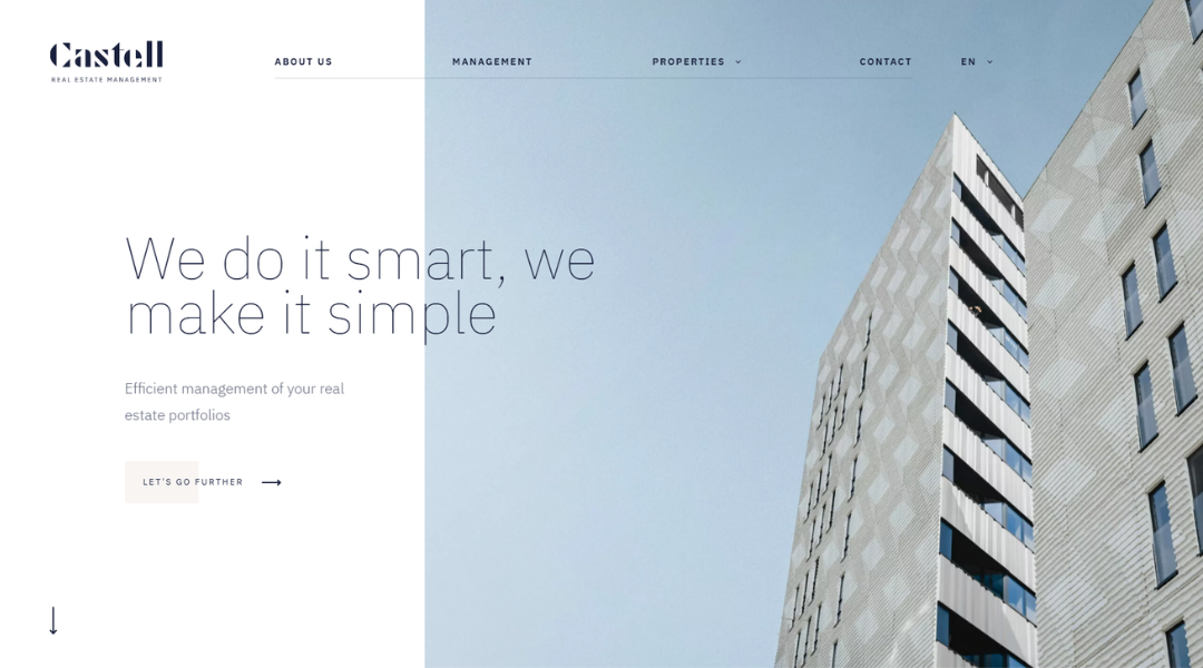
Castell Management keeps things sharp, focused, and impressively clear. From the first glance, the website tells you exactly what they do—property management, done right—with none of the usual noise.
Navigation is seamless. Whether you’re a landlord, investor, or simply exploring services, the site leads you where you need to go, quickly. No distractions. No detours. Just the facts, delivered with precision.
Service descriptions are refreshingly direct. Instead of jargon, you get real-world terms and real expectations. Their approach to property management feels grounded: consistent communication, efficient operations, and a clear respect for both property and people.
What stands out most is the tone. It’s calm, capable, and quietly professional—no big promises or over-polished buzzwords. Just the sense that Castell knows what matters to owners: reliability, accountability, and zero guesswork.
In a sector full of fluff, Castell keeps it clean. They manage the details, so you don’t have to.
19. Agate Luxury Residence
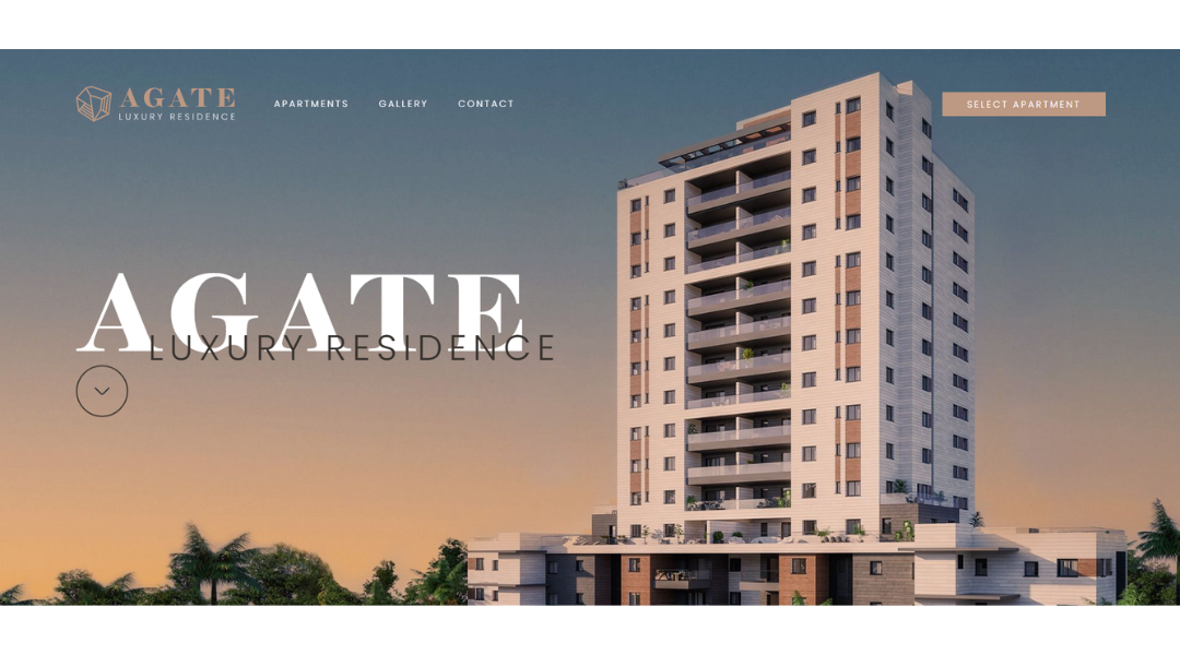
Agate by Brook isn’t just another development—it’s a statement. From the first moment on the site, you’re met with a sense of balance: refined design, clean architecture, and just enough information to keep you curious without feeling overwhelmed.
The layout is minimalist and intentional. Each section flows into the next with clarity and calm. You’re not sifting through endless blocks of text or vague marketing language. Instead, you get a focused look at the vision, the lifestyle, and the living spaces—presented with understated confidence.
What stands out most is the tone. It doesn’t try to oversell. It invites. From the soft visuals to the well-paced copy, everything feels considered—like the project itself.
Details on location, planning, and materials are delivered with just enough depth to show care without losing simplicity. This is design that speaks for itself.
Agate isn’t about excess. It’s about precision. And for those who value intention over impression, that’s exactly the point.
20. Belyi Ostrov House
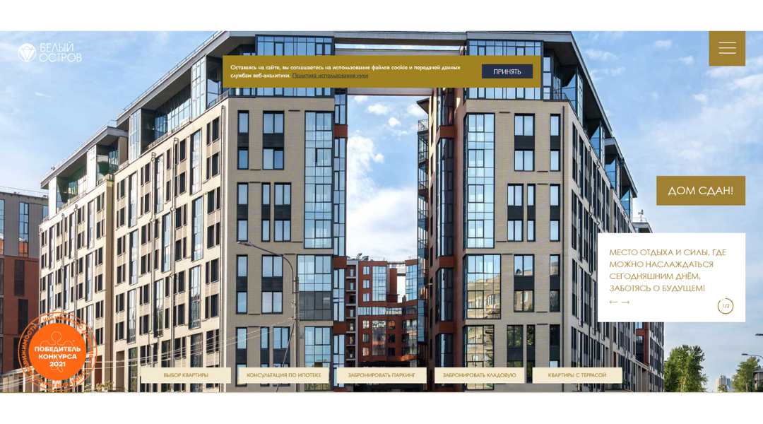
Belyi Ostrov House feels like a quiet retreat—right on the edge of Saint Petersburg, yet gently sheltered. The website reflects that harmony: clean design, smooth scrolling, and understated animation that draws you in, without shouting.
Homepage visuals are polished yet warm. You get gold and black accents that whisper luxury, not blare it. Navigation is intuitive—horizontal scroll, parallax effects, pop-up menus—all sleek and surprisingly easy.
Details carry substance. Listings offer a variety of thoughtful floor plans, balconies, terraces, and underground parking with EV charging. IP video intercoms and energy-efficient materials speak to modern, healthy living.
Overall, it’s a site that respects your time and attention. It doesn’t oversell—just presents a mix of comfort, tech, and community. If you’re looking for business-class living with a touch of calm, Белый Остров’s site shows you what that feels like.
Conclusion
A great real estate website doesn’t need to shout—it just needs to speak clearly and stay out of its own way.
Whether you’re revamping your current site or starting from scratch, the inspiration I’ve shared here can act as a quiet nudge in the right direction. You don’t have to copy anyone. You just have to care about how people experience your site—and build from there.
I always say: the best property sites don’t just list homes. They make people feel like they’ve already found one.
Now the question is—what’s your site saying?


