When someone Googles your name, what do they see?
For me, building a personal portfolio wasn’t just about design—it was about building clarity. A good portfolio doesn’t shout. It shows. It gives someone a feel for how you think, what you’ve done, and what it might be like to work with you. And let’s be honest: it’s also a quiet way of saying, “Yes, I know what I’m doing.”
So, I rounded up 19 portfolio websites that left an impression on me—not because they all look the same, but because they don’t. Each one uses different tools, tones, layouts, and approaches to say something real.
Here’s what you’ll learn from this list:
- How layout choices influence credibility
- Where to use visuals—and where to cut them
- What makes an About section actually work
- How personality can live in your design without taking over
- Why pacing and simplicity still win
If you’re thinking about refreshing your own site or building one from scratch, this is the kind of list that’ll give you a creative reset—without sending you into decision fatigue.
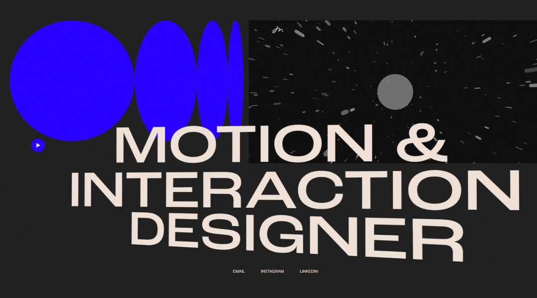
1. Enrico Deiana
Enrico Deiana’s website doesn’t just show digital work—it reflects a design mind that’s sharp, selective, and focused on movement. The layout is intentional. No clutter. No long intros. Just bold typography, clean visuals, and a clear invitation to explore.
The About section is brief but well-considered. Enrico doesn’t overshare—he explains just enough to position himself clearly: a product designer working at the edge of function and form. His approach feels practical but refined, more interested in clarity than cleverness.
Each project is framed with care. Case studies aren’t padded with filler. Instead, they highlight specific choices and outcomes—what was built, how it works, and why it matters. You get a sense of the process, not just the polish.
Even the small details—hover effects, scrolling behavior, subtle transitions—feel like they’ve been thought through. Nothing flashy, but everything works.
Enrico’s site doesn’t ask for attention. It earns it through restraint, focus, and a clear sense of direction. A digital space made by someone who knows exactly where he’s headed.
2. Sean O’Brien
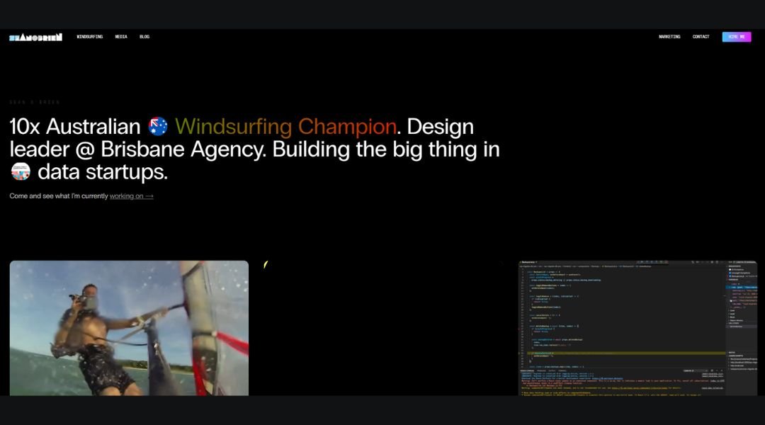
Sean O’Brien’s website moves fast—much like the athlete himself. It’s sleek, punchy, and packed with visuals that speak before any text does. From the first scroll, you know you’re in the space of a competitive windsurfer, media producer, and all-around action strategist.
The homepage wastes no time. Bold imagery and sharp headlines guide you through Sean’s professional highlights—from world titles to coaching programs to digital projects. It’s not just about sports—it’s about storytelling, teaching, and building momentum.
The site leans on visuals, but the writing holds its own. Each section is short, clear, and focused. Whether he’s outlining a media collaboration or an athlete training offer, the message stays consistent: results, backed by experience.
Navigation is tight, and the pace feels deliberate. This is a portfolio that works as hard as its owner. You won’t find fluff or filler here—just a direct, high-energy approach to work and life.
Sean O’Brien’s site doesn’t just showcase a career—it reflects an attitude: forward, fast, and always in motion.
3. Russell Brand
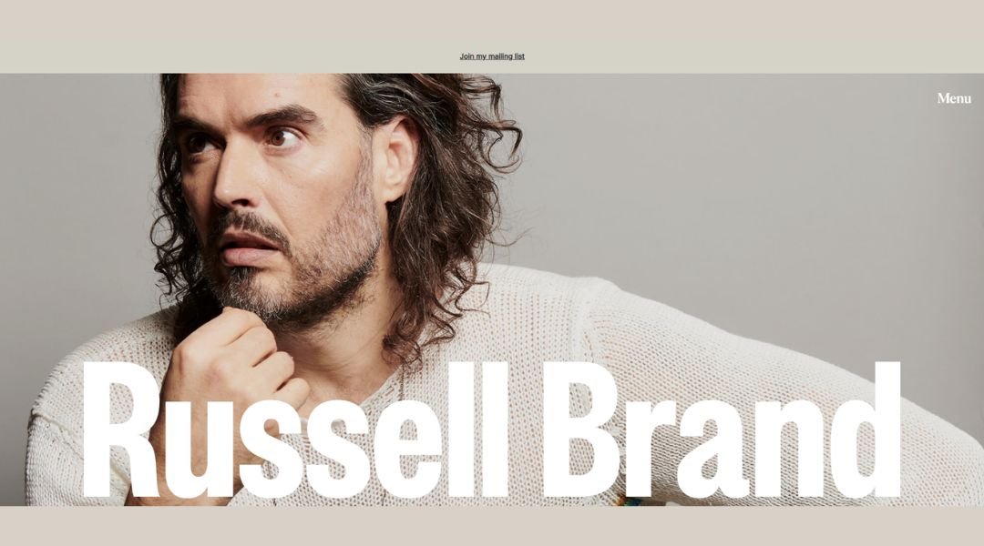
Russell Brand’s website feels like stepping into the mind of someone who’s constantly questioning the script—and rewriting it. It’s bold, direct, and refreshingly unpolished in all the right ways.
The homepage leads with purpose. Whether you’re there for his podcast, live shows, or books, the path is easy to follow. Content is grouped clearly, and the tone stays consistent: thought-provoking, outspoken, and unafraid to challenge the obvious.
Each section of the site reflects Brand’s shift from comedy to commentary. The language is conversational, but not casual. There’s intent behind every headline. His latest content—videos, posts, interviews—stays front and center, updated often and built for engagement.
Design-wise, it’s functional over flashy. Black-and-white tones, simple navigation, and bold type all let the message take the lead.
What the site does best is match the person behind it. It doesn’t try to smooth the edges—it leans into them. For visitors, that honesty is the draw.
Russell Brand’s site doesn’t just present a personality. It holds space for a point of view.
4. Cristiano Ronaldo

Cristiano Ronaldo’s site is a sharp showcase of persona and performance. It starts strong—with a bold black interface and his signature logo—framing him not just as a player, but as a brand built on excellence and ambition.
The Signature Museum section walks you through his journey with clean visuals and concise copy. Trophies, career highlights, and personal milestones are presented as chapters in a story of determination. No fluff, just impact—much like Ronaldo himself.
Merchandise pages—fragrances, boots, fashion—reflect his style. You see crisp product shots, clever descriptions, and a sense that each item carries a piece of the persona behind them, stripped of over-promotion .
Navigation stays intuitive. Whether you’re learning about his career, shopping his brand, or checking the latest news, the site feels direct and purposeful. Copy and visuals align to communicate the same message: relentless drive, modern masculinity, and global presence.
This isn’t a sports site. It’s a personal brand refined and in motion—without a hint of doubt or hesitation.
5. Bill Gates
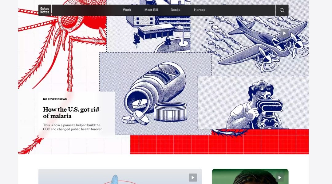
Gates Notes is more than a blog—it’s a window into how Bill Gates thinks. The site brings together personal reflections, global issues, and practical ideas with a tone that’s calm, curious, and grounded in data.
From the homepage, the layout is clean and focused. Topics range from climate and global health to books, innovation, and philanthropy. Each article reads like a letter—not a lecture. Whether he’s unpacking malaria progress or sharing a favorite read, Gates keeps the language accessible without dumbing anything down.
Visuals are used sparingly but effectively. Charts, video snippets, and book covers add context without clutter. Navigation is simple, and categories are clear, making it easy to explore deeper without feeling lost.
What sets the site apart is its balance. It’s thoughtful, but never too dense. Personal, without being self-focused. Gates Notes doesn’t chase clicks—it invites thinking.
In a space full of noise, this site chooses to speak slowly and clearly. And that makes it worth returning to.
6. Tamara Sredojevic
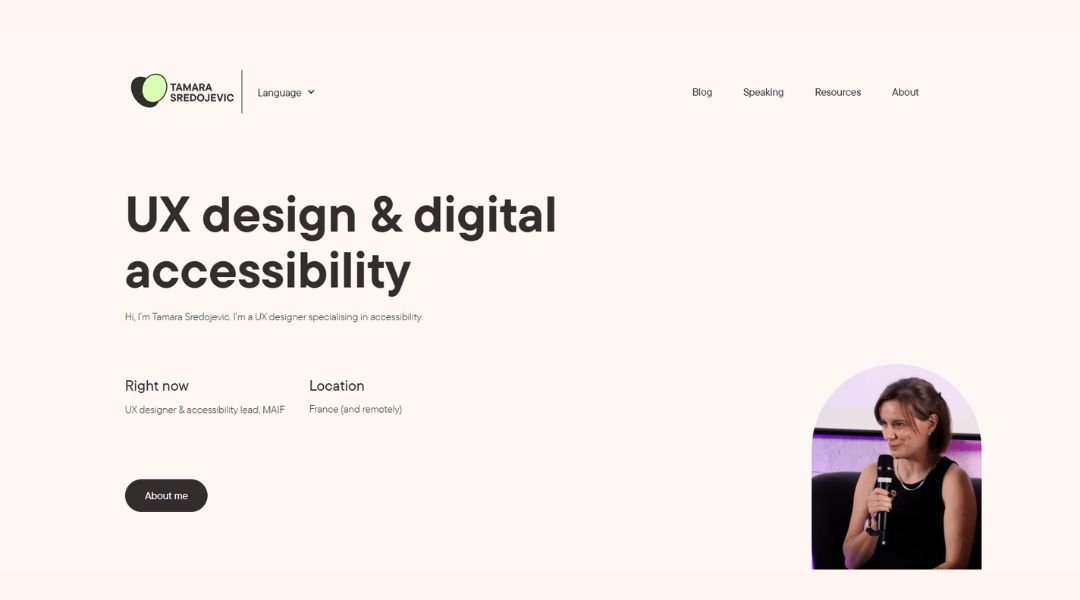
Tamara’s website opens with personality—bold fonts, playful color, and just enough movement to keep things interesting without going overboard. It’s a visual handshake that says: “This is design with character.”
The homepage is clean but expressive. You’re immediately introduced to her role as a designer and creative developer, and the design choices reflect both: artistic flair meets smart structure. It’s polished but never cold.
Her portfolio is where things shine. Each project is presented with balance—strong visuals, clear context, and a breakdown that shows both creative thinking and functional execution. It’s not just “what” she made—it’s “why” it works.
The About page keeps it human. No overused design clichés—just a clear explanation of who she is, what drives her work, and how she collaborates. The voice feels honest, approachable, and grounded in experience.
Everything on the site—from layout to copy—shows intention. Tamara isn’t just designing visuals; she’s building experiences with clarity and care.
This is a site that knows exactly what it’s doing—and who it’s speaking to.
7. Demas Rusli
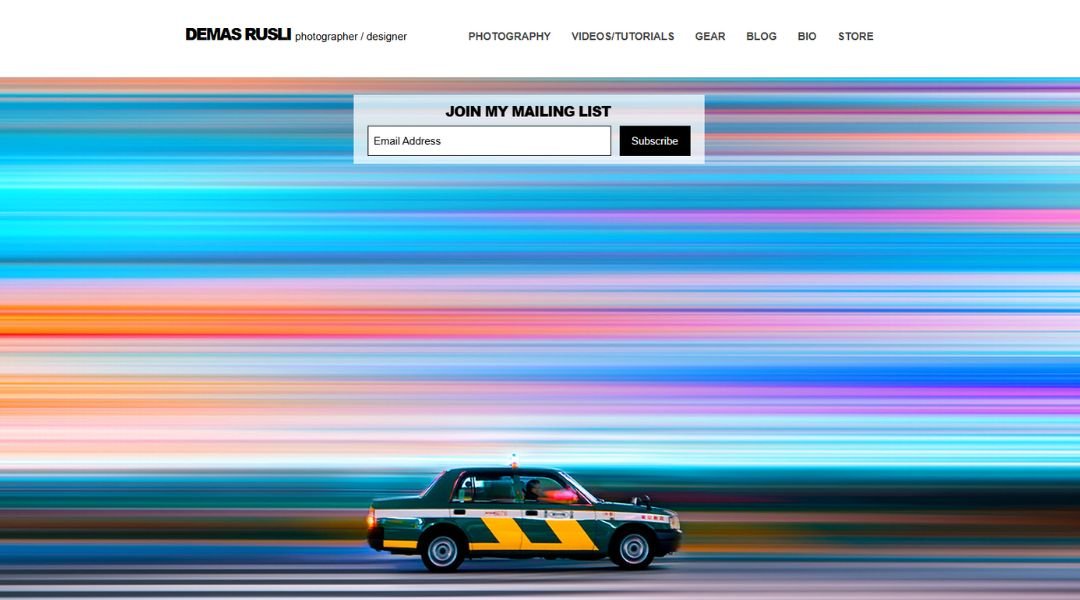
Demas Rusli’s website is as intentional as his photography. It opens with a crisp, full-screen gallery—no distractions, no noise. The images speak first, and they speak clearly.
Navigation is minimal but intuitive. Whether you’re browsing photo series, creative direction, or video projects, everything is structured to support the visuals without getting in their way. The design doesn’t try to outshine the work—it simply gets out of the way.
Each project page offers just enough context. No long essays, just short descriptions that let the imagery breathe while still giving insight into the thought behind each frame. Whether it’s architecture, aerial shots, or branded campaigns, the focus stays on composition, light, and intent.
The About section is refreshingly grounded. You learn about Demas as both a creative and a professional—an architect by training, now crafting powerful visual stories across media.
It’s not just a portfolio. It’s a curated space that reflects rhythm, restraint, and respect for good design. Nothing feels rushed. Everything feels considered.
8. Alice Lee
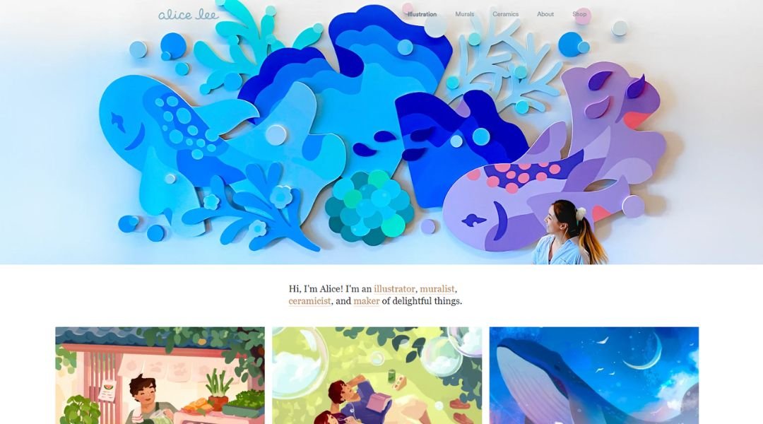
Alice Lee’s website feels like stepping into a world where illustration meets strategy—with charm, clarity, and no pretense. It’s vibrant but clean, playful but precise. You get the sense that every pixel was placed with purpose.
The homepage sets the tone quickly: bold visuals, gentle animation, and confident typography. It introduces Alice as more than an illustrator—she’s a visual storyteller, branding partner, and creative collaborator.
Each project is displayed with care. The case studies are structured and easy to digest, balancing beautiful artwork with smart insights into process and impact. From tech brands to personal passion projects, every piece shows her range and adaptability—without ever feeling scattered.
The About section keeps it warm and real. There’s humor, experience, and a clear sense of someone who brings both skill and perspective to the table.
This site doesn’t just showcase talent. It tells a story—about craft, curiosity, and creating work that’s both joyful and strategic. It’s the kind of portfolio that feels personal without trying too hard—and that’s exactly why it works.
9. Lauren Hom
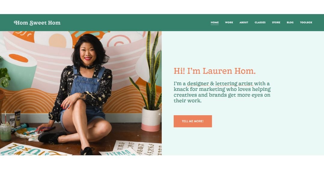
Hom Sweet Hom doesn’t just show design—it shares a perspective. The site feels like stepping into a well-organized sketchbook: creative, sincere, and full of visual personality without ever being overwhelming.
The homepage immediately reflects Christina Hom’s voice—illustrator, letterer, and creative with a sharp eye for humor and heart. Clean navigation and soft color choices guide you through her work, with each section designed to support both clarity and curiosity.
Project pages highlight a blend of commercial work and personal expression. You’ll find hand-lettered quotes, brand collaborations, and quirky side projects—all wrapped in a style that’s consistent but never repetitive. Copy is short, honest, and never overdone. You get the idea quickly, and you’re glad you stuck around.
The About section is refreshingly human. Christina doesn’t try to sound overly formal—she simply tells you who she is and what drives her. It feels like a chat, not a pitch.
Hom Sweet Hom works because it keeps things simple and sincere. It’s a portfolio built on personality—but one that knows how to stay focused on the work.
10. Todd Clarke
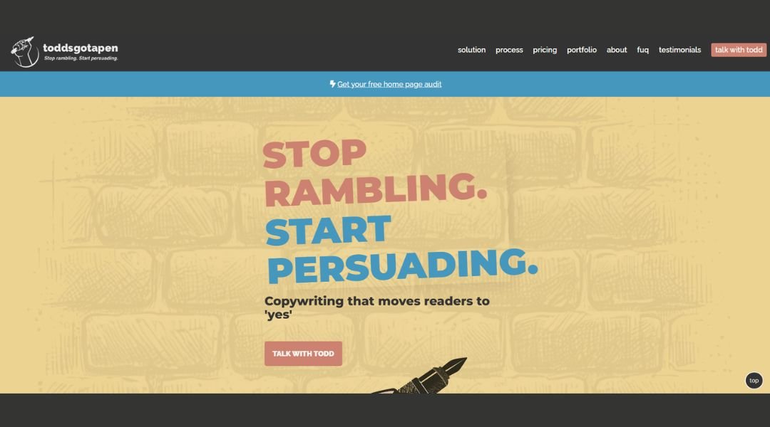
Todd’s Got a Pen is a portfolio that doesn’t take itself too seriously—and that’s exactly why it works. The site is sharp, quick-witted, and refreshingly light on fluff. From the name alone, you know you’re not walking into a standard copywriter’s website.
The homepage pulls you in with smart, punchy headlines and a tone that lands somewhere between confident and casual. It’s polished, but not trying too hard. You feel like you’re being talked to, not sold to.
Case studies are direct. They focus on the creative thinking behind the words—why they work, who they were for, and what they achieved. There’s variety here, but it’s curated. Every piece earns its spot.
The About section reads like a bio written by someone who knows what they’re doing—and enjoys doing it. It’s honest, a little funny, and free of buzzwords.
The whole site moves fast but leaves a lasting impression. It’s writing that’s clear, clever, and grounded in results—backed by a writer who knows exactly what he brings to the table.
11. Muriel Vega
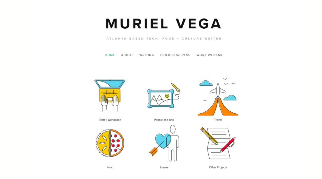
Muriel Vega’s site feels like good editing—quiet, precise, and intentional. It doesn’t shout; it speaks clearly. You’re introduced to her work as a journalist, editor, and cultural writer with range and clarity, but the tone never drifts into self-promotion.
The homepage is simple and purposeful. A brief intro, a clean headshot, and well-organized links to her clips and projects. No clutter, no scroll fatigue—just quick access to stories that speak for themselves.
Each portfolio piece opens up to a body of thoughtful reporting and sharp perspective. Whether she’s covering tech, food, culture, or identity, Muriel brings a steady voice and a focus on the human layer behind every headline.
The About section gives a sense of who she is—professional, curious, grounded in community. It’s warm without being overly personal, and clear without oversharing.
This is the kind of writer site that works because it respects the reader. The design fades into the background, letting the words do their job. It’s honest, well-paced, and deeply readable—much like her work.
12. Helena Bowen
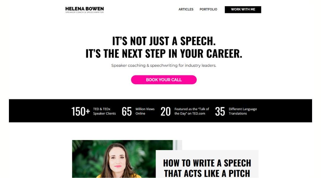
Helena Bowen’s website speaks the way she coaches—clearly, directly, and with purpose. It opens with a simple headline and an even simpler offer: helping people become better, more effective speakers. The tone is confident without being pushy, polished without being cold.
The homepage sets the tone fast. You know what she does, who she helps, and why it matters. Whether it’s TEDx speakers, executives, or rising leaders, Helena brings both experience and empathy to her craft.
The site is clean and content-rich. Her “Start Here” guide breaks down key areas—public speaking tips, personal development, thought leadership—with an easy structure and a conversational tone. There’s no jargon, just useful advice that makes sense on the first read.
The About section is grounded and human. She shares her background (including her work with HBO and dozens of TEDx speakers) without turning it into a résumé dump. It’s clear she knows her stuff—and cares deeply about the impact of a well-told message.
Helena’s site doesn’t oversell. It builds trust, delivers value, and invites you to speak with more clarity, confidence, and conviction.
13. Duygu Mühürdar
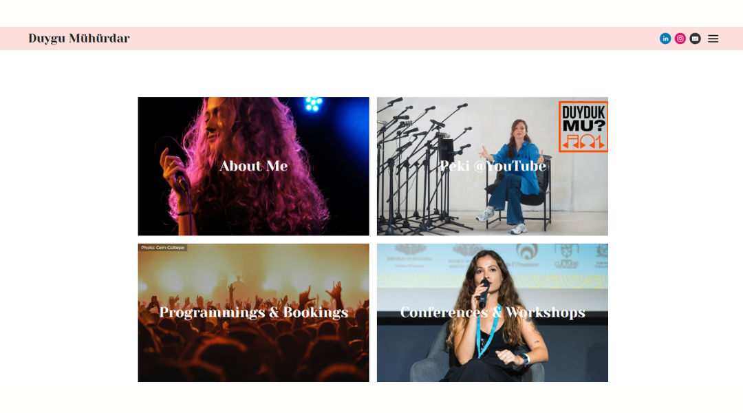
Duygu Mühürdar’s website speaks volumes about her career—without using many words. As a booking agent and ethnomusicologist, she blends cultural insight with event execution. The layout shows that blend clearly.
The homepage introduces her roles at a glance—booker, promoter, programmer—backed by a decade of experience. It moves fast but stays grounded. You see her work with artists like Snarky Puppy or Róisín Murphy, festival curation, and radio shows—not for name-dropping, but to show her impact.
Sections are practical and well-organized. Whether you’re checking artist bookings, programming history at Zorlu PSM or Pozitif Müzik, or tuning into her radio show, each page guides you clearly. No fluff—just what she does and why it matters.
Her About section adds context without oversharing. You learn about her academic path—violin, ethnomusicology, jazz training—alongside real-world experience. The site’s tone is grounded: confident but humble.
Duygu’s site doesn’t chase applause. It shows a professional who moves between festival stages, studio desks, and cultural spaces with intention and depth.
14. Marino Franulovic
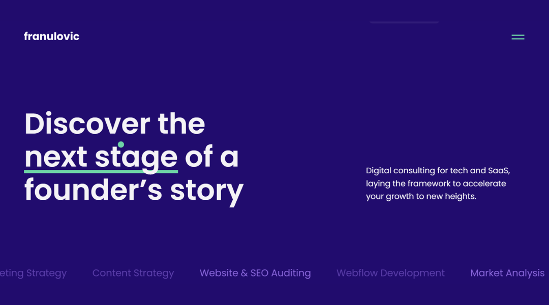
franulovic is a digital marketing consultancy built around one goal: helping tech founders scale smarter. The homepage is clean and mission-first. You immediately learn what they do—strategy, Webflow development, SEO audits, paid ads—and who they help: startups and SaaS businesses.
Capabilities are laid out clearly. Each service—planning, development, automation, auditing—is described in plain terms with a focus on results. There’s no jargon or vague promises. You understand what they offer and why it matters.
The blog deepens credibility. Posts on creator strategy, reputation management, and Notion templates are thoughtful and useful. They read like advice from a peer—not an agency trying to catch your attention.
What stands out most is tone. The copy is confident, but never pushy. It speaks to founders who want clarity and growth—not buzzwords. Testimonials underline that, praising both results and communication.
franulovic doesn’t try to impress with style. It leads with substance. If you’re ready to move beyond basic marketing and build systems that work, this is the site that shows you how.
15. Dayla Baron
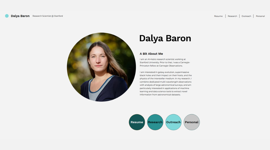
Dalya Baron’s website presents science with quiet clarity—and a sense of purpose. She’s an AI + Astro research scientist at Stanford, and the site feels equally intelligent and accessible.
The homepage gets straight to the point. You spot her role, her focus on black holes and galaxy evolution—and hints at her work with machine learning on large surveys. No jargon overload. Just clear markers of what she does.
Navigation is lean but effective. Resume, Research, Outreach, Personal—each section connects to a deeper layer without clutter. You click “Research” and find concise descriptions of projects like interstellar medium studies, AGN-driven winds, and data-driven discovery using unsupervised machine learning.
Her Outreach page adds a human edge. It shows public talks, volunteer efforts, and an ease with communicating science. It’s not just academic—it’s approachable.
What stands out is tone. The site never oversells. It doesn’t hype. It reports progress: from telescope time to publication metrics and data tools. It respects both the reader and the work.
Dalya Baron’s site doesn’t just list achievements. It shows a thoughtful scientist building understanding—of the universe, and of how we map it.
16. Yasio
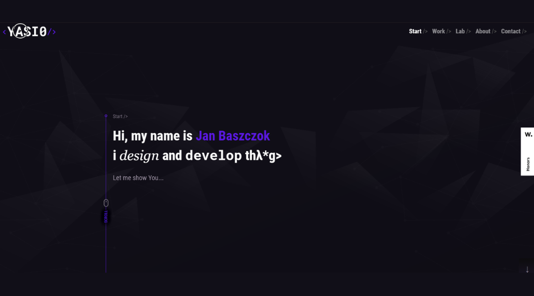
YASIO is a lightweight, cross‑platform C++ library built for asynchronous socket I/O. The website leads with clarity: support for TCP, UDP, KCP, SSL, and multicast—all under a unified API. It starts strong—no fluff, just technical purpose.
Platform support is spelled out quickly: Windows, macOS, Linux, iOS, Android, FreeBSD, Solaris, and more. You learn it’s used in real-world projects—from mobile game clients to VOIP and game engines like Unity and Unrea.
Documentation is easy to access. Quick-start guides, code examples in C++ and Lua, API references—everything is just a click away . There’s no guesswork in using it.
Feature pages stick to the point: fast timers, header-only mode, IPv6 support, binary stream utilities, Lua and JS bindings. Each feature is described briefly—so you can judge fit without hunting in code.
YASIO’s site isn’t flashy. It focuses on developer needs: clear specs, real use cases, and solid documentation. It shows respect for time—and trust in technical detail.
17. Steven Mengin
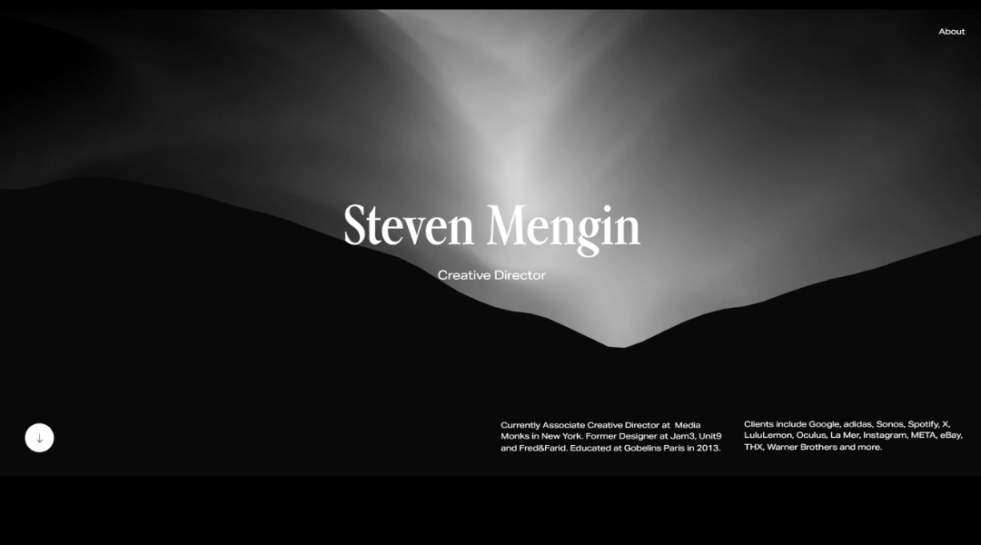
Steven Mengin’s website is a quiet powerhouse—simple on the surface, but deeply considered underneath. As a digital designer and art director, he builds visual systems that feel deliberate and refined. The site mirrors that same discipline.
From the landing page, the aesthetic is clean: monochrome palette, crisp typography, and subtle motion that adds life without distraction. Navigation is minimal, making space for the work itself to lead the way.
Each case study is focused. You’re shown the process, not just the final product. From typography choices to layout structure, you get a sense that nothing here is accidental. Whether it’s branding, web design, or digital art direction, Steven’s projects highlight clarity over clutter.
The About section keeps it lean—just enough to show his background, mindset, and design values. No filler, just facts presented with polish. Even his contact page feels considered, staying on-brand with tone and design.
This isn’t a portfolio that chases attention. It holds it—through control, intention, and the quiet confidence of someone who designs with both edge and restraint.
18. Square Me
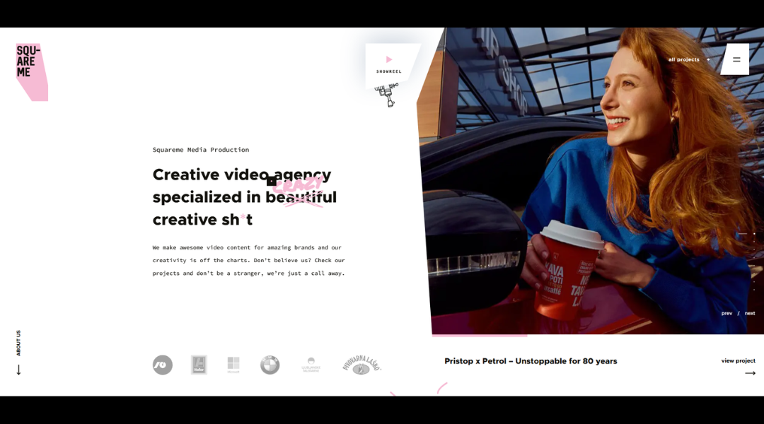
SquareMe is a Ljubljana-based video production studio that blends creativity with precision. From the homepage, their voice is clear and confident: “We create epic video content for amazing brands—and we like to have fun while doing it.”
They cut through the jargon right away. Whether you’re planning a TV commercial or a short film, SquareMe offers full-service production—from concept and scripting to shooting and post. Their client list is varied and impressive, including BMW, Microsoft, Lidl, Renault, and Slovenske Železnice.What stands out is tone: smart and slightly cheeky. They refer to themselves as “ninjas with Swiss knives” to highlight their versatility—and they promise a coffee-fueled, no-drama process.
Their project pages show a balanced mix of commercial and in-house content—everything from ad campaigns to award-winning short films like Štokholm and Truplo. Each case study highlights storytelling, production strength, and creative impact. SquareMe’s site doesn’t try to outdo the visuals—they let the visuals lead. Their brand isn’t built on hype. It’s built on results, range, and a healthy dose of personality.
19. Joao Verissimo
SquareMe is a Ljubljana-based video production studio that blends creativity with precision. From the homepage, their voice is clear and confident: “We create epic video content for amazing brands—and we like to have fun while doing it.”
They cut through the jargon right away. Whether you’re planning a TV commercial or a short film, SquareMe offers full-service production—from concept and scripting to shooting and post. Their client list is varied and impressive, including BMW, Microsoft, Lidl, Renault, and Slovenske Železnice. What stands out is tone: smart and slightly cheeky. They refer to themselves as “ninjas with Swiss knives” to highlight their versatility—and they promise a coffee-fueled, no-drama process.
Their project pages show a balanced mix of commercial and in-house content—everything from ad campaigns to award-winning short films like Štokholm and Truplo. Each case study highlights storytelling, production strength, and creative impact.
Conclusion
Personal branding isn’t about having the flashiest website. It’s about having one that feels aligned with how you work and how you think.
What I found in these 19 examples wasn’t just clever layouts or cool colors. I saw clarity. Intention. And a bit of personality peeking through in just the right places.
If one of these ideas helps shape your next project—or simply makes you rethink a section of your current site—then it’s already done its job.
Your portfolio doesn’t need to say everything. It just needs to say the right things, well.

