I’ve always believed a website doesn’t need to say everything to say something meaningful. Sometimes, less really is more—especially in design. One-page websites prove that point beautifully. They don’t just look clean; they feel easy. Like a well-written text message that lands better than a long email.
If you’re building a portfolio, promoting a product, or just want your visitors to stay focused without wandering off into a menu maze, a single-page layout might be exactly what you need.
Here’s what you’ll find in this piece:
- Why one-page sites actually work better for some goals
- The kind of content that fits this format (and what to skip)
- Real examples that keep it simple—and succeed
- Design ideas that use space, flow, and timing smartly
- A few friendly reminders to keep things light, tight, and scroll-worthy
No fluff. No filler. Just real takeaways from designs that get to the point.
1. Dolox
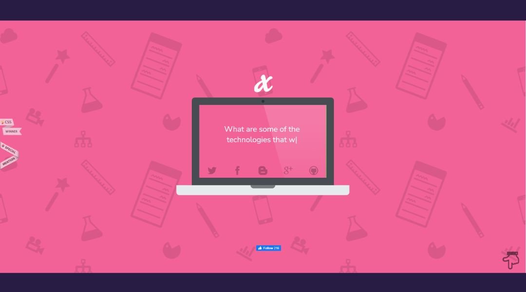
Dolox makes design feel effortless—at least on the surface. Dig a little deeper, though, and you’ll see just how intentional everything is. From the bold typography to the sharp contrast in layout, it’s clear this team doesn’t believe in playing it safe.
Instead of overwhelming you with jargon or stock phrases, Dolox lets the work do the talking. The homepage hits with confidence: clean, direct, and fully in control. Every project showcased feels alive, like it has something to say—and it usually does.
What’s refreshing is the balance. There’s room to breathe. Big visuals paired with lean copy keep things moving without sacrificing substance. It’s slick but not sterile. Thoughtful without trying too hard.
And while they keep things minimal, nothing feels missing. You walk away with a clear picture: Dolox knows how to turn strategy into visuals that stick. Whether it’s branding or design, they’ve got a sharp eye and a steady hand—no fluff, no filler.
2. Plant22
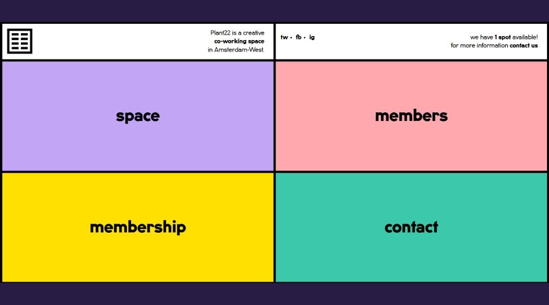
Plant 22 doesn’t just create — it curates. From the first scroll, there’s a distinct vibe: calm, clean, and confidently understated. This isn’t a brand screaming for attention. It’s more of a quiet invitation to slow down and look closer.
Their visuals do the heavy lifting. Neutral tones, thoughtful spacing, and photography that feels almost meditative. You can tell there’s care behind every decision, even the ones you don’t immediately notice. That’s the trick—making the complex feel simple.
The messaging is minimal, but it lands. Whether it’s a subtle nod to their creative process or the soft pacing of the layout, everything works in rhythm. No hard sells. No overexplaining. Just presence—and that’s rare.
Plant 22 feels more like a studio that listens before it speaks. And when it does speak, it’s through work that’s quietly powerful. The kind of design that stays with you—not because it shouts, but because it means it.
3. Oovra
OOVRA isn’t just a portfolio—it’s a statement. Right from the landing page, there’s clarity, control, and a striking sense of purpose. No filler, no distractions—just sharp visuals and confident design choices that pull you in without needing to shout.
This studio knows the power of restraint. The site layout feels deliberate, almost architectural in its precision. Every project is given room to breathe, framed with just enough context to spark curiosity without spelling everything out.
Typography is clean. Colors are restrained. But the impact? Bold. OOVRA manages that rare mix of minimal and memorable. There’s a rhythm to it—quiet intensity meets design fluency.
What’s most impressive is how easily it all flows. You’re not lost in menus or chasing down explanations. It’s all intuitive, calm, and visually on point. There’s a strong creative voice here—but it doesn’t beg for attention. It earns it, one well-crafted decision at a time.
4. Upscale Laundromat

Upstate Laundromat isn’t your average wash-and-dry stop. One look at the site and you can tell—this place has character. Clean design, playful touches, and zero confusion. It’s laundry, but with a little more soul.
The site gets straight to the point. Hours, services, vibe—it’s all right where you’d expect it. No clutter. Just useful info wrapped in a design that feels, well, fresh. There’s even a subtle sense of humor woven in, like the place knows laundry isn’t glamorous—but that doesn’t mean it has to be dull.
Photos are honest and inviting. You can almost hear the machines humming. And the color palette? Crisp and cool, much like their promise: a clean space that respects your time.
Whether you’re local or just passing through, the message is clear—this is laundry done right. Practical, polished, and with just enough personality to make you remember it. And yes, they do way more than just spin cycles.
5. The Rafael
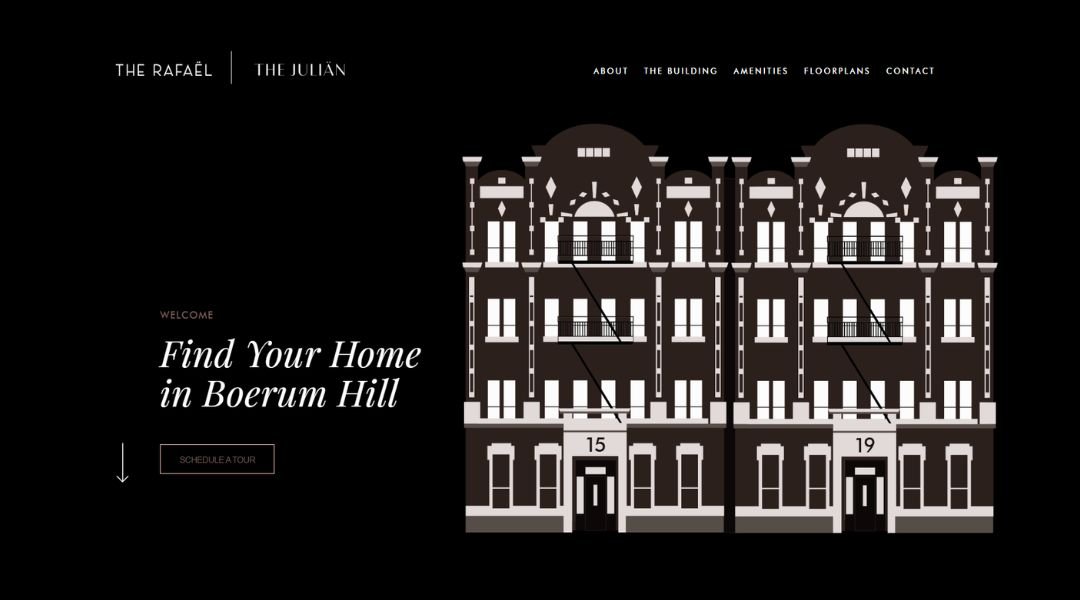
The Julian isn’t just another Brooklyn address—it’s a mood. The website opens with quiet confidence: refined visuals, generous spacing, and just the right amount of attitude. It feels elevated but never uninviting.
You won’t find flashy gimmicks or design overkill here. Instead, it’s all about tone. Clean typography, muted colors, and photography that speaks in full sentences. You get a sense of lifestyle without needing to read between the lines.
Each section moves with intention. The layout flows naturally, giving you the essentials—floor plans, features, and neighborhood highlights—without trying to impress with too much. It’s informative, but calm. Straightforward, but polished.
There’s a clear sense that The Julian knows who it’s for. It’s modern, grounded, and a little bit aspirational. Whether you’re browsing or booking a tour, the experience is smooth and to the point—just like the building itself.
No flash. No filler. Just good design and better living, wrapped in a digital space that knows when to speak and when to let the space do the talking.
6. Café Frida
Café Frida doesn’t just serve coffee—it serves atmosphere. From the moment the site loads, you’re transported. Warm tones, inviting textures, and photography that feels like a deep breath on a quiet morning.
The design is simple but soulful. No unnecessary clicks, no heavy menus. Just a fluid scroll through what matters: the space, the story, and what’s on your plate (or in your mug). You can practically smell the espresso.
But it’s not just about aesthetics. The site tells you what you need to know—hours, menu, vibe—without losing that handmade, personal feel. There’s an honesty to it. Like the café itself, it doesn’t try too hard. It just feels right.
You get the sense Café Frida isn’t here to follow trends. It’s here to build a little corner of calm for locals and wanderers alike. The kind of place where design and flavor come together—and linger longer than expected.
7. Davide Baratta
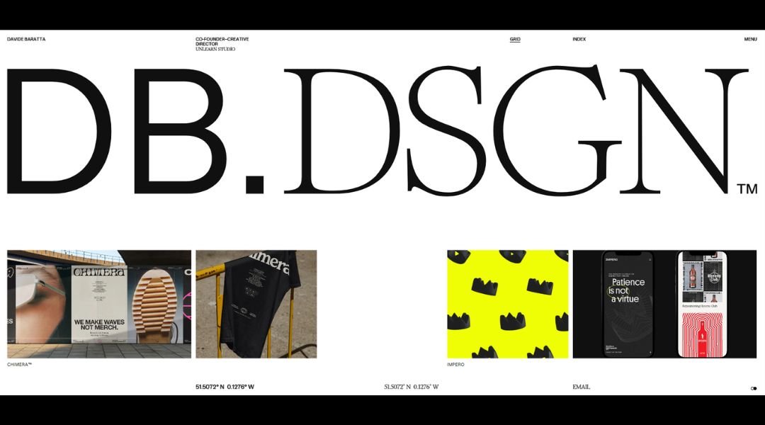
Davide Baratta’s site opens like his work—quiet, intentional, and impossible to ignore. There’s no rush, no noise. Just a carefully paced experience that gives space to think, to feel, to look twice.
Everything here is distilled. The design is minimal, but the message isn’t. Each project speaks with clarity. Images do most of the talking, and that’s the point. There’s confidence in restraint.
Typography is understated, almost whispered. Navigation is seamless. You’re not being led—you’re being invited. It feels more like stepping into a gallery than browsing a website. And just like good design, it leaves room for interpretation.
Baratta isn’t chasing trends. His portfolio leans into depth over decoration. Work that feels studied but still human. Intellect with a pulse.
The site doesn’t try to explain everything. It doesn’t need to. The clarity of form, the elegance of function—it’s all there, if you’re paying attention.
8. Béhen Bhai Book Club
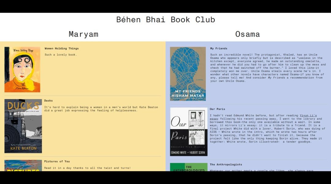
The Behen Bhai Book Club isn’t your typical reading circle—and the website makes that clear right away. Bright colors, playful layouts, and a tone that’s more sibling banter than literary lecture. It’s smart, but never stiff.
This is a space where design and storytelling go hand in hand. The visuals are bold without being loud. Typography has personality, but it doesn’t get in the way. Everything feels like it was made by someone who actually enjoys what they’re doing—because they do.
The site flows like a well-paced conversation. You learn about the club, the events, the vibe—without any fluff. It’s direct, warm, and refreshingly human. Like a group chat, but better organized.
What really stands out is the energy. There’s a clear love for books here, but also for people, for community, for shared voices. It’s not just about reading—it’s about connecting.
And honestly? It looks like a lot of fun.
9. We Ain’t Plastic
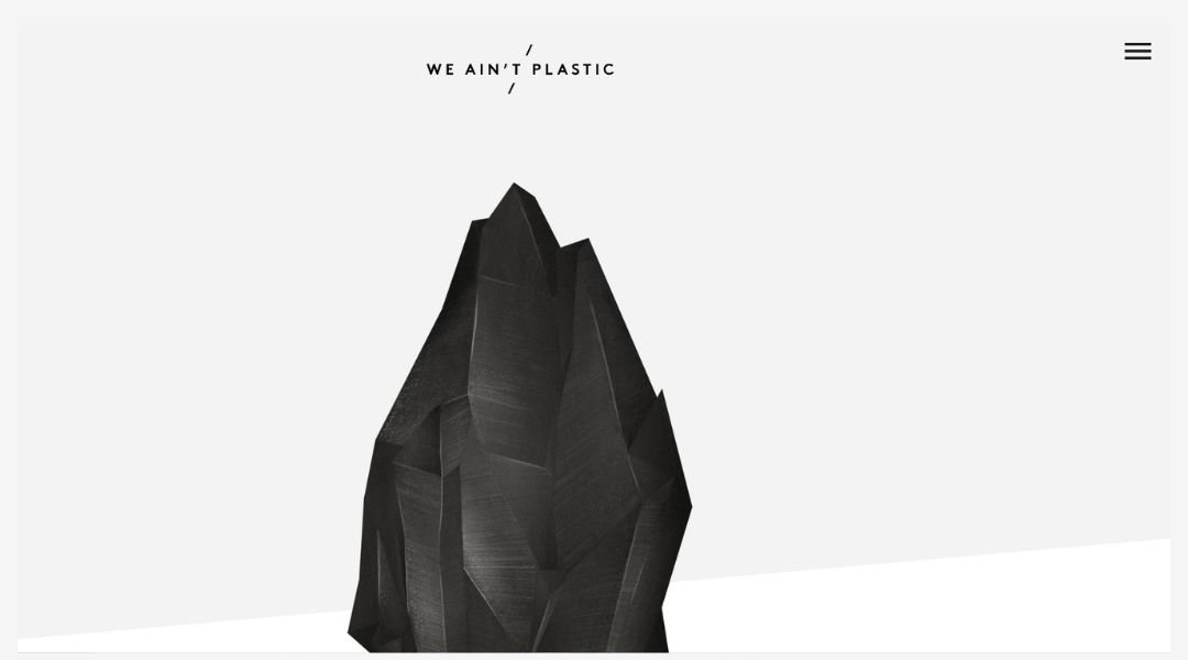
We Ain’t Plastic doesn’t waste time—or pixels. The moment the site loads, it’s clear: this isn’t about flashy effects or filler copy. It’s design with backbone. Thoughtful, intentional, and quietly bold.
The name sets the tone. There’s personality here, but it’s never overplayed. The layout is stripped down but sharp, letting the work take center stage. Each case study feels lived-in—less portfolio, more story with structure.
Navigation is clean, the tone is direct, and there’s zero fluff. You get a sense that this is someone who thinks deeply before touching a screen. Every project is a conversation, not just a deliverable.
There’s also a bit of a wink behind the seriousness. Subtle humor. Smart choices. A reminder that good design doesn’t have to wear a suit to be taken seriously.
In a world full of noise, We Ain’t Plastic speaks clearly—and only when it has something to say. Which, honestly, makes you want to listen.
10. Ribalta
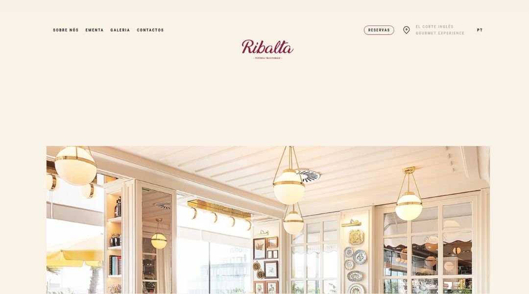
Ribalta keeps things quiet—and that’s what makes it stand out. From the first scroll, there’s a clear rhythm: crisp lines, soft tones, and a focus that never drifts. No noise, no over-introductions. Just work, presented with care.
The design leans into restraint. You won’t find bloated copy or flashy distractions. Instead, each project is framed like it matters—because it does. It’s architectural in feel: structured, intentional, and balanced without being cold.
The site doesn’t push. It invites. Clean typography, gentle transitions, and thoughtful spacing guide the experience. You’re not overwhelmed—you’re drawn in.
Ribalta feels like a studio that’s not chasing attention. It’s earning it through clarity, through precision, and through design that lets the work breathe. There’s something steady here. Mature, but not stiff. Creative, but not chaotic.
It’s the kind of site that doesn’t try to say everything. It says just enough—and says it well.
11. The art of texture
The Art of Texture doesn’t just show work—it sets a mood. From the first glance, you’re met with layers: soft motion, rich tones, and visuals that feel almost tactile. This is design you can feel, even through a screen.
Nothing here is rushed. The site unfolds slowly, like a quiet conversation. Each scroll adds depth. Projects are curated, not crammed. You’re given space to absorb, to notice, to appreciate.
Typography is understated. Animations are gentle. It’s all woven together with care, but never calls attention to itself. There’s confidence in that kind of restraint.
What stands out most is the tone—elegant, but grounded. You get a sense this studio knows how to balance polish with personality. The work speaks softly, but it stays with you.
It’s not about showing off. It’s about showing up with intention. And that’s exactly what this site does—gracefully, and without needing to say too much.
12. Weinbau Strenger
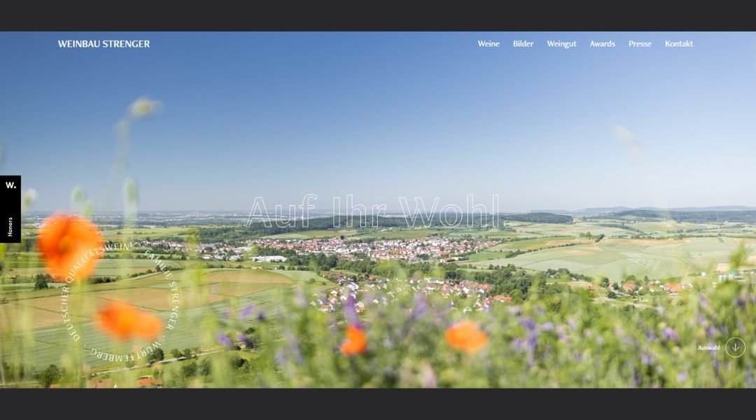
Weinbau Strenger leads with what matters: the land, the craft, and the care behind every bottle. The site mirrors that philosophy. It’s clean, focused, and full of quiet confidence—no frills, just honest character.
From the moment you land, there’s a sense of calm. Earthy tones, open layout, and photography that captures more than just vineyards—it captures rhythm. Seasons, hands, soil. The real work.
Navigation is simple. Details are clear. Whether you’re learning about the winery’s roots or browsing their selection, the experience is smooth and unhurried—like a slow pour on a quiet evening.
There’s pride here, but it’s never loud. The design speaks in gestures, not headlines. Tradition and technique are present in every frame, but so is a sense of welcome.
Weinbau Strenger feels like a place that understands time. How to respect it, how to work with it, and how to bottle the results with care.
13. Every Last Drop
Every Last Drop doesn’t talk at you—it walks you through. From the first click, the site moves like a short film with purpose. The design is playful, but the message is serious: water matters, and we’re all part of the story.
It’s not your average awareness campaign. The animation pulls you in, the pacing keeps you there, and the content lands without a lecture. Every scroll is a step deeper into how we use water—and how much of it we waste without thinking twice.
The tone is sharp but friendly. Facts are served straight, with a wink. It’s educational without being heavy. Even the statistics feel personal.
The site’s genius is in its simplicity. One page. One story. One clear takeaway: small actions matter. And they add up.
It’s clever, well-crafted, and genuinely engaging. You leave thinking—not just about water, but about how design can shift behavior. All in just a few minutes.
14. Gary Sheng
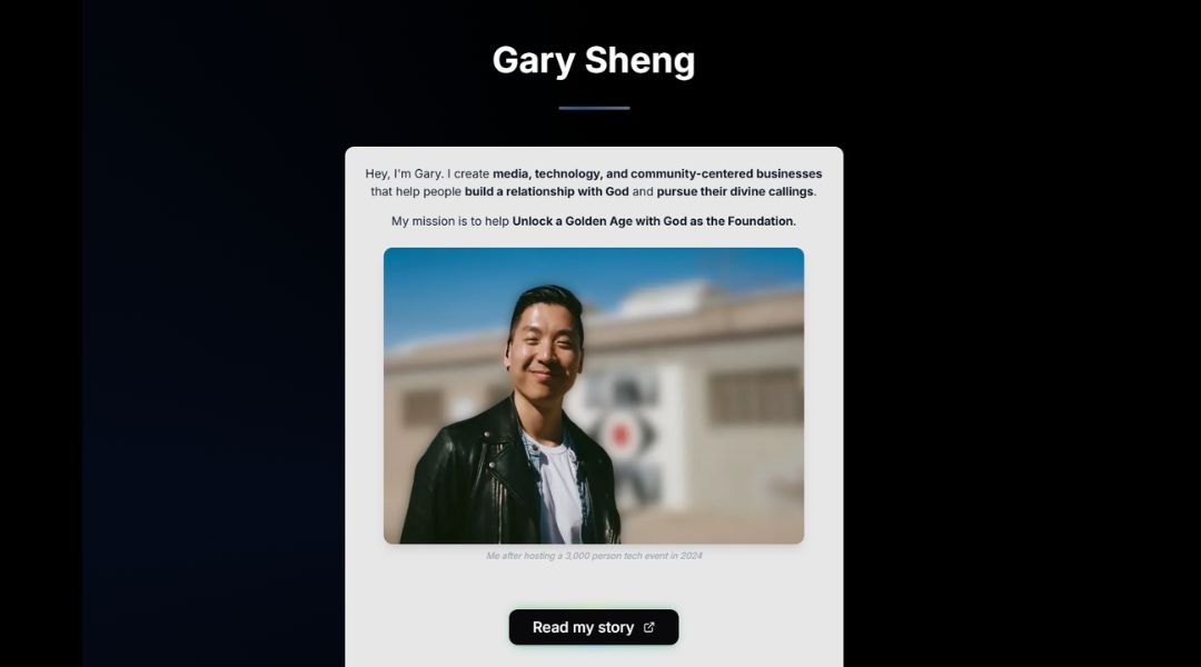
Gary Sheng’s site doesn’t waste your time—it respects it. From the first screen, it’s clear: this is someone with vision, focus, and a track record of building, not just talking.
The design is stripped down and purposeful. No extra fluff, no unnecessary polish. Just clarity—about what Gary’s doing, why it matters, and how you can get involved. The structure is as intentional as the message.
Each section has weight. Whether it’s about civic tech, web3, or community building, the language stays direct but personal. You’re not reading a résumé—you’re reading a point of view. And it sticks.
There’s a calm energy here. A mix of startup mindset and public purpose, presented with quiet confidence. It doesn’t shout. It invites. And that makes all the difference.
Gary’s not trying to be everywhere—he’s choosing where to focus. The site reflects that: minimal, clear, and grounded in impact.
15. Nathaniel Koloc
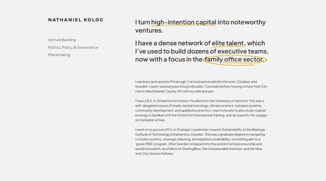
Nathaniel Koloc’s site doesn’t rush to impress—it gives you space to think. From the first scroll, the tone is intentional. It’s not flashy, but it’s unmistakably focused.
The layout is simple, even sparse, but the ideas behind it aren’t. Nathaniel’s work spans leadership, systems change, and career design—and the site reflects that range without trying to cram it all into one frame. It’s thoughtful, well-paced, and quietly ambitious.
The language is steady and reflective. There’s no overselling, no heavy branding—just clarity. Whether he’s writing about work that matters or guiding others toward purpose, the message stays grounded: complexity handled with care.
It feels less like a personal brand and more like a conversation starter. A place for thoughtful people to pause, reflect, and maybe even shift direction.
In a sea of self-promotion, Nathaniel’s site offers something different: perspective.
16. Kantwon
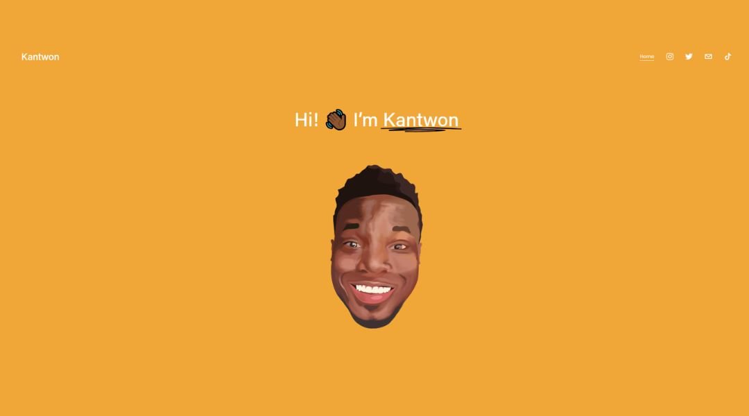
Kantwon Rogers’ site hits with clarity. No clutter, no second-guessing—just a direct window into someone who codes, teaches, and thinks deeply about how humans and machines connect.
It’s personal without being performative. The writing is sharp and honest, equal parts technical and human. Whether he’s breaking down AI safety or cracking a subtle joke in the margins, there’s a rhythm to it—smart, but never stiff.
The design is simple, almost academic, but with more personality than most lab reports. Navigation is straightforward. The about section reads like a conversation. And the blog? It’s thoughtful, curious, and surprisingly fun to read (yes, even the parts about debugging).
This isn’t a portfolio trying to prove something. It’s a working snapshot of a mind in motion—teaching, building, reflecting. Kantwon shows his work, shares what he’s learning, and doesn’t pretend to have it all wrapped up. That’s what makes it refreshing.
It’s tech with a pulse. And a sense of humor.
17. Sharam
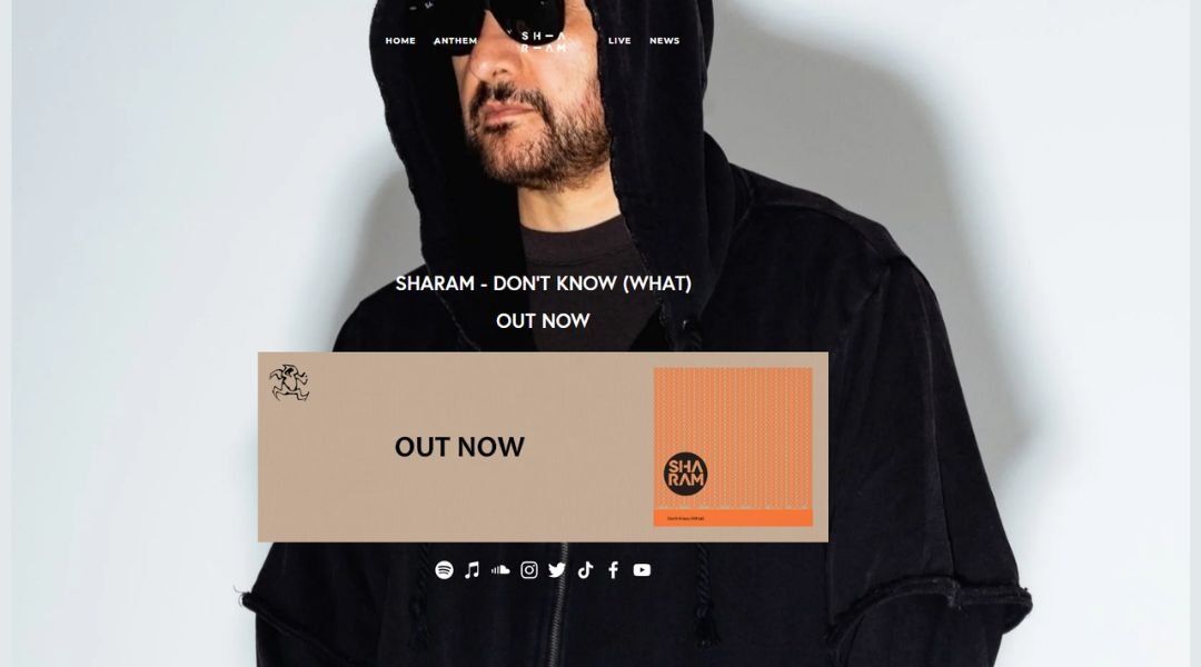
Sharam’s site feels like his music—precise, moody, and built to move. From the opening visuals to the dark, polished layout, it’s clear this isn’t just a portfolio—it’s a vibe.
Navigation is lean, but everything you need is right there. Tour dates, mixes, releases—it flows without friction. The site doesn’t scream for attention. It trusts the sound to speak.
There’s a cinematic quality to the experience. Black backgrounds, sharp contrast, and a sense of rhythm in how the pages load and shift. It’s immersive without being overwhelming—more like walking into a late-night set than browsing a press kit.
The tone is professional, but not distant. You get the sense that this is someone who’s been at it long enough to let the work lead. Nothing flashy, nothing forced—just a deep, steady pulse that mirrors the music.
It’s sleek, self-assured, and ready to play on repeat.
18. Jauz
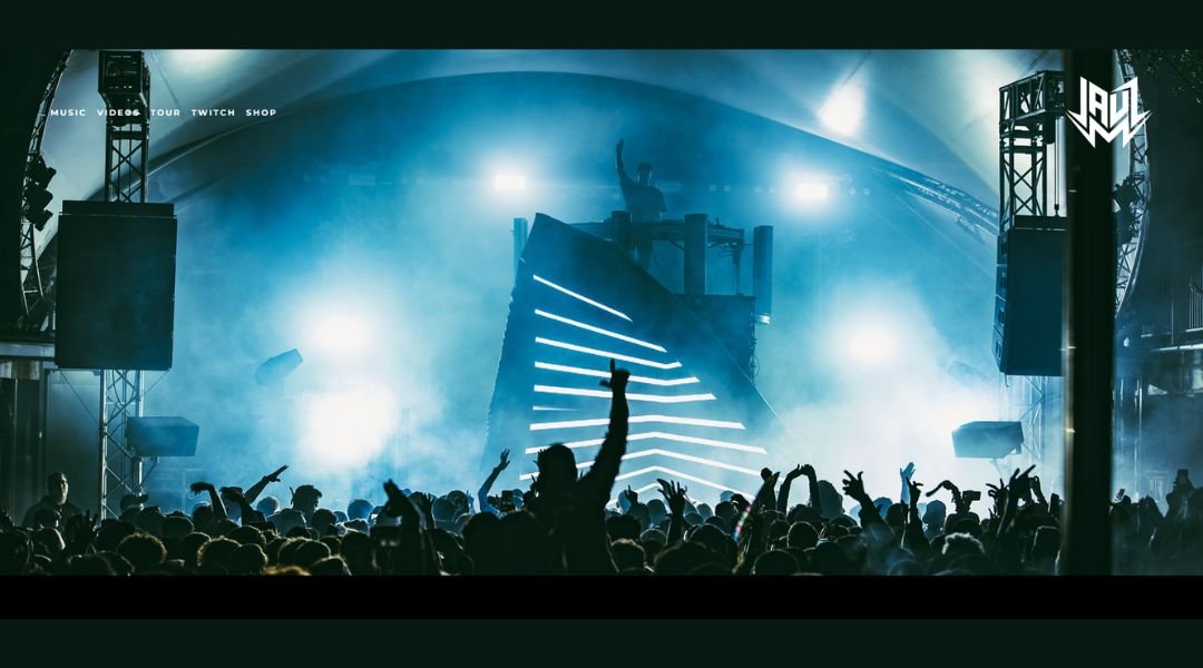
Jauz doesn’t ease you in—he drops you straight into the energy. The site mirrors the music: bold, fast-moving, and built for impact. You’re met with high-contrast visuals, sharp type, and a layout that wastes no time.
Everything is where it needs to be. Tour dates, new releases, merch—it’s all a click away, laid out in a structure that feels more like a setlist than a website. No guesswork. Just rhythm.
The design leans hard into personality. It’s high-gloss but never messy. Each section keeps the momentum going, like you’re scrolling through sound. You get a sense that this isn’t just an artist—it’s a full experience, designed to live both on stage and online.
There’s no filler here. The visuals hit, the branding is tight, and the vibe stays consistent. Whether you’re a longtime fan or new to the wave, the message is clear: this is loud, this is polished, and it’s moving fast.
And honestly? You’ll want to keep up.
19. Habitat
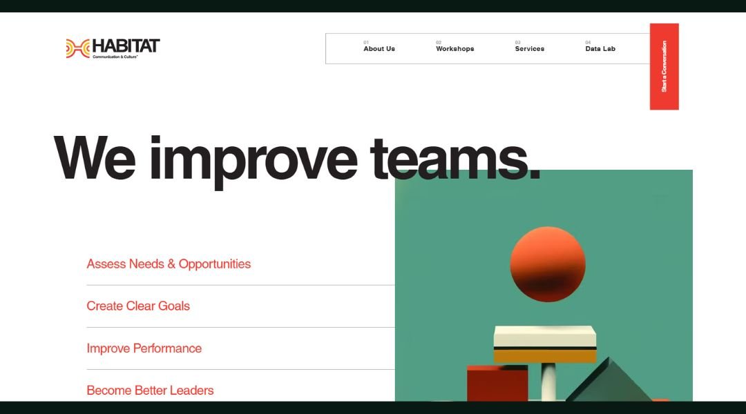
Team Habitat isn’t just building digital products—they’re building partnerships. From the moment the site loads, the message is clear: thoughtful design, real collaboration, and a process rooted in purpose.
The aesthetic is crisp and understated. Clean lines, soft tones, and smart use of space let the work breathe. It’s a confident presentation, but never showy. You’re not being pitched—you’re being welcomed in.
What stands out is the clarity. Every section, from services to team intros, is direct and human. You get a sense that this group values not just what they build, but how they build it—with people, not just for them.
The tone is approachable. The language skips the buzzwords and focuses on what matters: building things that work, and working with people who care.
It’s digital done differently—less noise, more listening. Team Habitat brings structure to creativity and puts people at the center of the process.
And in a space that’s often more hype than help, that difference feels refreshing.
Conclusion
I didn’t write this to convince you that every website should be one page. That would be like saying every book should be a haiku. But if you’ve got a focused message, a clear goal, and a good eye for pacing, this format can feel less like a shortcut—and more like the right call.
The best one-pagers aren’t about cutting corners. They’re about clarity. And let’s be honest: we could all use a little more of that, online and off.
Whether you’re planning your own page or just looking for inspiration, I hope these examples showed how simplicity—when done right—can carry more weight than a hundred clicks ever could.

