Mobile-first isn’t a trend anymore—it’s the baseline. As someone who spends hours building, testing, and refining websites that need to work on small screens, I know how quickly design ideas can feel recycled. That’s why I put together this collection—to help break that creative rut and get new energy flowing into your next mobile layout.
These aren’t just pretty sites. Each one offers something smart, practical, or just plain fun—features that solve problems, not just add decoration.
Here’s what I’ll cover:
- Layout choices that actually feel good in your hand
- Micro-interactions that add personality without slowing things down
- How designers are using type, spacing, and imagery to guide attention
- Design moves that balance creativity with real-world usability
- Examples that made me pause—and rework my own stuff
If your inspiration tab is full but your brain feels empty, this one’s for you.
1. Yves Saint Laurent
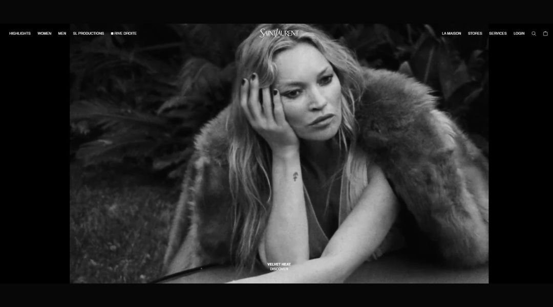
Saint Laurent’s site makes an entrance—quiet, bold, and polished. There’s no clutter, no overworked slogans. Just a clean scroll of fashion, detail, and unmistakable confidence.
Instead of shouting luxury, it nods to it. Product pages are stripped back and image-led, with minimal text and high-impact visuals. A jacket isn’t just shown—it’s framed like a portrait. And the homepage? It’s all atmosphere. High contrast, sharp photography, and the kind of precision you don’t need to explain.
The About section? It doesn’t try to summarize decades of influence. It trusts that if you’re here, you already know—or you’re curious enough to feel it.
What stands out is how little the site tries to impress. It just is. The design holds steady, like a runway model who knows they don’t need to look back.
And yes, there’s black. A lot of black. But somehow, it never gets tired. That might be the most impressive trick of all.
2. Lyft
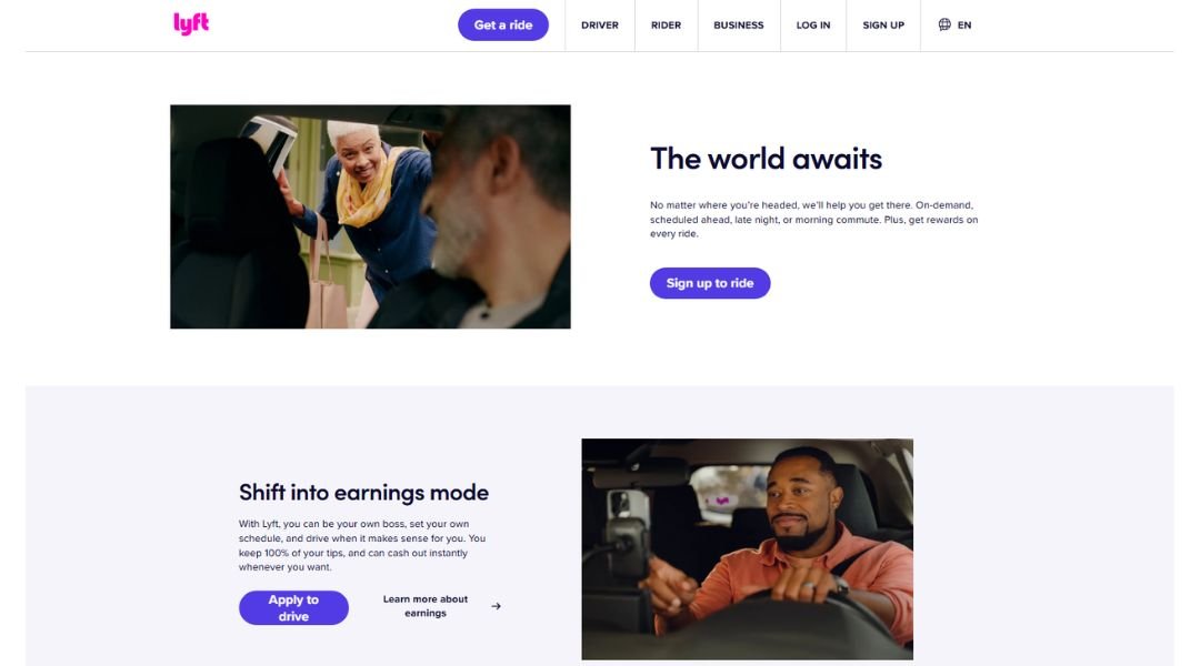
Lyft’s website gets right to it. No guesswork, no clutter—just clear direction for people who need to get moving. Whether you’re catching a ride or offering one, everything feels organized, fast, and a little friendlier than you’d expect from a tech company.
The design leans on soft color blocks, rounded edges, and conversational copy. Nothing shouts. Instead, the tone is helpful, like someone holding the door open rather than giving a pitch. Buttons are bold, the menu is straightforward, and it takes only a few clicks to go from curious to booked.
What’s smart is how the site balances two audiences at once—riders and drivers—without making either feel like a second thought. You’re not overloaded with options. Just nudged in the right direction.
There’s even a little personality tucked into the corners. Not overdone, just enough to make things feel human.
Lyft’s site doesn’t just guide users. It moves with them—quickly, clearly, and without the extra drama.
3. Mon Top Netflix

Mon Top Netflix is less a website and more a digital memory box. Created to celebrate Netflix France’s 10th anniversary, it lets users build and share a personal top 10 list of their favorite shows. It’s interactive, a little nostalgic, and surprisingly fun.
The design is clean but bold. Oversized titles, smooth transitions, and drag-and-drop functionality make the whole experience feel more like a game than a form. You pick, rank, and instantly see your top shows come together in a sleek, shareable format.
It works well on both desktop and mobile, with gestures that feel intuitive and layouts that adjust without a hitch. There’s even a built-in feature to generate social media-ready posts. No downloads, no fuss—just your top 10, ready to go.
But what makes the site stick is the tone. It’s light, human, and avoids the over-produced feel of most promo pages. You’re not just interacting with a brand—you’re revisiting what made those shows matter to you.
Mon Top Netflix does what good design should: it works, it connects, and it stays with you.
4. Hollie Fuller
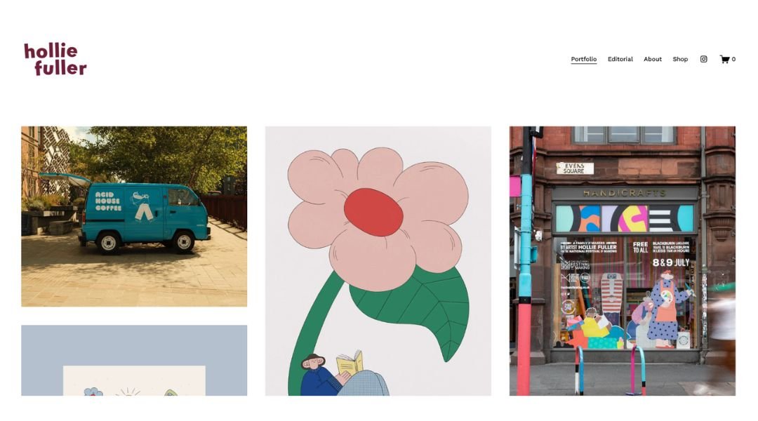
Hollie Fuller’s site is playful in the best way—full of movement, color, and charm without losing control. As an illustrator and animator, she brings a lightness to her work that feels intentional, not accidental. Her site captures that same energy.
Right away, the homepage sets the tone. Hand-drawn elements bounce and shift as you scroll, but never distract. They invite. The palette is soft but confident, with enough white space to let her illustrations breathe. You’re not overwhelmed—you’re intrigued.
The layout is simple, but the rhythm is dynamic. Each project is displayed with care, accompanied by just enough context to give you insight without overexplaining. From editorial pieces to animated loops, her work feels consistent in voice and flexible in form.
The About page is refreshingly brief and warm. There’s no polished sales pitch—just a designer who clearly loves what she does, and it shows in every line she draws.
Hollie Fuller’s site doesn’t shout. It smiles. And that’s more than enough.
5. Tumblr
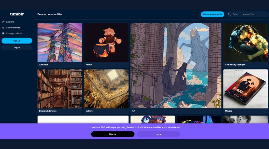
Tumblr isn’t just a platform—it’s a personality. Built on creativity, self-expression, and a dash of chaos, the site invites users to blog, scroll, repost, and fall into deep rabbit holes of everything from art to memes to niche fan theories.
The homepage keeps things straightforward. One quick sign-up, and you’re in. No endless onboarding. The design is simple but familiar—scrollable feeds, big visuals, and just enough structure to keep things from unraveling (barely).
Tumblr’s strength lies in its flexibility. You can write, post images, share music, drop a GIF, or reblog something strange at 2 a.m. without needing to explain yourself. It doesn’t ask for perfection—just participation.
What sets it apart is the tone. It’s one of the few platforms that still feels user-driven. The weird corners? Still there. The hyper-specific communities? Thriving. Somehow, it still feels like the internet before everything became a product.
Tumblr isn’t trying to keep up. It’s doing its own thing—and that’s why people keep coming back.
6. Trello
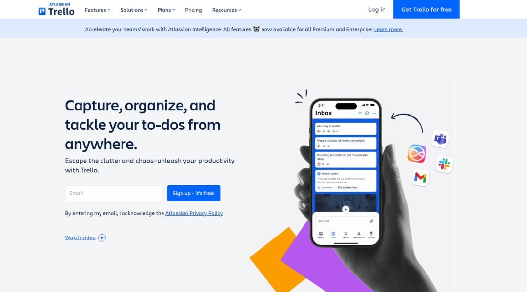
Trello keeps things moving—literally. Built around drag-and-drop boards, cards, and lists, it takes the clutter out of project management and replaces it with clarity. Whether you’re running a team or planning your week, it gives structure without the stress.
The homepage gets straight to the point. A few clicks and you’re in. No dense tutorials or heavy dashboards. Just visual tools that let you map out your work like a well-organized pinboard.
Each board feels personal. You can customize, color-code, label, and assign tasks without touching a spreadsheet. For teams, collaboration feels intuitive. Comments, due dates, and checklists live where the task does—no digging through inboxes or chasing updates.
The tone is calm, helpful, and thankfully free of tech jargon. It’s project management without the headache.
Trello isn’t trying to reinvent the wheel. It just makes it easier to turn—and maybe even a little satisfying along the way.
7. Uber

Uber’s site is built for action. Whether you’re looking to ride, drive, or manage a fleet, everything is structured for speed. It’s not flashy—it’s functional, clear, and gets you where you need to go, just like the service itself.
From the homepage, you’re given direct choices: request a ride, sign up to drive, or explore business tools. There’s no wandering through menus or guessing what button to click. It’s designed for people on the move.
Each section focuses on the essentials. Whether you’re checking fare estimates, learning how to become a driver, or managing a business account, the content is short and to the point. No unnecessary layers. Just practical answers and fast access.
The design leans into clean lines, strong icons, and plain language. It feels modern but grounded. And it works equally well on mobile, where most users likely land in the first place.
Uber’s website doesn’t just support the app—it reflects the brand: efficient, direct, and built to make things simpler.
8. Hello Monday

Hello Monday is what happens when storytelling meets sharp design. The studio’s website feels like a creative playground—but one built with intention. It’s immersive, interactive, and confident without ever being overwhelming.
From the first scroll, it’s clear: this is not your typical agency page. Animated transitions, unexpected layouts, and subtle soundscapes pull you in. But underneath the play is structure. Projects are organized, case studies are easy to explore, and each section moves with purpose.
What stands out most is the balance. The site is artistic but usable. It invites curiosity, but never loses clarity. You get a sense of the team’s personality without having to wade through pages of text.
Each project is presented like a living piece—part portfolio, part performance. It’s a reminder that digital experiences can feel human when crafted with care.
Hello Monday’s site doesn’t just showcase work. It is the work—bold, thoughtful, and built to be remembered.
9. The Cool Hunter
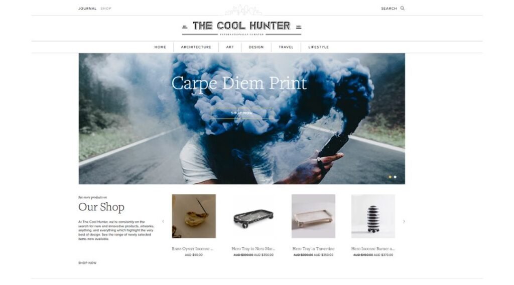
The Cool Hunter isn’t chasing trends—it’s curating moments. The site reads like a living moodboard, where design, culture, travel, and architecture meet under one bold, highly scrollable roof.
From the first glance, it’s clear this is about visuals. Big imagery takes center stage, with minimal text acting more like a caption than an explanation. Each post is quick, sharp, and editorial in feel—like flipping through a perfectly designed magazine without the paper cuts.
Navigation stays out of the way. Whether you’re browsing interiors, art installations, or offbeat hotel concepts, the layout gives the content room to shine. There’s no pressure to “explore more”—you just do, because it’s that compelling.
What makes it work is restraint. Nothing feels overworked or overexplained. It’s discovery-driven, built for people who appreciate great design without needing a long backstory.
The Cool Hunter doesn’t tell you what’s stylish. It shows you—and lets you decide what sticks.
10. LottieFiles
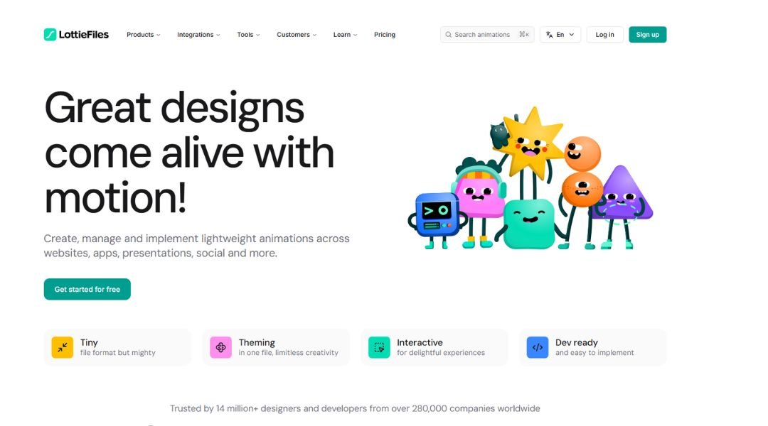
LottieFiles is where motion design meets efficiency. The site is built for creators who want to add animation without overcomplicating the process. Whether you’re a designer, developer, or somewhere in between, it gives you the tools to move fast—and make things move beautifully.
Right from the homepage, you’re introduced to what matters: lightweight, scalable animations that work across platforms. The layout is clean, with just enough motion to prove the product, but never distract from the message.
Browsing is smooth. You can preview animations, search by category, customize, and even test on real devices—all in a few clicks. There’s an ecosystem feel here, not just a toolset. Plugins, integrations, and a community of creators make it feel collaborative, not just transactional.
The tone is approachable but sharp. No fluff, just helpful features and clear benefits.
LottieFiles makes animation less intimidating and a lot more accessible. It’s not just for experts. It’s for anyone who wants motion to feel less like code—and more like creativity.
11. National Geographic
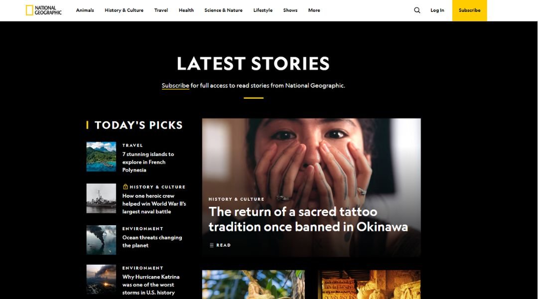
National Geographic’s website is a visual deep breath. Bold photography, immersive stories, and crisp layout work together to pull you in—whether you’re exploring ancient ruins, endangered species, or the edges of space.
The homepage wastes no time. Big headlines, striking images, and just enough copy to invite a click. It’s clean without feeling clinical, and rich without getting in its own way.
Navigation is smooth. Sections are clearly defined—Science, Travel, History, Environment—each filled with feature pieces that feel carefully chosen, not algorithmically pushed. You’re guided, not funneled.
But what holds it all together is the storytelling. Even the most complex topics are broken down with clarity and respect. There’s a quiet intelligence to the voice—never oversimplified, never overexplained.
National Geographic doesn’t just present facts. It crafts context. And it does so in a way that honors both the subject and the reader.
This is what a modern publication site should feel like: informed, curious, and always grounded in the real world.
12. Gelato La Boca
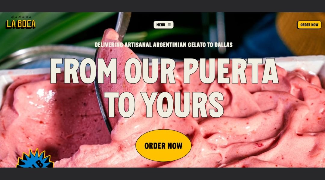
Gelato La Boca’s website feels as joyful as the gelato itself. Bright colors, smooth animations, and playful design choices create a browsing experience that’s hard to forget—and even harder to scroll away from.
The homepage sets the vibe instantly: vibrant, confident, and full of flavor. Each section glides into the next, offering just enough content to tempt, without crowding the screen. It’s cheerful, but not chaotic.
The flavors page does exactly what it should—it makes you want one of everything. With bold images and clear descriptions, even first-time visitors know what to expect. Whether it’s vegan-friendly or gluten-free, every option is clearly marked. No second-guessing, just straight-up scoop anticipation.
Beyond the counter, the site highlights catering with style. Booking the gelato cart for events is made simple and inviting, without the usual fuss.
Gelato La Boca’s site doesn’t just sell gelato. It reflects the spirit of the brand—bold, approachable, and full of character. It’s the kind of site that leaves you smiling—and maybe checking if they deliver.
13. Jambo Club
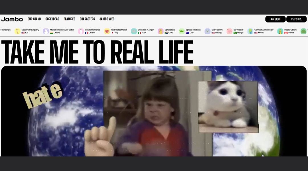
Jambo’s site feels like it’s built for motion—clean, fast, and focused on getting you where you want to go. As a hub for exploring the Jambo platform, it gives just enough to spark interest without bogging you down in detail.
From the landing page, you’re met with smooth visuals and a modern layout. The colors are fresh, the typography is sharp, and the interface is stripped of any distractions. It’s a digital experience designed for attention spans that don’t wait around.
What stands out is clarity. Each section answers a single question: what is Jambo, who is it for, and why should it matter? Whether you’re a new user or just curious, the site keeps the information light but intentional.
Calls to action are direct. No fluff, no endless scroll. It’s built for people who want to explore and decide quickly.
Jambo’s site mirrors its product philosophy—streamlined, user-first, and quietly confident. It doesn’t oversell. It invites.
14. Quipo

Quipo’s website makes one thing clear from the start: this is financial guidance without the lecture. Designed for freelancers and creative professionals, the app helps users track income, manage taxes, and make smarter money decisions—without needing an accounting degree.
The site feels like the app itself: focused, easy to navigate, and refreshingly human. Soft colors, simple illustrations, and friendly copy make the experience approachable. You won’t find buzzwords or financial jargon here—just real tools for real work.
Each section is direct. From features to pricing, everything is laid out with intention. No clutter, no buried details. Just practical steps for getting started, staying on track, and understanding where your money’s going.
What really stands out is the tone. It’s professional, but never stiff. The copy respects your time and your intelligence—like a financial coach who knows when to explain, and when to just give you the numbers.
Quipo doesn’t try to do everything. It does a few important things well—and that’s exactly what makes it useful.
15. Porsche
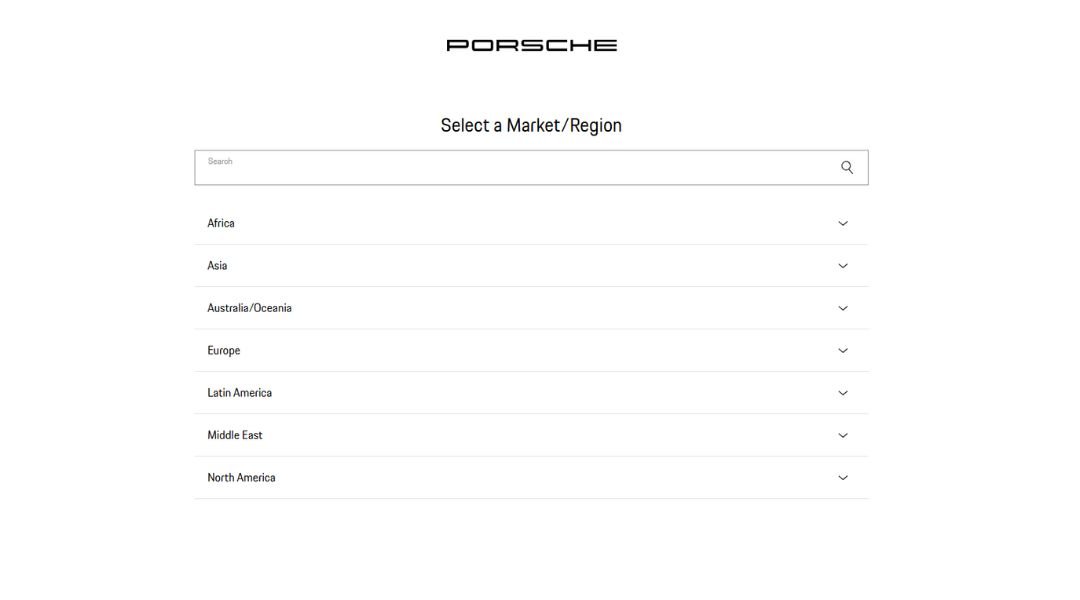
Porsche’s website feels exactly how a Porsche drives—refined, powerful, and completely in control. Every page is deliberate. No clutter, no noise. Just precision.
From the start, the homepage sets the tone: bold imagery, smooth transitions, and a calm confidence that doesn’t need to oversell. You can browse models, explore design features, or dive into performance specs—all without getting lost.
The interface feels effortless. Whether you’re building your dream car or just admiring one, the experience is sleek. Details are well-placed. Copy is minimal but meaningful. And every interaction—hover, scroll, swipe—feels as tuned as the engine under the hood.
What stands out most is the balance between emotion and engineering. Yes, the cars are technically brilliant. But the website reminds you that driving one is also about feeling—grip, speed, sound, and silence.
Porsche doesn’t use the site to shout. It uses it to show. And that’s all it needs.
16. Nodcoding
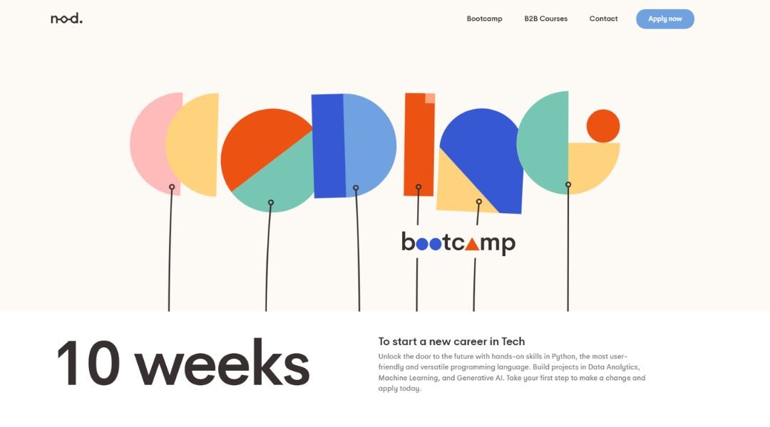
Nod Coding isn’t just about development—it’s about turning ideas into working products, fast. Focused on no-code and low-code solutions, the site speaks to startups, creators, and teams who need to move quickly without getting buried in technical complexity.
The design is crisp and minimal. Right from the homepage, the message is clear: less code, more results. Bold typography and straightforward language make it easy to understand what Nod offers—and who it’s for.
Each section is built with intention. Whether you’re looking to prototype an app, automate a workflow, or scale an MVP, the site walks you through the process without overwhelming you with detail.
There’s a confident calm to the tone. No fluff, no overhyped promises. Just a clear approach to building digital tools with speed and precision.
What makes Nod stand out is the way it bridges creative thinking with technical structure. It’s not about cutting corners—it’s about removing blockers.
If you’ve got a vision, Nod helps you ship it. Simple as that.
17. Simply Chocolate
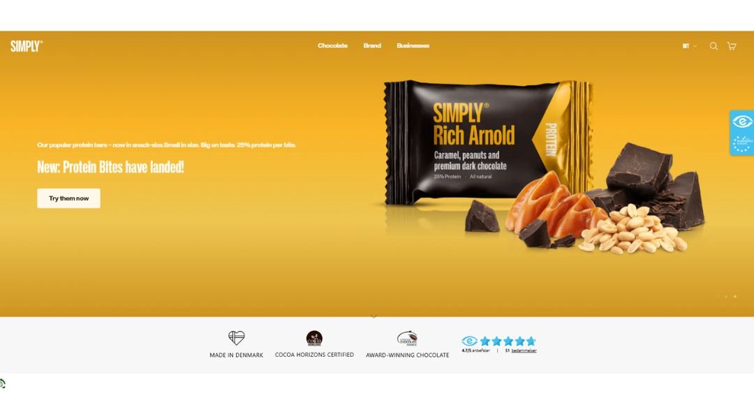
Simply Chocolate delivers exactly what the name promises—chocolate, without the nonsense. Based in Copenhagen, the brand mixes quality ingredients with playful design, and their website captures that balance perfectly.
From the homepage, you’re pulled into a world that’s bold but not overdone. Bright colors, clever packaging, and smooth scroll animations give the site a fun rhythm. It feels fresh, modern, and easy to navigate—like unwrapping a chocolate bar you’ve never tried but already trust.
Each product page is straight to the point. You get clean visuals, smart copy, and all the need-to-know details—no marketing overload. Whether it’s salted almonds or dark mint, the site makes every flavor feel like a small event.
There’s also a clear sense of humor here. From the tone of the descriptions to the playful names, everything is designed to feel approachable.
Simply Chocolate’s site doesn’t try too hard to be cool. It just is. And that relaxed confidence is exactly what makes it work.
18. Daylight
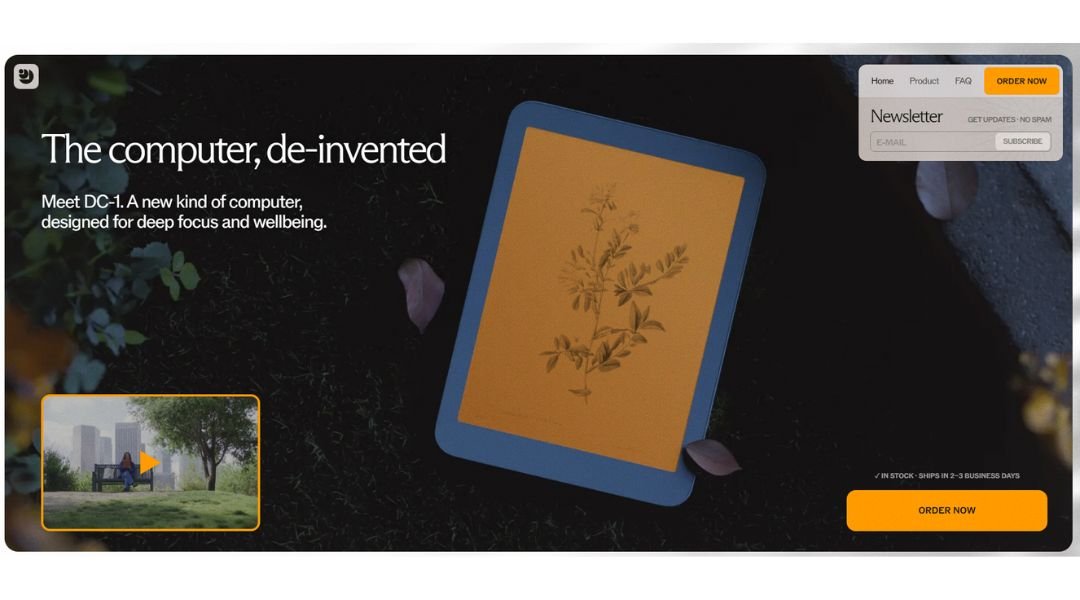
Daylight Computer doesn’t follow tech trends—it questions them. Built around the idea that screens should support well-being, not drain it, the site introduces a new kind of device: calm, focused, and intentionally different.
The homepage feels like a breath of fresh air. Soft tones, generous spacing, and minimal animation make it feel more like a wellness brand than a tech company—and that’s exactly the point. There’s no overload, no urgency. Just clarity.
The product—the DC-1—is presented with purpose. Instead of flashy specs, the site leans into how the device feels to use. No blue light. No glare. Just a screen that’s designed to reduce fatigue, not feed distraction.
Each section speaks with confidence, but without noise. You get the why, not just the what. It’s a tool for focused work, deep reading, and digital simplicity—things many devices seem to have forgotten.
Daylight’s site does what its product promises: it slows you down just enough to think clearly.
19. Neoplants
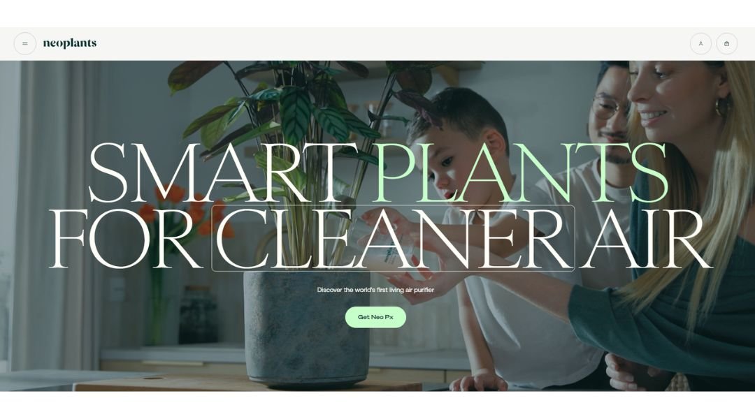
Neoplants is rethinking air purification—starting with the plants themselves. This isn’t about accessories or gadgets. It’s about bioengineering nature to do more of what it’s already great at: cleaning the air.
The website reflects that same vision. It’s modern, clean, and confident without overselling. Neutral tones, soft animations, and strong visuals guide you through a product that feels futuristic but deeply grounded.
The star of the site is Neo P1, a living air purifier designed to fight indoor pollution at the molecular level. But instead of diving into heavy science, the content is accessible and clear. It explains what matters—what the plant does, how it works, and why it’s different.
Everything feels well-paced. From visuals to copy, the site respects your time and your attention. It educates without overwhelming, and it invites curiosity without needing gimmicks.
Neoplants isn’t just selling a plant. It’s offering a smarter way to live with nature—by helping it do what it does best, just a little better.
Conclusion
Good mobile design doesn’t shout. It guides, it adapts, and sometimes—if it’s done really well—it even surprises.
The examples I’ve shared aren’t just about aesthetics. They’re about design decisions that respect how people actually use their phones. Small gestures, fast load times, and layouts that feel built with care rather than stuffed with features.
If you’ve been stuck, I hope this gave you something to rethink—or at least a new direction to sketch toward. The good ideas are out there. Sometimes, all it takes is seeing them in action to get your own moving.
