Creating a personal website shouldn’t feel like starting from a blank page with a blinking cursor and no plan. I’ve been there—tabs open, mood board half-built, and still unsure what direction to take.
So I pulled together 20 personal websites that actually inspired me to think differently about my own. They’re not just pretty templates—they’re smart, thoughtful, and built with purpose. Each one brings something helpful to the table, whether it’s layout ideas, smart copy, or a creative way to share work.
Here’s what you’ll find in this post:
- Sites that make a strong impression with minimal effort
- Creative ways to showcase work without oversharing
- Portfolios that balance personality with professionalism
- Smart use of space, color, and typography
- Layouts that let the content breathe and the message land
If you’re ready to stop scrolling and start building, this list is a great place to start.
1. Peter McKinnon
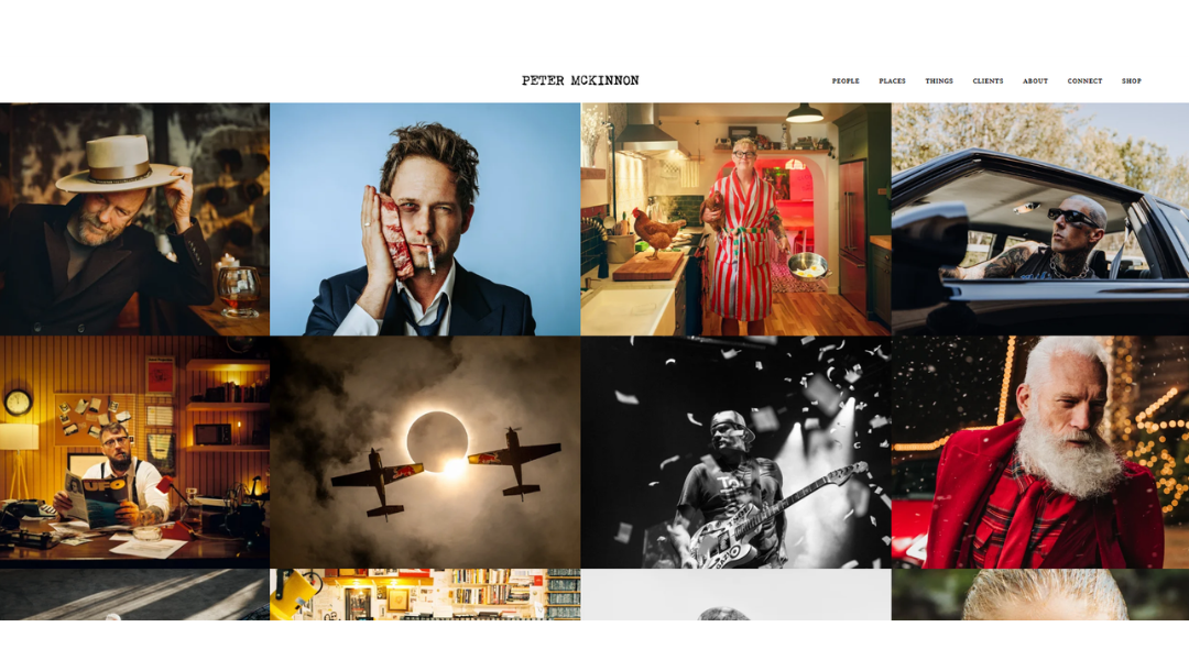
Peter McKinnon’s website pulls you in before you click a thing. It’s clean but bold, with a clear point of view. You immediately get that this isn’t just another photographer showing off gear—it’s someone who sees the frame before the lens does.
The About section? Straightforward, honest, and personal. No lengthy backstory or bloated biography. Just enough to understand where he’s coming from—and why he cares. There’s clarity in the way he speaks about craft, and a sense of calm purpose behind the camera.
What stands out is how the site moves. Each section feels intentional. Visuals are strong but don’t get in the way. Whether it’s photography, filmmaking, or prints, everything is built to showcase the work, not distract from it.
And yes—there’s coffee. Because, of course there is.
Peter’s site is sharp without trying to be clever. It works because it reflects him: focused, curious, and unafraid to hit “record” when most people would hesitate.
2. Jen Carrington
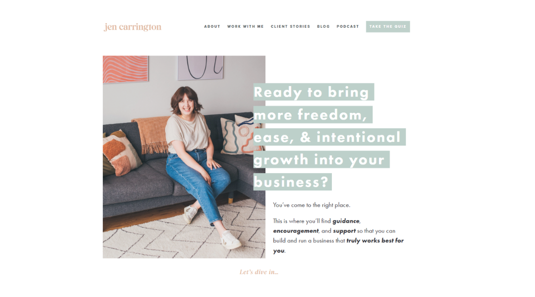
Jen Carrington’s website doesn’t try to impress with noise—it welcomes you with clarity. From the moment you arrive, there’s a calm, intentional feel to it. It’s not flashy. It’s honest. And that’s exactly what sets it apart.
Her homepage leads with purpose, not pressure. The language is straightforward and personal, like she’s talking to you, not at you. You won’t find jargon or forced energy—just thoughtful words from someone who knows how to listen before she offers advice.
The design is clean and easy to navigate. It reflects her coaching style: focused, kind, and rooted in real-life progress—not perfection. Whether you’re exploring her blog, podcast, or coaching offers, everything is laid out with care and clear intention.
There’s a softness here—but also strength. Jen’s work isn’t about big hype or quick wins. It’s about slow, meaningful growth. And her site reflects that balance beautifully.
If you’re a creative looking for support that feels grounded and human, this is the kind of space you’ll want to return to.
3. Kantwon
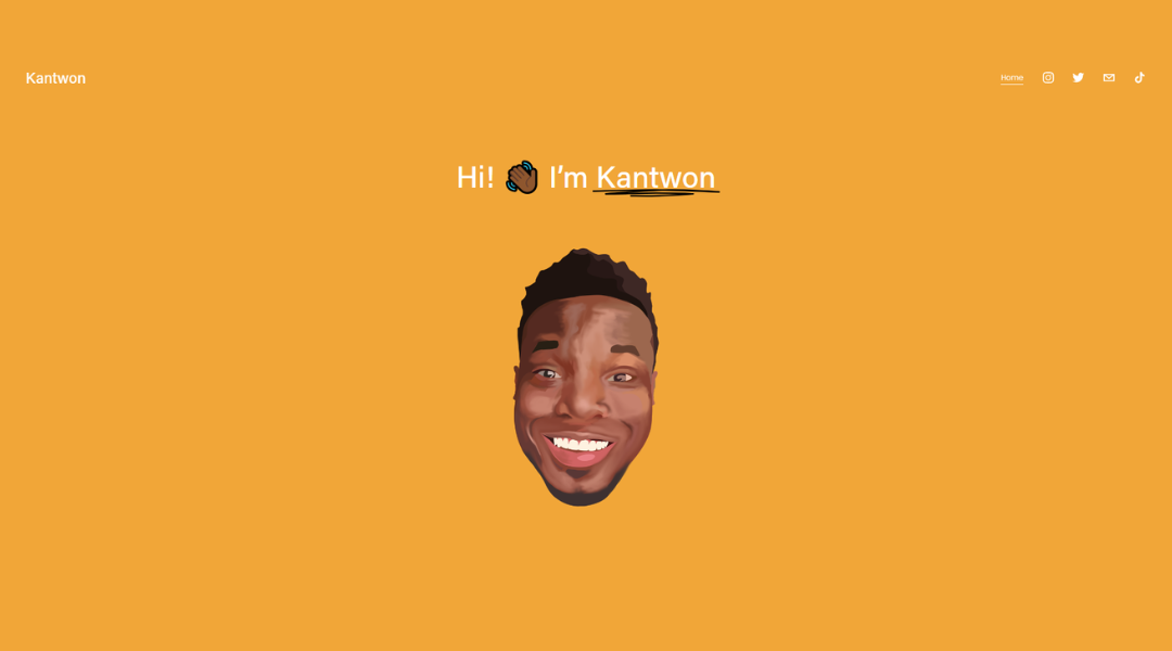
Kantwon Rogers’ website strikes a rare balance—it’s technical, but never dry. From the first scroll, it’s clear you’re stepping into the mind of a researcher who doesn’t just love data, but knows how to make it human.
The design is simple and distraction-free, letting his work and writing take the lead. You’ll find academic accomplishments, ongoing research, and thoughtful blog posts—all delivered in a tone that’s direct but never distant. It’s smart, yes—but approachable.
His bio tells a story, not just a résumé. You get a sense of how he thinks, what drives his work, and where he’s headed next. And the personal touches? Subtle, but they give the site a little warmth—a reminder that behind the code and experiments, there’s a real person with real curiosity.
This isn’t a portfolio trying to dazzle with effects. It’s a clean, confident presentation of meaningful work. Whether you’re a fellow researcher, a student, or someone just intrigued by AI and human-centered tech, Kantwon’s site offers substance—with style that knows when to step back.
4. Anthony Wiktor
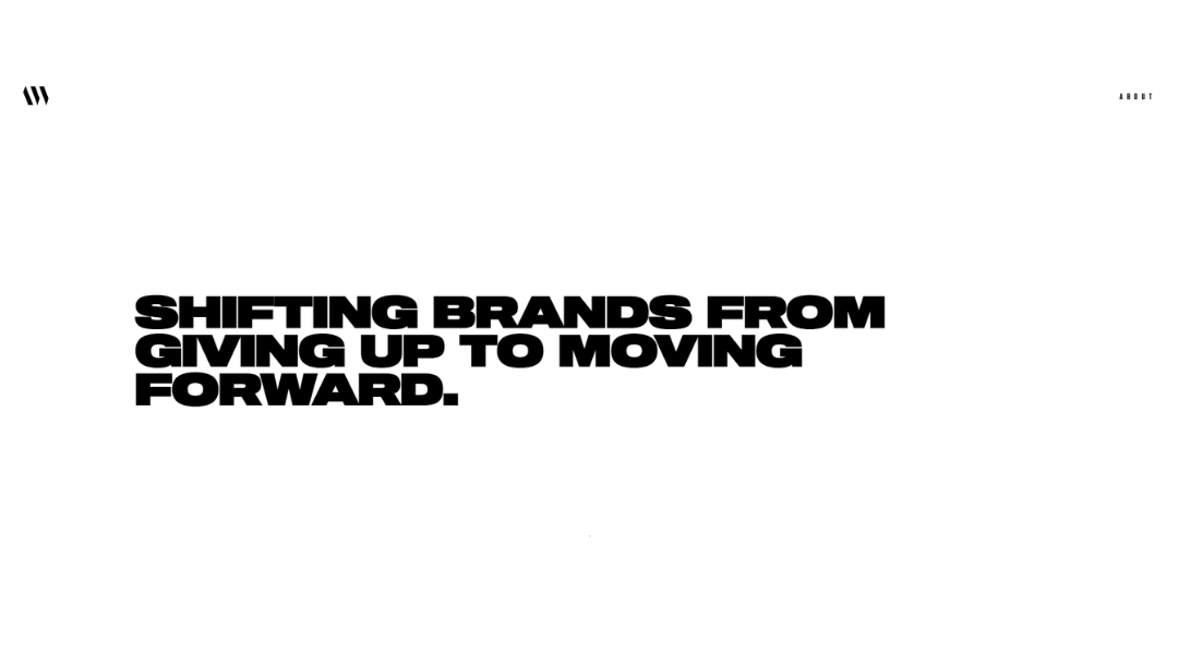
Anthony’s website is clean, sharp, and to the point—just like his work. You land on the homepage and immediately know what he does, how he does it, and why it works. No guesswork. No filler. Just clear, confident design rooted in strong visual thinking.
Navigation is smooth and minimal. Projects are presented with just enough context to get the idea, but never too much to slow you down. Every layout choice feels intentional. Typography, spacing, and imagery all play nicely—no one element screaming for attention.
The tone? Professional, but not robotic. It feels like a real person crafted this site—someone who knows the tools, understands brands, and respects good visual hierarchy.
What stands out most is restraint. Anthony doesn’t oversell. He lets the work do the talking—and it speaks well. If you’re looking for design that’s quietly confident and built for clarity, this portfolio is a solid example of how to do it right.
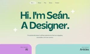
5. Sean Halpin
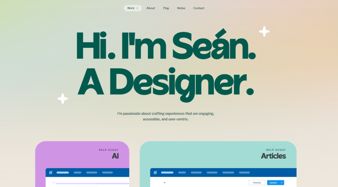
Sean Halpin’s site is a perfect blend of personality and precision. It’s lighthearted without losing focus, and polished without trying too hard. The homepage greets you with warmth—literally. “Hi, I’m Sean.” It’s casual, but behind that simplicity is sharp, thoughtful design.
The visuals are clean and friendly. Soft colors, smart spacing, and approachable type choices make the experience feel inviting, not mechanical. It’s the kind of portfolio that makes you smile and take notes.
Under the surface, there’s serious front-end skill at play. Animations are subtle and intentional. Content is easy to digest. Case studies are structured to show process and thinking, not just final shots. The message? This is someone who understands both users and code.
Even the little details—microcopy, transitions, layout rhythm—are handled with care. It feels personal but professional, playful but clearly experienced.
Sean’s site doesn’t just showcase his work—it reflects how he works: clean, creative, and refreshingly human.
6. Devon Stank
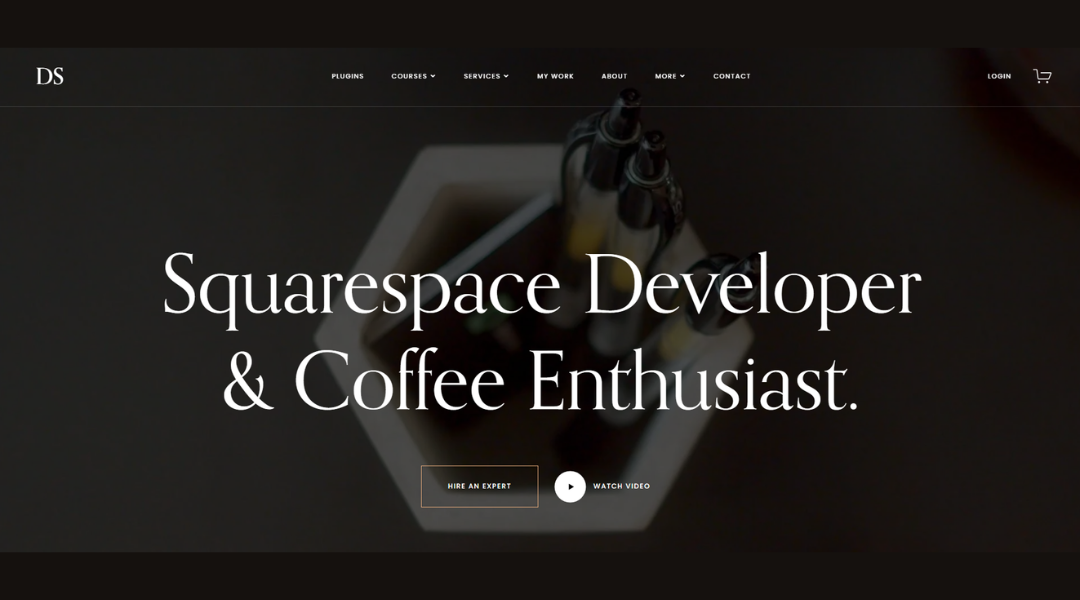
Devon Stank’s website doesn’t waste time. It opens with clarity, confidence, and a sharp layout that instantly communicates his expertise. No clutter. No distractions. Just a clean presentation of who he is and how he helps brands stand out.
From branding to website strategy, everything is framed around real results. The tone is straightforward and smart, with a focus on how good design supports clear business goals. Case studies walk the line between creative and practical—showing not just what was built, but why it works.
The design choices? Minimal, modern, and intentional. Nothing flashy, yet nothing feels flat. Every section has room to breathe, making the site feel thoughtful without being slow.
What stands out most is Devon’s positioning—not just as a designer, but as a creative partner with vision. This isn’t about trendy visuals. It’s about helping people move their ideas forward—with style and structure.
If you’re looking for clarity wrapped in good design, Devon’s site is a solid blueprint.
7. Lin-Manuel Miranda
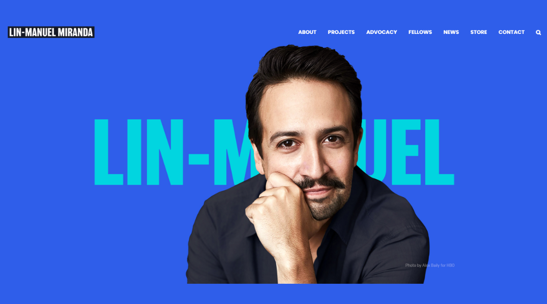
Lin-Manuel Miranda’s website reflects exactly what you’d expect from a creator who blends music, writing, and purpose so seamlessly—it’s focused, expressive, and grounded in storytelling.
The layout is straightforward. No unnecessary layers or fancy transitions. Just clean design choices that let the content speak. Whether you’re browsing projects, reading updates, or checking out his latest collaborations, the structure keeps things accessible and human.
The tone across the site is warm and welcoming. It doesn’t lean on fame—it leads with passion. Each section is crafted to give you a sense of what Lin’s working on, what he cares about, and how those two things are always closely connected.
There’s a creative pulse behind every page, but it’s never forced. You can tell this is a space meant to inform, uplift, and stay true to the work—without needing to dress it up.
Whether you’re a fan, collaborator, or just creatively curious, Lin’s site invites you in—quietly, thoughtfully, and with purpose.
8. Arlen McCluskey
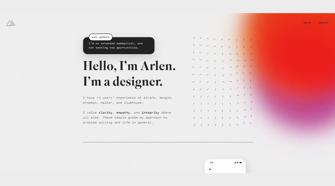
Arlen McCluskey’s site keeps things honest—minimal, intentional, and refreshingly free of filler. From the first scroll, it’s clear: this isn’t just another portfolio with polished visuals. It’s a space where design, code, and thoughtful thinking meet.
The homepage is simple but smart. Clear text. Calm layout. No visual overload. Just a smooth path into his projects and ideas. The tone is direct, but never cold. You get a sense of the person behind the work, not just the resume.
His case studies focus on real decisions—how and why things were built—not just what they look like. That clarity gives the work more weight. It shows process without over-explaining, and results without overselling.
Subtle touches—careful spacing, strong type, and smooth flow—make everything feel intentional. It’s the kind of design that gets out of the way, but still leaves an impression.
Arlen’s site doesn’t try to impress with flash. It earns attention through clarity, precision, and quiet confidence.
9. Michael Mannucci
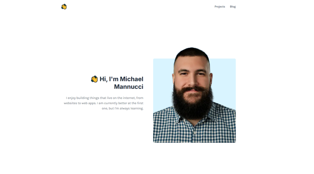
Michael Mannucci’s site hits you with clarity from the start. Clean layout, direct language, and visuals that carry weight without trying too hard. It’s not built to dazzle with effects—it’s built to connect
You won’t find long-winded bios or jargon here. Just a straight line from who he is to what he does. His portfolio leads with bold, well-framed visuals and backs them up with short, sharp project notes that explain just enough. The message? He knows his craft, and he knows how to keep your attention.
The design is minimal, but not sterile. Strong typography, smart white space, and just enough movement to feel modern. Everything flows smoothly—whether you’re here to explore creative work or get in touch.
What stands out most is the balance: confidence without ego, style without clutter. It’s the kind of portfolio that respects your time while still saying, “This is what I bring to the table.”
Michael’s site is all signal, no noise—and that’s what makes it work.
10. Scott Lacy
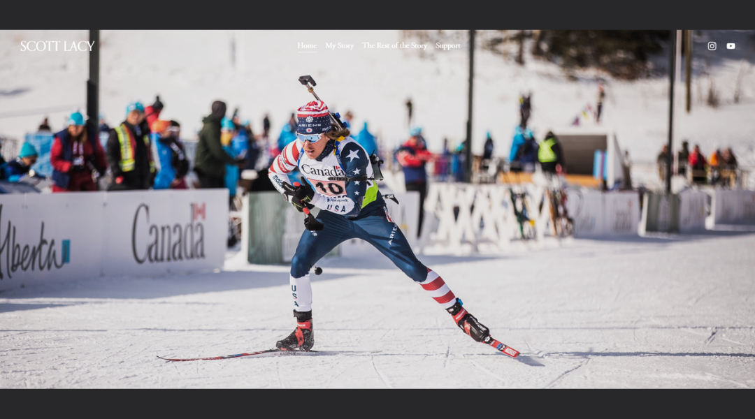
Scott Lacy’s site is minimal in the best way. It doesn’t chase trends or overload the screen. It invites you in with quiet confidence—and then gets straight to the point.
From the typography to the pacing, everything feels intentional. The homepage leads with clarity, not flash. It’s clear that Scott values thoughtful design, and that shows in how he presents his work. There’s no filler here. Just strong projects, smart ideas, and space to think.
His portfolio walks the line between polished and personal. Project descriptions are concise, but still manage to show process and purpose. You get a sense of what he built, why it mattered, and how he got there—all without a single unnecessary sentence.
The design itself reflects his style: calm, modern, and refreshingly direct. Nothing distracts. Nothing shouts. It’s just clean structure and quietly effective communication.
If you’re someone who values substance over noise, Scott’s site is worth your time. It doesn’t try to be everything—it just does its job really well.
11. Ryu Creative
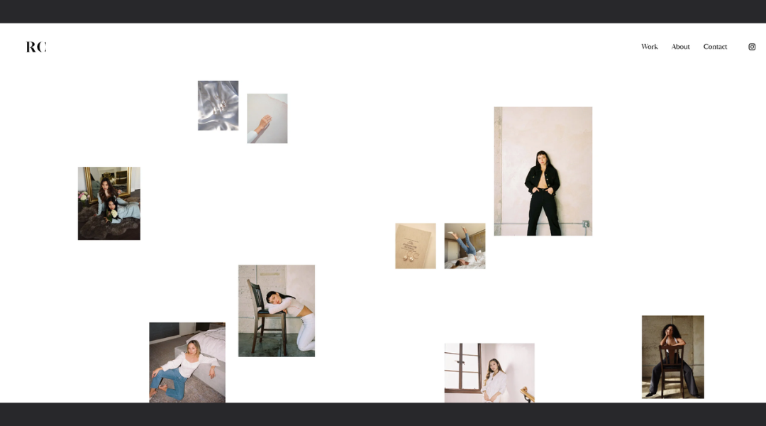
RYU Creative’s site makes one thing clear—they don’t just design brands, they build them with purpose. From the first scroll, it’s tight, focused, and full of intention. The layout is clean, and the messaging is sharper than most agency sites out there.
What stands out immediately is the balance of strategy and visual storytelling. This isn’t about trends or filler. It’s about helping businesses connect through clear thinking and smart execution. Their work is showcased with just enough context—who it was for, what the goal was, and how they delivered.
The tone across the site is confident, but not performative. It’s professional, but human. There’s clarity in every section, making it easy for potential clients to understand what RYU offers and why it works.
Visually, the site reflects the studio’s own design standards—minimal without being dull, bold without being overdone.
If you’re looking for a team that brings clarity to brand communication, RYU Creative’s site is a strong example of what happens when strategy meets design with focus.
12. Kelsey O’Halloran
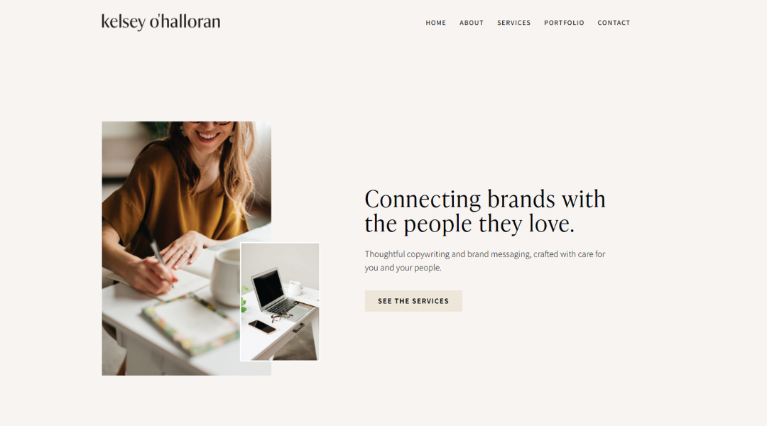
Kelsey O’Halloran’s site is a breath of fresh air in a sea of content noise. From the very first line, you know this isn’t just about copy—it’s about connection. Her writing isn’t salesy. It’s grounded, thoughtful, and designed to reflect the voice of the people she writes for.
The site layout is clean and welcoming. There’s no pressure, no corporate gloss—just calm design that supports clear messaging. The tone feels like you’re talking to a smart friend who gets branding and knows how to make words work.
Case studies and service pages are structured for clarity, not overwhelm. They walk you through her process and results without the fluff. You get a real sense of what it’s like to work with her: collaborative, strategic, and refreshingly human.
Kelsey’s site is more than a portfolio—it’s proof that good copy doesn’t have to shout to be heard. It just has to sound like you.
13. Mindy Nguyen
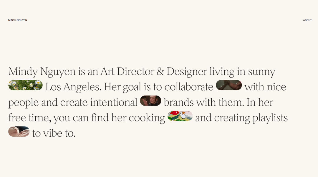
Mindy Nguyen’s site doesn’t shout—it listens. It’s calm, intentional, and beautifully restrained. From the first scroll, you can tell this is someone who values clarity just as much as creativity.
The homepage is a study in balance. Thoughtful typography, gentle movement, and clean spacing give everything room to breathe. You’re not being rushed or sold. You’re being invited in.
Her work is presented with care. Not overloaded, not under-explained—just enough to understand the thinking behind each piece. From branding to digital experiences, everything feels like it was made with both the user and the client in mind.
The writing is confident but soft-spoken. There’s no unnecessary flash here—just quiet expertise and a well-defined point of view. Even the smallest design decisions feel deliberate.
Mindy’s site is a reflection of her approach: thoughtful, purposeful, and grounded in real design thinking. If you appreciate work that’s as intuitive as it is refined, this portfolio delivers.
14. Olga Miljko
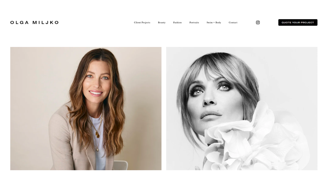
Olga Miljko’s website is subtle, but it leaves a mark. It doesn’t push for attention—it earns it. The design is soft, minimal, and quietly powerful. From the moment you land, it’s clear her work speaks for itself.
There’s a sense of calm throughout the site. White space is used with care. Typography is understated. Navigation is simple and distraction-free. It’s the kind of experience that lets the work breathe—and it works beautifully.
Each project is presented with just enough context. You see the visuals, understand the intention, and move on without friction. It’s not overloaded with explanation. Instead, it trusts the viewer to feel it.
The tone across the site is confident but never loud. It’s visual storytelling stripped down to what matters. Olga’s strength lies in restraint—and that comes through in every page.
If you’re drawn to design that’s thoughtful, editorial, and deeply considered, Olga Miljko’s portfolio is a masterclass in doing more by showing less.
15. Mike Kelley
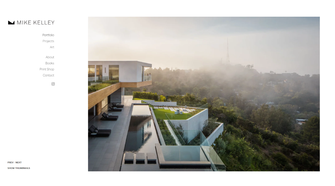
Mike Kelley’s website doesn’t waste a pixel. From the moment you land, you’re immersed in full-screen visuals that don’t just showcase buildings—they tell their story. This is architectural photography dialed all the way in.
The layout is bold but clean. Navigation stays out of the way, letting the images do what they’re meant to: hold your attention. Every gallery is presented with intention—smooth transitions, crisp organization, and zero clutter.
What stands out is the sheer command of space, light, and composition. These aren’t snapshots; they’re structured, thought-through visuals built with the same care as the architecture they feature.
Mike’s writing is minimal and direct. He’s not here to over-explain. Instead, he delivers clarity—about his process, his work, and the clients he serves. Whether it’s residential, commercial, or aviation-related shoots, the work speaks volumes.
If you want to see how strong visual storytelling works—without noise, gimmicks, or distraction—this is the benchmark.
16. Erica Lauren
Erica Lauren’s website is bold—but in a way that feels natural, not forced. From the first glance, it’s clear she’s not just building a brand—she’s inviting you into a perspective. Clean visuals, strong typography, and intentional color choices give the site both personality and polish.
Her work spans fashion, modeling, and storytelling—and the site reflects that versatility without trying to do too much. Each section is focused, allowing the imagery and message to land without distraction. There’s strength in the pacing. You’re not rushed, but you’re never lost.
The tone is confident but grounded. It doesn’t lean on overused branding speak. Instead, it delivers clear messages with care. You see her experience, but more importantly, you feel her values—representation, creativity, and self-expression.
This isn’t just a personal brand. It’s a visual statement of purpose. If you’re looking for an example of how to combine elegance with clarity, Erica’s site offers a quiet masterclass in doing it right.
17. Lisa Maltby
Lisa Maltby’s website is equal parts talent and truth. Right away, you can tell this isn’t just another creative portfolio—it’s a space that values honesty, skill, and a strong point of view.
The design is clean and calm. It doesn’t distract. Instead, it gives space for Lisa’s writing, illustrations, and voice to shine. Whether she’s working with brands or creating personal pieces, there’s a sense of purpose in everything she shares.
Her copywriting services are framed with clarity and a touch of wit—no fluff, just real insight into what words can do when handled well. The illustration section feels personal and expressive, but still polished enough for serious commercial work.
What really sets the site apart is the tone. It’s confident but warm. Professional but personal. You feel like you’re hearing from someone who’s as thoughtful with her clients as she is with her craft.
Lisa’s site doesn’t try to shout. It invites you in, tells you the truth, and shows the work—all without losing its creative edge.
18. Jake Sinclair
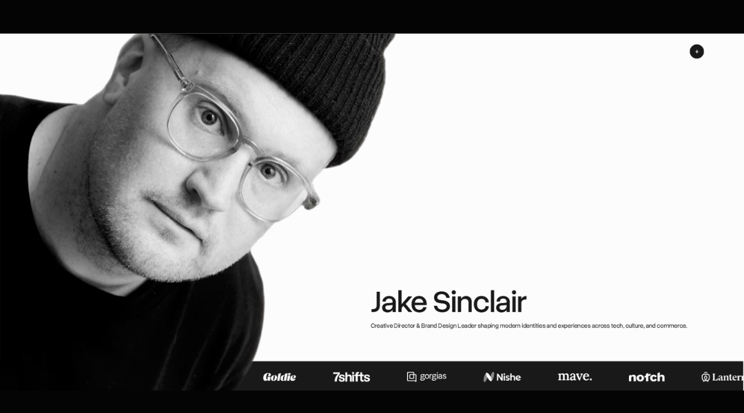
Jake Sinclair’s website is sharp, quiet, and confident. It doesn’t rely on flash—it relies on focus. From the first scroll, it’s clear Jake is someone who lets the work lead, not the noise.
The layout is minimal and intentional. Black, white, and space. That’s the palette—and it works. The typography is crisp, the navigation is frictionless, and the rhythm of the site mirrors the precision you’ll find in his projects.
Case studies are structured for clarity, not ego. They’re written with just enough context to show the thinking behind the visuals. You get the sense Jake’s approach is steady and grounded—design that serves, not distracts.
There’s also a quiet versatility in the work. Branding, development, product—each one presented with consistency and care. It feels modern without chasing trends, technical without being cold.
Jake’s site doesn’t try to convince you—it just shows you. And that calm, capable tone might be the best pitch of all.
19. Dr Gillian Jack
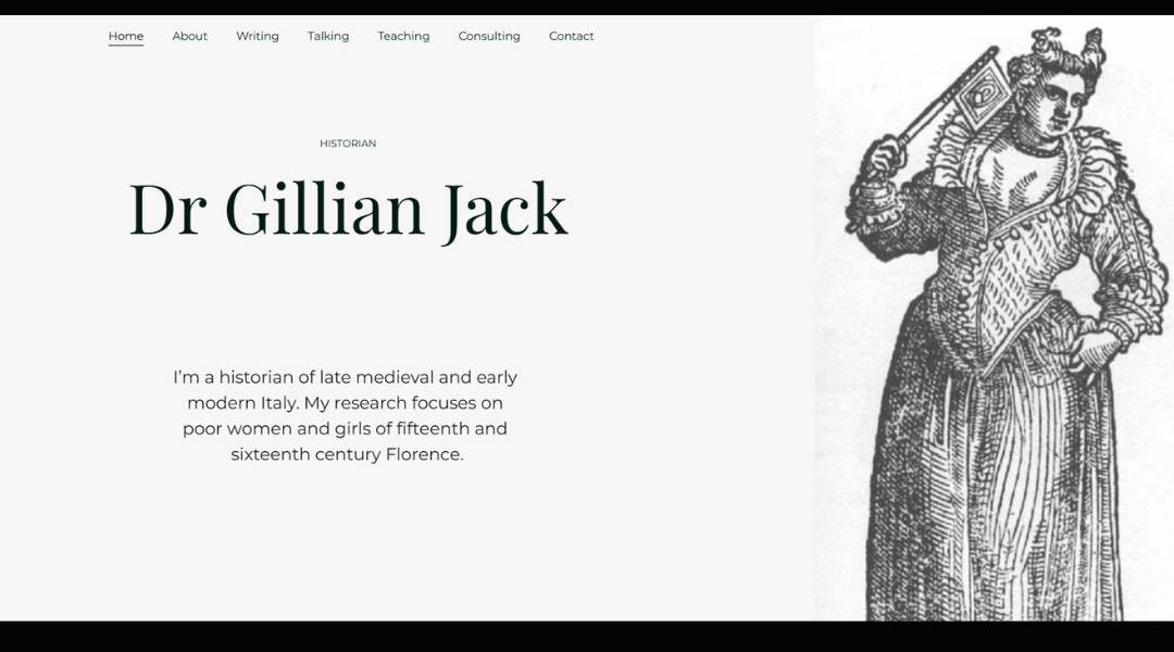
Gillian Jack’s website is thoughtful from the first glance. It’s not trying to impress with flash—it builds trust through clarity. The design is soft, minimal, and well-paced, creating space for her work—and her words—to do the talking.
Her focus on brand strategy and messaging is immediately clear. You’re not met with buzzwords or filler. Instead, Gillian speaks directly, offering a collaborative approach that feels personal but polished. You can sense she listens first—and writes with intention.
Each section is clean and focused. No unnecessary scrolling, no visual clutter. The layout allows you to explore her process and expertise without distraction. Whether she’s refining brand voice or crafting narrative structure, the message is consistent: this is strategy done with care.
The tone is warm but smart. It respects your time and assumes you’re here for more than just surface-level ideas. Gillian’s site is a quiet reminder that clarity is powerful—and thoughtful messaging can move a brand further than flash ever will.
20. Nicole Windle Yoga
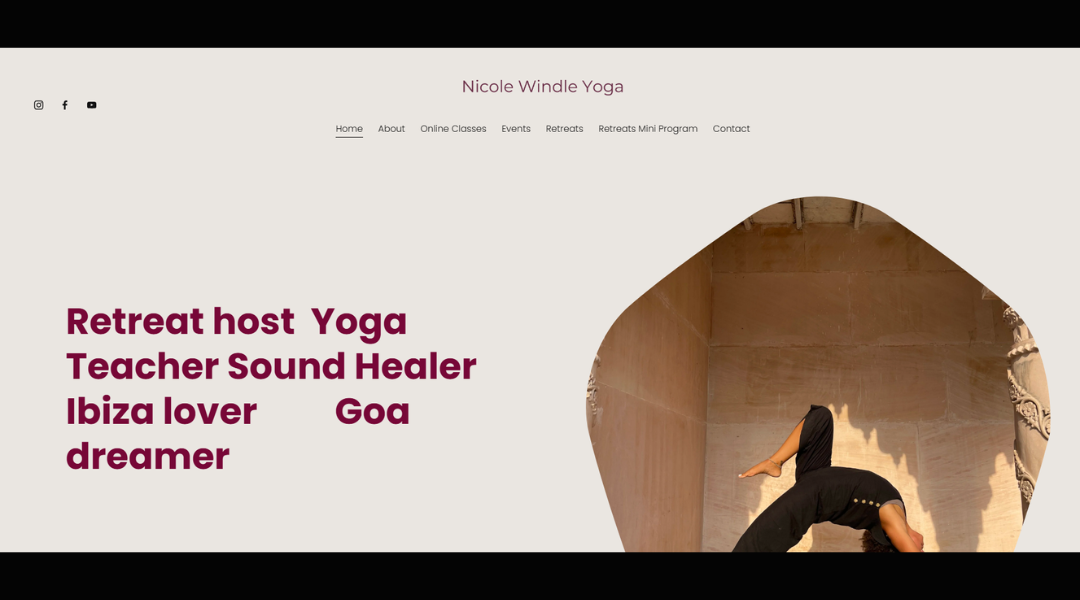
Nicole Windle’s website immediately sets the tone—peaceful, open, and grounded. It’s a space that feels less like a business page and more like a soft welcome. The colors, typography, and layout all reflect the kind of experience Nicole offers: clear, calming, and human.
The homepage offers everything you need without noise. Whether you’re exploring classes, retreats, or one-to-one sessions, the navigation is simple and the tone is easygoing yet professional. It’s clearly built with both new and returning students in mind.
What makes the site feel different is how personal it is. Nicole’s voice comes through in every section—not over-scripted, not too polished. Just honest. She’s not trying to “sell” yoga—she’s sharing what it offers.
Each page invites the visitor to pause, breathe, and consider what they need—whether it’s stillness, movement, or something in between. It’s not just a website—it’s an extension of her practice.
If you’re looking for an example of design that quietly supports its message, this is it.
Conclusion
A great personal website doesn’t need to shout—it just needs to sound like you.
Every example I’ve shared here helped me rethink what’s possible without getting stuck in design traps or overused trends. Some impressed me with their clarity, others with their boldness. But all of them had one thing in common: they made me want to keep scrolling.
If you’ve found even one idea that gets you moving again, this list did its job.
Now it’s your turn—take what resonates, leave what doesn’t, and build something that reflects what you actually care about. Your site doesn’t have to be perfect. It just has to start.

