When I set out to design an education website, I wasn’t just looking for something pretty—I wanted function, flow, and something that made people say, “Okay, this actually works.” If you’re like me, you’re not here for endless fluff or design jargon. You want practical, usable ideas that help you build a platform people trust and return to.
In this guide, I’ve rounded up 20 website inspirations that can give your platform the structure, confidence, and clarity it needs—without making it look like every other site out there. Some are sleek. Others are warm. All of them? They work.
Here’s what you’ll find inside:
- Layout ideas that balance visuals with clarity
- Navigation styles that keep users moving (without getting lost)
- Examples of how schools use personality in design
- Smart ways to present courses, calendars, and content
- Subtle tech features that add value—not confusion
Let’s make your site easier to love—and easier to use.
1. Dr. Deb Therapy
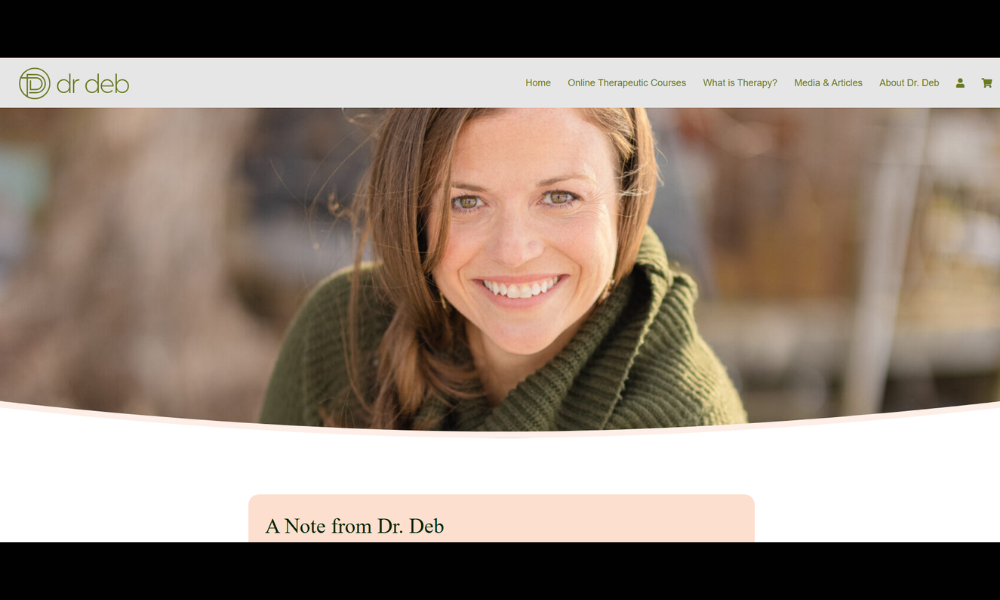
Dr. Deb’s site offers more than a quick introduction—it quietly invites trust. Based in Austin, she works with adults and couples who are feeling stuck, unheard, or simply worn out. Her About page skips buzzwords and instead shares what really matters: how she connects, listens, and helps people get unstuck.
The website opens with clean visuals and calm colors—nothing flashy, just space to breathe. Even the typography feels intentional. Her writing is easy to follow and personal without oversharing. It’s like a thoughtful conversation, not a pitch.
Instead of crowding the page with credentials, Dr. Deb focuses on what clients experience. That’s a subtle strength. You learn what she believes in and how she shows up—not just in sessions, but in how she runs her practice.
Also worth noting? No stock photos of people hugging plants. Just a simple, warm place that says: “You’re safe here.”
Professional. Grounded. Human. And that’s the difference.
2. Drdebtherapy
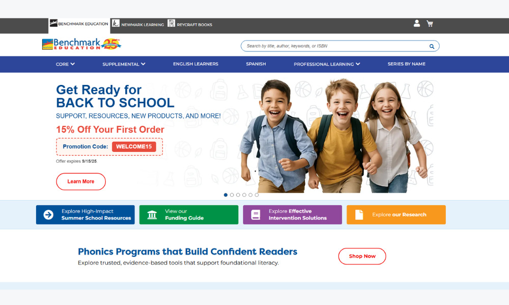
Benchmark Education doesn’t just offer learning materials—it builds tools for teachers who want to reach every student. From classroom libraries to intervention kits, their site reflects a quiet confidence: “We’ve got your back, whether your classroom’s buzzing or barely holding it together.”
What stands out is the focus on equity and accessibility. This isn’t a catalog stuffed with buzzwords. Instead, Benchmark makes it easy to see how their resources support real classrooms—with clear layouts, leveled content, and helpful guides that don’t talk down to teachers.
Their digital tools? Streamlined. Nothing flashy, just stuff that works. And the product pages? More about purpose than marketing fluff. There’s an underlying respect for both the learner and the teacher, which is refreshing.
Even the visuals feel grounded—images of real students, real books, and teachers in action. No overdone tech metaphors or “learning revolution” talk. Just solid support, clearly explained.
Benchmark’s message is simple: teaching is hard enough. The resources shouldn’t be.
3. University of Alabama
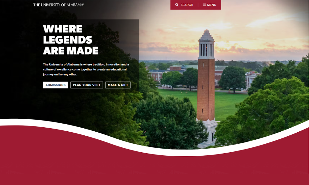
The University of Alabama doesn’t just lead with tradition—it walks the line between legacy and ambition. The homepage doesn’t try too hard. It invites you in with bold visuals, crisp headlines, and a clear sense of purpose.
From academics to athletics, everything’s organized without clutter. You don’t have to dig to find what matters—whether you’re a future student, a proud alum, or just curious about campus life. Each section feels like it’s written by someone who understands the value of time (and attention spans).
What’s refreshing? There’s energy without the noise. The stories spotlight real people, not just rankings. And while Crimson pride runs deep, the site doesn’t just chant the fight song—it shows what the university is building for the future.
No gimmicks. Just a confident blend of who they are and where they’re going.
Whether you’re looking for programs, research, or football scores (because yes, those matter too), the site meets you halfway—then points you forward.
4. Duck English School
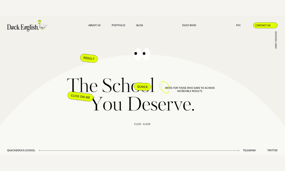
Duck School doesn’t try to be like every other coding platform—and that’s a good thing. The site is clean, to the point, and refreshingly light on jargon. You land on the homepage and immediately get what they do: teach kids to code in a way that actually makes sense.
There’s a quiet cleverness to how it’s all laid out. Big, bold text. Clear calls to action. No overloading you with techy buzzwords or flashing animations. Even the name—Duck School—feels fun without trying too hard.
What really stands out? The focus on real learning. Courses are structured but never stuffy. The visuals are playful, not chaotic. It’s clearly built for kids, but you can tell adults had to really think through how to keep it simple.
Parents will appreciate the clarity. Educators will notice the flexibility. Kids? They’ll just think it’s cool.
Duck School isn’t about turning every child into a developer overnight. It’s about helping them explore, build, and stay curious—one line of code at a time.
5. Karing for Postpartum
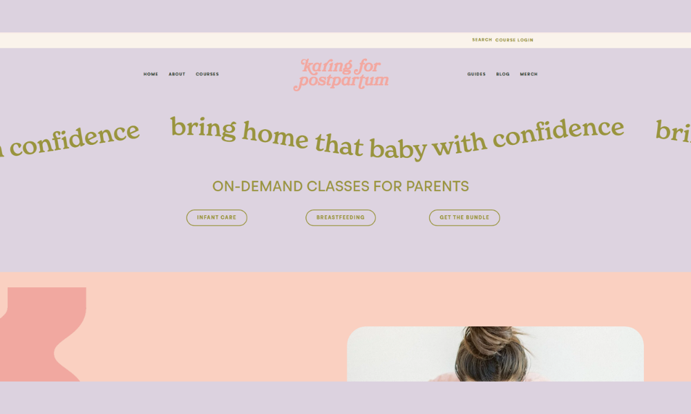
The courses at Karing for Postpartum aren’t just informative—they’re a quiet lifeline. The layout is gentle, the tone reassuring. Nothing overwhelming, just honest support for new moms and those walking with them.
Each course is clearly explained—no confusing sign-up tunnels or medical jargon dressed up as insight. The topics range from emotional healing to newborn care, all with a tone that says: We see you, and you’re not alone. It’s education with empathy, not pressure.
You won’t find fluffy “mom hacks” here. Instead, there’s thoughtful guidance, rooted in real experience and professional knowledge. Whether someone’s feeling lost, curious, or just tired (so, probably all three), the site offers a way forward that feels doable.
And the visuals? Calm, warm, and clutter-free—exactly the vibe you want when your brain’s running on two hours of sleep and cold coffee.
Karing for Postpartum makes space for learning, healing, and feeling heard. Not rushed. Not judged. Just supported.
6. Angela Valencia Spanish Teacher
Angela’s site feels like a breath of fresh air—warm, direct, and actually helpful. From the start, you get who she is: a real person who loves teaching Spanish and makes the process feel less like a chore and more like a good conversation.
The homepage is clean and approachable. No overload of grammar terms or walls of text. Just practical info, clear course options, and a sense that Angela genuinely wants you to enjoy learning. Her personality shines through—not with loud colors or gimmicks, but with thoughtful touches and real encouragement.
Lessons are structured, but flexible. She offers one-on-one sessions, beginner to advanced, all paced to fit real life (not fantasy schedules). You’ll also find tips, videos, and resources that make language learning feel doable—even if you haven’t touched Spanish since high school.
It’s not about perfection—it’s about progress. And Angela gets that.
Whether you’re brushing up for travel or finally tackling fluency, this is the kind of teacher-led site that makes you feel like, Hey, I can actually do this.
7. JP Teaches Photo
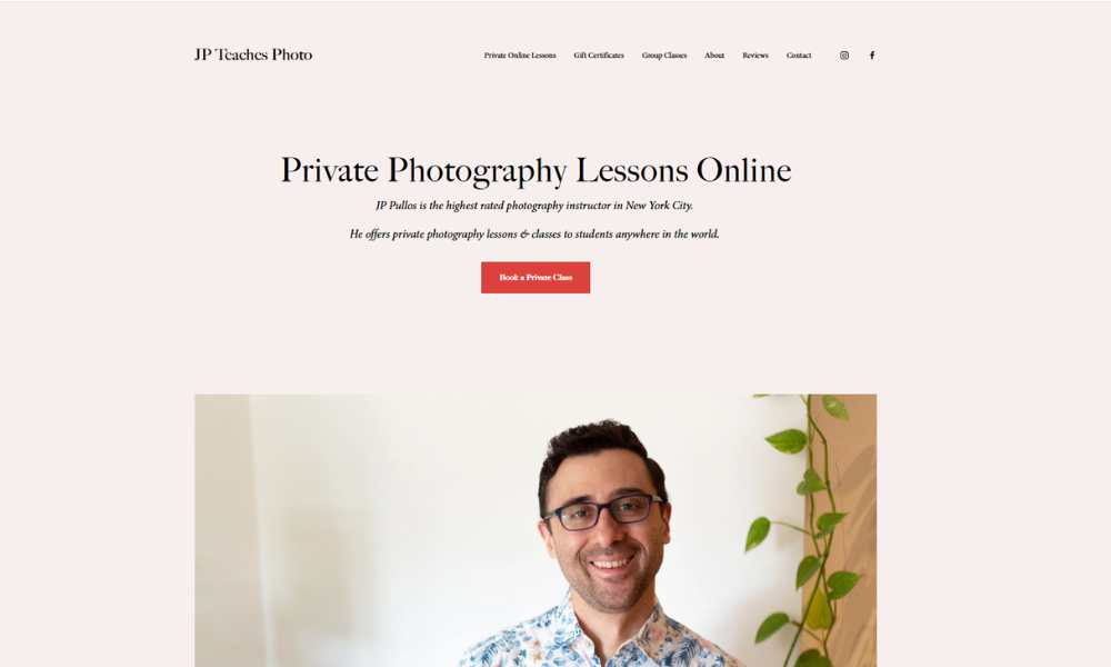
JP Teaches Photo isn’t here to drown you in camera jargon or lecture you on aperture theory. The site keeps it real—focused, welcoming, and genuinely useful for anyone who wants to get better at photography, without the overwhelm.
From the homepage, JP’s approach is clear: photography should be fun, not frustrating. Whether you’re holding a DSLR for the first time or looking to sharpen your skills, the site makes it easy to start. The courses are straightforward, the tone is down-to-earth, and there’s zero snobbery in sight.
Each section is built with the learner in mind. You’ll find tips that actually make sense, explained in plain English, with a teaching style that’s more supportive friend than strict professor. Plus, the visuals aren’t just pretty—they’re proof that the methods work.
It’s not about chasing perfect shots. It’s about finally understanding your camera and enjoying the process. JP meets learners where they are and helps them level up—with humor, heart, and a whole lot of know-how.
8. Glaze & Phase
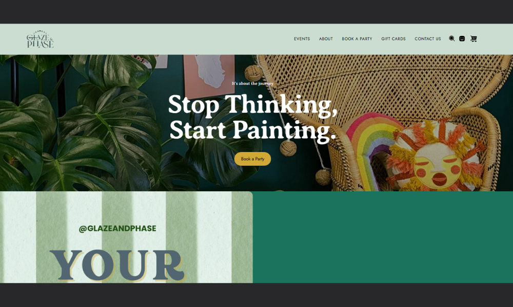
Glaze and Phase isn’t just about skin—it’s about slowing down and doing things with care. The site blends clean design with clarity, creating a space that feels more like a calm morning than a checkout line.
Right away, you can tell this isn’t a brand shouting at you about 10-step routines. The product pages are simple, direct, and surprisingly relaxing. Ingredients are explained without hype. There’s science, sure—but no pressure to become a chemist before choosing a serum.
Their approach? Intentional skincare that respects your time and your face. You won’t find any “miracle cure” talk here. Just well-made products with a purpose—and a community that values consistency over perfection.
The visuals are minimal but warm. The tone? Smart, but never preachy. Even their FAQs feel like a friendly chat, not a manual.
Glaze and Phase is for people who want skincare that works, looks good on the shelf, and makes sense. Simple as that.
9. Drexel University
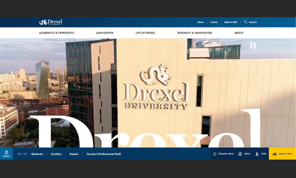
Drexel’s website doesn’t waste time—it gets to the point with confidence and clarity. From the first click, you feel the energy of a school that’s serious about innovation, but still knows how to speak like a human.
The structure is clean and fast-moving. Future students, current students, parents—it’s all there, easy to find. No buried links or endless scrolls. The big ideas are front and center: real-world experience, research that matters, and a co-op program that actually helps you land jobs, not just rack up credits.
What’s refreshing? It’s smart without showing off. Programs are explained clearly. Faculty and student stories feel real. And there’s no sugarcoating—the school’s urban, ambitious, and expects you to show up ready.
Visually, it’s modern without going overboard. Just enough edge to stand out, but still polished. Whether you’re interested in design, business, health, or engineering, Drexel makes its case with purpose.
It’s not trying to be everything to everyone. It’s a university that knows what it offers—and makes sure you know it too.
10. Tilton School
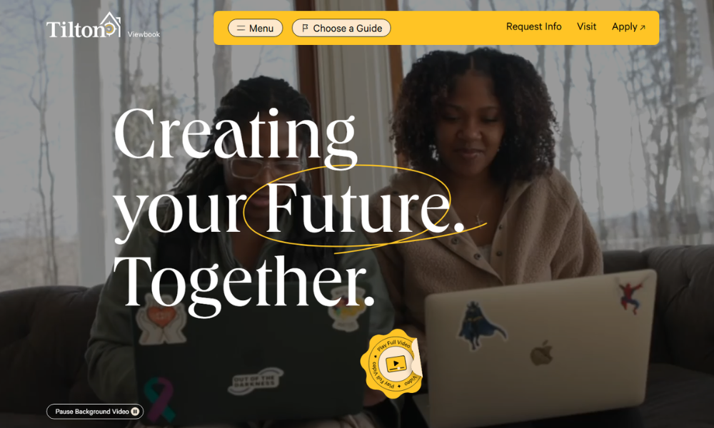
Tilton School’s viewbook doesn’t read like a sales pitch. It feels more like an invitation—one built around curiosity, growth, and the kind of learning that sticks with you long after graduation.
Right from the start, the design is sharp but welcoming. Big visuals, short copy, and zero fluff. You’re not left guessing what Tilton values: connection, purpose, and helping students figure out who they are while they’re figuring out what they want to do.
Each section is easy to digest. Academics, arts, athletics—it’s all laid out with clarity and intention. You get a sense of life on campus without needing a tour guide. Quotes from students and faculty are sprinkled in just enough to feel authentic, not staged.
There’s also an underlying theme here: this isn’t a one-size-fits-all kind of school. Tilton’s approach is personal, grounded, and surprisingly forward-thinking.
In short, it’s a school that doesn’t just prepare students for college. It prepares them to understand themselves—and that’s something you won’t find on every brochure.
11. The Online School
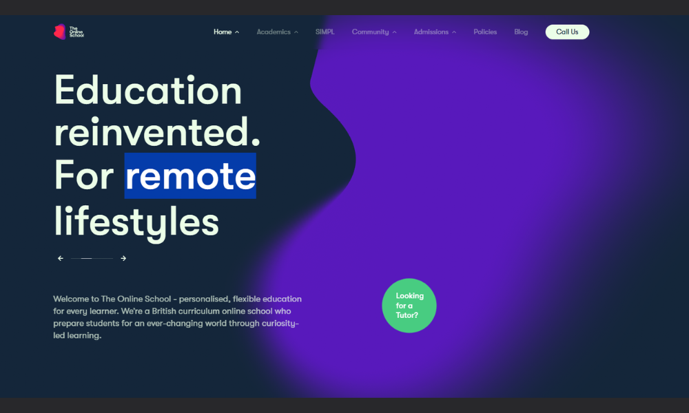
The Online School doesn’t overcomplicate things—it delivers flexible, focused education for students who need learning to fit real life. From the first glance, the site is structured, clean, and refreshingly direct.
This isn’t a maze of menus or vague promises. Whether you’re a parent, a student, or just exploring options, everything is laid out with purpose. Course offerings, teacher support, live lessons—it’s all easy to find and even easier to understand.
What stands out? The balance between structure and freedom. Students get the support of certified teachers and live instruction, but without the pressure cooker of a traditional classroom. There’s room to breathe here—ideal for learners who need a different pace or more focused attention.
The design feels calm, not clinical. The tone is confident but never pushy. It’s clear The Online School isn’t just offering convenience—it’s offering quality, wrapped in a format that makes sense for today’s families.
It’s school, reimagined—but without the gimmicks.
12. The Solanco School District
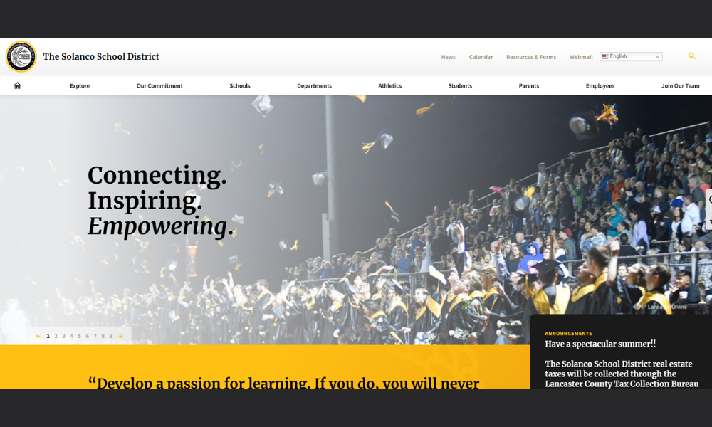
Solanco School District keeps things focused—clear priorities, easy access, and a strong connection to community values. The website reflects that. It’s not flashy, but it’s well-organized, which says a lot: they care more about function than fanfare.
From academics to athletics, the layout is intuitive. Parents can find what they need without playing hide and seek—calendars, staff directories, enrollment info, all easy to reach. And for students? There’s direct access to tools, resources, and support that actually help them stay on track.
The tone feels grounded. You get a sense that Solanco puts students first—not just in mission statements, but in how they show up day to day. Updates are current. Messaging is respectful. And there’s a consistent thread of: “We’re here for you.”
There’s also pride—local events, school spotlights, and achievements are front and center. But it never feels like self-promotion. More like a district that knows who it serves—and serves them well.
Simple. Honest. And all about real learning.
13. Pulteney School
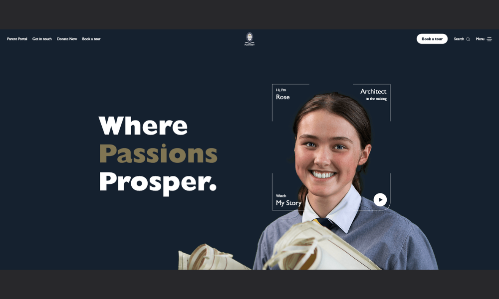
Pulteney Grammar doesn’t just educate—it nurtures. Set in the heart of Adelaide, the school blends tradition with forward thinking, offering students a place to grow with confidence, purpose, and curiosity.
The site reflects that vision clearly. It’s calm, organized, and full of intention. You’re not bombarded with flashy stats. Instead, there’s a quiet pride in what the school does—focusing on student voice, real relationships, and a well-rounded education that goes beyond textbooks.
From Early Learning through Year 12, Pulteney offers a structured yet flexible journey. Small class sizes, attentive teaching, and strong co-curricular programs shape students into independent thinkers—not just exam-takers. Whether they’re into drama, robotics, or rowing, every student finds space to explore what matters to them.
The tone throughout is warm, grounded, and quietly ambitious. It’s not about being the loudest—it’s about being the most thoughtful.
For families seeking more than just academics, Pulteney feels like a community where students are known, challenged, and supported—all at once.
14. CIS International School
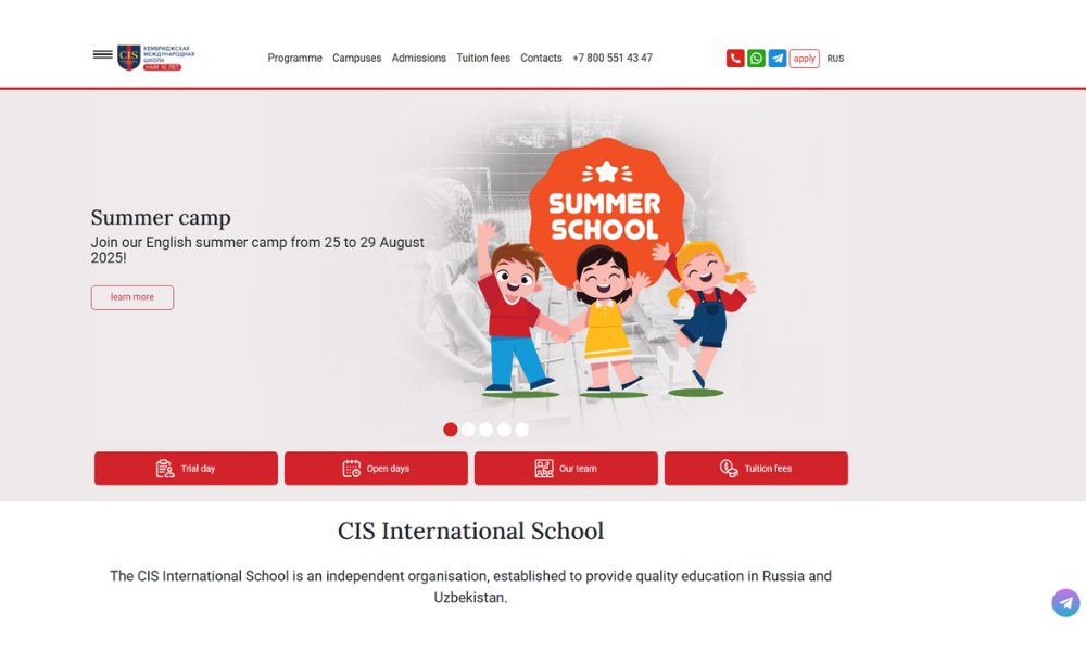
CIS International School offers more than just bilingual education—it creates a learning environment where global perspective and local understanding go hand in hand. With campuses across Russia and Central Asia, the school delivers a calm, structured experience that feels both ambitious and supportive.
From early years through A-Level, CIS follows the Cambridge curriculum while maintaining strong local foundations. English-speaking teachers work alongside native-language staff, helping students thrive in both worlds. The result? Confident learners who can shift between cultures and languages with ease.
The school doesn’t overpromise. The messaging is clear: strong academics, dedicated staff, and a close-knit international community. There’s emphasis on balance—STEM and the arts, academics and after-school life, challenge and care.
Whether it’s chess club, theatre, or student council, CIS encourages students to step up and speak out. But it also gives them space to figure out who they are—on their own terms.
It’s a school built for the present, with a mindset focused firmly on the future. Calm, capable, and globally grounded.
15. Adelaide Botanic High School
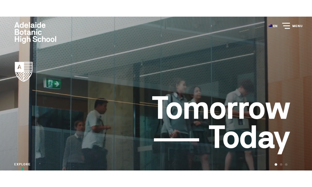
Adelaide Botanic High School (ABHS) is a co-ed public secondary school on Frome Road, Adelaide, serving students in Years 7–12 with around 1,250 enrolments. Opened in 2019 as South Australia’s first vertical school, it seamlessly blends innovative architecture with modern education—a building designed to inspire learning at every level.
From the homepage, you get a sense of purpose and place: steps away from the Botanic Gardens, zoo, the State Library, and the city’s cultural precinct, the school lives within its learning ecosystem.
ABHS organises curriculum into four connected areas—STEM, The Arts, Global Perspectives, and Lifestyle Choices. The approach fosters student voice and real-world thinking. There’s a strong emphasis on community, curiosity, and excellence—the school’s guiding DNA.
Facilities include open-plan learning zones, rooftop gardens and courts, a gym, food-tech kitchens, and a café—all within a smart, environmentally aware structure. Plus, ABHS supports leadership through its SYNERGY student program and a 1:1 laptop model.
16. Stanford University
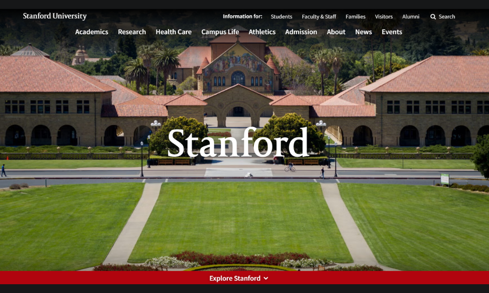
Stanford doesn’t need to shout. The moment you land on the site, there’s a quiet sense of purpose—bold but composed. The design is simple, but every element feels intentional. You’re not overwhelmed with noise; you’re guided with clarity.
From research to real-world impact, the message is consistent: Stanford is built for thinkers and doers. The site reflects that balance. Academic programs are easy to explore. Initiatives and innovations are woven in naturally, not crammed into headlines. Even the big ideas feel approachable.
What stands out is the tone. It’s not trying to prove anything—it’s simply showing what’s possible. Student stories, faculty work, and global projects are shared in a way that feels human, not rehearsed.
You also get a sense of place. California sun, open minds, and a campus that’s as forward-facing as the people on it. It’s a university that leads with curiosity, not ego.
Stanford doesn’t just present itself as a destination. It reads more like a launch pad—grounded, expansive, and always in motion.
17. Movement Lab
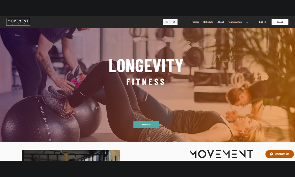
Movement LAB isn’t your average gym—and it doesn’t pretend to be. The moment you visit the site, it’s clear: this is a space designed for people who care as much about how they move as why they move.
The design is stripped down and focused. No clutter, no hype. Just movement, recovery, and human connection at the center. Whether it’s mobility training, strength work, or injury prevention, every offering feels considered and precise.
You won’t find generic fitness slogans here. The tone is calm but serious, like the coaches themselves. It’s less “no pain, no gain” and more “move smarter, live better.”
The visuals? Purposeful. Real people, real effort—captured without filters. Every section of the site feels like an extension of the studio: open, intentional, and built for progress.
Movement LAB speaks to people who’ve moved past fitness trends. It’s for those who want to understand their bodies, improve performance, and stay curious about what strength can actually mean.
Smart. Focused. And built to move with you.
18. Academy for Thinkers
The Academy for Thinkers doesn’t just teach—it invites curiosity. The site is quiet, focused, and intentional. No flashy distractions. Just clear direction and a strong belief in what education can become when students are truly seen.
Right from the homepage, you get a sense of purpose. This is a place where thinking isn’t rushed. Where questions matter more than quick answers. The language is simple, but the mission runs deep—developing minds with depth, not just breadth.
Programs are clearly laid out, with a tone that values quality over quantity. Whether it’s philosophy, creative expression, or inquiry-based learning, everything points back to one idea: thinking is a skill worth nurturing.
What stands out most is the school’s calm confidence. There’s no pressure to perform for the sake of performance. Instead, students are encouraged to engage, reflect, and grow on their own terms.
It’s education designed for the long haul—thoughtful, grounded, and refreshingly human.
19. Winchester College
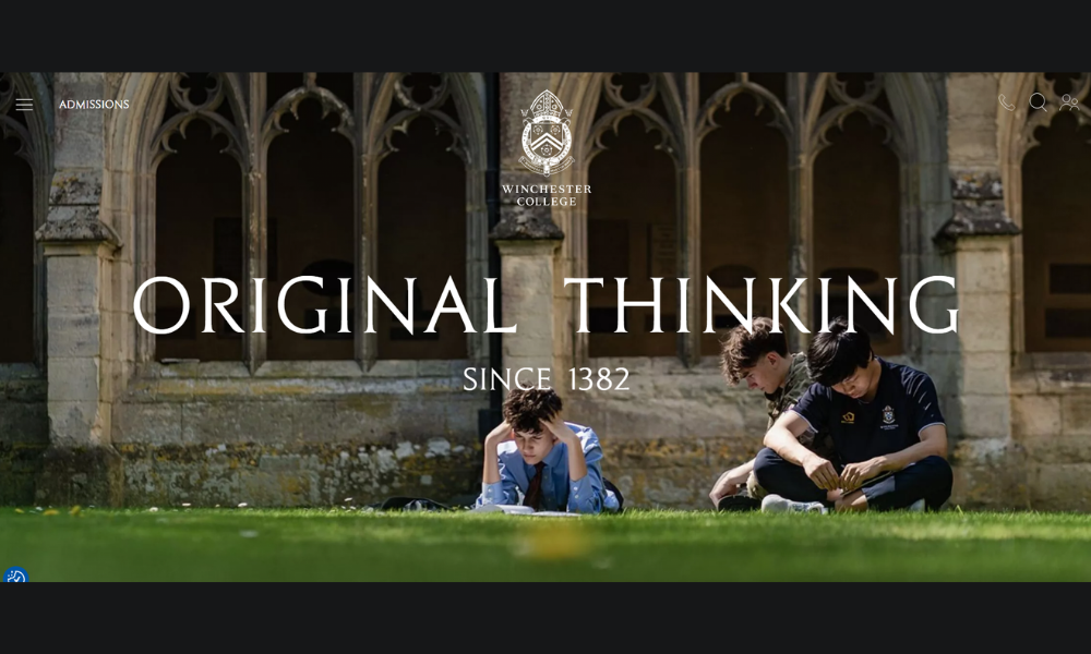
Winchester College doesn’t rely on tradition alone—it evolves with it. The moment you enter the site, you sense the balance: centuries of heritage paired with a modern, forward-looking spirit. Everything is intentional, from the visuals to the words.
The structure is calm and ordered. Whether you’re exploring admissions, academics, or life beyond the classroom, the information is clear and uncluttered. It’s not trying to impress with volume—it impresses with precision.
What comes through is a strong identity. Winchester values scholarship, but not in isolation. There’s a focus on character, reflection, and service. Education here is as much about who a student becomes as what they achieve.
The tone is quietly ambitious. No grand slogans. No need. Instead, you find an education shaped by inquiry, discipline, and a deep respect for learning.
It’s not just a school. It’s a place that believes in the long view—where thinking deeply still matters, and where the future is shaped by how well you understand the past.
20. Marcellin College
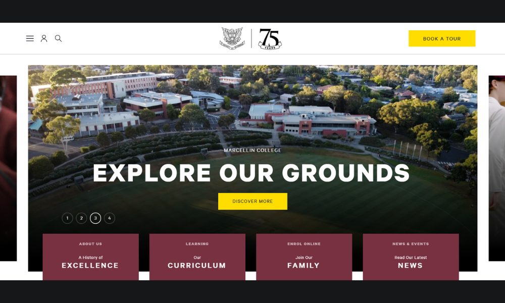
Marcellin College sets a tone right from the homepage: grounded, purposeful, and inviting. You sense a community that values each student—not just academically, but personally.
The site is clean and direct. Whether you’re looking into curriculum, co-curricular activities, or enrolment, it’s all easy to find. No clutter. Just clear options and a confident voice.
Academics are strong, but Marcellin is about more than grades. There’s visible emphasis on values, leadership, and wellbeing. Sport, music, pastoral care, social justice—all sit comfortably alongside classroom work. That balance feels real, not forced.
You also get a feel for the people. Staff and student stories appear naturally—short, honest, and focused on learning, friendship, and growth. Images reinforce it: students in action, classrooms in session, gatherings with genuine smiles.
The tone is warm, respectful, and forward-looking. It says: “We challenge our students to be their best—and we support them while they do it.” Marcellin feels like a place built on care, community, and confident purpose.
Conclusion
I’ve seen plenty of education websites that try to do everything at once. Most end up doing nothing particularly well. The best ones? They pick a lane, communicate clearly, and remember who they’re built for.
If even one of these 20 ideas sparks something for your platform, then this list did its job. Keep it simple, keep it human—and always build like someone smart is actually going to use it.
And if your site already checks a few of these boxes? Great. Now go check a few more.
