Every time I start a new eCommerce design project, I look for fresh ideas—not to copy, but to better understand what works and why. It’s not always about a flashy homepage or clever copy. Sometimes, it’s a small layout decision, a smart product grid, or the way the navigation just feels right.
This collection includes some of the best examples I’ve found across different industries. They’re not just pretty—they’re smart, functional, and built to convert. Whether you’re working on a client store, updating your own, or just curious about what’s working out there, this list offers real, usable inspiration.
Here’s what I’ll walk you through:
- Clean, product-first layouts that make browsing easier
- Mobile-friendly designs that actually scale well
- Smart homepage structures with clear messaging
- Cart and checkout flows that reduce friction
- Brand voice and visuals working together—not against each other
If you’re ready to build a store that works as good as it looks, these examples should help get things moving.
1. Land Rover
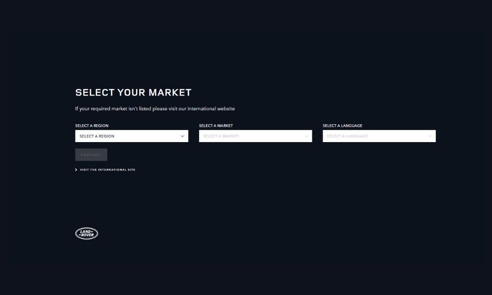
Land Rover’s website doesn’t waste time. It opens with confidence, framed by clean visuals and short, direct messaging. The tone? Serious, but not stiff. It reflects a brand that knows its identity—luxury meets function, without having to overexplain either.
There’s a rhythm to how the pages are laid out. You move from model highlights to tech features without friction. The build-your-vehicle section is especially well-done: clear choices, smart interface, no overload.
The copy avoids noise. No overused buzzwords, no overly polished fluff. Each section delivers exactly what’s needed—performance specs, visual design, and driver-focused tools—without trying to impress through volume.
You also get small, smart touches: subtle motion, balanced white space, and a focus on experience over adjectives. Even the off-road content feels accessible, not exaggerated.
It’s a website that mirrors the vehicles themselves—capable, sharp, and ready for whatever comes next (even if that’s just a Tuesday commute).
2. Helly Hansen
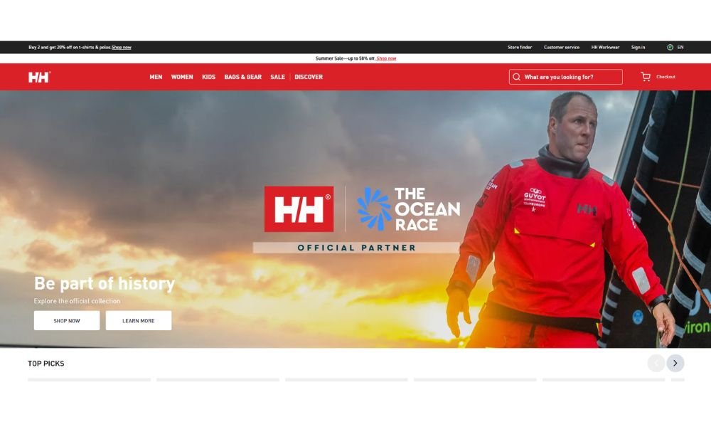
Helly Hansen’s website is just like the gear it sells—clean, tough, and ready for real conditions. The homepage is focused and practical, welcoming you with bold visuals and product categories that make sense. No clutter. No guessing.
Navigation is smooth. You can jump from alpine gear to coastal rainwear without getting lost in drop-downs. The product pages stick to the essentials: fit, function, and why it matters. And if you’re shopping with purpose (or urgency), the filters are actually helpful—not just a long list of buzzwords.
What stands out most is the tone. It’s direct and confident, with just enough detail to build trust. You’re not being sold a lifestyle—you’re being offered tools to keep moving, whatever the weather throws your way.
Even the tech specs feel grounded. Waterproof is waterproof. Insulated is insulated. The design reflects that same clarity—sharp photography, consistent spacing, and no visual distractions.
Helly Hansen doesn’t try to impress with flash. It leads with performance—and the website stays true to that mission from the first click.
3. Barbour
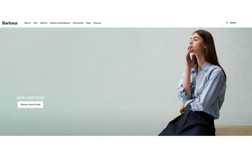
Barbour’s website feels exactly like the brand—classic, confident, and built to last. From the first scroll, you’re met with clean design and a quiet sense of tradition. No noise, no flash—just well-framed imagery and thoughtful navigation that guide you, not push you.
The homepage sets the tone with seasonal collections and understated photography. It’s clear the focus is on quality over quantity. Whether you’re shopping waxed jackets, accessories, or dog coats (yes, they’re there too), the layout keeps things simple and smart.
Product pages strike a good balance: enough detail to inform, not overwhelm. Fit, materials, care—it’s all there, with copy that respects your time. Even checkout feels calm, which is more rare than it should be.
What stands out is how well the brand’s heritage shows through without being heavy-handed. It’s polished but grounded—just like the clothing.
If you’re looking for a site that reflects craftsmanship without overselling it, Barbour’s digital storefront gets it right.
4. Fred Perry
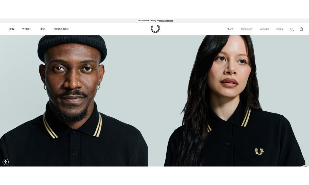
Fred Perry’s website doesn’t need to shout. Much like the brand itself, it leads with clarity, structure, and timeless edge. From the landing page, you’re drawn in by clean visuals, sharp typography, and a layout that keeps the focus on the clothes—not the page.
Navigation is smooth and intuitive. Categories are well-organized, making it easy to explore everything from polos and outerwear to curated collections. Product pages keep it simple—clear sizing, solid descriptions, and just enough styling notes to help you decide without feeling sold to.
What the site does well is hold onto the brand’s roots. There’s a quiet confidence in every page. British subculture, music, and street style show up in subtle ways, not as decoration—but as part of the brand’s DNA.
You won’t find gimmicks or endless scrolls. Just sharp presentation, thoughtful details, and a digital experience that mirrors the brand’s real-world identity: classic, focused, and built to last.
5. Byredo
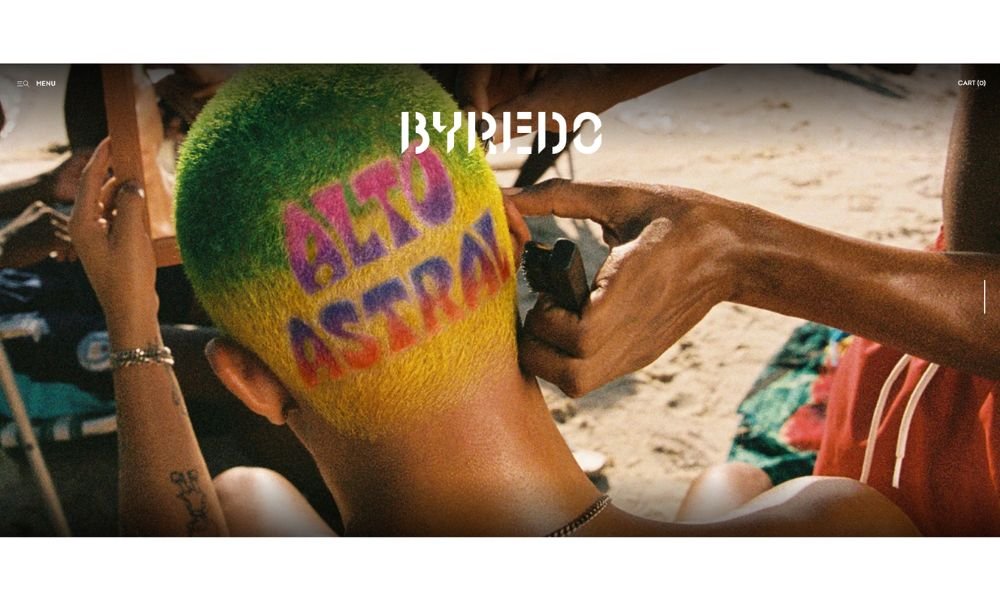
Byredo’s website is as carefully composed as the products it sells. From the first glance, you’re met with simplicity—quiet design, soft motion, and a layout that gives everything room to breathe. It’s clear this isn’t about rushing a sale. It’s about inviting you to look, pause, and choose.
Navigation is seamless. Fragrance, beauty, leather goods—everything is exactly where you expect it, without ever feeling crowded. Product pages are clean and focused. Notes, inspiration, and design are presented without overselling. It feels intentional, not performative.
What stands out most is the tone. It’s confident without noise. Even the visuals feel slow and steady, letting texture and color tell their own story.
Byredo doesn’t rely on big headlines or hard pushes. The site reflects the brand’s quiet strength—tasteful, edited, and designed to make you feel something without needing to say much.
If you’re looking for a site that shows how less really can be more, Byredo is a masterclass in restraint done right.
6. Omega Watches
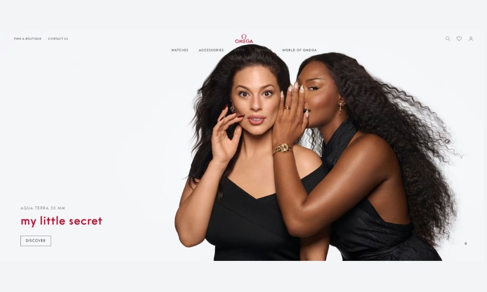
OMEGA’s website does exactly what you’d expect from a legacy brand—it leads with clarity, not flash. From the moment you land, the focus is on timeless design, innovation, and heritage, all laid out in a structure that feels deliberate and refined.
Navigation is smooth and intuitive. Whether you’re browsing collections or diving into the history behind a specific model, the experience is built to guide, not overwhelm. Product pages are especially well done—technical details are thorough but digestible, with strong visuals that speak for themselves.
The tone is measured and confident. There’s no need for overstatement when your brand is on the wrists of astronauts and Olympians. Even the storytelling sections—history, craftsmanship, and partnerships—are handled with restraint, letting facts and legacy carry the message.
This isn’t a site that tries to be trendy. It focuses on what OMEGA does best: precision, craft, and design that stands the test of time.
If you’re after a digital experience that mirrors the strength of the product it represents, this one’s right on time.
7. Harvey Nichols
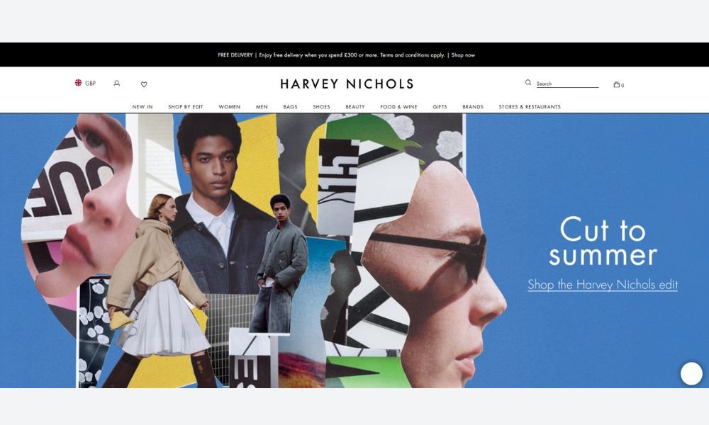
Harvey Nichols’ website delivers the luxury experience without overcomplicating it. From the first scroll, everything feels elevated yet approachable. The design is clean, with just the right amount of edge to reflect the brand’s fashion-forward attitude.
Navigation is smooth and smart. Categories are clear, filters are functional, and product pages balance visuals with detail. Whether you’re browsing high-end fashion, beauty, or gifting, the experience stays consistent—fast, polished, and easy to follow.
The tone across the site is confident but never pushy. There’s no overload of language or gimmicks. Instead, the products take center stage—supported by sharp photography, minimal copy, and a layout that respects your time.
What stands out most is the rhythm. Harvey Nichols knows its audience. The site flows like a well-edited editorial: bold when it needs to be, quiet when it should be.
If you’re looking for a luxury shopping experience that knows the line between curated and cluttered, this site holds it with style.
8. Vitamix
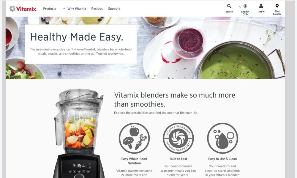
Vitamix’s website does what its products are known for—gets right to the point, and does it well. From the moment you land, the focus is clear: performance, reliability, and making real food prep easier, not harder.
The layout is clean and purposeful. Whether you’re shopping for a new blender, comparing models, or just looking for a smoothie recipe, navigation feels intuitive. Product pages strike a balance—specs are detailed without getting too technical, and features are explained in terms that make sense to actual users.
The tone is straightforward, with a light, confident touch. No over-the-top claims, just real functionality backed by thoughtful design. Even the recipe section feels less like marketing and more like a useful resource.
What stands out most is how well the site supports the buying process. It builds trust through clarity, not pressure. You feel informed—not sold to.
If you’re after a digital experience that reflects the product it represents—strong, simple, and built to last—Vitamix gets the blend just right.
9. Monin
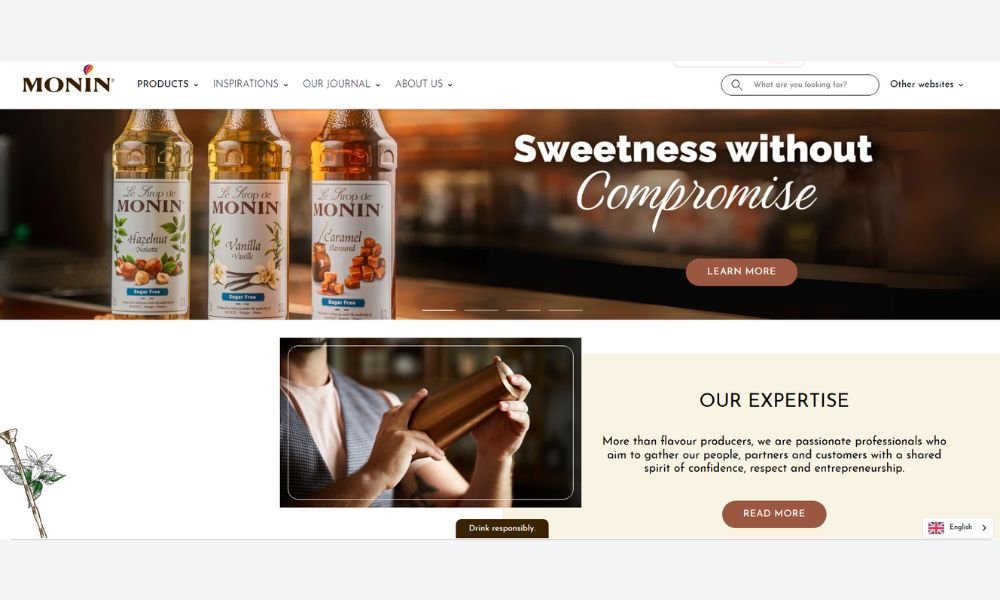
Monin 1912’s website is as smooth as the syrups it sells—refined, easy to navigate, and rich in purpose. From the first scroll, you’re welcomed into a world built around creativity, quality ingredients, and an appreciation for the craft of flavor.
The homepage is clean and visually appealing, offering quick access to syrups, recipes, and inspiration without overwhelming the senses. The tone is polished but friendly. Whether you’re a professional barista or a curious home mixologist, the message is clear: you’re in the right place.
Product pages are well-structured, with helpful descriptions, flavor pairings, and usage ideas. There’s no guesswork—just real tools for turning everyday drinks into something special.
The recipe section is a standout. It’s not just a filler—it’s a thoughtful resource for anyone looking to mix, stir, or shake up something different.
Monin 1912 doesn’t just sell syrup—it offers experience in a bottle. And the website makes that experience feel accessible, without losing its sense of craft.
10. Cox & Cox
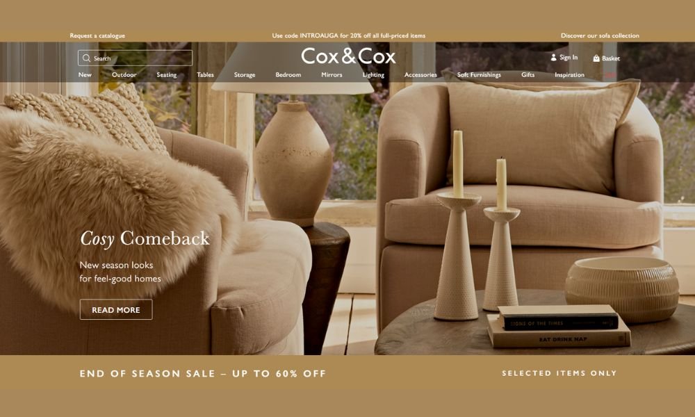
Cox & Cox’s website brings the same energy as its interiors—calm, curated, and beautifully functional. From the first scroll, it’s clear this isn’t fast furniture or trend-chasing decor. This is design meant to last.
The layout is clean and welcoming. Categories are easy to browse, filters actually help, and every detail feels considered. Whether you’re furnishing a room or choosing a single pendant light, the process stays smooth.
Product pages are thoughtfully structured. Clear images, precise dimensions, and care instructions make choosing easier. There’s enough information to support a decision—without making it feel like a task.
The tone is quiet but assured. There’s no hard sell. Instead, the pieces speak through minimal design, soft tones, and a site that gives them space to breathe.
Cox & Cox doesn’t lean on flash. It offers function, feeling, and style with staying power—and the website is a reflection of that same quiet confidence.
11. Catbird
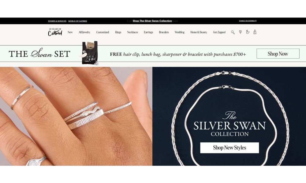
Catbird NYC’s website feels like one of its rings—delicate, intentional, and beautifully composed. From the first glance, you’re met with calm elegance and a quiet confidence. It’s not trying to dazzle with flash. It leads with meaning.
Navigation is smooth and minimal. Categories—rings, necklaces, gifts—are easy to explore without distraction. Product pages feature soft, intentional photography, clear sizing, and care details that respect both your time and the piece.
The tone is gentle but focused. Artisan notes, styling suggestions, and social proof give the experience depth. You’re not just browsing—you’re invited into something personal, crafted, and lasting.
What stands out most is the authenticity. The entire site supports the feeling that these pieces are chosen, not churned out. It’s curated, calm, and confident in its own style.
If you’re looking for jewelry with intention—and a website that reflects that quietly—Catbird NYC gets it exactly right.
12. Tom Dixon
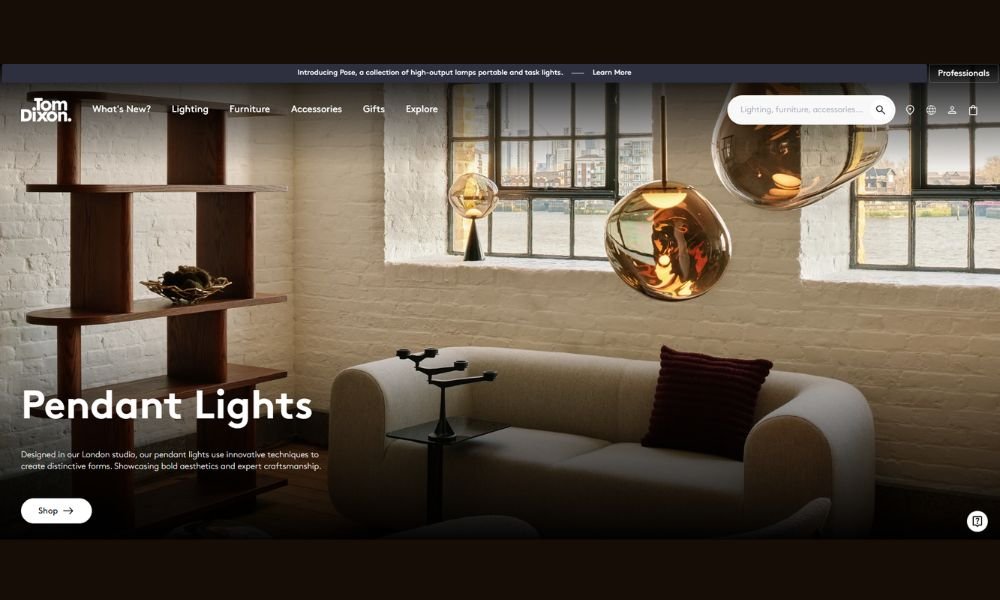
Tom Dixon’s website feels like entering a well-curated studio—bold, intentional, and thoughtfully composed. It doesn’t need flashy effects. Instead, it uses strong visuals and smart space to let the products narrate the story.
The layout is clean but playful. You’re greeted by striking hero images and clear navigation—lighting, furniture, and accessories all neatly sectioned. It’s easy to explore without feeling overwhelmed.
Product pages are elegantly detailed. Dimensions, finishes, and inspirations are presented clearly. The visuals carry their own weight, balanced by straightforward copy that feels grounded—not hyped.
What really stands out is the site’s atmosphere. It’s tactile and textured, yet calm. Interactive elements like hover states and light motion reinforce the sense that this is a site built by designers who think visually and conceptually.
Tom Dixon’s site doesn’t just show products—it shares a vision. It’s refined, confident, and unafraid to let form speak over function. If you’re looking for a digital space where craft meets concept—and where every detail matters—this is it.
13. Sigma Beauty
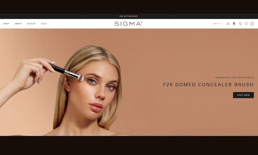
Sigma Beauty’s website is just like its brushes—precise, purposeful, and built to last. From the moment you land, the site feels confident. Bold imagery meets clear layout, letting the tools shine without distraction.
Navigation is smooth. Categories for face, eyes, tools, and brush care are easy to explore. Each product page offers sharp visuals, spec tables you can actually read, and care details that feel useful—not padded. It reflects the real-world care behind each item.
The tone is direct and supportive. Copy emphasizes performance and durability, highlighting patented interlocking ferrules and a free two-year warranty—features that matter to artists and shoppers alike.
Small but smart touches—like quick-add hover functions and integrated tutorials—show a team that’s thought through the artist’s journe. The site doesn’t rush you to buy. It invites you to learn first, then choose.
If you’re looking for a beauty site that balances craftsmanship with clarity, Sigma Beauty delivers. It’s polished, practical, and built the way the tools are—ready for real use.
14. Tripadvisor

TripAdvisor’s website gets right to the heart of planning with a clean, intuitive layout. From the first search box to city guides, the navigation is seamless—and smart filters help you zero in on hotels, restaurants, activities, flights, and rentals fast.
The homepage is more than a travel portal. It features top destinations and seasonal ideas, alongside community-driven tips and photo galleries that feel authentic—not polished . That mix keeps things organized without becoming cluttered.
Review pages are built for real insight. Rating bubbles, traveler photos, and structured content give enough detail to make informed choices. Adding new reviews or exploring forums is smooth, encouraging user engagement backed by TripAdvisor’s moderation efforts.
Even map tools feel thoughtful. You can drill down to streets, nearby attractions, and dining options. It’s a user experience designed to support decision-making, not distract.
TripAdvisor’s digital experience comes across as reliable. It’s built for function, shaped by community, and delivered without fluff—ideal for travelers who want clarity, not chaos.
15. Joy
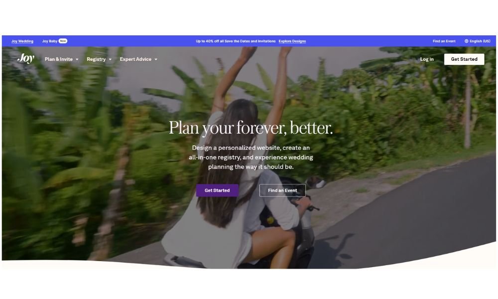
WithJoy’s website feels like a one-stop planning partner—calm, smart, and surprisingly generous. From the homepage, it’s clear: this isn’t about flashy marketing—it’s about giving couples the tools they actually need.
You get easy navigation through top features like RSVP tracking, guest management, and registry tools. Plus, the mobile app mirrors the site—so updates and reminders stay in your pocket. The layout is clean and quick to scan, making it easy to focus on what matters: planning a wedding without friction.
Every tool is built around usability. Need to block hotel rooms, assign plus-ones, or collect addresses? Done. Want save-the-dates, invitations, or a gift registry? All free—that’s right, free. And if you’re feeling a bit lost, integrated Q&A and guest tips keep your site guest-friendly.
What stands out is how it all just works together—no upsells or hidden fees. You get a polished, purposeful experience that guides your guests—and supports you—every step of the way.
WithJoy isn’t trying to be flashy. It’s trying to make your wedding easier—and it succeeds.
16. Audible

Audible’s website feels thoughtfully built—smart, clean, and tuned to real use. There’s no fluff. Just a clear path to discovering audiobooks, originals, and podcasts across devices.
Navigation is intuitive. Categories like Bestsellers, Originals, and Genres are easy to find. Each product page gives you what you need—narrator samples, runtime, reviews, and easy snippet previews. You can grab a free sample before committing.
Audible balances choice and simplicity. Options for Plus and Premium Plus plans are laid out clearly, with just the right detail on credits and benefits. It makes decision-making painless.
Playback controls are clean and adaptive—large buttons, bookmarking, even “shake to extend timer”—all designed for use on the go. It’s an experience built for listeners, not trends.
What stands out is how it combines Amazon’s scale with purposeful design—no frills, just a dependable platform for listening. If you want audiobooks without the noise, Audible delivers precisely that.
17. StyleSeat
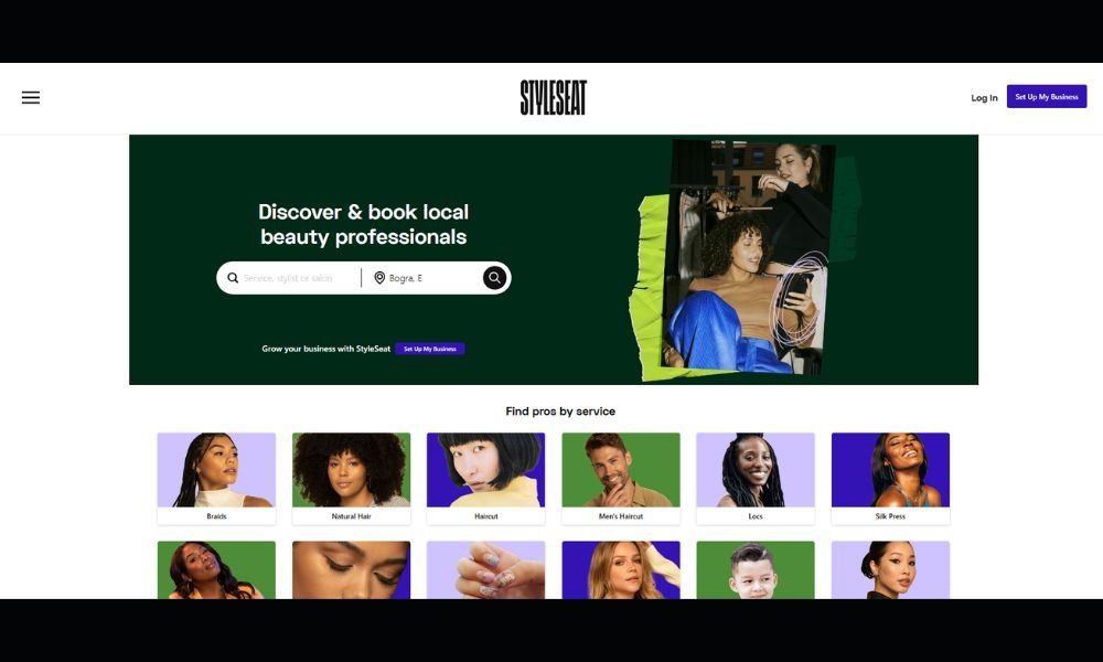
StyleSeat makes booking beauty and wellness services simple, fast, and efficient—for both clients and professionals. From the first click, the platform offers a clean, well-organized experience that feels built for real use, not just good looks.
Clients can search by location, service, or professional, making it easy to find exactly what they need—from haircuts and braids to facials and massage. Portfolios, pricing, and availability are all in one place, so there’s no guesswork. Just book, confirm, and show up.
For professionals, StyleSeat offers more than just scheduling. Tools for marketing, payments, and client management are built into the platform. Automatic reminders, protection from no-shows, and easy rescheduling help keep their calendar (and income) steady.
What sets StyleSeat apart is its clarity. It doesn’t try to be trendy—it just works. Whether you’re running a beauty business or booking a last-minute appointment, the process feels polished, flexible, and fast.
If you’re looking for a reliable way to connect with trusted beauty professionals—or streamline your own services—StyleSeat keeps things practical and professional.
18. Feastables
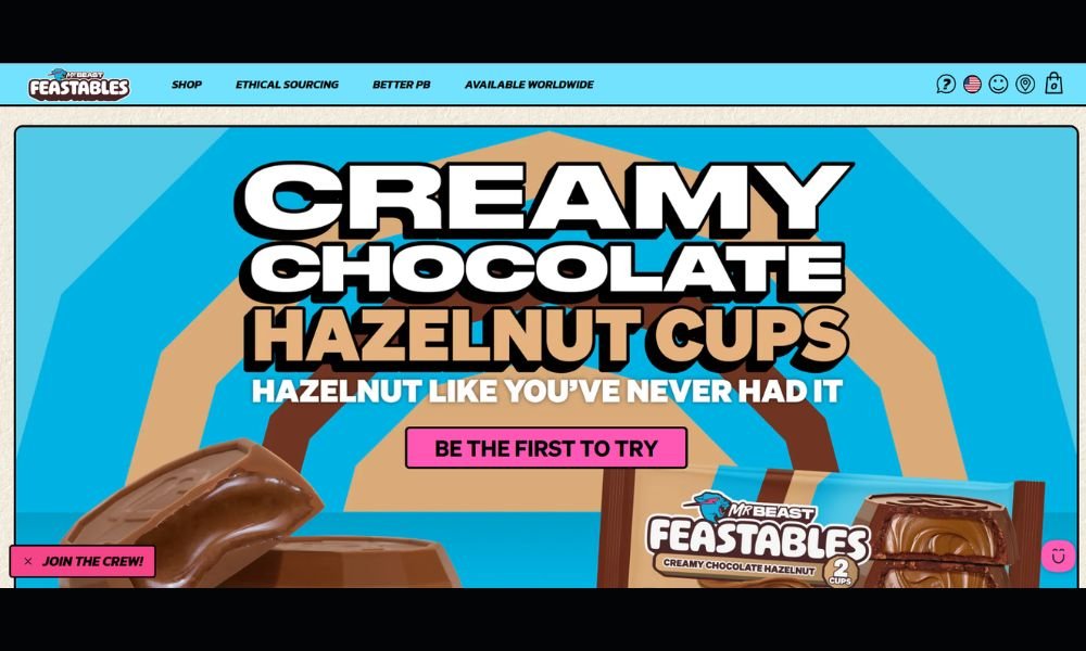
Feastables is a candy brand that knows exactly what it’s doing—keeping things simple, clean, and fun. The site feels just like the product: bold, playful, and built for a better kind of snacking.
Navigation is quick and intuitive. Whether you’re grabbing a bundle of chocolate bars or checking out the latest sweepstakes, everything is right where you need it. Product pages are clean and to the point—highlighting ingredients, flavor, and what sets these snacks apart.
What’s different here is the tone. It’s upbeat without trying too hard. You can tell the brand is serious about quality—no artificial flavors, organic ingredients—but still knows how to keep the vibe light.
There’s also a smart mix of utility and personality. From easy checkout to bright visuals and social-driven content, the experience feels smooth but never sterile.
Feastables doesn’t just sell candy—it sells a snack with purpose (and a little personality). If you’re looking for a better treat with a website that’s actually enjoyable to use, this one’s got flavor and function.
19. Romagnoli
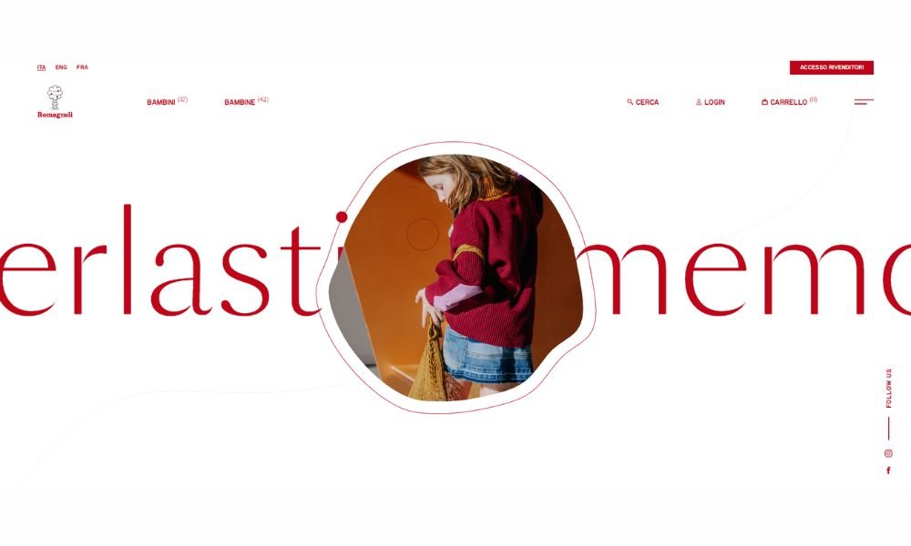
Romagnoli’s website is as refined as the craftsmanship behind its footwear. From the very first scroll, it’s clear this is a brand built on heritage, quality, and a thoughtful approach to design—without ever feeling outdated.
The layout is minimal, with just enough detail to guide the experience. Collections are easy to browse, and product pages are built for clarity. Materials, sizing, and finishes are laid out in clean sections, allowing the product to speak first.
The site carries a quiet confidence. It doesn’t rely on heavy branding or trend-forward styling. Instead, it stays focused on what matters: craftsmanship, comfort, and timeless style for growing feet.
Everything moves with purpose. Whether you’re exploring seasonal collections or reading about Romagnoli’s history, the flow feels curated—not rushed.
If you’re looking for children’s footwear that values fit and finish just as much as fashion, Romagnoli’s website makes its case without saying too much—and that’s exactly what makes it effective.
20. Farm To People
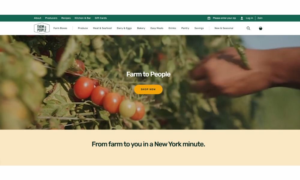
Farm to People brings a refreshing simplicity to online grocery shopping. From the first scroll, the website makes its values clear—local sourcing, small-batch quality, and transparency in every box.
The layout is clean and easy to navigate. You can browse weekly farm boxes, pantry staples, or curated seasonal finds without feeling overwhelmed. Product descriptions are short, helpful, and focused on what matters most: where it’s from, how it’s made, and why it belongs in your kitchen.
What makes the experience stand out is the intention behind it. This isn’t about overpacking your cart—it’s about eating better, with fewer steps in between the farm and your front door.
The tone is warm and practical. There’s no sales pressure or flashy slogans. Just a clear invitation to support sustainable food systems—and enjoy genuinely good food while doing it.
If you’re looking to move beyond mass-market grocery shopping and into something a little more thoughtful, Farm to People offers a direct, delicious alternative that works.
Conclusion
There’s no one-size-fits-all when it comes to great eCommerce design. What works for a skincare brand won’t always work for a tech startup—but the structure, clarity, and customer-first mindset behind these examples? That’s worth paying attention to.
My advice? Don’t just focus on what looks good. Look for what feels right—for your brand, your customers, and your goals. A site that’s easy to use and pleasant to shop can do more than you think.
If even one of these sites gave you a fresh idea or nudged your next project in a better direction, then this list did its job.


