I’ve scrolled through more design agency websites than I can count—some brilliant, some baffling, and a few that still haunt my bookmarks folder. The best ones? They don’t just look nice. They guide you, tell a story, and make you want to click one more time.
A strong agency site does more than list services. It shows how you think. And if you’re working on your own studio’s site—or planning to refresh a client’s—it helps to start with examples that actually do the job well.
In this post, I’ve rounded up 19 design agency websites that caught my eye for the right reasons.
Here’s what you’ll take away:
- Homepages that say a lot with very little
- Bold type and layout choices that don’t feel forced
- Smooth interactions that add—not distract
- Portfolios that show process, not just polish
- Case studies that read like conversations
- Navigation that respects the user
- Branding that feels lived-in, not layered on
- Sites that balance energy with clarity
If you’re staring at a blank Figma file or rethinking your agency’s identity, this list should help get the ideas moving.
1. RSNL Creative
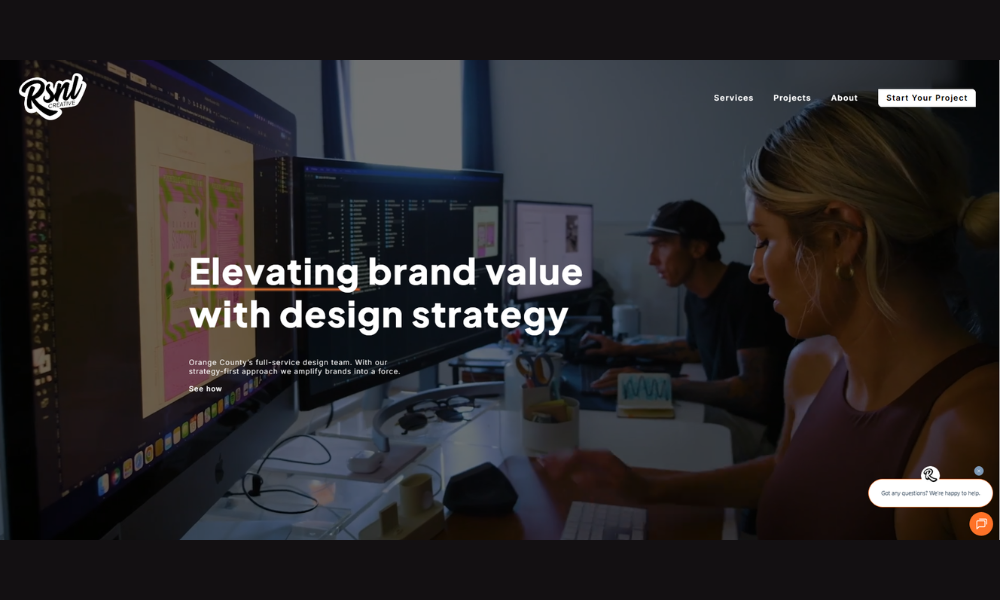
RSNL Creative’s site doesn’t start with a sales pitch. It opens with clarity and purpose. You’re immediately introduced to a team that builds brands with care—and knows how to make visuals speak without yelling.
The About section tells you more than job titles and history. It walks through their thinking. You get the why behind the work, not just the what. That adds weight to every case study that follows.
Their design language is clean and focused. Colors are calm. Type is crisp. Nothing feels overdone. Instead, the site feels like a thoughtful conversation with a group that genuinely listens.
There’s a good balance between personality and professionalism. You’ll see glimpses of humor, but it’s measured—like a well-placed aside in a meeting. It keeps things human.
RSNL doesn’t present themselves as “the answer.” They come across as a partner. And that’s what works. The site feels like it was built by the same kind of people you’d actually want to hire—smart, capable, and clear on what matters.
2. Creative Graphics UK
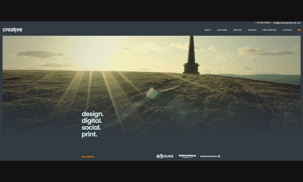
Creative Graphics UK doesn’t try to be loud—they’re just clear, capable, and good at what they do. From signage to full vehicle wraps, the site reflects a business that’s focused on making other brands stand out—without overcomplicating the process.
The homepage is clean and direct. You know what they offer right away, and the visuals show exactly how it all comes together in the real world. No guesswork, no fluff—just confident design with practical results.
The About section adds a human layer. You learn this isn’t some faceless print shop—it’s a hands-on team that values relationships, details, and doing the job right the first time.
Case studies are easy to scan and photo-driven, which works. If you’re looking for bold branding, clean signage, or something that turns heads at a stoplight, this team makes it look easy.
Overall, Creative Graphics UK delivers a straightforward message: they bring ideas to life through strong design, quality materials, and reliable service. No over-sell. No noise. Just solid work—and a site that reflects it.
3. JAX Branding
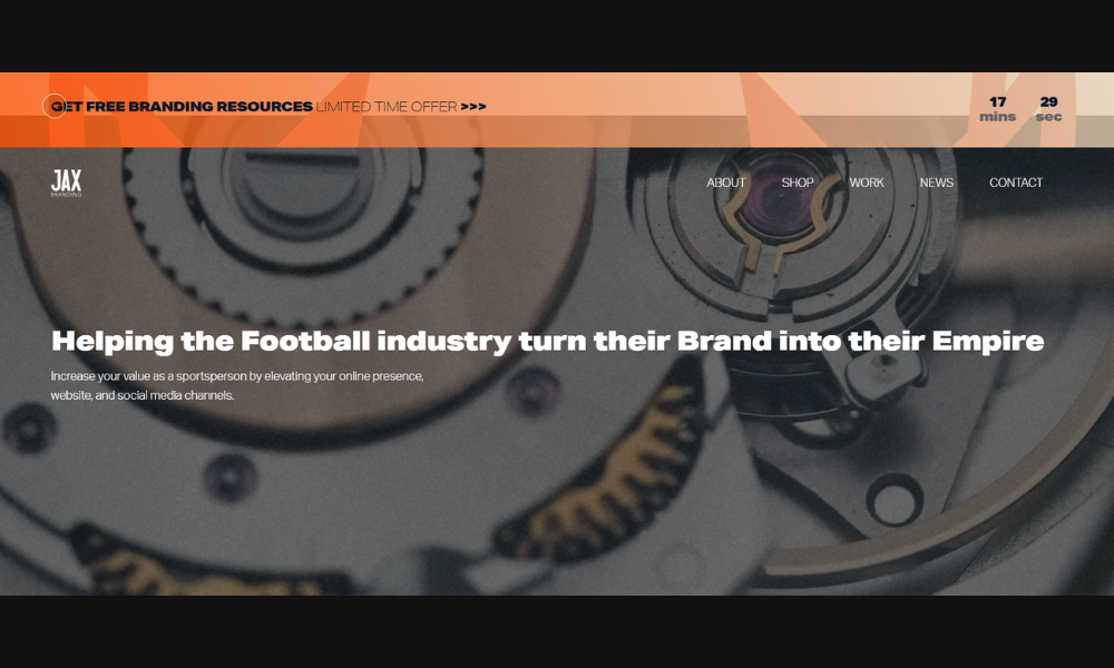
Jax Branding isn’t trying to appeal to everyone—and that’s exactly the point. From the moment the homepage loads, it’s clear this studio knows who it’s speaking to: sports brands, clubs, and professionals looking to stand out with purpose.
The tone is focused but friendly. There’s no hard sell here—just confident messaging backed by sharp visuals and a clear process. The About section reinforces that. It’s not just a bio; it’s a look into how Jax approaches design with real-world insight and strategy.
The layout is clean and purposeful. Pages load quickly, content flows naturally, and the work speaks louder than the words. Case studies aren’t buried in jargon—they’re built to show how branding can actually work in the field, not just in a slide deck.
There’s also a welcome human touch. It doesn’t feel like an agency trying to be cool—it feels like a designer who listens first, then creates what fits.
If you’re building a sports brand with serious goals, Jax Branding offers clarity, confidence, and design that doesn’t miss.
4. DBETA
Dbeta doesn’t waste your time. The moment you land on their site, it’s obvious—they design and develop digital products that are clean, efficient, and built to work.
The homepage is sharp and stripped down. Clear headlines, smart use of space, and a tone that skips the fluff. You’re not being sold. You’re being informed. That in itself builds trust.
Their case studies go beyond showing finished products. They show thinking—how decisions were made, what problems were solved, and how design supports performance. It’s thoughtful without turning into a lecture.
There’s a strong focus on collaboration throughout. Dbeta positions themselves less like a vendor, more like an extension of your team. It’s subtle, but it’s there in the way they speak about process, results, and relationships.
The design itself? Quietly confident. No overload. Just clean layout, strong typography, and work that speaks for itself.
If you’re after a digital team that understands structure, function, and visual clarity, Dbeta delivers without over-promising—and that’s a refreshing shift from the usual tech noise.
5. Bleech
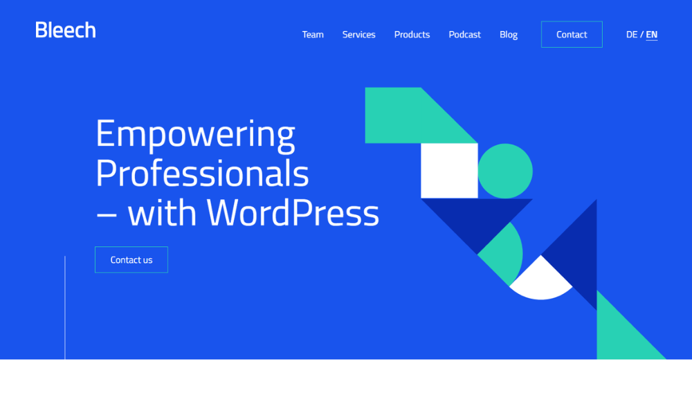
bleech builds websites like they build their message—clean, fast, and straight to the point. Specializing in WordPress development for design-driven agencies, they speak the language of precision without losing the human element.
The homepage makes their positioning clear: they don’t do everything, but what they do, they do well. Fast load times, scalable code, and a development process that puts clarity ahead of cleverness.
Content throughout the site is direct and refreshingly jargon-free. You won’t find bloated tech talk or vague mission statements. Instead, you’ll see structured services, a transparent workflow, and case studies that get to the point.
The overall vibe? Calm confidence. From typography to motion, every detail feels considered—but never performative. It’s built to show you they understand structure, not just visuals.
They’ve also nailed the tone: professional, collaborative, and quietly smart. If you’re a designer or agency looking for a development partner who actually delivers what they promise, bleech is exactly the kind of team you’d want behind your build.
6. Flightpath
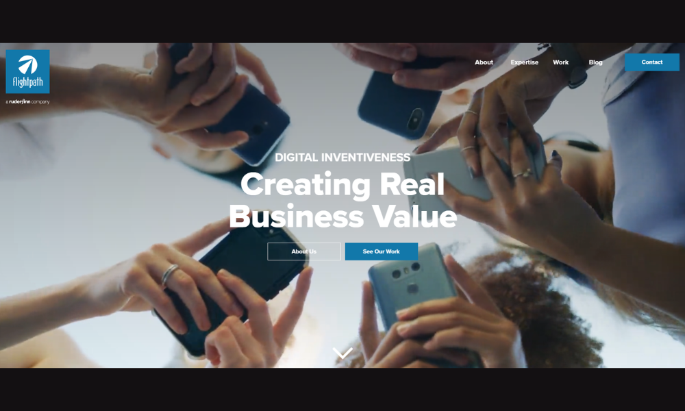
Flightpath doesn’t just do digital—they guide it. From the first scroll, the message is clear: this is a team focused on performance, not just pixels.
The homepage balances creativity with clarity. Services are laid out without the fluff. Whether it’s digital marketing, creative strategy, or media planning, Flightpath makes it easy to see what they offer—and how it works in practice.
Their tone is direct but approachable. No tech speak overload, no vague promises. Just smart thinking, supported by real case studies and measurable outcomes. It’s an agency that sounds like it knows what matters: results, relationships, and reliability.
Visually, the site is clean, well-paced, and full of thoughtful detail. But it never feels overdesigned. Everything supports the message without stealing the spotlight.
What stands out is how grounded it all feels. This isn’t an agency trying to be everything to everyone. It’s one that knows its strengths—and leans into them.
If you’re looking for a digital partner that leads with strategy and follows through with execution, Flightpath feels like a safe—and smart—bet.
7. Crafted
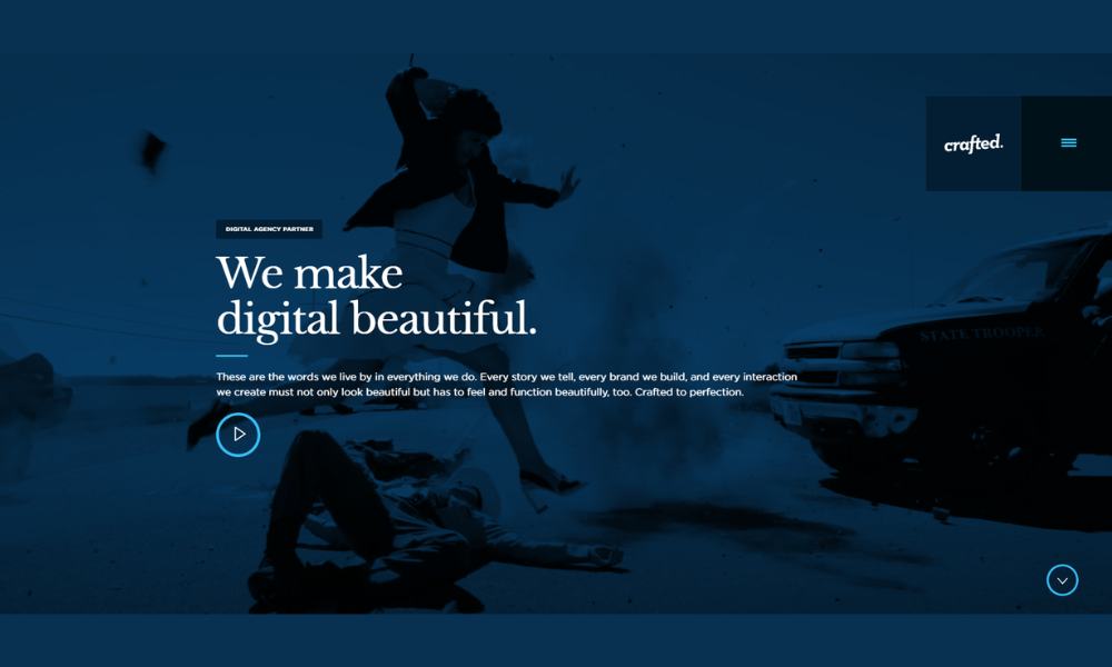
Crafted doesn’t just design websites—they build experiences that feel intentional from the first click. The message is clear: this agency thinks deeply about digital and delivers it with purpose.
The homepage is sleek without being sterile. Strong typography, bold visuals, and well-paced content guide you through what they do—branding, web, mobile, and marketing—without ever making it feel like a pitch.
What really works is the balance. The tone is confident but not inflated. There’s a clear understanding of the creative process, but it’s grounded in results and collaboration. You’re not just hiring a design shop—you’re getting a creative partner who’s listening before building.
Case studies are thoughtfully presented, and the flow of the site mirrors the kind of clarity they bring to their work. No wasted space. No filler. Just smart design that moves.
Crafted’s site doesn’t scream for attention. It earns it—with precision, clean energy, and a clear sense of what great digital work can actually look like.
8. The Boathouse Agency
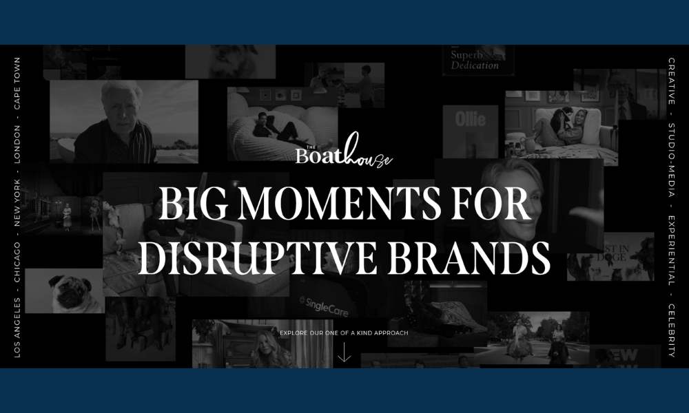
The Boathouse leads with clarity—and backs it with strategy. Their site doesn’t overwhelm or overpromise. Instead, it delivers a focused message: they help brands move with purpose, not guesswork.
From the first scroll, the structure is clean and steady. Messaging is sharp, services are broken down without fluff, and the tone stays steady throughout. Whether it’s brand building, performance marketing, or media strategy, The Boathouse presents its value like a partner—not a pitch deck.
The visual design is polished, but not loud. No clutter, no distractions—just enough motion and design thinking to guide the user, not show off. It’s the kind of confidence that comes from knowing your process works.
Their emphasis on alignment—between business goals, creative work, and measurable outcomes—gives the agency a thoughtful edge. And that alignment shows up not just in the content, but in how the site itself is built.
The Boathouse doesn’t just sell marketing. They sell momentum. And they do it with structure, calm energy, and a clear sense of direction.
9. WA Studio
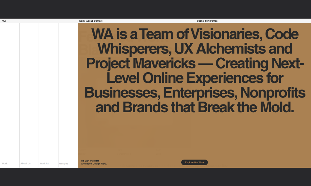
WA-Studio doesn’t waste time telling you they’re creative—they show it. From the first frame, their site feels more like an interactive piece of design than a typical agency page. It’s polished, deliberate, and unmistakably confident.
The homepage is minimal in words but rich in execution. Movement is used sparingly but effectively. Every scroll, every transition feels designed with purpose—not for show, but to guide.
Their work speaks for itself. Case studies aren’t buried under long intros or buzzwords. You get direct access to visuals, context, and outcomes—just enough detail to see what matters.
The tone is clear, the pacing is smooth, and nothing feels over-explained. WA-Studio isn’t just presenting design—they’re inviting you into how they think, without spelling out every step.
It’s the kind of studio that knows its strengths and lets the work carry the message. Clean layout, thoughtful storytelling, and design that holds attention without asking for it.
WA-Studio doesn’t chase trends. They build with restraint—and that’s what makes the site stand out.
10. Lumifig
Lumifig’s site is clean, focused, and straight to the point—just like the work they do. Specializing in 3D product visualization, they turn concepts into high-impact visuals that actually connect with customers.
Right from the homepage, the message is sharp. No filler, no guesswork—just a solid showcase of what they create and who it’s for. Whether it’s eCommerce, packaging, or concept rendering, the emphasis is on clarity and craft.
The visuals do the heavy lifting, and that’s exactly the right move here. You’re not reading through pages of explanation—you’re seeing results. Fast-loading, professionally lit, and compositionally strong work that speaks directly to product teams, marketers, and startups.
The tone throughout the site stays grounded. Lumifig doesn’t try to sound bigger than they are—they sound sharp, reliable, and capable. And that’s what makes the pitch land.
If you need visuals that look polished without losing realism, Lumifig’s site makes a strong case with minimal effort—and that efficiency reflects the mindset behind their work.
11. KM Design Solutions
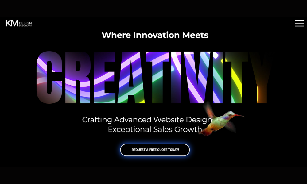
KM Design Solutions leads with clarity and follows through with smart design. The website is calm, professional, and direct—no distractions, just the essentials laid out in a way that’s easy to navigate.
From branding to web and print design, the services are clearly defined without feeling oversold. You get a real sense of what they offer and how they think—visual solutions rooted in function, not flash.
The tone is friendly but focused. This isn’t a studio chasing trends. It’s a design partner that values clean aesthetics, strong messaging, and a collaborative approach. The case studies keep it real, too—no fluff, just solid results backed by visuals and context.
Visually, the site mirrors their style—thoughtful spacing, neutral tones, and typography that’s easy to read. It sets the right tone for clients who want creative work that feels grounded and intentional.
KM Design Solutions comes across as steady, capable, and quietly confident. Their site isn’t trying to impress with noise—it’s built to connect with clients who know what they want: clarity, quality, and work that delivers.
12. Outlanders Design Studio
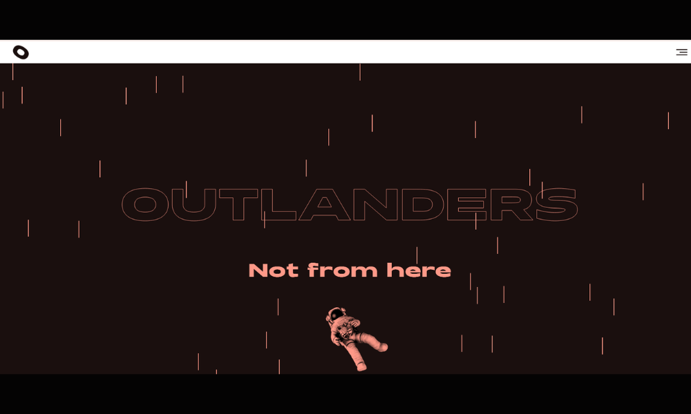
Outlanders Design doesn’t play it safe—and that’s exactly the point. Their site makes it clear: this is a studio built for bold ideas, expressive visuals, and branding that’s meant to be remembered.
From the start, the layout feels intentional. It’s creative without being chaotic. Color, motion, and typography all serve the same goal—showing that they know how to shape brands with energy and direction.
Their messaging walks a nice line. It’s confident, even a little edgy, but still accessible. You’re not being talked down to or lost in buzzwords. It feels like a team that listens, pushes boundaries, and enjoys the process along the way.
The work speaks loudly. Case studies are sharp and well-paced, giving just enough insight without slowing things down. It’s design that moves—and moves you forward.
If you’re a brand looking to stand out, not blend in, Outlanders Design brings the kind of creative focus that actually cuts through the noise.
13. Wow In Group
Wowingroup knows exactly what it’s offering—and its website reflects that. From events and activations to digital campaigns and brand experiences, everything is presented with energy, clarity, and just the right amount of personality.
The homepage hits quickly with bold visuals and a clear message: they build experiences that connect. Navigation is smooth, and each section focuses on showing results, not just listing services. It’s marketing with purpose, not performance for the sake of it.
Their tone is confident without trying too hard. There’s a sense of fun, sure—but underneath it is serious structure. The kind of agency that knows how to pull off something ambitious without losing control of the details.
Case studies are visual, quick to scan, and focused on outcomes. It’s not about what they did—it’s about why it worked. That approach keeps things engaging for clients who want impact, not just ideas.
Wowingroup’s site isn’t about selling a process. It’s about showing momentum—and they do it well.
14. Aryz 31
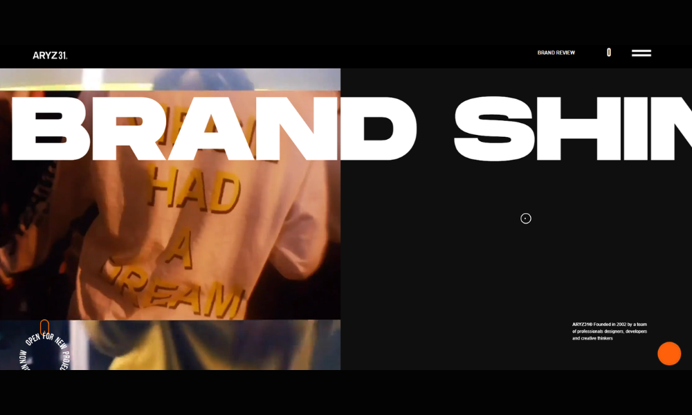
ARYZ31 isn’t just a portfolio—it’s a statement. From the first scroll, you’re met with visuals that speak louder than the copy, and that’s by design. This site doesn’t walk you through the work—it lets you walk through the mindset behind it.
The layout is sharp, intentionally stripped back. White space, strong typography, and curated imagery do the heavy lifting. No clutter, no filler—just design that knows where to stop and when to speak.
The content is minimal, but meaningful. You won’t find paragraphs of explanation. What you do get is a clear sense of rhythm, aesthetic, and technical control. It’s design with direction, not decoration.
There’s also a quiet confidence throughout. ARYZ31 doesn’t chase attention—it earns it. Each piece is carefully presented, allowing the viewer to focus on structure, tone, and story.
For agencies, brands, or collaborators looking for someone who understands design as visual strategy—not just visuals—ARYZ31 stands out by doing less, and doing it better.
15. VMV Studio
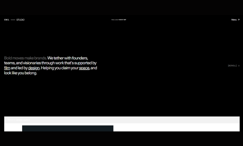
VMV Studio builds digital experiences that feel just as sharp as they look. The moment you land on the site, it’s obvious—this team knows how to use design to make a point, and they don’t waste time getting there.
The layout is bold but balanced. Large type, full-screen visuals, and smart pacing give the site a sense of rhythm without overloading the user. Every section is purposeful. You’re not asked to read more than necessary—but everything you need is there.
Their messaging is tight and self-assured. Whether it’s creative direction, branding, or web development, VMV speaks like a studio that understands both the technical side and the emotional weight of great design.
Project pages are visually rich and well-structured, giving clients a clear look into the thinking behind the work—not just the final product. The case studies are easy to follow and visually immersive.
VMV Studio presents itself exactly how you’d want a creative partner to show up—focused, thoughtful, and ready to turn ideas into design that actually moves people.
16. KOTA
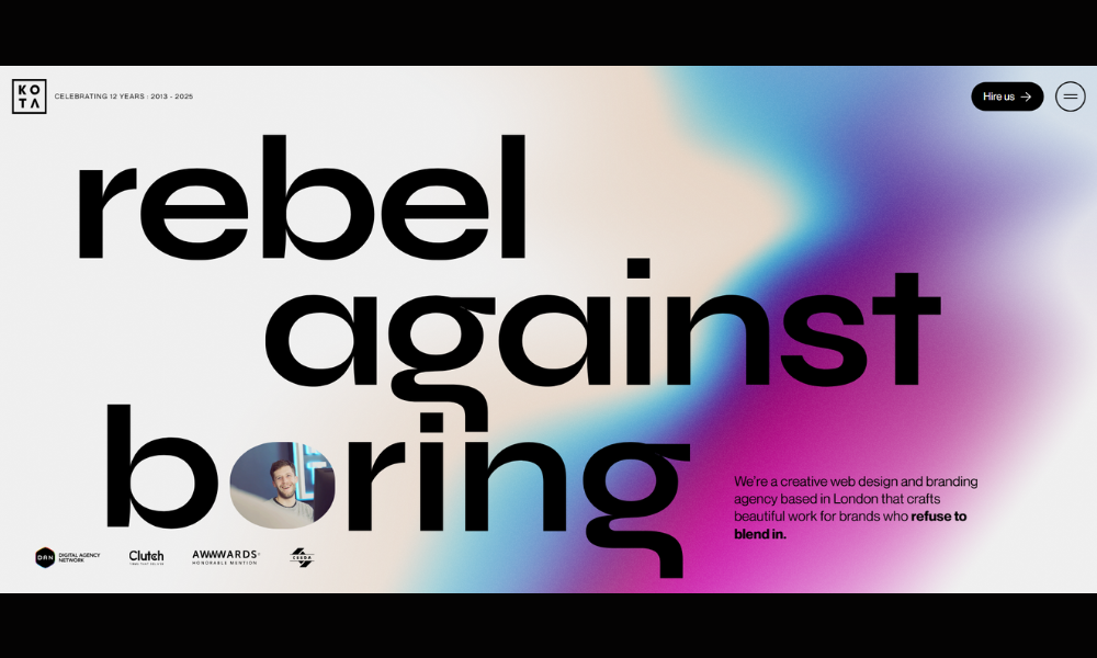
KOTA doesn’t just build websites—they build brand experiences that stay with you. From the first scroll, their site feels alive. Sharp motion, bold typography, and crisp layout choices come together with just the right amount of control.
The homepage wastes no time. It grabs attention and guides you straight into their work. Each project feels like its own visual world, but everything ties back to one clear message: design is how they communicate value.
The tone is confident and clean. KOTA presents itself as a creative agency that understands business goals—not just aesthetics. They know where function meets feel, and they stay in that lane with precision.
Case studies are immersive without being overdone. Visuals lead, supported by short, focused narratives. It’s less about buzzwords and more about showing how good creative solves real problems.
Even the smallest details—like hover states and transitions—feel thought through. If you’re a brand looking for something bold but still strategic, KOTA makes its case with design that’s both expressive and effective.
17. Socially Adept Solutions
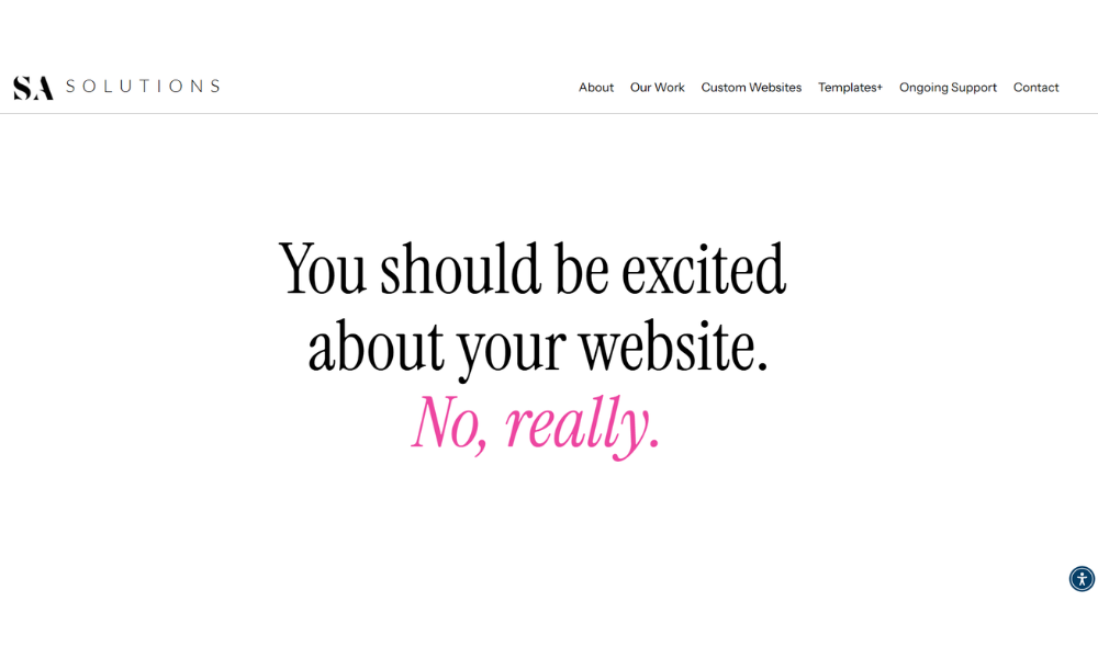
Socially Adept Solutions gets straight to it—they help businesses grow online through strategy, not guesswork. From the moment you land on their site, it’s clear this isn’t about flashy trends. It’s about smart, results-driven digital marketing.
The layout is clean and direct. Services are clearly outlined—social media management, content creation, branding, and digital strategy—without unnecessary filler. It’s easy to find what they offer and how they approach it.
Their tone is friendly but focused. You’re not being sold to—you’re being invited into a process that’s structured, thoughtful, and tailored to your brand’s real needs. Case studies and testimonials reinforce that with real results and client voices.
What stands out is the balance between professionalism and personality. The site feels human—accessible, but still serious about doing great work. It reflects a team that listens first, then builds a plan that makes sense.
If you’re a small business or brand looking for marketing help that’s actually grounded in strategy and follow-through, Socially Adept Solutions shows up like the reliable partner you’d want in your corner.
18. Loomo
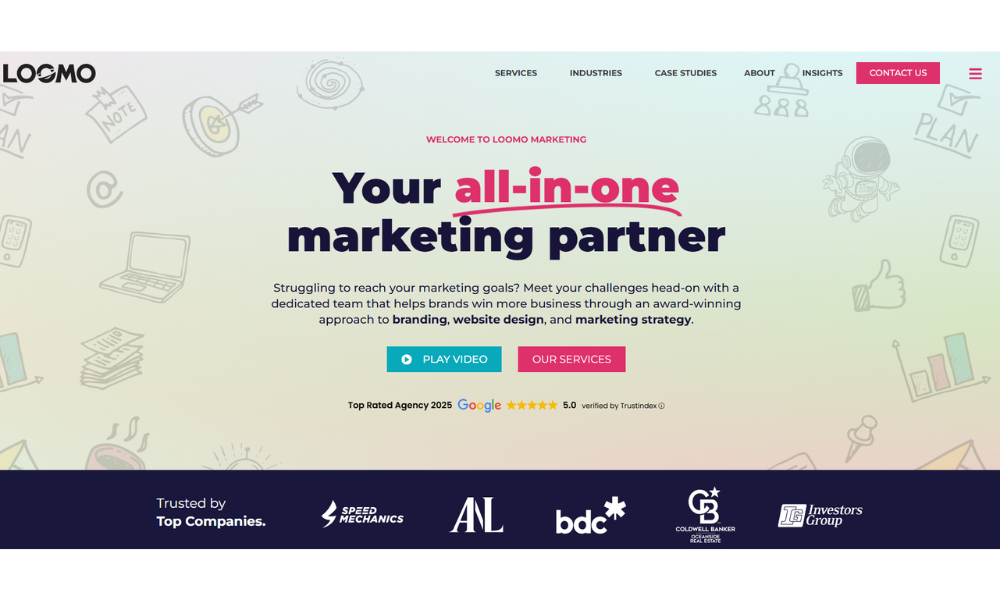
Loomo doesn’t just talk brand—they build it from the ground up, with clarity, strategy, and a little personality woven through every pixel. Their site is clean, friendly, and easy to move through, which feels intentional—just like their work.
The homepage gets right to it. You’re not wading through buzzwords or vague promises. Instead, Loomo lays out who they are, what they do, and how they help businesses connect more clearly with their audiences.
The tone is refreshingly grounded. It reads like a conversation with someone who knows what they’re doing—and enjoys doing it. Services cover branding, digital strategy, design, and development, and it’s all communicated without fluff.
Case studies are visually sharp and structured for quick understanding. The messaging stays focused on outcomes and collaboration, not just visual flair.
What makes Loomo stand out is the way they balance professionalism with personality. They show that creative work can be both thoughtful and approachable—built on a process that actually works.
If you’re looking for a marketing partner that’s sharp, clear, and easy to work with, Loomo makes a strong first impression—and backs it up.
19. Wix Lab
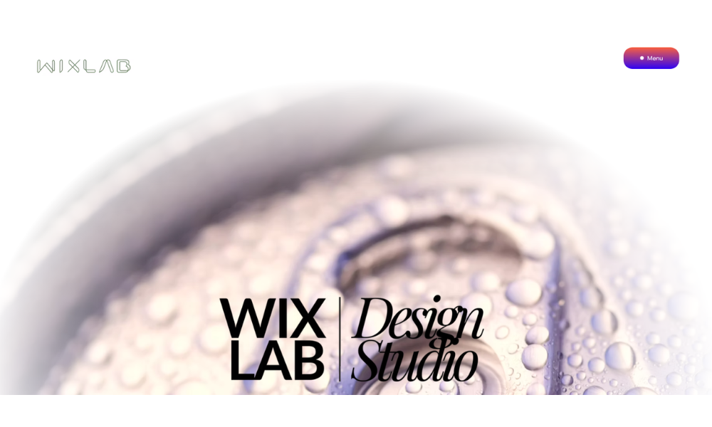
Wix Lab takes the guesswork out of building a standout website. From the first click, the message is clear—they specialize in custom Wix design and development that actually works for real businesses.
The site is clean, well-paced, and focused. No distractions, no endless scrolling. Just straightforward content that shows what they do, how they do it, and why it delivers. Whether you’re a startup, entrepreneur, or small business owner, Wix Lab positions itself as your go-to for web design that feels professional without the pressure.
Their tone is confident but never pushy. Services are explained in plain language, making it easy for non-tech clients to feel comfortable. Case studies are direct and visual, emphasizing outcomes over buzzwords.
What’s especially refreshing is the practical tone. It doesn’t try to impress with complexity. It earns trust by keeping things simple—and getting results.
If you’re looking for a creative team that knows Wix inside out and understands what a modern business really needs from its website, Wix Lab makes the process easy—and makes your brand look good doing it.
Conclusion
Not every agency needs to go loud or abstract. The most effective sites know their tone—and stick to it. Whether minimal, expressive, clean, or kinetic, the goal stays the same: clarity, connection, and a little visual charm along the way.
I put this list together not to impress, but to help spark your next move—whether that’s reworking a layout, fine-tuning your message, or simply rethinking what your site should say about you.
Because let’s be honest: the work starts with how you show up. And a good website? That’s your handshake, your first line, and maybe your best pitch—wrapped into one clean scroll.


