When I’m searching for standout web design, I’m not just looking for pretty pixels—I’m hunting for sites that actually work. That means smart layout, strong visuals, and a clear message that doesn’t get lost in all the scroll effects and sparkle. And let’s be honest—sometimes we all need a little creative nudge (or a full-blown design intervention).
In this article, I’ve collected some of the most thoughtful and visually sharp examples I’ve come across lately. These aren’t just good-looking websites—they’re memorable, useful, and built to engage.
Here’s what you’ll find:
- Real-world site examples that actually do their job (and do it well)
- Design approaches that keep users around—without shouting for attention
- My quick thoughts on what makes each site click (and what you might borrow)
If you’re a designer, a founder, or just someone who likes clean work with a bit of brains, this list is for you.
1. Ingamana

Inga Mana doesn’t just showcase architecture — it tells quiet stories through space. Based in New Zealand, this practice leans into design that listens before it speaks. Their site feels the same. It opens with calm: soft tones, slow movement, and an atmosphere that asks you to pause, not scroll fast.
Each project is treated like a living thing. The photography is intentional, the layouts understated. There’s no rush to impress. Instead, you’re invited to observe — the way light enters a room, how materials meet without shouting.
The writing, while minimal, hits the right notes. It communicates clarity, purpose, and a belief that buildings should belong to their surroundings, not sit on top of them. It’s design with restraint, but never hesitation.
Even the name, Inga Mana, carries weight — rooted in the idea of strength and spirit. That philosophy filters through everything: quiet homes, thoughtful transitions, spaces that breathe.
This isn’t flashy architecture. It’s deliberate. Personal. And, honestly, kind of refreshing.
2. Immersive Garden
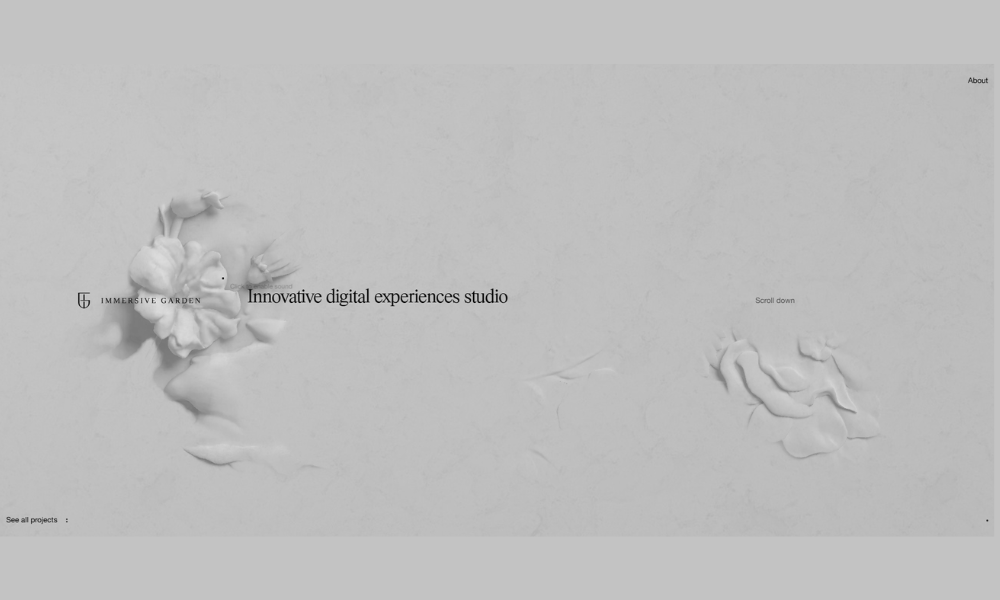
Immersive G doesn’t just present architecture — it performs it. The site itself feels like part of the portfolio: cinematic, bold, and undeniably intentional. From the start, visitors are dropped into a full-screen experience that feels more like a film trailer than a firm intro. And that’s the point.
This Tokyo-based studio leans into motion. Everything moves — backgrounds, transitions, even the cursor. But it never feels like fluff. Instead, it reflects their approach: immersive, story-driven, and deeply visual.
Project pages are clean but dramatic. Images dominate. Text stays out of the way but lands where it counts — a line here, a detail there. No fluff, no filler. Just architecture in high resolution.
What sets Immersive G apart isn’t just aesthetics. It’s confidence. The confidence to let design do the talking. And maybe whisper a little along the way.
If their website is any hint, working with them is less about explaining vision — and more about stepping right into it.
3. Daylight Computer
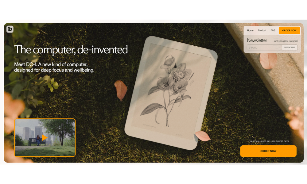
Daylight Computer rethinks what a tablet can be. It doesn’t shout with flashy colors—yet it speaks volumes. The homepage drops you into a serene, paper-like screen that works beautifully under the sun. No glare, no blue light, no distraction. Scroll through project pages and you quickly see why it’s called a “Live Paper” device. It refreshes at 60 fps, making reading, scrolling, and jotting notes feel smooth and natural—no ghostly lag. What’s clever? An optional amber backlight that skips the sleep-disrupting blues. It’s restful, like cozy firelight for your eyes. Specs don’t overwhelm you: a 10.5″ screen, 8 GB RAM, Wacom stylus support, and Android‑based Sol:OS. It’s simple, but not simplistic.
Daylight feels less like a tablet and more like a calm companion. It’s for focused readers, thinkers, and creators. And sure, at $729 it’s not cheap, but it’s not trying to be everything. It just wants to be…well, just enough. Need more convincing? Their guides break it down clearly—no techno-speak, just thoughtful clarity.
4. ISI Global

ISI Global is a B2B retail design agency with offices in the UK, Poland, and the USA. Since its founding in 2005, it has elevated brands worldwide through thoughtful store design, POP materials, and digital experiences.
Their website sets the tone from the start—bold visuals meet crisp typography. The black-and-white base feels modern and polished, while pops of yellow ‘Volt’ draw your eye to key sections. Scrolling reveals ‘Pathed’ graphics, clever visual guides that map a brand’s storytelling journey through each project.
Project showcases are clean and engaging. Brands like Sony, YETI, Google, and HP headline their work, and each example is displayed with just the right mix of image and insight. No jargon, just clarity.
Underpinning it all is a strong nod to sustainability. Their development services include CO₂ tracking, modular design, and recycling plans—proof they care as much about impact as aesthetics.
ISI Global’s site isn’t just a demo—it’s a pitch. Predictable, efficient, and quietly confident. You arrive curious. You leave convinced.
5. Futureform
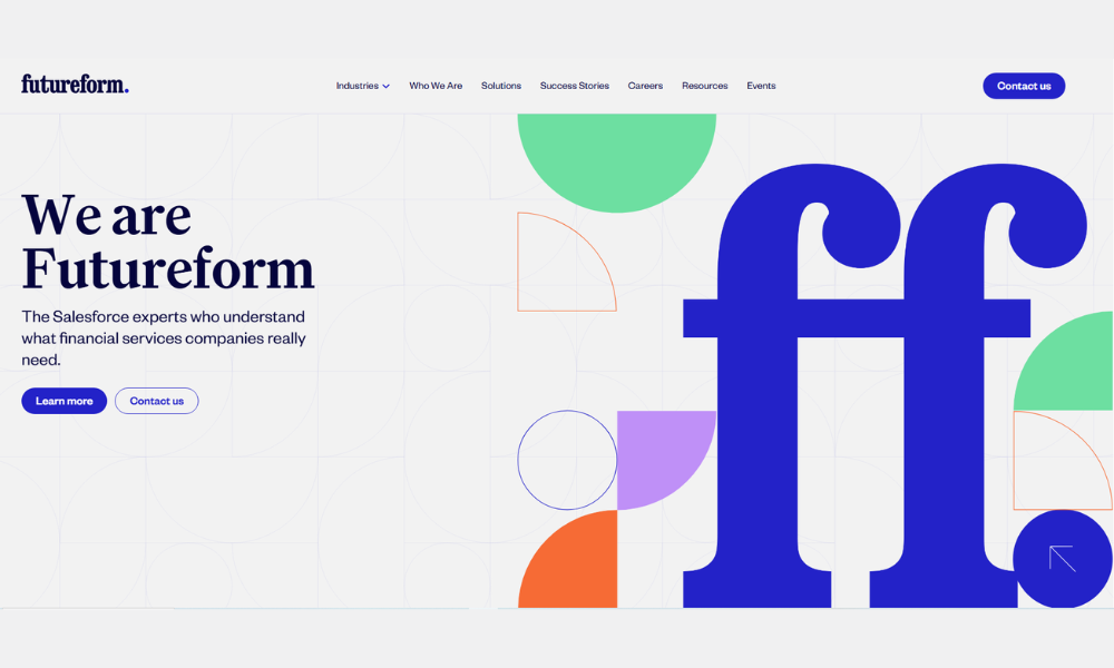
Futureform is a UK‑based Salesforce consultancy that understands financial services from the inside out. Their homepage sets the scene: clean layouts, bold type, and a hint of animation—just enough to show they’re digitally savvy without feeling flashy.
They work across four key sectors: insurance, asset management, wealth management, and private equity. Each has its own tailored industry template, cutting setup time by around 70%. No overwhelming jargon—just clear, value‑driven messaging.
Their “success stories” page is straightforward. You scroll. You see results. And it builds credibility without shouting for attention.
This is a remote‑first team with a real latch onto company culture—they run fitness programs, volunteer days, and even match staff donations. It’s practical, confident, and quietly upbeat.
Futureform doesn’t brag. It shows. Their design says: precise, experienced, and focused on outcomes. It’s a consultancy that feels modern and human—something financial services clearly needs.
6. Paffi
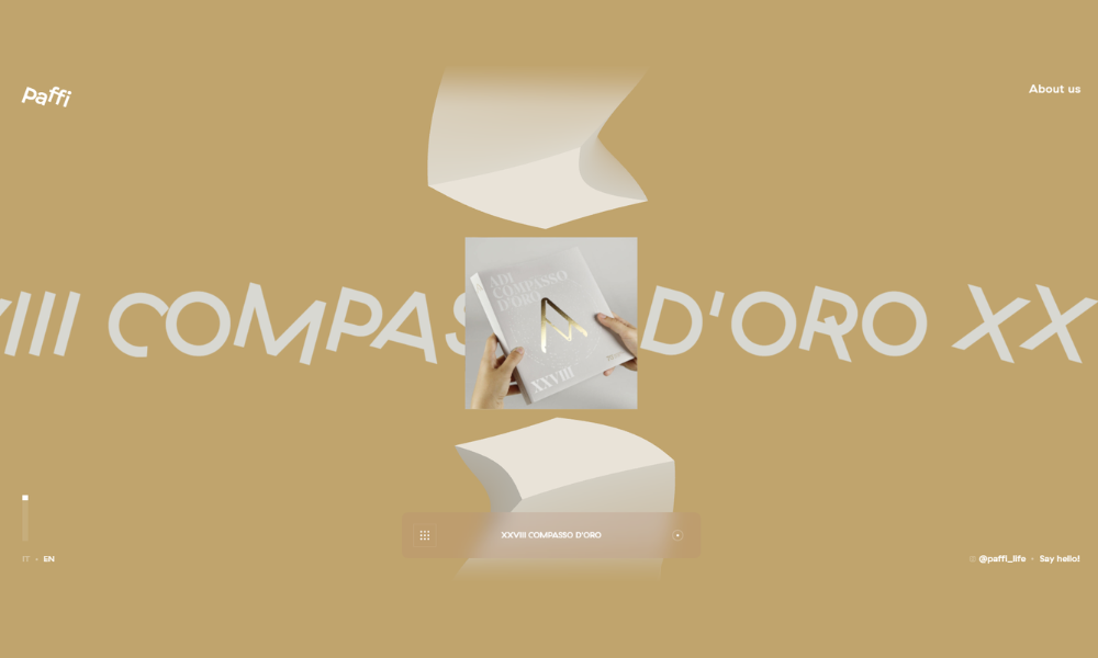
Paffi is a Verona‑based duo — Giulia Peretti and Silvia Recalcati — merging method with creative spark. Their site greets visitors with a playful rotating “totem slider” of brand colours and logos. It’s fun, intentional, and it pulses with personality.
No fluff here. Project pages are clean and clear, featuring vibrant gradients that reflect each client’s own palette. Navigation feels more like a discovery than a chore . Even the About page avoids the usual CV dump — instead it’s lively, personable, and reveals the duo’s decade‑long journey in a conversational tone.
What really stands out? Recognition. Paffi’s icon‑set for COVID guidelines earned them a spot in the prestigious ADI Design Index — the first step towards a Compasso d’Oro nod. Their recent work includes identity design for the XXVIII Compasso d’Oro catalogues — thoughtful, polished, paper‑first edits that highlight craft over flash.
Paffi’s site balances playful and professional. It’s evidence of careful thinking, creative joy—and yes, Italian flair with a smile.
7. DBETA
DBETA is a London-based creative agency that treats every website as an experience, not just code. The homepage lands you in a bold, human moment—a designer engrossed at their desk—instantly setting the tone.
They don’t just build sites; they craft interactive stories. Animations are smooth, not tacky. The layout balances strong visuals with clean typography. It’s clear, confident, and never loud.
You’ll find their process neatly mapped out: from wireframes to live launch, every step is transparent. They quote a 12–16-week delivery window and back it up with award-winning development chops—several CSSDA recognitions, for example.
DBETA’s service range spans custom WordPress builds, ecommerce, CRM solutions, SEO and analytics. They blend front-end flair with real-world business results.
Testimonials underline their client-first focus: “prompt responses,” “stress-free launches,” and trust in ongoing support .
8. Bleech
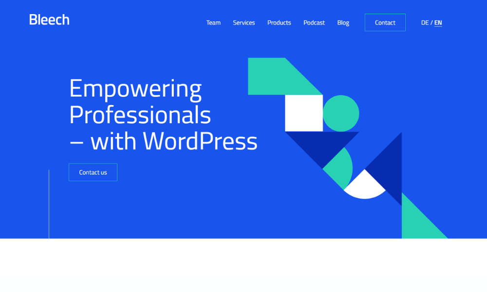
Bleech is a Berlin-based WordPress agency that crafts high-performing, easy-to-manage websites. The homepage greets you with a bold headline—“Empowering Professionals”—accompanied by vibrant visuals and logos of trusted partners.
Their team is described as passionate problem-solvers who love simplifying complex challenges. They take pains to offload the heavy lifting from clients, ensuring websites run smoothly and deliver business results. Projects are clearly explained—from wireframes to launch, using a modular, component-based system powered by their custom Flynt theme.
Client praise comes through in quiet confidence: “They simply brought the website to life and made it work out really well.”. Beyond build, Bleech offers ongoing support—maintenance, performance tuning, and even visual regression tests so updates don’t break things.
The overall feel? Professional, competent, and thoughtful. No flashy gimmicks—just WordPress expertise done right, exactly when businesses need it.
9. Crafted
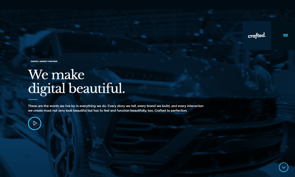
Crafted is a New York creative agency that makes digital beautiful. Their homepage opens with a rich navy canvas and a simple line—“We make digital beautiful”—and sets a polished, confident tone from the start.
They offer full‑service design: branding, web and app design, content, video, and development . Projects are shown clearly—big visuals, minimal text, thoughtful animation. Nothing feels busy. The goal is clear communication, not gimmicks.
Their process is laid out step by step—research, design, development, launch—so clients know exactly where they stand . And they back it up with credentials: award‑winning UX/UI designers, responsive builds, and quoted praise like “Always a pleasure to work with Crafted.”
Built for both creativity and performance, Crafted balances vision with results. It’s polished but approachable, thorough yet uncluttered. In short: refined design that works—and it even looks like fun to build with.
10. KOTA
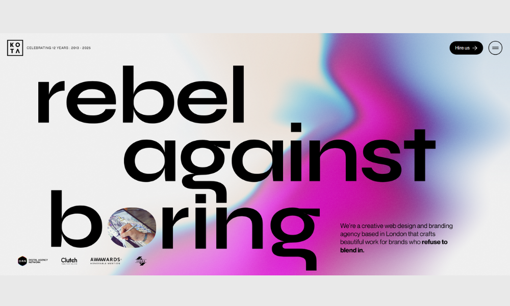
KOTA is a London & New York creative studio that treats the web like a gallery—where every pixel matters. Their site begins with a confident statement: beauty and impact come first. They offer a full suite: branding, web design, development, motion graphics, and digital marketing—each service aligned under clear, sharp messaging. Whether it’s wireframes or launch day, they keep communication transparent and on‑point.
Project pages shine without distraction. Big visuals, minimal text, and smart animations make work feel alive. No jargon—just clarity wrapped in craft. That combo hits home for tech brands, agencies, and B2B challengers looking to stand out.
Behind the visuals is SiteCare: ongoing support that treats your website like a living thing—updates, security, performance. It’s confidence, wrapped in care. Client testimonials echo the sentiment—responsive, creative, and reliable. One said: “Beyond the aesthetics, the site is incredibly functional… we couldn’t be happier!”
KOTA’s site proves one thing: design that looks good and works smart. It’s polished, purposeful, and refreshingly direct.
11. Caava Design
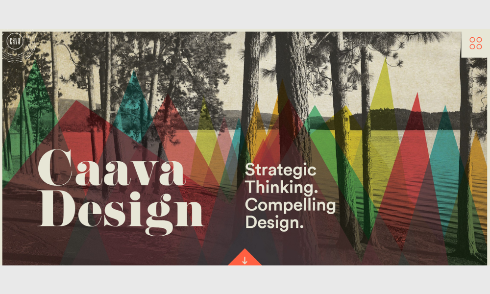
Caava Design is a Coeur d’Alene creative studio that fuses brand, packaging, and interactive design into cohesive experiences. They open strong: a clean, bold homepage that introduces their “formula” — multi-disciplinary, purpose-driven design.
Their portfolio ranges from spa branding to craft packaging. Each project is shown clearly: vibrant visuals, responsive layouts, and just the right amount of copy — no padding, no fluff. Viewers understand both the strategy and the style in a few seconds.
Behind it all: a process that’s simple but thorough — discovery, design, production, growth — where every detail gets attention . Cody Small (Creative Director) sums it up: “form follows function” and passion fuels every pixel.
Clients echo praise: thoughtful, prompt, and strategic—“intentionality” is a frequent compliment . They work with budgets from $25K up, blending craft with confidence.
Caava’s clear message: they’re not just designers. They’re thoughtful problem-solvers who bring brands to life—on shelf, online, or in your hand.
12. Flourish
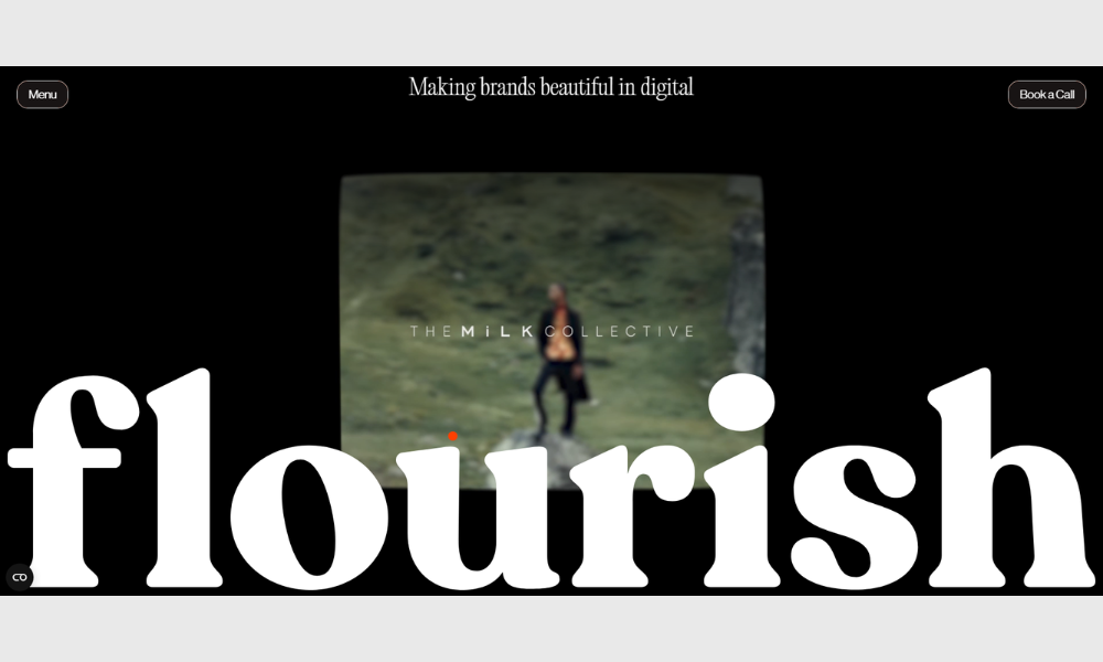
We Are Flourish is a Guildford- and London-based creative agency that treats brands and websites as standout experiences rather than mere projects. From the moment you arrive, the bold headline and polished visuals make it clear: they don’t settle for ordinary.
Their portfolio is proof of range—interior design, video production, travel, construction tech—but what stays consistent is clarity. Big images, minimal text, slick transitions—no jargon, just impact . Their About page speaks plainly: no fluff, no filler. Just a team willing to push back when needed and deliver truly great work.
Services? They’re listed with purpose. Branding, copywriting, WordPress builds—all backed by a promise of seamless functionality and support . And the testimonials drive it home: “smooth, quick and communicative process,” and “they understood we wanted something different, and they delivered”.
We Are Flourish doesn’t signal confidence—they show it. Clean, confident, and quietly proud: it’s design that works, built with character and clarity.
13. Loomo
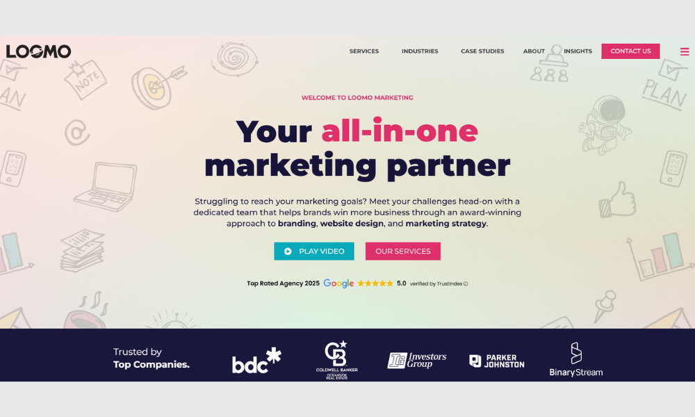
Loomo is the kind of creative studio that makes you look twice—in a good way. Based in Canada, they specialize in brand and digital experiences that feel less like “work” and more like conversation.
The site is straightforward, but far from plain. Strong visuals lead the way, supported by crisp copy and the occasional quiet surprise—like a cheeky line or a clean little motion. You won’t get lost here. Navigation is simple, the message is clear: they help brands make a better impression.
Their work spans industries—from healthcare to tech—and it’s all held together by one thing: clarity. Nothing over-designed. Nothing over-explained. Just thoughtful projects backed by smart design decisions.
What stands out? Their focus on both strategy and execution. One doesn’t outweigh the other. And that balance shows up in every project.
Loomo’s tone is approachable. Their work is polished but warm. And their team seems like the kind of people who love a good idea as much as a good coffee.
14. Niika
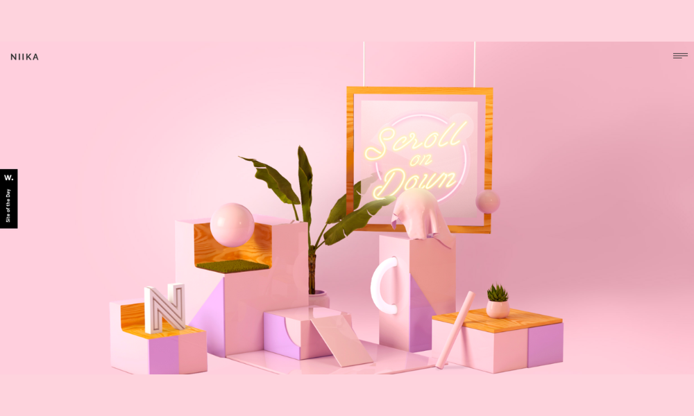
Niika isn’t just a creative studio—they’re brand builders with a sharp eye and sharper instincts. Based in Melbourne, they bring clarity to visual chaos, helping businesses show up with purpose and style.
The website reflects that philosophy. It’s lean, clean, and deliberate. You’re not overwhelmed with buzzwords or buried in slideshows. Instead, it’s a curated walk through work that speaks for itself. Every project feels intentional—no filler, just form meeting function.
They work across brand strategy, digital, and design. But what really stands out is how they handle tone. It’s not just how things look—it’s how they feel. From identity systems to digital experiences, there’s a thread of emotional intelligence running through it all.
Clients range from startups to household names, but the treatment doesn’t change: thoughtful, grounded, and never overcooked.
Niika doesn’t try to do everything. They do what matters—and they do it well. If you’re after design that’s honest, striking, and strategically sound, this studio makes a strong case without ever needing to shout.
15. Wavepoint
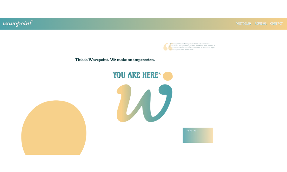
Wavepoint builds brands that don’t just stand out—they stand for something. This California-based creative studio leans into clarity, helping businesses communicate with purpose across strategy, design, and web.
The site itself is crisp and quiet. Black-and-white palette. Generous spacing. Just enough movement to feel alive, never distracting. You scroll, and the message sinks in: they think before they design.
Their strength lies in simplification. Whether it’s a bold rebrand or a subtle digital refresh, Wavepoint brings focus. No filler, no noise—just ideas that hold up under pressure. Project highlights are cleanly laid out, giving equal weight to concept and execution.
And it’s not all surface. Their copy is sharp, honest, and refreshingly direct. You get a sense of people who know what they’re doing—and aren’t interested in overexplaining it.
Clients span industries, but the approach is steady: strategy-led, visually strong, and designed to last. Wavepoint doesn’t chase trends. They build quietly confident brands that do the talking for you.
16. CXR.Agency
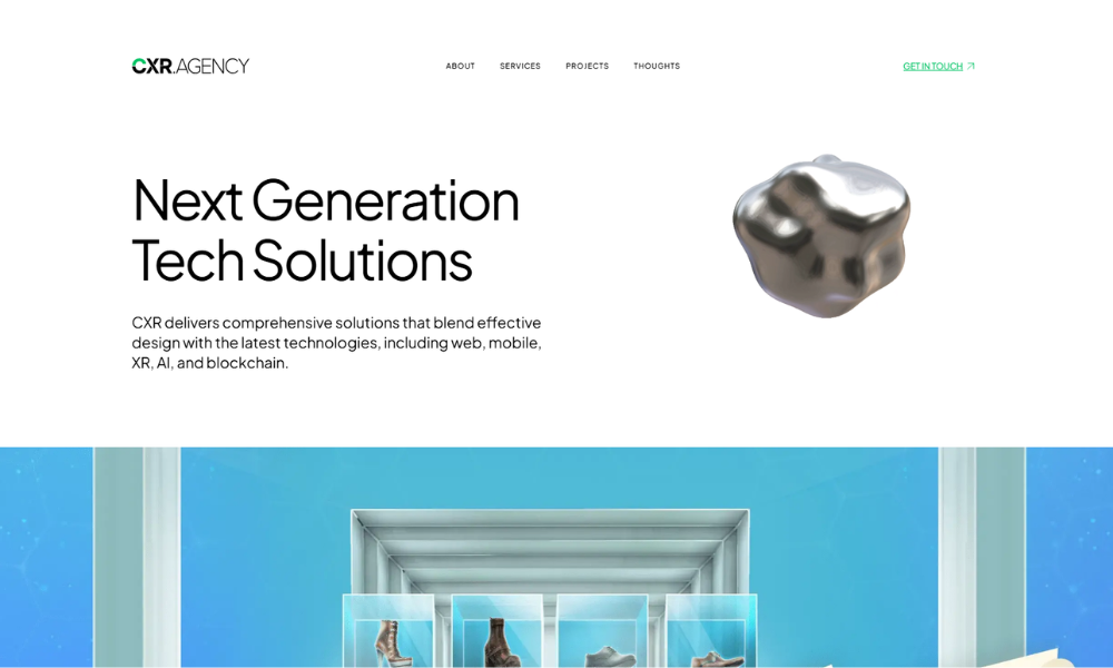
CXR Agency builds digital products that feel modern, fast, and intentional. Based in New York and Miami, they merge design, development, and strategy into experiences that don’t just look good—they move.
The site wastes no time. Strong typography, bold claims, and a fast scroll pace set the tone. You’re clearly in the hands of a team that codes, tests, iterates—and gets results.
They specialize in complex builds: apps, platforms, headless CMS, custom integrations. But the presentation stays refreshingly simple. No techno-overload. Just real capabilities, real examples, and a confident tone that says, “We’ve done this before.”
Case studies are stripped down but sharp—key visuals, clear metrics, and focused outcomes. It’s not storytelling for storytelling’s sake. It’s proof.
What clicks most is the duality: design-led thinking with enterprise-level engineering. You rarely get both at this level. Yet here it is—clean, smart, and fast-moving.
CXR doesn’t pitch fluff. They ship products. And the site shows that with every scroll.
17. Maycreate
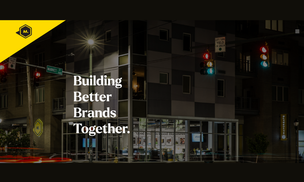
Maycreate is a Chattanooga-based agency that blends marketing, branding, and design into results you can actually measure. Their site feels exactly how their work looks—bold, confident, and built for momentum.
The homepage is fast to the point. Clear headlines. Focused copy. No wasted space. It signals a team that values action over applause.
They work across industries—healthcare, education, tourism, and tech—but the throughline is consistency. Every project reflects a deep understanding of audience, message, and visual tone. It’s not about trends. It’s about building brands that last.
Their services cover the full arc: strategy, design, web, advertising. Each delivered with an eye for precision and a tone that’s grounded, not overhyped.
What stands out? A clear sense of partnership. You don’t get the feeling they build and disappear. Their work suggests they stick around—refining, supporting, scaling.
Maycreate brings energy to the table, but not noise. Just solid thinking, sharp creative, and a team that knows how to get things moving in the right direction.
18. Lola Mullenlowe
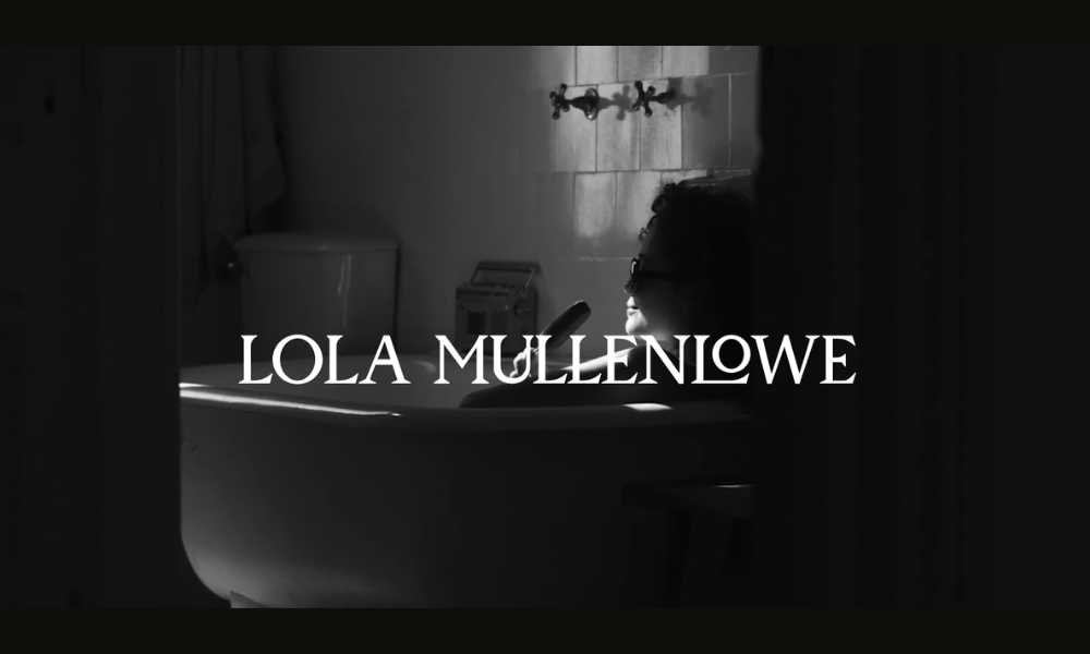
LOLA MullenLowe is an agency that builds brands people actually care about. Based in Madrid but working globally, they combine creative instinct with cultural insight—and it shows.
The website doesn’t overdo it. It’s stripped down, energetic, and full of attitude. Work takes center stage. Big campaigns. Bold headlines. Case studies that don’t just tell you what they did—they show you what worked.
You’ll recognize the names: Magnum, Burger King, Dove, Mattel. But this isn’t just big-brand gloss. There’s personality in everything—humor, edge, humanity. The creative is smart and emotional, never over-polished.
What’s striking is how they speak. Plain words. Strong ideas. Their tone says: we know who we are, and we know how to move people.
Behind the boldness is real depth—strategy, storytelling, sharp execution. They’re not chasing trends. They’re shaping them.
LOLA MullenLowe creates advertising that doesn’t just compete—it connects. The kind of work that sticks with you long after the scroll ends.
19. SPIN
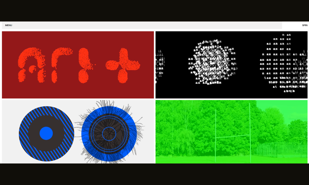
Spin is a London-based creative studio that blends culture, commerce, and craft into vibrant design and production. Their site greets you with bold frames—striking visuals paired with clean, punchy copy. It’s a clear signal: this team understands impact.
They tackle projects across branding, film, digital, and immersive experiences. Each discipline is showcased through sharp visuals and just enough context. You scroll—and absorb story, strategy, and style all at once.
The tone is brisk and deliberate. No fluff. No jargon. Just purposeful presentation that lets creativity take the stage. Whether it’s a brand id or a music campaign, execution is tight and thoughtfully curated.
What sets Spin apart? Their versatility. One moment you’re watching a slick brand film for a fashion label. The next, you’re immersed in visuals for a live event or interactive display. They handle diverse briefs without losing coherence or quality.
Spin’s site feels energetic—not flashy, but confidently alive. It reflects a studio that knows how to move fast, think deeper, and deliver work that lingers in the mind.
20. Mimosa
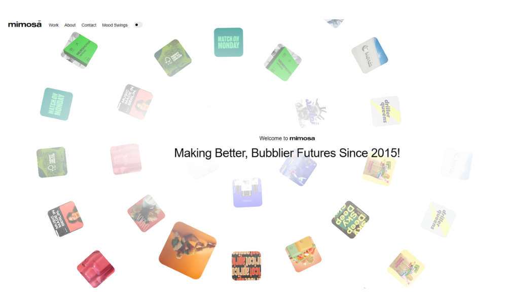
Mimosa Agency is a Brighton-based creative team crafting visual identities and immersive digital moments with a clear purpose. Their website opens with calm confidence—simple layout, bold visuals, and an uncluttered presentation that puts their work front and centre.
They specialise in branding, art direction, digital campaigns, and dreamy editorial visuals. You scroll and instantly grasp their strength: thoughtful aesthetics and purposeful storytelling. Each project feels considered, with the right balance of artistry and clarity.
Their tone is sharp and sincere. No buzzwords, just plain-spoken descriptions that let the visuals pull the weight. It’s design with heart, not hype.
What stands out? An appreciation for nuance. Colour palettes are smart, typography is crisp, and movement guides your eye without distracting. You feel included in a process that values craft and context.
Mimosa isn’t about loud declarations. They build work that beckons, not shouts. A site that reflects a studio invested in its craft—and in intelligent, understated impact.
Conclusion
Finding great website design isn’t about copying what’s trendy—it’s about learning from what’s working. That’s what I aimed to share here. Each of the sites I highlighted left an impression, not because they tried too hard, but because they understood their audience and stayed sharp from concept to code.
I hope these examples sparked an idea or two. Maybe even made you rethink a homepage, a layout, or a headline. At the very least, I hope you enjoyed the scroll.
And if not, well—I won’t take it personally. But your website visitors might.