When I feel stuck staring at a blank layout—or worse, a layout that just feels flat—I know it’s time to hunt for fresh inspiration. Over the years, I’ve collected websites that didn’t just look good, but made me stop and say, “Okay, that’s smart.”
Whether you’re designing your first landing page or polishing your hundredth client project, a little creative nudge can go a long way. That’s exactly why I put together this list—because I’ve been there, and I know how helpful it is to see what’s actually working.
Here’s what you’ll find in this guide:
- Smart layout ideas that don’t scream for attention
- Visual storytelling done right (and fast)
- How typography alone can carry the vibe
- Navigation tricks that make sites feel effortless
- Examples where “less” really did more
- Micro-interactions worth stealing
- Bold color choices that don’t go off the rails
- Real sites, no theory
- Clean design with actual personality
- Tips I personally use to avoid creative ruts
If you’re looking to sharpen your design instincts—or just want something better to scroll through than your inbox—you’re in the right place.
1. Mobbin
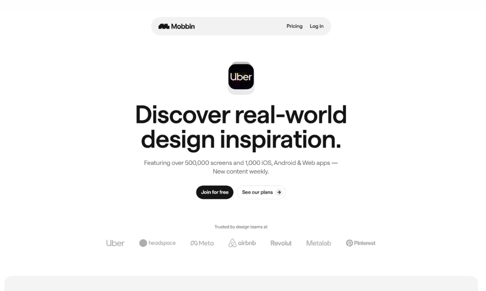
Mobbin skips the fluff and gets straight to it. It’s a clean, curated library of real-world UI patterns—no guesswork, just good design. Whether you’re building your next app or just browsing for ideas, this platform gives you a front-row seat to what top teams are shipping right now.
The homepage doesn’t waste time. You’re met with crisp screenshots and clear categories. No pop-ups yelling at you. Just a calm, focused layout that says, “Here’s the good stuff.” And it delivers. From fintech flows to onboarding screens, Mobbin helps designers and product folks see how others are solving real problems.
The best part? It feels like it was built by people who actually design things—because it was. It’s smart without showing off, and helpful without holding your hand. Even if you’re not working on something at the moment, scrolling through is oddly satisfying. Like window shopping for UI.
Mobbin isn’t trying to reinvent design. It’s just making it easier to learn from those who already do it well.
2. Awwwards
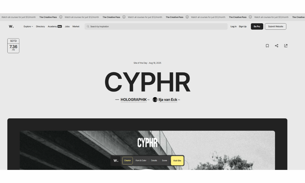
Awwwards is where great web design goes to show off—and where everyone else goes to feel slightly behind (in a good way). It’s not just a gallery; it’s a curated collection of the internet’s most ambitious, polished, and occasionally outrageous digital experiences.
From typography that moves like it knows something you don’t, to interfaces that feel more like interactive art than websites, Awwwards doesn’t just celebrate design—it challenges it. Each featured site is judged on creativity, usability, and that hard-to-pin-down “wow” factor. It’s where pixels meet prestige.
The layout is clean and editorial. Think design magazine, not design blog. You’ll find filters, tags, and categories, but they don’t get in the way. This site respects your time—while making you want to stay longer than planned.
Whether you’re a developer, designer, or someone who just really likes a good hover state, Awwwards is both inspiration and benchmark. You don’t scroll through it for fun (though you might). You scroll because you want to do better.
3. Godly
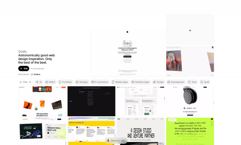
Godly doesn’t bother with introductions—it just drops you straight into the good stuff. Scroll down, and boom: motion-heavy, bold, sometimes weird (in the best way) web design from all over the world. This isn’t your average inspiration site—it’s more like a digital mood board with a caffeine habit.
The interface is minimal, but the content? Anything but. You’ll find websites that animate, glitch, hover, and surprise—each pushing boundaries without pushing you away. Unlike some galleries that feel too curated to be useful, Godly keeps things raw and real. It’s curated, yes, but still feels human.
You won’t get star ratings or detailed write-ups here. And that’s kind of refreshing. The work speaks for itself. You click, you explore, you get inspired—or mildly jealous.
Perfect for designers who are tired of “clean and modern” and want to see what happens when the rules are optional. Godly isn’t about playing it safe. It’s about showing what web design looks like when creatives are left unsupervised.
4. Landbook
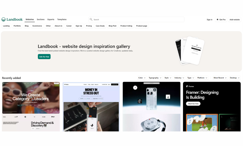
Land-book is the digital equivalent of flipping through a well-organized sketchbook—if that sketchbook had a thing for sharp layouts and sleek hero sections. It’s a visual archive of landing pages that actually work, not just look good.
The interface is simple. No distractions, no gimmicks. Just a steady stream of curated web pages that span industries and styles—from bold SaaS homepages to soft, minimalist portfolios. If you’re a designer, marketer, or founder in need of ideas, this is where your research gets a visual upgrade.
What’s smart is how browseable it is. Clean thumbnails, fast load times, and filtering that doesn’t require a tutorial. You want eCommerce? Sorted. Portfolios? Right there. It’s structured enough to save time, but open enough to spark unexpected inspiration.
Land-book isn’t loud. It doesn’t try to sell you a course, a plugin, or a newsletter. It just quietly delivers quality. And in a web full of noise, that kind of confidence stands out.
5. Minimal Gallery
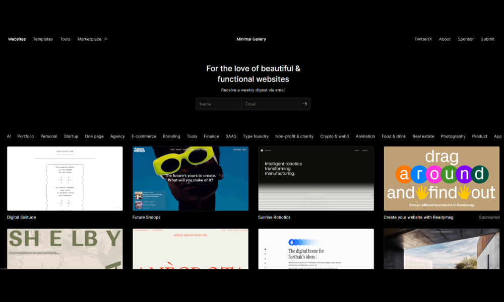
Minimal Gallery is what happens when less really is more. No clutter, no noise—just a carefully curated stream of design-driven websites that know when to breathe. It’s calm, intentional, and honestly kind of refreshing.
This isn’t a place for visual chaos or overloaded interfaces. Every site featured here embraces negative space like it’s part of the design team. From portfolios to microbrands, Minimal Gallery highlights work that’s elegant without trying too hard.
The browsing experience? Smooth. Thumbnails are big enough to matter, filters are easy to use, and there’s no distracting sidebar begging for attention. It’s built like the sites it features: thoughtful and well-paced.
Minimal Gallery doesn’t scream innovation—it whispers taste. If you’re looking for inspiration that’s subtle, smart, and rooted in restraint, this is your spot. Perfect for designers who believe white space is a design decision, not an accident.
It’s quiet, but in a good way.
6. No Code Supply
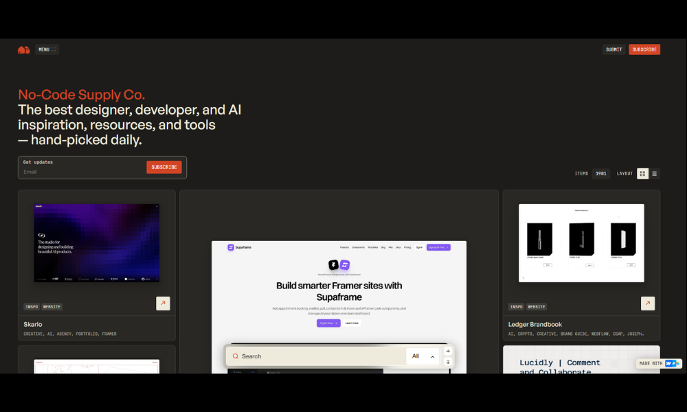
NoCode Supply is like a toolbox that actually makes sense. No digging, no gatekeeping—just a clean collection of high-quality tools, templates, and resources for folks building without code.
From Webflow templates to Notion kits and AI plugins, everything’s organized with care and zero fluff. It’s not trying to overwhelm you with options. It’s curating what actually works, so you can spend less time hunting and more time building.
The site itself? Predictably solid. Minimal layout, easy navigation, and filters that don’t fight back. You’re not here to admire the UI (though it’s nice). You’re here to grab something useful and go.
Whether you’re a startup founder, solo builder, or designer trying to launch fast, NoCode Supply gives you a head start—without asking for your email at every turn. It feels more like a trusted folder than a marketplace.
Simple idea, well executed. Which, fittingly, is what no-code is all about.
7. Landingfolio
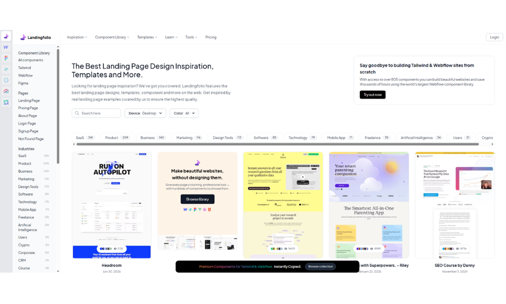
Landingfolio is your personal mood board for landing pages—except it’s organized, searchable, and doesn’t live in 47 browser tabs. It’s a curated collection of real pages built by real teams, designed to spark ideas without overwhelming you.
The layout is clean and friction-free. You get categories, filters, and crisp previews that actually tell you something. Whether you’re designing a pricing section, building a hero layout, or just trying to make your call-to-action not sound desperate—Landingfolio has examples that help.
It’s especially great for those “I know what I want, but I need to see it” moments. And because it pulls from live pages, there’s a practicality to it—these aren’t just pretty mockups; they’re pages out in the wild doing their jobs.
No pop-ups, no fluff, no over-designed distractions. Just thoughtful, handpicked design examples that speak clearly and work hard. If you’ve got a landing page to build and a blank Figma file staring back at you, this is a good place to start.
8. Storefront.design
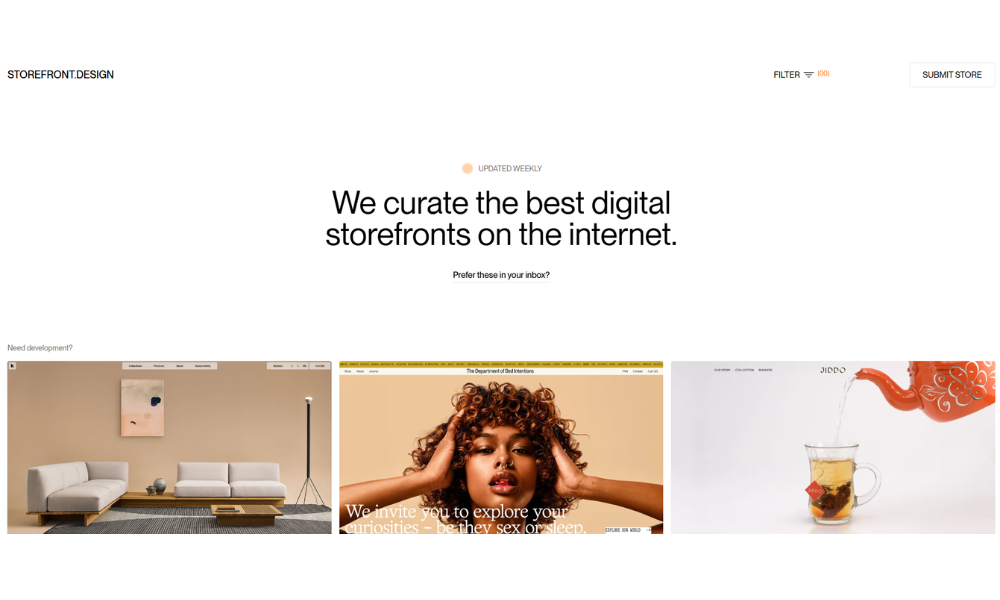
Storefront Design is where eCommerce inspiration goes to stay organized. It’s a curated gallery of standout online stores, built for designers, developers, and founders who want their product pages to feel less… template-y.
From indie brands to polished powerhouses, every featured store brings something to the table—clean UI, thoughtful layout, or just that extra something in the details. It’s not about flashy gimmicks. It’s about seeing how smart design helps products sell without screaming “BUY NOW” at you.
Navigation is refreshingly simple. You can filter by platform (hello, Shopify fans), category, or vibe. It’s scrollable, snackable, and easy to get lost in—in a productive way.
No endless blog posts. No signup walls. Just a steady stream of well-built storefronts doing what they do best: showing products, telling stories, and converting clicks into carts.
If you’re building a shop and staring at a blank homepage, Storefront Design is a solid place to recharge your design brain.
9. Dark Design
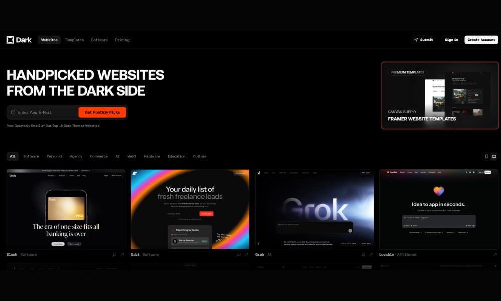
Dark Design is what happens when moody meets masterful. It’s a curated collection of websites that prove you don’t need white space to look clean—or bright colors to grab attention.
Every site featured leans into darker aesthetics, but there’s nothing dull here. Think bold contrast, sharp typography, and that cinematic, late-night feel. If your idea of “minimal” comes with edge and attitude, this gallery will feel like home.
The site itself stays out of the way—simple grid, smooth scrolling, and just enough tagging to help you find what you’re after. It’s focused, not fussy.
Great for designers hunting for inspiration that doesn’t come in pastel. Or for brands ready to trade “friendly and fresh” for something more refined, more dramatic, more… serious.
Dark Design doesn’t shout. It simmers. And if you’re building a site that needs to look cool without trying too hard, this is a pretty good place to start.
10. Navbar Gallery
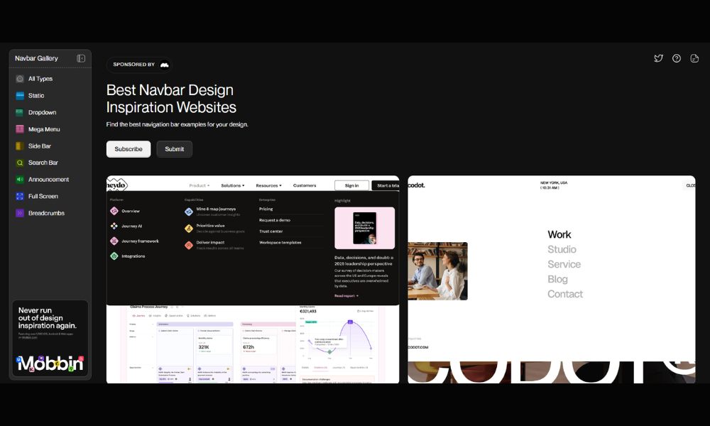
Navbar Gallery does one thing—and does it well. It’s a tightly curated collection of navigation designs that puts the spotlight on a part of the website most people forget… until it’s frustrating.
This gallery brings together headers, nav menus, mobile drawers, and sticky bars from real websites that get it right. No over-engineered dropdowns or menus that require a tutorial—just clean, usable, well-thought-out navigation that makes browsing feel easy.
The layout is exactly what you’d hope for: minimal, fast, and distraction-free. Filter by style, function, or platform, and you’ll find nav designs that actually fit your project—not just look pretty in isolation.
Perfect for designers who’ve spent too long tweaking a hamburger menu at 2 a.m., or product folks trying to figure out how to keep users from getting lost. Navbar Gallery isn’t flashy, but that’s the point. It shows how great design guides without shouting.
If the header is your site’s first handshake, this is where you go to make it a good one.
11. Footer Design
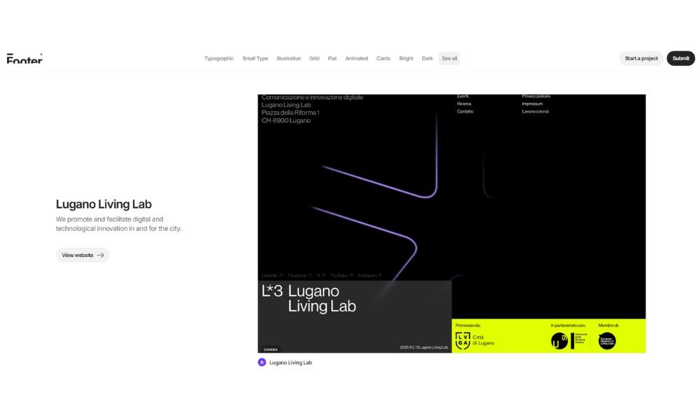
Footer.Design proves that the bottom of a page doesn’t have to be an afterthought. It’s a curated gallery dedicated entirely to footers—yes, footers—because good design doesn’t end above the fold.
This site showcases how smart brands turn quiet space into something useful (and occasionally impressive). From minimalist layouts to content-heavy navigators, you’ll find real-world examples of what works when users scroll all the way down.
The interface is exactly what you’d want from a gallery like this: clean grid, easy filtering, and zero distractions. No pop-ups. No fluff. Just a quick way to see how others make their last impression count.
Whether you’re designing a footer that’s clean and subtle or one that packs in links, CTAs, and brand personality—this is where you go for ideas that don’t feel like copy-paste jobs.
It’s niche, sure. But that’s what makes it good.
Because if you’re sweating the details at the bottom of your site, chances are the rest of it’s solid too.
12. Awesomed
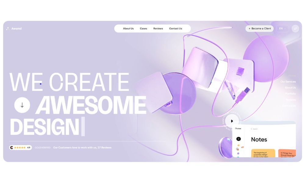
Awsmd is a fast, focused gallery of websites that nail the details without overthinking them. It’s not trying to win design awards. It’s just a smart, curated collection of things that look good and work better.
From bold landing pages to sleek portfolios, everything here earns its spot. You won’t find clutter, endless categories, or design-for-design’s-sake. Just sharp visuals, real functionality, and layouts that feel modern without chasing trends.
Browsing is quick and painless. Sites load in place, previews are clean, and tagging actually helps instead of getting in your way. It’s a great resource when you’re stuck staring at your own layout, wondering why it suddenly looks like it was built in 2012.
What makes Awsmd stand out is its simplicity. It doesn’t try to be everything—it just shows you what’s working out there, without the noise.
If you want inspiration without the overwhelm, and examples that feel fresh but practical, Awsmd delivers. Straight to the point. Just like your next project should be.
13. Genrod
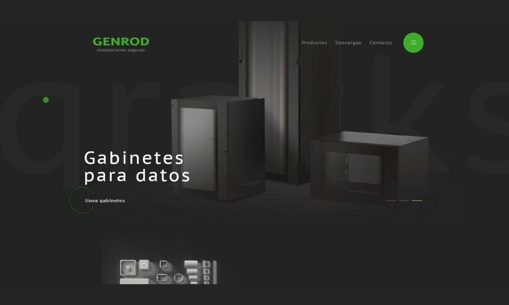
Genrod doesn’t waste time telling you what it does—you see it. Strong visuals, confident layout, and a clear message: this is a company grounded in precision and built for impact.
As a manufacturer of electrical components, Genrod leans into clarity. The design is clean, industrial, and efficient—no unnecessary frills, just solid presentation. Their product catalog is structured, searchable, and built for utility, not decoration. You get the sense that what they build works—and lasts.
What stands out? The consistent visual language. From sharp typography to smart use of color, everything reflects a brand that knows its audience: technical, professional, and detail-oriented. Even the animations are subtle—controlled, like their engineering.
Navigation is easy, content loads quickly, and the mobile experience holds up well. It’s a rare example of a product-heavy site that doesn’t feel heavy.
Genrod’s site isn’t flashy. It’s focused. And that’s exactly what you want from a company making the parts your infrastructure depends on.
14. Shape
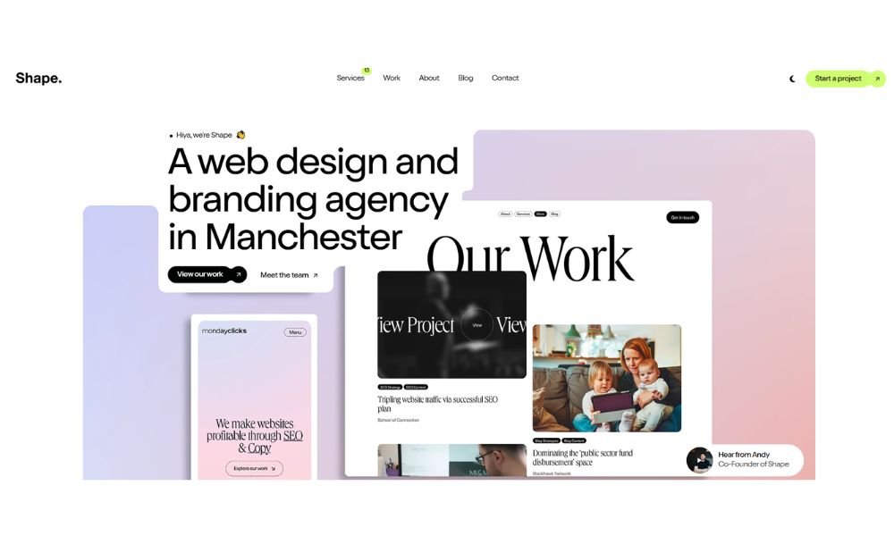
MadeByShape doesn’t just talk creative—it shows it. From the moment the homepage loads, you get the feeling this agency knows how to balance personality with precision.
The design is elegant but playful. Smooth animations, crisp typography, and just the right amount of white space make the site feel high-end without being cold. It walks the line between approachable and expert—exactly what you’d want from a studio designing for ambitious brands.
Content is clear, well-structured, and refreshingly human. Their case studies actually tell stories, not just list deliverables. You get insights into the process, the thinking, and—yes—the results.
What’s especially nice? It doesn’t try too hard. No endless buzzwords. No aggressive calls to action. Just confidence through clarity and craft.
MadeByShape comes off as the type of team that listens, then delivers something better than you described. And their website? It’s proof of that.
15. Sliders
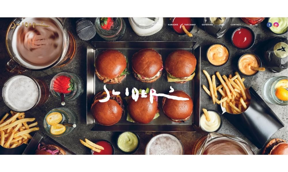
Sliders isn’t your average burger joint—and their website makes that clear before you even scroll. Bold visuals, oversized typography, and full-screen flavor (literally) set the tone: this is fast food with a side of style.
The homepage hits hard—minimal text, strong photography, and just enough motion to keep things lively without getting messy. It’s designed like their menu: focused, sharp, and built to leave an impression.
Navigation is simple, the vibe is confident, and the branding is tight across every page. Even the menu feels curated, not crowded. You’re not just here to pick a burger—you’re here to buy into a culture.
What’s refreshing? It doesn’t try to be everything. No unnecessary storytelling. No forced authenticity. Just slick design with real energy behind it.
Sliders isn’t just selling food—they’re serving up a brand. And judging by the look and feel of their site, it’s one that knows exactly who it’s talking to.
16. Appetite Creative
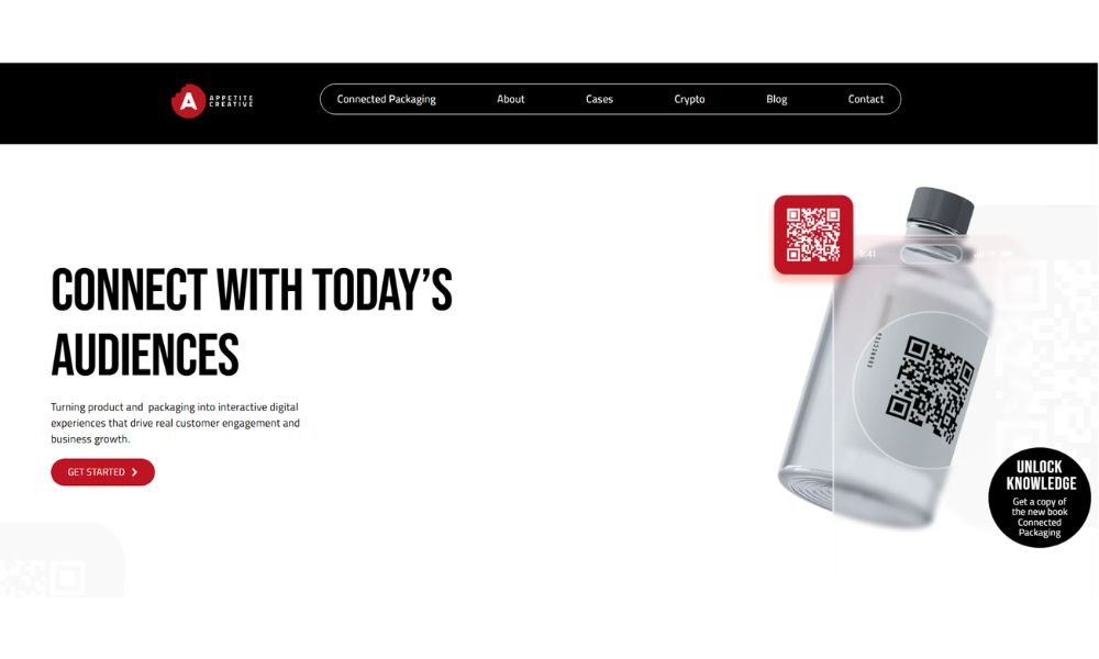
Appetite Creative doesn’t just build digital experiences—it throws a bit of attitude into the mix. The moment the site loads, it’s clear: this agency has energy. Bold colors, animated elements, and a layout that moves fast without losing focus.
This isn’t your standard corporate portfolio. It feels alive. From interactive case studies to playful transitions, everything is built to hold your attention—and keep it moving. The tone is confident, creative, and unafraid to have a little fun with the work.
Services are laid out clearly, without jargon. You won’t get lost in buzzwords or buried in process slides. It’s straightforward: creative tech, smart branding, and campaigns that get results.
The site also walks the walk on responsiveness—mobile experience is just as tight. Whether you’re a brand looking to go bold or a marketer scouting fresh ideas, Appetite gives the impression of a team that’s ready to push boundaries—and enjoy the process.
In short: they know how to sell, how to surprise, and how to stand out.
17. WSP Anticipate

WSP Anticipate doesn’t just showcase ideas—it invites you to think forward. The site opens with a bold, cinematic feel. Clean lines, strong typography, and motion that’s confident without being distracting. It feels more like a thought lab than a typical corporate experience.
This isn’t about showcasing services—it’s about exploring possibilities. The content leans into foresight, innovation, and future-centric thinking, but without falling into buzzword territory. It speaks clearly, with a tone that balances authority and curiosity.
Visually, the site is polished but restrained. Neutral palettes, intuitive navigation, and editorial-style layouts give each topic room to breathe. It’s structured for engagement, not just display.
Where it really shines is how it frames complexity. Big ideas are broken down with clarity and a sense of narrative, making the work feel both visionary and grounded.
WSP Anticipate isn’t selling a product. It’s sharing a mindset. And that mindset is all about preparing for what’s next—with purpose, not panic.
18. Emanuele Papale

Emanuele Papale’s portfolio doesn’t just present his work—it performs it. From the first scroll, you know you’re in the hands of someone who treats digital design like choreography. Smooth transitions, intentional spacing, and typography that whispers confidence rather than shouting for attention.
This is a portfolio that feels like it belongs to a designer who builds with restraint—and understands the power of every pixel. The case studies are clean, clear, and easy to digest. No fluff. Just strong visuals, smart layout decisions, and thoughtful motion.
The site itself feels like an extension of his design philosophy: understated, modern, and precise. Navigation is frictionless. The structure invites exploration without forcing it. And everything—from animations to copy—is finely tuned, but never overdone.
You won’t find gimmicks here. Just solid, mature design work that speaks for itself.
Emanuele doesn’t just show what he’s made—he shows how he thinks. And that’s the difference between a portfolio and a designer worth remembering.
19. Limely
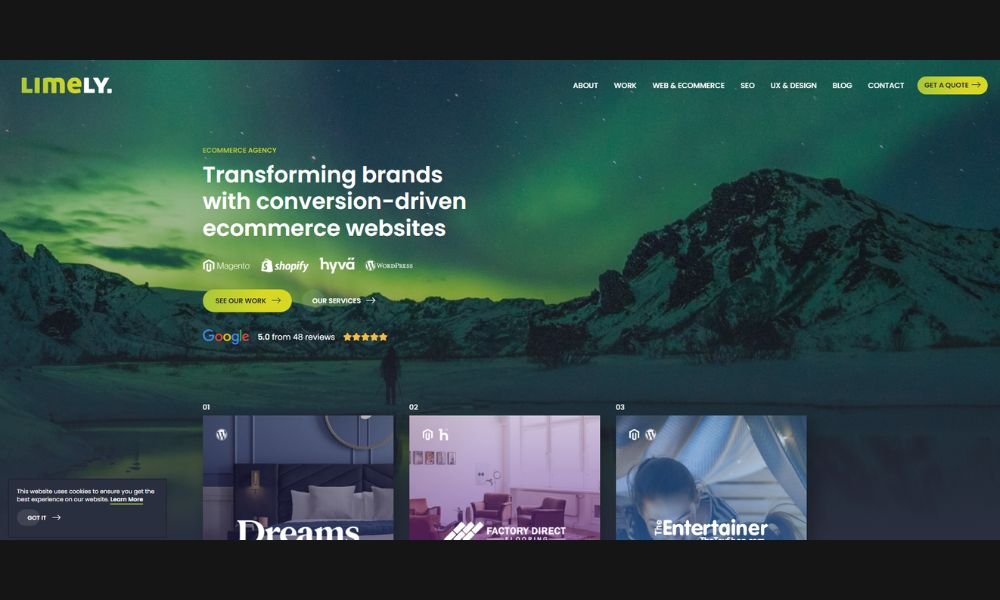
Limely doesn’t just build websites—they build them with backbone. From the get-go, their site feels like a handshake: confident, no-nonsense, and well put together. Big type, bold statements, and sharp visuals let you know this agency takes both creativity and conversion seriously.
There’s a smart balance here. Playful tone, yes—but it’s paired with structure and clarity. Case studies are polished without being over-polished. The work is front and center, and they’re not shy about results.
Navigation is snappy, content is clear, and you won’t find yourself buried under jargon or fluff. Whether they’re talking eCommerce or custom development, the language stays human—which is a win in a sea of “solutions” and “synergies.”
The site reflects a team that knows who it’s for: brands that want substance with style. It doesn’t overpromise. It shows what’s possible—and then shows that they’ve actually done it.
In short: Limely looks like a team you’d want to work with. And their site makes that decision feel easy.
Conclusion
Every time I come across a site that’s bold, thoughtful, or just oddly satisfying, I add it to my mental mood board. This list is a snapshot of those moments. Not trends for the sake of looking trendy—but websites that make their point clearly and creatively.
If even one of these examples gave you a new direction, a layout idea, or just the push to try something slightly different in your next project—then it’s done its job.
Because good design doesn’t start with pixels. It starts with a spark. And sometimes, that spark comes from scrolling someone else’s homepage.
Now it’s your move.

