When I’m stuck staring at a blank canvas—or worse, a blank screen—I know it’s time to seek fresh inspiration. As a graphic designer, the right website can do more than just look good. It can spark ideas, shift creative direction, or just remind me why I got into this field in the first place.
In 2025, designers (myself included) are looking for more than flashy visuals. We want substance, clarity, and maybe a little wow-factor without the drama. That’s exactly what this roundup offers.
Here’s what you’ll discover:
- Handpicked design websites that actually make you want to create
- Clean layouts with thoughtful visuals—not just trends in disguise
- Portfolios that balance personal flair with smart structure
- Examples that mix function and beauty, without trying too hard
- A few favorites with bold type, brave color, and zero fluff
Whether you’re building your own site or just browsing for ideas, these picks are worth the scroll.
1. Dribbble
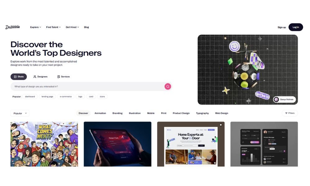
Dribbble isn’t your average portfolio site. It’s where designers go to be seen, not just stored. From pixel-perfect UI mockups to hand-drawn logos that somehow look casual and brilliant, this platform feels alive. The homepage reads like a digital gallery—except you don’t have to pretend to “get” everything.
Unlike some networks that bury talent behind filters and clunky tags, Dribbble keeps things simple. Projects take center stage. You scroll, you click, you get inspired (or slightly jealous). That’s part of the charm.
Profiles offer more than just a feed of shots. Designers add their tools, style preferences, and sometimes even a little personality. Want to know who made that sleek app interface? Click. Want to hire them? You probably can.
Whether you’re here to browse or to build a following, Dribbble works because it doesn’t try too hard. It just gives creatives space—and lets the work speak first.
And sometimes, that’s all you need.
2. Behance

Behance: Big Ideas, Fully Rendered
Behance is where creativity goes long-form. It’s not just a place for pretty previews—it’s for telling the whole story behind the work. Think mood boards, progress shots, final pieces, and everything in between. If Dribbble is the teaser trailer, Behance is the full feature.
What makes it stand out? Depth. Designers, illustrators, and makers of all kinds get space to explain their process. You don’t just see what was made—you see how, and often, why. It’s the portfolio version of showing your homework, but in a good way.
The interface stays clean, so projects do the talking. From branding concepts to motion graphics, there’s plenty to explore—and plenty of inspiration to accidentally spend an hour scrolling through.
Profiles are well-organized, with real room to breathe. You can follow creatives, comment on work, or quietly admire from afar. No pressure.
Whether you’re here to share, hire, or get lost in ideas that are far cooler than your to-do list, Behance welcomes you with open pixels.
3. Awwwards
Awwwards is like the Oscars for websites—minus the awkward speeches. It’s where designers, developers, and digital artists submit their best work to be seen, scored, and (if they’re lucky) celebrated. And honestly? It’s beautiful to look at, even if you’re just window shopping.
Every site featured here feels like it was built on another level—clean, bold, and often a little daring. Visitors can browse by categories like animation, typography, or even color palette. The result? Endless inspiration, organized without being overwhelming.
The scoring system isn’t just for bragging rights. It helps you see what makes a site stand out—design, usability, creativity, and content all play a role. Plus, getting a nod from Awwwards? That’s a legit badge of honor in the design world.
Each project includes team credits, tools used, and sometimes even notes from the creators themselves. It’s not just eye candy—it’s insight.
If you’ve ever wanted to see what’s possible with a browser and a lot of vision, this is the place.
4. Abduzeedo
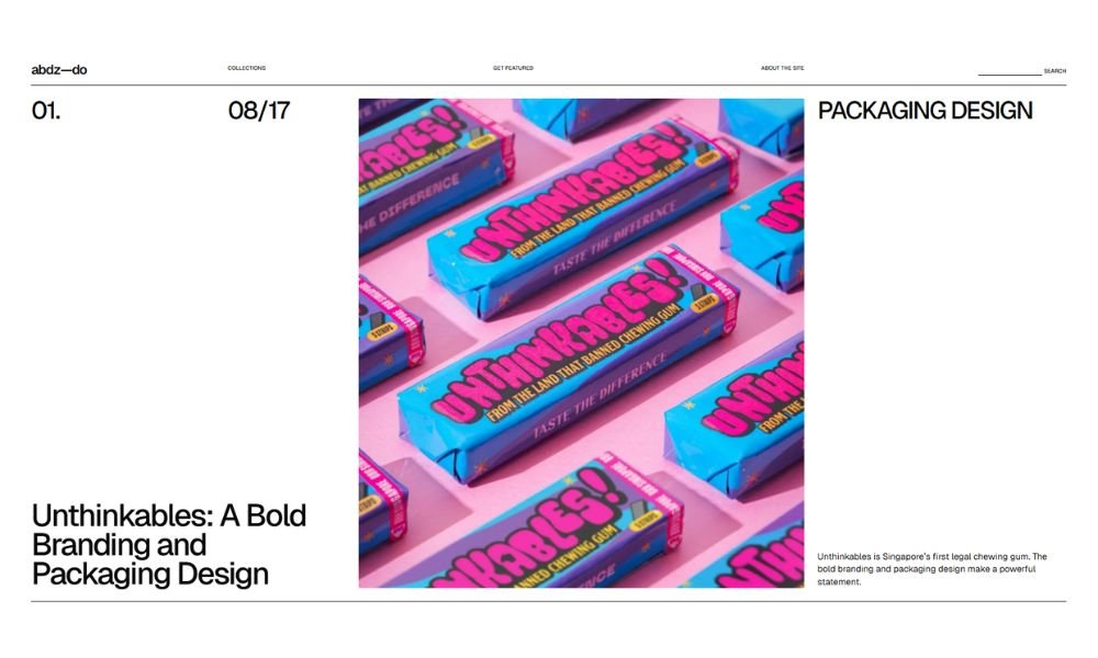
Abduzeedo (yes, it’s fun to say) is where creativity gets a daily workout. Part blog, part showcase, part visual rabbit hole—it’s been fueling designers with inspiration since back when gradients were still edgy.
The site covers a bit of everything: branding, 3D, UX, typography, photography. One scroll and you’re likely to stumble onto a moody poster design, a futuristic UI concept, or a logo so clever it makes you reconsider your own.
What sets Abduzeedo apart is its tone. It doesn’t preach. It shares. Whether it’s highlighting personal passion projects or commercial work, the vibe stays accessible and upbeat—like a talented friend showing you cool stuff they found.
Each post offers quick context: who made it, how it was done, and sometimes why it stands out. No fluff. No filler. Just visuals and insights that spark ideas.
For creatives needing a daily nudge—or a reason to procrastinate productively—Abduzeedo is a solid bet. Just don’t blame them when your five-minute break turns into an hour of “just one more scroll.”
5. Designinspiration
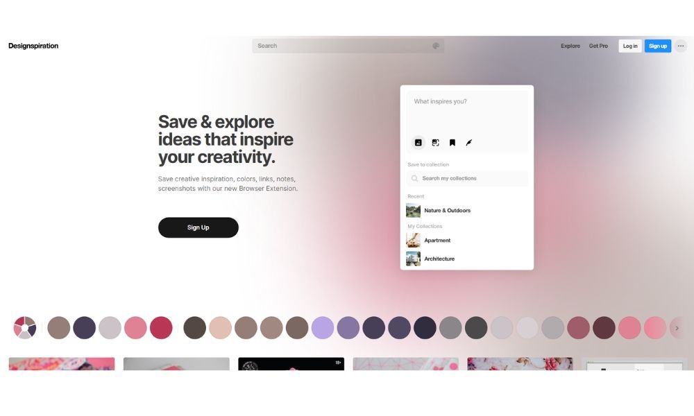
Designspiration isn’t loud. It doesn’t scream “look at me.” It just quietly delivers really, really good design. From typography and architecture to color palettes and posters, this platform feels like the Internet’s most stylish filing cabinet.
The layout is intentionally minimal—no distractions, no fluff. Just a crisp grid of visuals that makes scrolling feel more like curating than browsing. You’re not just looking at images; you’re building ideas without realizing it.
Search is where things get interesting. Type in a keyword—or better yet, explore by color—and you’re off. The site pulls in work from all over the creative spectrum. No lengthy write-ups or backstories here. It’s visual-first, and proudly so.
Designers, artists, and even non-creatives use it as a go-to for brainstorming, referencing, or just recharging the creative brain. It’s basically Pinterest with better taste and fewer cupcake recipes.
If you ever need a spark, a vibe, or a gentle reminder that good design still exists out there, Designspiration delivers—quietly, confidently, and one perfect image at a time.
6. Creative Boom
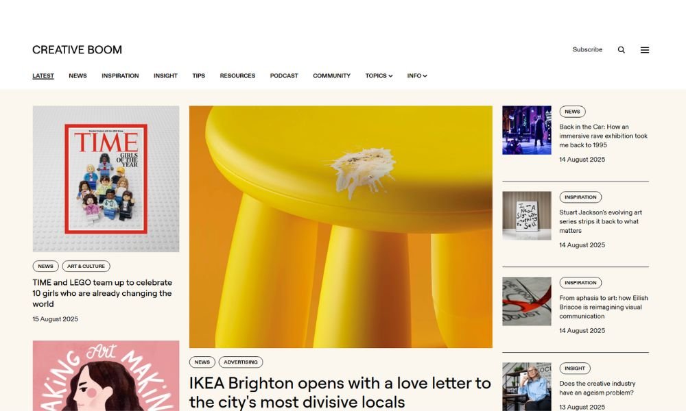
Creative Boom is part magazine, part inspiration feed, part creative pep talk. It’s one of the rare places where designers, illustrators, photographers—and even people who don’t own a single sketchbook—can find stories that stick.
Instead of just showing off shiny portfolios, it dives deeper. Interviews with artists, career tips, studio visits, and honest advice make it feel less like a highlight reel and more like a creative journal you didn’t know you needed. The tone? Friendly but informed—like chatting with your smartest design friend who also happens to know what’s trending.
You’ll find more than visuals here. The writing actually matters. Whether it’s about dealing with burnout or pricing your work without cringing, Creative Boom gets real without getting heavy.
The homepage blends art and insight effortlessly. And the content mix—both global and grassroots—means you’ll always discover someone or something new.
In a space crowded with fast likes and faster scrolls, Creative Boom reminds you that creativity is more than a grid. It’s a process. And yeah, sometimes a mess—but one worth reading about.
7. One Page Love
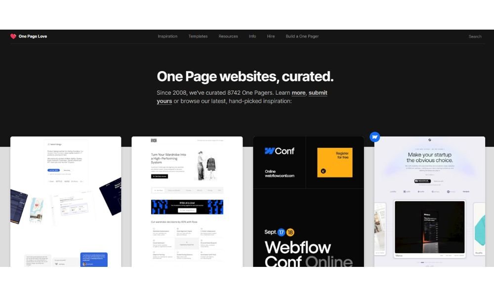
One Page Love is the kind of site that makes you rethink that 15-page sitemap. Focused entirely on—you guessed it—single-page websites, it celebrates designs that say everything without making you click a dozen times to find it.
The homepage delivers a steady stream of beautifully crafted one-pagers, from bold personal portfolios to slick product promos. It’s a goldmine for designers looking for layout ideas, creative transitions, or just a reminder that simplicity still sells.
What makes it work? Curation. Each featured site comes with a quick summary, clean preview, and no marketing fluff. You get design, function, and inspiration—all in one scroll.
There’s also a blog, resources, and even templates if you’re ready to stop browsing and start building. Whether you’re deep into web design or just appreciate smart UI, One Page Love hits the mark without wasting your time.
It’s minimalism with purpose. And sometimes, that’s all you really need.
8. Joaoverissimo
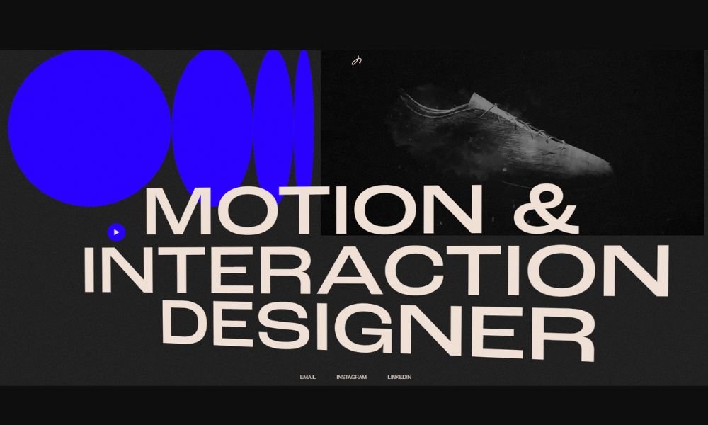
João Veríssimo’s portfolio doesn’t just show what he does—it feels like it. From the first scroll, you get movement, clarity, and a bit of attitude (the good kind). It’s sleek without being sterile, bold without yelling. Basically, it’s what you wish most motion design portfolios looked like.
He lets the work speak first. Projects are neatly presented, with just enough context to make you curious. No over-explaining, no fluff—just tight visuals, smooth transitions, and a clear sense of design direction.
The site is a one-pager, but don’t mistake that for minimal. Every section flows into the next with care. Even the cursor feels considered. João knows the value of rhythm—visually and interactively.
There’s also something refreshingly honest about it. No overdone case studies or trendy buzzwords. Just solid creative, delivered with confidence.
Whether you’re a fellow designer or someone scouting talent, this portfolio makes one thing clear: João gets it. And he makes sure you do too—without saying a word too many.
9. Yeshidesigns
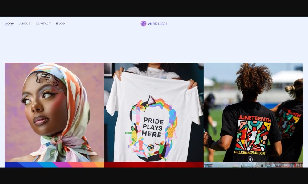
Yeshi Designs doesn’t waste your time—and that’s a compliment. Their “Work” page dives right in, showcasing brand identities, packaging, and design systems that are equal parts sharp and soulful. No drawn-out intros, just bold visuals backed by clean thinking.
Each project feels intentional. Whether it’s a playful color palette or a logo that balances elegance with edge, the design choices speak louder than paragraphs ever could. And while the layout stays minimal, the work definitely doesn’t. You get range, personality, and a clear sense of what makes each piece tick.
It’s not just pretty packaging, either. There’s real design thinking under the hood—strategic, smart, and never overdone. Yeshi’s style? Confidently modern, with just enough quirk to make it memorable.
Hover, scroll, click—every interaction feels smooth and well-paced. Even the tiniest details (like that satisfying image rollover) remind you: this team knows their craft.
If you’re into design that looks good and knows why it looks good, Yeshi’s work hits the mark. Quietly powerful, visually rich, and refreshingly focused.
10. Nishaksethi
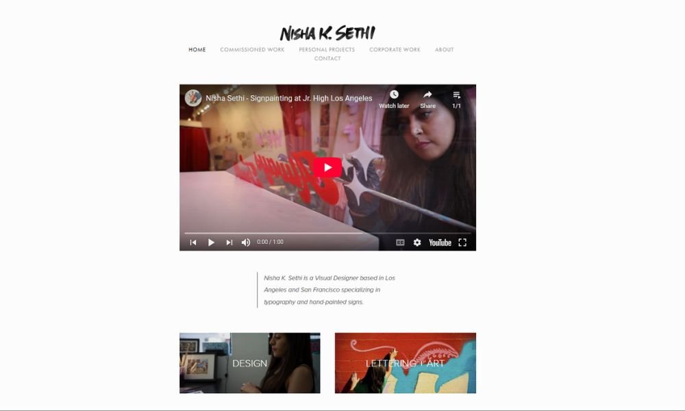
Nisha K. Sethi’s work hits you fast—in the best way. Bold lettering, unapologetic messages, and hand-drawn charm come together in a portfolio that’s as expressive as it is intentional. Every piece feels personal, yet powerfully public.
The site itself keeps it simple. No extra clicks, no filler. You scroll, and the work speaks—visually loud, but always with purpose. Whether it’s a mural, poster, or protest sign, there’s a clear thread: voice, identity, and fearless creativity.
Her lettering style is raw in the right places, polished where it needs to be. You can tell it’s hand-crafted, but never rushed. There’s a pulse to it—a sense that the work was meant to be seen and felt.
Beyond the visuals, there’s a mission. Nisha blends activism and design without turning it into a slogan. It’s not performative—it’s lived, and it shows.
If you’re looking for design that doesn’t just decorate, but actually says something, this portfolio is a must-see. It doesn’t whisper. It stands up and speaks out.
11. Davidmilan
David Milan doesn’t just design letters—he gives them attitude. His portfolio bursts with hand-drawn type that’s loud, expressive, and anything but background noise. Each piece feels like it was made to be worn, shouted, or painted across a wall.
The homepage gets right to it: bold visuals, no distractions. From brush lettering to digital experiments, everything is loaded with energy. Even static images feel like they’re about to leap off the screen.
You won’t find stiff layouts or over-explained case studies here. The work is the focus, and it does the heavy lifting. The vibe? Urban edge meets precision craft—where style meets skill, and neither shows off more than it needs to.
It’s clear David knows his tools, but more importantly, he knows his voice. There’s consistency without repetition, flair without fuss. Whether it’s a poster, a collab, or a personal project, the identity stays sharp.
Looking for type with personality, motion, and punch? David’s portfolio doesn’t whisper. It writes in all caps—and somehow still keeps it cool.
12. Roosbeeldt
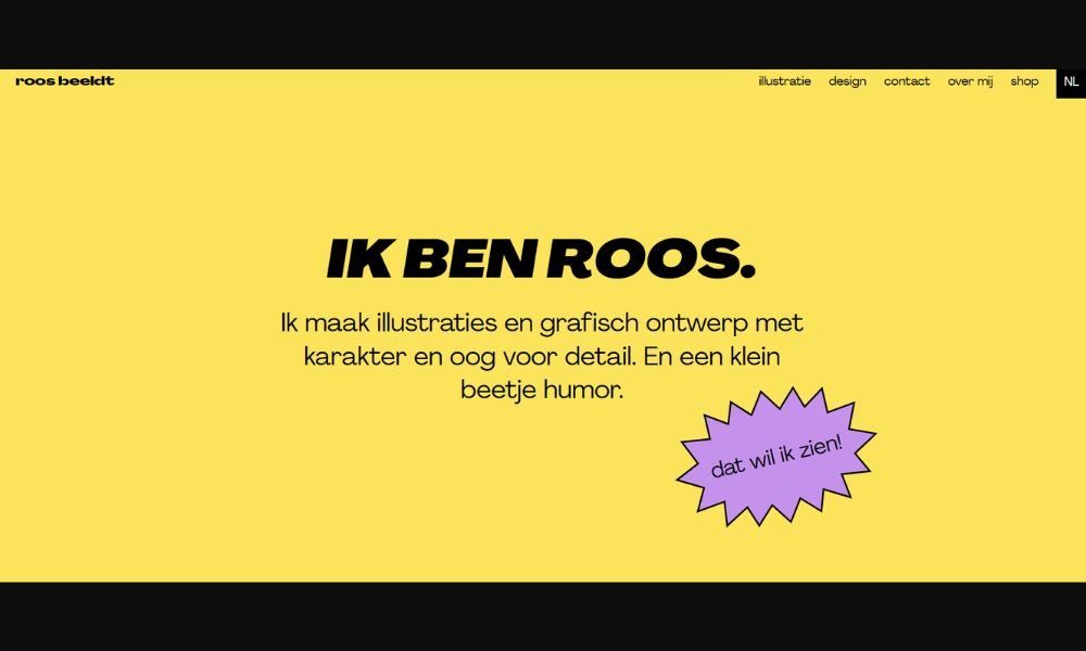
Roos Beeldt’s portfolio doesn’t shout—and that’s exactly the point. With a clean, quiet aesthetic and carefully spaced layouts, her work invites you in gently. It’s thoughtful, editorial, and deeply rooted in clarity. Nothing here is rushed, and nothing feels thrown in just to fill space.
From typography to art direction, each project feels like a conversation between content and form. Roos designs with restraint, but not minimalism for its own sake—every visual choice is intentional. The whitespace? Working just as hard as the headlines.
Project pages are well-structured, giving you just enough insight into her process without overloading. And the work itself? Calm, confident, and beautifully composed—like it knows exactly what it’s doing, without needing to explain itself too loudly.
The site flows with the same kind of elegance found in her design. Browsing feels less like scrolling and more like flipping through a curated publication—precise, soft, and visually satisfying.
Roos Beeldt doesn’t design noise. She designs presence. And sometimes, that’s what cuts through everything else.
13. Sierraplese
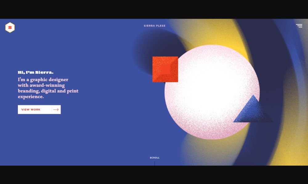
Sierra Plese’s portfolio doesn’t try to impress you with noise—it earns your attention with calm precision. From the very first scroll, you’re met with refined layouts, purposeful type, and visuals that breathe. It’s modern, but not trendy. Detailed, but never overdone.
Her work spans branding, art direction, and editorial design, and it all shares a common thread: clarity. Each project is introduced with just the right amount of context—enough to pull you in, never too much to weigh you down. The balance between structure and softness feels intentional.
The site itself mirrors her design values. Clean navigation, subtle motion, and just a touch of personality in the copy make for an experience that’s as thoughtful as the work it showcases.
Sierra’s style isn’t about shouting for attention—it’s about earning trust through smart, beautiful design. You don’t scroll away wondering what she does. You scroll away knowing she does it well.
If you appreciate design that’s as strategic as it is graceful, you’re in the right place.
14. Craig.black
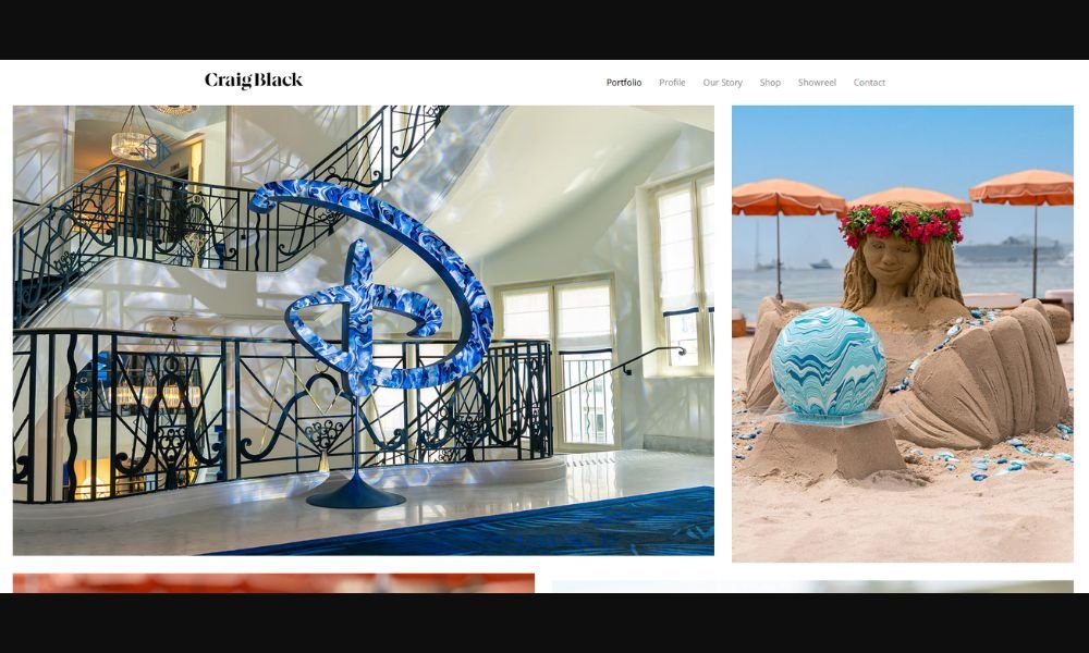
Craig Black doesn’t do quiet design. His work is bold, expressive, and instantly recognizable. From his signature acrylic fusion pieces to kinetic typography, everything feels like it was made to stop you mid-scroll—and it does.
The site wastes no time. Right from the homepage, you’re immersed in color, movement, and craft. The projects are documented like artwork, not just assets—each one captured with the kind of detail that shows just how hands-on Craig really is.
What makes it click? It’s not just style. It’s consistency with purpose. Craig’s visual language is loud, yes—but it’s also incredibly focused. He knows exactly who he is as an artist, and that confidence shows in every brushstroke, every curve, every concept.
Even the site structure supports the energy. Clean layout, large imagery, minimal text—because honestly, the work speaks for itself. And it’s got a lot to say.
If you’re into design that merges fine art with branding power—and isn’t afraid to take up space—Craig Black’s portfolio is a masterclass in doing both.
15. Ariesmoross
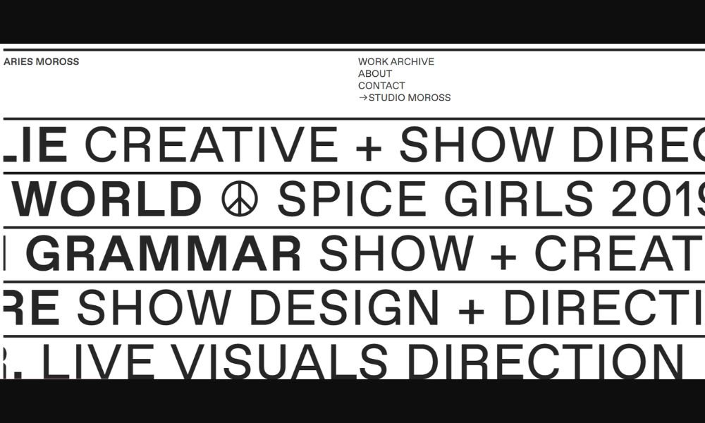
Aries Moross doesn’t just create visuals—they command attention. Their portfolio bursts with lively typography, vibrant murals, album art, and campaign visuals that instantly grab you. Think energetic hand‑drawn lettering, bold color palettes, and imagery that feels as alive as the music behind it.
From early days illustrating indie music flyers in London’s club scene to launching their vinyl‑only label and founding Studio Moross in 2012, Aries has built a career on adaptability and artistic spirit. Today, their work spans creative direction for pop icons like Kylie Minogue, H.E.R., Spice Girls, Disclosure, and London Grammar—on everything from album campaigns to live show visuals.
What stands out? A fearless use of color and confident execution. The portfolio layout is clean, letting the work have the final say—no excessive text, just visually striking, attention‑grabbing design . That rainbow energy isn’t decoration—it’s identity.
Whether you’re a brand, artist, or agency in search of design that’s bold, playful, and purpose‑driven, Aries Moross delivers with unmistakable flair.
Let me know if you’d like a version tailored for festival line-ups, design students, or corporate branding teams!
16. Vanschneider
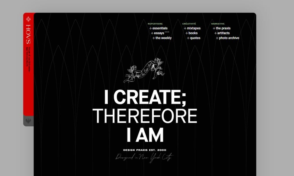
Andreas van Schneider’s portfolio site—House of van Schneider—balances personal flair with design superpowers. The homepage is a gallery of projects ranging from sleek BMW customizations to NASA mission branding. Each piece lands with purpose and polish.
There’s no fluff here. Rather than generic case studies, you get clear visuals backed by precise context: what the project is, who it’s for, and why it matters. Whether it’s the Europa Clipper logo or his own mymind app, each entry shows both aesthetic finesse and thoughtful strategy.
The site’s structure echoes his mindset: no trendy gimmicks, just clean navigation and subtle motion. It feels timeless—like something you’ll still be impressed by in ten years.
Andreas doesn’t just show work—he opens doors into his world. Essays, mixtapes, favorite items, quotes, and photo archives all live under one roof. It’s part portfolio, part personal library. And yes, it really is a house—a home for creativity that’s both polished and playful.
Let me know if you’d like a version geared toward design agencies, potential partners, or visual storytellers!
17. Creative Boom
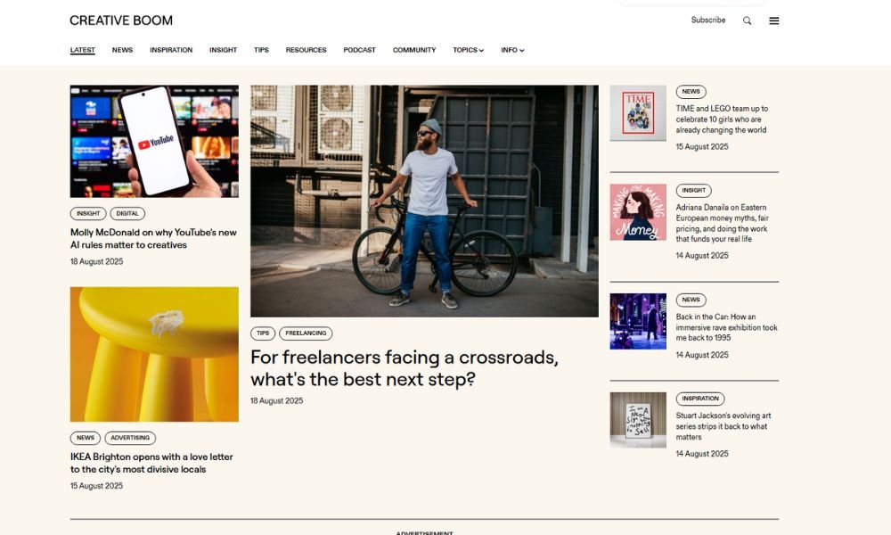
Creative Boom isn’t just a site—it’s a creative home. Since 2009, this UK-based platform has been delivering inspiration, industry news, and practical advice to a global audience of designers, artists, photographers, and more.
It covers everything from animation and branding to careers and culture—without ever feeling overwhelming.
Its tone is friendly and supportive, not preachy. You’ll find interviews, trend pieces, thoughtful essays, and freelance tips—all written with honesty and clarity. It’s the kind of place where you can read about mastering type, surviving a slowdown, or finding confidence in your voice .
The site’s layout reflects its mission: clean, easy to navigate, and focused on content that matters. The Studio, their private community, adds another layer—real conversations, meaningful connections, and shared creative energy.
In a digital world full of noise, Creative Boom reminds you why you became a creator in the first place. It’s genuine, grounded, and full of ideas worth thinking about.
18. Abduzeedo
Abduzeedo—also called ABDZ—started in 2006 when founder Fábio Sasso began using it as a creative journal after being “abducted” by design. What began as a personal blog has since grown into a go‑to hub for design, photography, UX, and more. Today, it still shuns noise in favor of substance: daily inspiration, practical tutorials, and smart design commentary.
The site layout is clean and distraction‑free. A crisp grid showcases the latest color-themed branding, case studies, and motion design with simple titles and clear visuals—no fluff, just design fuel .
Abduzeedo’s strength lies in its authenticity. Articles often highlight both craft and context—from editorial identity to UI/UX tools. Fábio’s voice remains upfront: he does the redesigns himself roughly every 18 months, keeping things fresh and personal.
Free to browse, premium subscribers can enjoy an ad‑free, faster experience plus priority exposure. Whether you’re a freelance designer, student, or just design-curious, Abduzeedo delivers inspiration and insight in doses that feel meaningful rather than overwhelming.
Conclusion
I don’t believe in inspiration that sits pretty and goes nowhere. The sites I’ve highlighted here all offer something practical—whether it’s structure, mood, or simply a reminder that great design doesn’t need to shout.
If one layout made you pause, or one color combo sparked an idea, then this list did its job.
Keep collecting what clicks with you. File it, sketch it, steal it (ethically). That’s how I stay creatively sharp—and maybe, how you will too.
And hey, if your portfolio isn’t sending the message you want? These sites might just give you the nudge to fix that.


