If you’re anything like me, your browser bookmarks are packed with architecture websites—some you admire, others you quietly compete with. Creating a portfolio that not only shows your work but says something about your style isn’t just a goal—it’s the starting point.
Over time, I’ve collected architecture sites that impressed me not just with pretty visuals but with sharp functionality, meaningful layout choices, and designs that feel like the architect behind them. Clean, focused, and not trying too hard.
In this guide, I’ll walk you through the 20 architecture websites that inspired me most—each one chosen because it does one (or more) things right.
Here’s what you’ll discover:
- Smart homepage layouts that get straight to the point
- Effective use of space, type, and storytelling
- Subtle design choices that speak volumes
- How to structure a site that works for you, not just for show
- And yes, a few examples that made me mutter, “Why didn’t I think of that?”
Let’s get into it—just enough detail to inspire, not so much you scroll forever.
1. Patchwork Architecture

New Zealand-based Patchwork Architecture doesn’t just design buildings—it tells stories in concrete, timber, and light. The moment you land on their website, you’re met with bold imagery and personality. It’s not flashy; it’s thoughtful.
Their portfolio skips the typical gloss. Instead, it offers honest glimpses into projects mid-progress—proof that the process matters just as much as the outcome. You won’t just find polished photos; you’ll see angles, textures, and decisions in action.
The About page is refreshingly direct. Instead of corporate jargon, you get to meet the minds behind the work. They speak plainly about their philosophy and make space for creativity to shine through every project.
Patchwork’s site isn’t overloaded. It’s confident in its simplicity, yet full of character. You can almost hear the pencil scratching across tracing paper.
This isn’t architecture for the sake of appearances. It’s functional, personal, and quietly clever. Like a perfectly placed window on a foggy morning—it just makes sense.
2. Measured
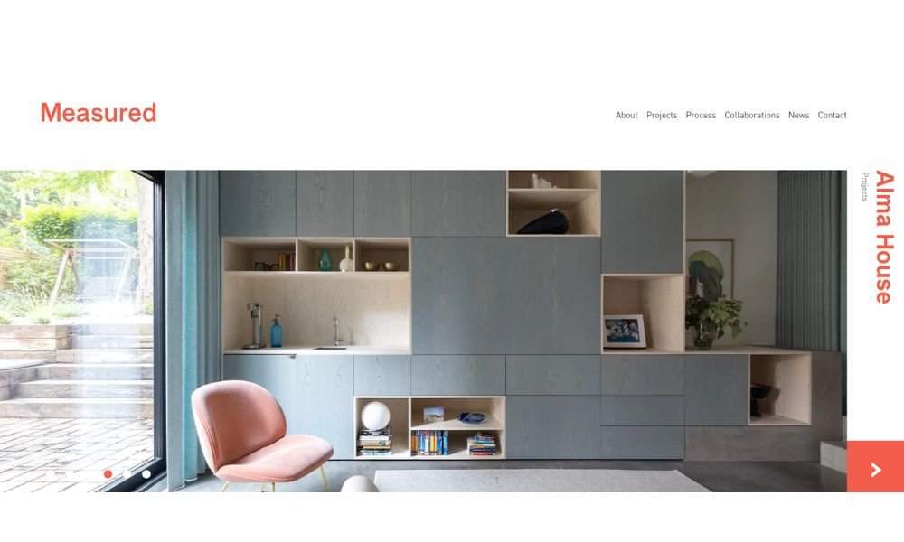
Measured Architecture isn’t trying to impress with noise—it impresses with restraint. Based in Vancouver, this studio builds with intention. Every line, material, and space has a reason for being there.
Their website reflects that clarity. It’s clean but never cold. Navigation is simple. Projects are presented without excess, letting the work speak for itself. And it does—quietly, but with impact.
What stands out is how they treat architecture less like a show and more like a dialogue. Whether it’s a remote cabin or an urban home, each project feels like a thoughtful conversation between space and its surroundings.
The About page avoids the usual puff. It’s short, but it hits the mark. You get a sense of who they are without reading a novel. They value collaboration, precision, and—most importantly—people.
This isn’t architecture that chases trends. It’s measured. Honest. Designed to live in, not just look at.
And yes, their projects may be minimal—but the craftsmanship? That speaks volumes.
3. ABCD Architect
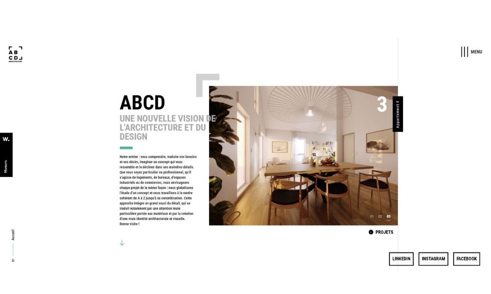
ABCD Architecture, based in Paris, takes modern design and adds a distinctly human rhythm to it. Their site feels more like a curated experience than a typical architecture portfolio—and that’s the point.
You won’t get lost in flashy animations or endless scrolls. Instead, you’ll find work that’s smart, elegant, and grounded in purpose. Each project balances precision with personality—never overdone, never underthought.
The firm’s philosophy? Architecture that connects. You can sense it in the way they frame spaces and even in how they document them. Projects come with context, not just captions. It’s design that listens before it speaks.
Their About section is clean and concise. No overblown language—just a clear sense of vision and values. They focus on collaboration, sustainability, and real-world impact. No filler. Just intent.
ABCD’s work feels both local and international. It could stand tall in any city, but still fits seamlessly into its neighborhood. Nothing screams for attention—yet everything earns a second look.
Measured, intuitive, and quietly confident—ABCD builds with care, not just style.
4. Humbert & Poyet
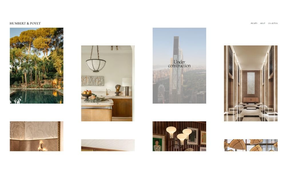
Humbert & Poyet designs spaces that feel like they’ve always belonged—elegant without trying too hard. Based in Monaco and Paris, this design duo balances luxury with restraint. Their projects? Polished, yes—but never overdone.
The website mirrors their aesthetic. Smooth, deliberate, and straight to the point. No distractions. Just refined visuals and clean presentation. You’re guided through their portfolio as if walking through one of their interiors—calm, intentional, and quietly captivating.
Each project tells a slightly different story, but the language stays consistent: symmetry, rich textures, and attention to how people actually live. It’s design that’s made to be felt, not just seen.
The focus here isn’t just on form. It’s on emotion. Whether it’s a boutique hotel or a private residence, their spaces carry mood and memory. Nothing feels rushed. Every detail earns its place.
And while the style leans luxe, there’s restraint. Think timeless rather than trendy. Precision without pretense.
This isn’t design shouting for attention. It’s whispering in the right ear—with perfect lighting.
5. Ark-Shelter
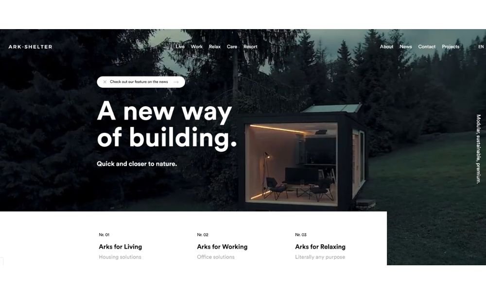
Ark Shelter brings a fresh take on tiny homes—clever, cozy, and built with purpose. Their website reflects that simplicity. You won’t find gimmicks or flash. Instead, you’ll see clean lines, honest materials, and a clear focus on living well in small spaces.
The portfolio is smartly curated. Each tiny home stands alone, yet fits a bigger story—how minimal space and maximum comfort can coexist. The photos show finished cabins, but also peek inside with detail shots that speak to craftsmanship and thoughtful design.
Their About section gets right to the point. They’re passionate about sustainability and efficient living. You don’t need a paragraph to feel their values. It’s there, plain and simple.
Each project is presented as a living space—designed to be used, not just admired. And yes, there’s a calm charm to it all. No over-the-top marketing. Just beautiful homes that feel personal and inviting.
Ark Shelter’s work proves that small-scale design can be big on character. It’s tiny-home living done with intention, care, and quiet confidence.
6. Amanda Martocchio
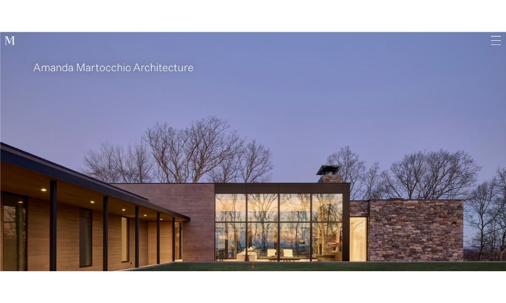
Amanda Martocchio Architecture brings a fresh perspective to residential design—elegant, thoughtful, and lived-in. Their website mirrors this clarity. No clutter. No unnecessary flair. Just clean, compelling visuals that let the work speak.
Each project is showcased with both full vistas and close-ups—highlighting how light plays on fine finishes and where details matter most. You see more than just spaces. You glimpse the lifestyle she’s designing for.
The About page is crisp and sincere. Amanda’s background and design philosophy are shared in just a few sentences, but they land with warmth and purpose. You immediately sense her emphasis on harmony between home and inhabitant.
Projects range from cozy cottage updates to contemporary new builds, yet a consistent tone runs through—balance, comfort, and sense of place. The imagery doesn’t overwhelm; it draws you in quietly.
What stands out is authenticity. These aren’t staged showhouses. They come across as real homes for real people. After a moment, you find yourself picturing morning light streaming over your kitchen counter.
Intentional design, personable approach, and quiet sophistication—Amanda’s work feels like an invitation to live well.
7. Archi Site Mobius
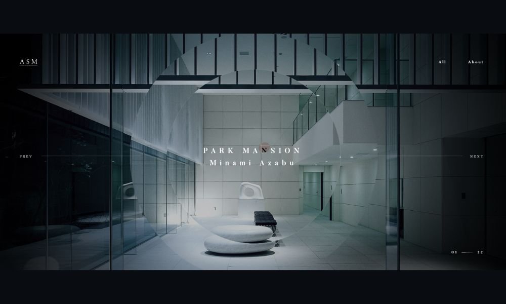
ARCHI SITE MOBIUS, based in Tokyo, approaches architecture like a composer does music—minimal, refined, and emotionally tuned. Their work doesn’t overwhelm. It invites.
From city residences to serene retreats, each project balances geometry with grace. You’ll notice a steady rhythm: clean lines, soft light, and a deep respect for space. Nothing feels rushed. Nothing feels loud.
The website reflects this same calm. Smooth transitions, generous white space, and just the right amount of detail. Browsing feels less like flipping through a portfolio, more like walking through their work—quiet, focused, intentional.
The firm’s philosophy is subtle but clear: create architecture that resonates with its surroundings and its users. You feel that harmony in every corner, every shadow, every pane of glass.
Their designs aren’t about spectacle. They’re about stillness. A kind of beauty that lingers after you’ve left the room.
ARCHI SITE MOBIUS doesn’t just build structures. They shape experiences—thoughtfully, and with lasting impact.
8. Maman-Corp
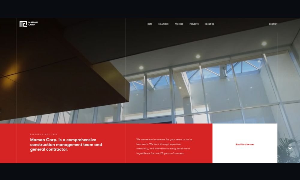
MAMAN Corp doesn’t just build spaces—they shape moods. Based in Japan, their work blends raw materials with refined finishes, creating interiors that feel grounded, yet quietly elevated.
Their website carries the same energy. It’s stripped-down, direct, and well-composed. There’s no fluff, just intentional presentation. Every photo is framed to tell a story—concrete meeting wood, soft light meeting sharp lines.
What stands out most is the firm’s ability to balance contrast. Industrial textures meet warm tones. Open space meets precision. Their restaurant, office, and retail interiors aren’t just beautiful—they’re lived-in, functional, and honest.
The project pages avoid overload. Just the essentials: imagery, subtle layout, and enough detail to invite a closer look. You don’t scroll endlessly—you stop and take it in.
MAMAN’s approach feels instinctive. Less about decoration, more about atmosphere. Their work isn’t trying to impress—it’s trying to feel right. And it does.
There’s a quiet confidence behind every wall and surface. Architecture, here, is about presence—not just appearance.
9. Zikzak
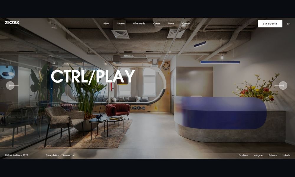
Since 2014, ZIKZAK Architects has been shaping office and commercial interiors worldwide. Their work shows simple elegance—a balance of precision and personality. No flash. Just thoughtful creativity.
The website presents projects with clarity. You’ll see office layouts, retail spaces, and public interiors, all curated to make an impression. Every image tells a story of how space supports people and purpose.
Look at the QUATTRO office: 55 meeting rooms, adjustable zones, and acoustic solutions that cut noise by 85%. It’s efficient, yes, but also warm—natural tones and comfy lounges shape the day. Their mission is simple: design spaces that feel good and work well. The team blends materials, light, and layout to enhance productivity and connection.
ZIKZAK’s style? Minimal, functional, human. It’s a creative toolkit aimed at real life. These aren’t just showrooms—they’re places people live, work, and feel inspired. Visiting their portfolio feels like stepping into spaces built with care and intelligence.
10. Archi-Graphi
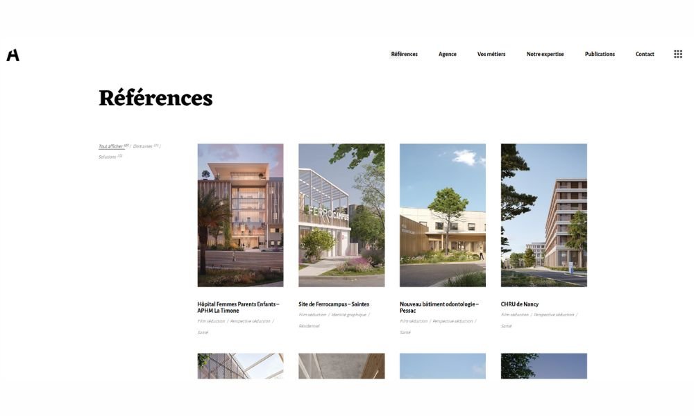
Archi Graphi doesn’t just visualize architecture—they craft clarity. Based in France, the studio specializes in high-end 3D imagery that feels more like art than rendering. Their work gives structure emotion and makes unbuilt spaces feel tangible.
The website is focused and well-paced. No distractions, no unnecessary fluff. Each project is laid out with intention—renderings that showcase light, material, and atmosphere with striking realism. Whether it’s a private residence or a commercial development, the storytelling is sharp.
What sets them apart is consistency. The visuals are clean, immersive, and technically precise—yet never sterile. Every detail feels considered, from reflections in a window to texture on a façade.
Their philosophy is simple: help architects and developers communicate vision with elegance and accuracy. It’s not about drama—it’s about trust. And the work speaks for itself.
Archi Graphi isn’t trying to oversell. Instead, they invite you to pause, look closely, and imagine the space before it exists. That’s the magic.
11. Pelizzari

Pelizzari Studio brings quiet elegance to spaces that hold history. Based in Brescia and Milan, the studio doesn’t just renovate—they reinterpret. From villas on Lake Como to restored convents, each project feels like a conversation between time and taste.
Their website reflects this philosophy—refined, minimal, and immersive. You’re not overwhelmed with information. Instead, you’re invited into their world one image at a time. Earthy textures, soft lighting, and layered materials tell stories without saying too much.
Pelizzari’s strength lies in balance. Old stone meets new steel. Vintage charm meets clean-lined function. Every space feels custom, but never forced. It’s design that listens first, then acts.
The portfolio avoids the obvious. No over-decoration. No trend-chasing. Just spaces that feel personal, polished, and rooted in their surroundings. You get the sense that beauty here is built to last.
Pelizzari Studio doesn’t design for the moment—they design for meaning. And in each project, you feel that intention.
12. Mafco House

MAFCO House builds spaces that feel handcrafted, not mass-produced. Based in Toronto, their approach to custom homes and interiors centers on natural materials, precision, and a deep respect for how people live.
The website reflects that mindset—clean layout, strong visuals, and just enough detail to draw you in. No noise, no over-explaining. Just polished craftsmanship on full display.
Their projects strike a rare balance. Wood, steel, and stone meet in compositions that feel grounded and personal. You’ll notice the care in a stair joint, the proportion of a window, the stillness of a perfectly lit kitchen.
MAFCO doesn’t chase trends. Their work is timeless, but not static—each home feels tailored without shouting for attention. It’s design that respects the landscape and the people who inhabit it.
You can tell they build with intention. Every photo captures something lived-in, even when brand new.
In a market full of noise, MAFCO House stands out by staying quiet—and letting their work speak.
13. Mareines Arquitetura
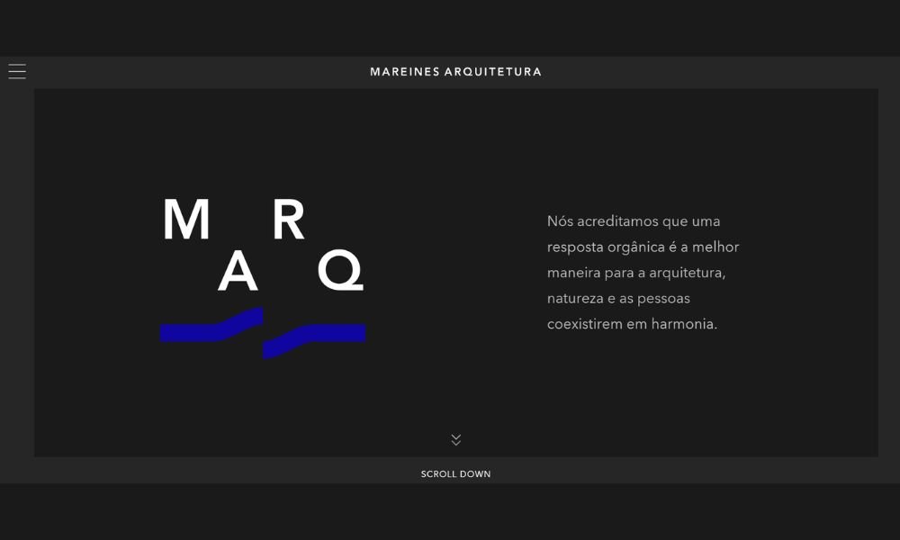
Mareines Arquitetura isn’t afraid of bold moves. Based in Brazil, the studio fuses organic forms with technical precision, creating spaces that feel alive—flowing, open, and deeply connected to nature.
Their website is striking without being showy. Projects unfold like a visual story: sweeping curves, raw textures, tropical light. From beachfront homes to cultural centers, each design invites you to move through space rather than just observe it.
What sets Mareines apart is their sense of rhythm. Rooflines echo landscapes. Materials respond to climate. There’s intention in every angle, but nothing feels rigid. The work is expressive, yet grounded.
The studio’s philosophy leans into sustainability and spatial experience. It’s not just about structure—it’s about how you feel moving through it. You sense air, light, and silence playing their part.
This is architecture that speaks to its place. It breathes with its environment. And while the designs are often sculptural, they’re never distant—they welcome you in.
Mareines Arquitetura blends art and function with effortless confidence. And the result? Spaces that linger long after you’ve left.
14. Canatal
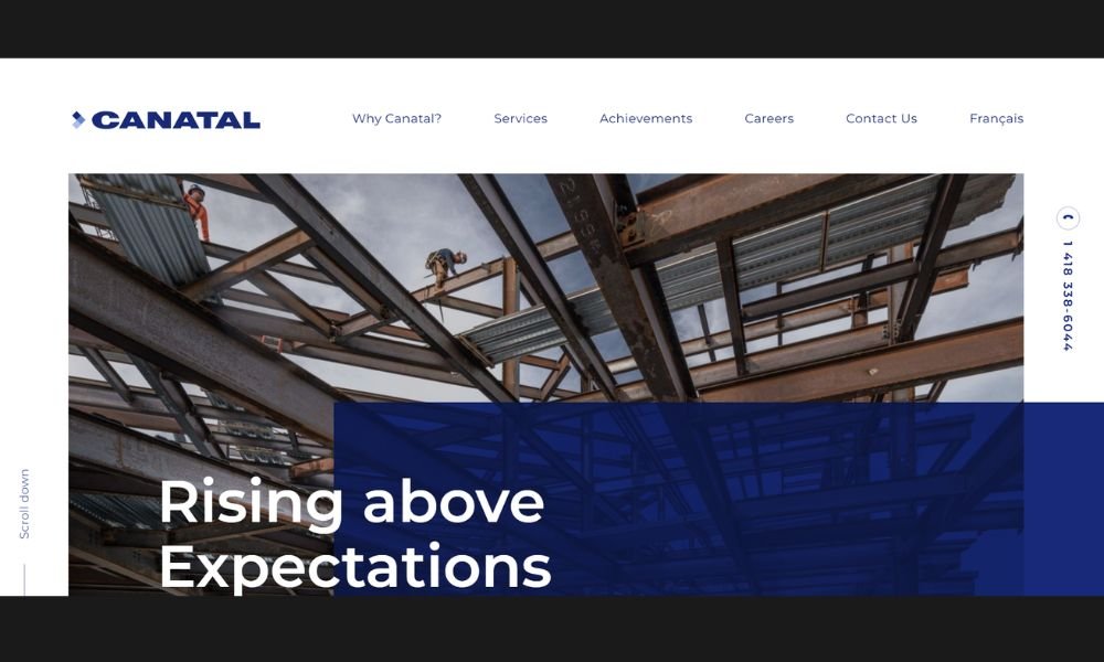
Canatal doesn’t just fabricate steel—they engineer confidence. Based in North America, the company has spent decades refining how structural steel is designed, built, and delivered for high-performance projects.
Their website reflects that mindset: clear, direct, and engineered for clarity. From commercial towers to complex institutional builds, each project highlights precision, scale, and reliability. You see the work—and the weight it carries.
What stands out is their control over the full process. Design-assist, fabrication, and delivery all stay in-house. That means tighter timelines, fewer surprises, and a standard of quality that doesn’t slip.
The tone is no-nonsense. There’s pride, but no puff. They show what they’ve built, how they do it, and why it works. The message is simple: trust the structure.
Whether supporting a skyline or a sprawling facility, Canatal’s steel solutions are as efficient as they are essential. It’s not about being flashy. It’s about holding everything together—literally.
15. Henning Larsen

Henning Larsen designs with light—and it shows. Based in Copenhagen, the studio has spent decades shaping spaces that feel open, human, and deeply connected to their surroundings.
Their website is calm and confident. Projects range from cultural landmarks to climate-conscious urban plans, all presented with crisp visuals and minimal distraction. You’re guided through their work as you would be through one of their buildings—thoughtfully, with purpose.
Each design is rooted in context. Whether it’s a timber-built office in Copenhagen or a concert hall in Iceland, the studio responds to both place and people. There’s no formula—just sensitivity to light, material, and movement.
Sustainability isn’t a label here. It’s built into the structure, the layout, the life of each project. Nothing feels forced. Everything breathes.
Henning Larsen doesn’t chase spectacle. They design for longevity—for communities, for experience, for change. Their architecture doesn’t need to shout. It just fits—and leaves space for everything else to matter.
16. Henry J Lyons
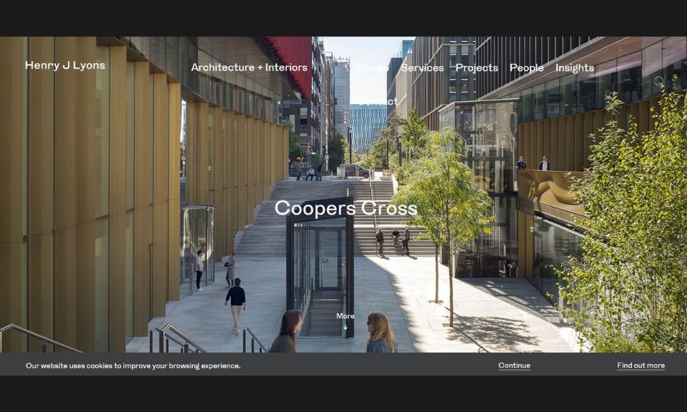
Henry J Lyons brings over a century of experience into every project—and it shows. Based in Ireland, the studio blends tradition with innovation to create architecture that feels grounded, forward-thinking, and quietly ambitious.
Their website is structured and straightforward. You’ll find civic buildings, workplaces, and cultural spaces—each designed with care, precision, and a deep understanding of how people move through space. Nothing flashy. Just work that speaks through detail and purpose.
Sustainability is more than a checklist here. It’s visible in the way buildings breathe, adapt, and serve the people who use them. From large-scale office hubs to public institutions, their designs are thoughtful and built to last.
What stands out is their consistency. Each space feels resolved—technically strong, visually calm, and rooted in function. There’s a deep respect for place, but also a willingness to push the conversation forward.
Henry J Lyons doesn’t just build architecture. They build environments that reflect who we are and how we live—quietly intelligent, distinctly human.
17. Maadi Group

Maadi Group delivers architecture rooted in innovation and regional insight. Based in Morocco, they design structures that speak to culture, climate, and future needs.
Their website is clear and intuitive. From residential complexes to mixed-use developments, each project is showcased with clean visuals and purposeful pacing. You don’t get lost in detail—you get drawn in.
What sets them apart is their contextual approach. Materials, forms, and layouts respond to local heritage and modern ambitions. Think terraced facades that echo traditional patterns, reimagined in contemporary lines.
Details matter here. Sunlight, airflow, communal space—they’re all woven into design from the outset. It feels deliberate, not decorative. Every element has intent.
Maadi Group blends practical know-how with thoughtful creativity. Their environments work well almost as soon as you enter them—they feel lived-in yet fresh.
This isn’t design for show. It’s design for living: resilient, familiar, and tuned to both people and place.
18. Mason Group
Mason Group is a St. Petersburg and Moscow–based collective that unites architectural design and construction under one savvy roof. Their site opens with a muted video overlay—instantly setting a high-end tone and showcasing real projects in motion.
Projects range from luxury residences to landmark commercial builds, each framed by clean lines and grand scale. Smooth parallax scrolling reveals professional images, engaging without showing off. It’s architecture that speaks through presence, not words.
The navigation is pared-down and purposeful: About, Projects, Contact. Less clutter, more clarity—you always know where to look. And yes, the contact button is easy to find. They make reaching out feel almost as well-built as their structures .
The About section is straightforward: elite design and build services, end-to-end, plus landscape. No filler. Just competence.
What makes theirs impressive is the unity between vision and execution. Mason Group doesn’t segment; they tie design intent tightly to delivery. It’s a full-service mindset presented with confidence and care.
This is architecture online that feels real—a polished showcase with muscle and soul.
19. Asher Slaunwhite + Partners
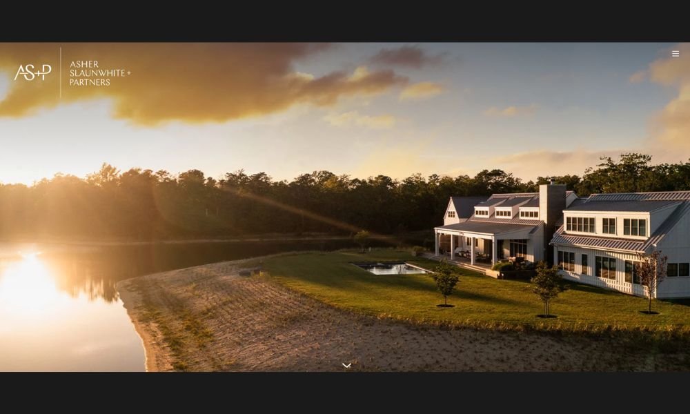
ASP Architects approaches each project with quiet precision and strong intent. Based in the Philippines, their work combines smart functionality with clean design, creating spaces that feel balanced, efficient, and deeply grounded.
The website is sleek and structured—just like their architecture. No clutter, no over-explaining. Each section moves with clarity, showing a range of residential, commercial, and institutional work that reflects both modern needs and contextual sensitivity.
What stands out is their attention to proportion and flow. From compact urban homes to expansive corporate campuses, every space is designed to work—visually, spatially, and practically.
Their portfolio isn’t about spectacle. It’s about discipline. Lines are clean, materials are honest, and there’s a calm confidence in how everything fits together.
ASP doesn’t just build structures—they solve for people, purpose, and place. Their designs are forward-thinking, but never disconnected from the everyday.
It’s thoughtful architecture made to last—and built to live in.
20. Conran & Partners
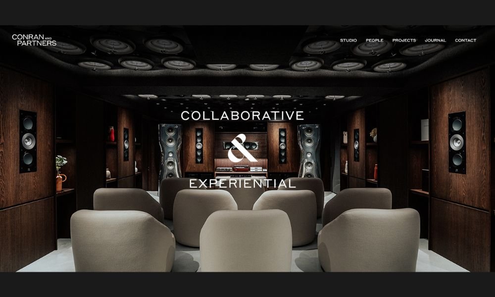
Conran and Partners design with purpose—and with legacy. Rooted in London and working globally, their studio blends architecture and interior design into spaces that are both intelligent and human.
The website is elegantly understated. Projects are showcased with clarity and care, spanning residential, hospitality, and urban design. Whether it’s a boutique hotel in Tokyo or a London riverside development, the common thread is thoughtfulness.
Their work speaks in quiet detail. You’ll see natural textures, clean silhouettes, and layouts that consider how people move, rest, and live. It’s not design for effect—it’s design that works.
What stands out is the seamless dialogue between architecture and interior. Nothing feels disconnected. Everything flows—from façade to fabric.
Their roots in British modernism are clear, but the result is far from nostalgic. Each project feels fresh, contextual, and unmistakably refined.
Conran and Partners don’t follow trends. They build environments that last—spaces that respond to culture, climate, and the people who occupy them.
Conclusion
The truth is, there’s no single formula for a great architecture website. But the best ones I’ve seen—and shared here—have a few things in common: they’re intentional, easy to navigate, and give the work space to breathe.
Whether you’re launching your first site or refreshing your fifth, I hope these examples gave you something real to work with. Not theory. Not design-speak. Just sharp ideas you can actually apply.
My advice? Keep your site simple. Let the work shine. Add personality where it counts. And if you’re ever unsure, take a break, come back, and ask yourself: Would I hire me based on this?
Chances are, if it feels right to you, it’ll feel right to the client too.


