I’ve always believed you don’t need a computer science degree or a weekend lost in HTML to start something meaningful online. With so many simple tools out there, launching a website today feels less like “Where do I even begin?” and more like “Which idea should I start with?”
This guide isn’t packed with jargon or tech-heavy advice. It’s just practical, doable website ideas—things you can build on your lunch break or in your sweatpants at 11 p.m. (no judgment).
Whether you’re looking to explore a side hustle, share what you know, or just see if anyone else loves your dog as much as you do, I’ve pulled together a list that covers a little of everything.
Here’s what you’ll find:
- Personal blog concepts that don’t sound like 2006
- Micro-business sites you can launch without a team
- Portfolio and service-based layouts that look sharp without the stress
- Community and content-driven ideas that invite others in
- Creative spins for hobbyists, makers, and curious minds
No coding. No panic. Just a handful of clear starting points—because sometimes the best websites begin with a simple idea and a little momentum.
1. Lars Tornoe
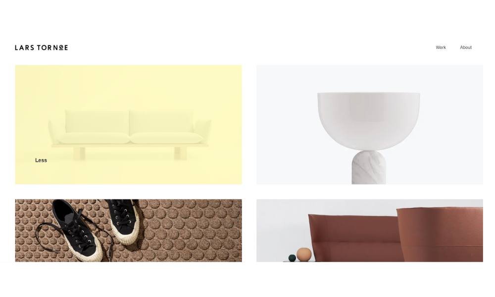
Lars Tornøe’s website feels as thoughtful as the objects he designs. It’s quiet, balanced, and structured—much like the furniture and lighting pieces featured throughout. The homepage doesn’t shout. Instead, it guides with clarity.
Each project is shown in a neutral space, allowing the form and function to stand on their own. You won’t find long descriptions or overworked jargon. Just names, materials, and scale—presented like a well-made chair: minimal, but considered.
His “About” page adds helpful context. Lars is a Norwegian designer with a background in furniture, and it shows. His approach focuses on creating objects with character—sometimes playful, often practical. He lets the work speak, but he also tells you just enough to understand where it comes from.
Navigation is simple. The color palette is soft. There’s no guesswork or clutter. Just design presented with care and confidence.
For professionals who appreciate precision without pretension, this site offers a calm space to explore. And yes, it might even make you want to replace that old lamp.
2. Bedow
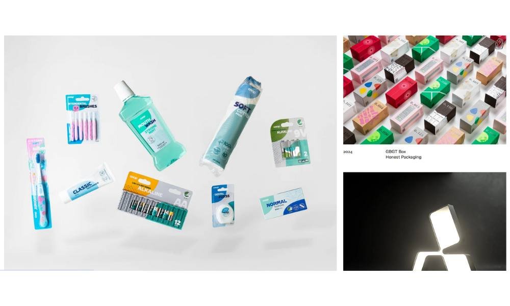
Bedow’s website is proof that good design doesn’t have to be loud to get your attention. The layout is stripped down, but not bare. It’s deliberate—built to make you slow down and look twice.
The homepage opens with a single line and a quiet grid of work. No pop-ups. No flashy animations. Just a clear invitation: explore the studio’s thinking through its output. And once you do, it’s all there—posters, brand systems, packaging—each with its own space to breathe.
Project pages are precise. A few sentences. A few standout visuals. The writing is sparse but effective, offering just enough to understand the concept without overexplaining it.
The About section is short and direct. Bedow is a Stockholm-based design studio focused on long-term thinking, which explains the calm pace and uncluttered structure. It’s not trying to follow trends. It’s building ideas that hold.
If you’re looking for high-concept design with a low-ego delivery, Bedow’s site gets it right. It’s confident, clean, and crafted for those who value thinking as much as doing.
3. ETQ

ETQ Amsterdam’s site walks the line between retail and experience—quietly confident, beautifully structured, and entirely focused on the product. From the start, you’re met with white space, crisp type, and a layout that doesn’t push. It invites.
The homepage feels more like a gallery than a storefront. Footwear takes center stage, photographed with care, positioned without clutter. Each image feels deliberate. There’s no need for over-the-top copy—the product design does the talking.
Navigation is clean and seamless. Shoes, apparel, and accessories are organized clearly, and filtering is quick and frustration-free. Even the checkout process reflects the brand’s overall tone: smooth, minimal, and well-considered.
The “About” section is brief but telling. ETQ focuses on simplicity, quality, and longevity. The language matches the product—understated, but certain. No marketing fluff. Just clear values, well presented.
ETQ’s website is more than a place to shop. It’s an extension of the brand’s design philosophy: reduce the noise, elevate the essentials. And it works.
If you appreciate design that speaks quietly—and still leaves a strong impression—this site delivers with control and confidence.
4. Co & Co
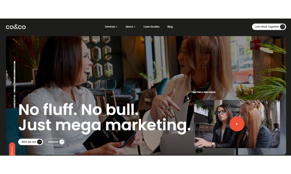
Co&Co’s website opens like a conversation you want to keep having—smart, straightforward, and refreshingly grounded. The design is clean and confident. Nothing overworked. Nothing extra. Just solid ideas, clearly delivered.
Right from the homepage, you understand what they do: brand strategy, design, and storytelling with intention. But they don’t hit you with buzzwords. They show you what that looks like—through projects that are purposeful and sharp.
The Work section leads with bold case studies. Each one gets space to breathe, and every visual is paired with short, effective copy. Enough to get the point. Not enough to lose your interest.
Their About page? Brief, but meaningful. You learn what drives them: clarity, collaboration, and ideas that actually stick. The writing feels personal without turning into a pitch.
There’s a rhythm to the whole site—measured, clear, and client-friendly. It doesn’t try to be clever. It just is.
If you’re looking for a studio that leads with thinking, not trend-chasing, Co&Co makes its case with quiet confidence—and a portfolio that backs it up.
5. Monograph
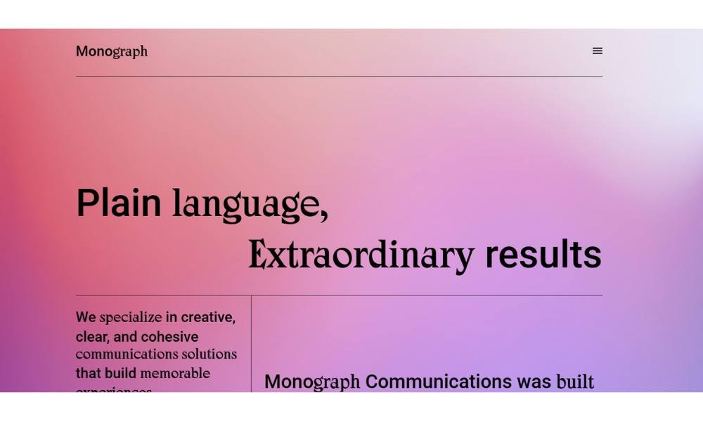
Monograph Communications’ website delivers clarity with every scroll. From the first view, it’s obvious—this is a studio that values strong ideas, simple language, and work that actually works.
The layout is clean and straightforward. No clutter. Just well-organized sections that get to the point. Their homepage presents what they do—writing, strategy, messaging—without overexplaining it. The tone is calm, confident, and distinctly human.
The Work section stands out. Case studies are smartly laid out: sharp headlines, focused copy, and just the right amount of context. They show the thinking without giving a full lecture. That balance is rare.
Their About page introduces a team that knows how to write for people, not just at them. There’s no ego, just experience. And a quiet belief that good writing can do a lot of heavy lifting.
It’s the kind of site that makes you want to keep reading—not because it’s loud, but because it’s considered. Every word feels like it belongs.
If you’re searching for a studio that takes communication seriously—but doesn’t take itself too seriously—Monograph gets the tone just right.
6. Netil Radio
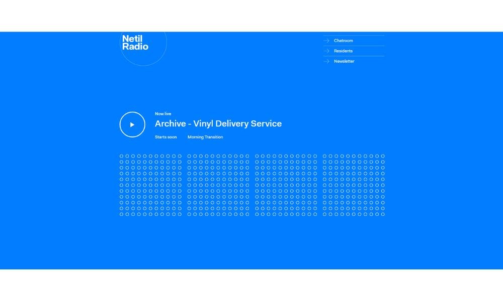
Netil Radio isn’t your usual station—it broadcasts from a shipping container perched atop Netil Market in East London. That setup alone sets the tone: creative, community-driven, and a bit offbeat.
The homepage feels more like a bulletin than a home page—listing live shows and resident DJs without fanfare. That approach fits—the content speaks louder than slick design. Want to explore? Just pick a show, tune in, and you’re part of the scene.
The heart of the station is its people. DJs, artists, guests—all with unique voices, unheard stories, and soundtracks shaped by passion. You’ll find names like Psych Milligan, Sassy Wylie, BabyBoy G, and dozens more on their roster. It’s less about polished playlists and more about real connection.
Their substack archive offers updates with candid photos of the container studio—with glowing hues, gear in action, and glimpses of community life on the roof.
Everything about Netil Radio is straightforward. No fluff. No corporate gloss. Just authentic shows from a genuinely creative hub. It’s a small space with a big voice—exactly what East London thrives on.
7.Field
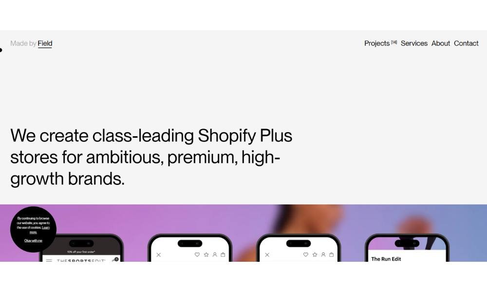
Made by Field keeps things simple—and that’s exactly what makes the work stand out. The homepage opens with confident typography, muted tones, and a quiet focus on craft. No over-intros. Just design, delivered clean.
The studio focuses on brand and digital work, and the projects speak for themselves. Each case study is presented with restraint: bold visuals, minimal text, and enough breathing room to let the design do the heavy lifting. Nothing feels rushed. Nothing feels crowded.
The About section says just enough. Field is an independent design studio based in the UK, led by creative director James Field. The tone is steady—experienced, not inflated. It’s clear this is a team that prefers clarity over flash.
Navigation is frictionless. Pages load fast. The whole experience feels intentional—every detail considered, without calling attention to itself.
If you’re drawn to design that’s precise but unfussy, and to studios that focus more on results than self-promotion, Made by Field feels like a smart, well-built fit. It’s branding without the buzzwords—and it works.
8. Benjamin Hardma

Benjamin Hardman’s site is a quiet showcase of stark beauty and visual control. From the homepage, the tone is set: minimalist layout, powerful imagery, and total focus on his work as a polar landscape photographer and cinematographer.
The Home carousel speaks volumes—fjords, ice caps, volcanic flows—each image revealing texture and emotion without a single sentence. It’s art, not advertisement.
Navigation is clean and simple. You’ll find Prints, Expeditions, Courses, About, and Contact—all clearly labeled and easy to access. Each section feels purposeful.
On Expeditions, you get the invitation: join Benjamin in Iceland, Greenland, Svalbard, or Antarctica. It’s lean on text and rich on insight—enough to know what you’re signing up for, not everything behind it.
The About page reads like a pro bio: Australian-born, decade-long experience, work with Netflix, BBC, National Geographic. The tone is matter-of-fact but confident.
Courses and prints are formatted cleanly—high-quality, easy to navigate, and priced with clarity.
If you’re drawn to photographic storytelling that values presence over noise, Benjamin’s site delivers. It’s visual poetry with purpose.
9. Scott Snyder
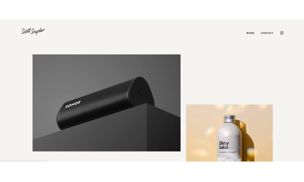
Scott Snyder’s site feels like stepping into a design studio turned gallery. The homepage is clean, with a crisp grid of object shots that immediately set the tone. You don’t need a headline to get the point—his imagery speaks clearly.
Each project page is concise. One or two lines introduce the concept. Then you see the work: products, spaces, and still life captured with precision. No padding. No filler.
The About section is equally streamlined. Scott is based in Costa Mesa and works with creatives and brands to highlight carefully crafted design. It’s honest, direct, and professional.
Testimonials sit neatly beneath. Clients praise his vision, control of light, and organized delivery. They don’t gush. They confirm his reliability. That’s just enough.
Navigation is simple: Work, Contact. That’s it. You click. You view. You know what he offers.
If you appreciate object photography that’s clean, deliberate, and quietly confident, this site delivers. It doesn’t shout—it shows. And it leaves you knowing that Scott takes both craft and process seriously.
10. Soilboy

Soilboy’s site feels like walking into a calm, modern greenhouse—rooted, minimal, and intentional. The clean homepage features featured products: bonsai, terracotta planters, and specialist soil. It’s quiet, focused, and purposeful.
Navigation is straightforward. Categories like Plants, Planters, Essentials, and Workshops are clearly labeled. No guessing, no clutter—just simple paths to what you need.
Each product page is functional and refined. Take the Sleeping Pine Bonsai—a short description, care tips, and dimensions are all you need. The visuals speak for themselves.
Their About message is an invitation: a mission to spark curiosity about greener living. It feels genuine, not salesy.
Even their brick‑and‑mortar experience store reflects that same calm—natural materials, soft lighting, crafted installations—focused on care rather than commerce.
Whether you’re shopping online or visiting in person, everything aligns: thoughtful products, clear care guidance, and an atmosphere that encourages you to slow down—and maybe buy a bonsai.
11. Ginventory
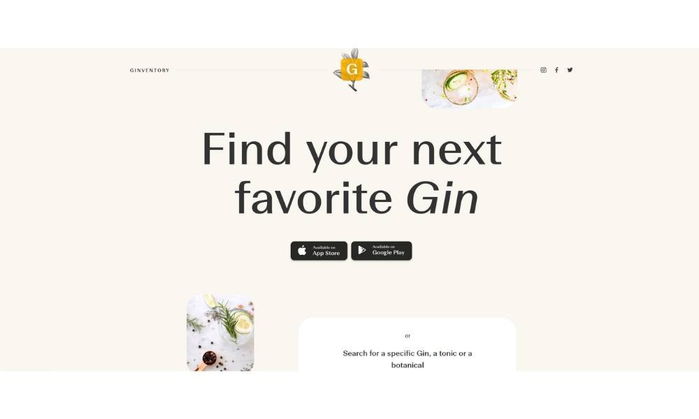
Ginventory is all about making gin discovery easy—and a bit fun. From the moment you open the app, the search bar greets you. You can look up a gin, tonic, or garnish fast. No fluff. Just results.
Tabs for “Gins,” “Tonics,” and “Garnishes” are right there—and the layout stays tidy, even as you scroll through hundreds of options. Clean visuals and ratings help you pick quickly.
Each gin’s page shows a photo, ABV%, distillery info, and the “Perfect Serve” recipe—all in one spot. You can save it to your “Cabinet,” rate it, or add it to your wishlist.
With over 6,500 gins listed and more than a million downloads, Ginventory clearly has reach—and a 4.5‑star rating on iOS backs up its reliability.
What makes it stick? It’s simple, smart, and slyly playful. Witty illustrations and smooth transitions give it personality—without getting in the way.
If you’re someone who enjoys a good G&T and wants to keep track of what you like, this app feels like a good companion. Just don’t expect cocktail guru lessons—this is smooth, not splashy.
12. O’Neil Langan
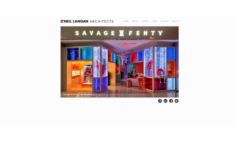
Olarch’s site makes a firm first impression—quietly bold and purposeful. The homepage greets you with full-screen visuals that showcase their architectural precision. No flashy intros. Just space and form.
Navigation is sleek and intuitive. Sections like Projects, Studio, and Contact are clearly labeled and easy to open. You can dive into work without hunting.
Their Projects page is thoughtful. Large images, clean layouts, and minimal text. You understand context without scrolling a novel. Each project feels given room to speak.
The Studio section is short and direct. Olarch operates from London and focuses on creating thoughtful spaces. The tone is factual with mission—no inflated claims.
What stands out is restraint. The site doesn’t rely on animations or gimmicks. Instead, it trusts design to lead. The spacing, typography, and imagery all suggest discipline and clarity.
If you appreciate architecture that values proportion and purpose over flash, Olarch’s site is a model example. It’s confident, well-composed, and built to quietly impress.
13. Casa Mami
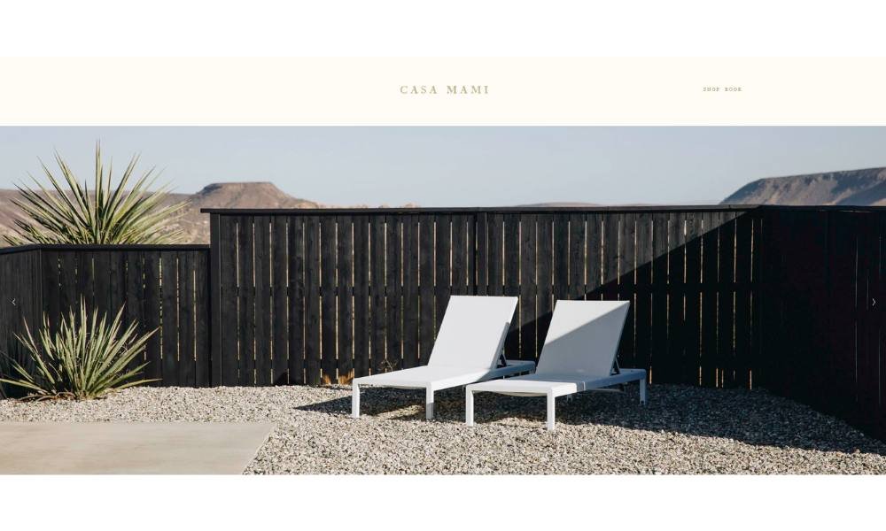
Casa Mami’s site offers a blend of design showroom and desert retreat. At first glance, it feels intentional—minimalist visuals paired with spacious layouts. It doesn’t explain much, but it creates room for you to look, think, and feel.
The homepage focuses on one idea: an eco-friendly adobe cabin in Pioneertown, set within a vast Mojave landscape. Imagery of the space is central. You see architecture meet nature in a quiet dialogue.
Navigation is lean: About, Gallery, Renovation, Shop, Book. That simplicity supports the experience. You’re free to explore architecture, stay options, and the products used in the house—nothing more, nothing less.
The “About” section tells you it’s a restored desert home by Working Holiday Studio, balancing design with off-grid living. You learn about its eco credentials—solar power, water tanks—and its intention-driven restoration. Buying what’s inside isn’t an afterthought. The shop showcases the curated items featured in the retreat—bringing the showroom concept full circle. If you appreciate design that stays quiet but confident, and a brand that lives its values in both place and presentation, Casa Mami is a space you’ll want to linger in.
14. Oishii
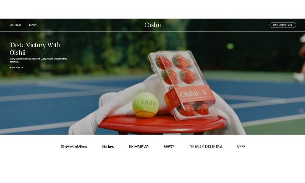
Oishii’s website captures the essence of luxury strawberries in an understated and elegant way. The homepage focuses on a single goal: letting the fruit shine. A simple hero shot of their signature berry, paired with minimal text, sets a refined tone that feels intentional—not flashy.
Navigation stays straightforward. Tabs like Our Berries, Facilities, Recipes, and Shop let you find your way without confusion. No pop‑ups, no gimmicks—just a clean path to what interests you.
Their Berries section shows two varieties: the Omakase and Koyo. Each has its own page with sharp photography and concise info—origin, flavor notes, and best serving tips. You get all you need without the fluff.
The Facilities page is compact but effective. It describes their indoor vertical farms and zero‑pesticide process. You don’t need a degree in agriculture to follow along—it’s clear, simple, and trustworthy.
This site doesn’t try to sell itself. It showcases product, process, and heritage with calm precision. If you’re drawn to premium ingredients presented with elegance and ease, Oishii’s site delivers exactly that.
15. La Petite Alice
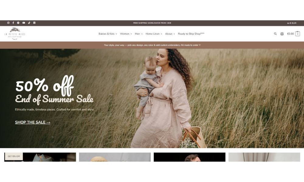
La Petite Alice’s website is gentle, stylish, and focused. From the moment you arrive, the design feels thoughtful—soft tones, curated imagery, and an inviting layout that guides without urging.
The homepage opens with a large, serene image—likely one of Alice’s signature cakes or styled tablescapes. The design is elegant but never overdone. It suggests care without showiness.
Navigation is intuitive. Tabs like Home, About, Gallery, Menu, and Contact are clear and helpful. You’ll find everything you need in two clicks.
The About section shares personal background with a light touch—Alice, a passionate baker, blends creativity with tradition. You sense someone who cares about flavor—and presentation.
The Gallery is beautifully organized. Each photo highlights color, texture, and theme—pastel wedding cakes, baby shower treats, celebratory confectionery. It’s visual storytelling with refinement.
Information on the Menu page—prices, sizes, custom options—is laid out cleanly. No confusion. Just easy choices for clients.
La Petite Alice’s site feels like her creations—well-made, charming, and sincere. Perfect for those who want a cake that’s more than dessert: it’s a small, sweet celebration.
Conclusion
I won’t promise instant fame or a viral launch. That’s not how good ideas usually work. But I will say this: starting a website doesn’t have to be hard. In fact, it might be easier than ordering dinner online (especially if you’ve ever tried to spell “aioli” under pressure).
Pick an idea. Keep it simple. See where it goes.
Because the sooner you start, the sooner you’ll know what’s possible—and maybe, just maybe, you’ll enjoy the process more than you expected.
And hey, if all else fails, at least you’ve claimed a solid domain name before someone else with the same idea and slightly better SEO gets to it.


