I’ve seen how easy it is to get stuck on “What kind of online store should I build?” Been there. Too many tabs open, too little clarity. So I’ve pulled together a list of ecommerce website ideas that aren’t just practical—they actually have potential.
Each one can be started with minimal overhead, limited tech knowledge, and just enough motivation to skip another episode of your favorite show. Whether you’re starting fresh or rebooting an idea that’s been sitting in your notes app for too long, there’s something here for you.
Here’s what you’ll find:
- Product-based stores with low entry barriers
- Digital services you can run solo
- Subscription concepts people will actually pay for
- Niche markets worth exploring
- Low-inventory models for busy lives
You don’t need to be a coder or have a warehouse. But you do need a smart idea—and a willingness to try.
1. Zulu Longines

The Longines Zulu site launches with quiet sophistication. A full-screen hero image of the watch standing against the sky instantly captures attention. It doesn’t shout—just shows precision and elegance.
Scrolling down, you find technical details like case size, movement type, and water resistance. Each fact is presented clearly, without filler text or marketing hype. It helps you understand the watch without guessing.
The “Heritage” section adds context. Longines shares brief but relevant history—its aviation roots in the 1960s and how those early models influenced the Zulu design. You learn why it matters. You aren’t just reading specs—you’re getting a story.
Images of the watch in real settings—cockpit, travel gear, desk—give a sense of purpose. They feel aspirational yet real. You get how the watch fits into everyday life, not just museum display.
Even the FAQ section is well done. Concise answers on strap changes or accuracy. Useful. Honest. Professional.
If you appreciate thoughtful design, technical clarity, and a bit of aviation nostalgia, Longines Zulu delivers. It’s not flashy. It’s carefully designed. And it leaves you knowing exactly what this watch stands for: form, function, and a nod to history.
2. Potion
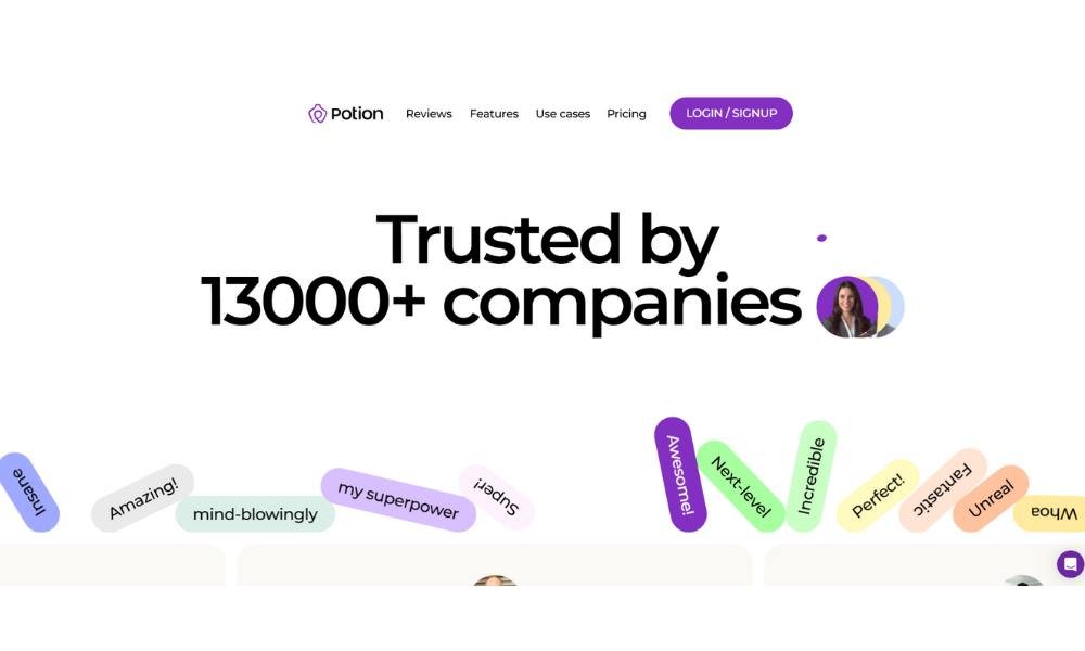
Potion’s website opens with welcoming simplicity. The homepage immediately introduces the platform: a tool for creating personalized, link-based landing pages—minus the clutter.
Right away you see intentional design. Clean typography meets a muted color palette. No distractions—just a clear call to action and reasons to explore further.
Key features are broken into bite-sized sections: link-in-bio pages, CRM data capture, and on-page purchases. Each feature comes with a short explanation and icon. It’s straightforward, informative, and easy to scan.
A section on “Built for professionals” quietly highlights use cases—creators, coaches, small businesses—without overwhelming copy. You understand who it’s meant for in seconds.
Signup is simple. A button that reads “Get started” leads into a clean form. That ease of action reinforces the message: Potion makes it simple to build, share, and track without fuss.
What stands out? The balance between form and substance. The design feels modern, but the copy matches it: concise, professional, and human. No jargon for the sake of sounding smart—just clear explanations that matter.
3. Help Scout

Help Scout’s website welcomes you with a clean interface that feels instantly useful. No fluff. Just a clear value proposition: smarter customer support for modern teams.
The homepage leads with straightforward lines and real user stats—support volume, response time, satisfaction scores. It tells you what matters: results. And it does so without jargon or confusion.
Navigation is intuitive. You’ll find clear sections: Product, Pricing, Resources, Company. Each link gets you exactly where you want to go.
The Product pages walk you through core tools—shared inboxes, live chat, help docs—using concise bullets and relevant visuals. Each feature feels practical and designed for immediate use.
Their Resources section stands out. Guides, case studies, and videos cover real-world scenarios: scaling support, onboarding, and team efficiency. The tone stays helpful—not salesy.
Even the About page is well-crafted. You learn who they are: a remote-first company built on empathy and customer-centric values. It adds a human touch without heavy storytelling.
Help Scout’s site doesn’t chase trends. It reflects the product: thoughtful, no-nonsense, and built for teams that care about their customers. It’s support software that actually supports users.
4. Bite Toothpaste Bits

Bite’s site feels clean and purposeful—just like their product. You land on a crisp homepage showcasing their eco-friendly toothpaste tablets in refillable glass jars. No clutter, no plastic tubes. It’s clear what they believe in.
The main sections—Products, About, Our Impact, and FAQs—are easy to find. Each page provides exactly what you need without fluff: how the Bits are made, why they matter, and how to use them. You won’t scroll forever to find details.
Their About story is relatable. It begins with surf lessons and kitchen chemistry, then launches into a mission to cut plastic and clean habits, all backed by B-Corp certification and real numbers.
Product pages match the tone: concise benefits, clear ingredients, and step-by-step instructions on how to brush with a Bit. It’s smart, helpful, and honest.
What stands out is transparency. They share reviews, impact data, and even Shark Tank highlights—without sounding boastful. Just facts, purpose, and dependable design.
If you’re into clean routines, sustainable choices, and products that walk their talk, Bite’s site delivers—all while keeping it simple and sincere.
5. Black Star Pastry
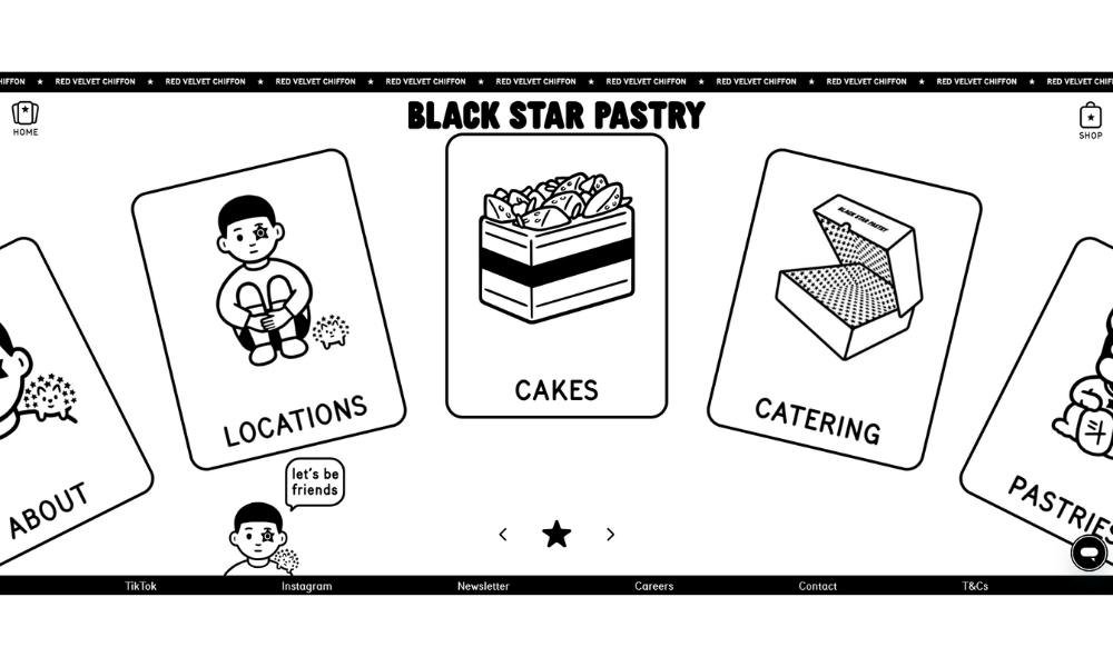
Blackstar Pastry’s website opens with striking visuals—deep pink confections and designer décor that look as sumptuous as they are precise. It feels intentional and confident, as though every pastry on display has been styled for maximum appetite appeal.
Navigation is simple: Menu, Locations, Catering, and About. You click through without delay or confusion. No noisy promos—just what you want to find fast.
The Menu page is well organized. Signature offerings like strawberry watermelon cake are easy to scan, with crisp descriptions and clean layouts. You don’t need a sweet tooth to appreciate how well things are presented.
Their Locations section lists cafes with opening hours and addresses. No filler. Just practical info that tells you where—and when—to taste the goods.
The About page shares the story with a few warm sentences: a passion for design, seasonal ingredients, and a belief that desserts should be memorable. It’s concise and heartfelt.
Blackstar Pastry’s site captures the brand: more than food—it’s a crafted experience. It’s visually rich, user-friendly, and leaves you ready to visit or order, without ever feeling pushy.
6. Make Architects

Make Architects’ site immediately conveys thoughtful restraint. The homepage welcomes you with a clean, full-screen visual—often a striking building that sets a confident tone without saying a word.
Navigation is clear and calm. Menu options like Projects, Studio, News, and Contact guide you seamlessly, with no distractions pulling you off course.
The Projects section is the star. Each project opens with bold imagery, paired with concise captions that cover location, date, and type. You get context without overload. The clean grid layout helps each project hold its space, and clicking through feels intuitive.
The Studio page is brief and revealing. It describes Make’s focus on people-driven design, sustainable practices, and innovative processes. No jargon—just clear explanations of who they are, how they work, and what they value.
News and insights are equally accessible. Short updates on awards, events, or launches keep you informed—without turning into a newsletter.
This site feels like Make’s architecture: precise, purposeful, and quietly ambitious. It’s a portfolio you can explore without pressure—and one that builds confidence through clarity.
7. Crate & Barrel
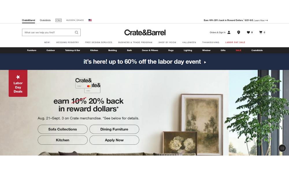
Crate & Barrel’s website strikes a tidy balance between inspiration and practicality. The homepage opens with lifestyle imagery—dining setups, layered rugs, and calm living spaces—that feel curated, not staged.
Navigation is clear. Sections like Furniture, Decor & Accents, Kitchen & Tabletop, and Outdoor guide you instantly. Everything feels organized, making browsing feel intentional rather than overwhelming.
Product pages are designed for clarity. A bold photo gallery is joined by concise details—dimensions, materials, care instructions—and helpful swatches or variant options. It’s easy to gather the essentials without digging.
Their Inspiration & Ideas section adds value. Short articles like “Setting a Cozy Fall Table” or “Under $50 Finds” give practical design cues—and some quiet style cues without pressure to buy immediately.
The “See in Your Space” AR feature shows real understanding: you can virtually place a sofa in your own room. That’s useful, not gimmicky—just helpful for someone balancing style with space.
Crate & Barrel’s site reflects its brand: clean design, functional features, and a sense of calm confidence. It doesn’t overwhelm—it equips you—while gently guiding toward what’s possible in your home.
8. Allbirds
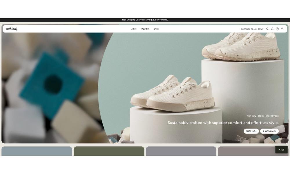
Allbirds’ website feels clean, modern, and focused—much like their sustainable footwear. From the moment you arrive, the homepage offers a calm, visual-first experience featuring their iconic wool and tree fiber sneakers. What you see is what you get: comfort, simplicity, and purpose.
Navigation is intuitive. Tabs like Shoes, Clothing, Sustainability, and FAQ guide you without excess. You quickly find what matters—product details, sizing, carbon impact—without hunting through menus.
Product pages are straightforward yet thorough. Each pair includes clear specs (materials, weight, machine-washable), honest fit notes, and carbon footprint data. It’s informative without overwhelming. The styling photos show real use—on feet, in life—rather than trying too hard to impress.
The Sustainability section doubles as a story and proof point. Allbirds shares its eco philosophy—merino wool, sugarcane soles, carbon labeling—with measurable statistics. That transparency builds trust.
Overall, the site mirrors the brand: understated, purposeful, and grounded in values. It doesn’t chase trends. It delivers clarity, connection, and confidence. If you’re shopping for sneakers that feel good, perform well, and align with your values, Allbirds gets the balance just right. No fluff. Just feel–and facts–you can trust.
9. Nike
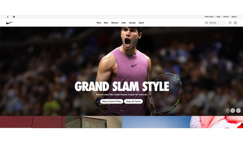
Nike’s website opens with bold visuals and a confident vibe. It’s clear: this is a brand built for movement—performance, style, and innovation.
The homepage combines sweeping action shots with fast-loading modules. No fluff. Just clear entry points like Men, Women, Kids, and Sports. You get where you need to go in a click.
Product pages strike a smart balance. High-quality images meet detailed specs—materials, sizes, release dates—alongside customer reviews. It’s all fact and function, refined for easy scanning.
Sections like Customise, Sale, and Sustainability show thoughtful layering. You can design your own kicks, grab a deal, or learn about recycled sole materials—all from one menu bar.
The Membership feature stands out. You get member-only drops, early access, training tips, and community events. It’s subtle, not pushy—an invitation rather than a hard sell.
Nike also supports your decisions. Their Size Guide and Product Finder tools feel useful, not marketing-driven. You’re guided—not sold to.
This site feels like Nike itself: powerful, purposeful, and audience-aware. It reflects a brand that knows what it is and trusts its audience to do the same.
10. Frans Hals Museum
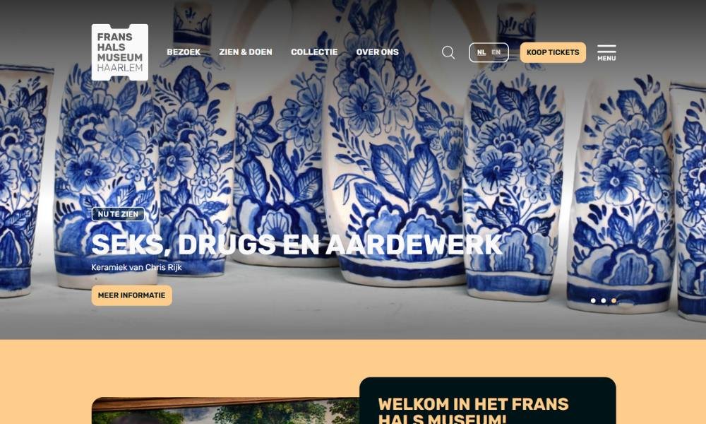
Frans Hals Museum opens with quiet dignity. Housed in two historic Haarlem buildings, it feels like stepping into art history. The clean homepage invites you to explore its Golden Age masterpieces without distraction.
The layout is calm and intentional. Navigation groups collections, exhibitions, and visitor info—no guesswork, just easy guidance.
Two venues await: the Hof, a former almshouse with regents’ portraits, and the Hal, a converted meat market hall that hosts modern art. Each space holds contrast and balance. Old meets new.
In the Collections section, you’ll find scores of works by Hals and his contemporaries—portraits full of life, emotion, and that trademark brushwork. Context is clear. You read painted dates, artist names, brief backstories.
Visitor details are practical. You’ll find hours, café options, ticket advice (weekends fill up—tips included), and accessibility notes. Useful.
What stands out? It’s a museum that respects your time and curiosity. No clutter. No grandstanding. Just art—seen and understood. It’s thoughtful, historic, and quietly bold—all at once.
11. The Scott Resort & Spa
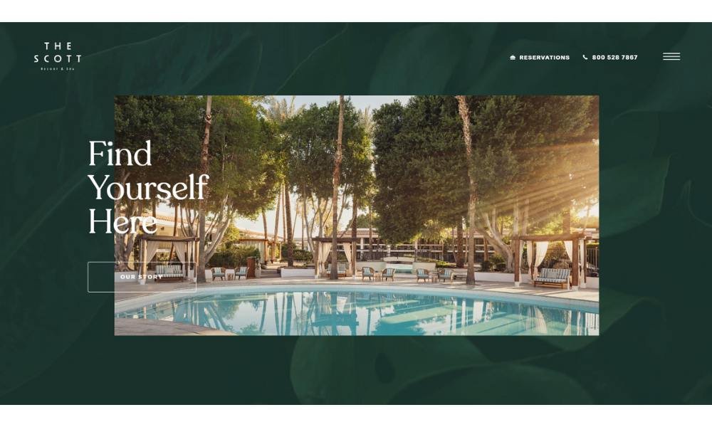
The Scott Resort’s website welcomes you with sunlit visuals that hint at relaxation—palm trees, turquoise fountains, mid-century flair. Right away, you sense a spot that’s upbeat but not overdone.
Navigation is clean and simple. Rooms, Dining, Pool & Recreation, Meetings & Events, and Offers guide you smoothly. No surprise detours—just what you’d want for a getaway.
The Rooms section displays each option with spacious images and sharp descriptions—suite size, décor vibe, key features. It’s clear, not glitzy. You feel informed, not sold to.
Their Dining page highlights the Citrus & Salt restaurant and bar with minimalist photos. Menus are easy to locate and scan—no fluff, just flavor and hours.
The Pool & Recreation area reads like a teaser for a good time—poolside cabanas, weekend events, wellness classes—with a relaxed tone that stays on brand.
Booking flow is intuitive. “Check Availability” stands out without screaming. It’s confident but relaxed.
The Scott Resort’s site captures the brand: stylish, easygoing, and intentional. It doesn’t over-promise. It shows you what a refreshing stay could feel like—then invites you to step in and see if it’s your kind of place.
12. Vitra
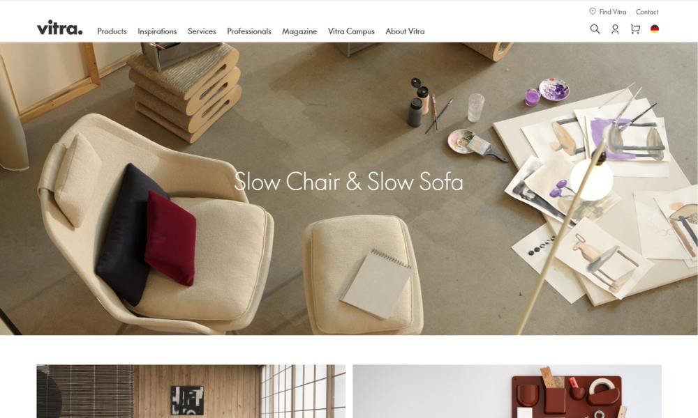
Vitra’s website greets you with a minimalist elegance. The homepage features clean lines and bold visuals of iconic furniture pieces—no clutter, just design that speaks for itself.
Navigation is crisp. Sections for Products, Designers, Projects, and Company guide you smoothly. You know exactly where to click, and why.
The Products pages feel curated and well-paced. Each chair, table, or lamp comes with precise specs, designer notes, and polished imagery. The balance is just right—enough detail to be useful, without overload.
In Designers, you meet names like Verner Panton, Charles & Ray Eames. Brief bios help you understand their influence in a few sentences. It adds context without droning on.
Their Projects section displays real-world installations. These shots show how Vitra’s designs work in space—homes, offices, public buildings—without convoluted captions.
Even the Company page keeps things smooth and professional. You learn about their history, philosophy, and production standards—all in a tone that mirrors their design ethic.
If you care about well-made design and thoughtful presentation, Vitra’s site offers both. It doesn’t need flash. It shows quality—with confidence and clarity.
13.Display
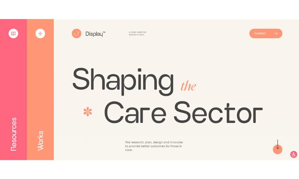
Display Care’s website greets you with clean efficiency. The homepage immediately lays out the service—repair, buyback, and recycling for mobile devices—without unnecessary flair.
Navigation is intuitive. Menu options like Services, Pricing, How It Works, and Contact guide you directly to what you need. No guesswork. Just clarity.
Each Service page gets straight to the point: What’s covered, how it works, and how long it takes. Whether it’s a cracked screen or battery replacement, you know exactly what to expect.
The Pricing section is refreshingly transparent. Costs for repairs appear up front, avoiding uncertainty. No hidden fees. No surprise charges.
Their How It Works page uses simple steps and visuals to walk you through the process. It’s helpful for anyone who’s never sent a phone off for repair before.
What stands out is trust. Display Care doesn’t rely on flashy marketing—they rely on clear info and easy navigation. It’s a site that says: we value your stuff, your time, and your peace of mind.
If you need device repair that’s reliable and hassle-free, Display Care makes it feel straightforward—and that confidence matters.
14. Zenni
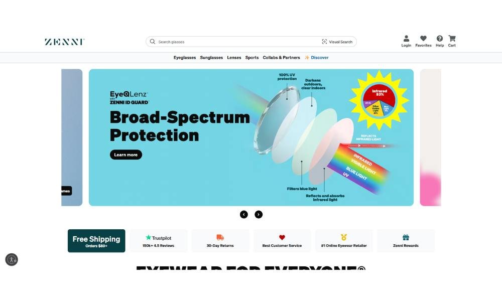
Zenni Optical’s website strikes a clean, smart balance between style and function. From the moment you land, it’s clear: affordable eyewear doesn’t have to look cheap.
The homepage leads with a callout—“Eyewear for Everyone”—and simple menu options: Glasses, Sunglasses, Blue Light, Kids. Everything is easy to find.
Product pages are thorough without hitting you with too much info. You get frame specs, lens choices, and even carbon impact notes in a few lines. Screenshots, virtual try-on previews, and clear price options keep it honest and helpful.
Blue-light and reading glasses are presented as practical tools. No frills—just benefits you can understand in a glance. Plus, featured stats and customer reviews show this isn’t just hype.
Their How-To Guides and Blog are full of real advice—using HSA/FSA, choosing the right fit, caring for lenses. The tone is friendly, not pushy.
Overall, Zenni’s site feels like a trusted companion: modern, no-nonsense, well-informed. It guides you through eyewear choices with clarity. And at the end? You feel informed—not sold—to.
15. Heveya
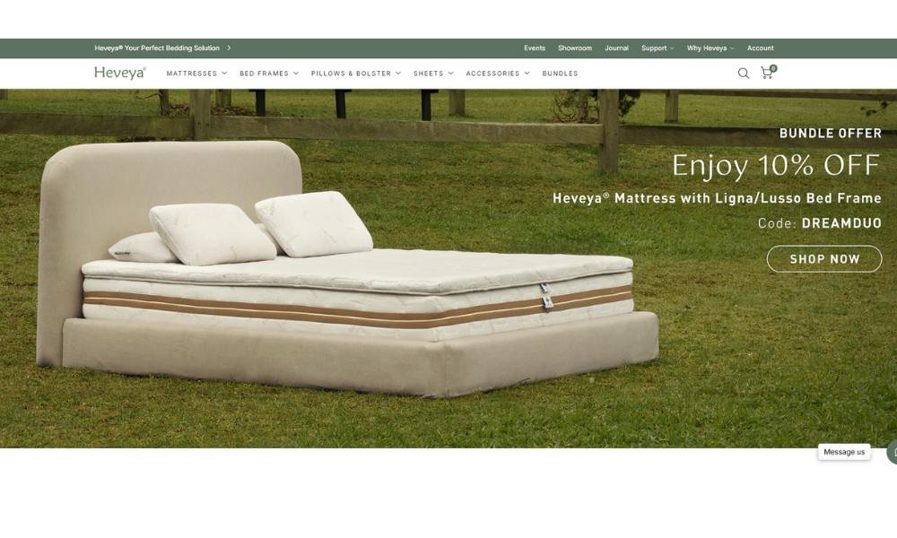
Heveya’s site embodies calm and intention. The homepage opens with serene bedroom scenes and simple calls, showing a refined focus on sleep quality—and natural living.
Navigation is clear and thoughtful. Tabs like Mattresses, Sheets & Throws, Wellness, and Why Heveya lead you directly to what matters. No fluff, no distractions.
Each product page is smartly laid out. You’ll find key details—materials, certifications, pricing—with clear visuals. Take the Double Linen Throw: linen weight, size, origin—all presented in a clean format that builds confidence and desire.
Their Story & Sustainability section shares origin, B‑Corp status, and eco goals in concise language. You learn about latex sourcing, natural fibres, and social impact—without feeling talked down to.
Showroom info adds a human touch: inviting images and helpful hours encourage in‑person visits. You feel welcome, not sold.
This site balances substance with style. It’s not flashy. It’s designed for someone who cares about environmental values and health—without needing a sales pitch.
If you’re looking for bedding that’s natural, well‑informed, and thoughtfully presented, Heveya delivers. It leads with calm expertise—and that matters in a world of noise.
16. Notebook Therapy
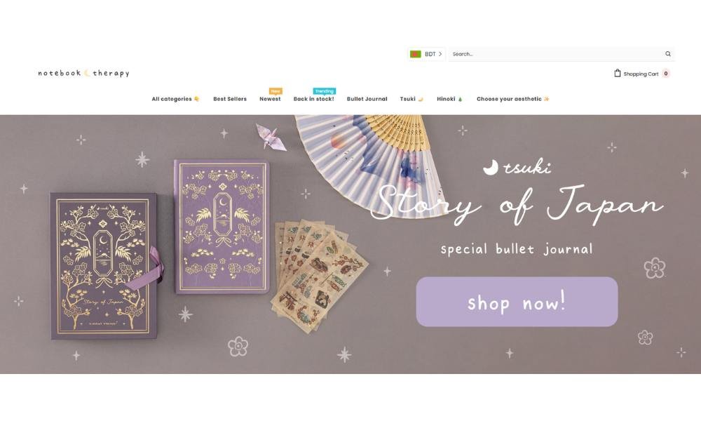
Notebook Therapy’s site opens with a welcoming, no-nonsense vibe. A clean homepage offers a calm scroll through notebook covers, stationery kits, and desk essentials—presented simply, without sales pressure.
Navigation is intuitive. Categories like Notebooks, Writing Kits, Pens, and Gifts make browsing easy. Everything is just where you expect it—no hunting required.
Product pages balance visuals and specifics. You see high-quality images alongside clear descriptions—dimensions, paper type, and thoughtful prompts where relevant. The tone feels like helpful notes from a friend.
Their Collections section curates seasonal or themed bundles. Wrist-friendly for the overwhelmed shopper. You can explore confidently, knowing you’re getting something thoughtfully grouped.
Notebook Therapy’s About page explains their mission: to spark creativity and reflection. It’s sincere, concise, and grounded in purpose—not hype.
The site also offers a blog with writing prompts and motivational tips. These short posts add value without turning into long-form lectures.
If you’re someone who loves pen, paper, and small rituals that make your day feel more intentional, Notebook Therapy’s site speaks to you. It’s stationery with purpose—and it feels like a thoughtful pause.
17. AYO

GoAyo’s website and app present a neat and purposeful wellness solution. You land on a clean homepage that explains the product in seconds: wearable eyewear and an app built around light therapy to balance your circadian rhythm.
Navigation is intuitive. You’ll find clear tabs for How It Works, Research, App, Shop, and Support. You don’t need to hunt—everything is set out plainly.
The How It Works section is efficient. It explains in short, direct sentences: blue‑turquoise light mimics sunlight, helping you sleep, boost energy, or beat jet lag. They mention clinical backing without jargon—just science you can follow.
App integration is well framed. You input your sleep and travel plans. The app syncs with your wearable and personal routine to craft light sessions. It feels tailored and simple.
They keep transparency front and center. Founders share data, explain session timing, and include a user manual—so you know what to expect.
If you’re after a science-backed yet accessible path to better sleep and energy—without complicated tech or apps that overpromise—GoAyo is a strong contender.
18. Pitch Tents
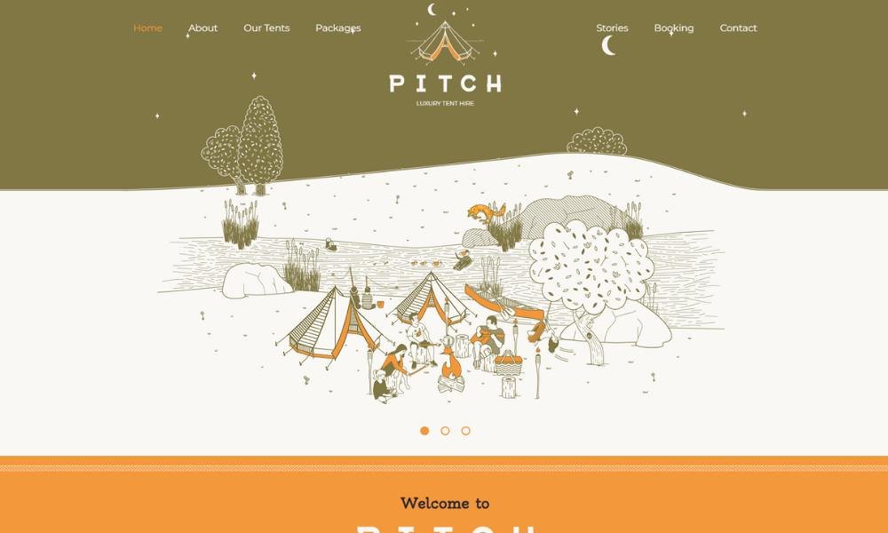
Pitch Tents’ website opens with crisp imagery—camping setups under open skies that feel both inviting and purposeful. Straight away, it’s clear they know their gear—and who it’s for.
Navigation is simple and direct. Sections like Products, How It Works, Blog, and Contact are easy to find. You land where you want with no guesswork.
Their Products page lays out tents, accessories, and bundles in a clean grid. Each item gets a photo, key specs, and price. No fluff—just what you need to decide. You can scan details fast and feel confident about what you’re getting.
The How It Works section explains setup in plain terms. Short steps and visuals show you can pitch a tent without needing a manual thicker than a novel.
A thoughtful Blog shares quick tips—from campfire cooking to tent care. The tone is friendly, helpful, and professional.
What stands out is their approach: gear for real adventures, not photo shoots. It feels grounded and accessible.
If you’re shopping for tents that work as hard as you do, Pitch Tents’ site makes the case with clarity, quality, and no frills—just solid, actionable information.
19. Grainne Morton
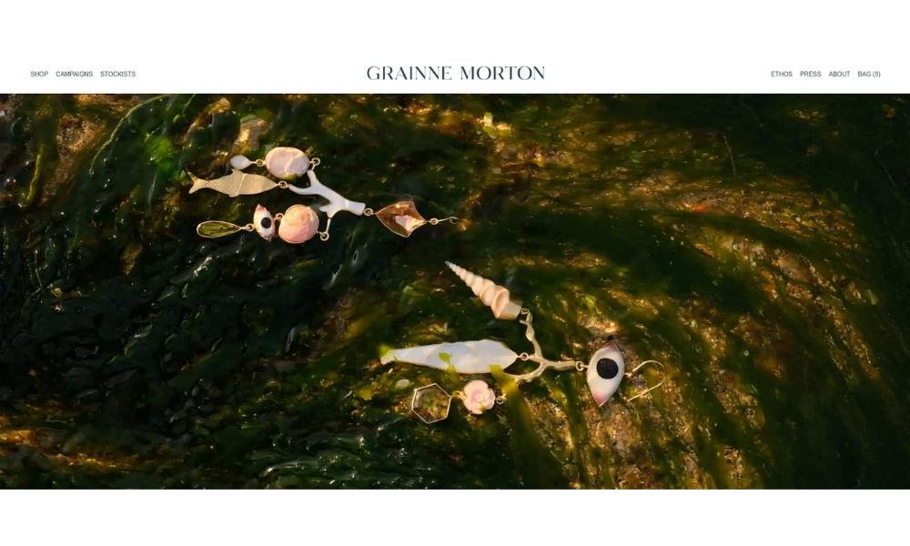
Grainne Morton’s site feels like stepping into a cabinet of curiosities—curated, personal, and quietly rich. The homepage showcases her handcrafted jewellery with clean, white space that lets each piece shine.
The Shop section is neatly organized: earrings, necklaces, bracelets, rings, with clear pricing. Each listing includes striking imagery of the piece—like the Mosaic Flower Drops or Victorian Pin Drops—presented without clutter.
Her About page tells a story. Based in Edinburgh, Grainne is drawn to tiny objects and stories, like a magpie collecting rare gems. You learn about her Northern Irish roots, her studio practice, and how folklore and found objects influence her designs.
Project pages, tagged “Latest creations,” offer a taste of her style: playful, precise, and evocative. It’s more than jewellery—it’s storytelling in miniature.
Even the Contact section is thoughtful—clear options for wholesale, press requests, or just reaching out.
What stands out is balance. The design is minimal but heartfelt. Each piece, each sentence feels considered. Grainne’s site isn’t just an online shop—it’s a window into her world of tiny treasures and personal connections.
The Bottom Line
If you’re still wondering which idea to chase, that’s normal. The key is to pick one that fits your interest, your time, and your budget. I built my first store on a laptop with spotty Wi-Fi and zero experience, so trust me—progress matters more than perfection.
Start simple. Launch something scrappy. Learn as you go.
And don’t overthink the tech. Most platforms today handle the heavy lifting. What matters is that your site solves a real problem—or brings someone a little joy.
Now, bookmark this list. Or better yet, pick one idea today and run with it. Because your future store won’t build itself.
Unless it’s AI-powered. But let’s not get ahead of ourselves.


