As a designer and developer, I’ve spent enough time with portfolio websites to know this: what you show is important—but how you show it matters even more.
Your portfolio is more than a gallery. It’s your pitch, your handshake, your quiet flex on a screen. Whether you’re writing code, sketching interfaces, or blending both into something beautiful, the right idea can turn “just another site” into something people actually remember.
In this post, I’m sharing practical and creative portfolio ideas that work—without the fluff, filler, or forced inspiration.
Here’s what I’ll cover:
- Simple portfolio concepts that don’t feel boring
- Interactive layouts that show off your skills (without overcomplicating things)
- Clean designs that focus on storytelling
- Personal touches that add personality without making it all about you
- Bonus tips to help your site feel polished—without trying too hard
No gimmicks. Just ideas that work—because they’re clear, thoughtful, and a little unexpected.
1. Adham Dannaway
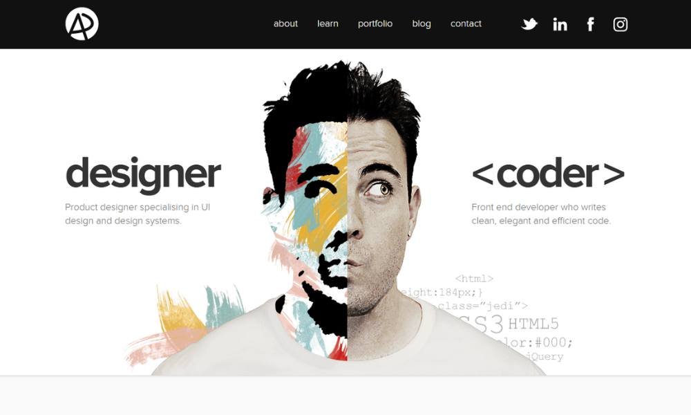
Adham Dannaway’s site pulls double duty—and it does it well. As both a designer and developer, he splits his homepage right down the middle. One side highlights design, the other code. Simple, clever, and surprisingly effective.
What really makes this layout stand out is that it speaks before you even start reading. Visitors immediately understand his skill set, without scrolling a word. That’s smart design—quietly confident, not flashy.
His About page doesn’t just list experience; it gives personality to the pixels. You learn who Adham is, how he works, and yes, why he’s different (without him shouting it). There’s a balance of visual polish and professional substance that’s rare to see—and refreshing.
And let’s be honest: that homepage split? It’s got just enough geek flair to make developers grin, and enough clean design to make designers nod. Mission accomplished.
2. Charles Bruyerre

Sharleen Lassalle’s portfolio doesn’t wait to introduce itself—it steps forward with color, clarity, and just the right amount of confidence. A creative developer and designer, she’s built a site that reflects both sides of her skill set. The result? A sleek, animated scroll that doesn’t just show projects—it brings them to life.
What makes it memorable isn’t just the design (though it’s sharp). It’s how personal it feels. Her homepage includes a snapshot of her background, a quick hit of personality, and just enough flair to keep you curious without overdoing it.
Her work section is clean and efficient, with subtle movement that gives you a taste of her style and discipline. Each project looks intentional—not just placed, but presented. You get the sense that every choice was made with purpose, not guesswork.
There’s also a quiet sense of humor woven in. It’s confident, a bit playful, and fully professional. Whether you’re here for code or creativity, Sharleen’s portfolio makes a solid first impression—and keeps you interested for the second.
3. Bruno Simon
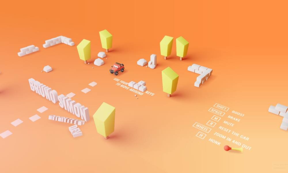
Bruno Simon doesn’t just build websites—he builds experiences. From the moment the page loads, you’re not scrolling, you’re driving. Literally. His portfolio turns into a 3D playground where a tiny car navigates through his work, skills, and sense of humor. It’s unexpected, slightly ridiculous—in the best way—and completely unforgettable.
This isn’t gimmick for the sake of it. Underneath the fun is serious technical firepower. The interactive environment showcases his WebGL and Three.js expertise without a wordy explanation. You see what he can do, because you’re playing with it.
Despite the bold concept, it’s surprisingly smooth to explore. Each section is placed with care, and the transitions guide you more than they distract. You’re entertained, but also informed.
Bruno’s site makes a clear point: creativity and code don’t need to live in separate corners. He proves they can collide—at speed—and still keep their polish.
It’s not a traditional portfolio, and that’s the point. In a sea of grids and galleries, his work drives circles around the rest—literally.
4. Patrick David
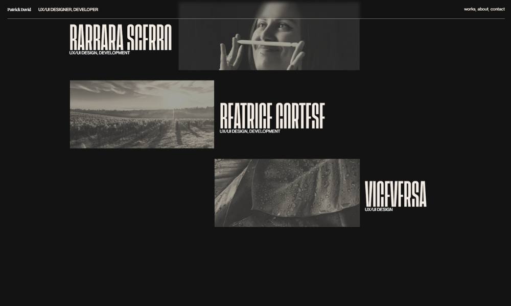
Patrick Bet-David’s site is exactly what you’d expect from a high-performance entrepreneur—it’s direct, fast-moving, and built to convert attention into action. Right from the landing, bold visuals, crisp copy, and sharp calls-to-action guide you through his world of business strategy, media, and leadership.
But it’s not just about the flash. His site is structured to reflect clarity of purpose. Whether you’re discovering Valuetainment, booking him as a speaker, or digging into his business playbooks, every section serves a goal. It’s built like his brand: no-nonsense, outcome-driven, and highly dialed in.
The messaging is confident without being inflated. You’re not overwhelmed with buzzwords—you’re offered insight, experience, and clear next steps. It feels less like browsing a website and more like being invited to level up.
There’s a professional intensity throughout, but it’s balanced by accessibility. You don’t need a business degree to get what he’s about—you just need drive. And that’s the real takeaway here: this is a site that doesn’t just talk about ambition. It speaks directly to those who have it.
5. Kenneth Jimmy

Kenjimmy’s site proves that clean doesn’t have to mean boring. From the moment it loads, you’re greeted with smooth motion, sharp visuals, and a vibe that says, “Let’s skip the fluff—here’s the work.”
As a front-end developer and designer, he strikes a careful balance between technical skill and creative taste. The layout is minimal, but not empty. Every section has purpose. Transitions feel fluid, not flashy. You’re guided through his background, skills, and projects without needing a map—or patience.
What stands out most is his attention to pacing. Nothing drags, nothing feels rushed. It’s a portfolio that lets the work speak while still showing personality—subtle, confident, and quietly ambitious.
The color palette stays calm, but the work pops. Projects are presented with care and just enough context to understand the thinking behind them. No buzzwords. No filler. Just solid execution and clarity of focus.
In short, Kenjimmy’s site does what good portfolios should: it shows you what he’s capable of without trying too hard. And that, in itself, says a lot.
6. Seán Halpin

Sean Halpin’s website feels like a deep breath in a noisy room. Clean design, soft tones, and thoughtful spacing guide you through his work with ease. It’s minimal, but not cold—more like a quiet confidence that doesn’t need to shout to be noticed.
A front-end developer and designer, Sean clearly understands both form and function. The site loads with subtle motion and just the right amount of charm—no gimmicks, just solid craft. His typography is deliberate, his layout structured, and his content purposeful.
What really sets it apart is the personality baked into the simplicity. There’s warmth in the way he writes, and a clear pride in the work he presents. His About section is brief but human, offering just enough to connect without overselling.
Navigation is intuitive, and the experience feels smooth from start to finish. There’s nothing flashy here—and that’s exactly why it works. The focus stays on clarity, usability, and strong visual hierarchy.
Sean’s portfolio doesn’t try to impress with noise. It earns attention through calm, clarity, and confident design choices. And honestly, that’s refreshing.
7. Jesse Zhou
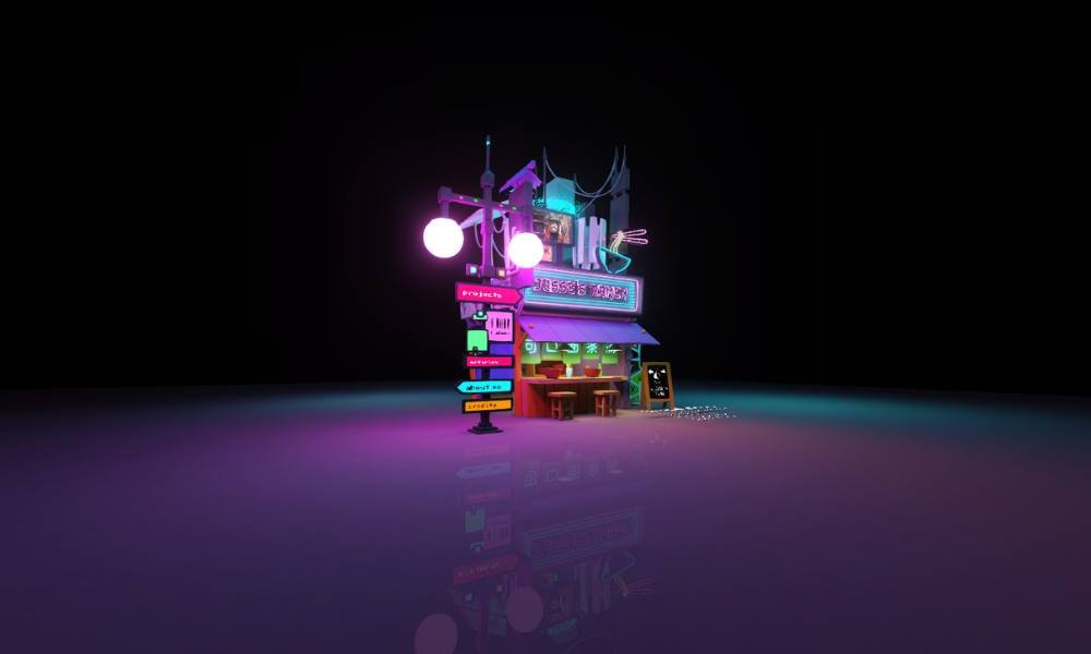
Jesse Zhou’s portfolio doesn’t waste your time. It’s precise, polished, and instantly puts his work front and center. From the opening scroll, it’s clear—this is someone who knows what they’re doing and isn’t afraid to show restraint.
As a product designer, Jesse leads with clarity. His projects are presented with structure and intention. No fluff, no over-designed gimmicks—just thoughtful case studies backed by smart decisions. You’re not overwhelmed with content, but what’s there carries weight.
The interface itself reflects the kind of experience he designs: clean layouts, consistent rhythm, and smooth flow. Every section serves a purpose. His tone? Calm and competent. There’s confidence, but no ego. He tells you what he’s done, how he thinks, and why it matters—then gets out of the way.
The writing is lean, the visuals do the heavy lifting, and everything works as it should. You get the sense that Jesse doesn’t just design for users—he respects them.
In short, it’s a portfolio that speaks the same way good products do: clearly, quietly, and with purpose.
8. Cyd Stumpel
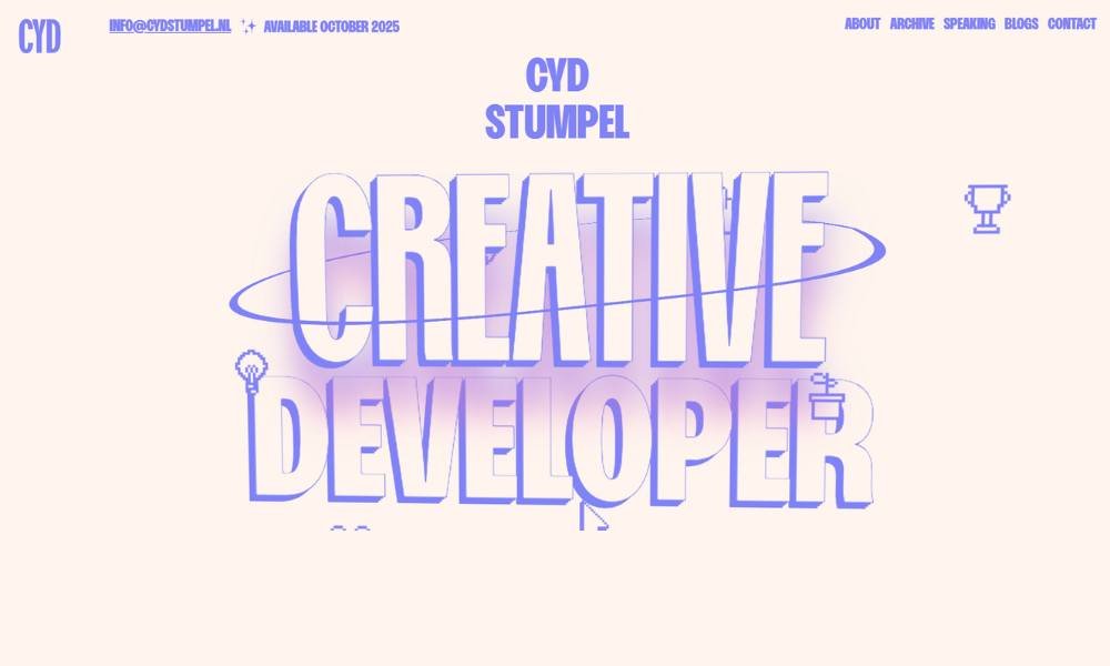
Cyd Stumpel’s site is a bold statement in motion and meaning. From the first interaction, you’re met with playful animations, vibrant colors, and a sense of rhythm that keeps you curious. It’s design that feels alive—but not chaotic.
A creative developer with a sharp eye and a sense of humor, Cyd blends technical skill with a strong visual identity. Every interaction has been considered. The transitions are smooth, the layout is intentional, and the experience feels fresh without ever feeling overwhelming.
What’s especially striking is how the site balances creativity and control. There’s room to explore, but nothing feels loose. Even the fun bits serve a purpose. You learn about Cyd’s approach, projects, and personality just by navigating the space.
Her About section is personal but to the point. It gives just enough background to build connection, with a tone that’s friendly, self-aware, and real. No overpromising. Just thoughtful design and solid code—delivered with a wink.
In a sea of portfolios, this one doesn’t just stand out. It moves.
9. Tamal Sen

Tamal Sen’s portfolio takes a clean, no-nonsense approach—and that’s exactly what makes it work. From the first scroll, you’re met with clarity: his role, his skills, and his projects, all delivered with quiet confidence.
As a frontend developer focused on performance and precision, Tamal keeps the spotlight on what matters. The design is minimalist, but not empty. Sections are laid out logically, content is concise, and nothing feels like filler. It’s all signal, no noise.
His projects are presented with context, showing not just what he built, but how he thought through each challenge. There’s a strong technical foundation here, paired with a clear eye for usability and accessibility.
The site doesn’t rely on flashy effects or loud statements. Instead, it reflects the kind of developer who values structure, focus, and results. It’s thoughtful, consistent, and refreshingly easy to navigate—exactly the kind of experience you’d expect from someone who builds with intention.
Tamal’s site speaks to developers, designers, and clients alike. And it does so without saying too much—because the work does the talking.
10. Edward Hinrichsen
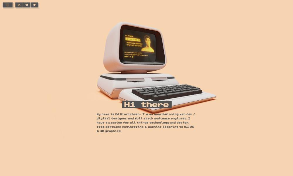
Edward H’s site gets straight to the point—but with style. It opens with a punch of bold type, clean spacing, and an immediate sense of confidence. No clutter. No confusion. Just crisp design and clear intent.
A creative developer and designer, Edward brings a hybrid skill set to the table, and his portfolio reflects that balance. The layout is minimal, but interactive elements are sprinkled in with care. It’s structured, but never stiff. You feel the creative control behind every section.
Projects are displayed with sharp visuals and brief but meaningful context. He doesn’t overexplain—he lets the work speak. And it does. Each page flows intuitively, and transitions feel smooth without stealing the spotlight.
What makes it especially effective is the restraint. The site knows what it wants to say, says it well, and gets out of the way. There’s a sense of polish, but it’s not trying to impress—it’s just showing what’s possible when precision meets creativity.
In a field full of flash, Edward’s portfolio stands out by keeping it smart, clean, and honest.
11. Maxime Bonhomme
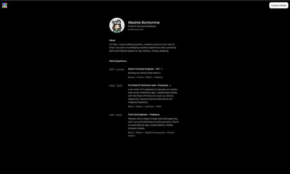
Bonhomme’s site doesn’t follow trends—it happily breaks them. From the opening screen, you’re pulled into a world that’s bold, surreal, and strangely charming. It’s part portfolio, part performance, and fully original.
This isn’t your typical “clean grid of projects” approach. Instead, the experience is theatrical—animated characters, unexpected layouts, and playful motion guide you through a space that feels more like an art installation than a résumé. But under all the whimsy, there’s serious design thinking at work.
The interactions are deliberate. The pacing is tight. Every scroll, hover, and transition feels tuned for attention. It’s chaotic—but in a controlled, intentional way.
Bonhomme manages to make you laugh, wonder, and still understand what he does—and that’s no small feat. His About section is honest and unpolished in the best way, leaning into personality without losing clarity.
In short, this portfolio isn’t just a showcase—it’s a statement. Bonhomme isn’t asking for permission to be different. He’s already doing it.
12. Edewor Onyedika

Onyedika’s portfolio is sharp, direct, and quietly powerful. It opens with a focused layout, soft tones, and just the right amount of motion—setting a calm, intentional tone that carries through every section.
A product designer and front-end engineer, Onyedika blends logic with aesthetics. His site mirrors that mix: minimal design, clean typography, and interactions that feel subtle but polished. You’re not distracted—you’re guided.
Each project is presented with clarity and purpose. No jargon, no padding—just thoughtful breakdowns of challenges, decisions, and outcomes. It’s the kind of work that speaks to process, not just polish.
What really sets the experience apart is the tone. It’s mature, measured, and honest. There’s personality, but it doesn’t try too hard. You get a clear sense of how he thinks—methodical, user-focused, and precise.
The site reflects someone who cares about the craft, not just the result. No gimmicks. No empty buzzwords. Just solid design, clean code, and a clear point of view.
In short, it’s the kind of portfolio that leaves a lasting impression—quietly, but confidently.
13. Ram Maheshwari
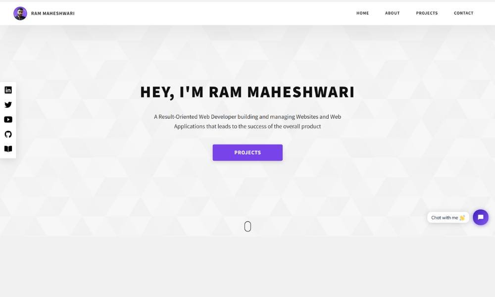
Ram Maheshwari’s site is smooth, modern, and purpose-built—much like the digital experiences he creates. From the first scroll, you’re met with clean typography, smart layout choices, and a tone that’s both confident and approachable.
As a product designer, Ram puts clarity first. His portfolio avoids fluff. Every section is functional, every word considered. Case studies are well-organized and straight to the point—breaking down not just what was built, but why it worked. You’re not reading a sales pitch; you’re following a thought process.
What’s refreshing is the calmness of the design. It doesn’t try to overwhelm you with effects or buzzwords. Instead, it walks you through his skills, philosophy, and approach with precision. Visuals are clean, interactions subtle, and navigation effortless.
There’s also a sense of consistency that speaks volumes. From the color palette to the writing tone, everything feels intentional. It’s not flashy—and that’s what makes it stand out.
In short, Ram’s site reflects the kind of designer who doesn’t just chase trends—he solves real problems with style and substance.
14. Adenekan Wonderful
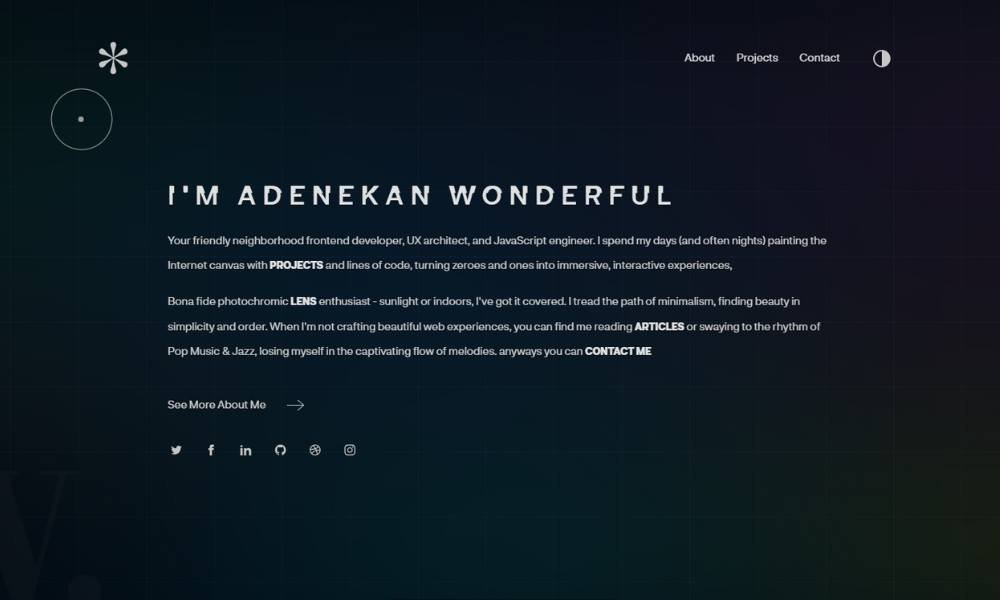
Codewonders.dev is more than a personal site—it’s a well-organized reflection of a developer who builds, writes, and shares with purpose. Bolaji Ayodeji combines technical skill with a clear communication style, and his site captures both.
The homepage is clean, developer-focused, and fast. No distractions. Just a strong introduction, a list of recent work, and links that invite you to dig deeper if you want. It’s efficient—but not cold.
What really stands out is the depth of his writing. Blog posts aren’t just quick tips—they’re thoughtful, well-structured explanations that show care for the developer community. You get the sense he’s not writing to perform—he’s writing to help.
Project links, speaking highlights, and open source contributions are presented without noise. Everything is where it should be. The design stays out of the way and lets the content shine.
Bolaji’s site is built like his approach to work—clear, honest, and generous with knowledge. Whether you’re here to learn or to collaborate, the experience speaks for itself.
15. Olaolu Olawuyi

Olaolu Olawuyi’s website is the kind of portfolio that feels instantly personal and impressively polished. From the opening screen, you’re met with clarity, calm color, and just enough motion to show finesse without showing off.
As a creative developer and designer, Olaolu clearly understands the importance of detail. The site flows smoothly, with carefully spaced sections, crisp typography, and interactive touches that feel purposeful—not decorative. You’re not clicking around aimlessly; you’re being guided.
The “Work” section is sharp—well-documented projects that explain the how, not just the what. He breaks down process, decisions, and outcomes with clarity, which speaks to both technical peers and curious collaborators alike.
But beyond the visuals and code, there’s a real voice here. His writing is warm, honest, and quietly confident. It’s a rare mix: someone with strong technical skills, thoughtful design sense, and the ability to communicate clearly without the noise.
Olaolu’s site doesn’t try to do too much. It does what matters—and it does it really well.
16. Eric Van Holtz
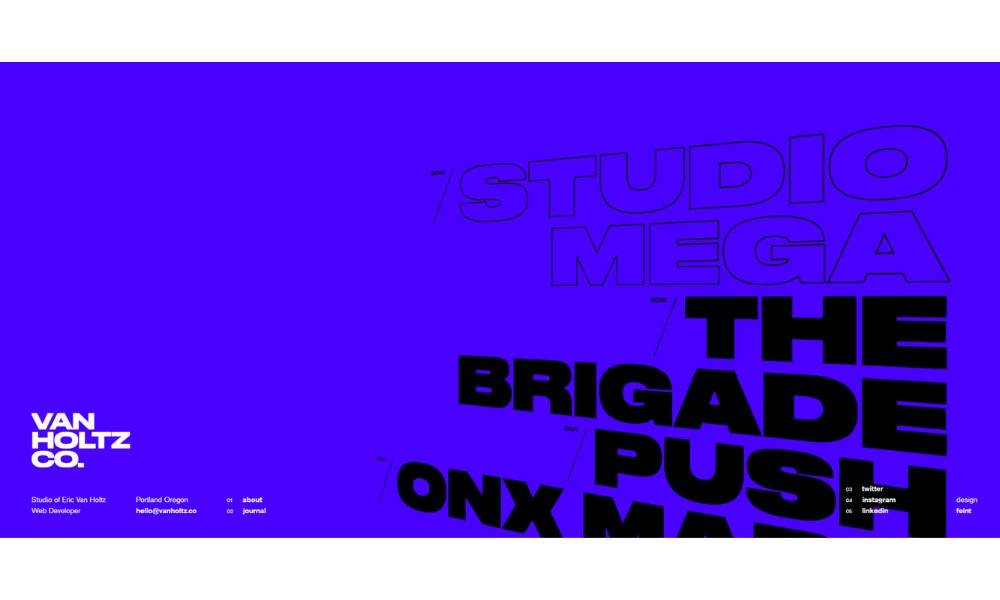
Timothy Van Holtz’s site feels like it was built by someone who doesn’t just know how to code—but knows how to think. From the very first screen, the layout is crisp, the pacing intentional, and the message clear: thoughtful engineering, delivered with design sensibility.
The homepage makes a strong impression without shouting. Typography is bold yet balanced, and every interaction feels smooth, almost invisible in how well it supports the experience. It’s minimal in appearance, but rich in function.
Timothy’s portfolio doesn’t flood you with projects. Instead, it showcases a focused selection, each explained with care. You get a real sense of how he approaches problems—technically sharp, creatively grounded, and always with an eye toward clarity.
There’s also an understated confidence in the writing. No buzzwords. No filler. Just honest descriptions, clean code, and the occasional touch of personality where it counts.
This isn’t a portfolio that tries to be everything. It’s focused, purposeful, and quietly impactful—just like the work it represents.
17. Lauren Waller
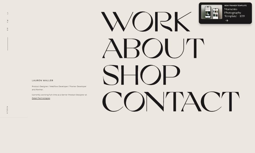
Lauren Waller’s site greets you with calm confidence. From the start, it’s clear: she understands design, and she respects your time. The layout is clean, the typography is thoughtful, and the tone is grounded—professional without being distant.
As a product designer, Lauren doesn’t just show finished work—she invites you into the process. Case studies are well-structured, offering insight into how she solves problems, not just how things look at the end. There’s clarity in every section, and a sense of discipline behind the details.
What makes the experience stand out is the restraint. No unnecessary animations. No filler content. Just strong design decisions, explained with intention. Her About page adds just the right amount of personality—genuine, warm, and straightforward.
This portfolio doesn’t try to impress with flash. It earns attention through focus, balance, and quiet precision. Every element has a job, and it does that job well.
In short, Lauren’s site reflects the kind of designer you trust quickly—because the work speaks clearly, and so does she.
18. Matt Farley
Matt Farley’s site is sharp, efficient, and refreshingly direct. From the first scroll, it’s clear—he’s a designer who values clarity, consistency, and strong visual thinking. No flash, no filler. Just thoughtful design presented with quiet confidence.
The layout is clean and spacious, making it easy to focus on what matters: the work. Case studies are well-organized, with just enough context to show process without overexplaining. You’re not overloaded—you’re informed.
What stands out is the precision. Typography, spacing, and flow all feel tuned. It’s the kind of site that doesn’t just look good—it works well. Every element supports the message, and nothing feels accidental.
His tone is professional but approachable. There’s a human touch throughout—from the personal intro to the way each project is framed. It reads like someone who’s serious about craft, but still easy to talk to.
In a landscape full of loud design and layered animations, Matt’s site does something harder—it communicates trust through simplicity. And that’s exactly what makes it memorable.
19. Brittany Chiang
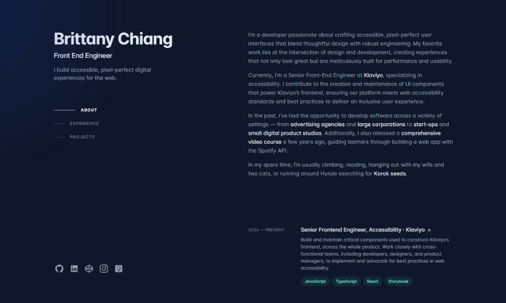
Brittany Chiang’s website is a masterclass in minimalism with meaning. It opens with clean typography, calm colors, and a layout that feels like it was built to breathe. Nothing shouts—yet everything stands out.
A front-end engineer with a sharp eye for design, Brittany’s site reflects the same principles she brings to her work: clarity, consistency, and careful attention to detail. Projects are presented with structure and purpose, giving just enough context to show the thinking behind the build—without weighing the viewer down.
What makes it memorable is the balance. It’s technically sound but never stiff. Visually refined, but not over-styled. Each section flows naturally into the next, with motion that feels intentional and light.
The tone is approachable, professional, and refreshingly human. Her About section is brief, but it carries weight—clear values, clear goals, and a clear sense of who she is.
This isn’t a portfolio trying to impress with noise. It’s one that earns trust through thoughtful design and quiet confidence. And that’s exactly what makes it effective.
20. Ian Dunkerley
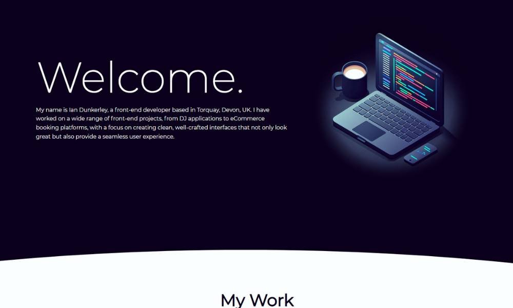
Duncan Foster’s site doesn’t just show creative work—it lives in it. From the moment it loads, you’re immersed in a bold, unconventional space where design, motion, and curiosity collide. It’s sharp, dynamic, and unmistakably personal.
The layout leans experimental, but the experience stays smooth. Animations are intentional. Type is expressive. It feels like you’re flipping through a designer’s mind—but in the best, most organized way possible.
Duncan’s background as a creative director is clear throughout. Every interaction has weight. The visuals are strong, but they never overwhelm the message. Case studies are framed with clarity, offering insight into both process and creative intent without the fluff.
The personality? It’s present and unapologetic. There’s wit in the writing, confidence in the design, and an energy that keeps you moving forward. This isn’t a cookie-cutter portfolio—it’s a living, breathing reflection of a creative who knows how to push boundaries without losing direction.
In short, it’s bold. It’s memorable. And it works—because it’s built by someone who clearly loves what they do.
Conclusion
You don’t need a thousand animations or clever buzzwords to build a great portfolio. You just need a site that speaks your language, feels human, and actually shows what you can do.
The best portfolio ideas are the ones that reflect you—not a design trend or a tech stack checkbox.
So take what fits. Leave what doesn’t. And if you end up making a homepage with a dancing robot and floating text, make sure it has good spacing.


