When I first set out to build my personal website, I had two tabs open: one for inspiration and one for a blank page. Guess which one stayed open longer?
Creating an online presence that actually feels like you can take more than a clean layout and a headshot. Whether you’re a creative, consultant, or somewhere in between, the design and structure should reflect what you do—and how you think.
I’ve rounded up 19 personal website ideas that actually work. These aren’t just pretty templates—they’re thoughtful starting points that can help you stand out, communicate clearly, and maybe even make your homepage feel less like a placeholder.
Here’s what you’ll find in this list:
- Ideas for creatives, developers, writers, and coaches
- Layout inspiration that favors clarity over chaos
- Ways to share your work without oversharing
- Subtle extras that make your site more personal
- Tips on organizing content for both you and your audience
If your site’s been “under construction” since 2021, consider this your gentle push.
1. Ine Agresta
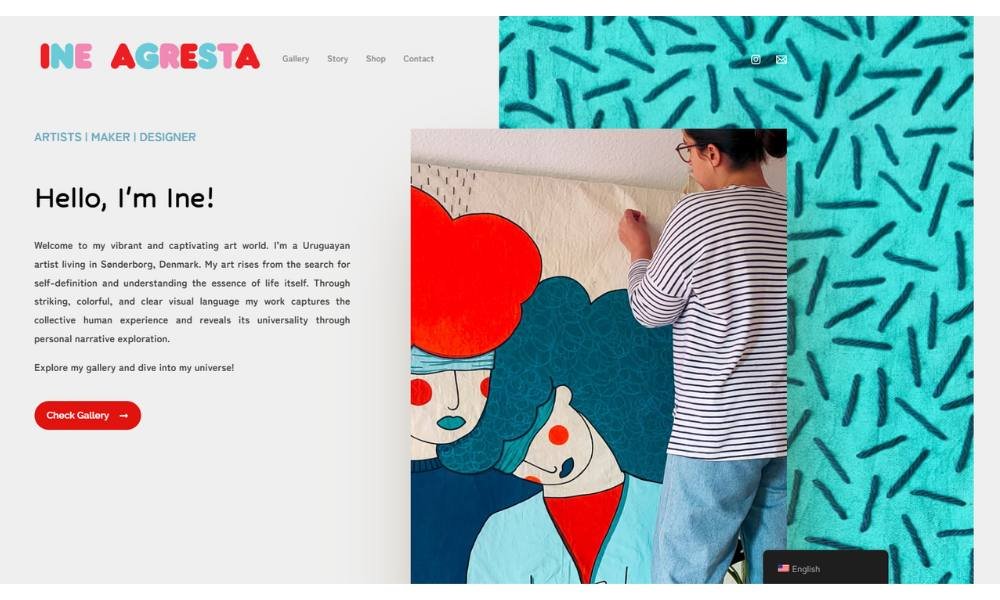
Inea Gresta’s site opens with intention. No clutter, no overload—just strong visuals and quiet confidence. The homepage speaks in design, not distraction.
You’ll notice it right away: her work doesn’t try to explain itself too much. Instead, the portfolio leads, while clean text provides just enough to keep you grounded. It’s direct, and refreshingly so.
The “About” page offers more than just a timeline. Inea shares her approach with clarity—focused, collaborative, and shaped by real-world experience. You get a sense of someone who listens, builds thoughtfully, and doesn’t waste words—or pixels.
One standout element? Her decision to let unfinished work live on the site. It doesn’t feel incomplete. It feels alive. Like you’re catching ideas in motion, not just outcomes.
This isn’t design wrapped in buzzwords. It’s practical, with a quiet edge. Whether you’re a client or just someone curious, Inea’s work leaves space to think. And that, in design, is harder than it looks.
2. Neil Oseman
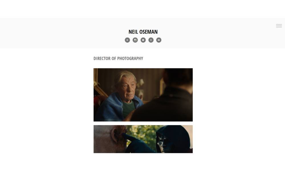
Neil Oseman’s site makes one thing clear from the start—this is someone who knows his craft and doesn’t need to oversell it. The layout is straightforward, with zero distractions. It feels built for people who value clarity, not clutter.
As a cinematographer, Neil lets the visuals do most of the talking. His portfolio is front and center, with sharp imagery and curated project reels that speak for themselves. Everything is organized by format—features, shorts, commercials—making it easy for visitors to find what they’re looking for without a scavenger hunt.
His blog adds a welcome layer. It’s not just gear talk or set anecdotes—it reads like insight from someone who’s been in the field, solved real problems, and still finds it all worth writing about.
The “About” section is honest and matter-of-fact. No drawn-out origin story. Just a clear picture of who he is, what he’s done, and how he approaches visual storytelling.
Altogether, the site reflects the work: intentional, efficient, and built to last longer than a trend cycle.
3. Jake Sinclai

Jake Sinclair’s personal site is a masterclass in visual-first storytelling. The bold homepage design—dark backgrounds with animated avatars—sets a polished, creative tone from the start. It feels playful, but professional.
The navigation is simple and clear. Section labels like Home, About, Skillset, Projects, and Contact ensure you’re never lost. Each click lands you exactly where you need to be.
His About page reads like the summary of a seasoned pro. He highlights a decade-long, multi-disciplinary journey across digital design, print, video, and motion. It’s direct, well-structured, and grounded in real work—no filler.
Project galleries are arranged by category—branding, UX, motion graphics, you name it. Each piece has enough context to feel substantive without crowding the page. The effect is clean, curated, and compelling.
Even the typography and spacing feel intentional. There’s plenty of white space. Text is to the point. Everything echoes an eye for clarity and craft.
If you’re looking for a portfolio site that’s confident, creative, and polished—this one nails it. It showcases a designer who knows his strengths, trusts them, and isn’t afraid to let his work speak.
4. Dr Gillian Jack
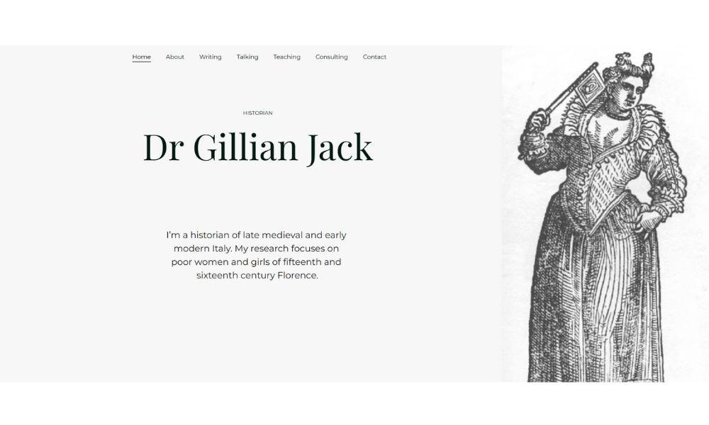
Dr Gillian Jack’s site opens with confidence. A clean homepage and sharp typography set a scholarly but approachable tone from the first glance.
Her title reads: “historian of late medieval and early modern Italy.” No fluff—just truth. And that clarity is carried into every section.
The About page shares her path with ease. She mentions her MA, MLitt, and PhD, and explains her focus on poor women and girls in Florence. It’s straightforward academic storytelling. You understand her focus, depth, and passion without having to dig.
Her Writing and Talking pages feel like natural extensions—clean lists of articles and talks that show her expertise in action. No filler text, just relevant work that matters.
Navigation is smooth. Menu items are clear: About, Writing, Teaching, Consulting. You click, you learn, no detours.
The site feels less like a resume and more like an invitation—to think, to question, to listen. It’s direct, with character and focus.
5. Anulika Nwankwo

Anulika Joy’s site is more than a portfolio—it feels like a personal conversation. From the opening scroll, the tone is warm, grounded, and beautifully clear. The homepage greets you with purpose, not performance.
Her writing is the standout. Whether it’s a blog post, a bio, or a story highlight, her voice stays steady—honest, reflective, and full of thought. There’s no sense of trying too hard. It feels lived-in, not polished to perfection.
Navigation is straightforward. Pages are labeled simply: About, Blog, Projects, Contact. Each section offers a glimpse into her work and thinking without overexplaining. You get the sense she values presence over polish.
What makes the site feel special is the way it’s built around connection. Whether she’s sharing her faith, a piece of poetry, or a quiet moment from life, it all feels intentional. Personal without being performative.
If you’re looking for a site that leads with heart, clarity, and quiet strength, Anulika Joy’s stands out by doing less—and doing it well.
6. Nicole Windle Yoga
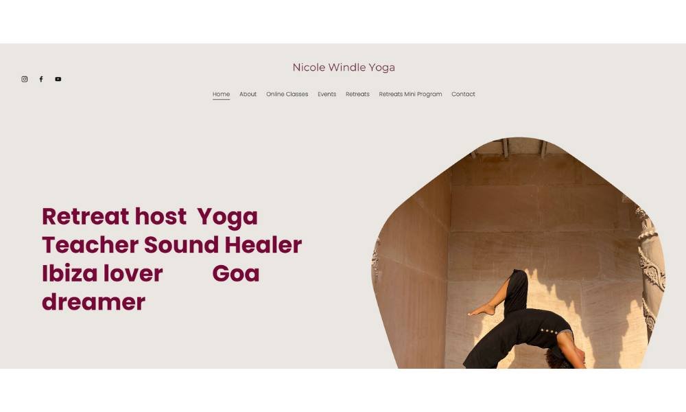
Nicole Windley’s site feels both grounded and uplifting—just like her classes. Soft, natural tones and uncluttered graphics set a calm, welcoming mood from the very first scroll.
The homepage greets you with clarity. A friendly intro, a snapshot of her class style, and direct links to schedules and programs. No filler text—just essentials, clearly presented.
The “About” section reveals more: Nicole teaches a blend of Hatha, Ashtanga, Forrest, and gentle flow. She mentions her roots in dance and healing. It’s honest, relatable, and human—exactly what you need when choosing a teacher.
Schedules and class descriptions are easy to find. Information is organized, no need to dig. Whether you’re new to yoga or returning after a break, she makes it feel approachable.
What stands out? Her voice. Nicole writes with warmth and subtle confidence. You feel invited, not sold to.
Overall, this site offers exactly what Nicole’s classes promise: a clear path, a caring guide, and space to breathe. It’s simple, sincere, and well worth a visit before you roll out your mat.
7. Amacie Design Studio
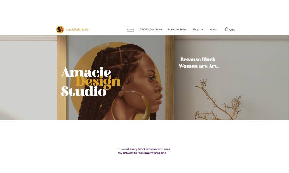
AMacie Design Studio leads with clarity and intention. From the homepage, you’re greeted by bold typography, structured layouts, and a modern aesthetic that keeps things clean without feeling cold. It’s a site that knows what it’s here to do—and does it well.
The studio’s focus is front and center: branding, strategy, and design. No guessing, no filler. Each section is built to give just enough insight—whether you’re browsing past projects or reading about their approach.
The “Work” page showcases client pieces that feel polished and purposeful. There’s range here, but also consistency. You get the sense that each brand is crafted with care, not just thrown into a template.
Navigation is intuitive. The site flows like a well-paced conversation—structured, but never stiff. Even the copy is thoughtful. Professional, yet human. Confident, not loud.
If you’re looking for a studio that values intention over trend, and design that works with strategy—not after it—AMacie makes that case without overexplaining. It’s strong, clear, and built to make an impression that lasts.
8. by Andrew Clay
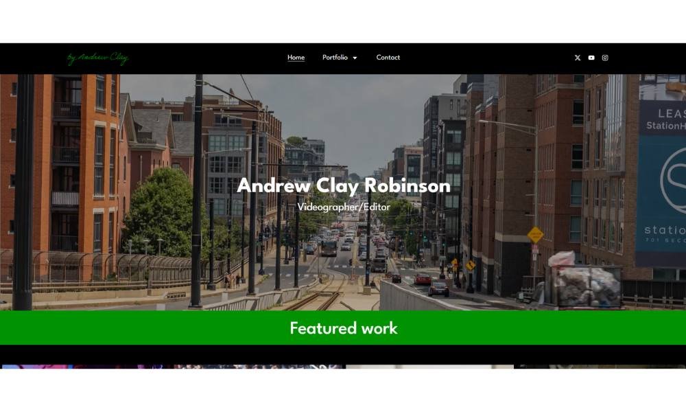
Andrew’s site is a clear reflection of his skills: direct, visually driven, and confidently presented. The homepage greets you with a bold statement—“Filmmaker & Video Editor”—and nothing more. It’s straightforward and effective.
The portfolio is split into Video, Photography, and Motion Graphics & Animation. That clear labeling helps anyone find what they’re after—no hunting required. Visitors can jump right into brand spots, sports reels, timelapses, or nonprofit stories.
What stands out is the visual storytelling. Clips and stills sit front and center, leaving space for the work to make an impression. No filler text needed.
His About section is sharp and succinct: a Baltimore-based filmmaker with a decade of experience collaborating with nonprofits, sports teams, and businesses. No fluff. Just context.
Even navigation feels intentional. Simple menu. Visible social links. Clear contact prompt.
This site feels like Andrew himself—creative, purposeful, and uncluttered. It’s a portfolio that knows what it is, and lets you see why in the first few seconds.
9. Morgan Sun
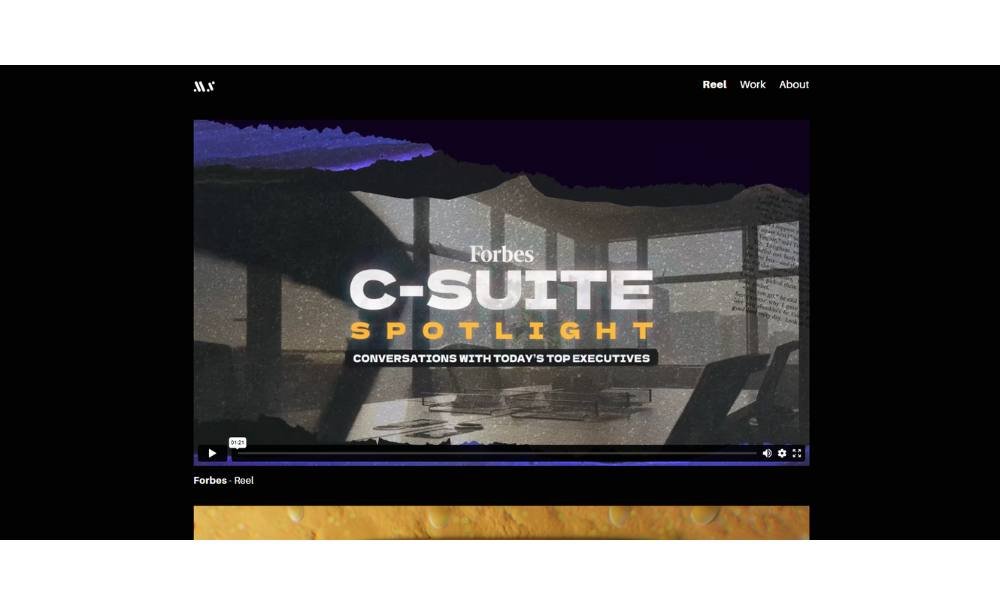
Morgan Sun’s website opens with quiet confidence. The homepage is minimal, but nothing feels missing. Just her name, a simple navigation menu, and strong visuals that speak louder than long-winded intros.
She leads with visuals—designs, objects, spatial studies—all presented with clarity and a sense of intention. Each image feels carefully chosen, allowing her work to breathe without the need for heavy explanation.
The “About” section gives just enough. Her background in industrial design is mentioned, but the focus stays on what drives her: process, form, and thoughtful interaction. It’s brief, but effective—you get a sense of focus without filler.
What stands out is her ability to show precision without being rigid. The layout is structured, but never cold. Even the whitespace feels like part of the design language.
Morgan’s site doesn’t oversell. It doesn’t need to. It presents thoughtful design in a way that feels accessible and smart—perfect for collaborators, clients, or anyone who appreciates design with clarity and care.
10. Kristi Hines
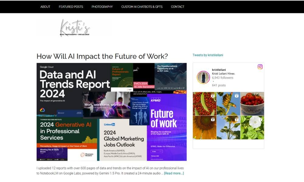
Kristi Hines’ website is built like her writing—clear, direct, and ready to get to work. From the homepage, it’s obvious: this isn’t just another freelance writer site. It’s a focused, well-organized platform for someone who understands both words and strategy.
Navigation is simple and efficient. Sections like Services, Portfolio, About, and Contact are easy to find and even easier to understand. No fluff, no guesswork.
Her “About” page reads like a conversation with a professional who knows her strengths and doesn’t need to oversell them. Kristi’s background in SEO, content marketing, and journalism comes through naturally—one sentence at a time.
The portfolio section is particularly strong. Clean layout. Real results. A mix of B2B and tech-focused writing shows her range without overwhelming the viewer.
Everything on the site reflects Kristi’s approach: practical, polished, and built to deliver. If you’re looking for a writer who understands content and business goals, this site says it before you even fill out the contact form.
11. Κalogirou Rania
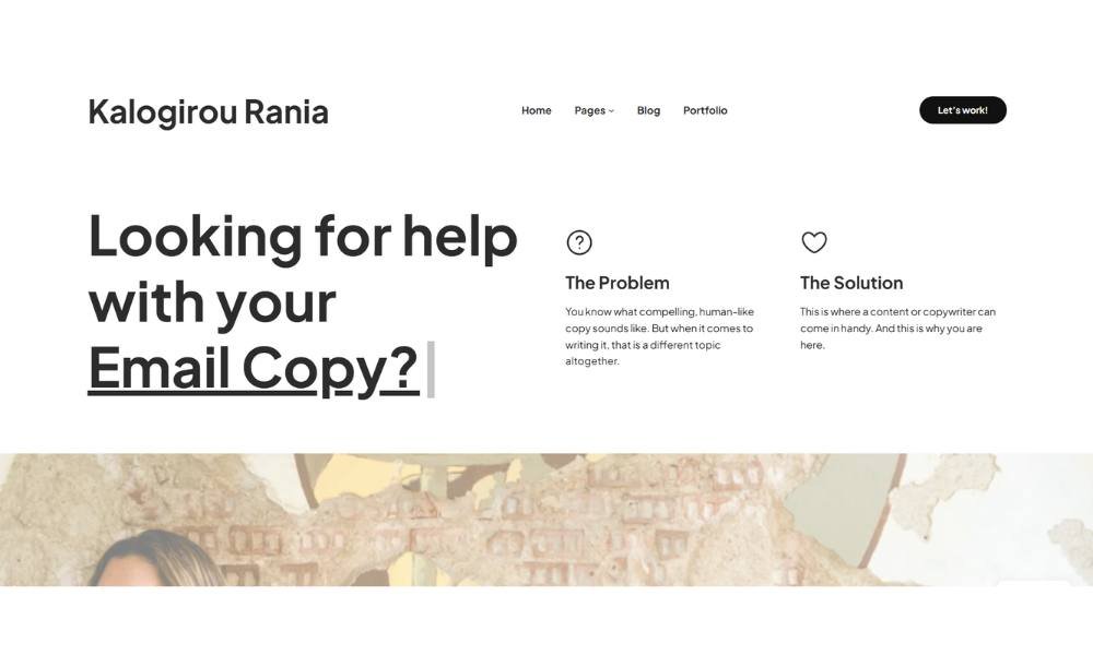
Kalogirou Rania’s site is all about making words work—with precision and economy. From the first scroll, you know what she does: copywriting that hits home. The crisp typography and uncluttered layout signal professionalism from the start.
Her homepage grabs attention with sharp headlines and a clear call to action. You don’t have to dig to find what she offers. It’s presented right where your eyes land, making it easy to act when a line resonates.
On the Portfolio page, her sample writing spans industries—travel, skincare, leadership. Short and impactful snippets keep things snappy and easy to digest. You see range without scrolling through wall‑to‑wall text.
Her About section is straightforward. Rania introduces herself as a freelance writer who uses research and strategy to shape content. No filler. Just essentials—and a bit of warmth that says she cares.
This site doesn’t waste words—or time. It feels smart, well‑organized, and ready to convert browsers into clients.
12. Visual Poetry
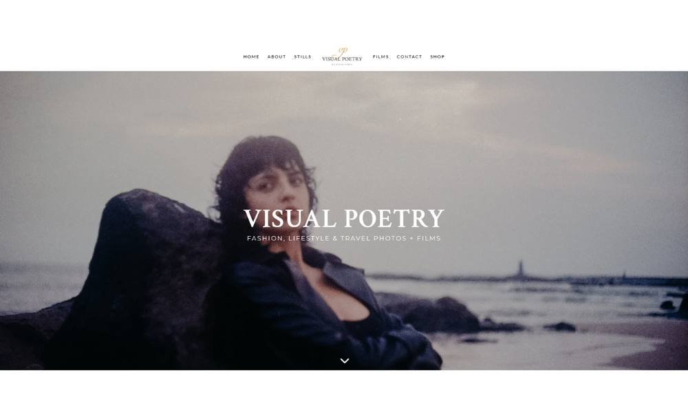
Visual Poet’s site feels both artful and direct. The homepage opens with a soft-focus, cinematic image. No long intros—just visuals that imply depth.
Split into Stills, Films, and Contact, the navigation is clear and intentional. You find what you need without digging.
Their visuals take center stage. A street-style photo with a model peeking through foliage feels candid, yet carefully crafted. It doesn’t shout, it invites. You’re there without being told how to feel.
“About” offers just enough. Their line reads like this: “I listen to your words and illustrate them into beautiful visual imagery.” No jargon. Just a promise—and it sets expectations.
Projects are curated, not crowded. Each still or clip is given space to land. You sense a creator who values quality and wants the work to breathe.
What’s smart here is balance. The site feels creative, but never at the expense of clarity. Like a poem in motion, it leaves room for interpretation while still giving direction.
If you’re drawn to cinematic visuals that feel thoughtful and human, Visual Poet speaks your language—with images that stay with you.
13. Rafal Bojar
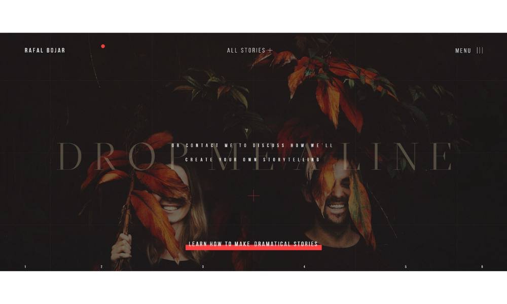
Rafal Bojar’s site doesn’t just present photography—it immerses you in it. The moment the homepage loads, you’re pulled into a cinematic world. Motion. Texture. Emotion. It’s clear: this is storytelling first, photography second.
Navigation is understated but effective. The menu floats quietly—Portfolio, Stories, Journal, Contact—allowing the visuals to lead. And they do. Every frame feels intentional, like a still pulled from a film you didn’t know you wanted to see.
His “Stories” aren’t just galleries—they’re narratives. Names, dates, and glimpses into relationships unfold with depth and restraint. There’s a pace to it. You’re meant to pause.
The “About” section is just as poetic. Rafal speaks like someone more interested in people than pixels. His words are few, but chosen carefully—like his frames.
This isn’t a traditional portfolio. It’s an experience. You scroll slowly, not because you have to—but because you want to.
For anyone drawn to visual storytelling that feels raw, human, and artfully imperfect, Rafal’s site doesn’t just show his work—it shows his point of view. And that might be the rarest quality of all.
14. Leesha Williams

Leesha Williams’ site opens with warmth and authenticity. From the first scroll, you notice her photos—natural, candid, alive. No stiff portraits, just real moments that feel like they matter.
Navigation is clean and clear. Tabs like About, Portfolio (split into Photography and Videography), Blog, Pricing, and Contact guide you straight to what you came for—no guesswork.
Her About section reads like a friendly chat. You learn about her creative journey, what she cares about, and how she captures people in their most genuine light. It’s personal, but not overdone.
The portfolio is the star—and for good reason. Whether it’s a couple sharing a quiet laugh or a bride framed against soft sunlight, each image feels thoughtfully placed. The “My Style” note is straightforward: she focuses on connection over polish.
Even the Pricing page reflects that mindset—clear, transparent options, no surprises.
Overall, this is photography with heart and honesty. You get a sense that Leesha cares deeply about moments. Her site makes you pause and feel something real.
15. Greg Ross
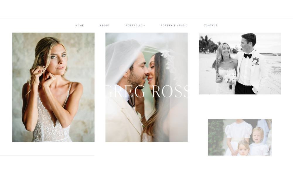
Gregory Ross’ site has a familiar, relaxed rhythm—like talking to someone you already trust. A clean homepage with his name, crisp layout, and inviting visuals set that tone immediately.
His navigation menu is straightforward: Home, About, Portfolio, Journal, Contact. Each section gets you where you need without guesswork.
The About page tells a story, not just a resume. You learn he’s spent years shooting weddings, families, and destinations—Los Angeles to Nashville and beyond. His calm, easygoing demeanor shines through. He’s the kind of pro who’ll climb on chairs or sprint backward to capture the perfect moment.
The Portfolio is all visuals—clean grids, no distractions. Sections for weddings, engagements, and family sessions make sense and let the work speak.
His Journal adds depth. A mix of travel shots, session highlights, and reflections give texture beyond galleries.
The site feels like Greg himself: friendly, committed, and skilled. It doesn’t overstate—it shows. If you’re after photography that’s honest, visually strong, and human, this site makes the case—in every click.
Final Thoughts
Building a personal site doesn’t have to feel like assembling IKEA furniture without the manual. With the right idea—and a little intention—you can create something that’s both functional and fully yours.
These 19 ideas aren’t rules. They’re starting points. Pick one, mix two, adjust as needed. Just keep it honest, keep it clear, and skip anything that feels like filler.
Whether your goal is to get hired, get noticed, or just get your name out there, the right structure can help you do more with less.
And if all you’ve done so far is secure your domain name? That still counts as progress.

