Let’s face it—building an artist website can feel a bit like staring at a blank canvas. Endless possibilities, zero direction. I’ve been there. Whether you’re just starting out or trying to give your current site a much-needed refresh, knowing what works (and what doesn’t) can save you time—and a few headaches.
In this piece, I’m sharing artist website ideas that actually work. Not fluffy inspiration or abstract theory—real, visual concepts grounded in strategy, storytelling, and usability. These are things I look for when designing and reviewing websites across creative industries.
Here’s what you’ll find:
- Ideas for homepage layouts that feel clean, not cold
- Smart ways to organize your portfolio (without overwhelming anyone)
- Subtle design choices that keep visitors around longer
- What to include in your About section that isn’t just… your résumé
- A few fun surprises you can actually pull off, no coding degree needed
If you’re ready to get serious about your site—without losing your personality—you’re in the right place.
1. Samantha Keely Smith
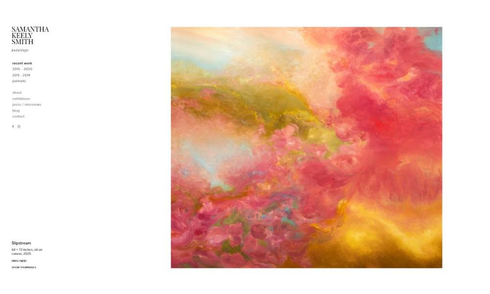
Brooklyn-based painter Samantha Keely Smith doesn’t just show you her art—she pulls you into her process. The moment you land on her site, you’re greeted by bold, atmospheric works that feel almost alive. These aren’t just finished pieces on display. They’re part of an evolving journey, documented with honesty and a touch of drama.
Her About page goes beyond formalities. Instead of listing awards and education in bullet points, Samantha shares her perspective. It’s a quiet, thoughtful insight into how she sees the world—and paints it. You start to understand what drives her, and why her work feels so personal.
One refreshing detail: her images don’t scream for attention. They just exist—confidently. There’s no loud branding or heavy graphics. Just the art, front and center. It’s a reminder that sometimes, less really is more.
And while the site is clean, it doesn’t feel cold. There’s warmth in the simplicity. A kind of honesty. It doesn’t try too hard—and that’s what makes it memorable.
2. Almost Real
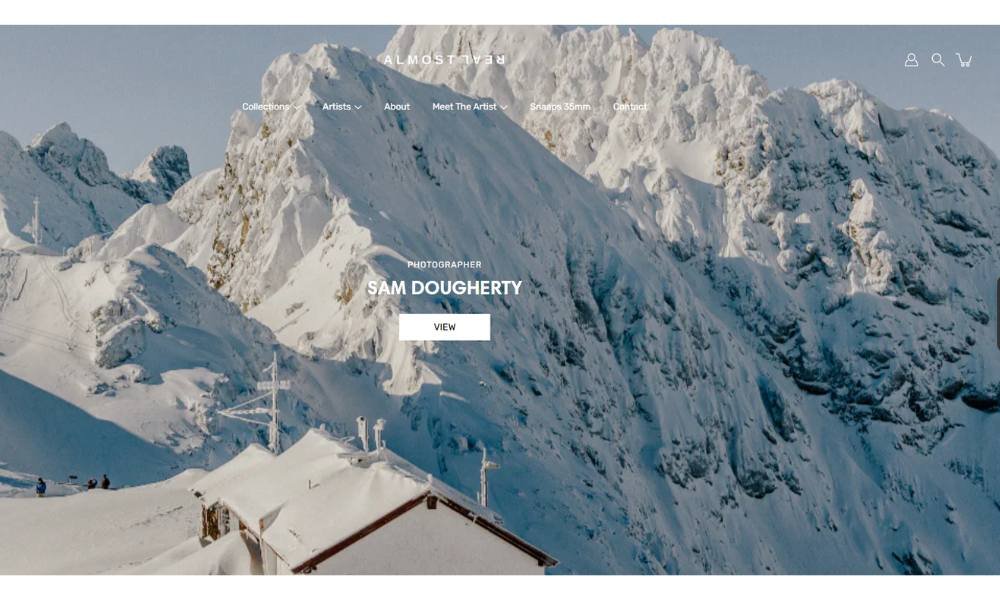
Almost Real isn’t your average creative studio—and it doesn’t try to be. From the first scroll, you’re met with visuals that don’t just look good—they challenge you to look twice. Their work lives in the space between design and concept, where form meets attitude.
The studio’s About section keeps things refreshingly direct. Instead of corporate fluff, you get a sense of personality, intention, and a slightly rebellious spirit. They describe what they do, but more importantly, they show how they think—and that’s where the magic happens.
What stands out most? Confidence. Not the loud, boastful kind. The kind that comes from knowing who you are and being okay if not everyone “gets it.” Their projects aren’t just built for brands—they’re built with a point of view. And yes, some of them are a little weird. That’s the point.
The site itself feels like a creative playground. It’s clean, but not boring. Structured, but with just enough edge to keep you curious. No over-explaining. No over-designing. Just sharp work, a clear voice, and the sense that this team really enjoys what they do.
3. Benjamin Hardman
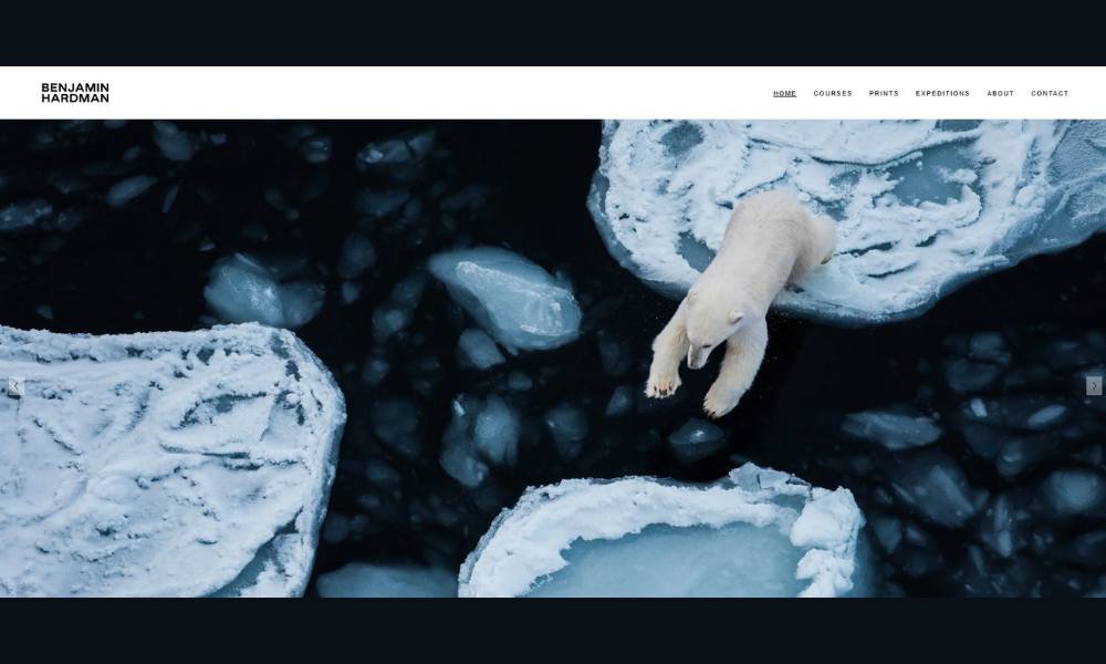
Benjamin Hardman doesn’t just take photos—he captures silence. His portfolio is a quiet storm of icy landscapes, dramatic light, and vast, otherworldly scenes that feel untouched by time. Every image feels like it was earned—not just taken.
His site wastes no space on distractions. It’s minimal, but not empty. The design lets the work speak, and it does—loudly, in its own quiet way. You scroll through raw, frozen worlds that somehow feel deeply human. There’s precision here, but also emotion.
The About section is brief, but effective. It hints at his journey, his Icelandic base, and his deep connection to remote places. No filler. Just facts and focus.
What’s striking is how consistently his style carries across every project. Whether it’s a glacier, a mountain range, or a frozen shoreline, each image feels considered. Not staged—just honestly seen.
This isn’t just a portfolio. It’s a visual commitment to patience, isolation, and the stark beauty of cold. There’s no need for bold statements. The work speaks in a whisper—and you’ll want to listen.
4. Maegan Guerette
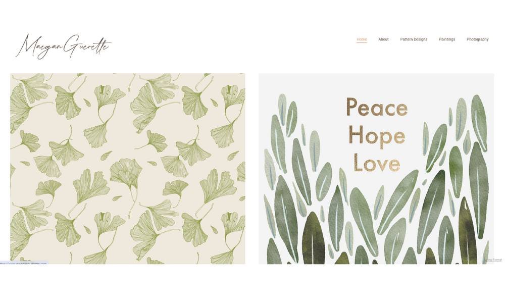
Maegan Guérette’s work feels like a memory you haven’t lived—but somehow remember. Her photographs walk a fine line between documentary and dream, offering quiet moments that linger longer than expected.
The website mirrors that sensibility. It’s spare, intentional, and calm. No visual clutter, no heavy design tricks. Just space—to look, to feel, to absorb. Her portraits and stills are unhurried, and that pace carries through the entire experience.
Maegan doesn’t oversell her vision. Her About page is short and steady, letting her background surface gently. There’s no long-winded pitch or creative manifesto. Just a sense of someone who pays attention—and wants you to, too.
The work itself is subtle, but sharp. Faces, light, and texture all feel handpicked, not just captured. There’s care in every frame, but never too much polish. That slight imperfection? That’s the charm.
This isn’t a gallery built to impress—it’s one that invites. Quiet confidence. Soft edges. And images that don’t shout for your attention, but earn it anyway.
5. Kate Vass
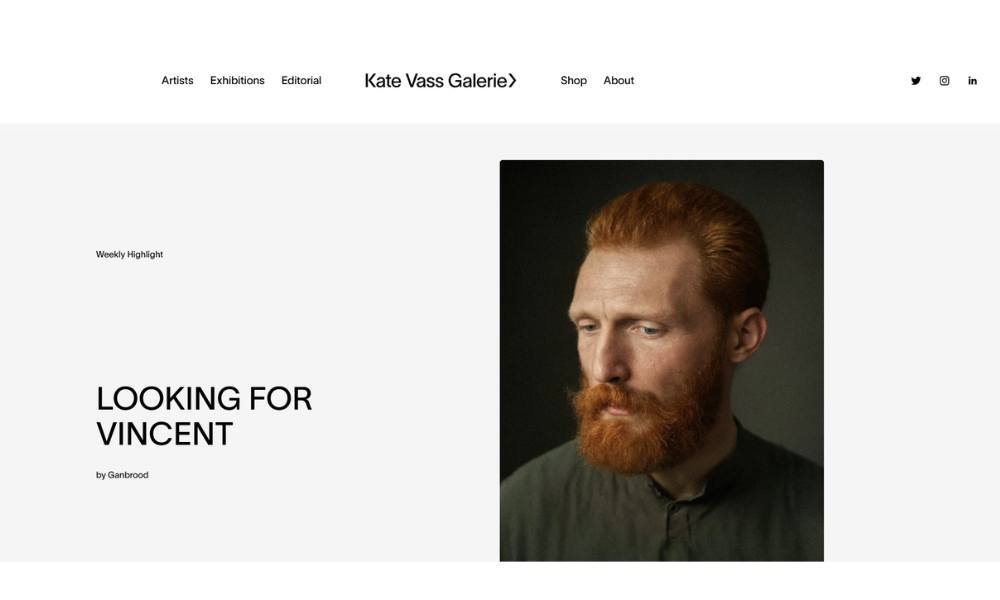
Kate Vass Galerie doesn’t follow trends—it studies them, questions them, and occasionally flips them inside out. The gallery’s focus on digital art, blockchain, and conceptual photography makes it feel less like a white-wall space and more like a lab for ideas.
From the first click, the site signals clarity. It’s modern, but not trying too hard. Clean layout, confident structure, and work that speaks without needing a long introduction. It’s a space for thinkers and collectors who appreciate art that pokes at the edge of technology.
The About section tells you what you need to know—no fluff, just direction. The gallery is selective and smart, with a strong curatorial voice that favors work with both substance and curiosity.
Artists featured here aren’t just visually bold—they’re asking real questions. About ownership. About value. About the role of digital art in a physical world that’s still catching up.
This isn’t just a gallery showing what’s next. It’s already there, calmly waiting for the rest of us to notice.
6. Mel Volkman
Mel Volkman’s For Beauty and Truth feels like a soft whisper in a loud room. The collection is quiet, but it holds weight. Each piece feels deeply personal—like a page torn from a handwritten journal you’re not quite sure you were supposed to find.
The site keeps things simple. No distractions, no forced narratives. Just a clear path through works that blend emotion with restraint. The palette is muted, the presentation minimal, but the feeling? Anything but.
This isn’t art meant to decorate—it’s meant to sit with you. Some pieces feel like grief wrapped in linen; others, like a fragile kind of hope. There’s no need to decode anything here. You feel it, or you don’t. And if you do, it stays with you.
The collection name says it all. There’s a kind of raw honesty in these works—delicate, but never weak. Volkman doesn’t try to impress. She just tells the truth, quietly and beautifully.
No overstatement. No rush. Just a clear invitation to feel something real.
7. Sophie Kahn
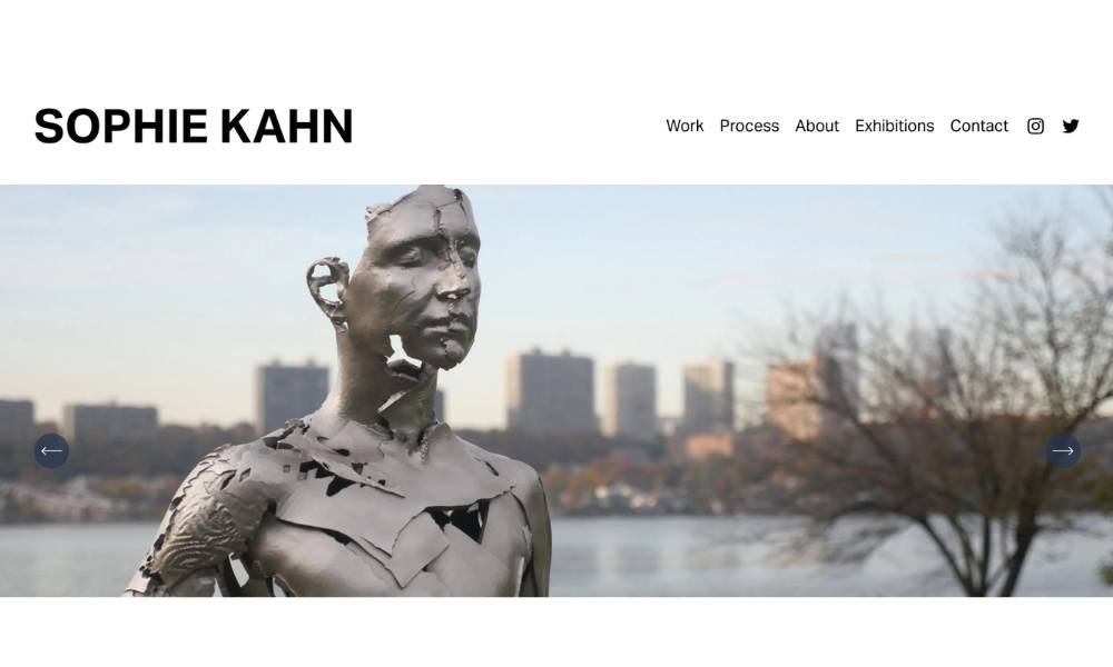
Sophie Kahn’s work lives in the space where precision meets fracture. Her sculptures look like they’re caught mid-glitch—half-human, half-history—frozen in the moment something both breaks and begins.
The site reflects that same tension. It’s clean, structured, and quiet. No noise, no distractions. Just the work, front and center, with enough space around it to let you pause and wonder. Every piece feels intentional, but also a little haunted.
Her About section gives you just enough context to understand the “why” behind the work. Her background in photography and digital fabrication shows, but it’s not the technology that leads—it’s the questions she asks through it.
There’s a kind of stillness to her sculptures. Not inaction, but suspension. Like time stopped mid-sentence. The fragmented surfaces, the missing pieces—they don’t feel unfinished. They feel exactly as they should be: open-ended.
Sophie isn’t trying to fix or smooth over the cracks. She’s highlighting them. And in doing so, she turns digital imperfection into something unexpectedly human.
8. Jason Arkles
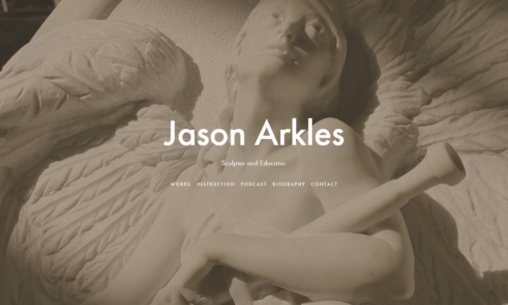
Jason Arkles doesn’t just sculpt—he brings the old world into the present, one chisel mark at a time. Based in Florence, his work is grounded in classical technique, but it never feels stuck in the past. It’s traditional, yes—but there’s life in it. Intention. Weight.
The website keeps things straightforward. No heavy-handed branding. Just an artist and his work, laid out with quiet confidence. The sculptures are front and center—no fuss, no filters. Just form, craft, and a deep respect for history.
His About page gives you a sense of both skill and humility. You learn about his training, his passion for teaching, and his deep dive into Renaissance methods. It’s not a self-promotion exercise—it’s more like a nod to the lineage he’s part of.
What stands out is the focus. Everything here feels built to last—not just physically, but philosophically. Arkles isn’t trying to chase trends. He’s building something solid. Something honest.
In a time of fast and flashy, his work reminds you that patience still matters. And so does craft.
9. Jessica Chou
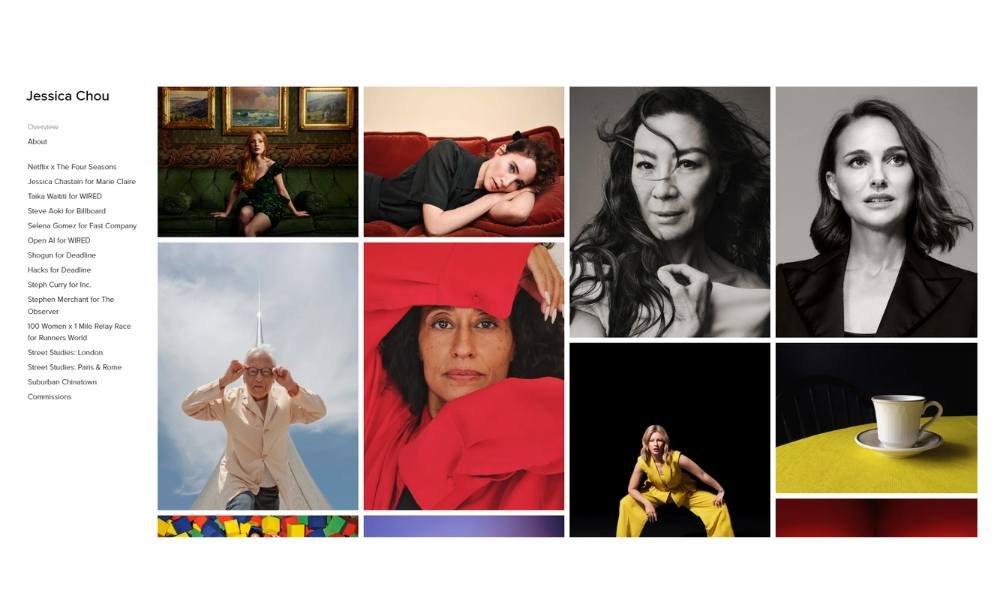
Jessica Chou captures people in a way that feels honest, but never exposed. Her portraits don’t push—they observe. Her subjects aren’t posed for drama; they’re simply present, and that’s enough.
The website echoes that approach. It’s clean, organized, and free of distractions. The images lead, as they should. There’s no need to over-explain when the work already knows what it’s doing.
Her About page is concise, grounded, and refreshingly human. You get a sense of who she is—a thoughtful observer with a strong editorial voice. She’s worked with major publications, but never lets the bylines do all the talking.
What stands out is the balance. The photos feel quiet, but never flat. There’s room in each frame—room to breathe, to think, to notice small things. Light, posture, expression—it’s all intentional, but never heavy-handed.
Jessica’s work doesn’t scream for attention. It just holds it. And in a world full of noise, that kind of calm confidence is rare.
10. Andrea Lawl Manning
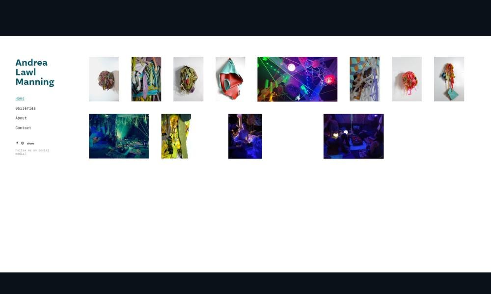
Andrea Manning paints what many people overlook: stillness, softness, and the way light quietly moves across everyday forms. Her work doesn’t clamor for attention—it waits, gently, until you’re ready to really see it.
The website feels just as thoughtful. It’s simple, spacious, and carefully paced. Nothing feels rushed or overdone. The colors breathe. The work speaks.
Her About section is short, sincere, and focused. You learn a bit about her background, but more importantly, you feel her perspective. She paints from a place of presence—not performance. That comes through in every brushstroke.
What makes the work stand out isn’t boldness. It’s restraint. The scenes are intimate. Familiar, even. But they carry a kind of quiet depth that stays with you longer than expected.
Andrea’s pieces don’t try to impress. They invite. They offer a sense of calm, a small pause in a very fast world.
And sometimes, that’s exactly what you didn’t know you needed.
11. Jingna Zhang
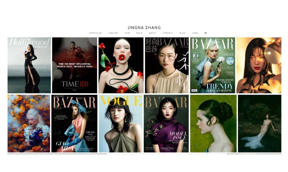
Zhang Jingna’s work feels like it exists in its own atmosphere—somewhere between dream and discipline. Her photographs carry a stillness that’s theatrical without being loud. Beautiful without being fragile. Every frame looks like it was meant to be remembered.
The site reflects that same clarity. It’s sleek, minimal, and confident. No gimmicks—just the work, shown with care and control. The galleries are thoughtfully arranged, allowing the images to breathe. No clutter. No rush.
Her About page gives a direct but humble view into her path—from national athlete to world-recognized photographer. It’s not self-congratulatory. It’s focused. Like the images themselves.
What sets her apart is consistency. Whether it’s fashion, portraiture, or fine art, her voice remains unmistakable. There’s a quiet intensity in her work—graceful, but never passive.
Zhang isn’t chasing attention. She’s building legacy. One frame at a time.
12. Carmen Hunter
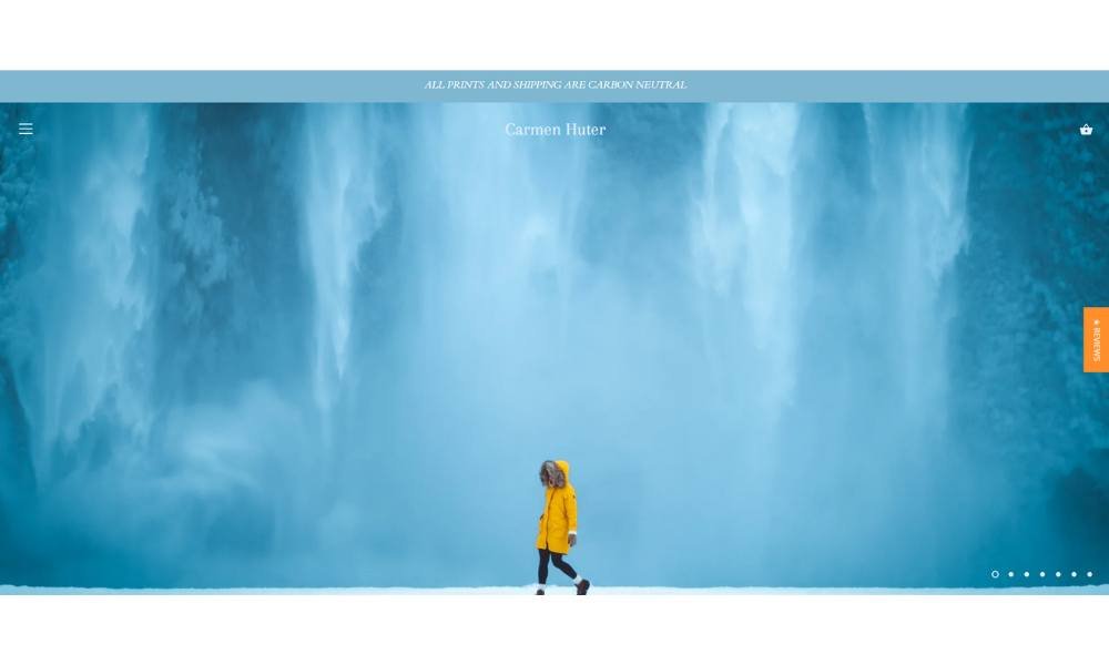
Carmen Huter doesn’t just take you places—she makes you feel them. Her photography captures more than landscapes. It captures movement, light, and the kind of stillness that only comes when you’re far from everything.
The website reflects that same clarity. It’s minimal but inviting. No distractions, no unnecessary frills. Just image after image that feels like a breath of fresh, high-altitude air.
Her About section is refreshingly down-to-earth. You don’t get a long list of accolades—you get her voice. Honest, curious, and quietly driven. She’s not trying to impress. She’s simply showing you how she sees the world.
What stands out most? Joy. Even in the most remote, dramatic places, her photos carry a kind of lightness. There’s beauty, yes—but also freedom. A sense that life doesn’t have to be rushed or complicated to be meaningful.
Carmen’s work isn’t just about far-off places. It’s about perspective. And she offers it generously, one frame at a time.
13. Raul & David
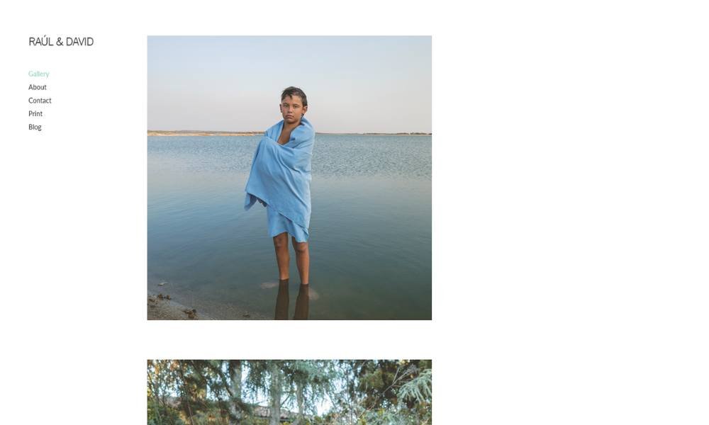
Extravagantes Photo brings bold moments into crisp focus. Their portfolio revels in vibrant contrasts, sharp angles, and quiet pauses—all captured with intention. Each image is vivid yet balanced, powerful without overwhelming.
The website echoes that vision. It’s clean, grid‑based, and easy to navigate. No distractions. Just bold visuals, front and center. You scroll through striking portraits and edgy scenes that feel both polished and authentic.
The About page cuts through fluff. It’s direct. You learn who’s behind the lens, what fuels the vision, and why certain moments spark creative energy. This isn’t a resume—it’s a doorway into their world.
What stands out is confidence. Their book doesn’t seek approval, but invites curiosity. You sense a studio that values storytelling over staged smiles and crafted backdrops. It’s about capturing real responses—micro‑expressions, subtle glances, fleeting gestures.
Extravagantes isn’t chasing trends. The work feels current but rooted. There’s an organic vitality that makes each photograph feel relevant yet timeless.
Clean layout. Authentic images. A clear perspective. Not flashy—it’s focused. And in a sea of overproduced content, that kind of clarity is a breath of fresh air.
14. Andrew L. Shea
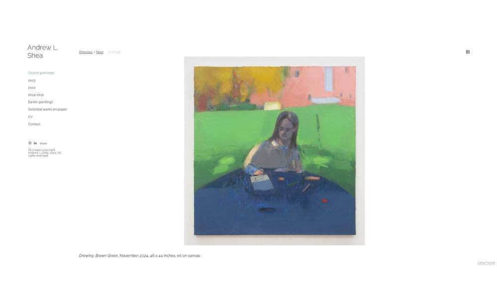
Andrew L. Shea paints moments that feel half-remembered—soft studio corners, casual breakfasts, mirrored reflections. His work carries a calm intimacy, where oil on canvas meets quiet attention to everyday life.
The site is unassuming and steady. Galleries are labeled clearly by year—2023, 2022, earlier works. The layout isn’t flashy. It’s just enough space to move through each painting with care.
His About and CV pages offer context without excess. You learn that he holds an MFA from RISD, teaches at Parsons and BMCC, and writes for The Brooklyn Rail and The New Criterion—you get a sense of his thinking as well as his making.
What’s striking is consistency. Every painting—whether a vase, a studio corner, or a self-portrait—feels observed, considered, and grounded. There’s no rush. Just slow looking and careful brushwork.
Andrew’s work doesn’t shout. It whispers. And in that whisper, you hear both precision and presence. It’s art that rewards stillness—one frame, one breath at a time.
15. Wenting Li
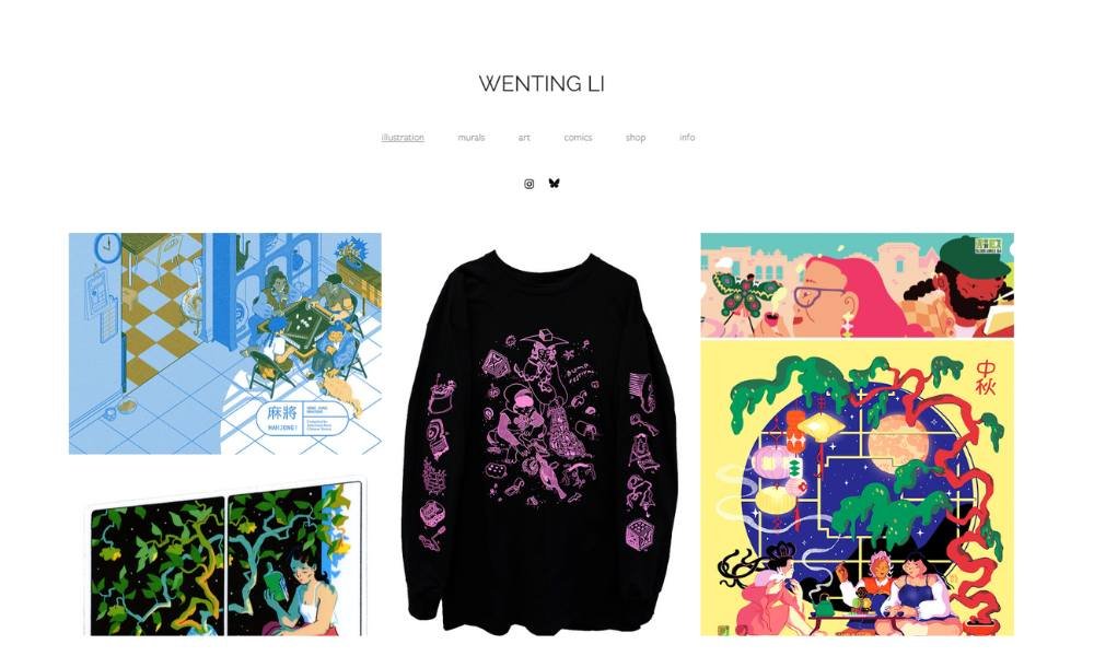
Wenting Li paints stories onto walls, screens, and pages—each illustration carrying playful detail with a thoughtful pause. Browsing her site, you see murals that brighten city corners, editorial work that hints at wider worlds, and comics that feel quietly lived‑in.
The layout is clean and calm. You can move between murals, publications, shop, and comics without distraction. Each section is organized clearly, letting the work stand on its own.
Her Info page feels grounded. You learn she’s based in Toronto (Tkaronto), working across illustration, painting, installation, comics, and even sculpture. She’s curious about memory, climate, tech, and how stories shape our lives—a mix that gives her work direction without weighing it down.
What stands out is curiosity. Whether it’s a shop sticker design or a magazine cover, her pieces feel precise, warm, and quietly bold. You sense intention—but not over‑design. She’s not chasing style; she’s drawing connections.
Wenting’s work doesn’t shout. It invites. You look twice. You stay longer.
16. Alex Tran
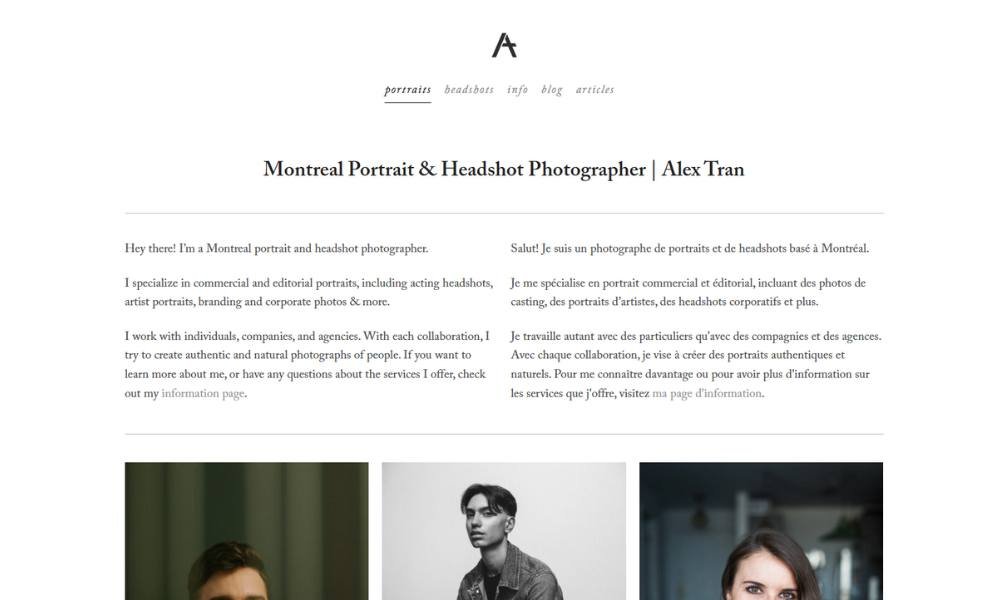
Alex Tran’s work is clean, precise, and quietly cinematic. His photographs feel like stills from a story just starting—or one you’re already in the middle of, whether you realize it or not.
The site reflects that clarity. No clutter. No unnecessary design tricks. Just sharp, intentional imagery laid out with purpose. You land on the homepage, and it’s all there—mood, tone, and a sense of rhythm that carries through every frame.
His About page keeps it simple. A few lines, a quiet introduction, and a clear sense of what drives his lens: people, movement, light. You don’t get a long backstory—you get a photographer who lets the work do most of the talking.
Each shot, whether it’s a portrait, lifestyle moment, or editorial piece, feels carefully composed but never stiff. There’s room for realness—for personality to come through. You sense trust between the subject and the photographer.
Alex isn’t over-directing or over-staging. He’s noticing. And that kind of attention is what makes the work stand out.
17. Caroline Drogo
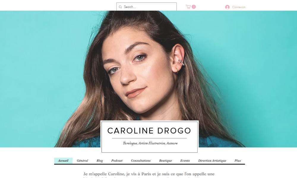
Caroline Drogo blends illustration, tarot, and design into a singular visual language that’s both playful and introspective. Growing up among wild landscapes, she carries that sense of wonder into her studio creations—portraits, flora, tarot decks that feel like found artifacts.
Her website echoes this blend. It’s bright and modern without ever feeling trendy. Galleries, shop items, blog posts—all are pared back, letting color and line do the talking. Navigation is clear, easy, and welcoming.
The About section is light but grounded. You learn she’s based in Paris, works as illustrator, graphic designer, author, and tarot reader—and yes, she makes her own decks and consults at events. No long bio; just enough to know there’s curiosity and intention behind every stroke.
What stands out most is authenticity. Her pieces feel hand‑drawn, spirited, and slightly esoteric—like secrets half-shared. Whether it’s a whimsical mural, a tarot card, or a line‑drawing print, the work feels considered but never contrived.
Caroline doesn’t chase aesthetics. She makes things that feel alive—and a little magical.
18. Eric Pickersgill
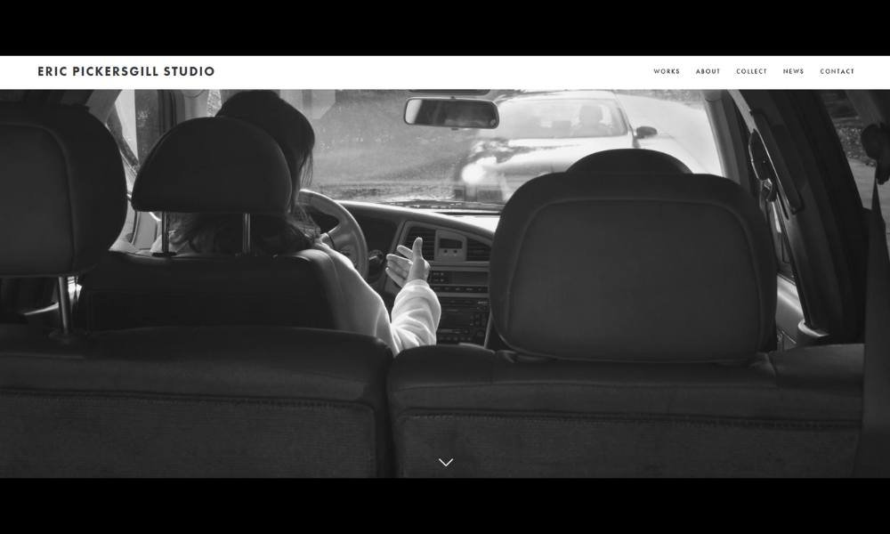
Eric Pickersgill’s black-and-white portraits capture the quiet paradox of our device‑obsessed lives. The images are staged—but familiar: people holding ghost phones in empty hands, as if the device itself speaks louder than the call.
His website is clear and calm. You land on Projects, and you move through series like “Removed” without distraction. Layout is clean; text is minimal. The work takes the lead.
The About section is straightforward. You learn about his MFA, his teaching, and his curiosity about how cameras—and screens—shape what we see and how we connect. It never feels like self-promotion. Just honest context.
What hits hardest is subtle humour. A young kid engrossed in an invisible screen or a parent pretending to scroll—you smile, but you also pause. It’s familiar and just a bit absurd.
Eric isn’t condemning phones. He’s holding up a mirror. And in that reflection—less judgment, more gentle nudging—you sense both critique and compassion. It’s work that makes you look, laugh, and think—all at once.
Conclusion
Your website doesn’t need to shout. It just needs to work—for you, for your art, and for the people trying to find you. Whether you pulled one idea from this list or all twenty, the goal is the same: make your work easier to find, easier to enjoy, and harder to forget.
I’ve found that small changes—thoughtful layout tweaks, a sharper intro, better image flow—can do more than a complete redesign. You don’t need to reinvent the wheel. You just need to steer it with a little more intention.
If any of these ideas sparked something, sketch it out. Tweak your About page. Reshoot that banner image you’ve been ignoring for three years. Progress isn’t always dramatic—but it’s always better than waiting for perfect.
Your site doesn’t need to be everything. It just needs to be yours—clear, true, and ready for whoever clicks next.

