Coming up with a great website idea as a student is both exciting and… occasionally frustrating. I’ve been there—staring at a blank screen, unsure if I should build a blog, launch a mini store, or teach people how to fold origami ducks online. (Spoiler: I picked the ducks.)
In 2025, the smartest student websites won’t just show off skills—they’ll be small but powerful platforms to learn, grow, and maybe even earn. Whether you’re into code, content, creativity—or some strange mix of all three—there’s room to start something meaningful.
In this post, I’m sharing 20 practical and creative website ideas I believe students can build without needing a million-dollar budget or a caffeine-fueled all-nighter. Here’s what you’ll find:
- Clear, doable concepts for personal and academic growth
- Sites that teach, share, sell, or build community
- Real-world value with room to experiment
- Ideas that go beyond the generic portfolio or blog
And yes—some light humor, because learning shouldn’t feel like a spreadsheet.
1. Zaytuna College
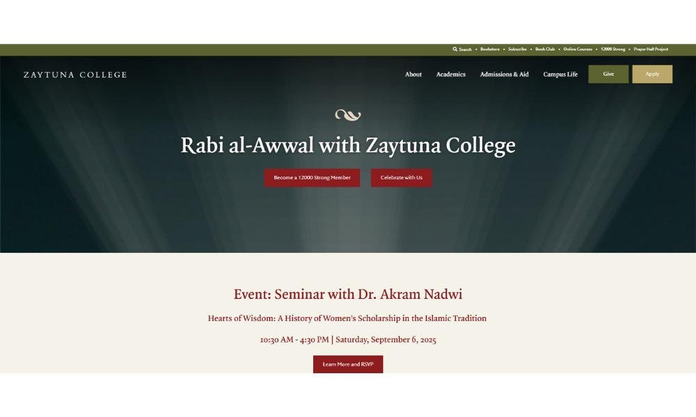
Zaytuna College isn’t your average academic institution. Sitting at the intersection of classical tradition and modern relevance, its website reflects the same spirit—simple, intentional, and quietly powerful.
Instead of overwhelming visitors with buzzwords or flashy animations, the homepage takes a calmer route. A clean layout. Thoughtful typography. Imagery that feels grounded. Everything on the page feels considered, not thrown together. And yes, the olive tree logo? A quiet nod to heritage and wisdom—without shouting about it.
The About section reads more like a thoughtful conversation than a press release. It doesn’t just list programs. It shares a vision. A sense of purpose. You learn why they do what they do, not just what they offer. That subtle difference goes a long way.
Even their news section feels curated with care. No clickbait. Just meaningful updates, written with clarity and respect for the reader’s time. In short, Zaytuna’s site does what many try (and fail) to do—it communicates trust without needing to say the word once.
2. Dakota Wesleyan University
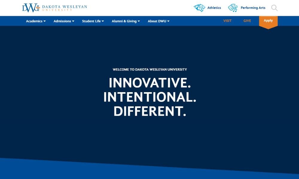
Dakota Wesleyan University doesn’t just present itself as a place of learning—it feels like a place where purpose gets a seat at the table. From the first scroll, you’re met with clean visuals and clear messaging. No fireworks, no filler—just a well-organized layout that respects your time.
The homepage gets right to it. Programs, student stories, campus life—it’s all there, without asking you to dig through digital clutter. Even the headlines avoid hype. They speak plainly and honestly, which is refreshing.
One small but smart detail? The photos. Real people, real smiles, not staged stock images of students pretending to be amazed by a whiteboard. It’s a small thing, but it makes a difference.
The site also gives prospective students a feel for the campus vibe—community-driven, supportive, and focused. You get the sense that DWU values relationships as much as results.
It’s not flashy, and that’s the point. The site reflects the university’s character: practical, grounded, and driven by something a bit deeper than marketing lingo.
3. Alverno College
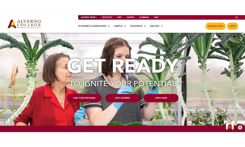
Alverno College makes an impression quietly—and effectively. Right away, the website feels different. It’s not trying to impress you with flash. It’s trying to talk to you. And it does that well.
The layout is clean, with bold headlines that don’t overpromise. Instead of shouting about rankings or statistics, it focuses on what really matters—how students grow. The tone throughout? Confident but conversational. You’re not being sold something. You’re being invited to consider a path.
One standout is the emphasis on women’s leadership and personal development. It’s not buried in fine print—it’s front and center. The site lets you know that education here goes beyond tests and textbooks. It’s about shaping people who think, speak, and lead with intention.
Photos show real moments—students working, laughing, speaking up—not stiff graduation poses. It feels authentic, like someone actually paid attention to what prospective students care about.
The takeaway? Alverno’s site doesn’t need dramatic effects to make a point. It relies on clarity, sincerity, and a strong sense of purpose—and that approach works.
4. Bates College
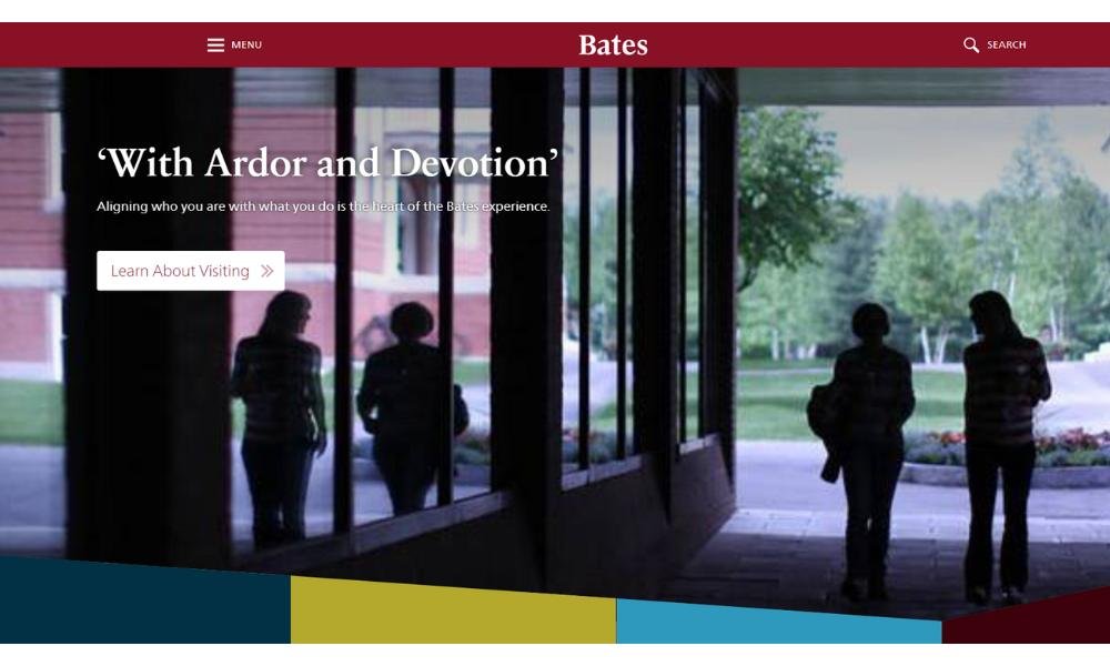
Bates College doesn’t overcomplicate things. Its website is crisp, confident, and to the point—like a well-edited essay. You won’t find long-winded mission statements or cluttered menus. Instead, you get clarity. Fast.
From the first glance, it’s clear Bates wants to show you what life feels like on campus, not just what it offers. The photography is bold and grounded in real moments—students thinking, collaborating, hiking, even just existing without a filter.
Academics are presented with purpose. Not just lists of majors, but stories about learning that’s active and engaged. Even the language avoids the usual buzzwords. You won’t be “immersed in a dynamic ecosystem of knowledge.” You’ll study, think hard, and probably get your boots muddy along the way.
The overall tone says: you’re capable, and we’ll challenge you accordingly. And yet, it never feels cold. The site carries a quiet warmth, the kind that doesn’t need to be declared in big letters.
Bottom line? Bates isn’t trying to be everything to everyone. It’s showing you exactly who it is—and trusting that if you belong, you’ll know.
5. University of Chicago
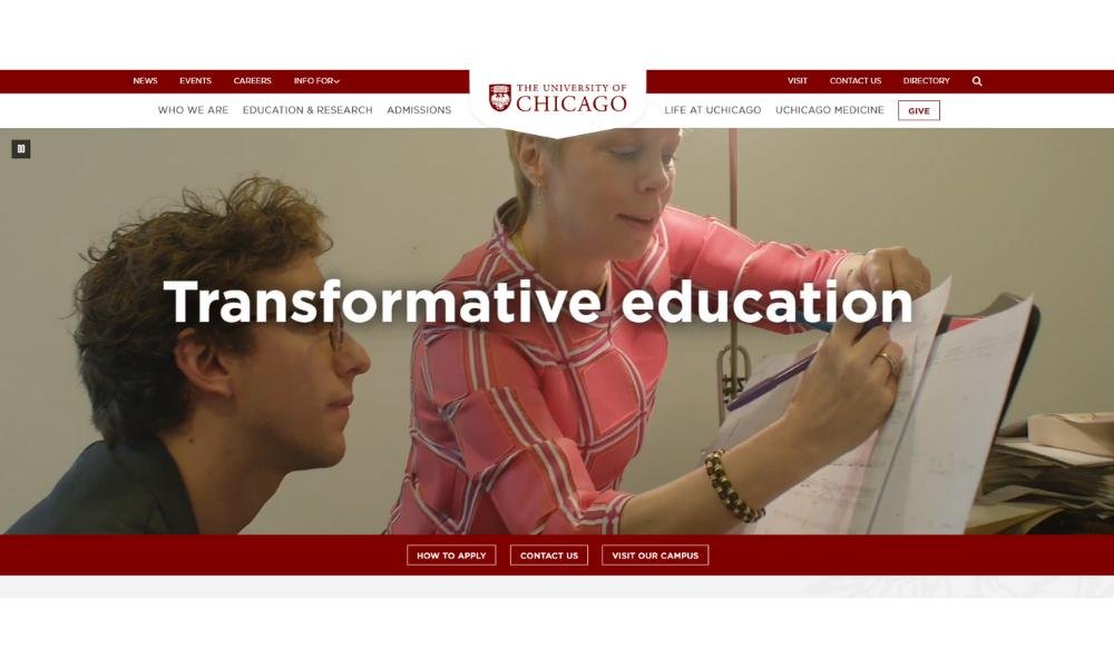
The University of Chicago’s website doesn’t waste time on small talk. From the first click, it makes its position clear: this is a place for serious thinkers. The design is minimal but bold, with typography that means business and content that respects your intellect.
Rather than overload the homepage with distractions, it points you toward big ideas—research that matters, conversations that challenge, and a campus culture that thrives on curiosity. You won’t find animated confetti or cheerful countdown timers. What you will find is focus.
What stands out most is the tone: direct, confident, and just a touch philosophical. It speaks to people who don’t mind complexity—and maybe even enjoy it. The visuals follow suit. They’re not trying to look trendy. They’re trying to look real.
There’s no hand-holding here, and that’s the point. UChicago doesn’t pretend college is easy. It presents itself as a place where questions are more important than quick answers—and where ambition is taken seriously.
It’s not flashy. It’s not casual. But if that resonates with you, chances are—you’re already the kind of student they’re looking for.
6. Muhlenberg College

Muhlenberg College strikes a careful balance—warm and welcoming, yet driven by purpose. The website doesn’t lean on gimmicks. Instead, it leads with clarity. Bold visuals, easy navigation, and a message that’s quietly confident.
Right away, you notice the focus on people. Not just programs or stats, but students and faculty doing meaningful work. It feels like a place where community isn’t just a line in the brochure—it’s the day-to-day reality.
The academics page goes beyond listing majors. It gives you a sense of how learning happens here—curious, collaborative, and built around real conversations. Even the admissions section feels less like a sales pitch and more like an open door.
And yes, the arts get their due. Muhlenberg doesn’t tuck creative life into a sidebar. It puts it right out front, alongside science, service, and everything in between. That speaks volumes.
Overall, the site mirrors the college itself: thoughtful, intentional, and people-focused. It’s not trying to shout over the noise. It’s offering something quieter—and stronger.
7. Princeton University
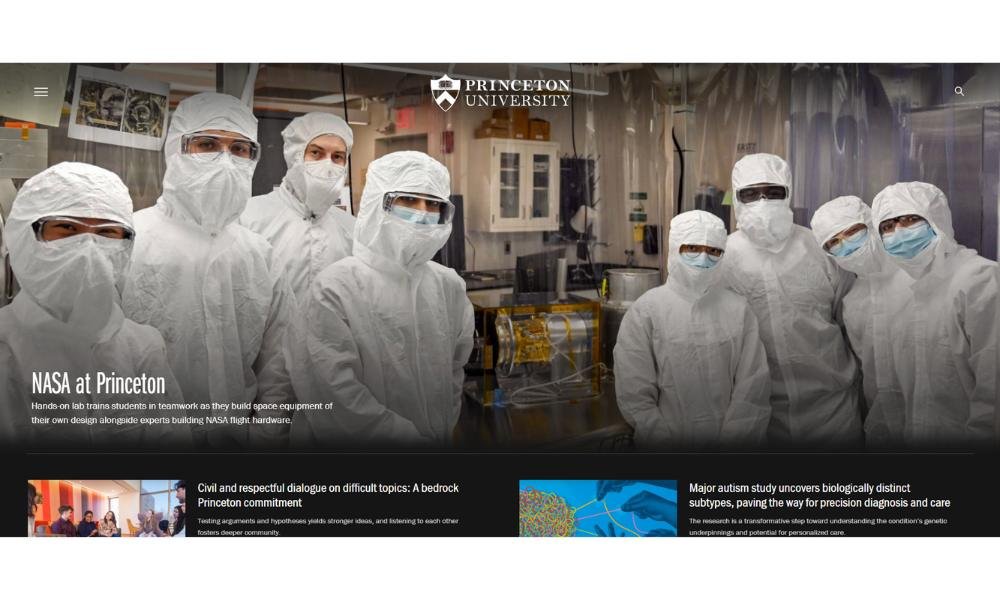
Princeton doesn’t need to prove itself—and its website knows it. The design is elegant, restrained, and deliberate. It leads with ideas, not flash. Instead of trying to dazzle with noise, it lets its legacy—and its vision—do the talking.
The homepage opens with purpose. Big questions, bold research, and a clear sense that this is a place where thinking deeply still matters. It doesn’t overwhelm with options. It guides you with focus.
You’ll notice the writing is precise. Every word counts. Whether you’re reading about climate research, student life, or financial aid, the tone is direct, confident, and built for readers who want substance.
Visuals support the story without crowding it. Real people. Real moments. No stock smiles or empty taglines. Even the smallest details—from the menu layout to the event highlights—feel considered.
The message is subtle but clear: Princeton isn’t trying to impress everyone. It’s inviting the right minds to engage. And if you’re someone who sees learning as a lifelong pursuit, you’ll feel it right away.
8. Rhode Island School of Design
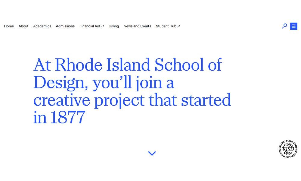
RISD’s website feels like a well-composed canvas—clean, bold, and alive with purpose. The layout is crisp, and the messaging is confident without ever feeling boastful. It’s clear this isn’t just a school; it’s a place where creative ambition meets fine-tuned craft.
Right from the homepage, you’re met with real work—student projects, process shots, and rhythmic visuals. This isn’t about flashy effects; it’s about showing creativity in action. And yes, the site celebrates experimentation—the kind that can get messy before it becomes magic.
The academic sections go beyond listing majors. You get a sense of learning that’s hands-on and rigorous: think studio critique, collaborative workshops, and materials-driven exploration. This is a community of makers who test limits and learn by doing.
Even the tone of the headlines feels intentional—short, impactful, with personality. There’s a touch of artistic wit without ever turning coy. It feels like someone who knows their stuff, and welcomes you into the conversation.
In short, RISD’s site doesn’t broadcast. It reveals. It trusts that if your pulse races at the sight of a bold sketch or a clever prototype, you’ll already feel at home.
9. Virginia Commonwealth University
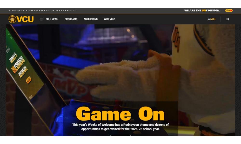
VCU’s website brings energy without chaos. From the first scroll, it’s clear this is a place where ambition meets momentum. Bold typography, confident colors, and a structure that respects your time—it all sets the tone.
What stands out most is how present the city of Richmond feels. The university doesn’t separate itself from its surroundings—it thrives in them. You can sense the rhythm of urban life woven through academics, research, and student culture.
VCU doesn’t talk at you. It talks with you. Whether highlighting groundbreaking research or community partnerships, the tone stays grounded. No jargon-heavy monologues. Just sharp, clear storytelling.
And the creativity? It’s not tucked away in one department. It’s everywhere—arts, science, health, business. The site shows a university unafraid to mix disciplines and do the unexpected.
Student voices show up often—and naturally. You don’t have to wonder what the vibe is. It’s right there in the photos, the projects, the language.
In all, the site reflects what VCU is: dynamic, inclusive, and always in motion. If you’re looking for a campus that doesn’t stand still, this one keeps pace.
10. Howard University
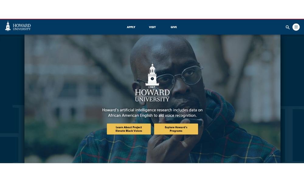
Howard University’s website speaks with presence. It’s polished, purposeful, and immediately rooted in legacy. But more than history, it highlights momentum—this is a place moving forward, not just reflecting back.
The homepage carries weight. Not through flash, but through clarity. Strong visuals, sharp headlines, and a clear focus on leadership, research, and impact. You don’t have to dig to find out what matters here—it’s front and center.
Academic offerings are laid out with precision, but never feel cold. There’s a strong sense of purpose behind each program, and the site makes that connection without overselling. It’s honest, direct, and mission-driven.
And community? It’s everywhere. Student voices, alumni achievements, cultural life—it’s all part of the story. The tone is confident and proud, but never performative. It feels real.
Even small design choices—clean navigation, bold photography, strong typography—echo the university’s identity: focused, grounded, and ready for what’s next.
Howard’s site doesn’t chase trends. It holds its space. If you’re looking for a university where excellence is expected and purpose leads, the message here is clear—you’ve found it.
11. Fashion Institute of Technology
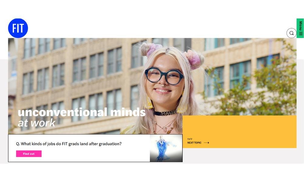
FIT’s website doesn’t just inform—it presents. Clean lines, bold visuals, and an editorial feel make it clear: this is where design meets discipline. It’s sharp, structured, and yes—unapologetically creative.
From the jump, the homepage feels like a curated portfolio. Student work isn’t hidden in a gallery link—it’s part of the experience. The message? Creativity isn’t a side project here—it’s the main event.
Navigation is smooth and smart. Whether you’re looking at programs in fashion, business, or tech, everything’s organized without feeling rigid. And while the visuals are strong, they’re never overwhelming. The design supports the story without trying too hard.
What really stands out is the sense of now. This isn’t a school locked in theory—it’s tuned into the industry, the city, and what’s next. Even the writing has that New York directness: quick, clear, and confidently on-brand.
FIT’s site feels like what the school is—forward-thinking, fast-moving, and built for creatives who are ready to work.
12. Cornell University
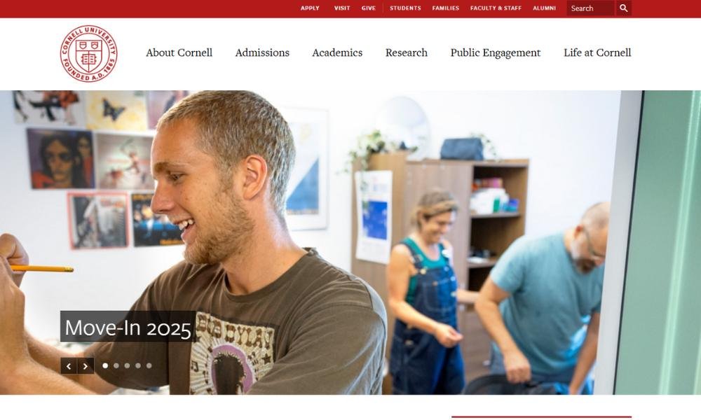
Cornell’s website feels like the university itself—expansive, intelligent, and quietly confident. The design is minimal but strong, letting the content carry the weight. No gimmicks, no shortcuts—just clarity.
From the start, the site makes its scale clear. Multiple campuses, diverse programs, a global reach. But rather than overwhelm, it guides. Clean menus, smart organization, and a tone that trusts the reader’s focus.
Academics are presented with substance. Whether you’re exploring engineering, agriculture, or the arts, the emphasis is on impact. It’s not about checking boxes—it’s about pushing boundaries with purpose.
You’ll also see a commitment to community, woven throughout. Cornell balances Ivy League rigor with a land-grant mission—and the site reflects that dual identity with ease. It’s elite without being exclusive. Serious, but never stiff.
Photos, headlines, and student voices give the site life. It’s not just about what’s being taught, but how it’s lived. The message is steady and clear: at Cornell, excellence isn’t just expected—it’s used.
13. Georgetown University
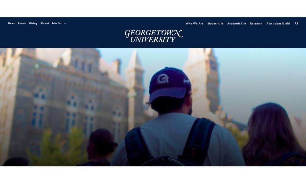
Georgetown University’s website speaks with quiet authority. It’s refined, thoughtful, and unmistakably rooted in tradition—with a forward-looking edge. From the first page, the focus is clear: this is a place where ideas shape action.
The design is polished without being flashy. Strong typography, purposeful white space, and striking photography come together to reflect the university’s values—academic rigor, global perspective, and ethical leadership.
The site’s content doesn’t just highlight programs—it highlights purpose. Whether it’s law, public policy, health, or the humanities, there’s an ongoing thread: impact. You get the sense that what’s learned here doesn’t stay in the classroom.
Community is everywhere. Faculty voices, student stories, and a deep connection to Washington, D.C., make the site feel active and grounded. It’s not just about education. It’s about engagement.
Even the tone—measured and confident—reflects the institution. Georgetown isn’t trying to sell an experience. It’s inviting you to be part of something bigger, something that asks questions, seeks justice, and builds thoughtfully.
14. University of Washington
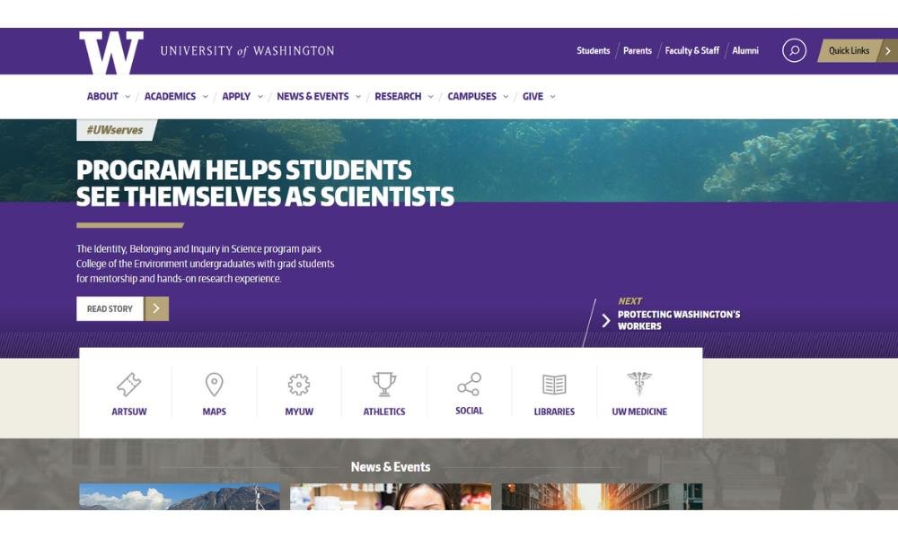
The University of Washington’s website moves with quiet momentum. It doesn’t shout. It leads—with clarity, confidence, and scale. From the start, it’s clear this is a place built for action and grounded in impact.
The homepage balances simplicity with depth. Sharp visuals and clean navigation guide you through a university that spans disciplines, cultures, and continents. Research, innovation, and public service aren’t buried—they’re built into the experience.
The tone is calm but focused. You won’t find overworked slogans or exaggerated claims. Instead, there’s a steady rhythm of real work: climate science, public health, social equity. The kind of work that doesn’t just stay in the lab—it reaches communities.
You also get a sense of place. Seattle isn’t just a backdrop—it’s part of the conversation. Urban energy meets natural beauty, and the site reflects that blend without saying it outright.
Overall, UW’s website presents a university with reach and relevance. One that values discovery, responsibility, and forward thinking. It invites you to engage, not just observe—and that difference matters.
15. Wheaton College
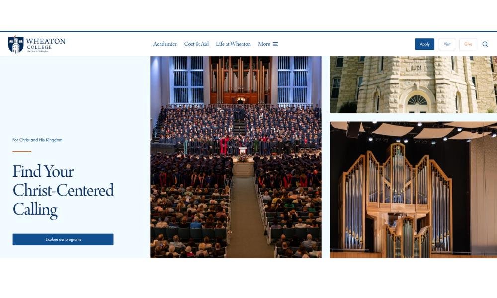
Wheaton College’s website feels intentional and confident. The site doesn’t rely on flashy visuals—it highlights substance. Clean layout, clear messaging, and a tone that signals thoughtful community and enduring values.
The homepage welcomes you with real moments—students studying outdoors, collaborating in labs, volunteering in local neighborhoods. These images aren’t staged; they’re snapshots of life on campus. That sense of authenticity carries through the content.
Academics get the spotlight too. You won’t find a generic list of majors—each program is framed around impact. Learning is contextualized: faith intersecting with service, science equipped for good, arts contributing to conversation. It speaks to a sense of purpose woven into daily life.
The tone throughout is steady and earnest. It’s friendly without being casual. It’s confident without being showy. Whether highlighting chapel, community engagement, or cross-disciplinary projects, the message is consistent: here, education shapes more than careers—it shapes character.
Wheaton’s site isn’t trying to be everywhere at once. It reflects a distinct identity: thoughtful, values‑focused, and quietly purposeful. If you’re seeking depth over flash, you’ll feel right at home.
16. Massachusetts Institute of Technology
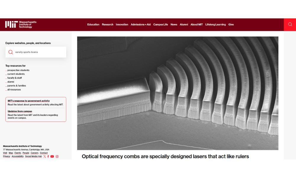
MIT’s website doesn’t try to charm—it just delivers. The design is stripped down, functional, and fast. Like the institution itself, it gets to the point: innovation, research, and bold thinking are the default here.
You’re not greeted with long paragraphs or marketing fluff. Instead, the site presents a steady stream of what’s happening now—breakthroughs, prototypes, policy conversations, and problem-solving at scale. The tone is concise and confident. There’s no hand-holding, and frankly, none needed.
Academics are framed as engines of progress. Whether it’s robotics, climate science, urban planning, or design, every program feels plugged directly into real-world relevance. You don’t just study at MIT—you contribute.
Even the visuals reflect this mindset. Candid lab shots, sketches, fieldwork—everything feels in motion. The future isn’t a concept here; it’s a task list.
MIT’s site reflects what the school has always been about: ideas made tangible. If you’re drawn to challenges, collaboration, and thinking a few steps ahead, you’re already in the right place.
17. Juniata College
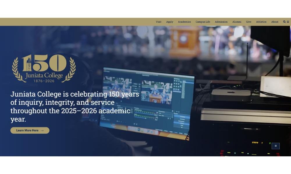
Juniata College’s website feels personal—like a conversation, not a campaign. It’s thoughtfully organized, visually calm, and refreshingly free of overstatement. You’re not being sold something. You’re being welcomed in.
From the homepage, it’s clear this is a place that values individuality. Programs are flexible, and the site reflects that spirit—easy to navigate, but open-ended enough to invite curiosity. You get the sense that students here shape their own paths, not just follow tracks.
The tone is warm but direct. It highlights academics with sincerity, showing how learning here connects with real life. You’ll see student research, faculty mentorship, and global learning—all presented without pretense.
Community comes through strongly. The visuals show small classes, hands-on experiences, and students who look like they know each other’s names. There’s a quiet confidence to the way it’s all presented—no flash, just focus.
In all, the site reflects what Juniata is about: thoughtful education, tight-knit community, and room to explore. If you’re looking for a college that listens more than it lectures, this one’s worth a closer look.
18. University of Notre Dame
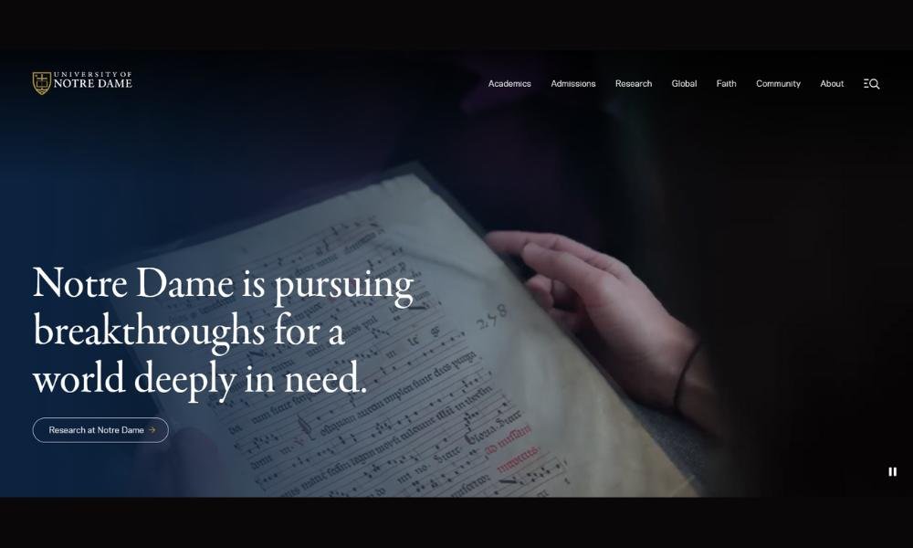
Notre Dame’s website opens with quiet authority. It’s polished, purposeful, and centered on a clear message—scholarship with integrity. The design is clean, with bold visuals and thoughtful navigation that respect your time and your intelligence.
Right from the homepage, you sense the university’s identity. Academic excellence, community engagement, and faith intersect in tangible ways. You won’t find flashy gimmicks. Instead, the site offers substance: research breakthroughs, student-led service, and campus traditions that span generations.
The tone is grounded and confident. Each program reads as meaningful by design, not by hype. Whether it’s engineering innovation, public policy, or liberal arts, the focus is on learning that endures and contributes. You get the message that here, education extends beyond the classroom.
Images echo that same depth—students studying in the library, collaborating in labs, volunteering locally. Even the smallest details, like the way the menu is structured and what headlines are highlighted, feel intentional.
Overall, Notre Dame’s site communicates a sense of purpose and belonging. It invites you to engage—not just observe. And if you value excellence, community, and conviction, you’ll recognize a place that’s worth your attention.
19. Duke University
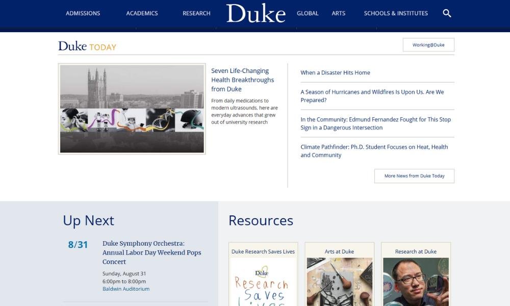
Duke’s website opens with a steady confidence. It’s sleek, focused, and thoughtfully streamlined—much like the institution itself. No unexpected pop-ups, just clean design, purposeful content, and visuals that feel lived‑in, not staged.
From the homepage, you notice the balance. Academic excellence, research, innovation, and campus life—all given space without shouting. Programs are presented clearly, with real insights into what learning feels like: collaborative labs, public engagement, and ideas that extend beyond campus.
The tone is assured but approachable. You get concise snapshots of stories, breakthroughs, and student impact, without buzzwords or fluff. It reads like a conversation among driven peers—not a polished pitch.
Images reinforce trust: students brainstorming, teams building, professors teaching under an oak. Even site navigation reflects thought—organized intuitively, helping you find what matters quickly.
Overall, Duke’s site doesn’t chase the spotlight. It trusts that thoughtful storytelling, real voices, and clear design are enough. If you’re seeking depth, ambition, and a sense of shared purpose, this site doesn’t just inform—you’ll feel like you belong.
20. University of Nebraska–Lincoln
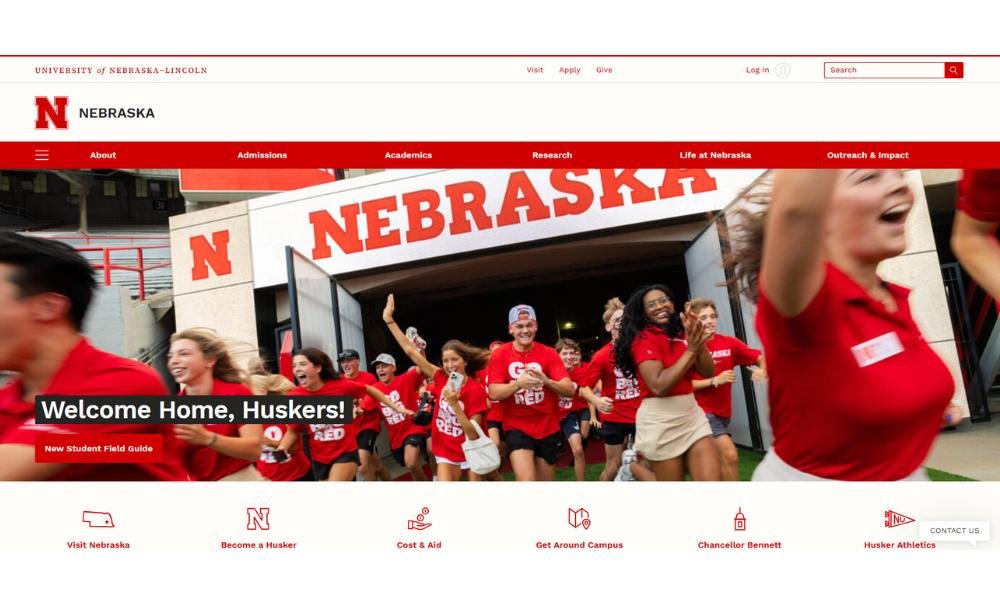
UNL’s website makes a strong first impression—grounded, focused, and audience-aware. The design isn’t flashy, but it’s modern and reliable. Bold headings, clear sections, and honest imagery combine to show a university that works with intent.
Right from the homepage, you feel a sense of purpose. Agriculture, engineering, arts, business—they’re all represented, but never scattered. The tone is confident and pragmatic. It doesn’t rely on hype. Instead, it presents programs and research with clarity and relevance.
The campus comes to life through storytelling. Photos of students in fields, labs, studios, and community settings reflect a hands-on, engaged culture. You sense place: the university doesn’t just exist in Nebraska—it contributes to it.
Navigation is intuitive. Prospective students, researchers, and alumni each have clear pathways. The content adapts: entrance requirements, research highlights, event updates—you’ll find them instantly, without unnecessary clicks.
Overall, the site reflects what UNL is: accessible, enthusiastic about its work, and rooted in real-world impact. It doesn’t try to be everywhere; it showcases depth where it counts. If you’re drawn to a university that values community, practical achievement, and steady growth, this one speaks with honesty and clarity.
Conclusion
I built my first site just to see if I could. What I didn’t expect was how much I’d learn along the way—about design, problem-solving, and what it takes to keep people interested beyond the homepage.
These 20 ideas aren’t just starter projects. They’re opportunities. Try one, adapt another, combine two if you’re feeling bold. What matters most is taking that first step—building something that feels like you.
Remember: the best student websites don’t have to be perfect. They just have to start.
And if your site ends up about origami ducks? You’re in excellent company.

