Building an author website can feel like one of those “I’ll get to it eventually” projects. I get it—I’d rather write dialogue than decide on font pairings. But your website is your home base. And if you’re serious about growing your readership, it’s worth getting right.
I’ve worked with countless author sites, and I’ve seen what works—and what doesn’t. Good design isn’t about fancy effects or a dozen pages. It’s about clarity, connection, and knowing what your audience came for (hint: it’s usually your books).
Here’s what I’ll cover in this guide:
- How to structure a homepage that keeps people reading
- What to put on your About page—besides your entire life story
- Smart ways to organize your books and series
- Tools to build an email list (without being annoying)
- Extras readers love: playlists, journals, behind-the-scenes
- The one mistake I see most authors make—and how to avoid it
If you’re ready to give your writing a stronger online home, this list is for you.
1. Chunka Mui
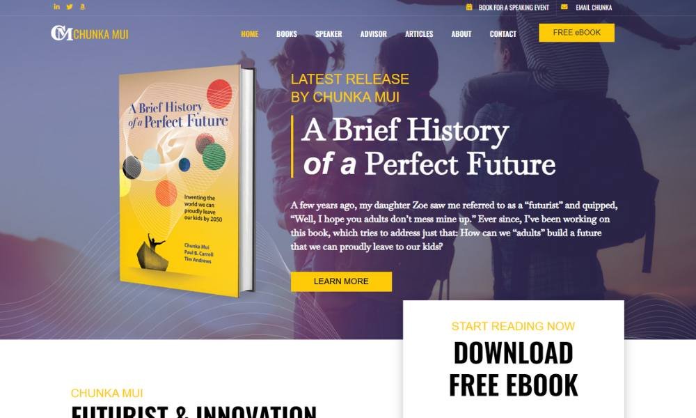
Chunkamui doesn’t just build brands—they give them personality. Based in Toronto, this creative studio blends strategy with a touch of humor and a lot of visual clarity. From the start, their site feels light but purposeful. You’re not guessing what they do. You’re curious to see how they do it.
Their About page reads more like a conversation than a pitch. It walks you through who they are and how they think—without turning into a résumé or a lecture. There’s a casual confidence to it. Not too formal. Not too quirky. Just real.
The homepage gets straight to the point: a clean layout, punchy headlines, and case studies that actually show their process. There’s personality here—but never at the cost of professionalism.
And yes, they even have a section titled “Not Work,” which includes things like a fake meat brand and a very committed fish illustration. It’s oddly charming—and smart. You get the sense they enjoy what they do, and they want clients who feel the same.
Chunkamui’s site doesn’t over-explain. It shows. And in the design world, that’s often the sharper move.
2. Leigh Bardugo
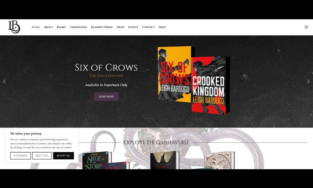
Leigh Bardugo’s website feels like stepping into the edge of a story—moody, clear, and just mysterious enough to keep you clicking. From bestselling novels to screen adaptations, her work spans fantasy, suspense, and the occasional monster (human or otherwise).
The homepage keeps it simple: latest releases, events, and just enough atmosphere to set the tone. You know exactly where you are—and what kind of stories you’re about to meet.
Her About page avoids the usual ego parade. It’s direct, grounded, and offers just enough backstory to connect the dots. You learn about her education, her past lives in other careers, and her quiet obsession with dark, beautiful things.
What stands out? Voice. Whether you’re reading her bio, browsing her book pages, or checking out her newsletter, it all sounds unmistakably like her. Confident. Clever. Sharp.
There’s no flashy scroll effect or dramatic trailer here. Just a clear path through a body of work that already does the talking.
Leigh’s site, like her books, is structured, intentional, and impossible to confuse with anyone else’s.
3. Austin Kleon
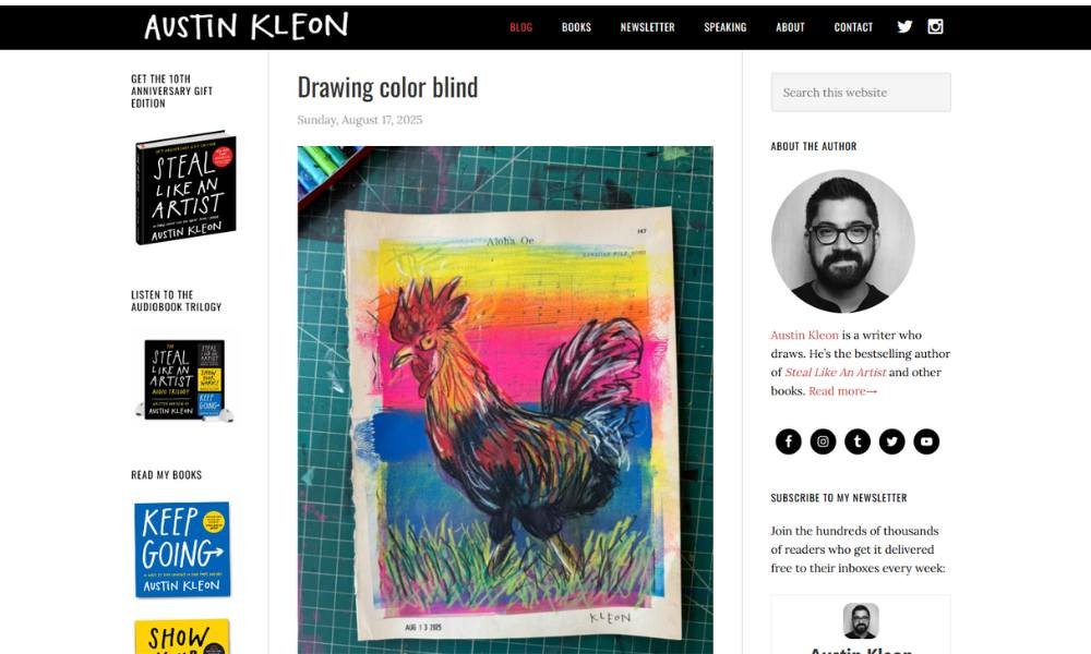
Austin Kleon’s site feels like a friendly desk companion—bright, thoughtful, and ready to spark creativity. He’s the author-artist who turns everyday scribbles into insightful ideas, and that tone shines through immediately.
The homepage greets you with his latest book, notes on creativity, and “Ten Things I’m Loving.” It’s organized, yet never sterile. You get the sense he’s sharing, not selling.
His About page is warm and unpretentious. You learn about his background, his writing process, and his belief that “show your work” isn’t a gimmick—it’s a creative mindset. No ego. Just encouragement.
What stands out? Personality. From blog posts to newsletters, you hear his voice: curious, clever, and a bit playful. There’s room for doodles, book lists, and even his favorite fonts. And yes, it’s charming without being cheesy.
There are no heavy visuals or big-banner videos here. Just ideas, generously laid out, ready for you to pick up. Austin invites you in—no velvet rope, no smoke and mirrors. Just plain, honest creativity.
4. Joe Hirsch
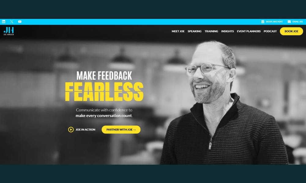
Joe Hirsch’s website feels like sitting down with someone who actually listens—then gives you the kind of advice you wish you’d heard years ago. As a speaker, author, and coach, Joe specializes in feedback that’s clear, constructive, and—surprisingly—kind.
The homepage is straightforward and smart. You’ll find his core work right up front: speaking, writing, and guiding teams through better communication. No fluff. Just clarity.
His About page tells you what you need to know, without the usual corporate detour. It highlights his background in education, his research-driven approach, and yes, his TEDx talk—without sounding like he’s reciting a LinkedIn bio.
What sets this site apart is tone. It’s approachable but polished. Whether you’re exploring his books, scanning testimonials, or considering a workshop, the voice stays steady: helpful, focused, and grounded.
Joe’s message is simple—better feedback leads to better results—and the site delivers that message the same way he teaches: with precision, humility, and just the right amount of personality.
5. Helen Hoang
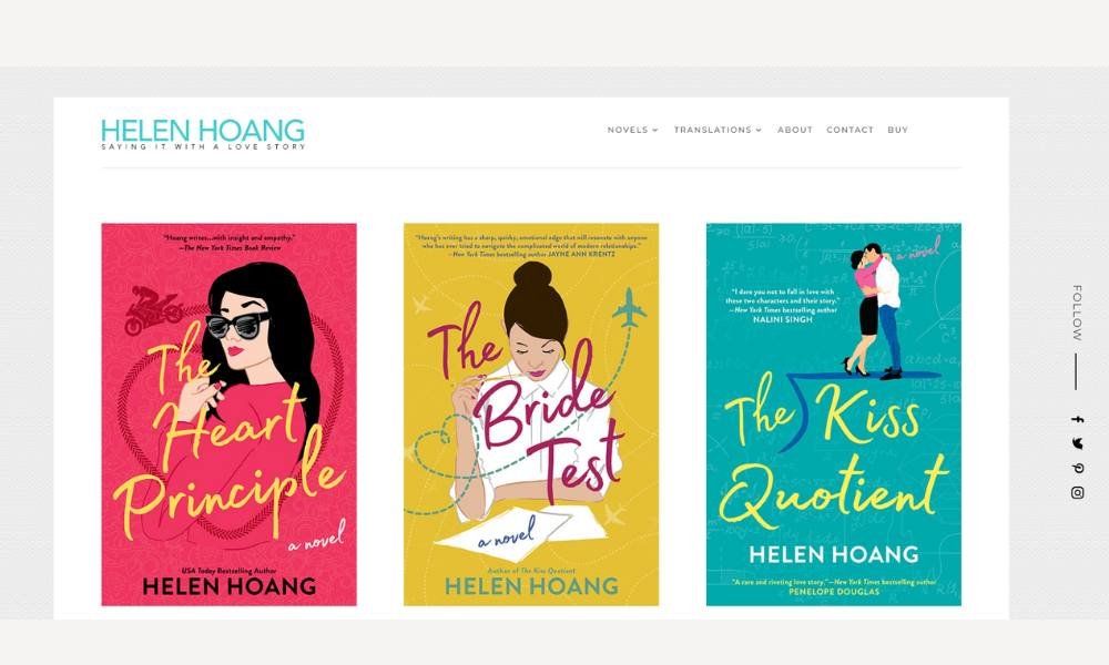
Helen Hoang’s website feels like slipping into a heartfelt conversation—warm, direct, and honest. Best known for her insightful novels about love and neurodiversity, Helen brings that same approachability to her site.
The homepage delivers what matters: book covers, upcoming events, and a heartfelt note that sets the tone. No gimmicks. Just a clear path for readers to follow.
Her About section is personal without oversharing. You learn about her writing journey, her experience with ADHD and autism, and the heart behind her stories. It’s straightforward, sincere, and grounded. You feel invited in—from the first sentence.
What stands out is ease. As you explore her books, blog, and newsletter, the voice stays consistent: friendly, compassionate, and sharp-witted. There’s a confidence here—not the flashy kind, but the steady, self-knowing type.
There are no distracting animations or cluttered layouts. Just content that reflects her work’s honesty. Helen’s site isn’t selling an image—it’s offering connection. And in a genre full of loud voices, that kind of simplicity is refreshing.
6. Mike Michalowicz
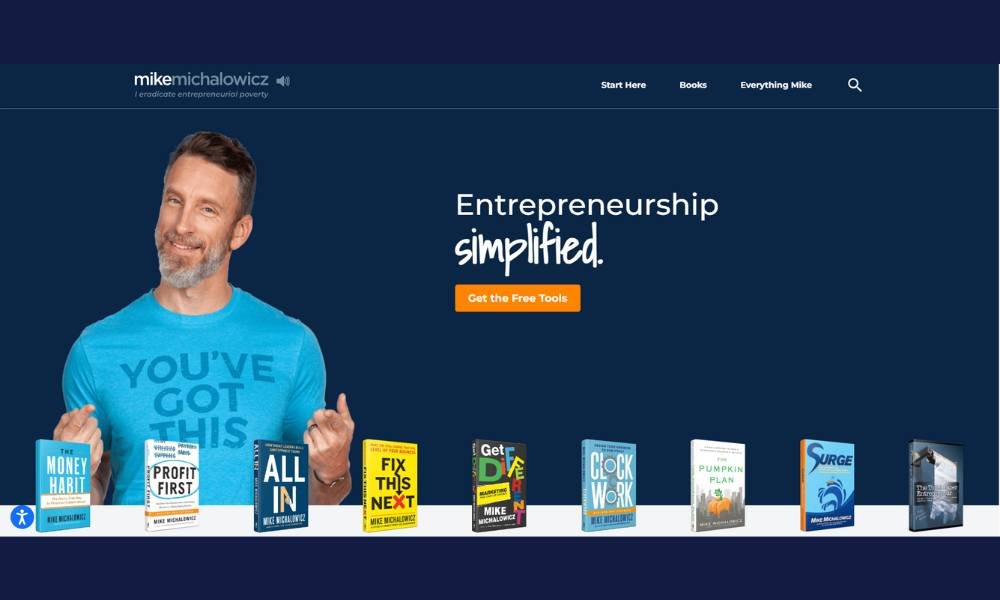
Mike Michalowicz’s website feels like a power-packed conversation with someone who gets business—fast. Known for books like Profit First and Clockwork, he doesn’t just share ideas. He gives you clear steps to change things up.
The homepage sets the tone: smart headlines, bold colors, and easy paths to his articles, tools, and events. It’s energetic, but not overwhelming. It says: “You’re in the right place.”
His About page cuts right to the chase. You learn he’s built and sold multiple businesses, then turned that into a mission: to help others build predictable profits and more freedom. No frills. Just a proven track record.
What stands out is practical optimism. Whether you dig into his blog, sign up for coaching, or check out his workshops, the voice stays upbeat, direct, and full of purpose. There’s confidence here—rooted in real results, not hype.
Mike’s content isn’t about chasing the next shiny thing. It’s about mastering what works now. His site reflects that: no distractions, no fluff—just strong ideas designed to help a business owner roll up their sleeves and build something that lasts.
7. T.A White
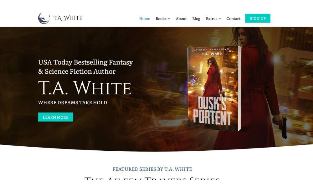
T.A. White’s website comes across as warm and grounded—like a reliable friend who tells you the truth about trauma, healing, and growth. An expert in trauma therapy and mental wellness, White brings compassion and candor to every corner of the site.
The homepage is clear. You find therapy options, speaking engagements, and recent articles right away. No jargon-filled hero banners—just heartfelt care wrapped in clean design.
His About section is personal and honest. You learn about his journey, credentials, and what led him into trauma therapy. It never feels like a boast. You feel guided, not marketed to.
What really stands out is empathy. Whether you click into his blog, browse services, or consider working together, his voice is steady and encouraging. There’s no “quick-fix” tone—just thoughtful, rooted support.
T.A. White isn’t selling an image. He’s offering space—to listen, reflect, and move forward. And in a crowded field of self‑help messaging, that kind of sincerity is refreshing.
8. Mark Dawson
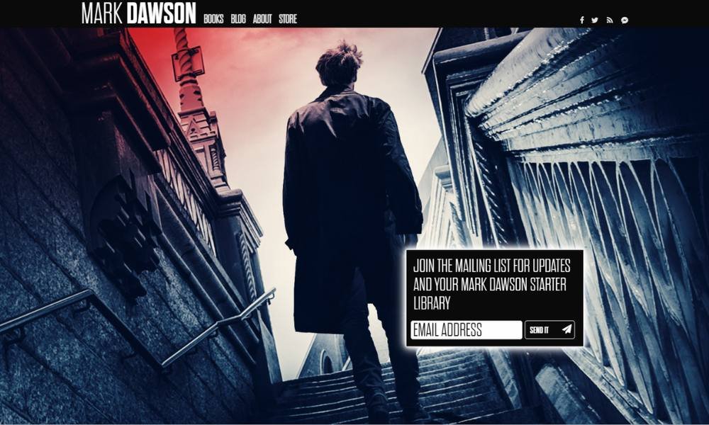
Mark J. Dawson’s site feels like stepping into a writer’s den—organized, confident, and inviting. Best known for his thrillers and crime novels, he gives you everything without overwhelming you.
His homepage hits key points at a glance: latest book covers, series order, and ways to subscribe. No clutter. Just clear paths for readers and publishers alike.
The About section is concise and honest. You learn how he started writing, why he self-publishes, and how he keeps readers engaged through immersive stories. It never drifts into ego. It stays grounded.
What shines through is consistency. Whether you check his blog, look at audiobook versions, or read character spotlights, the voice is steady: professional, focused, and a bit warm. There’s no flash. Just a clearly delivered message.
Mark’s site isn’t about hype. It’s about connecting—one story at a time. And in a crowded genre, that quiet professionalism is a gift.
9. Miki Taylor
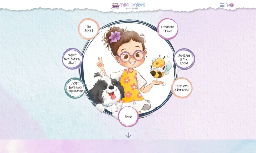
Miki Taylor’s website feels like opening a window to calm creativity. As a fine-art photographer, her work centers on light, space, and quiet moments that slow time down.
The homepage is spare but inviting. No heavy intro copy. Just muted tones and strong visuals that set the mood. You scroll through recent series, and you sense intention with every image.
Her About page is short and sincere. You learn she studied art, spent time with mentors, and travels to capture natural light. It’s clear she values simplicity—with purpose.
What stands out most is atmosphere. Each photograph feels like a breath. The site gives each piece space to be felt, not rushed past. There’s no aggressive branding—just trust that the work will speak.
Miki’s voice stays consistent throughout—quiet, confident, and genuine. It’s not flashy. It’s thoughtful. And in a scroll-heavy internet, that kind of pause is rare.
10. Mark Manson
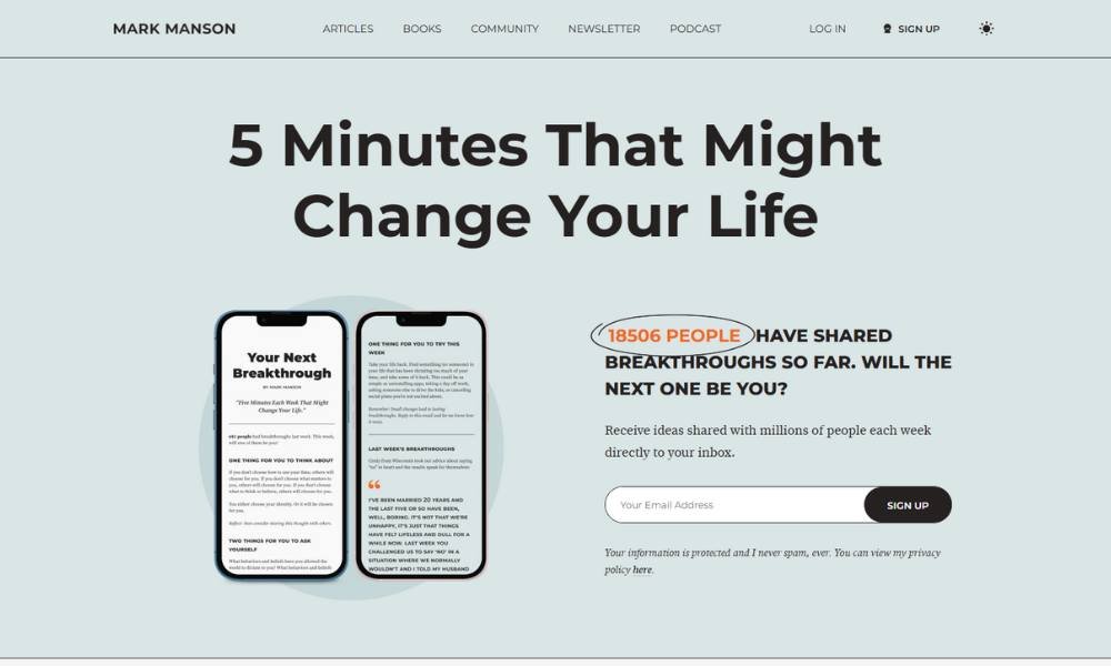
Mark Manson’s website feels like a candid chat with someone who’s been around enough to speak truth without sugarcoating. Known for his no-nonsense self-help style, he brings the same tone to his online presence—direct, grounded, and a bit irreverent.
The homepage gets straight to the point. You see his latest book, popular articles, and free worksheets. No fluff, no oversized hero sections—just what matters. You’ve landed in the right place.
His About section reads like a conversation at a coffee shop. You learn about his writing journey, why his blunt style resonates, and how he works to bring clarity to messy parts of life. It feels honest, not showy.
What stands out most is his voice. The tone stays steady—curious, provocative, and never saccharine. Whether he’s writing about relationships or productivity, you know what you’re getting: smart insight wrapped in plain speech and occasional humor.
There’s no over-polished branding here. Just real talk, consistent content, and lasting value. In a world full of motivational noise, Mark’s site is a refresher. It reminds you that honesty can feel like a favor.
11. Daniel Gibbs
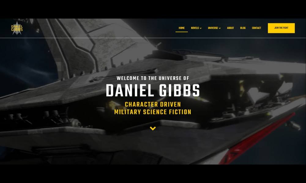
Daniel Gibbs writes science fiction with heart—and hardware. His site wastes no time showing you what he’s about: starships, military strategy, and characters trying to survive more than just war.
The homepage is efficient. You’re met with bold book covers, clear series guides, and ways to start reading immediately. No guesswork. Just click and go.
His About page is direct, with a personal tone that cuts through the usual sci-fi swagger. You learn he’s a U.S. Air Force veteran, which explains the realism in his battle scenes. But more than that, you see a writer who values the people in the story as much as the tech.
What stands out is structure. The site is clean, well-organized, and clearly built for readers who love series. Whether you’re exploring his books or checking for updates, everything’s easy to find.
Daniel doesn’t overcomplicate the experience. He keeps the focus where it should be: the stories. And with so many out there, that kind of clarity is a win.
12. George Weigel
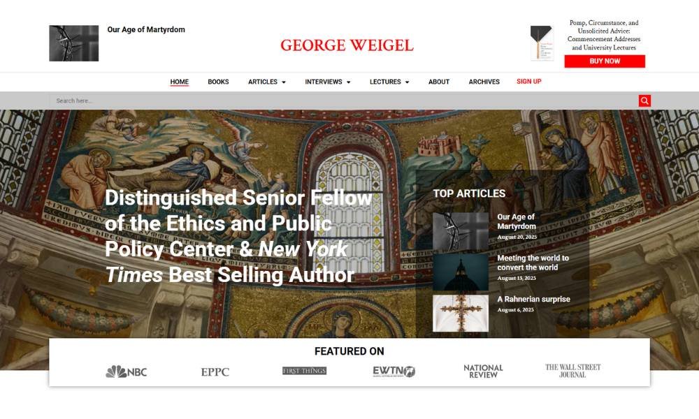
George Weigel’s site feels like a thoughtful lecture that doesn’t put you to sleep. He’s a Catholic theologian and public intellectual who writes with clarity, insight, and a bit of edge.
The homepage is polished and straightforward. You immediately see his role at the Ethics and Public Policy Center, his latest publications, and links to his weekly column. Nothing overwhelming. You just know this is serious work.
His About page is sharp and to the point. You learn he earned degrees at St. Mary’s and the University of Toronto, led EPPC, and wrote the acclaimed biography of Pope John Paul II. It’s factual, but the choices reveal his commitment to ideas.
What stands out is his voice. Whether in essays, op‑eds, or podcast appearances, you get intelligence that’s both firm and fair. No fluff. Just careful thinking.
George’s site isn’t flashy. It’s grounded in substance—and that’s exactly the point. In an age of noise, this kind of steady seriousness feels like a breath of fresh air.
13. Brené Brown
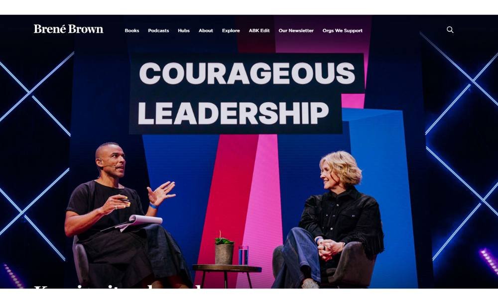
Brené Brown’s site feels like a thoughtful conversation with a wise friend—grounded, candid, and just vulnerable enough to make you lean in. She’s a researcher, speaker, and author who tackles shame, courage, and belonging with data-backed insight and no-nonsense kindness.
Her homepage is direct. You immediately see her books, podcasts, and events. No pomp. Just an easy path to ideas that matter.
Her About page is honest and sharp. You learn about her academic background, her TED talk on vulnerability, and her mission to build braver leaders. It never reads like a resume—it reads like a real person sharing hard-earned lessons.
What stands out? Voice. Whether you browse her weekly newsletter, watch a workshop, or scroll through resources, there’s a consistent tone: warm, incisive, and encouraging. Humor peeks through, but the core is sincerity.
There’s no flashy motion or gimmicks. Just smart content, clearly laid out. Brené doesn’t sell you an image. She offers understanding—and sometimes, that’s exactly what you need.
14. Melanie Moreland
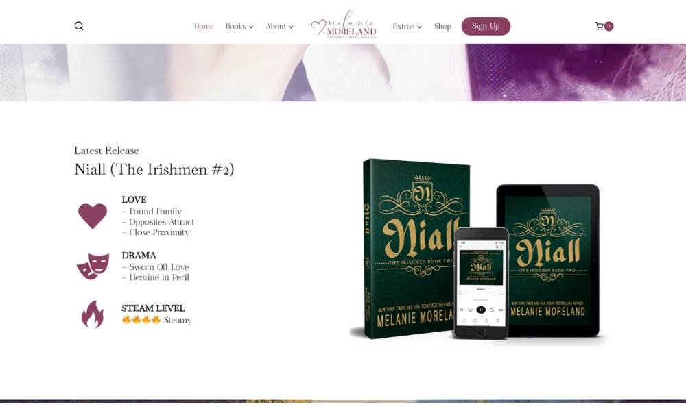
Melanie Moreland’s website is as polished and inviting as her storytelling—straightforward, a little swoony, and built to pull you in. Known for contemporary romance packed with heart and a touch of heat, she brings those same themes into every part of her site.
The homepage doesn’t waste time. You’re greeted with bold book covers, easy access to her series, and a warm welcome from the author herself. Everything is organized clearly—because romance fans like a good setup.
Her About page reads like a conversation. You learn how she started writing, what inspires her characters, and yes—how much she loves a happily ever after. No pretentiousness. Just a writer who clearly loves the work.
What really works? Consistency. From the color palette to her tone across pages, everything feels cohesive. Whether you’re previewing a new release or hunting for your next favorite book boyfriend, the experience is easy and engaging.
Melanie doesn’t overcomplicate the message. She writes love stories, and she builds a digital space that reflects exactly that—clean, confident, and completely reader-friendly.
15. Wilbur Smith
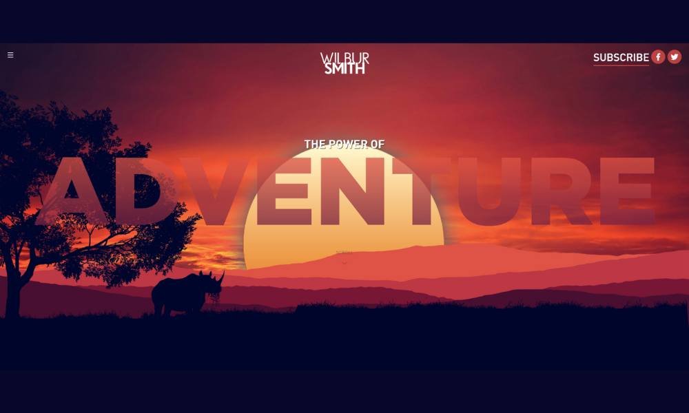
Wilbur Smith’s website feels like a map to adventure—bold, organized, and full of promise. A bestselling author known for epic sagas set in Africa and beyond, his site draws you in with big landscapes, striking book covers, and clear navigation.
The homepage highlights his latest releases and series paths. You get everything at a glance: from Courtney epics to Egyptian adventures. This isn’t just a bookstore—it’s a storytelling portal.
His About section shares his journey—degrees earned, decades writing, and a love for history and bold characters. There’s no filler. Just a glimpse into a life shaped by curiosity and discipline.
What stands out is scale. Whether you’re browsing thrillers set in wartorn Africa or historical dramas with swashbuckling flair, the layout supports it. Large visuals, quick series summaries, and a tight club sign-up—easy moves that tell you this is a well-oiled author platform.
Wilbur’s site doesn’t whisper—it commands. And in a genre pulsing with action, that sense of steady confidence suits him just right.
16. The Winter Skye Series
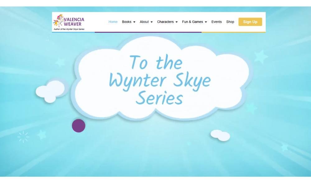
WSW Books feels like a joyful bookshelf come to life. Their focus on children’s literature shines through from the first scroll—bright covers, lively illustrations, and a sense of imagination that just clicks.
The homepage is clean and inviting. You land on key titles right away, with clear sections for age groups and series. No overflow of options—just easy browsing that puts story front and center.
Their About section tells you who they are—publishers driven by curiosity and care. You learn they’re independent, work closely with authors and illustrators, and take pride in bringing diverse voices to young readers. It never reads like corporate speak—just genuine interest in crafting joyful books.
What stands out most is tone. Whether you explore book details or publisher notes, you feel that WSW Books values both creativity and connection. There’s no forced whimsy, but a steady, sincere spark.
WSW’s site isn’t flashy. It’s thoughtful. It’s artful. And in a world that sometimes treats kids’ books like afterthoughts, that kind of deliberate design feels like a gift.
17. Gary Vaynerchuk
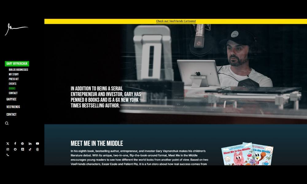
Gary Vaynerchuk’s book page feels like a pep talk you can take home. Each title—Crush It!, Jab, Jab, Jab, Right Hook, Twelve and a Half—is lined up with clear purpose. You don’t just browse books. You get a sense of what mindset you’re signing up for.
The layout is tidy and functional. You land on a gallery of covers, brief blurbs, and straightforward calls to act. No aggressive sale copy. Just a confident nudge: this could change how you work and show up.
The blurbs match Gary’s voice—upbeat, actionable, and candid. You learn what problem each book helps solve: marketing, personal branding, or emotional intelligence in business. No fluff. Just a sense of urgency and real-world results.
What stands out is consistency. Across every title, the tone stays bold but grounded. You hear Gary’s voice: high energy, practical, and often real-talk. His page isn’t flashy, but it’s motivating—organized for someone ready to learn and level up.
Gary’s book page doesn’t overpromise. It delivers clarity, grit, and maybe even a challenge. And for his audience, that’s exactly the point.
18. Wonder
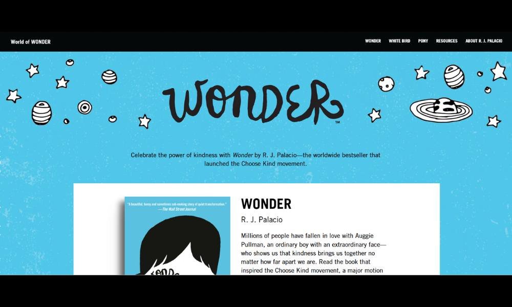
The Wonder page feels like a gentle invitation to something meaningful. Centered on R. J. Palacio’s bestselling story, it draws you in with cover art that hints at warmth, courage, and a quiet lesson in kindness.
The layout is uncluttered. You land on book options—paperback, audiobook, illustrated—and can explore themes or educator materials without fuss. It’s organized for easy browsing.
The About section gives you just enough to connect: Auggie Pullman’s story, the author’s inspiration, and how the Choose Kind movement grew. It’s heartfelt but tidy. No heavy introductions—just substance.
What stands out is clarity. Each edition gets a simple summary. Extras like journals or teacher guides are listed cleanly. You know where to click if you want more depth—or move on if you’re already convinced.
There’s no flashy animation or marketing overload. Just purposeful design and honest content—much like the book itself. The page supports the story without overshadowing it. And that makes for a thoughtful, respectful experience—exactly what Wonder deserves.
19. Tim Sullivan
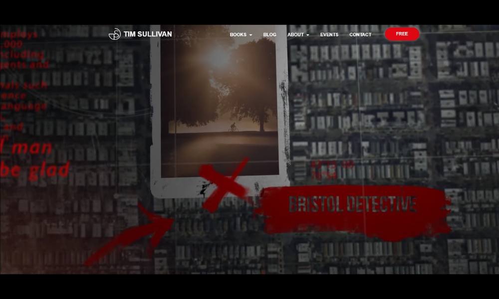
Tim Sullivan’s website reads like the prologue to a sharp, well-paced thriller. As a bestselling crime writer, he wastes no space. You land on bold book covers—The Dentist, The Patient—and immediately understand where you’ve arrived.
The homepage is clean, no clutter. Series listings, latest releases, and a simple newsletter prompt take center stage. It’s tidy, easy to scan, and built for readers who want to dive in fast.
His About section offers context without overly long backstory. You learn he draws from real-life experience—his past in the Guardian newsroom adds weight to his plots. The tone warms up, but never veers into self-promotion.
What stands out is consistency. Whether you check his blog updates or book blurbs, the voice remains steady: professional, slightly personable, and rooted in narrative craft. There’s subtle wit, but mostly you sense a writer who respects your time.
Tim’s site doesn’t flirt with gimmicks. He’s not after hype. He offers solid stories, well-told and easy to find. And in the crowded world of crime fiction, that kind of clarity is more than welcome.
20. Maggie Carpenter
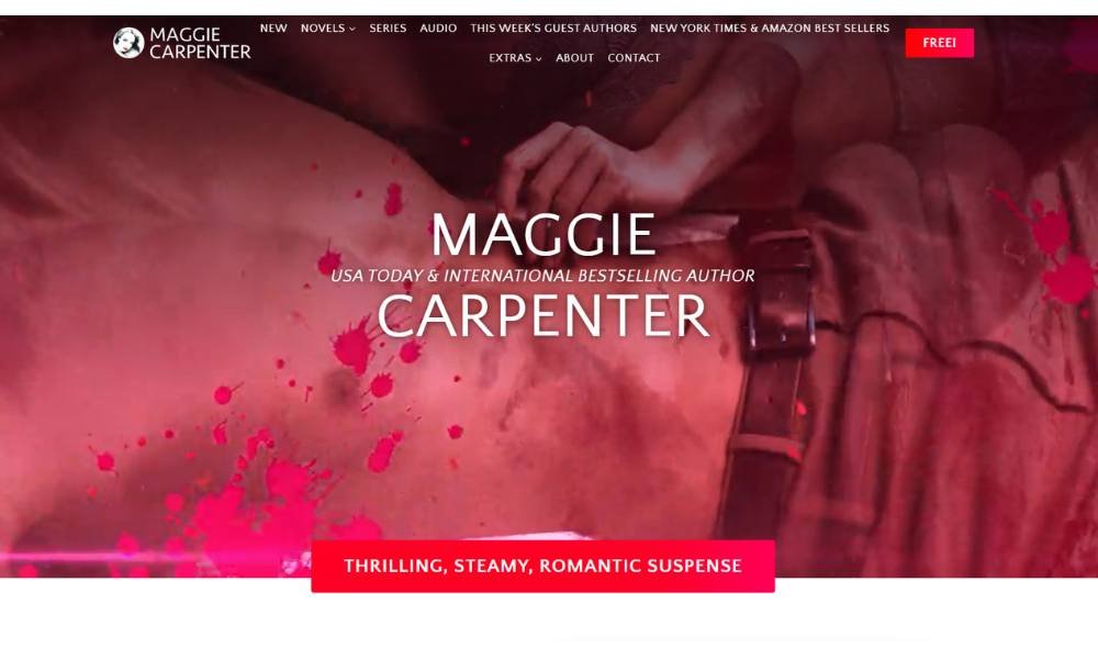
Maggie Carpenter’s site immediately tells you she writes stories with heart and heat. She’s a bestselling author who blends romance with a bit of suspense and a whole lot of charm.
The homepage is sleek and inviting. You see bold book covers, series names, and a quick way to start reading. Everything feels organized—perfect for fans hunting romance that packs a punch.
Her About page reads like a chat over coffee. You learn how she got started, what scenes make her smile, and why her characters tend to break a few rules (in a good way). It’s relatable, without sliding into cheesy.
What stands out is tone. Across blurbs, blog updates, and newsletter prompts, everything feels consistent—warm, witty, and clear. She doesn’t over-write or over-commit. She knows her style, and the site shows it.
There’s no flashy animation or cluttered layout. Just romance stories served straight. And in a genre full of noise, that kind of clarity is a win.
Conclusion
You don’t need a flashy website to make a real impact. You just need one that feels like you—clear, welcoming, and easy to navigate. Every detail doesn’t have to be perfect, but every page should serve a purpose.
If you pulled even one idea from this list and put it into action, that’s progress. Your site doesn’t have to impress everyone. It just has to help the right readers find you—and stick around.
And if you’re thinking, “Do I really need all of this?”—no, you probably don’t. But if you want your work to have a life outside the page, a thoughtful online presence is a pretty great place to start.


