If you’ve ever stared at a restaurant website and left more confused than hungry, you’re not alone. I’ve seen it all—menus hidden under four clicks, photo galleries from 2007, and reservation buttons that lead to… nowhere.
That’s why I put together this list. These 20 restaurant websites actually work. They’re beautiful, smart, and, most importantly, they make you want to eat there. Whether you’re designing your own site or just gathering ideas for a client, these examples will save you time—and maybe spare you a few headaches.
Here’s what you’ll get from this list:
- Restaurant sites that show personality without losing function
- Menus that are easy to read (and even easier to find)
- Homepage layouts that work for fast-casual spots and fine dining alike
- Design ideas that support the brand, not distract from it
- Subtle choices that create a better guest experience from screen to table
Let’s get into what these restaurants got right—and how you can borrow their best ideas.
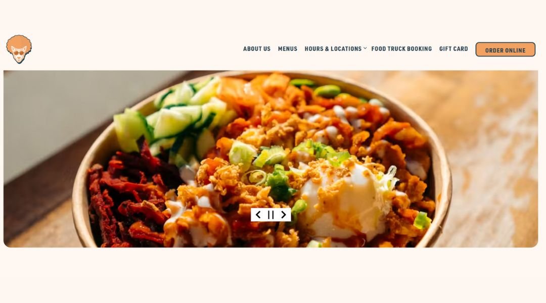
1. Urbanbelly
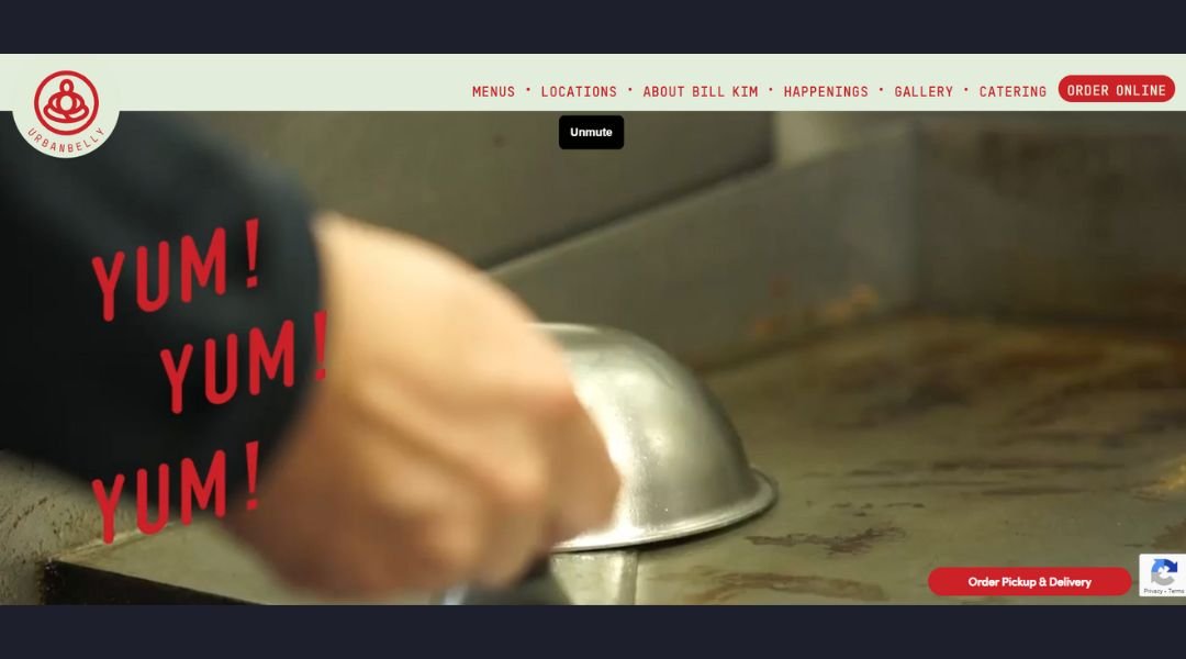
Urbanbelly doesn’t just feed you—it keeps you curious. From the first glance, the site is fast, fresh, and unpretentious. You land on bold food photos that skip the styling tricks and just show what’s real: noodles, rice, and dumplings that look like they came straight from a hot kitchen (because they did).
Chef Bill Kim’s name is there, but it’s not a chef-as-celebrity situation. Instead, the story unfolds through the food. The site layout is clean, the colors are vibrant, and the copy is short but confident—like someone who knows the food speaks louder than anything else.
The “About” section is straightforward. It tells you where the flavors come from and why they matter, without reading like a novel. And the menu? It loads quickly and doesn’t make you squint or scroll forever. A win in itself.
Urbanbelly is a reminder that good design doesn’t have to be loud. It just needs to be honest. And hungry or not, this site might convince you to place an order… or at least plan a visit.
2. Pujol

Pujol doesn’t announce itself—it arrives. The site is as refined as the food it represents: no gimmicks, no clutter, just calm elegance and deliberate design. From the opening screen, you know this isn’t just a restaurant. It’s an experience that starts before you even book a table.
Chef Enrique Olvera’s name appears quietly, like everything else here—measured, confident, and precise. The visuals are restrained, letting the textures of tortillas and sauces do most of the talking. The menu is presented like a short story. A thoughtful one.
Navigation is intuitive. There’s nothing trying too hard. Reservations are just a click away, and information is clear without being transactional. Even the typography feels handpicked—elevated, but not cold.
What the site does best is reflect the restaurant’s rhythm. It’s slow, intentional, and proud of where it comes from. No big slogans. Just quiet mastery.
Pujol doesn’t need to convince you it’s special. It just invites you to look closely—and trust that everything has its place.
3. Punkt Gdynia
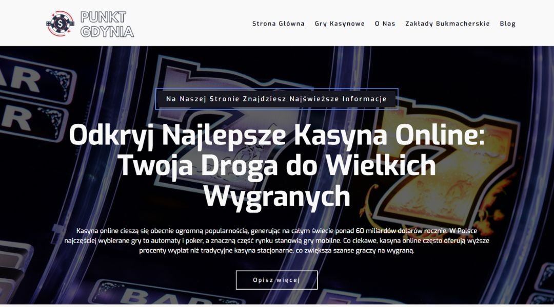
Punkt Gdynia feels more like a creative signal than just a space. The website is minimalist but never cold—structured design, clear typography, and just enough visual breathing room to make you want to explore. It’s confident without being loud.
This is a cultural venue that understands balance. Exhibitions, talks, screenings—they’re all given equal weight, both in content and layout. Nothing fights for your attention. The event calendar is straightforward, with visuals that feel curated, not crammed.
The “About” section offers context without the fluff. You quickly get the idea: Punkt isn’t trying to be everything. It’s trying to be meaningful—through art, conversation, and collaboration rooted in Gdynia’s creative scene.
The site moves at a calm pace. It respects the work being shown and the people coming to see it. You’re not overloaded with text, but you’re not left guessing either.
Punkt Gdynia isn’t just a space—it’s a pause, a perspective, a well-placed dot in the cultural map. And the site carries that same rhythm: simple, thoughtful, and ready when you are.
4. Bon Bouquet Café
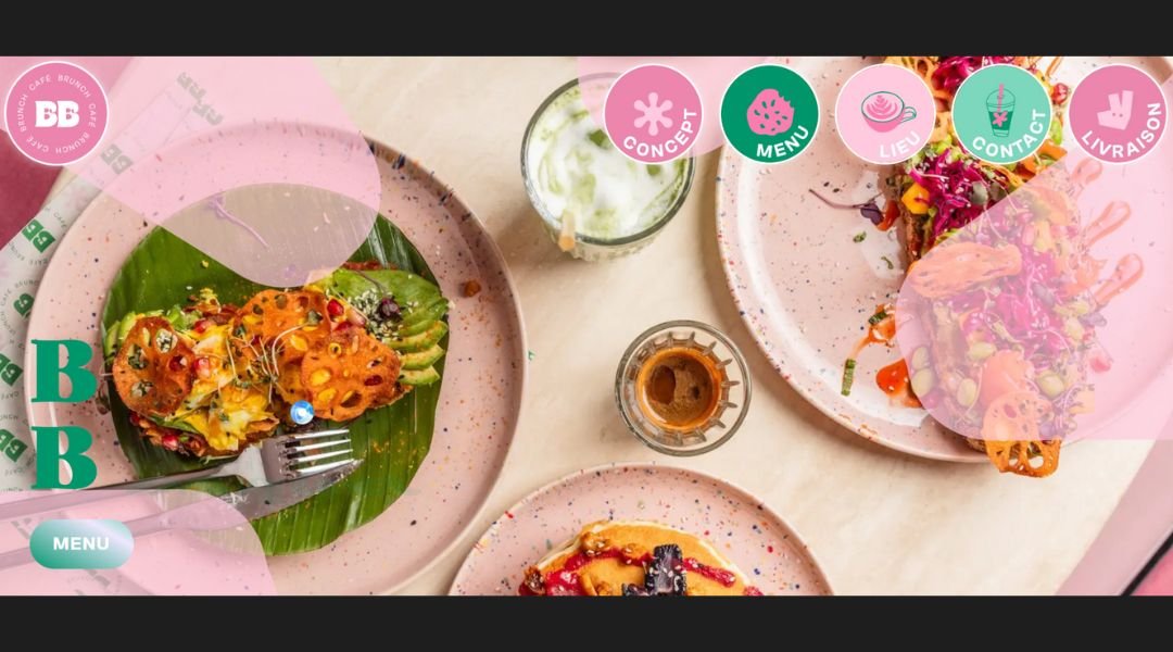
Bon Bouquet Café doesn’t just serve brunch—it serves a whole vibe. The website opens like a sunlit morning in Paris: soft colors, airy design, and just enough personality to make you want to book a table before finishing your scroll.
Everything here feels considered but never fussy. From stacks of pancakes to freshly poured lattes, the visuals are crisp and crave-worthy. The site keeps things light—just like the space itself. It’s more of a mood than a menu dump, and that’s a compliment.
Navigation is smooth. You’ll find what you need—locations, hours, menus—without a maze of links or distractions. The “About” page stays short, sweet, and photo-forward, which honestly says more than a long story ever could.
What works best is the balance. Bon Bouquet feels cool but approachable. Stylish, but not trying too hard. The kind of place where the coffee’s strong, the lighting’s flattering, and the WiFi password probably comes with a smile.
In other words: it’s brunch done right—on the plate and on the page.
5. Barra
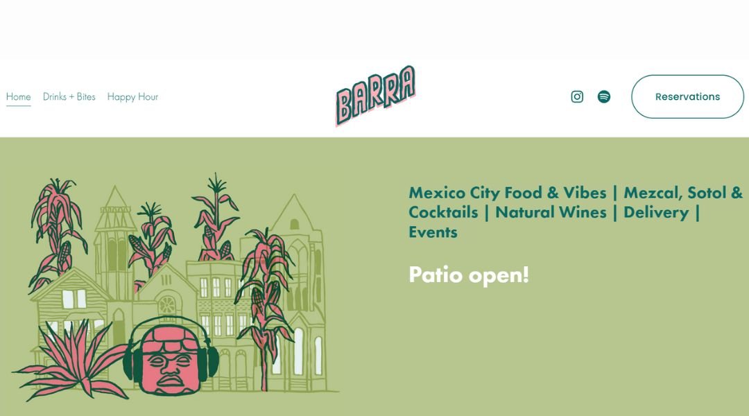
Barra doesn’t shout for attention—it welcomes you in with a slow pour and low lighting. The site reflects the same experience you’ll find inside: clean, modern, and just a little bit mysterious (in the best way).
From the homepage, you’re greeted with simple elegance. Soft-toned visuals, clear type, and a no-fuss layout that puts the focus on what matters—drinks, dishes, and a space that feels like the city outside just hit pause.
Menus are easy to access and beautifully understated. You’re not sifting through pages—you’re selecting your next favorite cocktail or shareable plate without the scroll fatigue. It’s thoughtful, just like the bar program itself.
The “About” section is brief but grounded. You get the sense this isn’t a trend—it’s a team with purpose, building something that lasts. It’s stylish but not staged. Designed, but not overdone.
Barra feels like the kind of place you tell your friends about—but only after your second visit. And the website? It gives just enough away to get you there.
6. Canlis
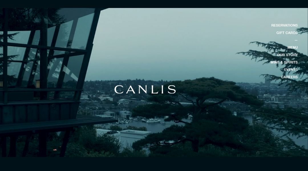
Canlis doesn’t just offer fine dining—it offers intention. The website mirrors that vision: minimal, graceful, and quietly self-assured. You’re not overwhelmed with words or photos. Just a few well-placed visuals and an invitation to slow down.
Every section of the site feels curated, not constructed. The design is spare but never empty. There’s space between elements—just like there’s space between courses at the table. It’s about pacing, and Canlis understands that rhythm deeply.
The “About” page leans into legacy without making it a museum piece. You learn enough about the family, the philosophy, and the care behind the scenes—but it’s never self-congratulatory. It’s honest, warm, and deeply Pacific Northwest.
Even the reservations process feels thoughtful. No flash, no friction. Just a quiet confidence that if you’re meant to be there, you’ll find your way in.
Canlis isn’t just a restaurant. It’s a reminder that hospitality is an art. And the site? It feels like part of the experience—unrushed, refined, and ready when you are.
7. Lucky Folks
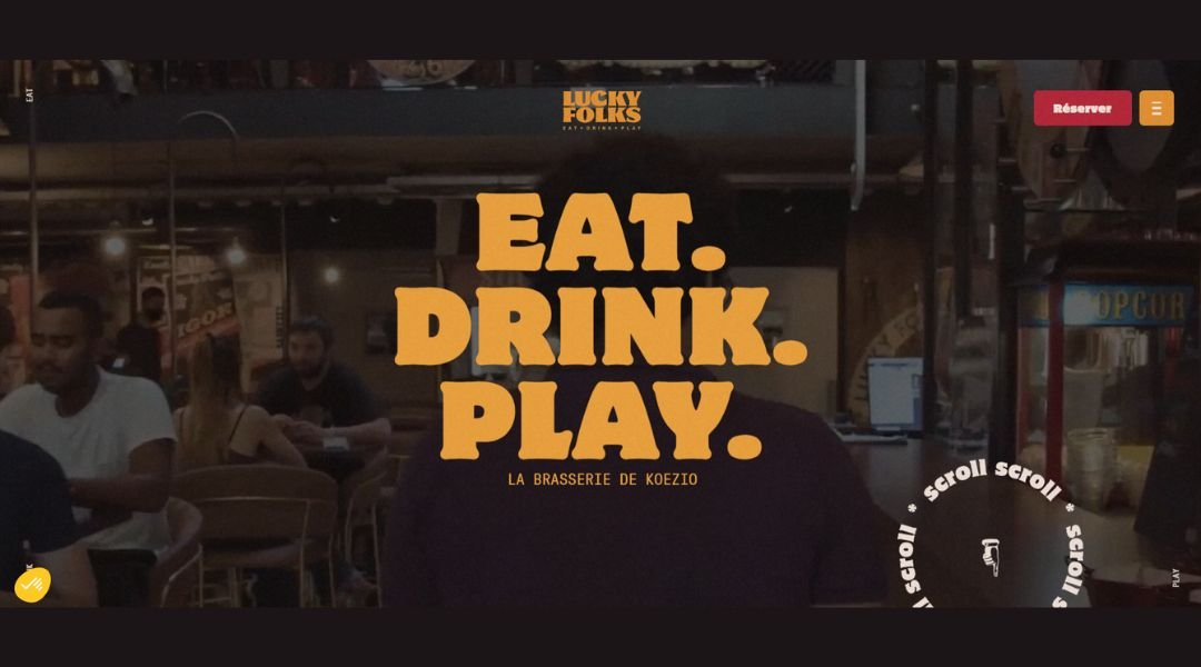
Lucky Folks doesn’t feel like a restaurant. It feels like a night out that got everything right. The site sets the tone fast—bright visuals, bold colors, and just enough motion to make you want to grab a drink, roll a ball, or maybe both.
It’s part bar, part restaurant, part bowling alley—but not the sticky-floor kind. Think neon meets leather booths. The homepage gets you in the mood before you even click a menu. You’re not just going to eat here—you’re going to hang out.
Navigation is fast and clean, with just the right amount of flair. Menus are easy to access, event info is clear, and everything moves like the place sounds: upbeat, sharp, and slightly cheeky.
The “About” section is light on words but big on attitude. You’re here to have fun, and they know exactly how to deliver it—with good food, strong cocktails, and plenty of ways to play.
Lucky Folks is where grown-up nights meet playful energy. And the site? It brings that vibe to life before you’ve even booked a lane.
8. Flaner
Flâner doesn’t rush to tell you what it is—it invites you to take your time. The site opens like a soft-spoken introduction: monochrome palette, generous spacing, and refined restraint. It’s not trying to impress—it already knows who it’s for.
This is more than a clothing brand. It’s a mood, a walk, a pause. The collections speak in subtle textures and timeless forms. The photography is clean and unforced, reflecting the pieces themselves—simple, strong, and quietly confident.
Navigation is intuitive, the layout calm. Every click feels intentional. Product pages are free of noise—just fabric, silhouette, and thoughtful presentation. Nothing extra, nothing missing.
The “About” page stays true to the tone. It doesn’t oversell. It simply offers a perspective—one built on quality, patience, and a slower rhythm in a faster world.
Flâner isn’t chasing attention. It’s building something steady. And the site reflects that perfectly: a digital space where stillness, clarity, and style move together.
9. Back Door Donuts
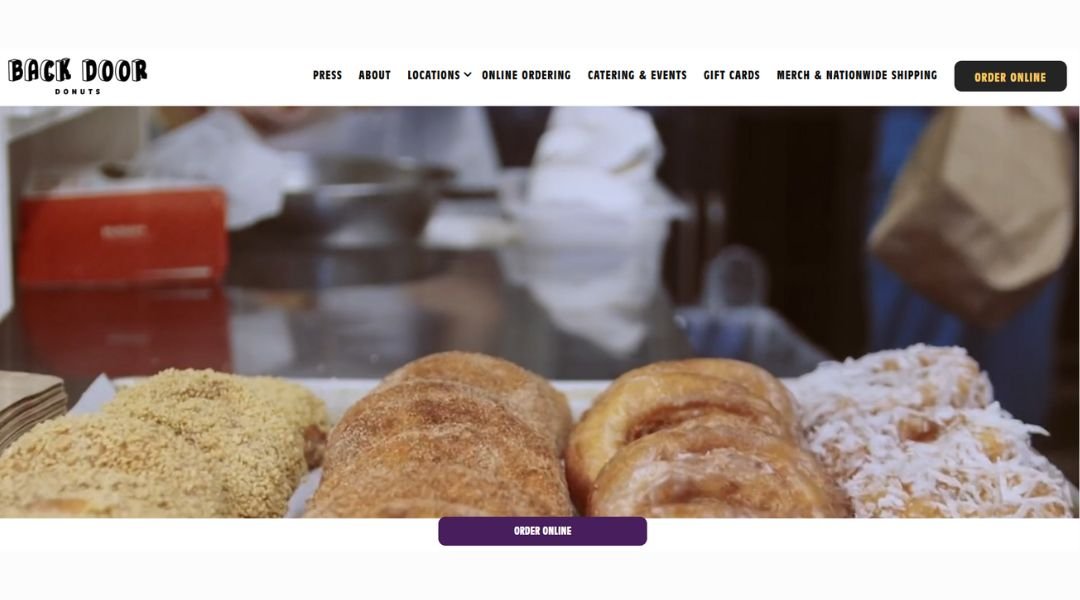
Back Door Donuts doesn’t need a flashy pitch—it has warm, gooey credibility baked right in. The site captures that late-night, just-one-more-donut kind of energy without overdoing it. Bright colors, bold type, and yes, donut photos that hit you right in the cravings.
From the moment the homepage loads, you know exactly what you’re in for: fresh donuts, a bit of mischief, and a lot of flavor. Whether you’re a local or a tourist on Martha’s Vineyard, this place is part sweet shop, part local legend.
Navigation is fast, and the info you need—hours, location, menu—is right where it should be. You won’t get lost unless it’s in a dozen maple bacon.
The “About” section is short and satisfying, just like a classic glaze. You get the story, the attitude, and the reason people keep lining up after dark.
Back Door Donuts is the kind of spot you tell your friends about the next morning—if you didn’t eat every last one yourself. And the site? Just like the donuts: warm, a little wild, and worth the wait.
10. Disco Cheetah
Disco Cheetah doesn’t just serve Korean food—it serves bold, fast, unforgettable flavor with a side of attitude. The website captures that same energy: bright colors, punchy design, and just enough groove to match the name.
From food truck roots to a brick-and-mortar spot in Vancouver, the brand doesn’t miss a beat. The homepage gives you everything upfront—menu, ordering info, hours—with no fluff and no slow load times. Just like their food, the experience is quick, fresh, and full of impact.
The visuals are crisp, the layout is easy to follow, and the menu? A greatest hits lineup of Korean comfort food built for takeout or dine-in. Bulgogi beef, spicy pork, tofu—you’re not here to hesitate.
The “About” page is short but hits the right notes. You get a sense of personality, hustle, and a clear love for good food made fast. It’s street food that grew up a little—but didn’t lose its swagger.
Disco Cheetah isn’t trying to be fancy. It’s trying to feed you fast, feed you well, and maybe make you smile while you wait. The site? It does exactly that.
11. Septime
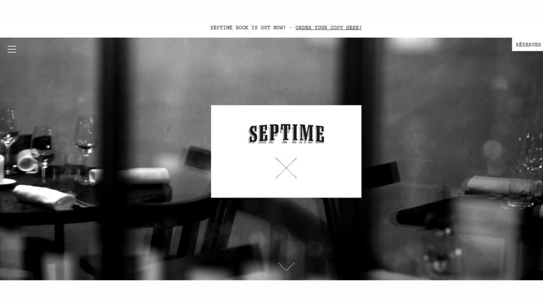
Septime doesn’t need to explain itself—it just invites you in with grace. The website mirrors the experience: minimal, fluid, and intentional in every detail. It’s not about flash. It’s about presence.
From the homepage, everything feels like a deep breath. Clean typography, subtle animations, and a muted palette create space—not just to read, but to feel. It’s modern Paris, distilled.
The layout is straightforward but refined. Reservations, menus, philosophy—it’s all there, without friction. Nothing overwhelms. You get just enough to know the story, then you’re left to imagine the rest.
The “About” page reads more like a quiet manifesto than a sales pitch. It speaks to seasonality, sustainability, and a commitment to food as craft—not spectacle. No buzzwords, just thoughtful simplicity.
Septime isn’t trying to be the hottest table in town. It’s built for those who appreciate subtlety, rhythm, and something lasting. The site, like the restaurant, reflects that—a rare balance of confidence and calm.
12. The Clove Club
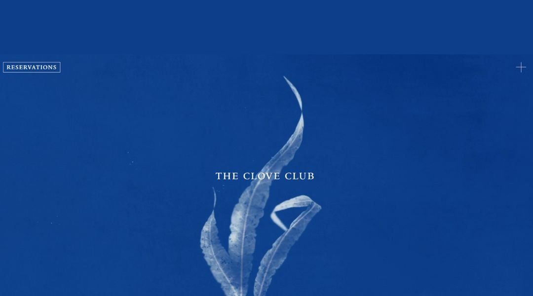
The Clove Club doesn’t rely on big statements—it lets restraint do the work. The website is as composed as the food it represents: structured, minimal, and thoughtful from the first scroll. No loud graphics, no excess copy—just intention.
Housed in a historic London town hall, the restaurant blends classic bones with contemporary thinking. The site reflects that balance perfectly. The design is quiet but direct, giving you what you need—menus, booking, philosophy—without ever feeling rushed.
Photography is clean and moody, mirroring the experience on the plate: modern, seasonal, and crafted with focus. You’re not browsing a brand—you’re being introduced to a mindset.
The “About” section is brief but impactful. It touches on origin, ambition, and execution without overselling. The tone is steady, like a place that knows its value and doesn’t need to shout it.
The Clove Club isn’t chasing trends—it’s shaping what comes next. And the site? It’s a seamless extension of that idea: thoughtful, elevated, and designed for those who pay attention.
13. Pizzeria Vetri
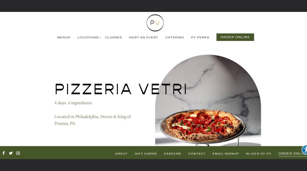
Pizzeria Vetri is what happens when great pizza meets zero pretense. The website wastes no time getting to the good stuff—big, golden crusts, bubbling cheese, and that perfect balance of casual vibe and serious flavor.
The homepage hits you fast with what matters: photos that make you hungry and a layout that’s easy to love. Locations, menus, online ordering—it’s all right there, no clicks wasted. The tone is upbeat but never pushy. Like the kind of friend who shows up with pizza and doesn’t overtalk it.
The “About” section keeps it real. It gives you a quick glimpse of the passion behind the pies, but lets the food lead the story. This isn’t a brand built on hype. It’s built on dough, timing, and a steady oven.
Every page feels designed with the guest in mind—clean, fast, and flavorful. Whether you’re planning a night out or just trying to solve lunch, the site makes one thing clear: good pizza shouldn’t be complicated.
And at Pizzeria Vetri, it never is.
14. Sweetgreen
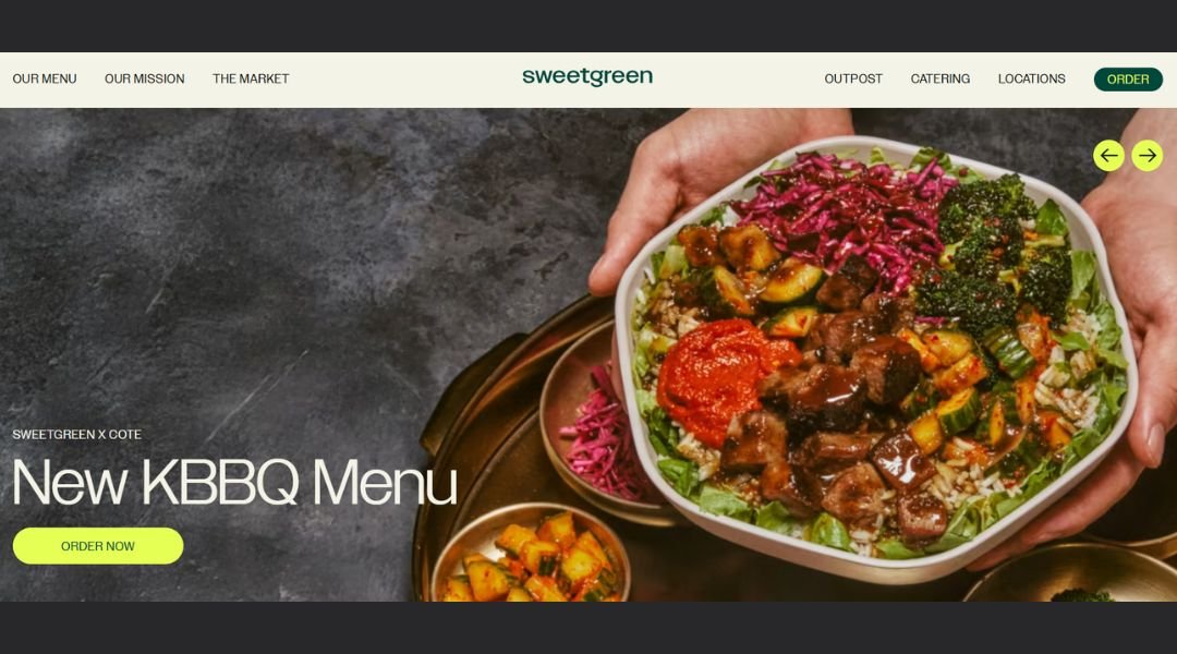
Sweetgreen isn’t just about salad—it’s about rhythm, routine, and real food that actually tastes good. The website hits that same balance: fresh, fast, and built with care. From the first scroll, you get what Sweetgreen stands for—seasonal ingredients, transparent sourcing, and a future-minded approach to food.
The design is clean, airy, and efficient. No fluff. Just bold photos, sharp typography, and clear pathways to order, find a location, or learn where your greens came from. It feels like the digital version of their bowls—thoughtfully layered, easy to digest.
The “Our Story” section gives context without turning into a lecture. You learn the brand’s values—community, sustainability, simplicity—without ever feeling talked at. It’s informative, not preachy.
Sweetgreen’s site doesn’t overcomplicate things. It understands that hungry people want clarity, not clutter. But behind the minimalism, there’s a clear mission driving it all.
In short: it’s a place where food meets purpose. And the site delivers that message with the same freshness and care they put in every bowl.
15. Hisa Franko
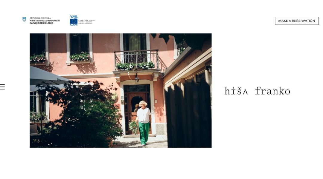
Hiša Franko isn’t just a restaurant—it’s a landscape served on a plate. The website reflects that same spirit: wild but graceful, rooted in place, and driven by a deep connection to its surroundings. Nothing feels rushed here. Every word, every image, every pause is deliberate.
From the homepage, you’re drawn into the rhythm of the Soča Valley. Earth-toned visuals and atmospheric photography set the tone—this is not a quick scroll-and-go. It’s an invitation to linger.
Chef Ana Roš’s voice comes through clearly, not in loud branding but in quiet conviction. The “About” and “Philosophy” sections read like journal entries—intimate, thoughtful, and grounded in respect for both nature and craft.
Navigation is fluid. Menus, reservations, team stories—they’re all there, but never in your face. The design holds space, much like the restaurant itself.
Hiša Franko isn’t trying to be everywhere. It’s right where it belongs—tucked into the hills, speaking softly, and letting the land lead the way. The website honors that perfectly.
16. Frantzén
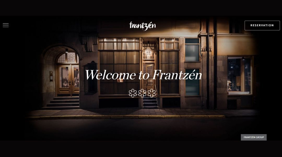
Restaurant Frantzén doesn’t need a dramatic introduction. The website, like the dining experience, is calm, exact, and deeply intentional. It opens with immersive visuals—slow, cinematic, and composed—pulling you into a space where detail is everything.
The design is sleek, with a dark palette and minimal text that lets the mood do the talking. You won’t find loud headlines or flashy animations. What you get is clarity. Precision. A rhythm that mirrors the kitchen itself.
Navigation is seamless. Booking, philosophy, and team are all tucked into a structure that feels as carefully crafted as a course in the tasting menu. The “About” section doesn’t brag—it shares. Chef Björn Frantzén’s vision is clear: innovation rooted in emotion, driven by experience.
Every part of the site feels elevated, but never distant. It’s built for people who notice the little things—and expect them to matter.
Frantzén isn’t just a restaurant. It’s a performance in restraint, movement, and memory. And the site? It sets the stage beautifully.
17. Laurie Raphaël
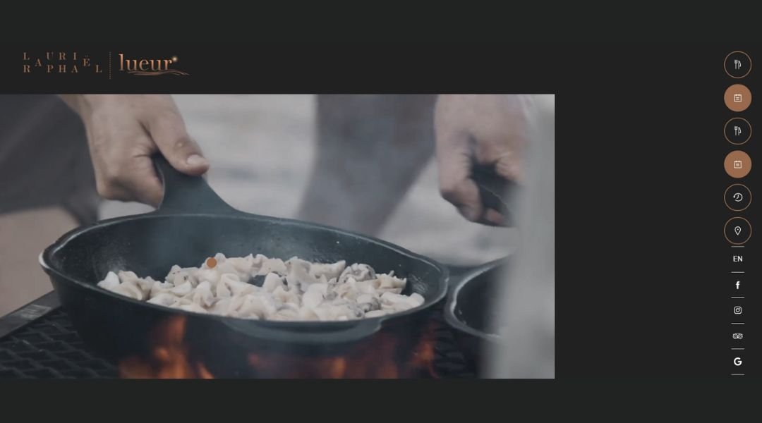
Laurie Raphaël feels less like a restaurant website and more like a personal letter wrapped in linen. From the moment the homepage opens, you’re met with a quiet elegance—soft tones, cinematic movement, and just enough space to let it breathe.
The design is polished without feeling sterile. Navigation is intuitive, menus are easy to find, and every section flows like a conversation—one that’s deeply rooted in Quebec’s culinary landscape. This isn’t a place trying to impress through noise. It speaks in nuance.
The “Philosophy” section blends story with vision, giving you insight into the father-son duo behind it all. It’s personal, but not overly sentimental. You get a sense of craft, of legacy, and of a deep respect for ingredients and identity.
The visuals do their part too—ingredients, plating, spaces—all captured with the same restraint and intention you’d expect from a multi-course tasting experience.
Laurie Raphaël doesn’t need to push. It invites. And the site carries that feeling beautifully—like the restaurant, it trusts that the right people will understand exactly what it’s offering.
18. Sublime Doughnuts
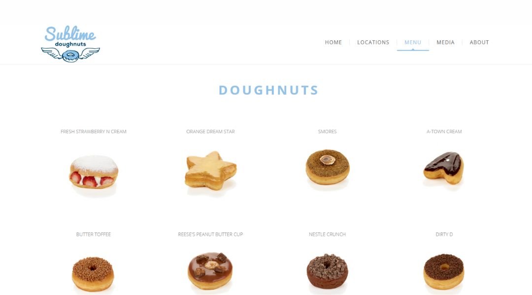
Sublime Doughnuts doesn’t tiptoe around what it is—it celebrates it. Loud flavors, bold colors, and a homepage that feels like a sugar-powered joyride. From the first scroll, you know this isn’t your average donut shop.
The website is playful but clear. You’ll find donuts shaped like burgers, ice cream-stuffed creations, and names that double as punchlines. But the fun never comes at the expense of function—menus are easy to browse, ordering is a breeze, and the vibe? Pure energy.
The “About” section tells the story of founder Kamal Grant with just the right mix of passion and humor. A Navy vet turned pastry visionary? That’s a donut origin story worth reading.
Every corner of the site feels fresh, fun, and just a little over the top—in the best way. Whether you’re local to Atlanta or planning a sugar-fueled detour, this site makes one thing clear: donuts should be an experience, not just a snack.
Sublime Doughnuts isn’t trying to be subtle. And honestly, thank goodness for that.
19. Adachi
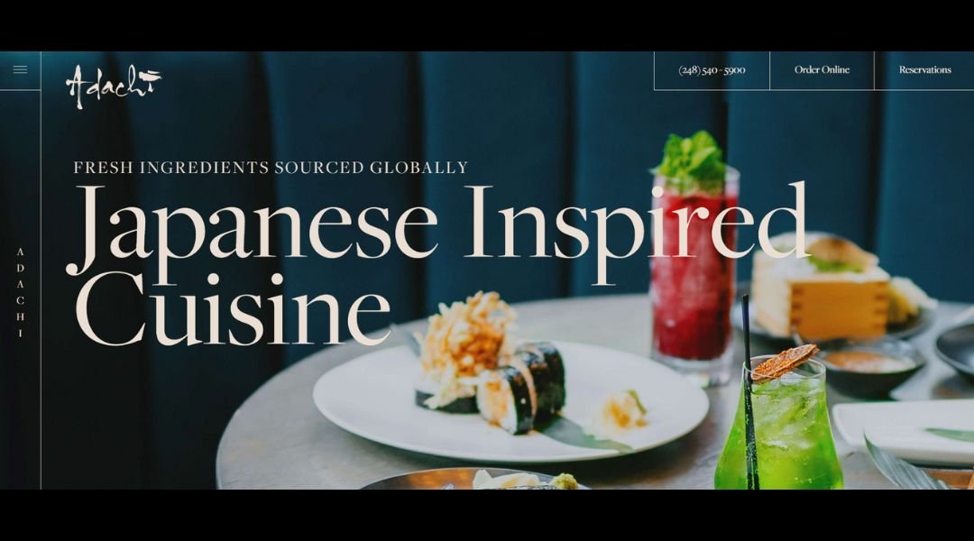
Adachi doesn’t rush to impress—it invites you to pause. The website opens with a slow rhythm: soft visuals, clean lines, and a layout that mirrors the calm precision of its Japanese-inspired dishes. It’s not flashy, but it’s undeniably refined.
Housed in a historic Birmingham mansion, Adachi pairs tradition with contemporary ease. The site reflects that blend—beautifully paced, carefully structured, and easy to navigate. Menus, reservations, and press are all within reach, but nothing feels crowded or overdone.
The “About” section offers just enough backstory to ground the experience. Chef-driven, detail-oriented, and rooted in craft, the restaurant’s vision comes through clearly—without needing paragraphs of explanation.
What makes the site work is what makes the restaurant memorable: balance. Each element serves a purpose. There’s space to look, time to consider, and room to anticipate the meal before you’ve even booked.
Adachi is elegance without ego. And the website delivers that message with grace, clarity, and intention.
20. Rosebud Kitchen
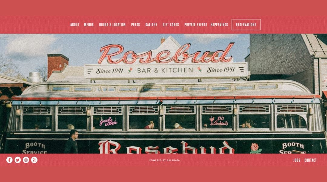
Rosebud Kitchen feels like brunch with your favorite people—familiar, unfussy, and just the right amount of retro. The website matches that tone perfectly. From the moment it loads, you get the sense that this is a place that knows how to keep it classic without getting stuck in the past.
The homepage keeps it clean. Photos of stacked pancakes, golden hash browns, and fresh coffee do the talking. Navigation is simple and friendly—menus, hours, reservations—it’s all right where you want it.
The “About” section keeps it short and sweet. You learn that Rosebud is all about comfort food done right, with a space that feels like a cross between a diner and your coolest neighbor’s kitchen. There’s no gimmick here, just quality ingredients and good company.
Whether you’re in for a slow Sunday or a weekday breakfast that doesn’t feel rushed, Rosebud promises something grounded and satisfying. And the site? It’s a slice of that experience—approachable, easygoing, and proud of the little things.
Conclusion
A good restaurant website doesn’t need all the bells and whistles. It needs clarity, style, and a reason for people to come back—both to the site and the restaurant.
These 20 examples prove that when you keep the user in mind, everything works better. You don’t need to reinvent the internet. You just need a homepage that loads fast, a menu people can actually read, and a tone that reflects who you are—not who you think you’re supposed to be.
Pick and choose what fits your brand. Maybe it’s the photography style, the menu layout, or how they handle online reservations. Whatever it is, make it yours.
Because at the end of the day, your website is just the appetizer. Make sure it leads to something worth staying for.

