I’ve spent a lot of time studying photography websites—some elegant, some bold, and a few that made me wonder if the designer ran out of coffee halfway through. Good design matters. A strong portfolio isn’t just about great photos—it’s about how those photos are presented.
Whether you’re building your first site or refreshing one that feels stuck in 2013, the right examples can help shape your direction without stealing your identity.
In this guide, I’ve collected 20 photography websites that actually work. Not just visually—but structurally, emotionally, and practically. These aren’t cookie-cutter layouts or trend-chasing designs. They’re real sites built by real photographers, each with its own way of saying: “Here’s who I am, and here’s how I see.”
Here’s what you’ll get from this guide:
- Clear design approaches that keep the focus on your work
- Portfolio layouts that feel inviting—not overwhelming
- Ideas on tone, structure, and voice that connect with real clients
- Subtle ways to make your site feel personal, not pushy
- A little inspiration (and maybe a few gentle nudges to finally update your “About” page)
Spoiler: scrolling through beautiful websites is way more fun than reorganizing your Lightroom catalog. Let’s begin.
1. Olga Miljko
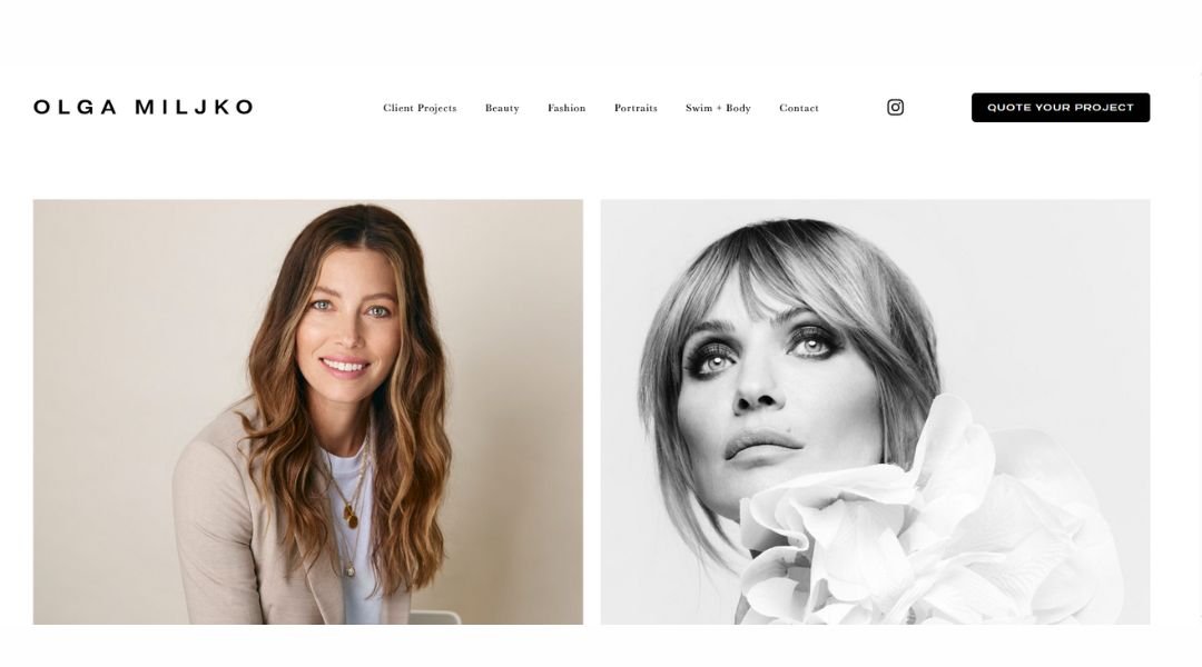
Olga Miljko is a Berlin-based architect and photographer whose work blends structure with story. Her portfolio doesn’t just show finished projects—it reveals moments, moods, and a quiet confidence in her creative voice.
What makes Olga’s site stand out isn’t just the visuals (though they’re stunning). It’s how she presents them—with restraint, clarity, and just enough personality to feel human. Each section feels intentional. Her About page, for instance, skips the fluff and gets to what matters: who she is, how she works, and why she creates.
Instead of overwhelming visitors with jargon or heavy-handed branding, Olga offers a quiet space. It’s clean, light, and refreshingly honest. Even the typography feels like a deliberate choice—neither flashy nor dull.
There’s also a bit of charm in how she shares her photographic work. It’s personal, but not preachy. Structured, yet open.
In a field where noise is common, Olga’s site speaks clearly—less like a pitch, more like a quiet conversation. And that’s what makes it memorable.
2. Shanley Cox
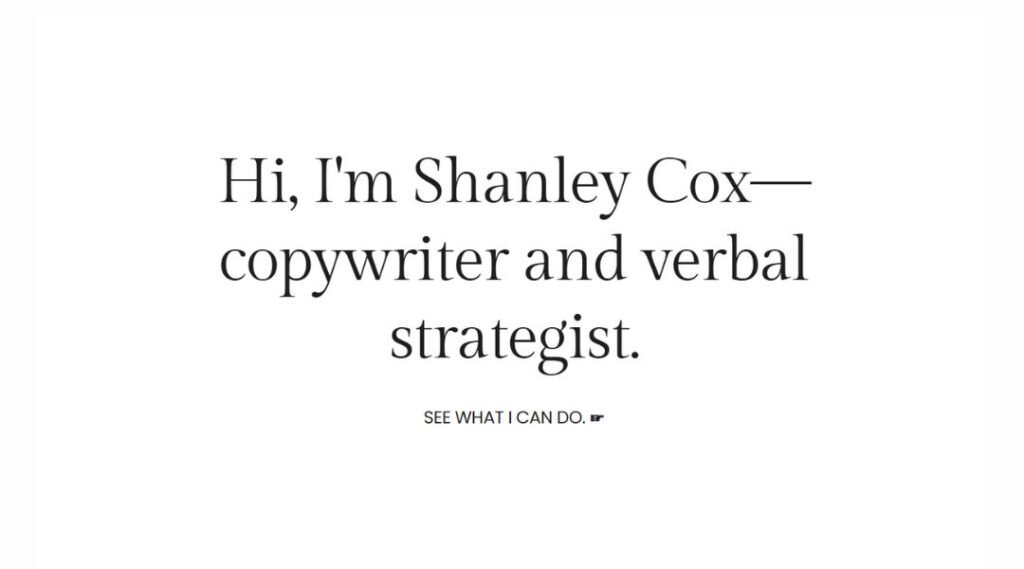
Shanley Cox is a Kansas City-based wedding photographer who captures moments that feel as real as they are beautiful. Her website isn’t just a gallery—it’s a window into her approach: warm, honest, and a little bold when it needs to be.
From the first scroll, visitors get more than just pretty pictures. There’s energy here. Her homepage immediately introduces you to a vibe that’s equal parts candid and confident—like a good friend who happens to be holding a camera.
What stands out is her voice. Shanley doesn’t hide behind polished phrases or buzzwords. Her About page reads like she’s talking to you over coffee. It’s casual, but not careless. Funny, but not forced.
Even the way her galleries are arranged tells you she respects both the big picture and the small, unscripted moments in between.
This isn’t photography trying to impress. It’s photography that means something—to her, and clearly to her clients. And that honesty? It’s hard to look away from.
3. Peter McKinnon
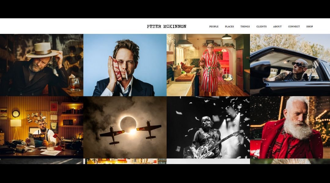
Peter McKinnon isn’t just a photographer or filmmaker—he’s a full-blown experience. His website reflects that. It’s bold, fast, and unapologetically creative, much like the man behind the lens.
From the first glance, you know you’re not in for a quiet browse. The layout is sharp, confident, and high-energy, but never messy. Every image, every word, feels dialed in. His visuals don’t just look good—they move. They tell stories. Sometimes loud, sometimes still, but always intentional.
The About section is brief but effective. No fluff, no filler. Just enough to get who Peter is without slowing the momentum. His shop? It feels more like a curated gear vault than a product page—because when your brand is built on creativity, even a coffee mug carries weight.
McKinnon’s site doesn’t try to explain everything. It shows you. The attitude, the craft, the community—it’s all there. Just not in your face about it.
And somehow, even with all the high-production flair, it still feels personal. Like you’re being invited in—not just to see the work, but to feel it.
4. Mike Kelley
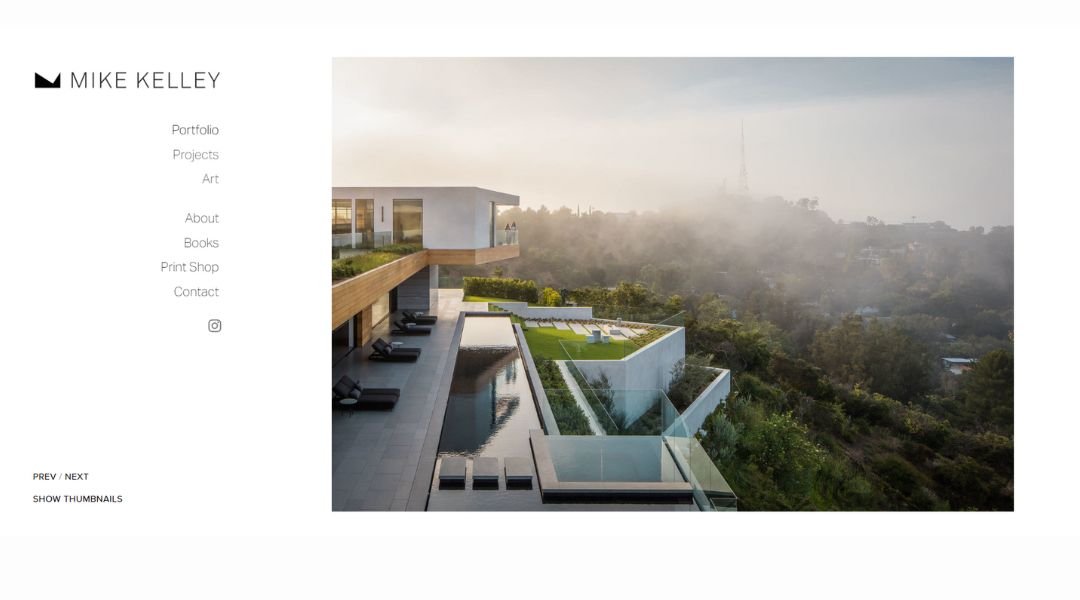
Mike Kelley doesn’t just photograph architecture—he makes buildings look like they woke up early, had coffee, and are ready to impress. His website mirrors that same polished confidence. Clean layout. Sharp visuals. No wasted space.
From the moment the homepage loads, you’re pulled into spaces that somehow feel still and alive at the same time. It’s not just about angles and lighting—it’s about mood. About making empty rooms tell a story.
The way Mike presents his work is straightforward and effective. No dramatic intros or poetic fluff. Just high-level images that speak louder than words. And when you do read his bio, you get a sense of humor tucked under the professionalism—a welcome reminder that the guy behind the lens is as approachable as he is skilled.
The site’s portfolio isn’t bloated either. It’s focused. Confident. Each project earns its place. That restraint makes it feel curated, not crammed.
In a niche where over-editing and over-explaining are common, Mike keeps it tight. Beautiful spaces, beautifully shown—with just enough personality to keep it human.
5. Scott Snyder
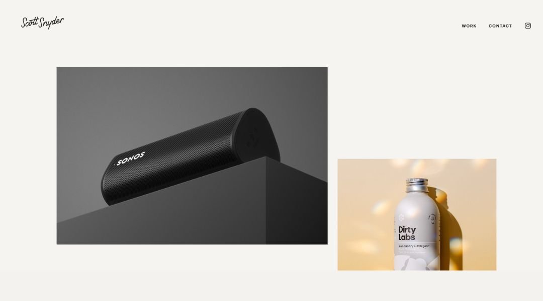
Scott Snyder photographs architecture like it was meant to be remembered. His website doesn’t rush you—it invites you in, quietly confident in what it has to show. No flashy tricks. No distractions. Just refined work that speaks for itself.
Right from the homepage, you can feel the precision. Lines, light, and layout—all carefully chosen, never overdone. Each gallery is organized with intent, offering a clear view into Scott’s eye for symmetry, calm, and form.
His About page keeps it human. It’s short, grounded, and refreshingly honest. No long origin story, just a clear sense of who he is and how he sees space.
This isn’t a site that’s trying to sell you. It’s showing you. The tone is professional without feeling stiff. The images carry the weight, and the words know when to step back.
For anyone who appreciates clarity—in both photography and design—Scott’s site delivers. It’s not loud. It’s not trying too hard. And that’s exactly what makes it work.
6. Liller Photo
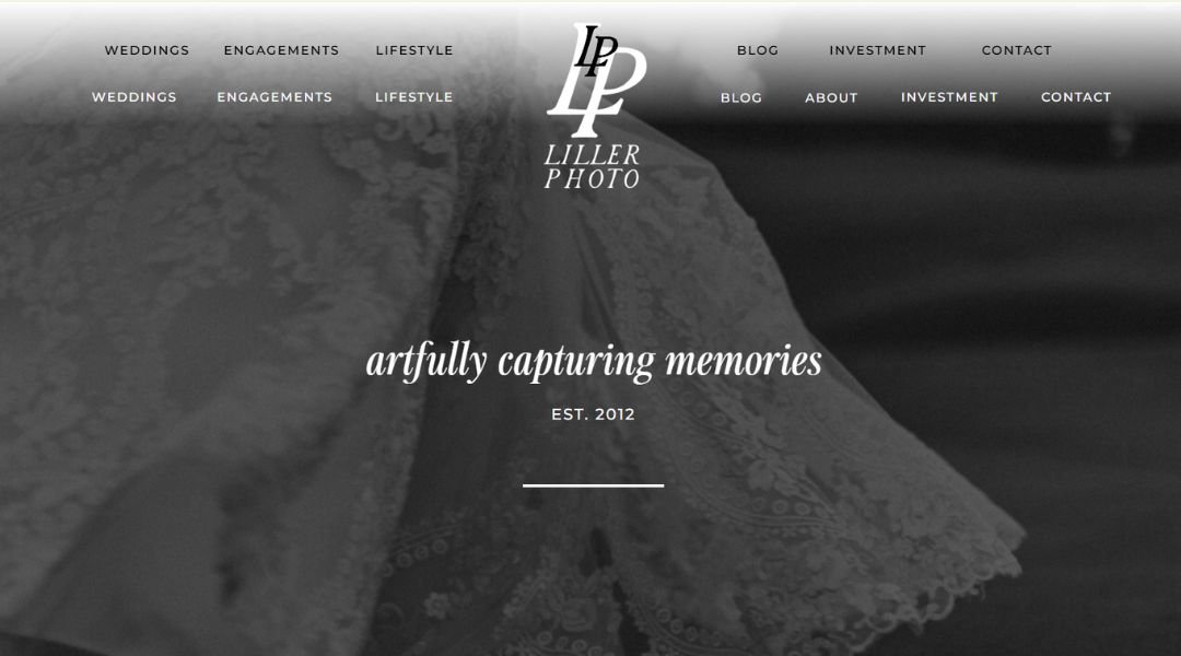
Liller Photo brings personality to the party—and captures every bit of it. Based in Baltimore, this wedding and portrait photography studio leans into vibrant energy, real moments, and a playful approach that never sacrifices professionalism.
From the jump, the site feels fun. But not chaotic. The colors pop, the language is friendly, and the photos? They’re full of life. You get the sense this team isn’t just documenting events—they’re part of them.
The About section reads like a conversation. It’s light, personable, and clear about what drives their work: connection, joy, and a little bit of quirk. There’s humor, but it’s balanced. It doesn’t undercut the skill behind the lens.
Even the FAQs carry a casual confidence—enough to answer real questions without sounding robotic. And the galleries? They’re curated to feel real. Not staged. Not stuffy. Just honest storytelling with great light and better timing.
Liller’s site doesn’t try to be everything. It knows what it is—bold, warm, and a little offbeat in the best way. It makes you want to grab a confetti cannon and book a session.
7. Jessica Chou
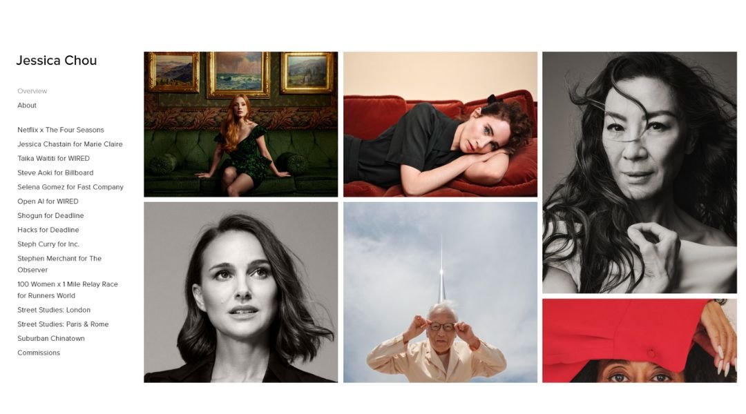
Jessica Chou’s photography doesn’t shout. It listens. Her work captures people and places with a quiet kind of clarity—honest, thoughtful, and never overworked.
From the moment her site loads, you’re met with stillness. Not emptiness—intentional space. The layout is simple and confident. No visual noise, no gimmicks. Just strong imagery that trusts you to look closer.
Her editorial and commercial portfolios each feel distinct, but they share a common thread: respect. For subjects, for stories, for details that others might overlook. The portraits aren’t posed to perfection—they breathe. The scenes don’t feel arranged—they feel lived in.
Jessica’s About page is minimal, but it does enough. It gives a sense of her background and her lens—both literal and artistic—without overexplaining. The work leads the conversation.
There’s something refreshing about the restraint here. The site doesn’t try to convince you. It quietly shows you what matters. And that kind of confidence stays with you, long after you click away.
8. Alex Tran
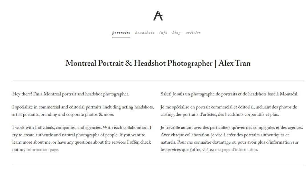
Alex Tran’s photography is full of movement—even when everything’s still. Based in Houston, he captures weddings, portraits, and moments in between with a style that’s cinematic, crisp, and quietly emotional.
The site reflects that vision. Clean layout. Sharp typography. No distractions. From the homepage to the final scroll, it’s all about the work—and the people behind it.
Alex’s photos feel lived in. Not staged or over-posed. There’s energy in the small glances, soft light, and natural framing. Whether it’s a wedding party mid-laugh or a quiet portrait at golden hour, the images tell their stories without trying too hard.
His About section hits the right note: warm, clear, and personal without going overboard. You get a sense of who he is, why he shoots, and how he works—with just enough detail to trust him, and no sales pitch in sight.
Even the contact page feels inviting. It’s direct, approachable, and respectful of your time.
In a crowded field, Alex’s site doesn’t shout. It resonates. And that’s the difference.
9. Mathieu Stern
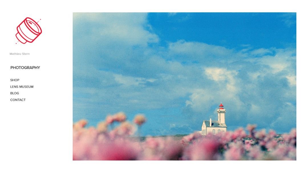
Mathieu Stern doesn’t just shoot images—he builds stories from the strange, the forgotten, and the beautifully flawed. His site mirrors that spirit. Unexpected, a little eccentric, but completely intentional.
Right away, you know this isn’t a typical portfolio. It feels like a museum exhibit mixed with a curiosity cabinet—except every piece has a purpose. Whether it’s portraits, experimental lenses, or full-blown visual projects, everything on the site speaks to Mathieu’s love of discovery.
His work isn’t polished in the traditional sense. That’s the point. There’s texture here. Grain, blur, light leaks—they’re not mistakes. They’re the language.
The About section gives a clear glimpse into his mindset. It’s not over-explained or overly formal. Just honest, creative, and maybe a bit mischievous—in a good way.
Even the way he organizes his projects feels curated for exploration, not just browsing. You don’t scroll through his site. You wander through it.
In a digital space full of clean, safe, and expected, Mathieu’s site chooses curiosity. And that choice makes it impossible to forget.
10. Will Bremridge
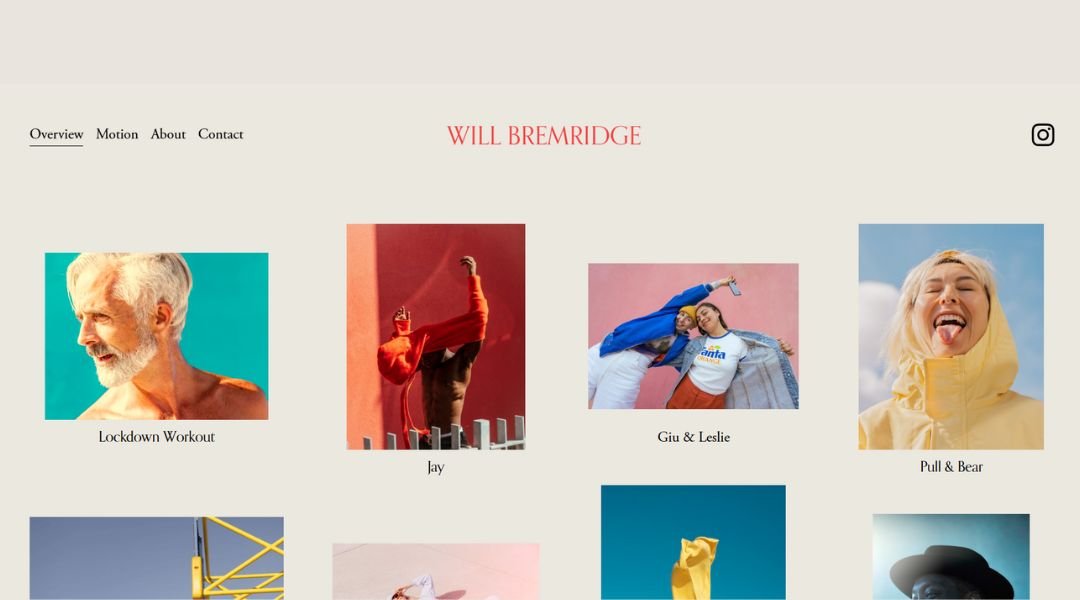
Will Bretzman captures motion with a sense of calm. His work—whether still or moving—feels grounded, cinematic, and personal. The website reflects that same tone. Clean. Considered. Unrushed.
Right from the homepage, you’re pulled into full-screen visuals that don’t just show the subject—they hold space for it. There’s no noise. No clutter. Just frames that feel composed but never stiff.
Will’s specialties in weddings and films are presented with balance. The galleries are tightly edited, offering just enough to understand his range without overwhelming the viewer. Each image feels part of a larger story.
The About page is brief, approachable, and quietly confident. He’s not selling himself with superlatives—just sharing who he is, what drives his work, and how he sees people and light. It’s refreshing.
Even the contact section keeps the tone easy and respectful. No push. Just an open door.
Will’s site doesn’t try to be flashy. It trusts the viewer to pause and look. And in that pause, the work speaks—gently but clearly.
11. Weddings By Lisa Nicole
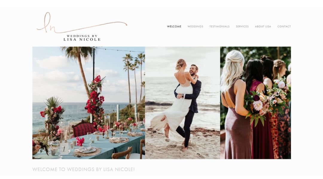
Lisa Nicole doesn’t just photograph weddings—she notices them. The quiet glances, the deep breaths, the laughs that sneak out mid-vow. Her work captures real moments, and her website reflects that same warmth and intention.
From the first scroll, the tone is inviting. It’s elegant, but not stiff. Romantic, but never overdone. The images speak with clarity—full of movement, feeling, and just the right amount of polish.
Lisa’s approach comes through in every section. The homepage sets the mood, but the About page brings it home. It’s heartfelt without getting overly sentimental. She shares her why, but keeps the focus on the people she serves.
Galleries are curated to feel genuine—not like a highlight reel, but like a memory you’ve just stepped back into. And the tone throughout is friendly, clear, and quietly confident.
This is a site that doesn’t need to over-explain. It trusts the viewer to feel something. And with work this honest, that’s more than enough.
12. Peter Fisher
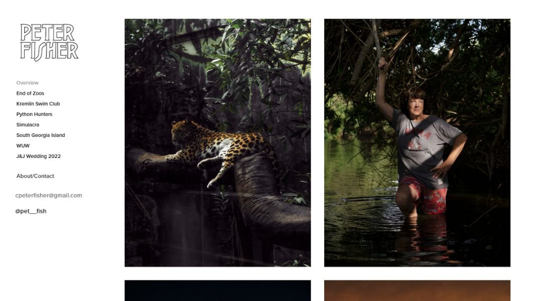
Peter Fisher’s photography is precise without feeling cold. Focused, but never forced. His site reflects that same clarity—simple design, clean flow, and visuals that do most of the talking.
From the homepage, you’re met with a direct, no-frills presentation of his work. Portraits, editorial shoots, corporate stories—they’re all framed with consistency and care. The lighting is crisp. The compositions are balanced. Nothing feels over-produced, but nothing feels casual either.
The About page is minimal, as it should be. It gives you enough: where he’s based, what he does, and how he works. No filler. Just a clear sense of a photographer who knows his strengths and doesn’t need to overstate them.
Even his portfolio navigation feels intentional. It’s not flashy, but it’s effective. You can move through projects without distraction—and that’s where his quiet style shines.
Peter’s site doesn’t chase trends or crowd-pleasing gimmicks. It reflects a photographer who’s clear on his craft and confident in his perspective. And that kind of focus is rare.
13. Meiwen See
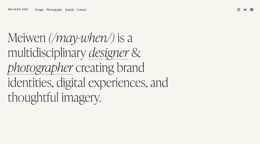
Meiwen See’s work feels like a quiet breath—light-filled, intentional, and full of subtle emotion. Her site mirrors that softness. It’s not rushed or cluttered. Just calm, clear, and visually led.
From the start, her homepage gives space to the images. Wide margins, soft tones, and curated galleries set the pace. Her weddings and lifestyle work both carry the same signature: natural light, gentle movement, and an eye for quiet beauty.
The About page is personal, but not overly detailed. She offers a thoughtful glimpse into who she is and how she sees the world. It’s honest and simple—enough to feel connected, but still professional.
Even her text choices echo the tone of her photography. Minimal, graceful, and clear. There’s no pressure or push. Just a quiet invitation to explore.
Meiwen’s work doesn’t rely on grand statements or heavy editing. It lives in small moments—glances, shadows, hands held in golden light. Her site knows that, and lets it all speak softly for itself.
14. Agatha Photography
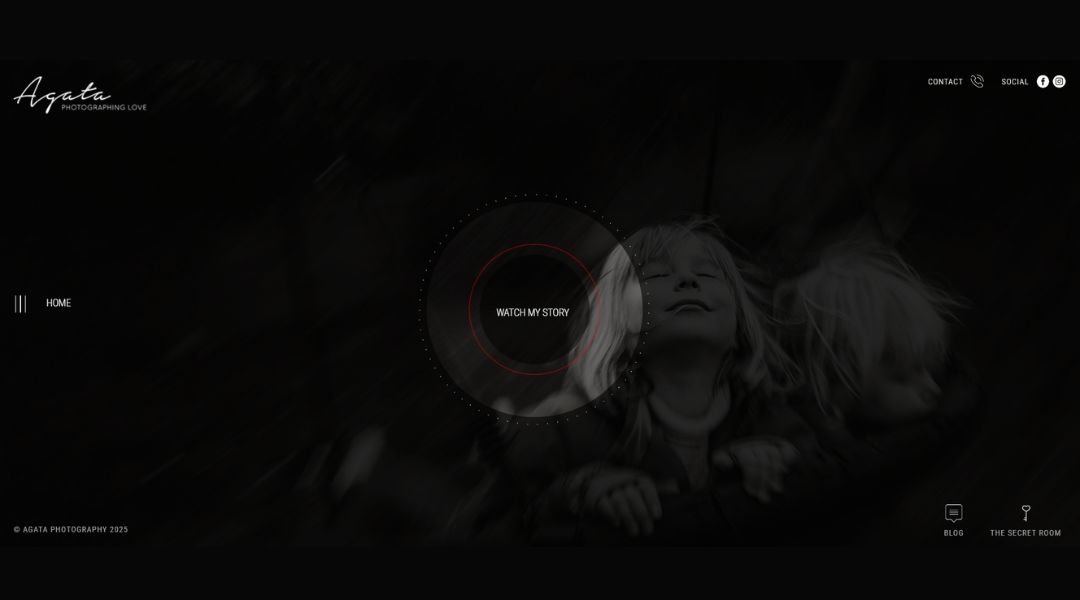
Agata’s photography tells stories that feel honest and alive. Based in the UK, she captures weddings with a documentary-style approach that values emotion over perfection. Her website reflects that same spirit—warm, thoughtful, and full of heart.
From the homepage, it’s clear this isn’t about posed moments or polished timelines. It’s about connection. Laughter between vows. Tears during speeches. That small moment when no one’s looking but the feeling is everything.
The site is easy to navigate, with galleries that feel curated—not crowded. The images are rich, natural, and full of movement, offering a clear sense of how Agata sees the world: with empathy and care.
Her About section is personal, but professional. She shares just enough to understand her voice and values, without shifting focus away from the couples she photographs.
There’s a softness to everything here—one that feels genuine. No flash, no gimmicks. Just honest stories, beautifully told.
If you’re looking for someone to capture the realness of your day without stepping into the spotlight, Agata’s work speaks clearly—and beautifully—for itself.
15. Dennis Berti
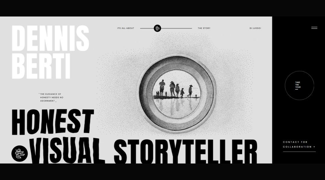
Dennis Berti doesn’t photograph weddings in the traditional sense—he lives them with his camera. Based in San Miguel de Allende, Dennis brings a photojournalistic approach that’s raw, real, and full of rhythm. His website captures that energy with ease.
From the moment it loads, you feel motion. Not just in the images, but in the way everything flows. His homepage greets you with genuine emotion—dancing, laughing, crying, celebrating—all without feeling staged or overly polished.
Dennis’s galleries aren’t arranged for show—they’re designed to tell a story. Each one feels like a memory unfolding naturally. Nothing forced. Nothing fake.
The About page is relaxed and personal. It’s clear he cares deeply about his work—and the people in it. You’re not just hiring a photographer. You’re inviting in someone who sees the heartbeat of a moment and knows how to keep up with it.
There’s humor, heart, and a whole lot of movement in his work. And somehow, even in the busiest scenes, Dennis makes it all feel beautifully human.
16. Ruud Luijten
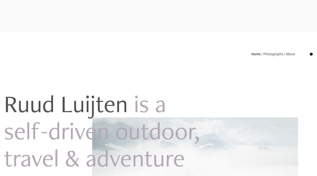
Ruud Luijten’s photography is built on patience and precision. Based in the Netherlands, his work captures architecture with quiet confidence—showing buildings not just as structures, but as experiences shaped by light, texture, and time.
His website reflects the same sensibility. The design is minimal and direct. No clutter. No distractions. The images stand front and center, giving you time to pause, observe, and take in the details.
Each gallery is carefully composed—just like his photographs. Whether it’s a crisp interior or a sweeping exterior, the work is consistent, clear, and technically strong. It’s not trying to impress. It’s just well done.
The About page offers a brief, focused look into Ruud’s background and philosophy. It’s professional, grounded, and free of fluff. You understand his approach immediately: thoughtful, skilled, and respectful of space.
There’s no overstatement here. Just solid, quiet work that speaks for itself—and a website that knows when to step back and let it.
17. Nordica Photography
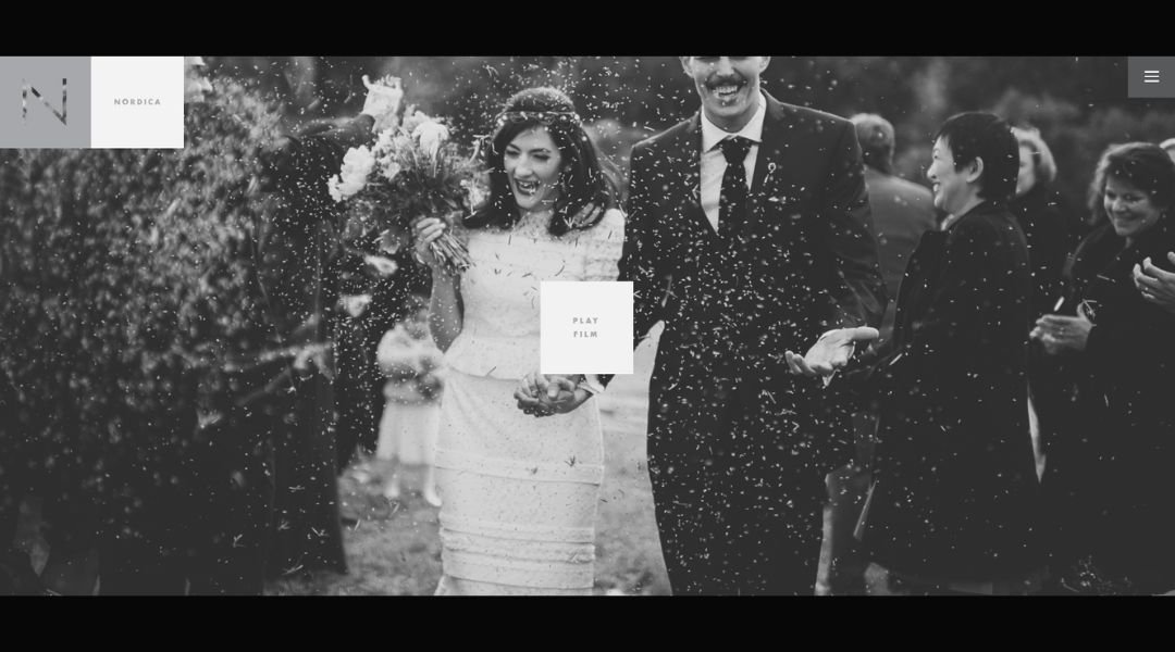
Nordica Photography doesn’t follow trends—it carves out its own path. Founded by two photographers with a shared vision, the work is bold, atmospheric, and unapologetically different. The website reflects that same sense of direction.
From the first frame, it’s clear you’re not here for cookie-cutter wedding photos. The visuals are cinematic, often moody, and always intentional. Mountains, forests, cliffside ceremonies—it’s storytelling on a grand scale, but still rooted in real human connection.
The design is minimal but powerful. Images lead. Text supports. Everything feels curated, not crowded. Their approach is direct, yet personal—you get a strong sense of voice without it becoming a monologue.
The About page keeps things clear: who they are, what they believe, and how they work. It’s honest and stripped down, like their photography. No fluff. No pressure. Just two people deeply committed to telling stories their way.
This isn’t wedding photography made to impress everyone. It’s made to mean something—to the couple, and to the people behind the lens.
18. Mario Dragicevic
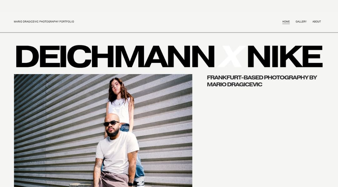
Mario Dragicevic doesn’t just photograph weddings—he documents presence. Based in Croatia, his work is quiet, intentional, and deeply observant. His website carries the same tone: stripped back, elegant, and built around stillness.
From the homepage, you’re drawn into imagery that feels less like a showcase and more like a memory—soft light, honest glances, a sense of being in the moment, not just looking at it.
Navigation is clean, with galleries that feel more like stories than collections. Each image is thoughtfully placed, each section unhurried. There’s no excess—just clarity.
His About page offers a calm introduction. No loud branding statements or oversharing—just a brief window into Mario’s philosophy and process. It’s thoughtful, grounded, and, like his work, focused on what matters most: people and connection.
Even the way the text sits on the page feels intentional. The site doesn’t push. It invites. And that restraint is part of what makes it so compelling.
Mario’s photography doesn’t rely on spectacle. It stays with you because it feels real. And his site gives you space to feel that, too.
19. Eisenberger
Eisenberger Photography approaches architectural imagery with clarity and control. Based in Austria, the studio delivers visuals that highlight precision, form, and function—without unnecessary embellishment. Their website follows the same principle: well-structured, minimal, and confidently understated.
From the first view, it’s clear this is about showcasing the subject, not the photographer. Every image is carefully lit, carefully framed. Lines are crisp. Shadows and highlights feel deliberate. Nothing is over-processed. Nothing distracts.
Navigation is clean and direct. The site presents different categories—architecture, industry, people—with equal respect and visual balance. Each gallery opens to a body of work that speaks through strong composition and technical accuracy.
The accompanying text is brief and purposeful. There’s no overexplaining. Just a quiet confidence in the work and a clear understanding of the clients’ needs.
Whether documenting a modern building or an industrial process, Eisenberger keeps the focus on clarity and quality. The site reflects that same standard—streamlined and smart, without ever feeling cold.
20. Prezemek Szuba
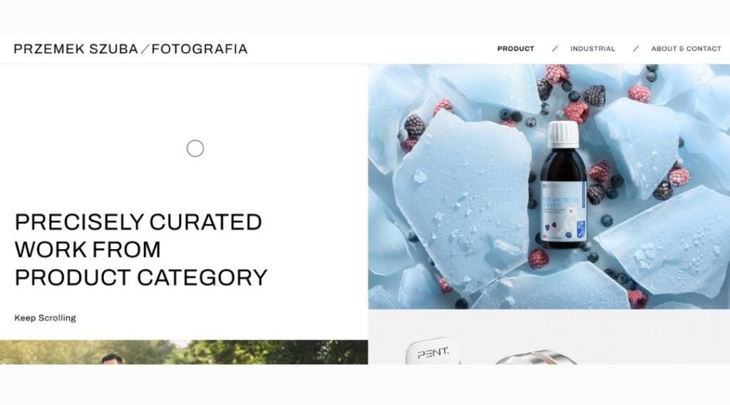
Przemek Szuba captures weddings with a cinematic stillness. His work doesn’t chase moments—it waits for them, letting each frame unfold naturally. The website reflects that same patience. Simple layout, strong visuals, and no unnecessary noise.
Right from the homepage, you’re drawn into scenes that feel honest. There’s intimacy here, but it’s never intrusive. His photos aren’t posed—they’re observed.
Galleries are cleanly organized, offering just enough to feel the story without oversaturation. Each wedding carries its own mood, its own rhythm. And yet, there’s a consistent thread—quiet depth, great light, and a deep respect for human connection.
The About page is brief, but personal. No long-winded story. Just a clear sense of who’s behind the camera and how he works. It’s calm, confident, and to the point.
Everything about the site—from typography to pacing—feels measured. Nothing rushes you. Nothing shouts. And that’s exactly why it holds your attention.
Przemek doesn’t just document weddings. He preserves the feeling in between the moments. And that’s what makes his work linger.
Conclusion
Looking at great photography websites isn’t about copying. It’s about noticing—what feels right, what invites you in, what holds your attention for more than five seconds. The best ones don’t shout. They whisper clearly.
If any of these 20 examples made you stop and think, “I could do that—but in my own way,” then the inspiration is already doing its job.
Building your site doesn’t need to be complicated. It needs to be honest. Show your work. Share your voice. Keep it clean. And maybe leave the full-screen autoplay videos to the fashion crowd—unless that’s your thing.
In the end, your portfolio should feel like a conversation, not a brochure. Hopefully, these samples gave you the confidence to shape that conversation with clarity, character, and a little creativity.
You’ve got the photos. Now, it’s just about showing them like you mean it.


