I’ve spent enough time building websites to know that starting your own can feel like staring at a blank canvas with a blinking cursor. Been there. Whether you’re a freelancer, creative, business owner, or simply someone who wants to showcase their skills, having a personal website isn’t a luxury anymore—it’s a solid move.
But here’s the kicker: building one doesn’t mean reinventing the internet. Sometimes, all you need is a little spark. That’s why I put together this handpicked list of 18 personal website samples that caught my eye—and held it.
Here’s what you’ll find in this article:
- A variety of real website examples from professionals across different industries
- How each site uses layout, content, and visuals to tell a story
- Smart takeaways you can borrow without breaking anything
- Ideas that work, even if you’re not a web designer
Some sites are bold. Some are quiet. All of them do one thing well—they work.
1. Pedro Campos
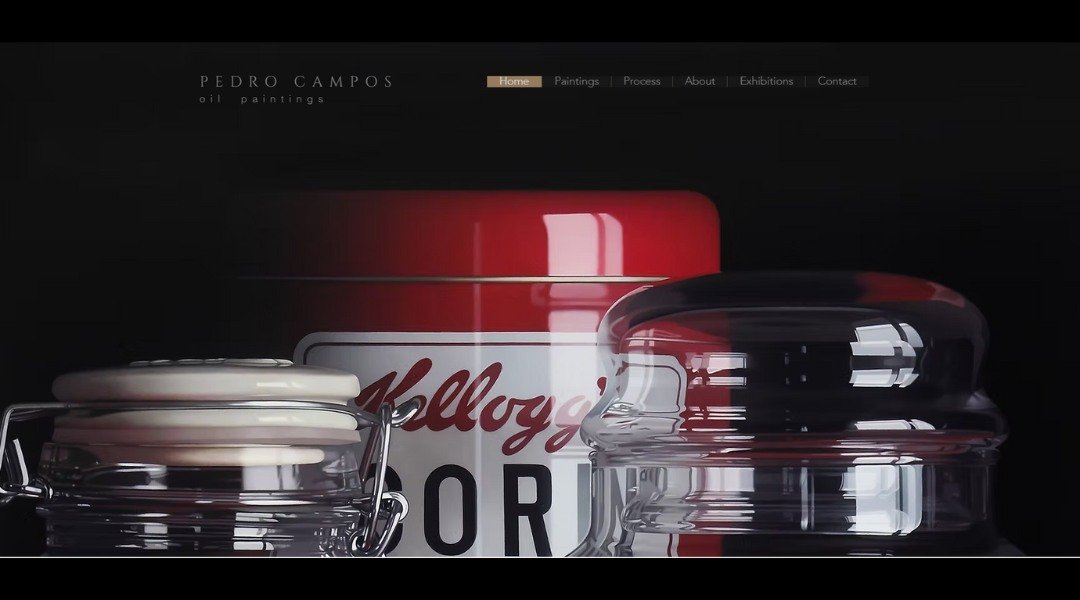
Pedro Campos isn’t just showing finished work—he’s showing what matters. Based in Madrid, Pedro’s architecture portfolio opens with a striking full-screen image. It’s clean, intentional, and instantly sets the tone. His About section? It does more than list degrees. Pedro talks about design like it’s personal—which, for him, it clearly is. You’ll learn how his projects reflect both careful thought and curiosity.
One standout move? He shares a few projects still in development. Rather than hiding the process, he invites you into it. It’s not chaos—it’s clarity in progress.
His site avoids the unnecessary and keeps attention on what’s real: space, material, and how people live within both. It’s direct and visually sharp, just like his work. No fluff. No filler. Just a clear vision from someone who knows what he’s building—and why it matters.
2. Natsai Audrey Chieza
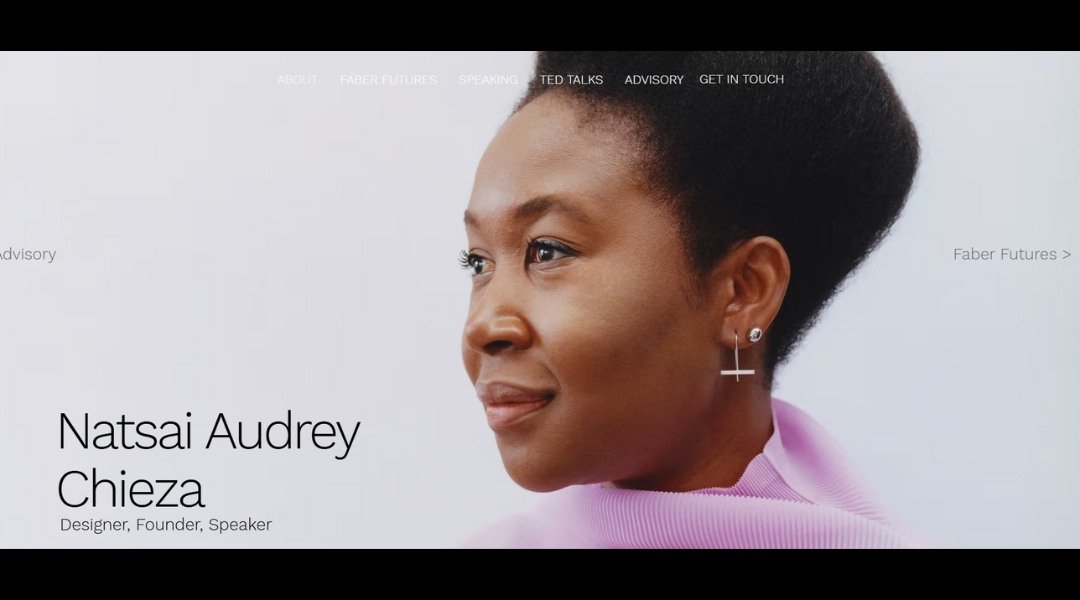
Natsai Audrey’s website doesn’t shout. It speaks—clearly, thoughtfully, and with purpose. As a designer working at the intersection of biology and innovation, she’s not offering a typical portfolio. Instead, she presents a body of work that questions how we create and what that means for the future.
Right from the homepage, the tone is calm but confident. There’s no clutter—just carefully chosen images and clean typography. Her About section moves beyond credentials. It gives insight into her philosophy, collaborations, and the thinking that fuels her projects.
What’s refreshing? She doesn’t try to simplify complex ideas for the sake of it. Instead, she invites the viewer to pause and reflect. Her work feels like a conversation—one that’s ongoing and intentionally open-ended.
This isn’t design for design’s sake. It’s thoughtful, socially aware, and deeply grounded in research. The site mirrors that spirit. It’s not flashy, but it leaves an impression. One that stays with you long after you’ve clicked away.
3. Calvin Pausana

Calvin Pausania isn’t interested in just making things look good—he’s designing stories with structure. His portfolio starts bold. The opening visuals grab your attention, but they don’t overwhelm. Instead, they guide. That’s kind of his whole thing: thoughtful visuals with purpose.
The About section reads like a conversation, not a pitch. Calvin gives us a glimpse into how he thinks, not just what he’s done. It’s honest, a little playful, and refreshingly human. You get the sense he’s someone who obsesses over the little things—but still knows when to let the design breathe.
One clever detail? His projects aren’t presented like trophies. They’re organized to show evolution. What worked. What changed. What challenged him. It’s smart. And subtle.
His site feels more like a curated experience than a static portfolio. Navigation is smooth. The colors are calm. The typography? Clean, but not cold. It’s clearly crafted by someone who knows that good design doesn’t shout—it speaks.
If you’re looking for a portfolio with both personality and precision, Calvin’s work makes a strong case—without ever having to say so.
4. Noah Demeuldre
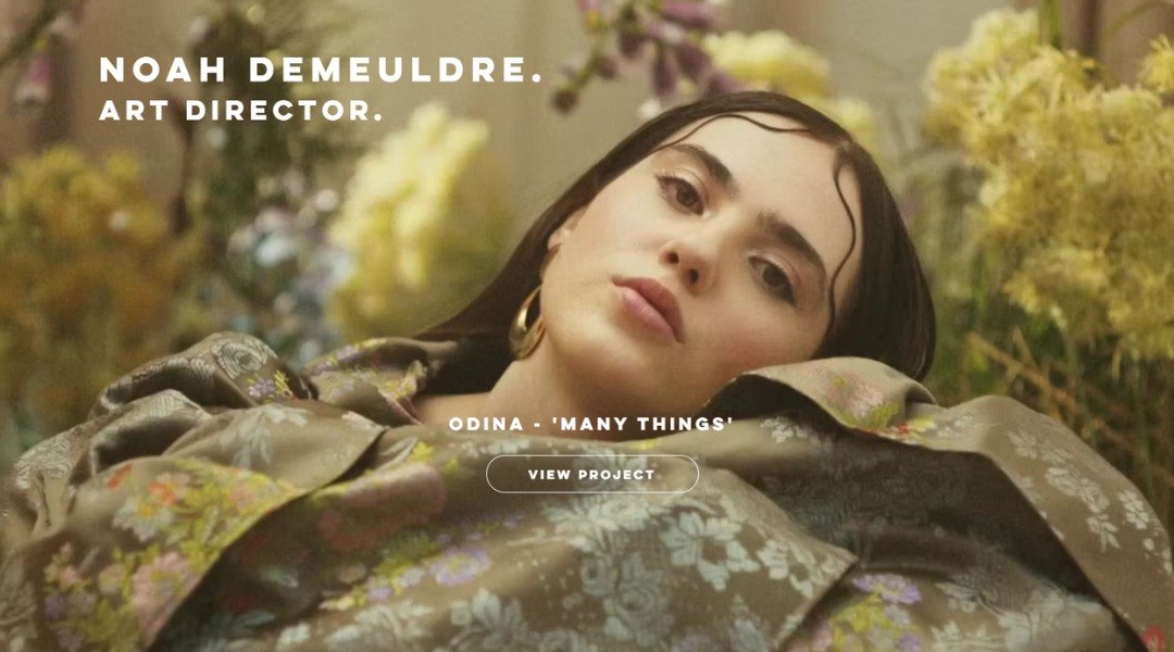
Noah Demeuldre’s portfolio doesn’t just display architecture—it tells you exactly where he stands. Based in Belgium, Noah’s site opens with bold visuals and no hesitation. You’re not guessing what he does or where he’s headed. The message is immediate: strong design, clear intent.
His About section reads like a quiet conversation. It skips the buzzwords and gets to the point. You’ll find insight into his process, a touch of personality, and the sense that he’s not just drawing buildings—he’s designing with a purpose.
There’s an honesty to how Noah presents his work. Projects are shown in context, with subtle transitions and generous white space that let each piece breathe. Nothing shouts, but everything speaks.
He even lets the occasional sketch or raw concept peek through. It’s a reminder: the process matters as much as the product. Noah’s site walks that fine line between polished and personal. The result? A portfolio that reflects not just skill—but clarity, restraint, and confidence.
5. Laura Baross
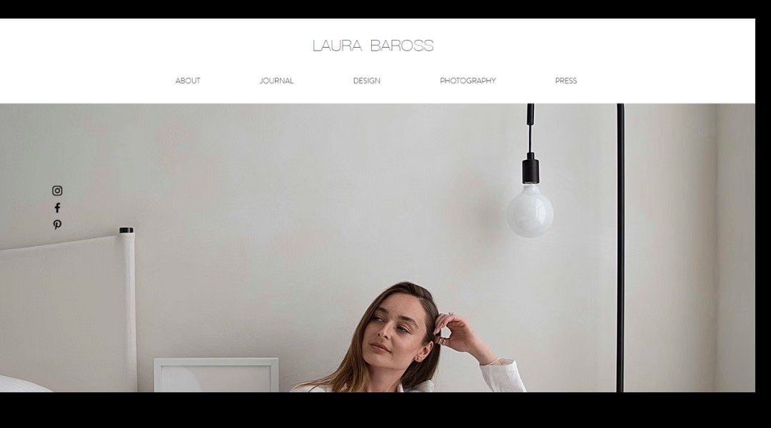
Laura Baross brings design down to earth—literally. As a Brooklyn-based interior designer focused on sustainability, her website reflects more than style; it reflects intent. From the start, you’re greeted with visuals that are warm, lived-in, and refreshingly honest. No sterile showrooms here. Just real spaces for real people.
Her About page reads like a conversation, not a pitch. Laura shares her background, values, and why repurposing materials isn’t just an afterthought—it’s part of her process. She’s not out to impress with jargon. She simply shows what happens when design respects both people and the planet.
What stands out? The Projects section feels like a journal—each space tells a story, and not one of them feels rushed. You get the sense she’s more interested in getting it right than getting it flashy.
Laura’s site doesn’t try too hard. It doesn’t need to. It’s quietly confident, much like her work—intentional, thoughtful, and built to last longer than a trend cycle.
6. Tobias Becs
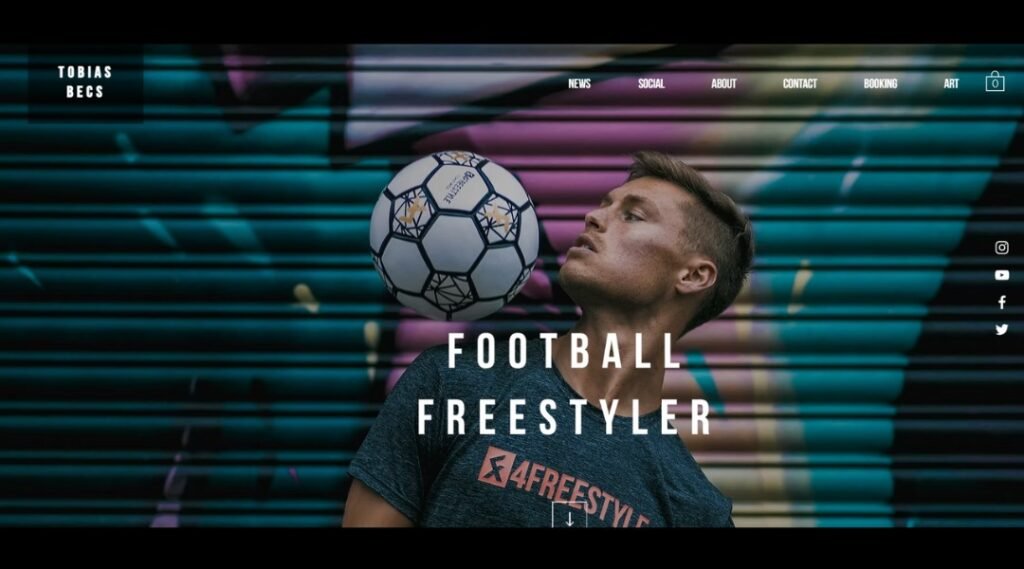
Tobias Becs isn’t your average athlete with a flashy homepage—he’s a storyteller with a ball. Right from the first click, visitors are met with motion. Fast-paced visuals. Purposeful edits. It’s not just style—it’s identity. You’re not guessing what Tobias does. You see it. You feel it.
His site highlights more than trophies and titles (though there are plenty). It shows how freestyle football can be both performance and message. His About page keeps things short, but sharp. It’s enough to know who he is, but leaves room for curiosity.
What stands out? Tobias treats video like his primary language. Whether he’s on stage, in the street, or shooting for a brand, it all feels consistent—fast, fluid, and focused. There’s no overload of text or clutter. It’s a visual portfolio built for movement.
This site isn’t trying to impress you with stats. It’s here to pull you into a rhythm. You don’t just scroll through—you follow along.
7. Libby Peterson

Libby Peterson doesn’t just shoot photos—she captures presence. From the moment her homepage loads, you’re met with stillness that feels alive. No overload. No distractions. Just images that breathe.
Her portfolio is structured like a quiet conversation. You’re not being talked at—you’re being shown. Whether it’s a portrait, a landscape, or a moment in-between, each photo has space to speak. That takes restraint. And vision.
Libby’s About section skips the overdone “I’ve always had a camera” line. Instead, you get a sense of who she is without the hard sell. It’s refreshingly human. She’s worked with major names, sure—but she doesn’t shout about it. The work does the talking.
What stands out most? Her comfort with quiet. Many portfolios feel like they’re trying too hard. Libby’s doesn’t. There’s confidence in the calm, and purpose behind the pause.
If you’re looking for photography that’s more than just beautiful—something that feels lived-in—this is worth a close look. Just be warned: you may stay longer than you meant to.
8. Dr. Gilbert Simon
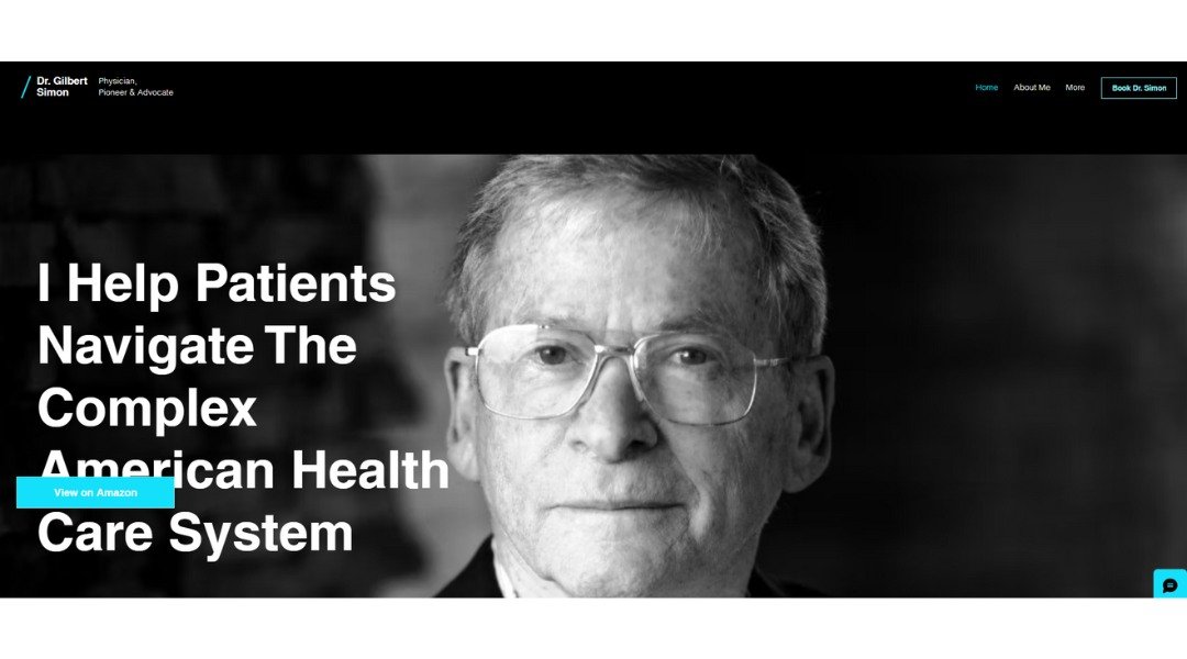
Dr. Gilbert Simon’s website doesn’t feel like a typical medical profile—and that’s the point. Based in California, Dr. Simon presents his background with clarity and purpose. The site opens with a calm, uncluttered layout. No distractions. Just focus—exactly what you’d want from a physician with decades of experience.
His About section goes beyond credentials. Yes, he’s board-certified. Yes, he’s been in practice for over 30 years. But what stands out is his thoughtful perspective on medicine. It’s clear he values patient understanding as much as clinical outcomes.
The writing is direct, occasionally conversational, and surprisingly approachable. There’s even a touch of dry humor—you’ll spot it if you’re paying attention. His FAQ page? Practical. Honest. Free of medical jargon. It’s like talking to a doctor who actually answers your questions without checking the clock.
This site isn’t trying to sell you anything. It’s simply offering confidence—backed by years of knowledge and a straightforward approach. In a world full of medical buzzwords, Dr. Simon’s calm, candid tone is a welcome change.
9. David Milan
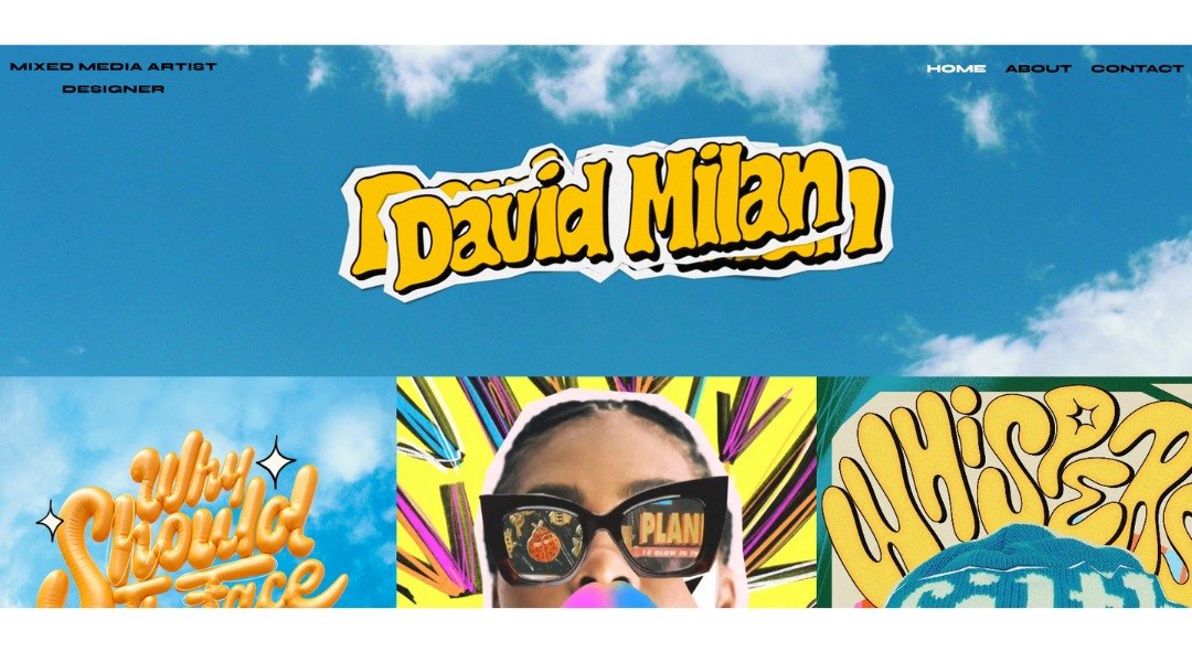
David Milan doesn’t just show lettering—he makes it move. The second his homepage loads, you’re hit with bold visuals and kinetic energy. Based in Spain, David blends graphic design with street art sensibility, and somehow makes neon colors feel smart.
His About page keeps it real. No drawn-out bio or overdone pitch. Just a quick look at how he started, what drives him, and a few well-earned collaborations that drop names without trying too hard.
What makes the site stand out? It feels like David. Vibrant, confident, slightly rebellious. Every project shown carries a pulse—whether it’s typography that looks hand-cut from graffiti walls or branded work for global names, each piece feels alive.
There’s no deep scroll rabbit hole here. The layout is tight, the navigation snappy. He trusts his visuals to do most of the talking—and they do. If you’re here to see how personality and design collide, you won’t leave disappointed.
David’s portfolio isn’t about perfection. It’s about presence. And it delivers.
10. Lena Sernoff
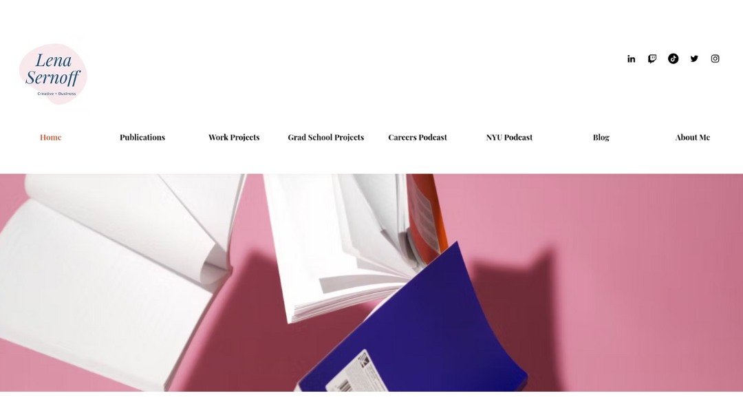
Lena Sernoff’s portfolio wastes no time telling you who she is. A writer, storyteller, and marketer—she gets straight to the point. Her homepage introduces her voice before you even read a word. It’s bold, confident, and refreshingly human.
Her About section doesn’t read like a résumé—it reads like someone you’d actually want to work with. She balances professionalism with personality, sharing not only what she does, but why she does it. There’s clarity in her tone and just the right dose of charm.
Visually, the site is crisp and unfussy. Navigation is intuitive. Her writing samples are front and center, and rightly so—they’re sharp, witty, and polished without being overworked. You get the sense she’s not trying to impress you—she’s just being herself. Which, frankly, is impressive.
Also worth noting: Lena includes a section on public speaking. It’s a subtle flex, but well-earned. The site flows like a conversation, not a pitch—and that’s exactly what makes it stand out.
11. Neil Oseman
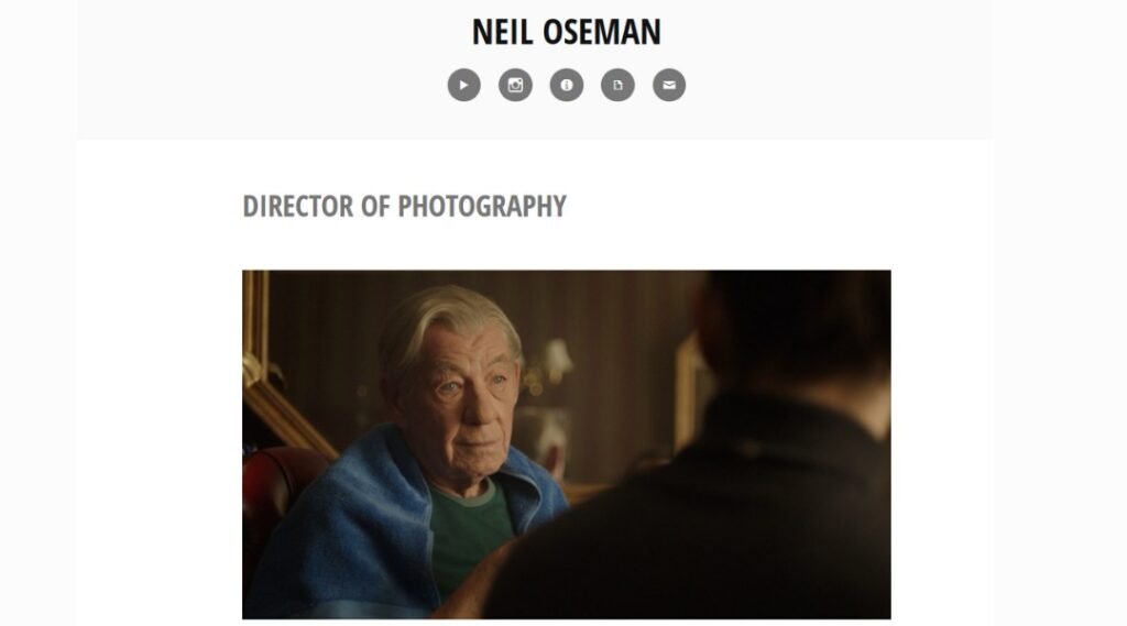
Neil Oseman isn’t just showing you where the camera points—he’s showing you why it points there. As a cinematographer with a clear eye for mood and movement, Neil’s site gives visitors more than a highlight reel. Right from the homepage, you’re drawn into a world of crafted light, precise angles, and storytelling that doesn’t shout—it whispers confidently.
His About section does more than check off achievements. It gives context. You get a sense of the person behind the lens—his love for visual storytelling, his technical chops, and yes, even the indie grind.
And then there’s the blog. It’s not a PR feed—it’s practical, personal, and surprisingly candid. From lighting setups to on-set hiccups, Neil shares his process without pretense.
You won’t find flashy gimmicks or endless jargon here. The design stays out of the way so the work can speak—and it does. Loudly, quietly, and everything in between.
12. Blue Sky Eating
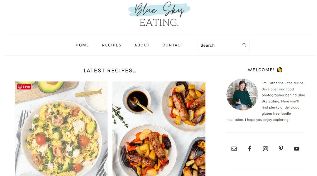
Blue Sky Eating isn’t your typical food blog—it’s smarter and lighter, much like the meals it features. Run by a UK-based home cook with a sharp eye for balance (and not just in flavor), the site offers recipes that are both practical and inviting.
From high-protein lunches to clever sweet treats, each post skips the long-winded backstory and gets straight to what you’re really there for: food you’ll actually want to make. The photography? Bright, clean, and refreshingly unpretentious. You won’t find dripping cheese and heavy filters here—just real meals that happen to look good, too.
The tone throughout is casual but confident. You’re not being talked down to, and you’re definitely not being lectured. There’s a quiet humor in how the writer phrases things, like someone who loves food but also understands that weeknights are short and nobody wants 18 steps for a sandwich.
Whether you’re after macro-friendly ideas or just want inspiration that feels doable, this site delivers with clarity and charm.
13. Jake Sinclair
Jake Sinclair doesn’t just build spaces—he builds ideas into them. Based in Vancouver, Jake’s architecture portfolio gets straight to the point. The homepage opens with impactful imagery that speaks before he does. It’s bold, but not loud.
His About section doesn’t oversell. Instead, it gives just enough to show where he’s coming from—professionally and philosophically. You’ll find more than a list of projects. Jake offers insight into how he approaches form, structure, and the balance between design and function. It’s thoughtful but never overcomplicated.
There’s a refreshing honesty to the work shown here. Some images are polished, others feel like mid-process captures. And that’s the charm—he’s not just showing end results, he’s showing decisions.
Navigation is quick, and the layout keeps things lean. No guesswork, no gimmicks. Just solid work and a clear message: thoughtful design doesn’t need a dramatic headline—it just needs to work well, look good, and maybe surprise you a little.
14. by Andrew Clay
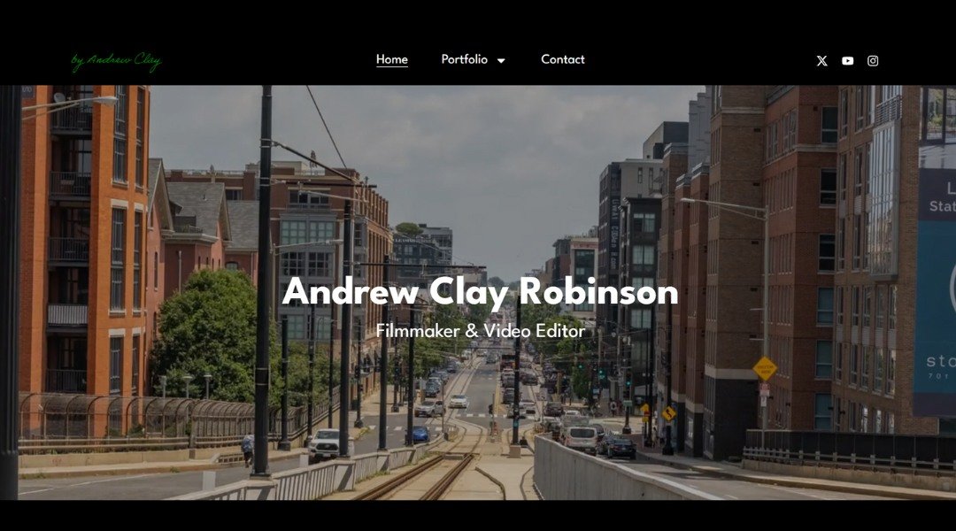
Andrew Clay’s portfolio doesn’t shout—it speaks. Quiet confidence is built into every corner of his site. From the first scroll, you’re met with bold imagery and subtle motion. It’s architectural storytelling without unnecessary noise. Based in Toronto, Andrew brings structure to creativity—and lets his work do most of the talking.
His About page is refreshingly direct. No lengthy bio, no overexplanation. Just a clear statement of intent, backed by visual proof. That’s rare. And refreshing.
One clever touch? The Projects section avoids overload. Each case study is well-paced and visually grounded. You get to know his thinking without feeling like you’re reading a thesis.
Even the site layout feels architectural—deliberate, spacious, almost like walking through one of his builds. There’s rhythm, but no rush. Every page is polished, but not overdone.
This is a designer who respects simplicity, function, and form. And in a field full of distractions, Andrew’s clarity stands out.
15. Minimalist Baker
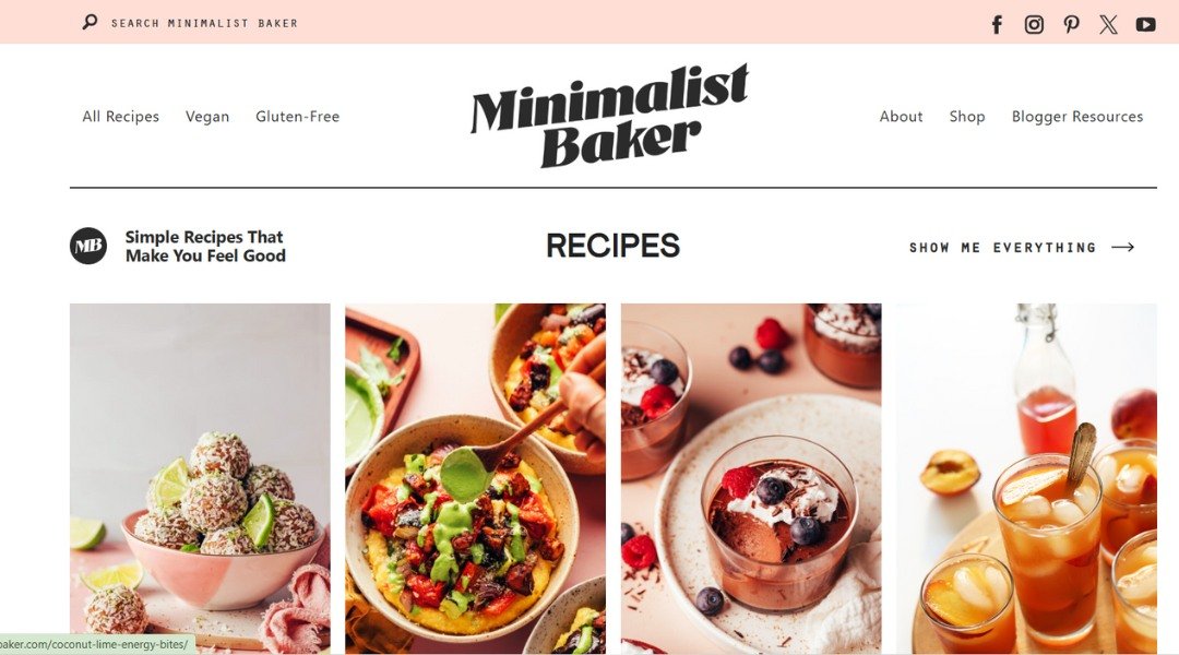
Minimalist Baker keeps it simple—but never boring. Dana’s approach to recipe development is clear from the start: fewer ingredients, minimal steps, and big flavor. Her homepage sets the tone immediately—bright, uncluttered, and inviting, like a clean kitchen ready to get to work.
Instead of overwhelming visitors with hundreds of links, the site offers focused navigation. Whether you’re looking for gluten-free banana bread or a one-pot dinner, you’ll find it fast—and probably bookmark it.
The About page gives a quick but meaningful look into her story. Dana doesn’t oversell; she just shares what works for her and her readers. And her photography? It’s doing more than showing food—it’s telling you, “Yes, you can make this. Tonight.”
What makes the site stand out is its trustworthiness. The recipes feel tested, loved, and shared from an actual kitchen—not a test lab. It’s not trying to be fancy. It’s trying to be useful. And it works.
Simple, smart, and exactly what busy people need after a long day. Just don’t browse while hungry.
16. Kristi Hines
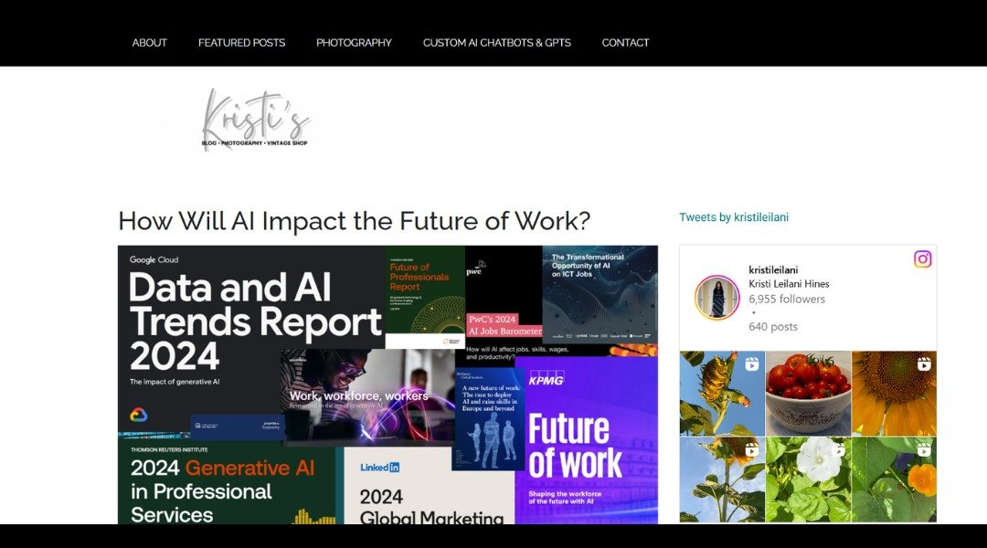
Kristi Hines isn’t just another content writer—she’s the one brands call when they want smart, results-driven copy. Her homepage wastes no time. Clear headline, strong focus, and zero fluff. It’s obvious: she knows her audience, and more importantly, she knows how to write for theirs.
The About section reads like a quick conversation with someone who knows her stuff but doesn’t need to brag. You get the highlights—experience with top-tier clients, serious SEO knowledge, and a content strategy mindset. But you also get a glimpse of her personality. Friendly. Focused. No filler words trying to sound impressive.
Her portfolio isn’t just a list. It’s proof. Each sample shows range—from tech to marketing to business—and her blog? Equal parts helpful and well-structured. It’s the kind of site where even reading the FAQs feels like a value-add.
Kristi’s site is a great example of writing that’s sharp without being stuffy. Whether you’re a small business or a SaaS giant, she makes it clear: she can tell your story—and help your audience care about it.
17. Visual Poetry
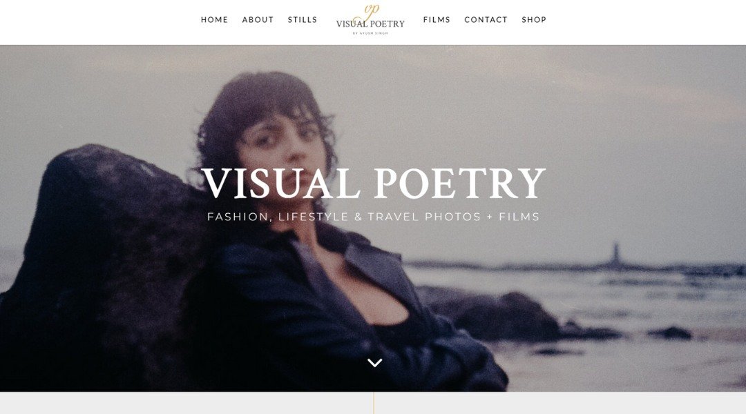
Visual Poet isn’t your typical portfolio—it’s mood, motion, and meaning all stitched together in a scroll. The homepage sets the tone with a bold, cinematic reel that doesn’t wait for permission to impress. It’s clear: this isn’t someone guessing at design. It’s someone living it.
The About section skips clichés and gets right to it. We’re introduced to a creator who values feeling just as much as form. There’s a strong voice here—confident, but not loud. Poetic, but grounded.
One clever touch? Projects aren’t boxed into rigid templates. Each one breathes. Titles float, images move, and the work speaks without shouting. Even the transitions feel choreographed—like the site itself was edited on instinct, not just code.
Visual Poet makes you feel like you’re inside the creator’s head, in the best way. It’s curated without being sterile, artistic without losing clarity. Whether you’re here for ideas, inspiration, or collaboration—you’ll leave knowing exactly who’s behind the screen.
18. Jacob Maentz
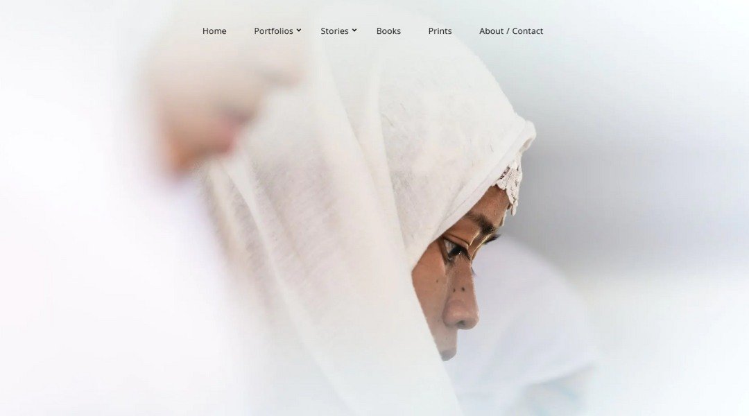
Jacob Gils doesn’t just take pictures—he builds perspective. His site opens with large-format photography that immediately catches your breath. These aren’t casual snaps; they’re bold, layered, and full of quiet energy.
Based in Copenhagen, Jacob’s portfolio leans into contrast—city meets nature, stillness meets motion. His series “Movement” is a prime example. Blur and structure coexist. You’re not just viewing an image; you’re pulled into how it was made.
The About page is brief, but impactful. It doesn’t oversell. It doesn’t need to. The work speaks volumes. And just when you think you’ve figured out his style, he throws in something unexpected—like a hazy skyline or a forest that feels almost painted.
This site is clean, minimal, and built for focus. No extra noise, no dramatic effects. Just strong imagery and a calm layout that lets you breathe. Gils isn’t trying to show off. He’s offering a way to see differently—and it works.
Conclusion
Building a personal website isn’t about checking every box or using every trend. It’s about making something that feels like you—and works for what you need.
I’ve pulled these 18 examples to help kickstart that process. Maybe one will give you your next idea. Or maybe you’ll just be glad to see what not to do (hey, that’s helpful too).
Either way, don’t wait for “perfect.” Start with what’s real, what’s yours, and tweak as you go. Your site doesn’t need to be loud—it just needs to speak clearly. Preferably without Comic Sans.


