Introduction
Typography is one of the most powerful yet subtle tools in branding. The right lettering isn’t just about aesthetics—it influences how people perceive and engage with a business. Whether crafting a logo, designing a website, or producing marketing materials, the selection of typefaces can impact clarity, trust, and overall brand identity.
I’ve worked with companies that completely transformed their image just by adjusting their typography. A small shift in lettering can enhance professionalism and readability while reinforcing brand consistency. So, how do you make the right choice? Let’s dive in.
What You’ll Learn
- Why typography plays a key role in branding.
- How different styles influence perception.
- The psychology behind type choices.
- Factors to consider when selecting a typeface.
- Common mistakes to avoid.
- How to create balanced pairings for a professional look.
Let’s get started.
Why Typography Matters in Branding
1. Shapes First Impressions
The way text is presented instantly affects perception. A clean, structured design builds credibility, while a cluttered or inconsistent approach can create doubt. Well-chosen typography ensures that messaging appears polished and intentional.
Think of Coca-Cola’s signature script—it feels personal and nostalgic. In contrast, Apple’s simple and modern typeface reinforces innovation and minimalism.
Related Read: Discover how logo design impacts branding.
2. Enhances Readability & User Experience
A stylish design means nothing if it’s difficult to read. Whether on a website, product packaging, or advertisements, text should remain legible across different formats.
Common pitfalls include using decorative styles that work in logos but fail in digital interfaces. A well-balanced selection ensures clarity on all platforms.
3. Reinforces Brand Recognition & Consistency
Using the same type family across all branding materials strengthens recognition. Repetition helps build familiarity, making a business more memorable.
Related Read: Learn why brand consistency builds trust.
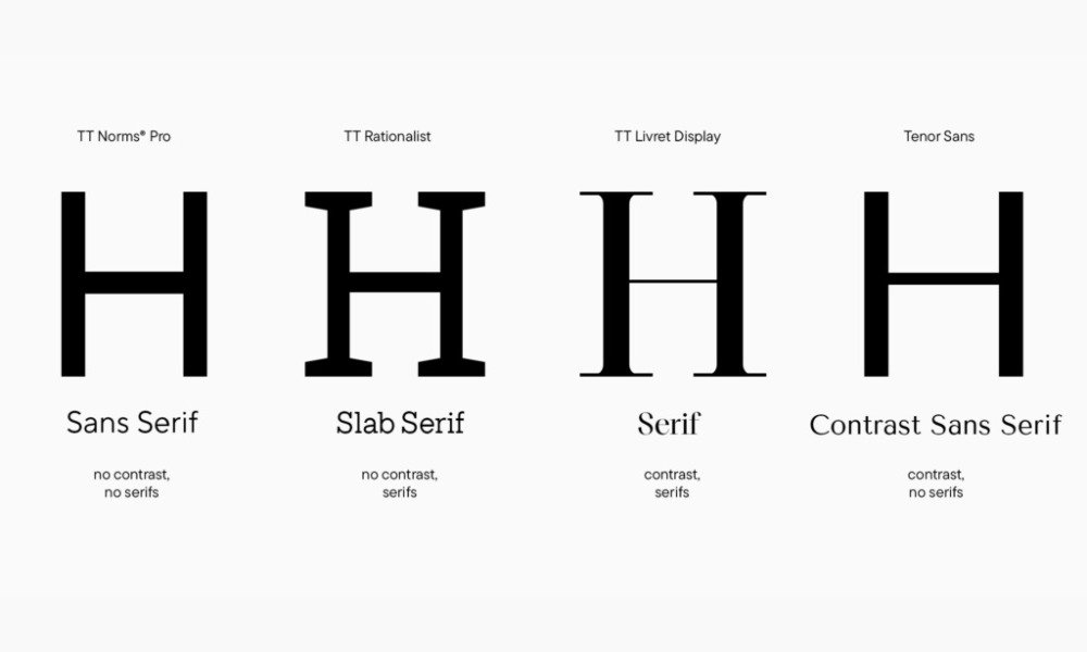
The Psychology Behind Type Choices
Each category of typefaces conveys a distinct mood. Selecting the right style can enhance messaging and reinforce a company’s values.
1. Classic & Trustworthy
Traditional typefaces often include small finishing strokes at the ends of letters, giving them a refined and established look. These are frequently used by financial institutions, law firms, and editorial brands.
Examples: Garamond, Times New Roman, Bodoni
2. Modern & Minimalist
Without decorative strokes, these clean styles feel sleek and contemporary. Technology companies and startups often favor these for their simplicity and approachability.
Examples: Helvetica, Futura, Montserrat
Related Read: See how color psychology influences branding.
3. Elegant & Personal
Script-based lettering mimics handwriting, offering a refined and artistic feel. These are common in luxury, fashion, and creative industries.
Examples: Pacifico, Allura, Dancing Script
4. Bold & Distinctive
Unique, often decorative, these make a strong impression in headlines but should be used sparingly. They add personality but can impact readability when overused.
Examples: Impact, Lobster, Bangers
How to Choose the Right Typeface for Your Business
The right selection isn’t just about personal preference—it should align with company identity and audience expectations.
1. Define Your Business Personality
A company’s style should match its voice. Ask:
- Is the tone formal or casual?
- Should it feel modern or traditional?
- Does it need to convey innovation or stability?
For instance, a law firm benefits from a structured typeface, while a children’s brand might opt for a rounded, playful option.
Related Read: Learn how brand identity shapes perception.
2. Prioritize Readability Across Platforms
A typeface should work well in both digital and print formats. If it appears stylish in a logo but difficult to read on a mobile screen, it’s not practical.
3. Match Industry Expectations
Certain styles are naturally associated with specific industries:
- Finance & Legal: Traditional and structured (Garamond, Times New Roman).
- Tech & Startups: Clean and modern (Helvetica, Futura).
- Luxury & Fashion: Sleek and refined (Didot, Playfair Display).
- Entertainment & Bold Brands: Expressive and impactful (Bebas Neue, Impact).
4. Pair Styles for a Balanced Look
Most businesses use a combination of styles—one for headlines and another for body text. A well-balanced approach creates contrast while maintaining cohesion.
Examples of Effective Combinations:
- Playfair Display (Classic) + Montserrat (Modern)
- Lora (Elegant) + Open Sans (Simple)
Related Read: Explore how brand guidelines improve consistency.
Common Typography Mistakes to Avoid
Overloading with Too Many Styles – Stick to two or three for consistency.
Choosing Style Over Functionality – A design may look beautiful but fail in usability.
Ignoring Mobile Compatibility – Some styles work well in print but don’t scale effectively on smaller screens.
Following Short-Term Trends – What seems trendy today may feel outdated in a few years.
Best Tools & Resources for Finding Typefaces
Here are some top platforms for exploring high-quality options:
Google Fonts – Free, widely compatible selections.
Adobe Fonts – Professional-grade options for commercial use.
Font Squirrel – Free typefaces with licensing for business applications.
Related Read: Learn why having clear guidelines supports branding.
The Bottom Line
Typography is a fundamental part of visual identity. The right choice enhances recognition, reinforces messaging, and improves user experience.
If you’re evaluating your brand’s typography, ask yourself:
- Does it align with the company’s personality?
- Is it clear and legible across all formats?
- Does it create a strong, lasting impression?
Even small adjustments can make a big impact. A refined selection can strengthen recognition and ensure consistency.


