A company’s image isn’t built on products or services alone—it’s shaped by how people perceive it. Among the many elements that contribute to recognition, a logo plays a vital role. It’s often the first thing a customer notices, setting the tone for how they interact with a business.
Think of some of the world’s most recognizable names—Apple, Nike, McDonald’s. Their symbols alone evoke instant recognition. That’s the strength of a well-designed visual identity. But why does a carefully crafted mark hold so much value? And how can businesses develop one that truly represents them?
Let’s explore the significance of a great logo, the psychology behind its impact, and the key elements needed to create a memorable design.
What Is a Logo and Why Does It Matter?
At its core, a logo is a visual marker that represents a business. It’s more than just a stylish graphic—it embodies values, mission, and personality. A strong mark fosters trust and leaves a lasting impression.
Beyond a Simple Graphic
A well-crafted design should:
Make an emotional connection with its audience.
Reflect personality—whether modern, playful, or sophisticated.
Be memorable and instantly identifiable.
For example, the Nike swoosh conveys energy and motion, reinforcing its athletic image. Similarly, Apple’s minimalist emblem symbolizes innovation and sleek design.
Related: What Is Branding? A Beginner’s Guide to Building Your Identity
The Role of a Logo in Business Growth
A carefully designed symbol does more than make a company look polished—it influences perception and builds credibility.
First Impressions Count
It takes only 7 seconds for someone to form an opinion about a business. A clear, well-structured visual representation can make all the difference in gaining trust.
Building Recognition
Consistency in branding helps people remember a company. When they see a familiar emblem across social media, packaging, or storefronts, it strengthens their connection with the business.
Related: Why Every Small Business Needs a Strong Brand Identity
The Psychology Behind a Great Logo
A well-designed mark isn’t just visually appealing—it taps into psychology to evoke emotions and associations.
Color Psychology
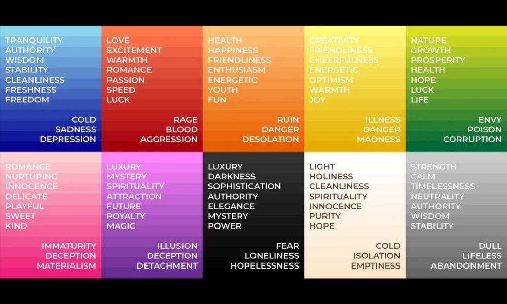
Colors influence perception:
- Red – Passion, energy, urgency (Coca-Cola, YouTube)
- Blue – Trust, professionalism, calm (Facebook, IBM)
- Green – Growth, sustainability (Starbucks, Whole Foods)
- Yellow – Optimism, warmth, youthfulness (McDonald’s, Snapchat)
Choosing the right hues is crucial in reinforcing a company’s character.
Related: Choosing the Right Colors for Your Brand
Typography and Shape Matter
Just like color, fonts and structure influence perception:
- Serif fonts (like Times New Roman) convey tradition and reliability.
- Sans-serif fonts (like Arial) feel modern and clean.
- Rounded designs create a friendly, welcoming feel.
- Sharp angles represent strength and innovation.
Each element contributes to the overall brand identity and should align with the company’s message.
What Makes a Logo Memorable?
For long-lasting recognition, a design should be:
Simple and Versatile
A clean, minimal look ensures easy recognition across different platforms.
Unique and Timeless
Avoiding fleeting trends ensures that an emblem remains relevant for years to come.
Scalable and Adaptable
A well-structured design should look just as good on a business card as it does on a billboard.
Related: Brand Guidelines: Why They’re Essential for Your Business
Common Mistakes to Avoid
Even with the best intentions, businesses sometimes make errors in visual branding. Here are a few pitfalls:
Overcomplicating the Design
Too many details can make a logo difficult to recognize at a glance. Keeping it clean is key.
Using Generic Symbols
A unique approach helps a company stand out rather than blend into the crowd.
Poor Font Choices
Typography plays a crucial role in communication. The wrong font can make a company look unprofessional.
Ignoring Scalability
A mark that doesn’t resize well can lose its impact on different platforms. Always test it at multiple sizes.
Related: 07 Common Branding Mistakes Small Businesses Make
How to Create an Effective Logo
Step 1: Define the Core Message
Before designing, understand what the company stands for. Ask:
- What emotions should the visual identity evoke?
- What makes this business unique?
Step 2: Research and Sketch Ideas
Exploring different concepts and gathering inspiration helps in finding the right direction.
Step 3: Choose Colors and Fonts Wisely
Using color psychology and typography principles ensures the design aligns with the company’s image.
Step 4: Test Across Multiple Platforms
A well-crafted logo should work seamlessly across websites, merchandise, and social media.
Related: The Role of Typography in Branding
The Future of Logo Design
As technology advances, visual branding continues to evolve.
Emerging Trends
- Minimalist Approaches: More brands are opting for sleek, clean marks.
- Animated Elements: Motion-based logos engage digital audiences.
- AI-Generated Designs: Artificial intelligence is influencing creativity in branding.
While trends shift, the fundamentals of an effective business identity remain the same: clarity, recognition, and alignment with a company’s mission.
Conclusion: More Than Just an Image
A well-crafted visual identity is an essential part of business success. It builds recognition, fosters trust, and differentiates a company from competitors. If you’re developing or refining your company’s image, take the time to create an emblem that truly reflects its values. A thoughtfully designed logo isn’t just an image—it’s the face of your brand


