Let’s be honest—creative block hits hard, and it doesn’t care what’s on your to-do list. I’ve been there too, staring at the screen, knowing the deadline’s real but the ideas… not so much.
That’s exactly why I put this list together.
Over time, I’ve bookmarked websites that sparked something—whether it was a clever layout, a bold color choice, or just the way a scroll felt unexpectedly smooth. This collection isn’t about trends that vanish by next quarter. It’s about digital design done right. Ideas you can actually build from.
Here’s what you’ll find in this list:
- Real-world examples of smart visual thinking
- Layouts that guide without shouting
- Sites that make interaction feel natural
- Clean structure and thoughtful use of space
- Just the right amount of edge (without losing usability)
You don’t need to reinvent everything. Sometimes, you just need a nudge in the right direction—and maybe a reminder that someone else figured out that sticky layout problem before you did.
1. Mobbin
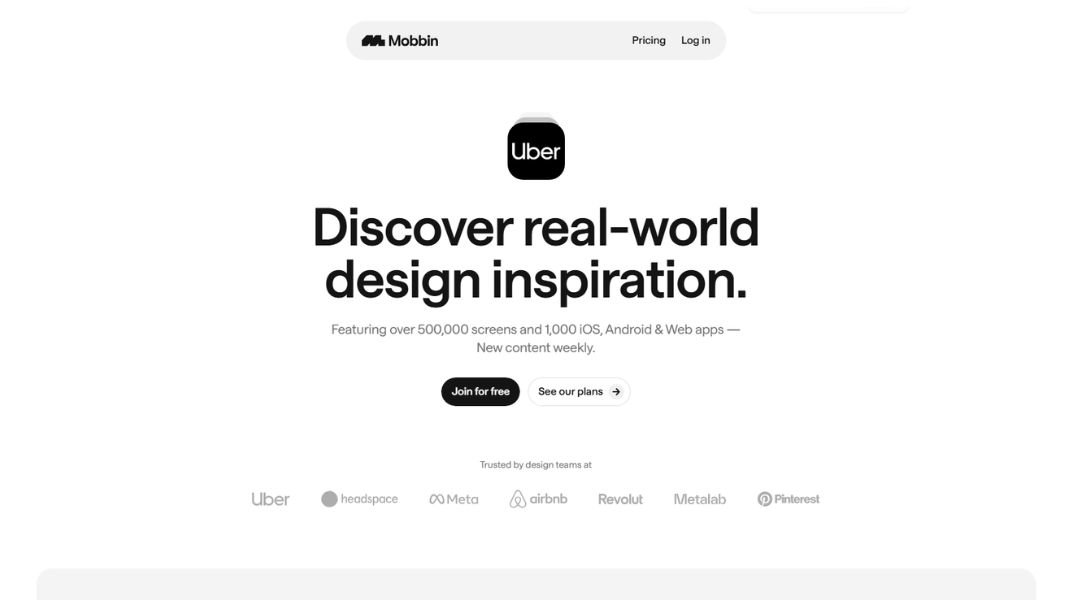
Mobbin isn’t trying to be flashy—it’s just smart. This design reference platform pulls together screenshots from popular apps and websites, organizing them in a way that actually makes sense. Whether you’re a UX designer, product lead, or someone who just likes clean interfaces, Mobbin gives you a front-row seat to what’s working out there.
The site feels sharp and purposeful. You’re not drowning in features or jargon. Instead, you get well-sorted visuals, easy filters, and quick previews. It’s like a shortcut to hours of research—without the tabs and chaos.
Mobbin’s strength lies in what it doesn’t do. No distractions. No fluff. Just real examples, well-curated, and ready when you need them. Even better, it updates regularly, so you’re always seeing what’s fresh.
There’s something satisfying about how simple it is. You log in, search a flow, and boom—you’ve got a reference that’s both practical and polished.
Mobbin isn’t trying to reinvent the wheel. It just makes finding good design a lot less painful.
2. Awwwards
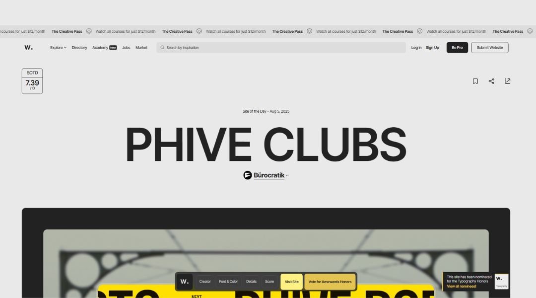
Awwwards is where digital designers go to be seen—and judged. But in the best way. It’s a platform that celebrates standout websites from around the world, recognizing design that’s not just good-looking, but thoughtfully built.
The site itself feels like a gallery, but one that moves fast. Bold visuals, crisp structure, and just enough detail to keep you scrolling. You can explore top-rated sites by category, style, or even color palette. Whether you’re a freelancer or part of a creative team, it’s a quick way to see what’s trending—without the noise.
Each submission comes with a score, but don’t let that scare you. It’s not about being perfect; it’s about pushing ideas and experimenting with form. And yes, some entries might leave you wondering how they even built that.
At its core, Awwwards is part inspiration, part motivation. It reminds designers what’s possible, and sometimes, what’s next. If you’re building for the web, this is the place to look before your next big idea.
3. Godly
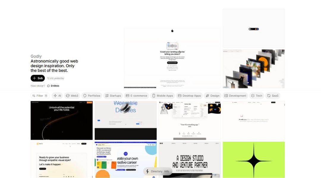
Godly is a visual playground for modern web design. It skips the buzzwords and cuts straight to what matters: bold, creative websites that actually spark ideas. If you’re the kind of person who bookmarks cool interfaces “just in case,” this place will feel oddly familiar—only better organized.
The homepage is a grid of eye candy. No endless filters, no long-winded copy—just scroll and click. Every showcased site feels carefully chosen, not just thrown in to fill space. There’s a strong focus on motion, layout, and experimentation, making it a go-to spot for designers tired of the usual templates.
Godly doesn’t pretend to be anything more than what it is: a well-curated collection of websites that look great and work even better. It’s direct, useful, and refreshingly low on fluff.
Whether you’re hunting for layout ideas or just need a quick jolt of visual energy before your next project, Godly delivers. It’s like a coffee break for your creative brain—minus the caffeine.
4. Landbook
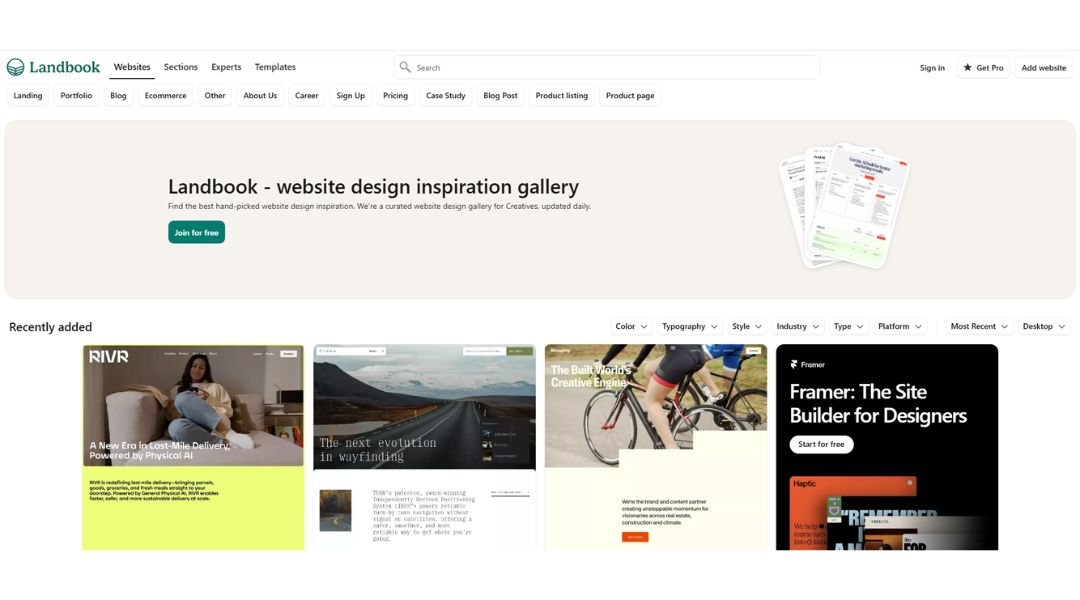
Land-book keeps things simple—and that’s what makes it work. It’s a well-organized collection of landing pages and websites that hit the mark on both design and usability. From tech startups to creative portfolios, the range is broad but never overwhelming.
The layout feels like a designer’s sketchbook—clean, fast, and focused. You scroll, you click, and you’re in. There’s no maze of categories or trendy buzzwords—just strong visuals and practical structure. It’s the kind of site that saves time without cutting corners.
Each entry shows off real-world design choices. Layouts that work. Color palettes that pop. Interfaces that just make sense. Whether you’re looking to build something fresh or refine your own work, Land-book offers a curated set of ideas without making it feel like a scavenger hunt.
It’s not trying to be flashy. It’s just consistent—and consistently helpful. Think of it as a quick design pit stop. Browse a few pages, get inspired, and get back to building.
5. Minimal Gallery
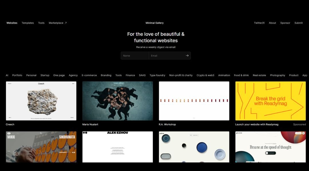
Minimal Gallery does exactly what the name promises—no clutter, no noise, just sharp, minimal websites that know when to stop. It’s a curated feed for designers who believe less really is more.
The layout is refreshingly simple. No distractions, no deep menus. You land on the page and get hit with crisp visuals, calm color palettes, and design choices that feel intentional. It’s the digital version of a deep breath.
Each featured site shows how simplicity can still feel bold. Whether it’s clever use of space or typography that doesn’t try too hard, the designs speak softly—but leave a mark. It’s a great place to browse when your screen feels too loud and your Figma file too crowded.
Minimal Gallery doesn’t over-explain or oversell. It just offers a steady stream of websites that get to the point and look good doing it.
Perfect for a quick dose of inspiration—or a gentle reminder that sometimes, less really is enough.
6. No Code Supply
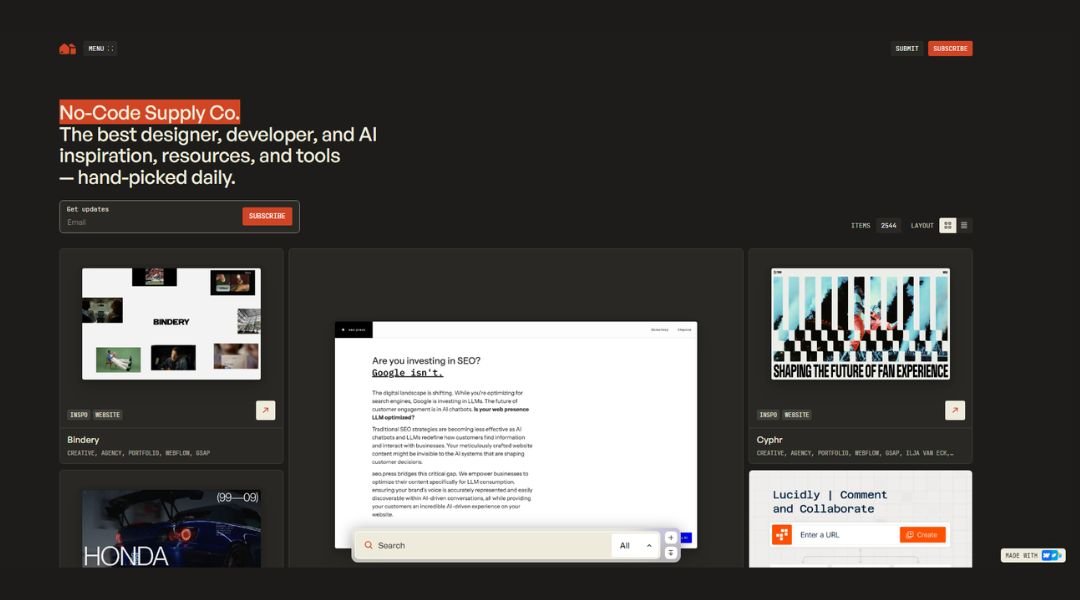
NoCode Supply is a curated hub for creators who want to build faster—with less code and more control. It brings together useful tools, templates, and resources that help you ship ideas without waiting on a dev team.
The interface is clean and direct. Categories are clear, and everything’s organized in a way that respects your time. Whether you’re launching a landing page, setting up automations, or trying out a new platform, you’ll find what you need without the scroll marathon.
What makes it stand out? It’s focused. No bloated lists or recycled recommendations—just practical tools that actually work. It feels like a friend tipping you off to the good stuff, not a marketplace trying to sell you everything at once.
NoCode Supply isn’t trying to replace developers—it’s just helping more people build smarter. If you’re working solo, moving fast, or just curious about no-code possibilities, this is one resource worth bookmarking.
Simple, useful, and refreshingly low on hype.
7. Landingfolio
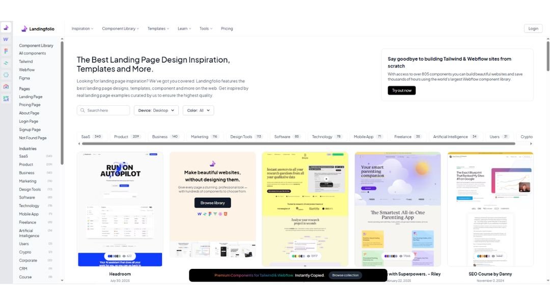
Landingfolio is exactly what it sounds like—a curated collection of landing pages that work. Whether you’re designing your first SaaS homepage or looking for new ways to present a product, this site gives you real examples that skip the fluff and focus on clarity.
The layout is no-nonsense. You get quick previews, easy filters, and well-organized categories that let you jump straight to what matters—design that converts. No deep digging or feature overload.
What makes it stand out? The collection feels intentional. Each page earns its spot by doing something right—clean layout, smart copy, or just a strong visual hook. It’s inspiration with purpose, not just pretty pixels.
Landingfolio is a favorite among startup teams, solo designers, and marketers who want to learn from real-world examples. It doesn’t try to teach you everything. It just shows you what’s working—clearly and efficiently.
If you’re stuck on your hero section or rethinking a CTA, this is the kind of resource that gets you moving again. Fast.
8. Storefront.design
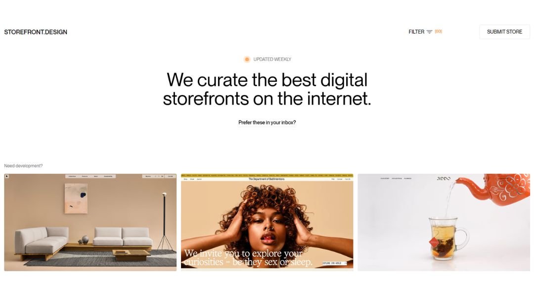
Storefront Design is a curated gallery of well-crafted e-commerce websites. No filler, no long lists—just real stores that look good and sell better. If you’re building a shop and need fresh ideas, this is a smart place to start.
From fashion brands to tech gadgets, the range is broad but focused. Each site is chosen for its strong visuals, intuitive layout, and smart user flow. You’ll see how others handle product pages, checkout experiences, and the tricky balance between clean design and conversion goals.
The interface is straightforward. Browse by industry, layout, or feature. No complicated filters, just quick access to examples that actually help. It feels more like flipping through a designer’s scrapbook than sorting through a catalog.
What’s nice is that the sites featured aren’t just beautiful—they’re functional. You’re not looking at design for design’s sake. You’re looking at what works in the wild.
If you’re working on an online store, Storefront Design helps you skip the guesswork—and maybe even spark something better.
9. Dark Design
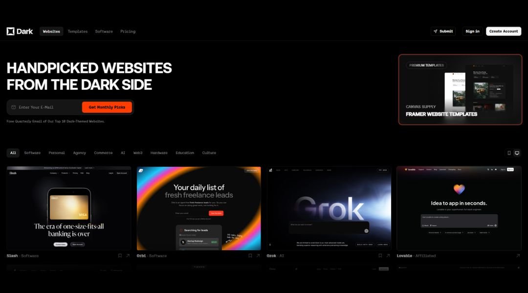
Dark Design is where minimalism meets mood. It’s a curated gallery focused entirely on websites with dark themes—think sleek interfaces, high contrast, and visuals that pop without shouting. If you’re drawn to black backgrounds and sharp design choices, this one’s for you.
The site layout is as sharp as the work it showcases. No distractions, no unnecessary noise—just a scrollable feed of designs that get straight to the point. Each entry feels intentional, highlighting how dark UI can feel both modern and dramatic without losing clarity.
It’s not just about the look. The showcased sites blend style with substance. You’ll see everything from product pages to portfolios, all proving that dark doesn’t mean dull.
Dark Design is perfect for designers wanting to explore moodier palettes or rethink how contrast can shape a user experience. It’s focused, stylish, and a welcome break from the sea of white-space-heavy inspiration galleries.
If light mode feels overdone, this is the darker side of design—done right.
10. Navbar Gallery
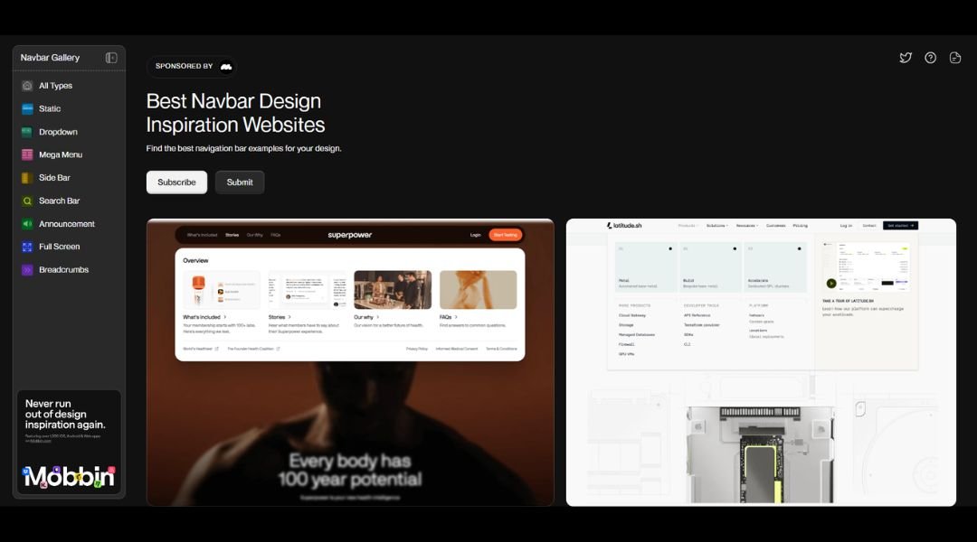
Navbar Gallery is a niche resource with a clear mission—highlighting how websites handle one of the most overlooked design elements: the navigation bar. It’s a simple idea, executed cleanly, and surprisingly helpful for anyone building user-friendly interfaces.
The site is straight to the point. No distractions, no unnecessary clicks. Just a scrollable feed of real-world navbars—from bold, animated headers to subtle, minimal designs. You’ll find inspiration for desktop layouts, mobile menus, sticky bars, and more.
What sets it apart is its focus. It doesn’t try to cover everything. Instead, it zooms in on a single element that has to look good and work well across every screen size. That makes it ideal for quick inspiration when you’re stuck on the top section of your next build.
Navbar Gallery isn’t trying to impress with big visuals or fancy animations. It’s about solving a specific design challenge—clearly and quickly. If you’re tweaking a menu or rebuilding a header, this is the quiet little resource you didn’t know you needed.
11. Footer Design
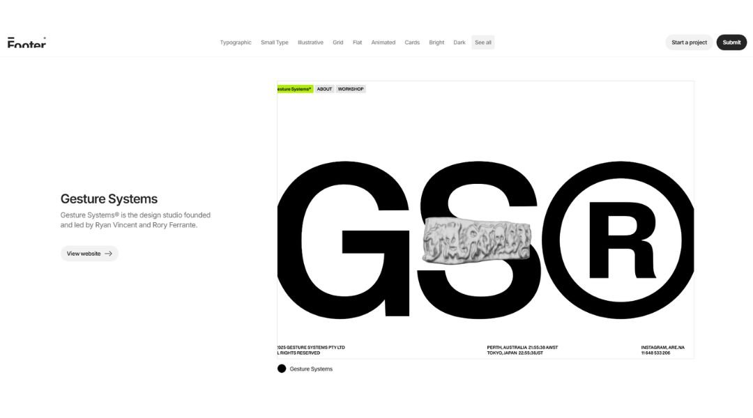
Footer.design is a focused gallery that proves one thing—footers matter more than people think. It’s a clean, curated collection of website footers that go beyond the default copyright line and give the bottom of the page the attention it deserves.
The layout is minimal and easy to scan. Just scroll and explore how different brands handle links, forms, contact info, social icons, and sometimes even a bit of personality. Whether you’re designing a serious B2B site or something more playful, there’s a footer here that’ll spark an idea.
What makes this collection work is its focus. It doesn’t try to be everything. It just tackles one common design element really well. And it quietly reminds you that the last part of your site still leaves an impression.
Footer.design is especially handy when you’ve finished the “fun parts” of a website—but still want to finish strong. Think of it as the final detail that pulls everything together.
Because even the end of the page deserves good design.
12. Intel
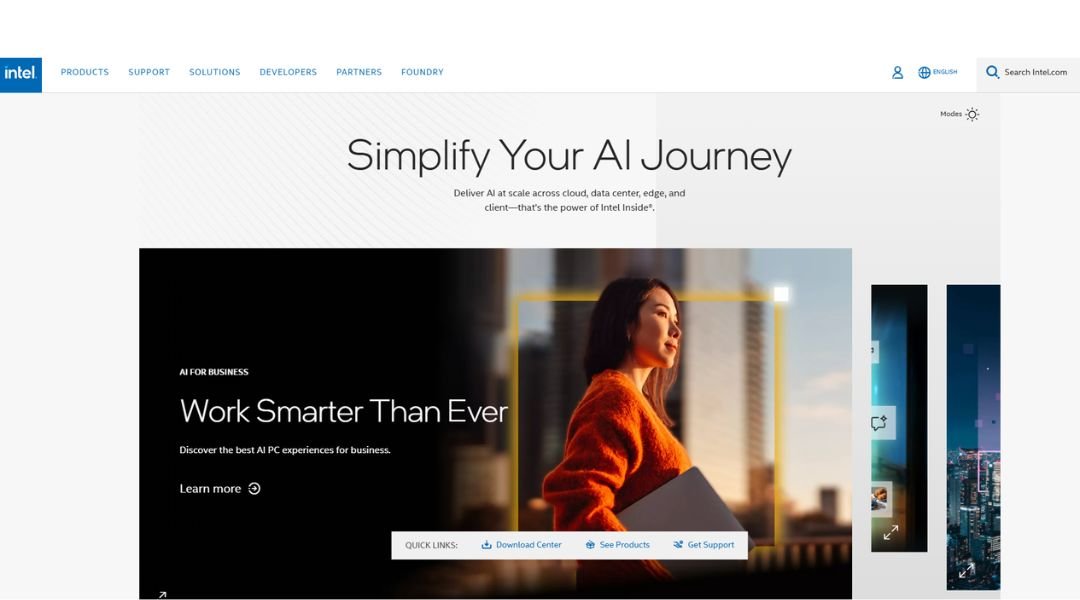
Intel’s website reflects the company’s reputation—precise, polished, and built to handle complexity without making it feel complicated. From processors to AI solutions, Intel.com serves up a wide range of products and innovations in a layout that’s surprisingly easy to explore.
The homepage sets the tone with bold visuals and direct messaging. Navigation is clear, even with a deep catalog of offerings. Whether you’re a developer, IT manager, or just checking specs on the latest chip, the path to information is smooth and efficient.
The design is modern but restrained. No gimmicks, no noise—just well-structured pages that make technical content approachable. Visual hierarchy is strong, and callouts guide you toward what matters without overloading the screen.
Intel.com doesn’t try to overwhelm. It delivers exactly what you’d expect from a global tech leader: clarity, speed, and a quiet confidence in its design.
If you’re building a large-scale site and want to see how function meets structure, this is a strong example—enterprise-ready but still user-first.
13. Foundry
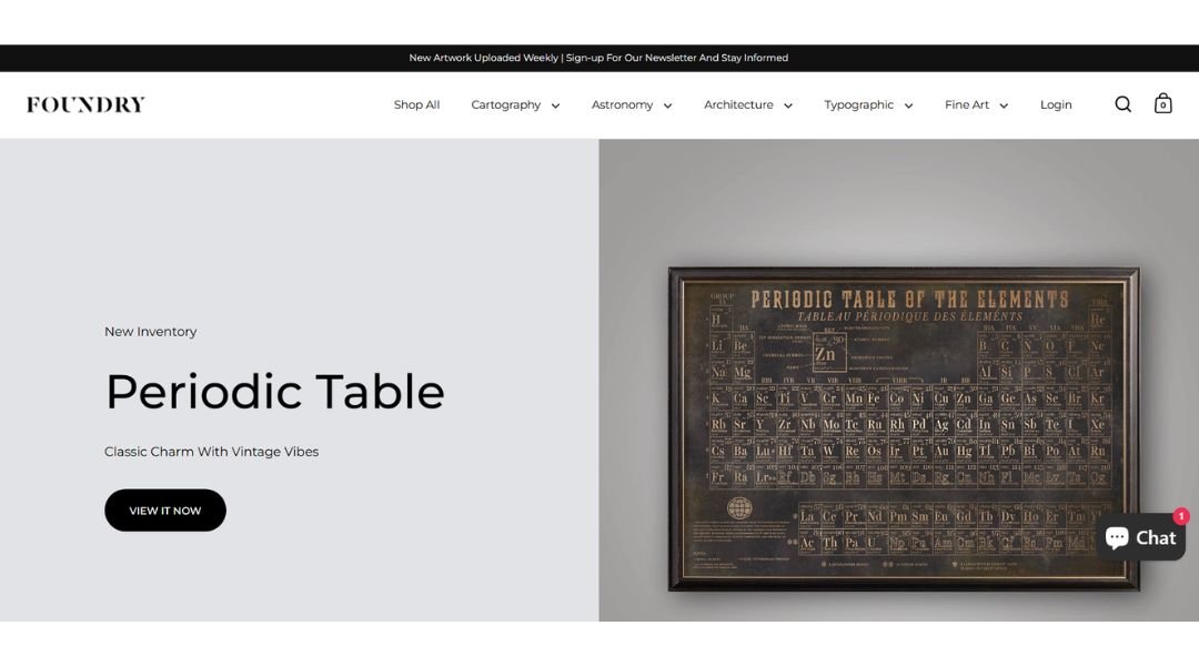
Foundry.co makes one thing clear from the start—they build brands that look sharp and move fast. As a venture studio, they blend creative strategy with operational muscle, and their website reflects that balance with precision.
The design is clean but bold. Crisp typography, strong visual rhythm, and just enough movement to keep things dynamic without feeling overproduced. It’s clear they know how to communicate without saying too much.
Content is minimal but effective. Each section earns its place, giving you a clear sense of what they do, how they work, and the kind of results they aim for. There’s a focus on performance and clarity—no fluff, no filler.
What stands out is how the site positions Foundry not just as a builder, but as a partner. The tone is confident but not loud, modern without chasing trends.
If you’re looking for an example of how to balance brand identity with business credibility, Foundry.co is a masterclass in doing more with less—and making it look effortless.
14. Supima
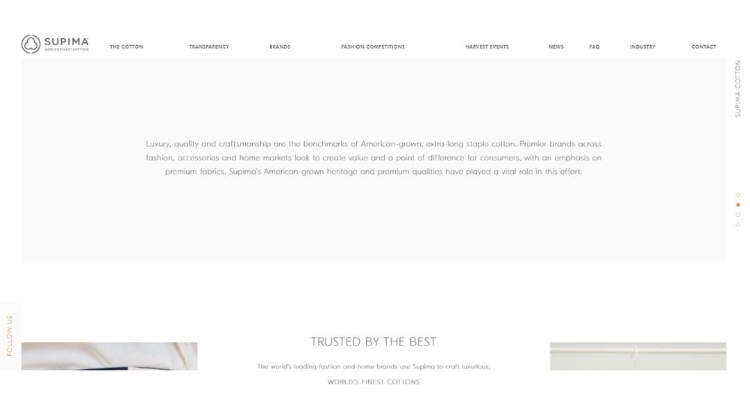
Supima.com reflects the brand’s core values—quality, heritage, and elegance—without shouting for attention. The site feels refined, much like the cotton it represents. It’s not trying to overwhelm with trends; it’s focused on storytelling and substance.
The homepage delivers a calm, polished experience. Visuals are soft but intentional. Navigation is smooth and straightforward, guiding you through Supima’s story, partnerships, and global reach with ease.
Every section has breathing room. From farm to fashion, the journey of Supima cotton is explained in plain, clear language—no jargon, just an honest look at craftsmanship and care. There’s a strong sense of transparency, and the design supports that tone perfectly.
It’s not overloaded with product pitches or unnecessary animations. Instead, the site builds trust. It speaks to both the fashion industry and the conscious consumer, offering insight into what makes this cotton different—without needing to overstate it.
Supima.com is a reminder that premium design doesn’t need to be loud. It just needs to be clear, thoughtful, and rooted in something real.
15. Okalpha
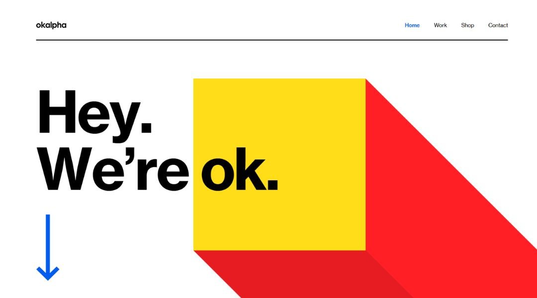
OK Alpha doesn’t play it safe—and that’s the point. This UK-based brand studio builds identities with punch, and their website reflects that sharp, no-nonsense attitude from the first scroll. It’s bold without being brash. Creative without getting lost in its own cleverness.
The homepage wastes no time. Big typography, smart motion, and just enough visual grit to keep things interesting. They’re clearly designers who think fast and execute even faster. The layout is lean, with focused case studies that show off real work—no bloated agency-speak here.
What sets OK Alpha apart is how direct everything feels. No deep dives into philosophy or over-explaining process. Just a clear signal: “We make brands that stand up and stand out.”
Even the copy feels carefully restrained—letting the work lead. That’s a rare level of confidence in the design world.
If you’re tired of vague branding jargon and want to see what clarity with edge looks like, OK Alpha is worth a look. Fast. Focused. Refreshingly honest.
16. Rick Waalders
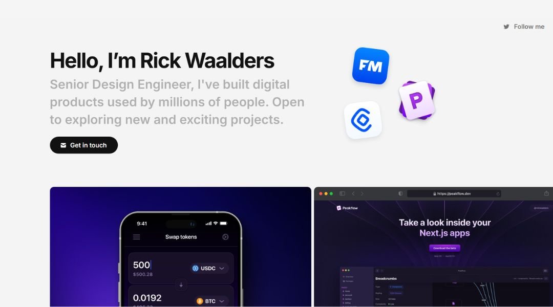
Rick Waalders’ site doesn’t overcomplicate things—it communicates. Straightforward, visually tight, and confident, it feels more like a well-designed pitch deck than a traditional portfolio. That’s a compliment.
From the moment you land, it’s clear Rick leads with clarity. The homepage balances bold typography with minimal structure, pulling you into a visual rhythm that matches his creative approach: refined, intentional, and built around impact.
Work is presented cleanly, with short, effective summaries and visuals that do the heavy lifting. No scrolling marathons. No inflated case studies. Just real projects, shown with the same restraint and polish Rick applies to his design.
What stands out most is the tone. The writing is clear but unafraid to be human. You’re not wading through buzzwords—you’re meeting a creative director who understands both craft and communication.
Rick’s site doesn’t try too hard, because it doesn’t have to. It’s confident, sharp, and refreshingly free of fluff.
If you’re looking for a masterclass in personal branding for creatives—this is it.
17. Mbau
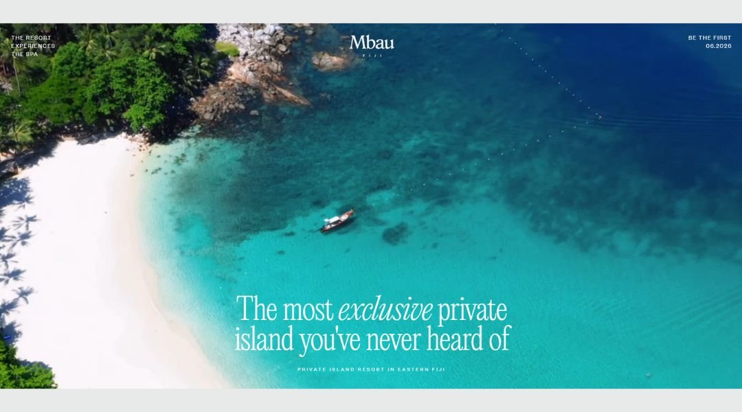
Mbau Island’s website invites you into a different pace—quiet, slow, and beautifully considered. From the first frame, it doesn’t rush to impress. It lets the setting speak for itself.
Full-screen imagery, elegant type, and an earthy palette create a sense of place before you even read a word. The design isn’t loud—it’s patient. Each section feels like a gentle step closer to understanding what Mbau offers: privacy, nature, and a kind of luxury that values space over spectacle.
The copy is minimal but intentional. There’s no hard sell, no overused travel clichés. Just the essentials—location, ethos, sustainability—all delivered with a calm confidence that mirrors the island itself.
This isn’t your average resort website. It’s more like a quiet promise: you’ll arrive, you’ll exhale, and you’ll remember what time feels like when it’s fully your own.
Mbau Island isn’t trying to be everywhere. It’s exactly where it needs to be.
18. Cure Nails
Cure Nails isn’t just selling polish—it’s shaping a vibe. From the moment you land on the site, there’s a sense of calm control. Clean layouts, soft tones, and thoughtful movement give the brand room to breathe—no flash, no clutter.
Product pages feel curated, not crowded. Each item is treated with care, paired with clean visuals and just enough detail to feel informative, not overwhelming. The focus is clearly on quality, not quantity.
The site’s tone walks a smart line: modern, effortless, and quietly confident. It doesn’t scream “luxury”—it shows it. From brand values to ingredients, everything is framed with intention and a touch of restraint. That makes the message stronger.
It’s beauty with clarity. Wellness without noise. Shopping that feels smooth, not rushed.
Cure’s site isn’t trying to impress with loud design—it’s building trust with balance, softness, and style that lasts beyond the scroll.
19. Elva
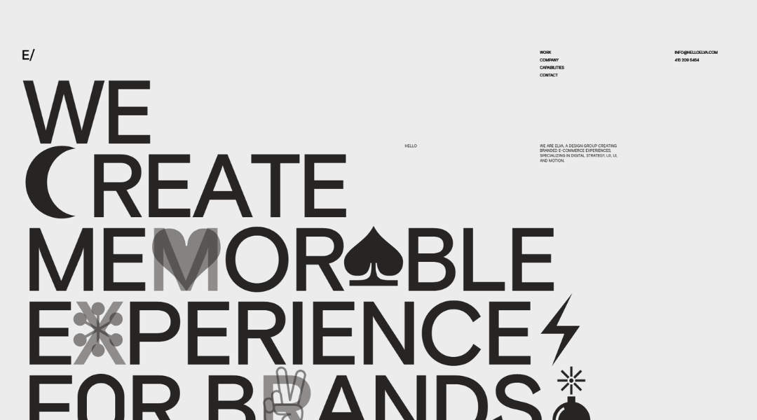
Hello Elva is proof that technology doesn’t have to look technical. From the first scroll, the brand’s soft visuals and spacious layout make it clear—this is about more than sound. It’s about presence, comfort, and the kind of tech that fits naturally into your life.
The site design is minimal, but never cold. Neutral tones, smooth transitions, and thoughtfully placed text create a calm browsing experience. It feels less like shopping and more like exploring something quietly smart.
Product pages focus on how Elva enhances moments—not just features. You’re not overwhelmed by specs. Instead, you’re invited to see how these sound devices complement daily life with elegance and ease.
Every detail—from the typography to the pacing—reflects the brand’s values: simplicity, warmth, and care. It’s a polished experience that gives space for the user to feel, not just click.
Hello Elva doesn’t shout for attention. It invites you to listen—gently, clearly, and beautifully.
20. Swab the World
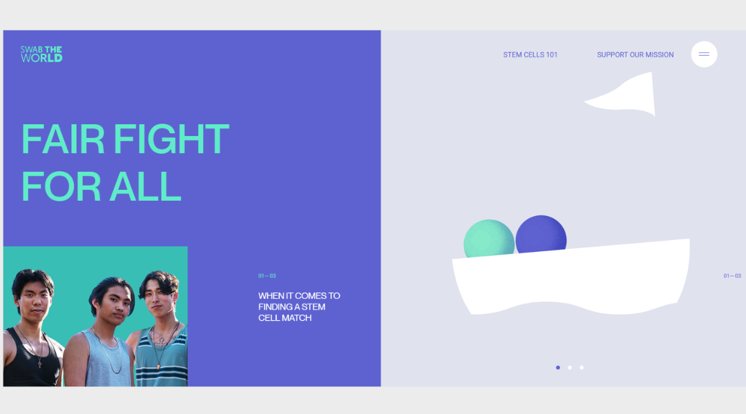
Swab the World doesn’t just raise awareness—it takes action. Built around the urgent need for more diverse stem cell donors, the site delivers its message with clarity, heart, and purpose.
From the start, the tone is bold but human. Strong visuals and concise copy guide you through the mission without overwhelming you. Every section has weight. You understand why this matters—and how you can help.
The design is fresh and accessible, balancing emotional appeal with practical information. It’s easy to navigate, whether you’re learning about the cause or signing up to swab. The personal stories woven throughout the site add depth without feeling overly produced—they’re real, and they hit home.
Swab the World makes a complex issue feel personal and urgent. It turns awareness into action, with a site that’s built not just to inform—but to inspire.
If you’ve ever wondered how design and purpose can work together, this is a powerful example.
Conclusion
If this list gave you even one new idea—or pulled you out of a creative slump for a moment—then it’s done its job.
I don’t believe inspiration should feel like a chore. That’s why every example here was picked for how it works and how it feels. Real design, built by real people, solving real problems—sometimes beautifully, sometimes playfully, but always with intent.
Keep these references close. Use them when your mockup feels flat, when your client wants “something fresh,” or when you’re just tired of looking at the same three color palettes.
And next time someone asks where you get your ideas from? Just smile. You’ve got twenty good answers ready to go.
