Whenever I sit down to start a new web design project, there’s one thing I count on more than coffee—fresh inspiration. Creative block isn’t picky. It hits designers, developers, and clients alike. But the good news? A quick scroll through the right kind of sites can snap things back into place fast.
I’m not talking about copying layouts or color palettes. I’m talking about ideas that nudge you to rethink the grid, try something offbeat, or simplify what’s been overcomplicated. In this guide, I’ll share the types of websites I turn to when I need that spark.
Here’s what you’ll find:
- Clean, minimal designs that let content breathe
- Bold, high-contrast visuals that leave a lasting impression
- Smart interactive elements that add life without noise
- Playful layouts that still keep their structure
- Portfolio sites that nail the “less but better” approach
- E-commerce designs that focus more on experience than just transactions
- Unexpected touches that make you pause—in a good way
These aren’t templates. They’re fuel.
1. RSNL Creative
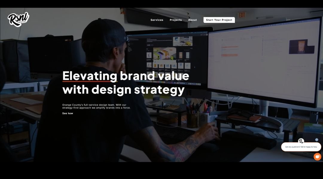
RSNL Creative doesn’t waste your time. The site opens clean, confident, and right to the point—kind of like a firm handshake from someone who actually listens. This Brooklyn-based architecture and design studio makes its intentions clear: thoughtful work, built with purpose.
Instead of trying to impress with buzzwords, RSNL shows you what matters. Projects are presented with space to breathe—just enough detail to spark curiosity without feeling like a textbook. The photography? Sharp. The layout? Easy to explore. And the message? We take design seriously, but not ourselves.
Click through and you’ll notice the balance: warm tones meet sharp lines. Their About section is refreshingly human, giving just enough background to build trust without sounding like a résumé readout.
What’s clever here is what they don’t say. The restraint feels intentional, almost architectural. RSNL isn’t trying to be loud—it’s being clear. And that kind of clarity is surprisingly rare.
In short, the site feels like the spaces they design: modern, grounded, and built for people who appreciate good work without the hard sell.
2. Doup.
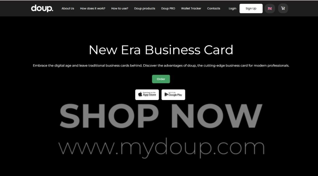
MyDoup
MyDoup keeps things simple—and that’s its strength. From the moment you land on the site, it’s clear: this isn’t about fluff. It’s about helping businesses tell their story with sharp branding and smart design.
The homepage skips the hard sell and gets straight to what matters. Bold statements, clean layouts, and visuals that pull focus. No endless scrolling, no mystery meat navigation—just a clear sense of who they are and what they do.
Dig a little deeper, and you’ll find a team that blends strategy with creativity. Whether it’s building brand identities or crafting visual systems, MyDoup approaches design like a conversation—not a monologue. It’s not about overcomplicating. It’s about making ideas work, visually and practically.
And here’s what really works: the site feels confident but approachable. It doesn’t try to impress with buzzwords or over-the-top animations. Instead, it trusts the work to speak—and it does.
In short? MyDoup helps brands look sharp without trying too hard. And in a world full of noise, that kind of quiet confidence stands out.
3. Adobe
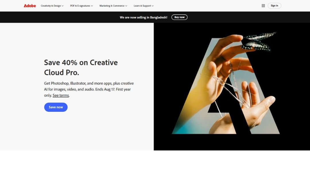
Adobe’s website doesn’t shout. It doesn’t need to. From the moment you land, it’s clear you’re in the hands of a creative heavyweight. The design is sleek, organized, and built to guide—not overwhelm.
Whether you’re a seasoned designer or just trying to edit your first PDF, Adobe makes the path forward pretty smooth. The homepage hits all the right notes: products up front, help close by, and just enough motion to keep things feeling alive without turning into a light show.
What stands out most is how the site serves different users without getting lost in the process. Need tools for video editing? Covered. Managing a business team? There’s a lane for that too. Each section is focused, direct, and lets the product speak for itself.
The experience feels purposeful—like everything was placed with intention. No clutter. No guesswork. Just fast, clean access to the tools that power creative work around the world.
In short, Adobe’s site works the same way its products do: powerful, polished, and built with the user in mind.
4. Apple
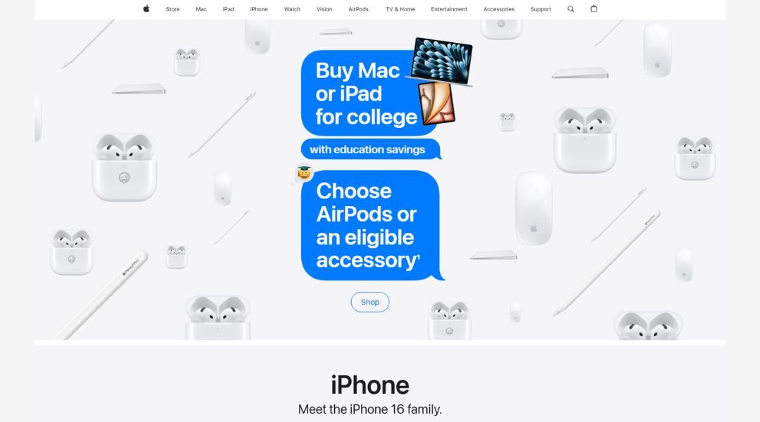
Apple’s website is exactly what you’d expect: sleek, minimal, and quietly persuasive. It doesn’t sell you products—it invites you to explore them. No pop-ups. No distractions. Just bold visuals, smart spacing, and a sense of calm confidence.
Each section moves like a well-rehearsed demo. Scroll down and you’re guided, not rushed. Want to check out the latest iPhone? It’s front and center. Looking for support? It’s just a click away. Everything feels intuitive—like it already knows what you’re here for.
Product pages aren’t just spec sheets—they tell stories. Features are broken down simply, with short copy that gets to the point. There’s just enough animation to keep things interesting, but nothing feels overdone.
What makes Apple’s site stand out isn’t just how it looks—it’s how it works. It respects your time, keeps choices clear, and trusts that good design doesn’t need to yell.
In short? It’s as refined as the products it showcases. Easy on the eyes, and even easier to use.
5. Microsoft
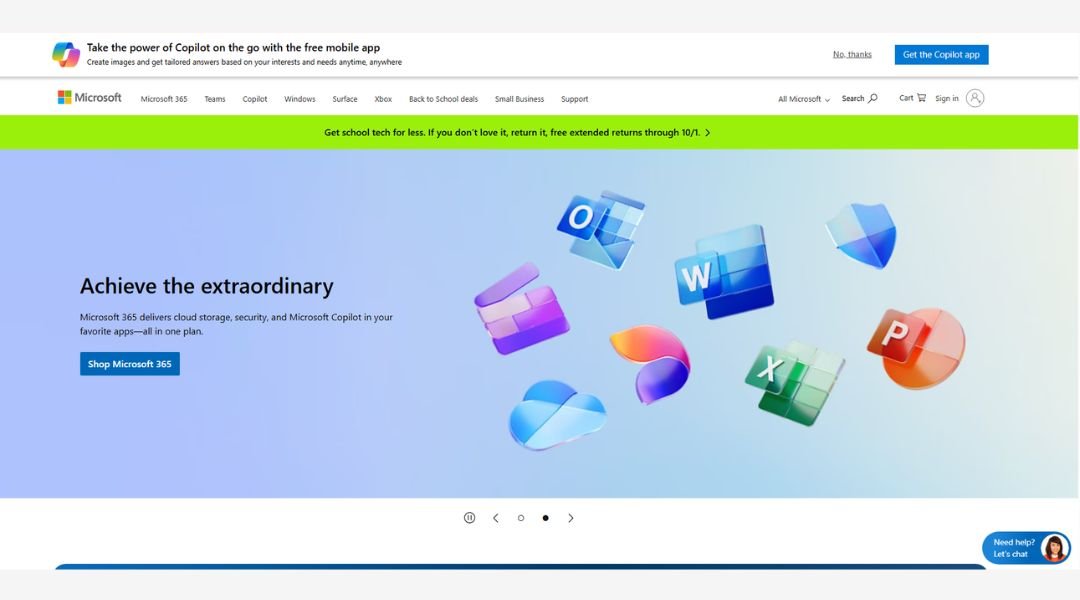
Microsoft’s website feels like its brand: structured, practical, and built to serve a wide range of users. Whether you’re here for software, hardware, or cloud solutions, the layout gets you where you need to go—without making you dig.
The homepage doesn’t try to wow you with flashy gimmicks. Instead, it quietly guides you with clean lines, thoughtful spacing, and clear categories. From business solutions to personal tech, everything is labeled with intention. You know what you’re clicking on before you even hover.
What’s impressive is how the site handles complexity without feeling, well, complicated. With so many products and services, you’d expect some clutter—but it never gets in the way. Navigation is straightforward, and the content is broken down into bite-sized, actionable sections.
You don’t have to guess where to find Office, Surface devices, or support—they’re right where you’d expect. No surprises. Just solid usability.
In short, Microsoft’s site reflects what the brand does best: it works. Quietly, efficiently, and with just enough style to remind you they’ve been doing this for a while.
6. Google
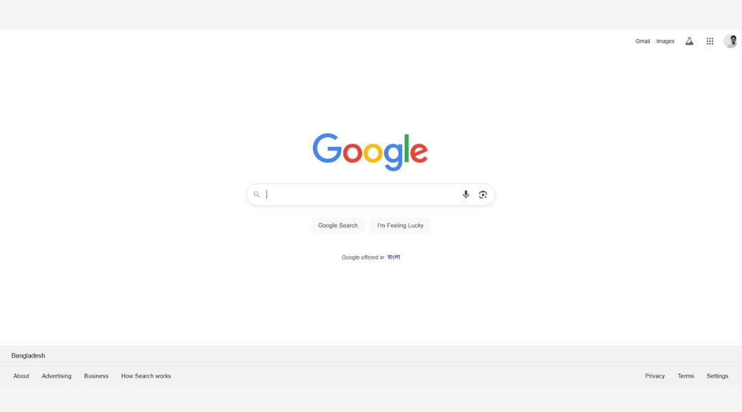
Google’s homepage is the definition of restraint. No clutter. No distractions. Just a logo, a search bar, and two buttons. It’s almost funny how something so simple has become the gateway to nearly everything online.
And that’s the point. The design doesn’t try to impress—it gets out of the way. Whether you’re looking up a quick fact or researching your next big move, Google keeps the experience fast, clean, and unbelievably easy.
Dig deeper into the broader site and you’ll find the same clarity. Whether it’s Gmail, Maps, or Google Workspace, the layout stays user-focused. Each product page is direct, practical, and designed for action—without overwhelming you with tech jargon or endless scrolls.
Even with all its influence, Google keeps the tone humble. It’s built to serve, not to show off. And in a digital world full of noise, that kind of quiet confidence feels refreshing.
In short? Google’s site does what Google does best: it gives you exactly what you need—and nothing you don’t.
7. Amazon
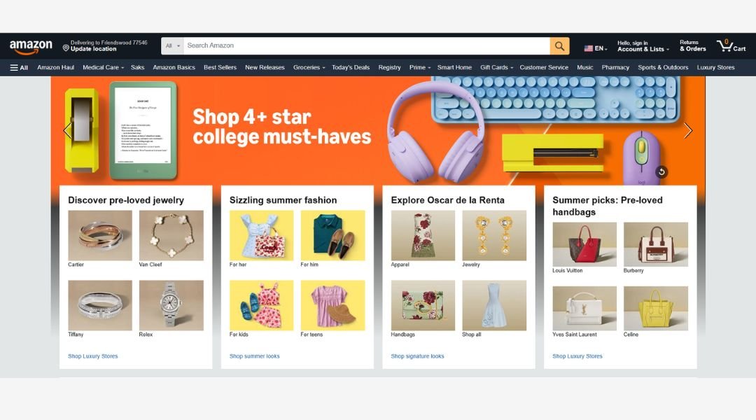
Amazon’s website doesn’t wait for you to browse—it gets right to work. From the moment you land, it starts offering: deals, recommendations, and everything you didn’t know you needed until five seconds ago.
It’s busy, sure, but it’s organized chaos. Categories are clearly marked, filters are easy to use, and the search bar? Practically psychic. Whether you’re shopping for groceries, gadgets, or that oddly specific kitchen tool, Amazon gets you there fast.
What keeps it all working is speed and familiarity. You always know where your cart is, how to track your order, and where that one-click button is hiding (even if your wallet wishes you didn’t). Product pages break down features, reviews, and options in a way that makes choosing easier—even when there are 14 similar versions.
Despite the scale, the site still feels personal. It learns, adapts, and quietly tailors itself around your habits.
In short? Amazon’s site isn’t trying to be beautiful—it’s trying to be useful. And it succeeds, one quick order at a time.
8. Tesla
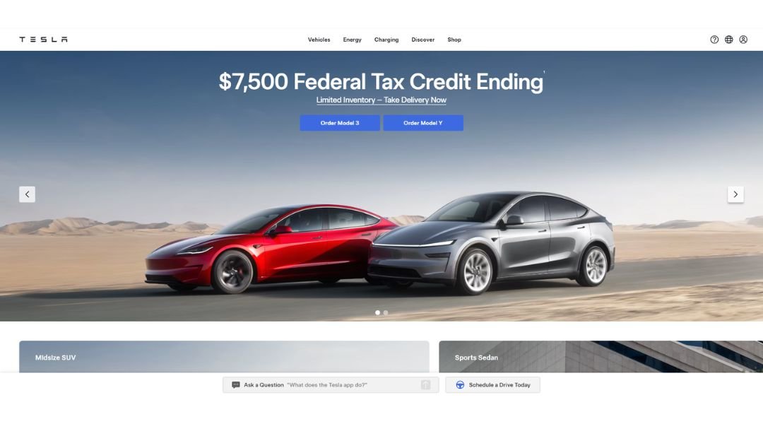
Tesla’s website mirrors its cars: sleek, minimal, and built for performance. No frills, no noise—just bold visuals, smooth transitions, and a layout that feels like it belongs in the future.
Right from the homepage, it’s clear what Tesla wants you to do: pick a model and start customizing. There’s no scrolling maze or cluttered menus. Just full-screen images, smart typography, and a navigation bar that stays politely out of the way until you need it.
Each product page is stripped down to the essentials. Specs are cleanly presented, options are easy to toggle, and the “Order Now” button is never more than a few seconds away. It’s less like shopping and more like configuring a mission.
The tone throughout? Confident but quiet. Tesla doesn’t over-explain. It lets the design, the numbers, and the brand reputation speak for themselves.
In short, the site feels exactly how the brand presents itself: innovative, bold, and moving fast—without saying a word more than necessary.
9. IBM
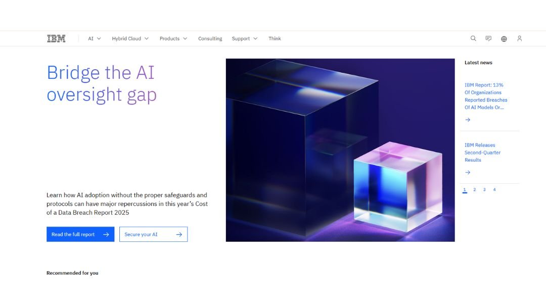
IBM’s website is exactly what you’d expect from a global tech leader: structured, focused, and built to serve professionals who want answers—not distractions.
The homepage gets right to it. Solutions, industries, case studies—everything has a clear place. It doesn’t try to dazzle with flashy effects. Instead, it leads with clarity and confidence, showing that depth doesn’t have to be overwhelming.
Navigation is sharp. Whether you’re looking into AI, cloud computing, or enterprise security, the content is well-organized and surprisingly digestible. There’s a lot here, but IBM makes it easy to scan, click, and get what you need without the usual jargon overload.
What stands out most is the tone. It’s serious, but never cold. You can tell IBM is speaking to professionals who value precision—and have no time to waste.
In short? IBM’s site reflects the brand perfectly: intelligent, well-built, and ready to help businesses solve real problems. No guesswork. Just smart design and even smarter content.
10. Pfizer
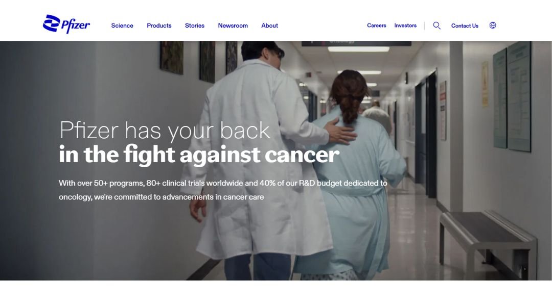
Pfizer’s website strikes a balance between science and accessibility. It’s polished, calm, and surprisingly welcoming for a company at the forefront of global healthcare.
The homepage leads with purpose. You’re not overwhelmed by scientific language or crowded layouts—instead, you’re guided through key areas: medicines, research, news, and how Pfizer is tackling real-world health challenges. Everything is designed to build trust without overselling.
Navigation is smooth and practical. Whether you’re a patient, a healthcare provider, or just curious about the company’s latest breakthroughs, the content is clear, direct, and easy to explore.
What sets it apart is the tone—informative without being overly clinical. There’s a sense of care behind the structure. Each section, from clinical trials to corporate responsibility, is written with transparency in mind.
In short? Pfizer’s website doesn’t just show what the company does—it shows why it matters. It’s not flashy, but it’s dependable. And in healthcare, that speaks louder than any headline.
11. Airbnb
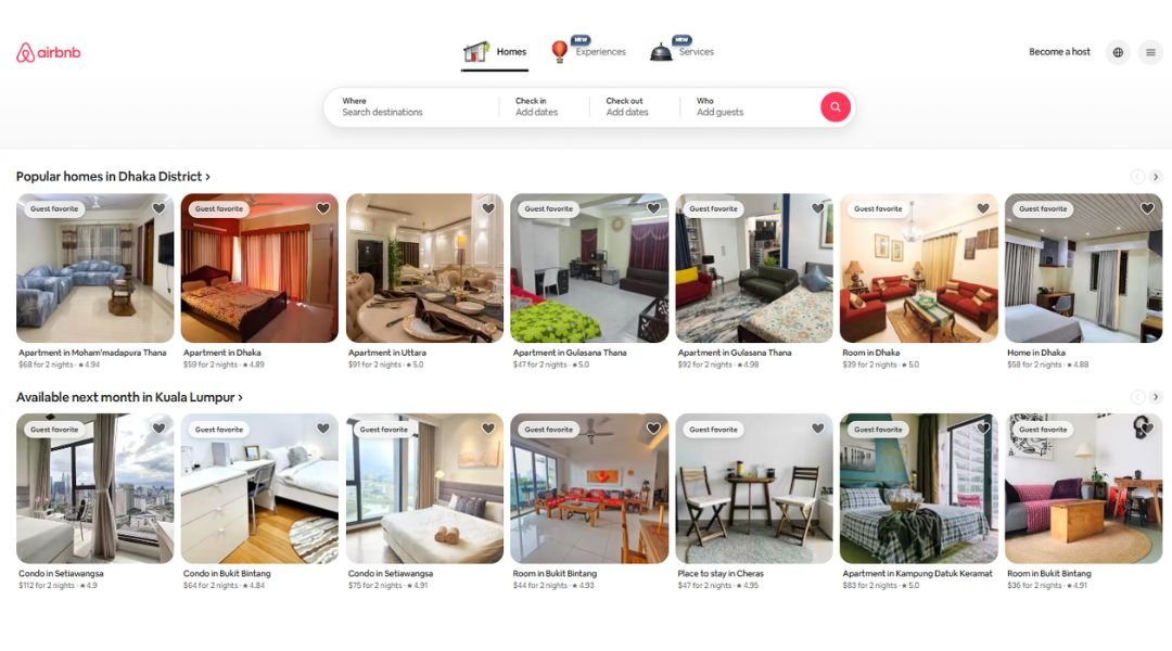
Airbnb’s website is like a well-packed bag—neat, intentional, and ready to go. From the first click, it welcomes you in with big visuals, simple search tools, and that subtle promise: your next adventure is just a few scrolls away.
The design is light and flexible, much like the stays it offers. Whether you’re planning a weekend escape or a month-long workcation, the homepage makes it easy to dive in. You type where, when, and who—and the site does the rest.
Listings are cleanly laid out with big photos, clear pricing, and honest reviews. Filters work fast. Navigation doesn’t get in your way. And if you’re curious about experiences or long-term stays, those are just a tap away.
What makes it work is the tone—friendly, never pushy. It feels more like a travel buddy than a booking engine.
In short? Airbnb’s site doesn’t just help you find a place to stay—it helps you imagine being there. Easy, engaging, and always just a little tempting.
12. Starbucks
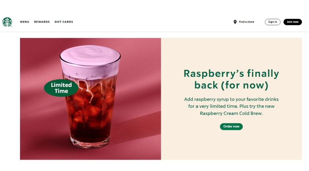
Starbucks’ website feels like stepping into one of its stores—familiar, warm, and effortlessly organized. The design is clean, the colors are cozy, and everything is exactly where you expect it to be.
Right from the homepage, it gets to the point. Want to order ahead? It’s front and center. Curious about what’s new on the menu? Just a scroll away. The layout keeps things moving without rushing you—much like a well-run café line.
Menus are easy to browse, packed with options, but not overwhelming. Whether you’re hunting for that seasonal favorite or checking how many pumps of syrup are in your latte, it’s all laid out with clarity.
Beyond drinks, the site leans into the brand’s values—community, sustainability, and connection. It doesn’t shout them at you; it just includes them in a way that feels real.
In short? Starbucks’ site delivers the same feeling you get with your morning order: reliable, friendly, and exactly what you needed.
13. Nike
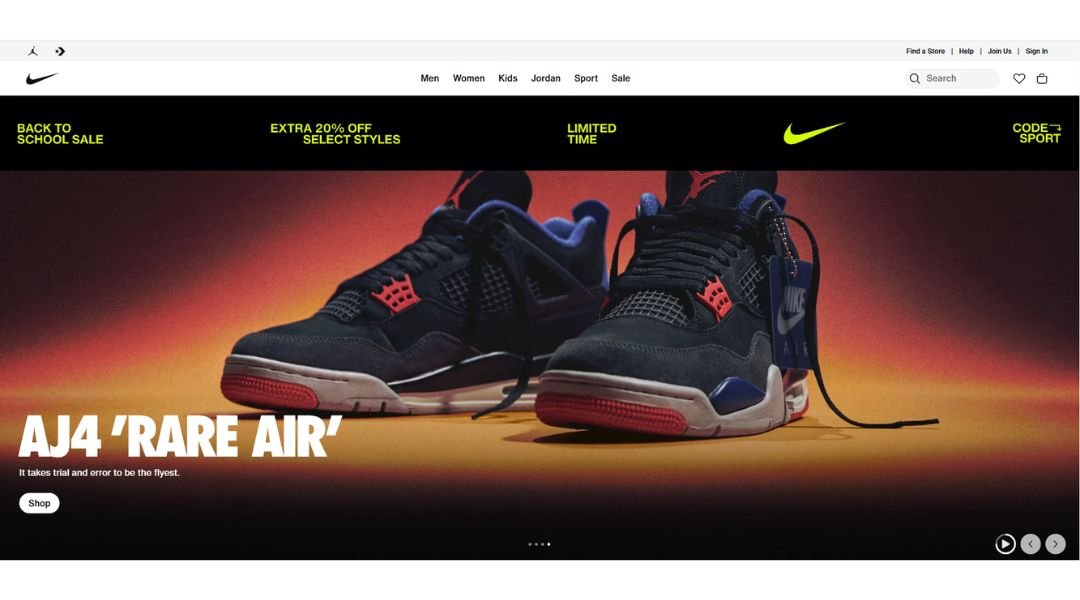
Nike’s website moves with the same energy as the brand itself—bold, fast, and built to perform. From the moment the homepage loads, it’s clear: this is more than shopping, it’s a mindset.
The layout is sharp. Big images, crisp headlines, and zero wasted space. Whether you’re hunting for running shoes, a workout hoodie, or the latest Jordan drop, everything is easy to find and quick to load.
Product pages keep it tight—clean photos, quick specs, and real customer reviews. No clutter, just what you need to decide and move on. Filters are fast and helpful. The whole experience feels like it was built by someone who hates waiting in line.
What really stands out is the tone. Confident, athletic, and just a little rebellious—without ever trying too hard. It’s not just about gear; it’s about getting after it.
In short? Nike’s site doesn’t just sell—it motivates. Simple to use, sleek to look at, and always pushing forward.
14. General Electric
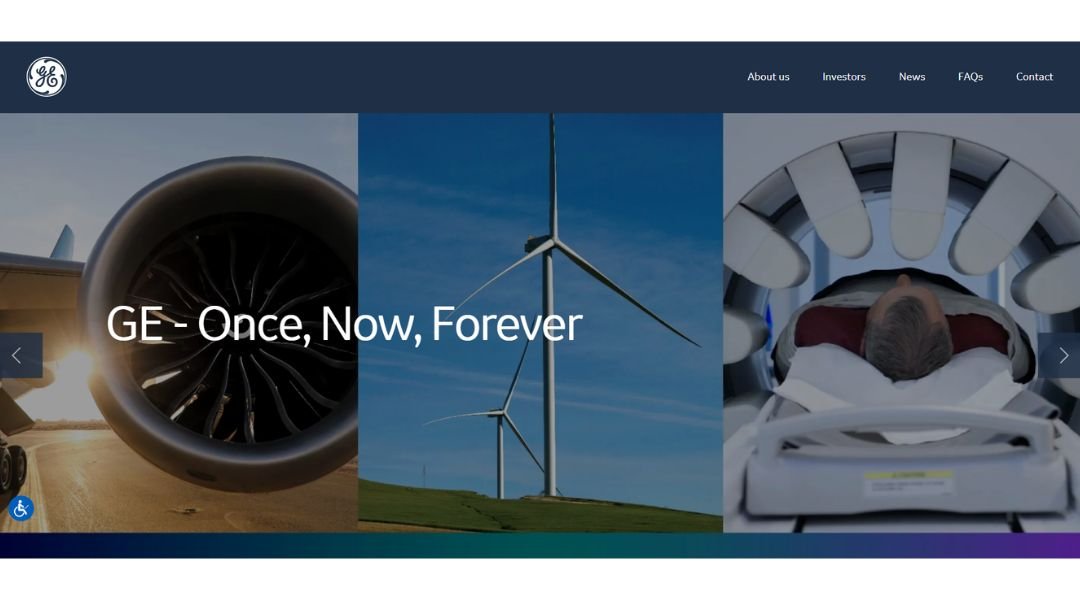
GE’s website reflects exactly what the company stands for: innovation with purpose, delivered through precision and clarity. The layout is clean and methodical—designed for users who want real information, fast.
From energy to aerospace, each section is clearly labeled and easy to navigate. The homepage doesn’t waste time—it leads with what matters: the work GE is doing now, and where it’s headed next. There’s no flash, just focus.
Product and industry pages are well-structured, offering just enough detail to inform without overwhelming. Whether you’re a partner, investor, or just curious about turbine tech, it’s all presented with quiet confidence.
The tone is serious, but not stiff. GE speaks like an engineer who knows their stuff—and doesn’t need to prove it.
In short? The site is built like GE’s technology: smart, efficient, and made to perform under pressure. It’s not trying to entertain—it’s here to inform, and it does that very well.
15. Walmart
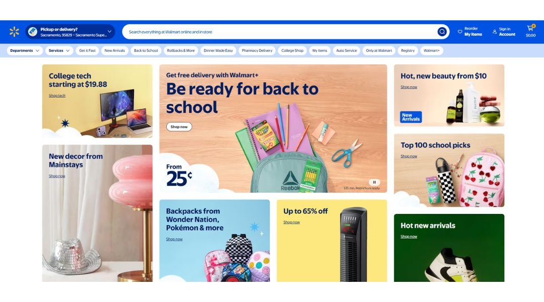
Walmart’s website doesn’t make you hunt—it gets straight to the point. Deals, essentials, and what’s trending are all right there on the homepage, ready for a quick scroll or an even quicker search.
The layout is busy, but in a good way. It reflects the in-store vibe: lots of options, easy to scan, and always a bargain nearby. Whether you’re restocking the pantry or impulse-buying a camping chair, the site makes it fast and frictionless.
Filters are sharp, product pages load fast, and pickup and delivery options are clearly flagged. Plus, the site quietly adapts to your habits, offering reminders and suggestions that actually make sense (most of the time).
And the tone? Friendly, practical, and helpful—like a store associate who actually knows where everything is.
In short? Walmart’s site is built for speed, convenience, and saving you a few bucks while you’re at it. It’s not fancy—it’s functional. And that’s exactly the point.
16. Visa
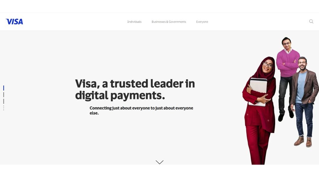
Visa’s website feels like the brand itself—secure, global, and built for clarity. The design is sleek but understated, letting information lead the way without extra flash.
From the homepage, it’s easy to see where you’re headed. Whether you’re a consumer, business owner, or financial partner, the layout quickly guides you to tools, products, and answers—without making you dig.
Pages are structured cleanly with short sections, clear headings, and easy-to-follow links. The language is confident but approachable, and you never get lost in corporate speak. Whether it’s learning how contactless payments work or exploring global security solutions, the content stays focused and useful.
What stands out is the trust factor. The tone is calm and steady—exactly what you want from a company that moves money around the world.
In short? Visa’s site works like its card: fast, reliable, and everywhere you need it. It’s not here to dazzle—it’s here to deliver. And it does.
17. Johnson & Johnson
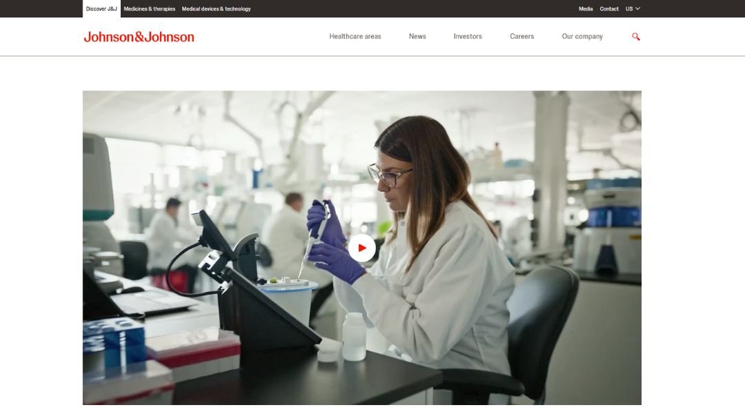
Johnson & Johnson’s website delivers what you’d expect from a healthcare giant: calm, credibility, and a focus on what matters most—people. The design is clean and minimal, with plenty of breathing room and thoughtful navigation.
Right from the homepage, you’re introduced to the company’s priorities: health innovation, scientific progress, and global impact. Whether you’re a patient, a healthcare provider, or an investor, the layout makes it easy to find your lane.
The content strikes a balance between informative and human. Breakthroughs in medicine, corporate responsibility, and employee stories all share space—without overwhelming you with technical details or corporate jargon.
What really stands out is the tone. It’s steady, trustworthy, and empathetic. There’s no flash. No hard sell. Just clear communication from a brand that’s been around long enough to know what matters.
In short? Johnson & Johnson’s website reflects its mission: improving health, one step—and one clear page—at a time.
18. McDonald’s
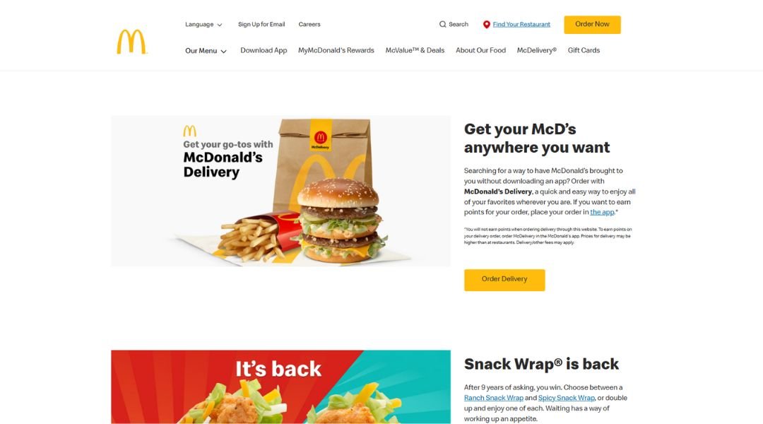
McDonald’s website feels just like its restaurants—quick, familiar, and built for convenience. Right from the homepage, it’s all about getting what you need fast: finding a location, browsing the menu, or grabbing a deal.
The layout is bright and friendly, with bold images and simple calls to action. Craving a Big Mac? You’ll find it in two clicks. Want to check app rewards or see what’s new? It’s right there, no digging required.
The tone is upbeat but not over-the-top. The content speaks directly to busy people who want food, fast—and maybe a little fun along the way. The mobile-first design makes sense too, since most visitors are probably just trying to order on the go.
What works best is how everything feels easy. From placing an order to exploring limited-time offers, the site keeps it light, direct, and very McDonald’s.
In short? The website does exactly what it should—feeds your curiosity (and maybe your stomach), without wasting a second.
19. Goldman Sachs
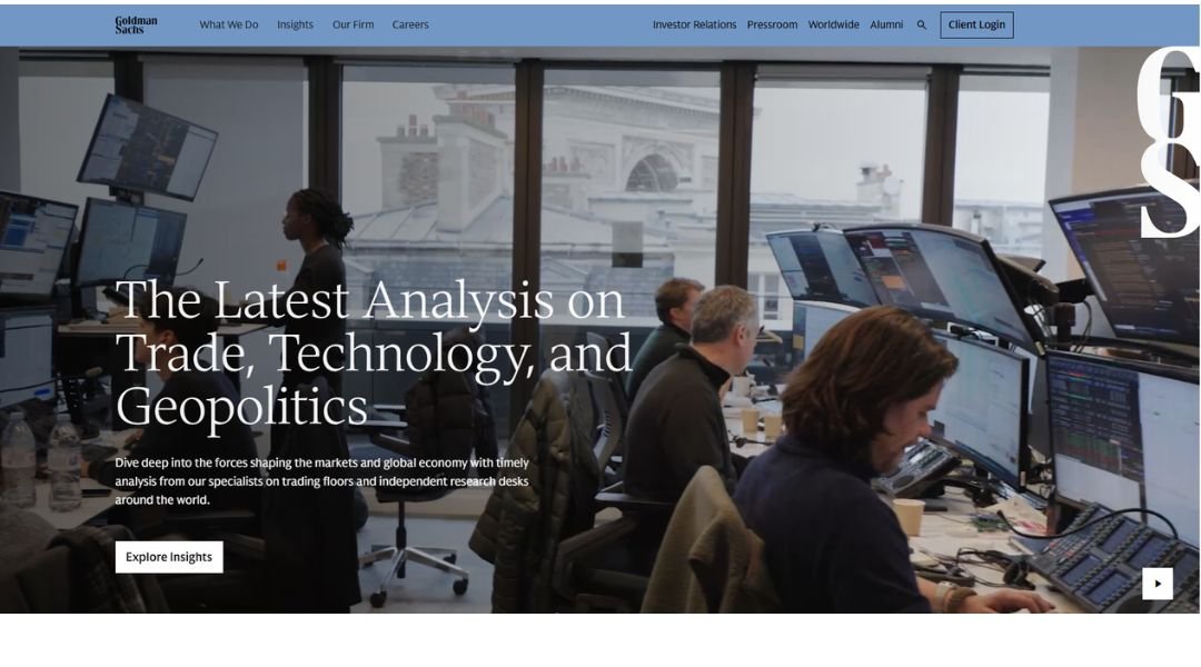
Goldman Sachs’ website feels exactly how you’d expect from a global financial powerhouse: polished, focused, and serious without being stiff. There’s no noise—just strategic clarity.
From the homepage, it’s clear who the site is built for: clients, investors, and industry professionals looking for insights, not sales pitches. Navigation is structured and purposeful. Whether you’re exploring market research, company updates, or career opportunities, everything is just a few clicks away.
Content is presented with discipline. Reports, thought leadership, and financials are cleanly laid out and easy to digest. The language is confident, measured, and refreshingly free of hype. It’s the kind of writing that earns your attention instead of begging for it.
The visual design supports the tone—minimal, modern, and built to emphasize substance over style.
In short? Goldman Sachs’ site doesn’t try to impress with flash. It does it with focus. It’s a digital reflection of the firm itself: sharp, intentional, and built for those who know exactly what they’re looking for.
20. Dropbox
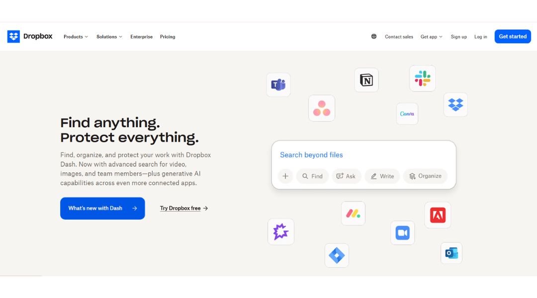
Dropbox’s website is as streamlined as the product itself—simple, clean, and focused on getting you organized fast. No clutter, no confusion. Just bold headlines, helpful visuals, and a clear path to getting started.
The homepage makes one thing obvious: Dropbox is built for work that flows. Whether you’re storing files, sharing projects, or collaborating across teams, the layout makes it easy to explore without getting lost in menus.
Navigation is sharp. Plans, features, and product use cases are all laid out with smart structure. Even the deeper pages keep the tone practical—enough detail to inform, but never too much to slow you down.
What stands out is the confidence in simplicity. Dropbox doesn’t oversell. It quietly shows how it helps you do more with less digital noise.
In short? The site reflects the product: intuitive, efficient, and ready to support whatever you’re working on—without getting in the way.
Conclusion
If you’re anything like me, you’ve probably stared at a blank screen longer than you’d admit. But the right spark—just one layout, one scroll effect, one smart use of white space—can flip that switch.
Whether you’re building a new site from scratch or just refreshing a tired one, good inspiration doesn’t tell you what to do—it reminds you what’s possible. The sites I’ve shared aren’t about trends for trend’s sake. They’re about choices that feel intentional, thoughtful, and quietly impactful.
And if all this talk has you itching to sketch, scroll, or rearrange your homepage… good. That means it’s working.
Let the ideas simmer, then build something better than what inspired you.
