When I’m looking to design a WordPress site that actually works, I don’t start with plugins or fancy features—I start with real-world examples. The kind that show what’s possible without throwing a hundred buzzwords at me.
In this post, I’ve pulled together 20 websites built on WordPress that caught my eye—for the right reasons. These aren’t just good-looking pages. They’ve got purpose, clarity, and the kind of design decisions that actually help people get things done.
Here’s what you’ll find:
- A range of industries and styles—from bold portfolios to practical business sites
- Layouts that balance looks with usability
- Clever use of themes and minimal add-ons
- Smart ideas worth borrowing (or improving)
- Sites that feel human—not over-produced
If you’re building, redesigning, or just curious what WordPress can do without the clutter, you’re in the right place.
Let’s look at what’s working—and why.
1. Wix Studio

Brooklyn-based architect Elena Park uses her portfolio to tell more than a story—it offers a peek into her process. Right from the homepage, you’re greeted by a bold, unfinished concept sketch. Instead of looking incomplete, it draws you in. It feels honest. Human.
Her About page goes beyond the basics. It’s not just a timeline of projects or degrees. It shares how her designs often start with long walks and strong coffee, and how green building isn’t just a checkbox for her—it’s the blueprint. The writing is direct, but you can still sense her passion under every sentence.
Even the site’s layout is a quiet nod to her work: clean lines, gentle movement, no unnecessary frills. You know what you’re looking at, and who you’re looking at.
This isn’t a gallery of buildings. It’s a reflection of how Elena thinks, works, and builds. If you’re looking for someone who speaks architecture fluently but without all the buzzwords, you’ll feel right at home here.
2. Mercedes-Benz

The Mercedes-Benz website doesn’t just showcase cars—it sets a mood. From the moment the homepage loads, the design says one thing clearly: this is precision, without the fuss. High-resolution visuals, subtle animations, and a confident layout draw your eyes exactly where they need to go—whether that’s a new model or a look behind the scenes.
The brand’s story isn’t shouted. It’s woven through sharp copy, thoughtful navigation, and a design that feels more like a showroom than a webpage. You won’t find bloated paragraphs or over-the-top slogans here. Just carefully chosen language that speaks to performance, heritage, and forward-thinking design.
And then there’s the innovation section—it’s not there to dazzle with jargon. Instead, it feels like a quiet flex. Future-facing tech, sustainability goals, and design thinking are all present, but handled with restraint. It’s confident without being loud.
This site doesn’t try to sell luxury—it reflects it. If you’re the type who notices the details others miss, you’ll appreciate what Mercedes-Benz has built—both on the road and online.
3. Katy Perry

The moment you land on Katy Perry’s site, you know you’re not here for ordinary. It’s colorful without being chaotic—polished, but with a wink. The homepage greets you like a backstage pass: bold visuals, tight layout, and just enough sparkle to keep things fun without overwhelming the senses.
Rather than overload visitors with every track and headline, the site smartly filters content. New music? Right up front. Merch? A click away. Tour info? Exactly where you expect it to be. It’s organized like a pro, but still lets Katy’s personality shine through.
The design walks a fine line—somewhere between pop art and clean commercial. There’s movement, but it never competes with the message. Her brand doesn’t need to shout. It smiles.
What makes it work isn’t just the visuals or even the content—it’s how comfortably it all flows. Fans can find what they want, and maybe discover something they didn’t know they needed. Just like Katy’s best songs, the site feels familiar, but always leaves room for surprise.
4. Bound Croatia

Outward Bound Croatia’s website is all about purpose—with no distractions. From the very first scroll, the message is clear: this is about real-world learning, outside four walls. Nature isn’t just the backdrop—it’s the classroom.
The design is clean and practical, much like the programs themselves. Photos of muddy boots, climbing ropes, and wide-open landscapes immediately set the tone. You’re not here to browse passively. You’re here to get involved.
Each section gets to the point quickly. Whether you’re a student, teacher, or curious parent, the layout makes it easy to understand what’s offered, who it’s for, and how to take part. There’s a quiet confidence to the site—no overpromises, just clear steps and real impact.
What makes it stand out? Honesty. It doesn’t try to polish the challenge away. It embraces it. This isn’t a luxury retreat—it’s hands-on growth, under the sky, boots in the dirt.
For anyone looking to push limits and learn by doing, the site delivers exactly what it should: clarity, energy, and a reason to pack a bag.
5. Brandon Photography

James B.’s website doesn’t waste time explaining cool—it shows it. From the moment you land, it’s clear this brand knows its identity. Sharp photography, crisp text, and a layout that’s as easygoing as it is refined.
The site feels like walking into a boutique where everything is in its right place. No clutter, no guesswork. Each product page is straightforward, letting the materials and craftsmanship speak for themselves. Descriptions are brief but thoughtful—just enough to help you imagine how a jacket or tee might fit into your own daily rhythm.
There’s a balance here: style without pretense. The navigation is smooth, and even the checkout feels intentionally minimal. No pressure, no pop-ups—just a clean path from interest to ownership.
It’s not trying to be flashy. It’s confident in the quiet details. The cuts, the fabrics, the photography—it all works together like a solid outfit: effortless on the surface, deliberate underneath.
If you’re the type who values subtle design and quality over hype, James B. might already feel familiar. In a good way.
6. Blue Cadet

The Bluecadet website doesn’t just present creative work—it performs it. Right from the homepage, you’re met with motion, interaction, and restraint. It’s like a digital handshake that says, “We know exactly what we’re doing.”
Rather than flood you with buzzwords, the content lets the work do the talking. Each case study is its own experience—precise visuals, short descriptions, and just enough narrative to show what mattered. The language? Simple, confident, and refreshingly free of filler.
Navigation feels more like exploration than a checklist. Whether you’re looking at cultural installations, digital experiences, or bold design systems, you’re never more than a click away from something compelling. And it all moves fast—no unnecessary scrolls or pauses.
Bluecadet doesn’t try to impress with noise. It leads with clarity. Everything here—from typography to transitions—feels intentional. If you’re a museum, a university, or a brand with a story to tell and no interest in the ordinary, this is your signal.
It’s less of a portfolio, more of a quiet flex. And it works.
7. Wanda Print
Wanda Print’s website is crisp, focused, and all about getting things done—beautifully. From the first glance, it’s clear this is a print company that understands both craft and convenience. No clutter, no guesswork—just a clean interface that makes choosing, customizing, and ordering simple.
Navigation is smooth, and each section has a job. Whether you’re a small business needing signage or a bride shopping invitations, the layout helps you find what you need without clicking in circles. Product categories are clearly displayed, and the customization tools feel approachable, not overwhelming.
Visuals do the heavy lifting—high-quality photos show off the finish and feel of the final product. The language stays practical but friendly, offering just enough personality to keep things from feeling too transactional.
And while printing might seem like a detail, Wanda Print treats it like a statement. Every page says: this isn’t just about ink and paper—it’s about helping people show up with something that looks right and feels right.
If you need print without the drama, you’ll find what you’re looking for here—and then some.
8. Essen International

Essen International’s website is sharp, direct, and unapologetically confident. No scrolling marathons or filler—just striking visuals, strong statements, and a layout that feels like it was built for decision-makers.
The homepage doesn’t try to woo you with buzzwords. It shows you the work—big, bold, and unapologetically clean. Case studies are compact but powerful, offering enough context to intrigue without drowning you in detail. It’s a portfolio that assumes you know what good looks like—and delivers exactly that.
Every element, from typography to spacing, feels intentional. There’s rhythm in the layout. You move fast, but nothing feels rushed. This is a studio that respects your time and shows their value without saying too much.
Even the language is stripped back. It’s design talking to design—no fluff, no hand-holding. Just a clear point of view and the creative work to back it up.
If you’re looking for brand strategy wrapped in clarity and control, Essen doesn’t need to oversell. One visit, and you’ll know: they’re already in the room where decisions happen.
9. July

The July July website is less about showing off and more about showing up—with style, precision, and a clear point of view. It opens with bold typography, quiet colors, and a layout that feels more like a design journal than a sales pitch.
Navigation is minimal, but not vague. Each project is presented like a standalone moment—brief, beautiful, and well-documented. You’re not dragged through fluff or over-explained ideas. The work speaks, and it speaks clearly.
The tone is confident without being cold. There’s a quiet humor in how little the site tries to convince you. If you get it, you get it. If you don’t? That’s okay too. It’s creative work made for sharp eyes and focused minds.
You won’t find loud animations or endless scrolls here. July July keeps it tight. Clean lines, smart grids, and just enough copy to keep your attention moving.
If you’re after thoughtful branding and digital design without the noise, this is the kind of studio that probably already cut what you were going to ask for—and made it better.
10. Bloomberg

The Bloomberg Professional site gets straight to the point—just like its users. From the start, it’s clear this isn’t a place for browsing. It’s a platform built for people who move fast, think globally, and rely on real-time data to stay ahead.
The layout is clean, deliberate, and content-rich without feeling bloated. Each section has a purpose, from product overviews to market solutions, with clear language that favors clarity over flash. There’s no need to guess what’s behind a link. You’ll know before you click.
What sets it apart is precision. Every sentence, every chart, every call to action feels engineered for people who value time. Even the design reflects the product—sharp, functional, and built to deliver results.
It’s not trying to be trendy. It’s trying to be essential. And it succeeds.
Whether you’re a portfolio manager, analyst, or executive decision-maker, the message is simple: Bloomberg isn’t just providing tools—it’s providing an edge. And it makes sure you see that, fast.
11. Chameaux

Team Les Chameaux’s website feels like a postcard from the edge of the map—bold, focused, and built with purpose. Right away, you’re pulled into their world: grit, humor, and a relentless drive wrapped in sandy terrain and human spirit.
The design is straightforward, with no gloss or unnecessary frills. It’s a site that reflects the team’s identity—practical, real, and all-in. Photos take center stage, showing the adventure as it is: raw, dusty, and undeniably inspiring.
You won’t find vague mission statements or corporate jargon here. What you get instead is a glimpse into a team that pushes limits for the love of challenge. The copy is brief but personal, giving just enough to understand who they are—and why it matters.
It’s more than a team page. It’s a rally point. For fans, supporters, and anyone who believes the best views come after the hardest climbs.
If you’re into driven people doing hard things with heart, Team Les Chameaux isn’t just worth watching—they’re worth backing.
12. Mobility

Trefecta Mobility doesn’t build bikes. It engineers machines. And the moment you land on their website, that distinction is clear. Everything about the experience—layout, visuals, language—feels precise, almost tactical.
The design is sleek and restrained. No distractions, no gimmicks. Just powerful imagery, crisp typography, and sharp messaging. It mirrors the product: technical, refined, and built to perform in ways most e-bikes wouldn’t dare attempt.
Each section moves with purpose. Specs are laid out clearly. Use cases are real, not theoretical. Whether you’re exploring defense applications or personal mobility, the information is delivered in a tone that’s confident without showboating.
What makes the site work isn’t just the visuals—it’s the attitude. Trefecta isn’t trying to appeal to everyone. It’s talking directly to riders, professionals, and decision-makers who need performance without compromise.
If you’re looking for a commuter bike, keep scrolling. But if you’re after engineering that meets extremes head-on, Trefecta doesn’t need to say much. It just needs to be seen.
13. Flickr Blog

The Flickr Blog is more than a platform update feed—it’s a window into the creative world behind the lens. Whether you’re a seasoned photographer or someone who just loves great visuals, the site invites you in with a tone that’s curious, thoughtful, and community-first.
The layout is clean, but never cold. Posts are organized clearly, with rich imagery leading the way. No flashy distractions—just stories, spotlights, and meaningful updates. From artist interviews to technical deep dives, the content strikes a balance between inspiration and information.
What makes it work? Voice. The writing feels personal, not corporate. It’s like hearing from someone who understands why people create, not just how. There’s room for playful moments, but the focus stays on quality and connection.
You won’t find shallow listicles here. Each post gives you something—insight, appreciation, or a fresh perspective on visual storytelling.
It’s not trying to be loud. It’s trying to be lasting. And for a platform that’s always been about preserving moments, that feels exactly right.
14. Psychologia

Statek Psychologia’s website feels like a quiet conversation—steady, welcoming, and focused. From the first click, it’s clear this isn’t just another psychology practice. It’s a place built around trust, clarity, and human connection.
The design is soft and minimal, with gentle colors and intuitive navigation. It doesn’t overwhelm—it invites. Whether you’re here out of curiosity or in search of real support, the site makes space for both.
Each section is clear and purposeful. Services are explained in plain language, without heavy jargon. The team is introduced not just by credentials, but by values—offering a sense of who you’re meeting, not just what they do.
What stands out most is the tone: calm, reassuring, and genuinely caring. There’s no pressure, no over-promising. Just a steady presence for those ready to talk, reflect, or take the first step toward something better.
If you’re looking for thoughtful, grounded support—not just answers—Statek Psychologia offers something rare: a place that listens before it speaks.
15. Airstream

The Airstream website doesn’t just sell travel trailers—it sells the idea of freedom with polish. Right from the homepage, it’s clear: this is legacy backed by engineering, style, and the open road.
The layout is clean and inviting. Navigation is simple, but purposeful. Whether you’re exploring models or dreaming of your next cross-country escape, the site guides you without pushing. Visuals are front and center—sleek aluminum exteriors, cozy interiors, and wide-open landscapes that feel like they’re waiting for your story.
But it’s not all lifestyle gloss. Each product page dives into the details—specs, floorplans, comparisons—without ever feeling cluttered. There’s substance here, not just shine.
And the tone? Confident, calm, and quietly adventurous. Airstream isn’t shouting. It’s simply showing you what’s possible—and letting the dream do the rest.
This isn’t just a site for shoppers. It’s a digital driveway for those already planning their next turn off the main road.
16. Tonal

The Tonal website doesn’t waste time—it moves like the product it promotes: sleek, smart, and built to perform. From the first glance, it’s clear this isn’t another piece of home gym equipment. It’s an entire training system, engineered for results and designed to fit real life.
The layout is bold but balanced. Dark backgrounds, strong typography, and just the right amount of motion create a sense of precision. You’re not overwhelmed—you’re pulled in. Product details, coaching features, and real-world stories are all within easy reach, each section focused and efficient.
Tonal speaks with quiet authority. No hype. No hard sell. Just clear messaging backed by innovation and data. It feels more like a personal trainer introducing you to your future routine than a brand trying to win your attention.
It’s not trying to be everything to everyone. It’s here for people serious about strength, progress, and time well spent.
In a world of quick fixes and noisy fitness trends, Tonal makes one thing clear: smart training is the new strong.
17. Viewer
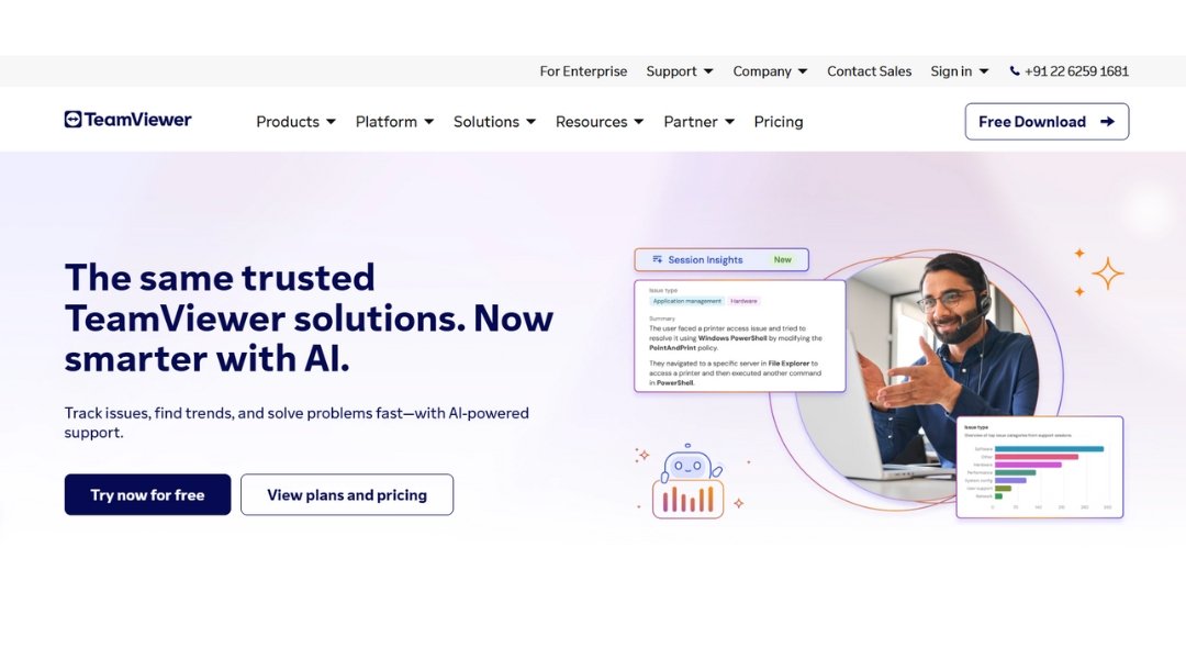
TeamViewer’s website delivers what the product promises—fast, efficient, and no-nonsense connection. From the moment you land, the focus is crystal clear: remote access, support, and control across devices, all wrapped in a user-friendly experience.
The layout is clean and well-structured. Whether you’re an IT professional, enterprise manager, or just someone trying to help a colleague from across the globe, the site makes it easy to find what you need—fast. Solutions are clearly divided by use case, with zero fluff and just enough detail to inform without overwhelming.
The tone is confident and grounded. It doesn’t overcomplicate. It doesn’t oversell. Instead, it shows you how to get from problem to solution in a few clicks.
TeamViewer isn’t trying to be flashy. It’s trying to work—on every device, in every location, under pressure. And the site reflects that: reliable, fast-loading, and focused on action.
If your business runs on connectivity, this isn’t just software. It’s part of your workflow—and the website gets that from the first scroll.
18. aThemes

The aThemes website keeps things simple—for a reason. It knows its audience: business owners, developers, and creators who want WordPress themes that look good and work harder. Right from the homepage, the layout is clear, the messaging focused, and the experience smooth.
Theme previews are easy to browse. Each product page offers exactly what you need to know: performance, features, compatibility. No filler, no guesswork. Whether you’re building your first site or revamping an old one, the tools are right where you need them.
The tone is friendly but efficient. It doesn’t push. It helps. There’s also a strong focus on value—free themes that don’t feel limited, and premium options that earn their price with real features, not just flash.
You won’t find design trends chasing clicks here. You’ll find fast-loading, flexible themes made to get sites online—and keep them looking sharp.
If you want WordPress to work for your business, without wrestling with code or clutter, aThemes gets you from idea to “live” with zero drama.
19. Charmer

The Asheville Bee Charmer website is exactly what you’d hope for from a shop with this name—sweet, welcoming, and full of personality. From the first click, you’re greeted with golden tones, playful bees, and a sense that this place is as much about community as it is about honey.
Navigation is easy and intuitive. Whether you’re hunting for small-batch honey, bee-themed gifts, or natural body care, everything is right where it should be. Each product feels hand-picked, not mass-produced—and the descriptions carry just enough story to make it personal.
The tone throughout the site is warm but clear. You feel like you’re being helped, not sold to. And while the aesthetic is charming, it never gets in the way of function.
What sets it apart? Heart. There’s a real sense that this brand believes in the bees, the craft, and the people they serve. It’s not just a store—it’s a small, buzzing celebration of nature’s most thoughtful workers.
Looking for something sweet with soul? You’ve just found it.
20. Avox Architects

The Avox Architects website speaks in structure—clear lines, intentional design, and a quiet confidence that reflects their approach to architecture itself. From the start, it feels considered. Nothing is rushed. Nothing is loud. Just space, form, and clarity.
The site layout is minimalist but not empty. Projects are presented with care—crisp images, concise descriptions, and a strong sense of material and place. You don’t get buried in text or flashy effects. You get a clear view of what Avox builds and how they think.
The tone is measured and professional. It respects your attention. Whether you’re a developer, homeowner, or public sector client, the message is consistent: thoughtful design, well-executed.
What makes it work? Simplicity paired with precision. Every element—visual or written—feels like it belongs. It’s not trying to sell a dream. It’s showing you what’s possible when form meets function with purpose.
For clients who value clarity, detail, and architecture that stands quietly and proudly—Avox Architects offers a steady, thoughtful hand.
Conclusion
So, what did I take away from these examples? Good design doesn’t shout. It guides. The best WordPress websites I’ve seen keep things clean, clear, and focused on real users—not just the latest trend.
I don’t believe there’s one “right” way to build a site. But after going through these 20, I’ve got a better sense of what feels right—and what actually works. Whether you’re planning a portfolio, running a store, or starting from scratch, there’s something useful here to borrow, remix, or spark an idea.
In the end, it’s not about having all the features. It’s about making something that feels like it fits. And if you can do that while keeping things simple and smart? You’re already ahead.
