I’ve spent enough time building websites to know one thing for sure—your online resume shouldn’t feel like a forgotten PDF with a fancy header. It should work as hard as you do. Whether you’re a designer, writer, developer, or someone who’s simply tired of saying “I swear I sent my resume,” having a web-based resume can save you from that awkward second follow-up.
In this post, I’ve rounded up 20 smart, creative, and practical online resume examples that actually do the job. And no, they’re not all made with the same template. Each one shows off skills, personality, and some clever use of whitespace. If you’re staring at a blank screen wondering how to present your work without sounding like a robot, you’re in the right place.
Here’s what you’ll find inside:
- Portfolio websites that highlight personality without sacrificing clarity
- Resume formats that actually make people want to scroll
- Design ideas that work even if you’re not a designer
- Tips I noticed that make these sites more effective (and memorable)
- A few small choices that make a big difference
Let’s take a look at what works—and why it works.
1. Kantwon Rogers
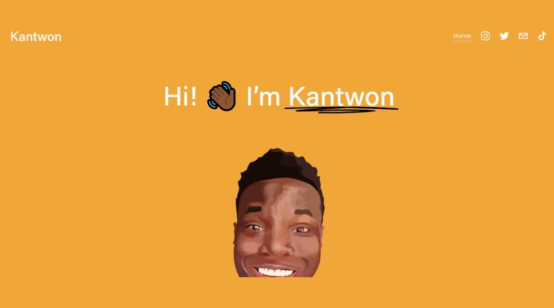
Kantwon Rogers isn’t just writing code—he’s building stories. His site offers a direct, no-frills intro, but spend a minute and you’ll see there’s a lot more under the hood. Right off the bat, the homepage plays it cool: simple layout, clean lines, and just enough color to keep things interesting. It’s not loud, but it speaks.
Check out the “About” section and you’ll find something rare—a tech pro who actually sounds human. Kantwon shares his background, his values, and even a few quirks. It’s personal, not overly polished. You get the sense he enjoys the process, not just the finished product.
One standout? His thoughtful blog posts. They’re short, smart, and not afraid to show personality. He doesn’t just throw jargon at the wall—he explains, reflects, and sometimes even pokes fun at himself. The site feels like an honest extension of him—clear, thoughtful, and quietly confident.
2. Oliver Anderson
Oliver Lucian Anderson doesn’t waste time telling you he’s creative—his work speaks first. Land on his homepage and you’re met with a bold statement: stillness, scale, and sharp lines. No distractions, no clutter—just images that hold your attention a little longer than you expect.
His site is more than a portfolio; it’s a mood. The navigation is quiet and deliberate, guiding you through projects that feel more like conversations than showpieces. There’s no over-explaining. Just enough context to make you curious, not enough to ruin the mystery.
Dig into the project pages and you’ll notice something refreshing—he’s not trying to sell you anything. Each piece is presented almost like a short film: simple, structured, and patient. The restraint is part of the charm.
Oliver’s work doesn’t shout. It lingers. And so does his site. It’s the kind of place that makes you slow down, scroll back up, and look again—because the details aren’t obvious, but they’re worth it.
3. Ximena N. Beltran Quan Kiu
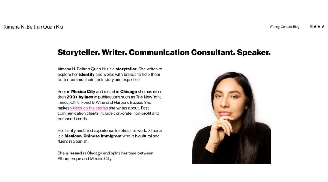
Ximena Benavides Quek doesn’t just document space—she interprets it. Her homepage greets you with a full-screen visual that’s both subtle and striking, much like her work. There’s no dramatic entrance, no forced narrative. Just images that invite you to pause and look a little closer.
Her site flows like a quiet walk through a well-designed building: thoughtful, measured, and never rushed. Each project is presented with balance—enough visual context to understand her perspective, but never overexplained. She trusts the work to speak, and it does.
Click into any project and you’ll notice she’s got range—from sculptural studies to more grounded explorations of place and identity. The photography is intentional. The layout gives each piece space to breathe. You’re not being guided; you’re being allowed.
There’s also a soft sense of rebellion here. Ximena’s work doesn’t follow trends. It follows questions. Her site mirrors that curiosity—quiet, deliberate, and quietly bold. It doesn’t ask for attention. It earns it.
4. Luana Psaros
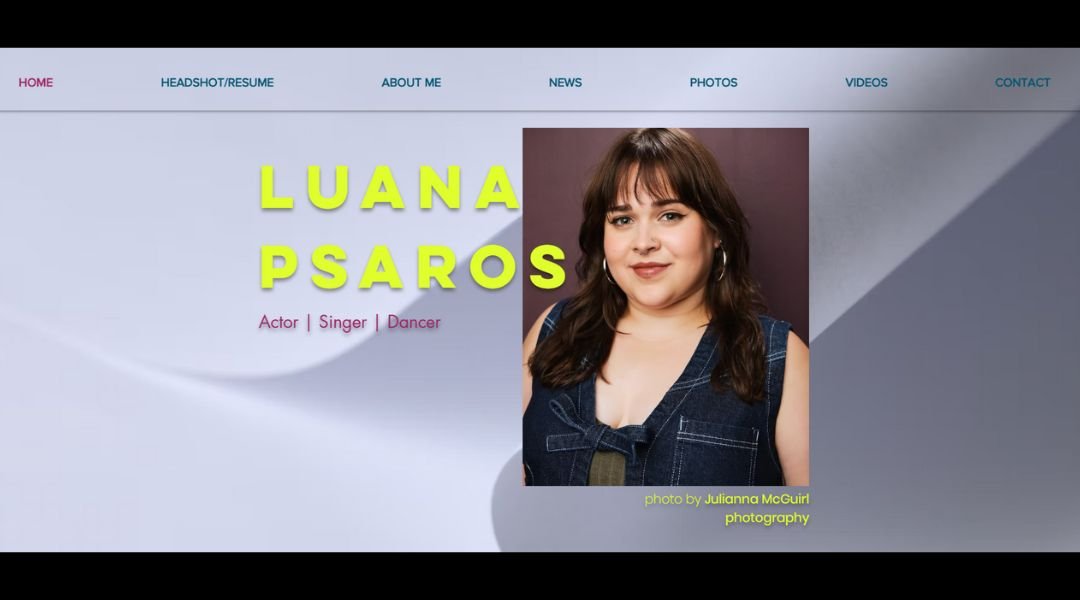
Luana Psaros doesn’t just design buildings—she shapes atmosphere. Her site opens with a calm, intentional energy. Minimal layout, restrained text, and visuals that do most of the talking. Nothing screams for your attention, but you’ll find yourself leaning in.
Her portfolio isn’t trying to overwhelm with volume. Instead, it offers clarity. Each project is given room—space to breathe, space to be understood. From interiors to speculative design, the work feels personal without needing to explain itself too much.
The “Info” page is short, but telling. You get a clear sense of Luana’s interests: space, environment, and the tension between built form and feeling. It’s more of a conversation starter than a résumé dump—and that’s the point.
What’s most striking? The restraint. Every choice—from typography to pacing—feels intentional. Her work doesn’t try to impress through noise. It creates a quiet confidence that stays with you, long after you click away.
5. Melanie Daveid
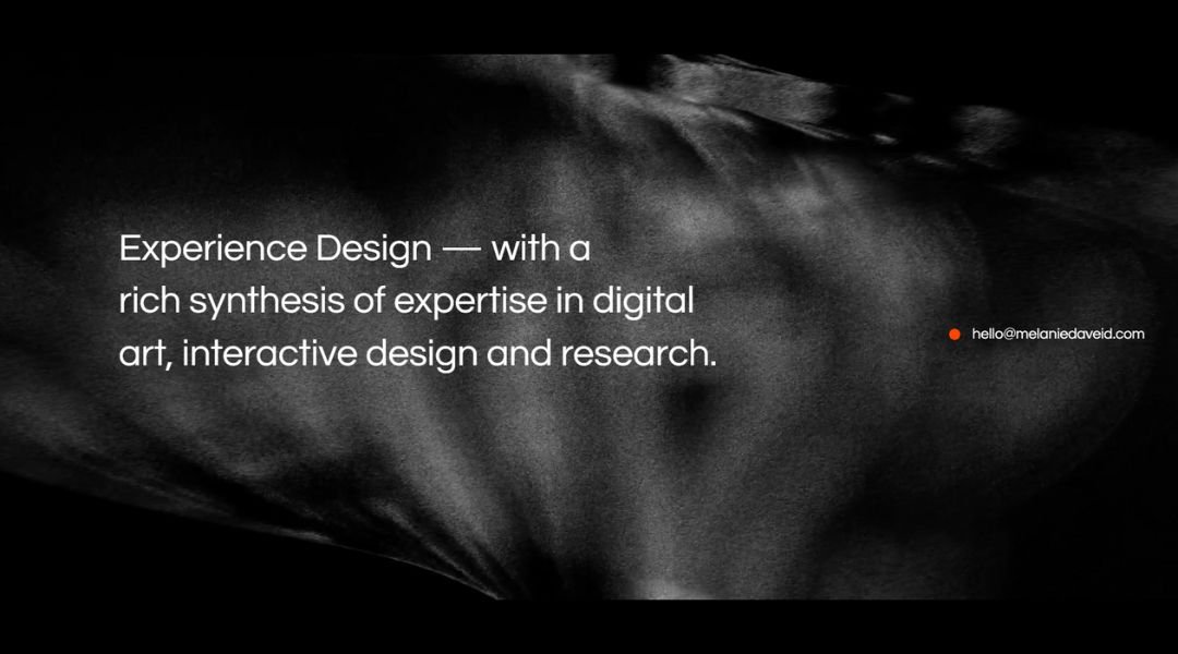
Melanie Daveid’s website doesn’t just introduce her—it moves like her work. From the first scroll, it’s clear: she understands interaction not as a feature, but as a feeling. The layout is smooth, the transitions are thoughtful, and every element feels like it belongs. It’s digital design with manners.
Her homepage offers just enough—no clutter, no chaos. She lets the visuals lead, with crisp case studies that speak to both logic and aesthetics. Whether it’s a mobile experience or a full product interface, her work feels polished without being precious.
What stands out most? Her attention to human detail. In a field that often leans technical, Melanie brings warmth. The kind that makes UX feel less like a system and more like a dialogue.
Click into any project and it’s structured, sharp, and refreshingly transparent. She’s not trying to impress with buzzwords. She’s showing process, clarity, and care. Her site doesn’t shout. It hums—with purpose, with personality, and with the quiet confidence of someone who knows exactly what she’s doing.
6. Alisha Selena
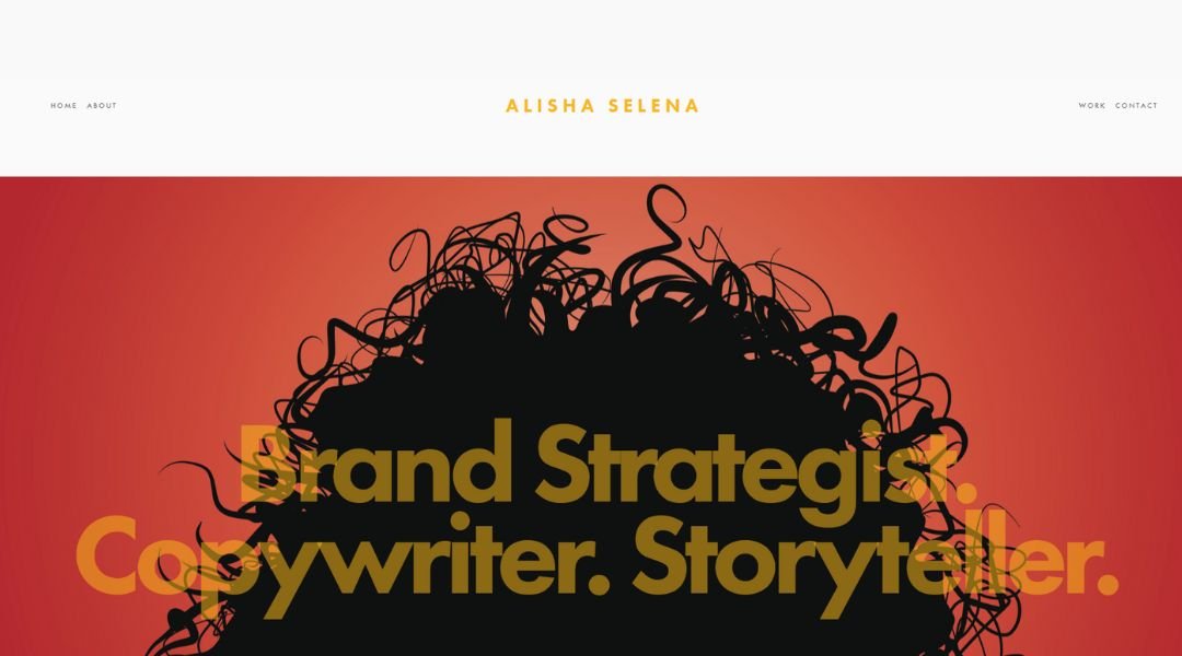
Alisha Selena’s site doesn’t overstate—it invites. From the start, you’re welcomed into a space that feels both personal and precise. Soft visuals, minimal text, and a quiet confidence guide the experience. It’s not about showing everything—it’s about showing just enough.
Her work explores identity, memory, and place, often through a lens that’s both conceptual and deeply grounded. Each project lives in its own space—visually and emotionally. You don’t scroll past her work; you pause with it. And that’s the magic.
The “About” section reads like a quiet conversation. It’s brief, but layered—equal parts biography and intention. You get a sense that Alisha isn’t just creating; she’s questioning, observing, and reflecting along the way.
What ties it all together? A sense of care. From typography to image pacing, everything feels considered. Nothing is loud, yet nothing fades. The result is a portfolio that doesn’t try to win your attention—it earns it, gently and honestly.
7. Kelsey Alpaio
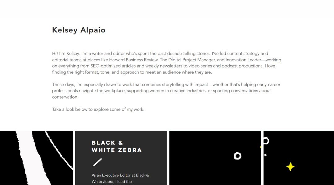
Kelsey Alpaio’s site gets to the point—with style. It’s clean, focused, and quietly confident. The homepage reads more like a handshake than a pitch: direct, but warm. No frills, no noise—just thoughtful work and the clarity to let it speak.
Her writing and editorial projects are presented with a careful balance—professional polish with just enough personality. Each piece comes with context, but never oversells. She trusts the reader to keep up, and that respect shows.
Dig a little deeper, and you’ll notice how much care goes into the structure. The copy is sharp. The layout breathes. Even the white space feels like part of the voice. It’s a site built by someone who understands that good communication isn’t about saying more—it’s about saying it better.
There’s also a quiet curiosity running through her work. She’s not just reporting—she’s exploring. And the site captures that rhythm. It doesn’t chase attention. It holds it, by being thoughtful, clear, and refreshingly human.
8. Drew Bone
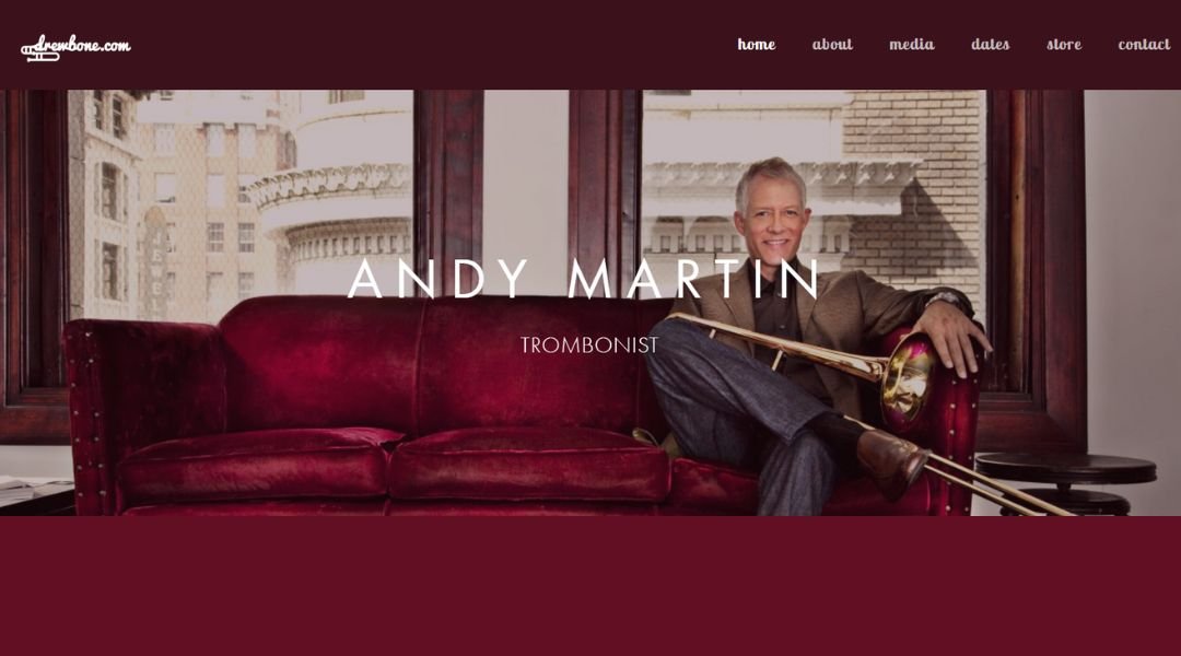
Drew Bone’s site opens with one clear message: design can be clever without being loud. The homepage is simple, but not shy—it gives just enough to catch your eye and keep you curious. There’s a calm confidence here, and it sets the tone for everything that follows.
His work spans digital design, branding, and creative direction, but it never feels scattered. Each project is laid out with precision and a light touch. He doesn’t over-explain, and he doesn’t need to—the visuals are smart, the context is tight, and the results speak for themselves.
The best part? There’s personality. From his logo to the casual tone of his writing, Drew’s site feels like it was built by someone who enjoys what they do. You’ll spot hints of humor, but they never distract—they just remind you there’s a real human behind all this polish.
It’s a portfolio that’s clean, sharp, and refreshingly unfussy. No hard sell. Just strong work, good instincts, and a layout that knows when to step back and let the design take the lead.
9. Lior Raz
Lior Raz doesn’t need a flashy intro—his site knows how to hold presence without pushing. From the first screen, it’s clear: this is a space built with intent. Clean layout, grounded visuals, and a quiet tension between simplicity and intensity. It doesn’t shout. It watches.
The portfolio is focused, cinematic, and strikingly paced. Lior’s work in film and television is front and center, but there’s no overload—just key projects that carry weight. The imagery does the heavy lifting, while the text steps in just enough to guide.
There’s a duality throughout: actor and creator, performer and storyteller. The site leans into that balance without overexplaining. It’s efficient, but personal. There’s room here for mood, and that mood sticks.
Even the site’s rhythm feels intentional. You move through it like a scene—quiet builds, controlled reveals, and a finish that leaves you wanting more. It’s not trying to tell you everything. It’s giving you exactly what you need—and leaving space for the rest.
10. Libby Peterson
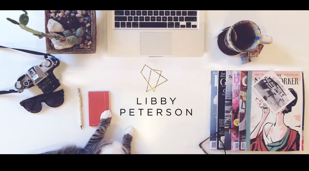
Libby Peterson’s site doesn’t try to dazzle with distractions—it leads with clarity. From the first glance, you’re met with a calm, image-forward layout that lets the photography breathe. No noise, no clutter—just the kind of quiet confidence that comes from knowing exactly what to show, and when.
Her portfolio feels intentional. Each photo—whether documentary, editorial, or portrait—carries its own weight. There’s a softness to the sequencing, but also a clear eye for timing, story, and place. The site moves like her work: observant, balanced, and always present.
Click into a project and you’re not overwhelmed by captions or commentary. Instead, the focus stays where it should—on the image, the light, and the moment. The design steps back so the subject can step forward.
Libby’s work doesn’t push for attention. It earns it through precision and restraint. And the site reflects that same rhythm—quiet, focused, and deeply tuned to the world just outside the frame.
11. Emily Sullivan
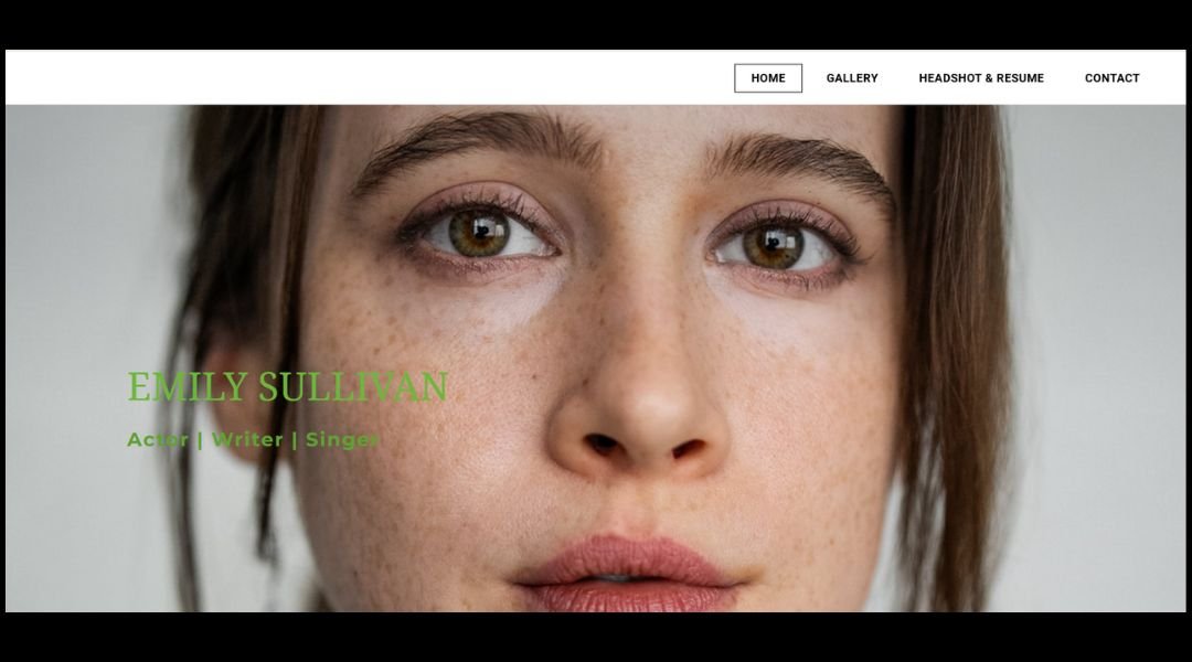
Emily Sullivan’s site opens like a stage light warming up—simple, steady, and ready to perform. It doesn’t overwhelm with flash. Instead, it invites you in with clarity and purpose. A clean layout, grounded language, and a quiet focus on the craft.
Her homepage gets right to it: recent work, training, and a tone that’s all professionalism without losing personality. Whether she’s on stage or in front of a camera, Emily’s presence feels anchored—versatile without ever feeling scattered.
The resume and gallery are structured without being stiff. Headshots are expressive, but never forced. Her bio reads naturally, like a conversation with someone who’s been doing the work, not just chasing credits. It’s straightforward—and that’s what makes it strong.
What stands out most is consistency. From performance to presentation, nothing here feels performative. Just talent, dedication, and the kind of ease that only comes with experience. Emily’s site isn’t loud. It’s ready—and that speaks louder than anything.
12. Rubens Cantuni
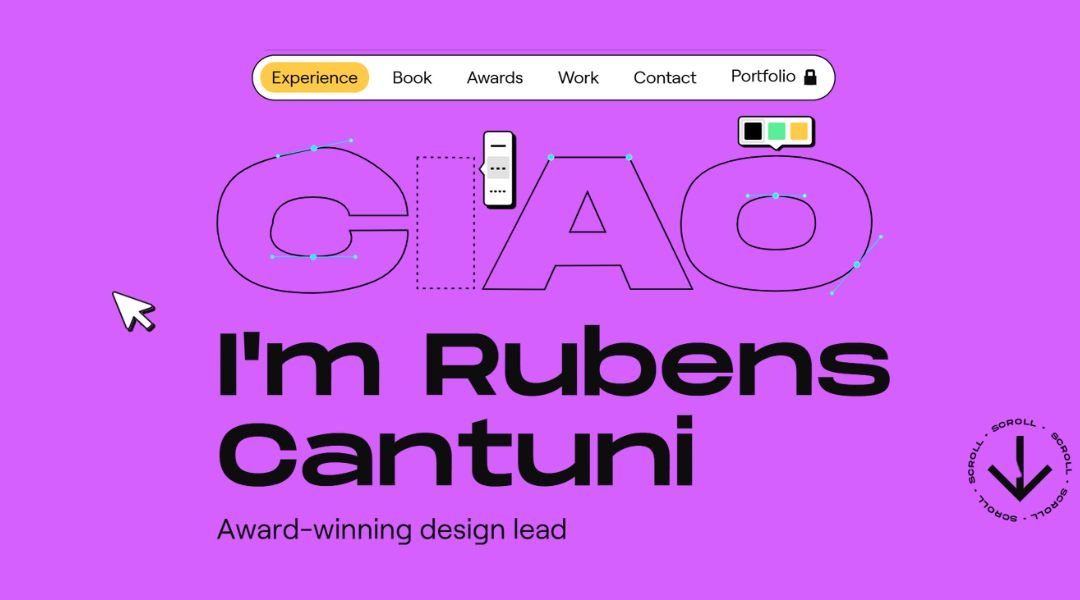
Rubens Gilbert’s site doesn’t just show design—it feels designed. From the moment you land, the layout is clear, calm, and intentional. There’s no clutter, no guesswork—just bold typography, confident spacing, and a rhythm that mirrors his work: clean, focused, and quietly inventive.
His portfolio spans branding, UX, and visual systems, but it never feels stretched. Each project is framed with care, giving just enough insight to understand the challenge—without overexplaining the outcome. He lets the visuals carry the weight, and they do.
The “About” section is refreshingly no-nonsense. A few lines, sharp and self-aware. You get a sense of someone who’s not trying to impress with buzzwords—just someone who knows what they’re doing and enjoys doing it well.
What stands out most is restraint. The design doesn’t beg for attention—it holds it. Rubens makes space for the work to breathe, and the result is a portfolio that doesn’t push. It flows—like someone who’s figured out that clarity beats flash, every time.
13. Jey Austen
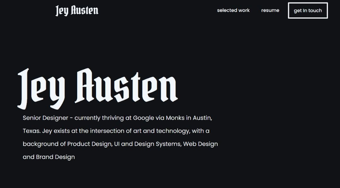
Jey Austen’s site opens like a quiet moment of clarity. Simple layout, clean lines, and visuals that land with intention. There’s no rush, no noise—just the kind of thoughtful pacing that mirrors how they work: focused, empathetic, and precise.
Their portfolio moves across design, art direction, and storytelling—but never feels fragmented. Each project is introduced with just enough context to invite you in, then lets the work speak for itself. Nothing is over-polished, but everything is considered.
The “About” page reads like someone who knows how to listen as well as lead. It’s honest, grounded, and refreshingly human. You don’t get a wall of accolades—you get a clear sense of purpose and perspective.
And that’s the strength of the site overall: quiet confidence. Jey isn’t performing design—they’re practicing it. With care, with curiosity, and without unnecessary fluff. It’s a portfolio that doesn’t need to shout to be remembered. It just needs a moment—and it earns it.
14. Allison Driscoll
Allison Driscoll’s website doesn’t over-introduce itself—it just starts a conversation. From the first glance, it’s clear this is someone who values clarity over flash. The layout is minimal, the navigation direct, and the tone refreshingly no-nonsense.
Her work spans digital accessibility, civic tech, and product leadership—and it all holds together with intention. The projects aren’t just listed; they’re framed with purpose. You understand what mattered, what changed, and how it was done—with zero buzzword filler.
Her “About” page does what it should: gives you the context without the fluff. You learn about her values, her experience, and her drive to make technology more inclusive. It’s sharp, grounded, and personal without turning into a pitch.
The overall experience? Steady, honest, and thoughtfully put together. There’s no loud branding or overdesigned distractions—just real work, clear results, and a sense that Allison’s not just building products—she’s building trust. It’s the kind of portfolio that feels like the work itself: accessible, intentional, and built to last.
15. Jessica Hopper
Jessica Hopper’s site opens like her writing—unapologetically direct, but full of depth if you’re paying attention. It’s minimal in design, but rich in presence. A plain background, simple text, and a quiet refusal to over-explain. It doesn’t try to sell you anything. It simply is.
Her work spans decades, genres, and mediums—but you won’t find it flaunted. Instead, the site functions almost like a bibliography with backbone. Books, essays, liner notes—it’s all there, but delivered without fuss. The confidence comes not from design flourishes, but from a body of work that’s already done the talking.
What’s most striking is the restraint. There’s no performance here, no curated persona. Just the essentials, delivered with the same clarity and conviction that’s shaped her voice as a critic and author.
It’s less a portfolio, more a timestamp. A quiet archive of a writer who’s helped shape the way music gets talked about—with grit, honesty, and zero tolerance for fluff. The site doesn’t shout. It trusts you to know why you’re there.
16. Tobias Becs
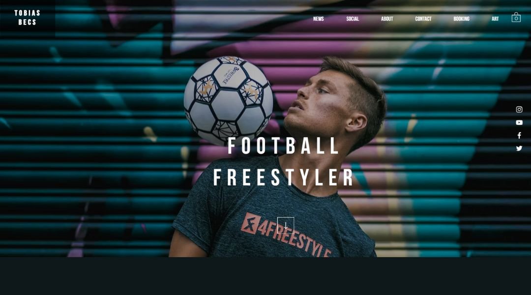
Tobias Becs doesn’t just freestyle—he’s built an entire world around it. His site opens with motion, energy, and a clear sense of purpose. It’s sleek, high-contrast, and instantly athletic. No wasted clicks, no filler—just a direct line into who he is and what he’s created.
From world titles to founding 4Freestyle, Tobias blends performance and entrepreneurship like second nature. The visuals hit hard: crisp action shots, bold text, and a pace that mirrors his movement—fast, fluid, and locked-in.
What makes the site work is how it balances personality with professionalism. You get the legend, but you also get the builder. Whether you’re a fan, a brand, or a curious visitor, it’s easy to understand what he does and why it matters.
Each section is intentional—products, videos, appearances—it’s all dialed in. There’s no pretending here. Just a world-class athlete who’s expanded the sport he helped define, and who’s still pushing its limits.
The site doesn’t just represent Tobias. It moves like him: precise, bold, and never standing still.
17. Brooke Applewhite
Brooke Barker’s site feels like opening a sketchbook you didn’t know you needed. It’s simple, warm, and completely disarming—in the best way. No flashy intros, no hard sell. Just quietly funny illustrations, surprising animal facts, and a tone that feels like a friend with excellent timing.
Her projects—Sad Animal Facts, Let’s Be Sad Together, and more—are laid out with clarity and charm. You don’t have to dig to find the work, and you’ll likely leave with a screenshot or three. Every page carries her signature mix of heart and humor: deeply relatable, occasionally weird, and always human.
The site keeps things light, but not shallow. Brooke’s voice is present in every corner—from the copy to the illustrations to the quiet way she lets vulnerability shine without making it a spectacle.
What stands out most? She makes sadness funny without making it small. And that’s not easy. Her site isn’t just a portfolio—it’s a place you’ll want to come back to, even if you’re not sure why. (Hint: it’s the tiny squid crying about his arms.)
18. Aaron Hinton
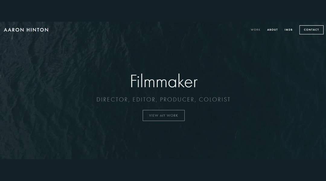
Aaron Hinton’s site doesn’t distract—it directs. Right away, you’re met with a clean visual field and crisp typography. No bells, no overbuilt navigation. Just work that’s given space to speak, and a designer who clearly understands how to say more by showing less.
His portfolio spans design, art direction, and creative strategy, with a focus on systems that feel human. Each project is framed with intention—minimal context, maximum clarity. Whether it’s brand identity or editorial work, you sense the same core instinct: get to the point, but get there with style.
The “Info” page reads like his design: clean lines, no extra weight. You get a sense of who he is, where he’s been, and what he values—without having to scroll forever.
What stands out most is control. The whole experience feels tight, steady, and refreshingly unpretentious. It’s not trying to impress with volume. It’s focused on the right things, at the right size, in the right order. Which is kind of the point of good design, right?
19. Gracie Wilson
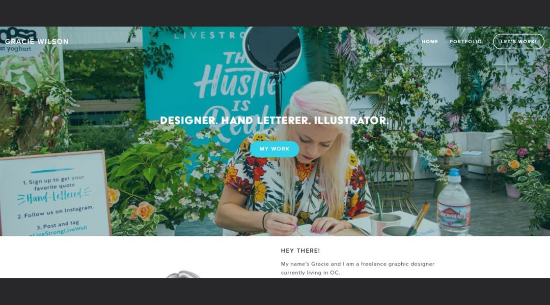
Gracie Wilson’s site is quiet, but it listens. From the first scroll, you’re pulled into a space that feels equal parts gallery and diary—clean layout, soft typography, and imagery that lingers. It’s not built to shout. It’s built to connect.
Her work spans photography, writing, and storytelling that’s rooted in observation. Each project unfolds gently—photos that feel like memories, text that reads like a friend reflecting rather than performing. It’s personal, but never precious.
The “About” page reads just right. You don’t get a long résumé; you get a person. Gracie’s voice comes through in the pauses, the phrasing, and the calm honesty behind the words. It’s more conversation than pitch, and that’s the charm.
This isn’t a portfolio that begs for attention. It holds space—for nuance, for quiet, for the kind of stories that often get overlooked. The work invites you in, but never tells you what to feel. That’s rare.
Gracie’s site doesn’t just present her work. It reflects how she sees: gently, clearly, and always with care.
20. Eldridge Doubleday
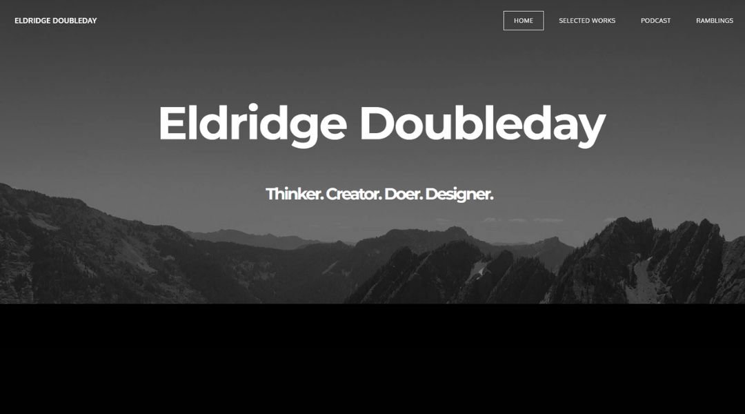
Eldridge Doubleday’s site doesn’t aim for spectacle—it goes for clarity. From the landing page, it’s all structure: balanced layout, clean type, and a sense that everything has a reason to be exactly where it is. No noise, no fluff—just the work, presented with focus.
His projects cover architecture, installations, and spatial design, with a quiet attention to detail that rewards slow looking. Each page gives you room to take in the material—measured captions, strong imagery, and a rhythm that mirrors the built environments he works with: intentional and grounded.
The “About” section keeps it simple. Background, experience, and approach—all delivered in a tone that’s honest, direct, and refreshingly free of jargon. You get a strong sense of someone who cares about precision—not just in form, but in thought.
What makes the site stand out is how little it tries to stand out. It reflects the work it houses: calm, precise, and built to last. Nothing performs. Everything holds.
Conclusion
If you’ve made it this far, you’ve probably realized there’s no one way to do a website resume right. But there are definitely better ways than another lifeless PDF floating in someone’s inbox.
Each of the 20 examples I shared brings something to the table—clarity, personality, structure, or a bold choice that makes it stick. That doesn’t mean you need to copy them pixel for pixel. Instead, pick what feels true to your style, your work, and how you want to be remembered.
My advice? Keep it clear. Keep it human. And don’t be afraid to show a little personality—even if it’s just through a typeface that doesn’t scream “default setting.” Your online presence should feel like you, not a template filling space.
Because the goal isn’t just to be seen. It’s to be remembered.

