When I started working on travel website projects, I did what most of us do — opened 30 tabs, got overwhelmed, then ended up clicking on flight deals instead of focusing on design.
So, I decided to gather some sanity-saving inspiration. Real websites. Real brands. No filler. These examples helped me sharpen my ideas and figure out what actually works — not just what looks nice in a template.
If you’re creating a travel site, refreshing one, or just curious how others make wanderlust feel this organized, this list might just help. And no, it won’t tell you to “embrace the journey.” Promise.
Here’s what you’ll find:
- A quick peek at 20 real travel websites that actually function well
- What each site does right (and where it gets a little creative)
- Simple takeaways you can apply to your own project
- And yes, a few subtle surprises that prove travel sites don’t all need palm trees on the homepage
Let’s keep it simple, visual, and actually useful.
1. Travel + Leisure
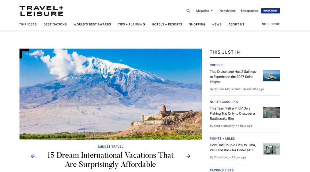
Nina Patel’s travel site doesn’t just list destinations — it makes them feel personal. Based in Seattle, Nina is a photographer and storyteller who documents places through people, local food, and unexpected side streets. Her homepage skips the fluff and goes straight into a vivid, slightly grainy photo from a coastal village in Sri Lanka — a moment mid-conversation, not mid-pose.
Instead of relying on glossy edits or crowded tourist shots, Nina shows the quieter beauty of travel. Her About page is refreshingly down-to-earth. You’ll find her favorite mode of transport (bikes), her go-to meal (noodles, always), and a few thoughts on traveling slow. It’s not a résumé — it’s a window into how she sees the world.
There’s also a blog, but don’t expect “Top 10” lists. Think more like “I Got Lost and Found the Best Soup.” If you enjoy stories that feel honest and maybe a little messy (in the best way), Nina’s site will feel like a good conversation — the kind you don’t want to end too soon.
2. Airbnb

Airbnb doesn’t just offer places to stay — it hands you a spare key to someone else’s world. Open the app, and you’re just a few taps away from a treehouse in Oregon or a loft in Lisbon. The experience feels less like booking a room and more like borrowing a life, temporarily.
What sets it apart? Personality. Each listing has a story, even if that story involves a squeaky floorboard and a cat named Milo. The platform invites hosts to show off quirks, not hide them. You’re encouraged to browse like a human — with filters like “OMG!” and “caves” if you’re feeling dramatic, or “design gems” if you drink espresso without sugar.
Their homepage is crisp, with generous white space and big, inviting photos that make staying home feel like a mistake. Meanwhile, the interface is intuitive — you never feel lost, even when searching for a place where the Wi-Fi works and the view is good enough to ruin your productivity.
In short: Airbnb gets that where you stay matters. It just makes it way more fun to find out where that might be.
3. New York Times Travel
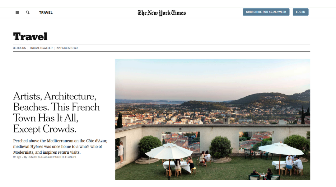
The New York Times Travel section doesn’t shout — it quietly hands you a passport and a reason to care. Each piece reads less like a brochure and more like a friend who travels smarter than you and remembers the names of cafés.
What makes it work? Depth without drag. You won’t just get, “Here’s a cool place.” You’ll get context — history, locals, and yes, the name of that perfect bakery with the warm rolls at 6 a.m. The stories skip the clichés and focus on how travel actually feels: beautiful, unpredictable, and occasionally delayed.
The layout is clean, focused. Headlines don’t scream, they invite. “36 Hours in Barcelona” doesn’t feel like a listicle — it feels like a plan made by someone who’s been, stayed too long, and has notes.
It’s also not afraid to slow down. From hidden trails in Japan to revisiting a city post-lockdown, there’s a sense that where you go matters, but how you go matters more.
If you travel to learn, not just escape, this section’s already packed your bag.
4. Costco Travel
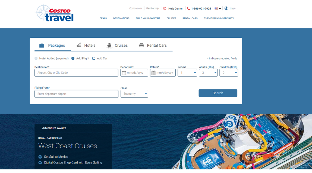
Costco Travel feels a bit like a secret you only hear from someone who’s really good at planning — or really into spreadsheets. It’s not flashy. No autoplay videos. No pop-ups shouting “LAST MINUTE!” And yet, here it is, quietly offering vacation packages that make your wallet and your inner travel nerd equally happy.
From all-inclusive beach stays to rental cars that don’t cost more than your flight, the site focuses on the basics — in the best way. You pick where you want to go, and it does the rest, including perks like extra discounts or added excursions. It’s like booking through a friend who’s unusually well-connected and oddly obsessed with travel value.
The design isn’t about wanderlust — it’s about clarity. Clean lines, clear filters, and no-nonsense navigation. You’re not distracted by drone footage or ambient ukulele music. You’re just getting deals.
And yes, you do need a Costco membership. But if you’ve ever bought a 40-pack of granola bars and felt good about it, chances are you already qualify.
5. Lonely Planet
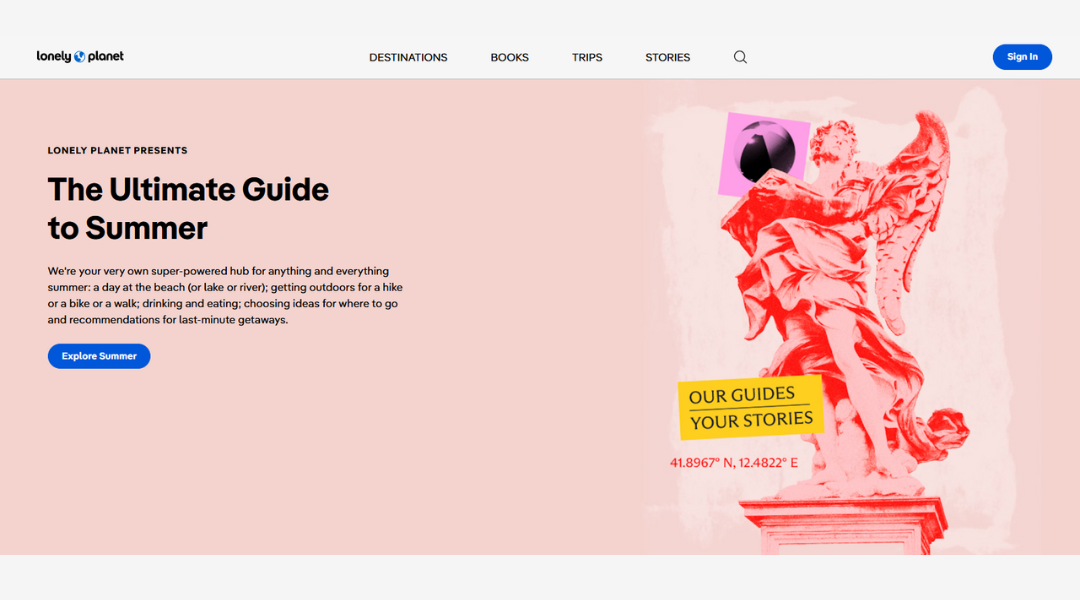
Lonely Planet isn’t here to sell you a vacation — it’s here to make you want one. And not just the postcard version. Their site feels like a well-traveled friend who knows the best bookstore in Kyoto and also how to not get ripped off by a cab in Lima.
It’s part guidebook, part inspiration board, and part gentle push to go somewhere that might not even have Wi-Fi. Articles cover everything from “hidden gems” (that are actually still hidden) to practical tips like when not to visit a city — refreshingly honest.
The layout is clean but packed with content. You can wander for hours, and somehow end up planning a weekend in Portugal even though you were just looking for a packing list. It happens.
They spotlight stories, not just places. That means local voices, real experiences, and plenty of “oh, I never thought of that” moments.
In short: if you’re the kind of traveler who enjoys the journey as much as the destination — maybe even more — Lonely Planet speaks your language. And probably knows a few others, too.
6. Expedia
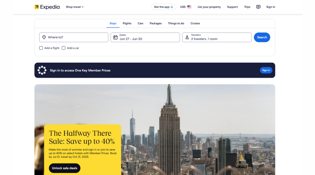
Expedia is like that friend who’s been everywhere and somehow still remembers your birthday. Flights, hotels, cars, packages — all in one place, minus the chaos. It doesn’t try to reinvent travel planning. It just makes it… work.
The homepage feels familiar — but that’s the point. It doesn’t ask you to solve a puzzle. Just type where you’re going, when you’re going, and whether or not you need a hotel with a pool big enough to keep your kids occupied for at least two hours.
There’s also a rewards program. Nothing complicated — book a few things, earn points, save money later. It’s the loyalty program equivalent of a high-five.
What really stands out is how flexible it feels. Need to cancel? Change your mind? Forgot you hate layovers? Expedia usually has options that don’t involve sitting on hold for three hours.
In short, if you like having choices and dislike drama, Expedia’s setup will probably suit you. It’s practical, user-friendly, and doesn’t judge if your entire trip revolves around room service and sleeping in.
7. The United States Department of State – Travel
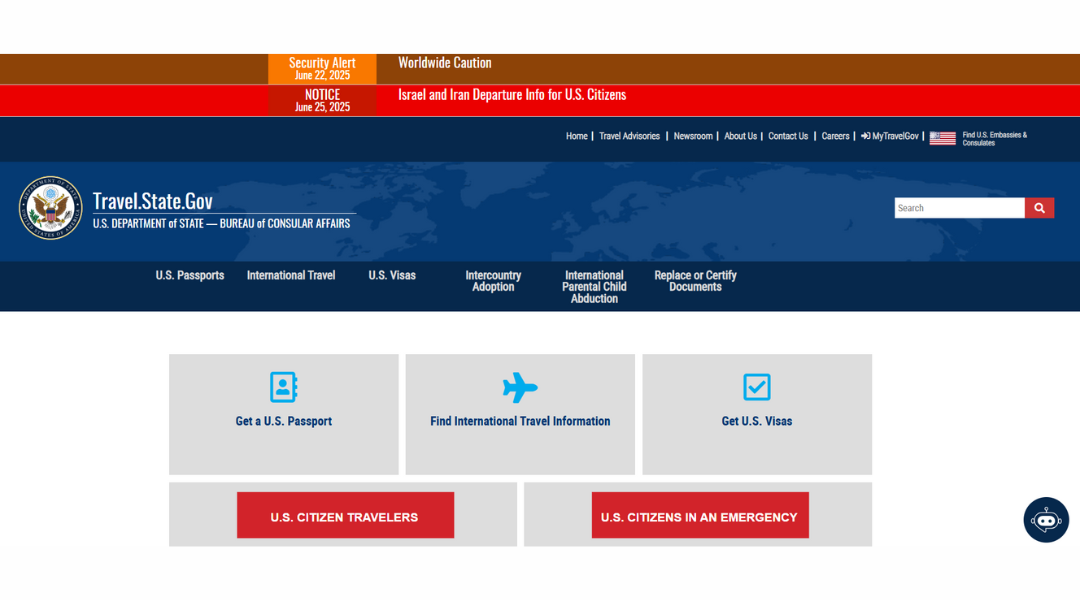
This isn’t the site you visit for dreamy sunsets or hotel inspiration. Travel.State.Gov is where you go before the trip — to make sure your passport isn’t expired, your destination isn’t in the middle of a political crisis, and you won’t unknowingly bring back something you shouldn’t (like a fine).
It’s run by the U.S. Department of State, which means the tone is serious — but the info is solid. Need a travel advisory? Got it. Looking for entry requirements, embassy contacts, or how to replace a lost passport in a hurry? Also here. There’s even a section to enroll in alerts so you’re not the last to know if something important changes mid-trip.
Design-wise, it’s more function than fashion. But everything is labeled clearly and built for people who just want answers fast. Think of it as your pre-travel checklist’s best friend.
Is it exciting? No. Is it important? Absolutely. Travel.State.Gov isn’t here to inspire you — it’s here to keep your trip from going sideways.
8. Kayak
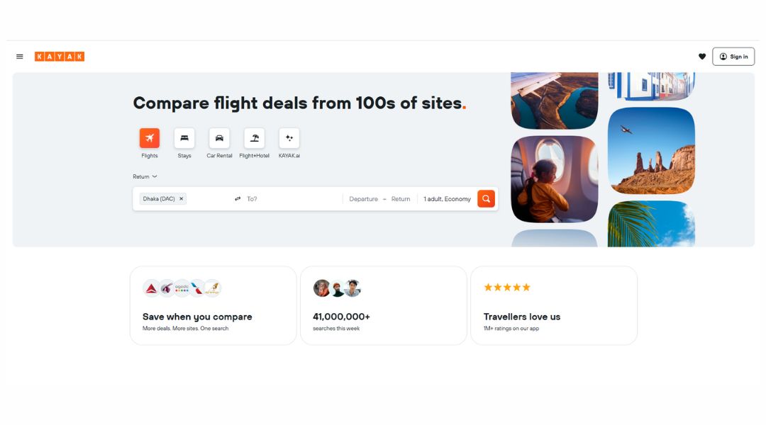
KAYAK isn’t a travel site that holds your hand. It hands you every flight, hotel, car, and deal — and lets you do the clicking. Think of it as the search engine for people who like options. Lots of them.
Right from the homepage, it’s clear: this isn’t about glossy destination guides or dreamy travel quotes. KAYAK is built for the efficient traveler. The “Let’s just see what’s out there” type. You plug in your dates, maybe a vague idea of where you’re headed (or not), and it pulls prices from just about everywhere.
There are filters for everything — nonstop flights only, hotel ratings, legroom, refundable bookings — so you can fine-tune your plans without losing your mind. The interface is clean, the results are fast, and if something’s a good deal, they’ll tag it for you like a helpful friend whispering, “Grab it now.”
They even have a “Explore” tool, which is basically code for “I need a vacation but haven’t figured out where.” KAYAK gets that. And it quietly makes you feel like the most organized traveler in the room — even if you’re still packing two hours before takeoff.
9. Bus2Alps
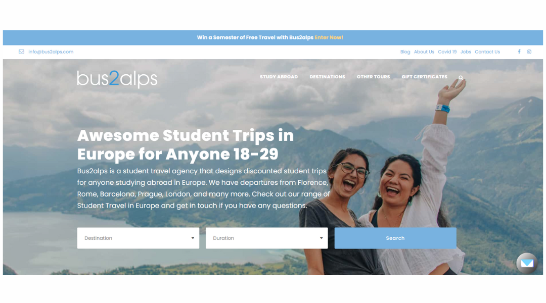
Bus2Alps is basically the friend who convinces you to book the trip — and then actually figures out the details. Aimed at students and young travelers studying in Europe, it turns “someday” trips into weekend plans with prices that don’t make you flinch.
The site keeps it simple. You pick your city, your date, and suddenly you’re on your way to places like Prague, Amalfi, or Interlaken — often with a built-in group of fellow travelers who are just as excited and slightly sleep-deprived. It’s less luxury resort, more shared adventure (with optional karaoke on the bus).
Each trip comes with a human guide, real recommendations, and just enough structure to make sure you don’t accidentally miss the boat — or the train, or the sunrise hike. The site’s design is clean, youthful, and easy to use, with just the right amount of “get-up-and-go” energy.
If you’re abroad, short on time, and big on stories, Bus2Alps makes seeing Europe feel less overwhelming — and way more fun.
10. Pro Travel International
Protravel isn’t your average “click and book” site — it’s more like having a travel-savvy friend who also happens to know every hotel manager on Earth. The homepage feels polished, with just enough luxury to make you sit up straighter without feeling underdressed.
This is a service built for people who don’t want to guess. Whether it’s a honeymoon in the Dolomites or a three-stop business trip with no room for error, Protravel connects you to actual advisors — yes, real people — who make travel less stressful and way more personal.
You won’t find a flash sale countdown or an AI chatbot pretending to care. Instead, you’ll see curated experiences, smart recommendations, and the subtle promise that someone else is handling the chaos behind the scenes. The kind of site where your time feels respected — and so does your taste.
Bottom line: if you’re after meaningful, smooth, and well-executed travel without spending three nights comparing airport codes, Protravel might just be your best-kept secret. (Just don’t be surprised when your trip starts with champagne.)
11. AAA Travel
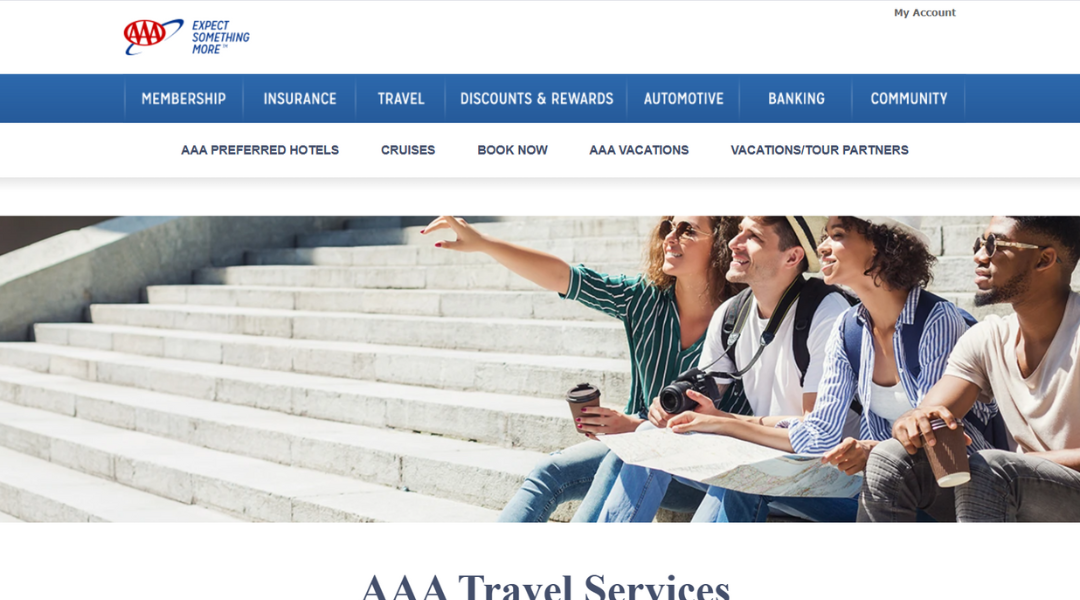
AAA Travel is like that dependable friend who always knows when to leave for the airport — and somehow finds better hotel rates than you. It’s not about trendy filters or splashy design. It’s about planning that actually works.
The site brings together cruises, road trips, guided tours, and hotel bookings without making you scroll endlessly. Everything’s organized, practical, and refreshingly un-glamorous in a way that says: “We’ve done this before. You’ll be fine.”
Need a car rental? Done. Looking for a vacation package that won’t eat your savings? Also here. AAA even throws in travel insurance and member perks without turning it into a scavenger hunt. It’s efficient — like booking with someone’s very prepared parent (who also knows a thing or two about discounts).
The real charm? Peace of mind. AAA has been around long enough to earn your trust, and the site reflects that — no fuss, no chaos, just plans that make sense.
In short, if you like your vacations organized, your maps folded (or digital), and your deals up front, AAA Travel is probably already your style — whether you realized it or not.
12. Travelocity
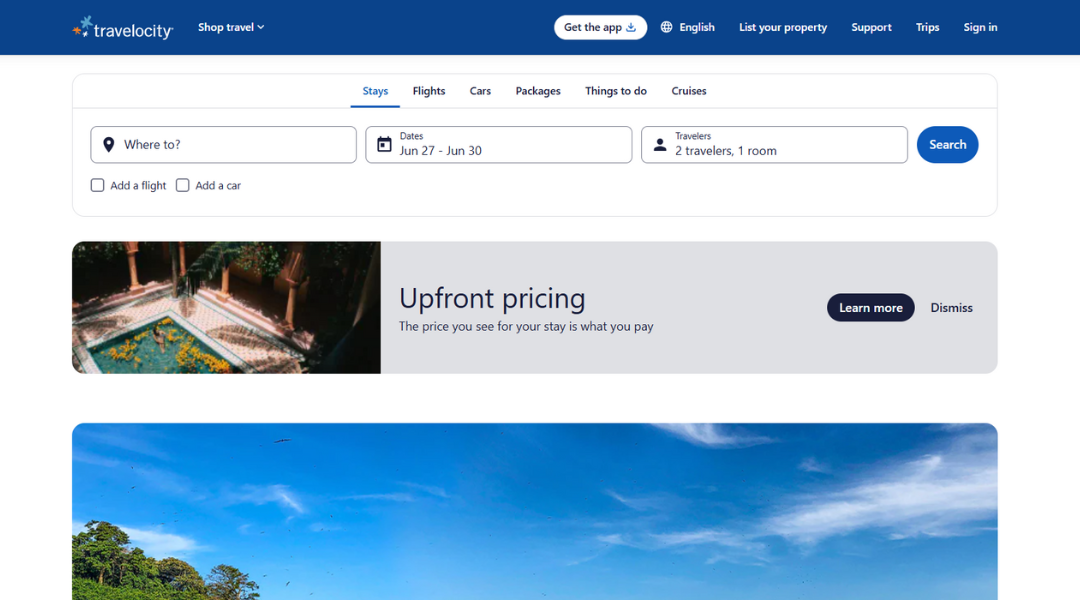
Travelocity gets straight to the point: you want to go somewhere, and you don’t want to spend three hours comparing tabs. Flights, hotels, cars — it’s all in one place, without the digital drama. The gnome mascot? Still charming. Still oddly persuasive.
The homepage keeps things simple. Search bar up front, deals just below, and no mysterious “hidden” fees when you click through. It’s not trying to be a lifestyle brand. It’s a travel tool — and a pretty efficient one.
One standout? The “Vacation Packages” section, where bundling your trip can save you enough to justify that airport cinnamon roll. Plus, the Price Match Guarantee means you won’t lose sleep wondering if you should’ve waited for Tuesday.
Travelocity doesn’t overwhelm you with buzzwords or endless sliders. It’s more like, “You going somewhere? Great. Let’s find the best way to get there.” Fast, reliable, and refreshingly unpretentious.
If you’re the kind of traveler who just wants to book it and get moving — without having to decode an entire travel blog first — this is your spot.
13. Smart Trip
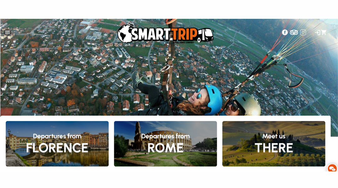
Smart Trip isn’t your average tour company — it’s the friend who knows where to go, what to skip, and which gelato shop is actually worth standing in line for. Based in Italy, it caters to students and young travelers who want to see more than just postcards and piazzas.
The site itself is as straightforward as their itineraries. You’ll find trips across Italy and Europe, clearly priced and packed with details that matter (like Wi-Fi on the bus and group discounts that won’t destroy your weekend budget).
Unlike some travel platforms, Smart Trip doesn’t try to impress with fancy animations or vague promises of “life-changing experiences.” Instead, it tells you exactly what you’re getting: transportation, tours, fun people, and maybe a late-night karaoke moment you’ll half-regret but never forget.
Their About page leans casual — because so do they. It’s a travel style that favors real connections over rigid plans. You’re not just sightseeing. You’re traveling with a crew.
If you’re young, curious, and okay with sharing snacks on a bus ride through Tuscany, Smart Trip might just be your kind of adventure.
14. Liberty Travel
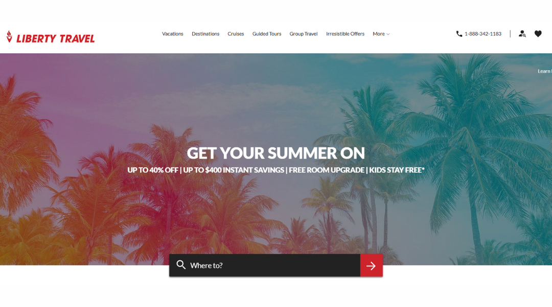
Liberty Travel is like having that one friend who always knows where to go, what to book, and how to avoid tourist traps. Only this friend has an entire team and a booking system. Whether you’re dreaming of Italy or just need a weekend escape that doesn’t involve washing dishes, Liberty Travel connects you to the trip — not just the flights.
Their strength? Real people. Yep, actual travel consultants who help plan your vacation without sending you five links and a “good luck.” The homepage keeps things focused. No visual chaos, just clear options — destinations, interests, and trip types — all waiting for your click.
You’ll find deals on everything from tropical getaways to family theme park bundles. They even have packages where you don’t have to think much at all — the trip, hotel, transport, done. For people who like travel but not travel planning, this is a win.
Liberty doesn’t just sell vacations. They help you book confidence — which is nice, because no one wants to second-guess their beach chair.
15. CNN Travel
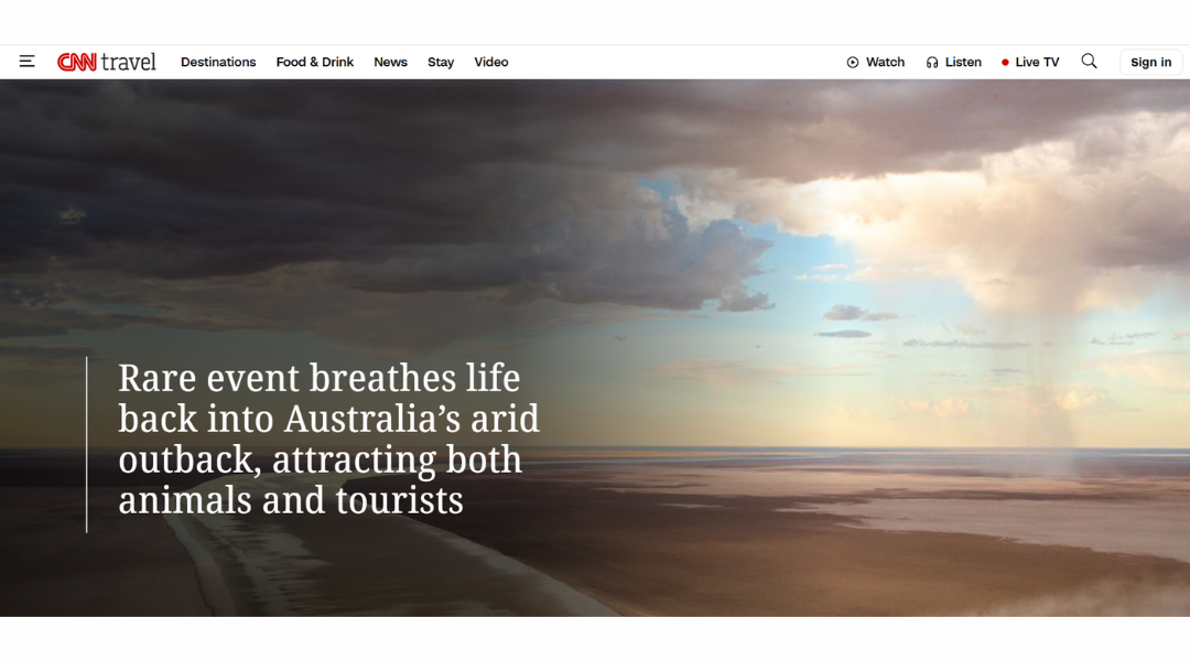
CNN Travel reads like that well-traveled friend who knows every airport lounge, never misses a headline, and still somehow finds time to track the world’s best noodles. It’s news-first, but with a passport.
Unlike traditional travel blogs, this site doesn’t just ask where you want to go — it tells you what’s happening there right now. New visa rules? It’s covered. Airline strikes? Yep. World’s top beaches list just dropped? You’ll find that, too — likely with a few you’ve never heard of (and now suddenly want to visit).
The layout is simple, driven by big images and bolder headlines. You won’t get lost in fluffy filler or endless sliders. Instead, it’s story after story that’s both useful and oddly bingeable — like travel planning meets breaking news.
There’s also a nice balance between practical tips (yes, you still need a passport) and inspiration, whether you’re chasing sunsets or just daydreaming at your desk. It’s travel journalism with its shoes on — ready to go, but still fact-checking the route.
16. JetBlue
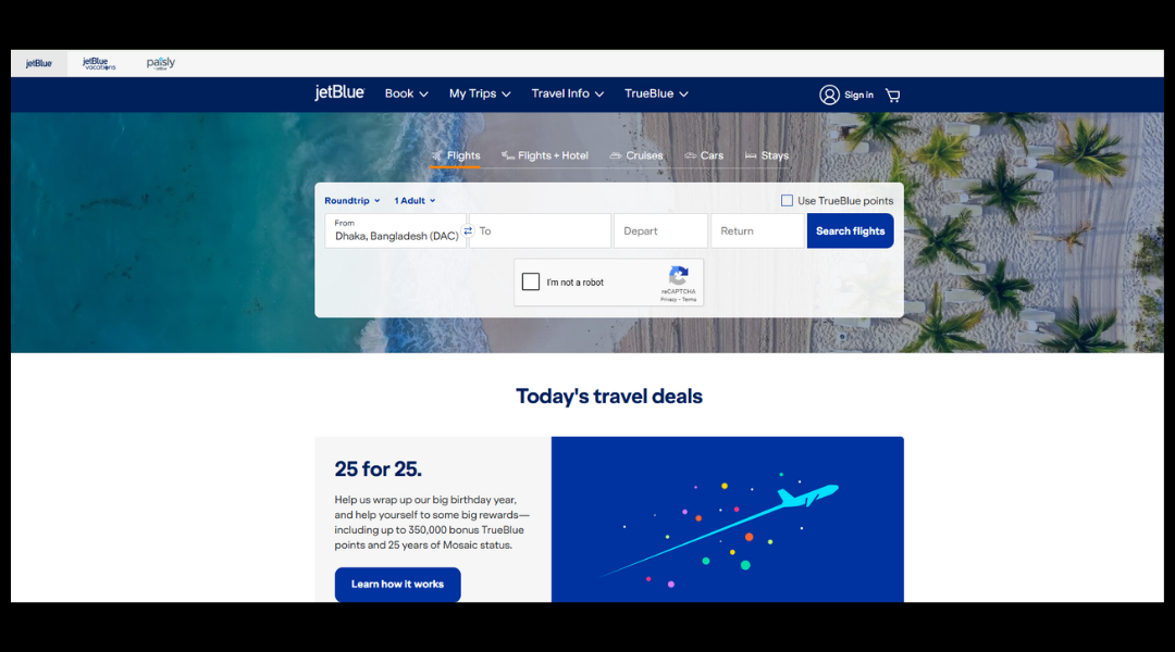
JetBlue doesn’t try to be everything to everyone — just really good at getting you from Point A to Point B without making you question your life choices. From the moment you open their site, the message is clear: clean design, easy booking, and none of the “wait, what fee is this?” confusion you might find elsewhere.
Flights come with legroom you don’t have to fight for, snacks that don’t feel like an afterthought, and Wi-Fi that actually works (most of the time). There’s even a seatback screen so you’re not stuck watching someone else’s rom-com on mute.
The website keeps things simple. You can search, filter, and compare without needing a manual. Plus, if you’re part of their TrueBlue program, those points start to add up faster than you’d expect — especially if you tend to “accidentally” plan weekend getaways.
JetBlue isn’t shouting to get your attention. It’s just calmly offering good flights, solid service, and the occasional free bag of blue chips. And sometimes, that’s exactly what flying should feel like — straightforward, with a hint of personality.
17. Trip Advisor
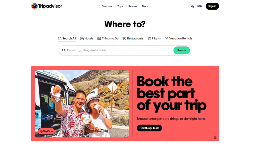
Tripadvisor is like that extremely organized friend who not only reads reviews — they write them, color-code them, and probably make a spreadsheet for fun. It’s not just about booking hotels or tours; it’s about knowing what you’re getting into before your suitcase hits the ground.
Open the site, and you’re greeted by a buffet of options: flights, restaurants, activities, and those super specific traveler tips like “ask for a corner room — it’s quieter.” With millions of reviews, you can filter by budget, vibe, or the all-important “free breakfast.”
The interface is straightforward. No guessing games. Each listing gives you the highlights (and lowlights) in real language from real people. Sometimes helpful. Sometimes oddly passionate about scrambled eggs.
And then there’s the forum — part Q&A, part therapy group for over-planners. Whether you’re debating carry-on sizes or obsessing over train schedules in Italy, someone’s already been there. Probably twice.
Bottom line: Tripadvisor isn’t just for booking — it’s for decision-making. And maybe, just maybe, avoiding that one hotel with “great location” and mysteriously low lighting in every photo.
18. BBC Travel
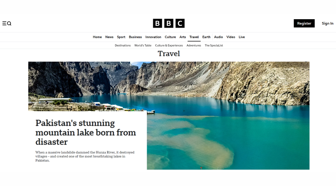
BBC Travel isn’t trying to sell you a flight deal. It’s here to tell you why Mongolian throat singing matters, or what breakfast in Bhutan says about the culture. Less “vacation planning,” more “your passport just got curious.”
The homepage greets you with striking images — not staged, not filtered, just real. There’s a sense that these aren’t places someone passed through in a rush. Writers linger. They talk to locals. They ask odd, wonderful questions — like why people in Sardinia live so long, or what makes a small Finnish town feel like a fairy tale.
Each story reads like a postcard from someone who really paid attention. The tone is thoughtful, not touristy. You won’t find listicles or packing tips — just deep dives into places, traditions, and the human side of travel.
Design-wise, it’s elegant but unfussy. Headlines speak directly. Navigation is smooth. You scroll, you click, and suddenly you’re learning about a remote island where cats outnumber people.
If travel is about curiosity, BBC Travel doesn’t just scratch the surface — it politely asks for tea and stays a while.
19. ViaHero
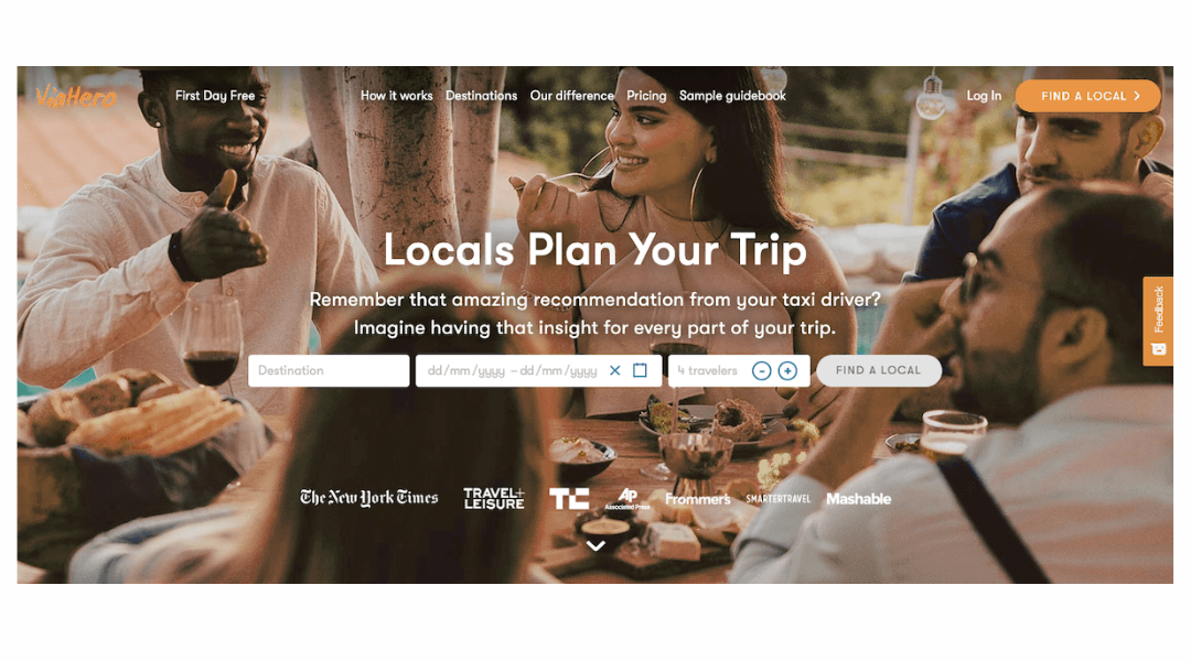
ViaHero is what happens when travel planning meets local wisdom—and skips the awkward group tours. The idea’s simple: you pick a city, and a real human who actually lives there builds your trip. No chatbots, no guesswork, and definitely no “hidden gems” that happen to be packed with tourists.
The site itself is refreshingly straightforward. No big banners or countdown timers pressuring you to book. Instead, you get real profiles of locals—writers, artists, foodies—each ready to create a custom plan based on your vibe, not just your budget. Want a week of museums and matcha in Tokyo? You got it. Prefer hiking trails and zero small talk in Patagonia? Also possible.
What’s nice is the balance. You get a full itinerary, but you’re still in control. It’s like traveling with a friend who sends you detailed Google Maps links, but doesn’t expect you to wait while they finish their coffee.
In short: ViaHero is for travelers who want authentic experiences without spending their nights reading through review sites at 2 a.m. It’s smart, personal, and just organized enough to keep things fun.
20. Virtuoso
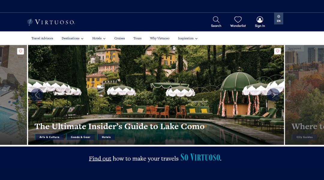
Virtuoso isn’t for booking quick weekend getaways. It’s for trips that involve real thought — and probably luggage that doesn’t have wheels squeaking at the airport. This is where travel gets personal, polished, and just a little indulgent (in the best way).
The site itself feels calm — soft tones, easy navigation, and no pressure tactics. Instead of pushing deals, it invites you to explore: private villas in Tuscany, remote island resorts, once-in-a-lifetime rail trips. And if you’re not quite sure where to start? There’s a human for that. Actual travel advisors who ask what you want — and then plan around it.
Every section offers inspiration, but not the generic kind. The kind that reminds you travel isn’t just about where you go — it’s about how it feels when you get there. Whether you’re celebrating something big or just want someone else to handle the planning, Virtuoso delivers the kind of service that makes you feel quietly VIP.
In short: it’s travel with polish, without the pressure.
Conclusion
After going through all 20 sites, one thing became clear: there’s no single “perfect” way to build a travel website — but there is a smart way to do it for your goals.
Some lean on big visuals. Others keep it all business. A few just toss the rulebook and still pull it off beautifully. I learned a lot by studying them side by side — and I hope you did too.
Whether you’re building for a client, redesigning your own, or just stealing ideas for the mood board (no judgment), these samples prove one thing: function and personality can absolutely coexist.
And if this helped, I’ll consider it time well spent — and maybe finally close some of those tabs.


