When I started looking into great news websites, I wasn’t just interested in headlines or color palettes—I wanted to see how real publishers keep readers informed and engaged. Some sites scream “BREAKING” in bold red. Others take a more measured, scroll-worthy approach. Either way, a good news site needs to be fast, clear, and built for readers who don’t have time to waste.
So I pulled together 20 real news websites that actually work. Each one shows how content, layout, and trust come together. Some do it with simplicity. Others bring energy, motion, or even a little personality.
Here’s what you’ll take away from this post:
- Homepage formats that balance breaking news and long reads
- Navigation choices that make content easy to browse
- Layout tips for mobile-first audiences
- Ways sites use headlines, video, and visuals effectively
- A few subtle ideas that make users stay longer than planned
1. The New York Times
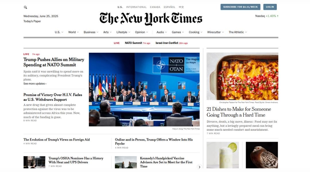
The New York Times doesn’t just publish news—it curates an experience. From the moment you land on the homepage, you know this site means business. Headlines are clear, photos draw you in, and the layout feels like it’s been through more planning than most people’s vacations.
What works especially well is how content is layered. You can skim for quick updates or dive deep into long reads, depending on how much coffee you’ve had. And the sectioning—Politics, Opinion, Culture—isn’t just for organization; it’s about helping readers find what matters to them fast.
Even the ad placements are smartly tucked in—not screaming for attention, just quietly existing. Kind of like that one colleague who’s always there, somehow everywhere, but never too much.
The real strength, though? Consistency. Whether it’s a breaking story or a weekend feature, the site delivers with polish and purpose. The New York Times online is a digital newsroom that respects your time while keeping you informed—and maybe, just maybe, a little more thoughtful by the time you click away.
2. CNN
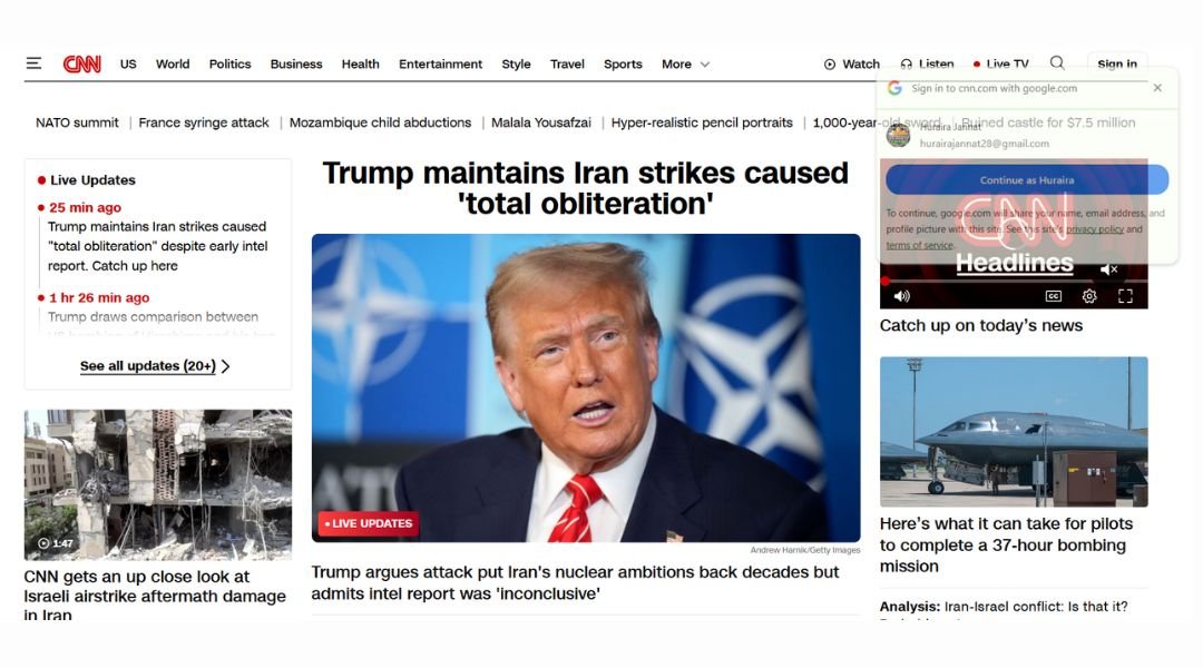
CNN’s website is built for people who want the news fast—and want it now. Right from the top, you’re hit with bold headlines, live updates, and video clips ready to play. It’s like walking into a newsroom where everything’s happening at once, but somehow, you still find your way.
The structure leans into urgency. Breaking news banners, real-time updates, and a steady stream of stories keep the homepage moving. But it’s not all noise. The site balances global events with lighter stories, opinion pieces, and features, giving readers a chance to breathe between updates.
Navigation is clear, though slightly stacked. You’ve got sections for politics, health, entertainment, and more—plus international editions for global readers. The video content is front and center, which fits CNN’s broadcast roots.
Overall, the site is designed for momentum. It doesn’t slow down, and it doesn’t expect you to either. CNN online delivers a steady drip of information for readers who want to stay informed and stay moving—whether they’re at a desk or on their third scroll of the morning.
3. BBC News
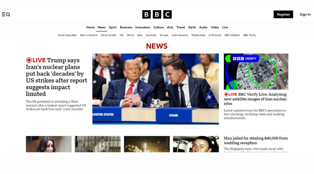
The BBC News website is calm, structured, and straight to the point—much like the tone it’s known for. There’s no flashing ticker or clickbait-style drama. Instead, you’re greeted with balanced headlines, crisp photography, and a clean layout that feels respectful of both time and intelligence.
The homepage leads with the biggest global stories, but scroll down and you’ll find thoughtful coverage on science, culture, health, and even a bit of sport (yes, British spelling included). Each section is neatly arranged, making it easy to hop between serious topics and human-interest pieces without feeling lost.
What stands out most is the tone. Articles focus on facts first, letting readers interpret without being nudged too hard. It’s steady, measured, and built for readers who prefer clarity over chaos.
Even the design choices reflect that mindset—minimal color, plenty of white space, and easy-to-read type. It’s not flashy, but that’s the point. BBC News isn’t trying to sell the news. It’s just here to report it—and it does that with a quiet confidence that’s hard to ignore.
4. Daily Mail
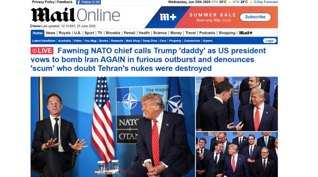
The Daily Mail website is anything but subtle—and that’s exactly its strategy. From bold headlines to a never-ending scroll of celebrity gossip, scandal, and breaking news, it’s designed to grab your attention and hold it like a tabloid in digital form.
The layout is busy. You’ll find top stories, sidebar teasers, and click-ready headlines packed tightly together. It might feel overwhelming at first, but for readers who love constant updates and drama, it delivers exactly what they came for—fast, flashy, and full of details you didn’t know you needed.
The mix of content is wide: politics, health, royal family news, and entertainment—often all on the same page. And let’s not forget the photos. Lots of them. Big, bold, and often front and center.
What the Daily Mail lacks in calm, it makes up for in energy. It doesn’t whisper the news—it shouts it, usually with all caps. If your style is “give me everything now, with pictures,” this site knows exactly how to keep you scrolling.
5. The Guardian
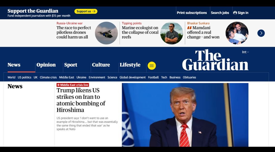
The Guardian’s website strikes a balance between journalism and personality. It delivers the news with clarity, but also isn’t afraid to show a little edge. The layout feels modern, the colors are subtle but purposeful, and the overall tone says: “We take this seriously, but we’re human too.”
At the top, you’ll find major headlines and live updates. Scroll a bit, and you hit opinion, culture, and long reads that go deeper than just the day’s drama. The mix is intentional—news for now, thoughts for later.
One thing that stands out? The writing. Headlines are sharp without being sensational. The content carries authority, but there’s room for wit, especially in commentary and features. It’s smart without being stiff.
The Guardian also makes its reader-supported model part of the experience, but not in a pushy way. A banner reminds you, politely, that good journalism needs backing—like a barista asking if you’d like to round up your total for a good cause.
Overall, The Guardian’s site is built for readers who want reporting with a point of view, a touch of personality, and a design that doesn’t get in the way. It’s thoughtful, fast, and just bold enough.
6. Fox News
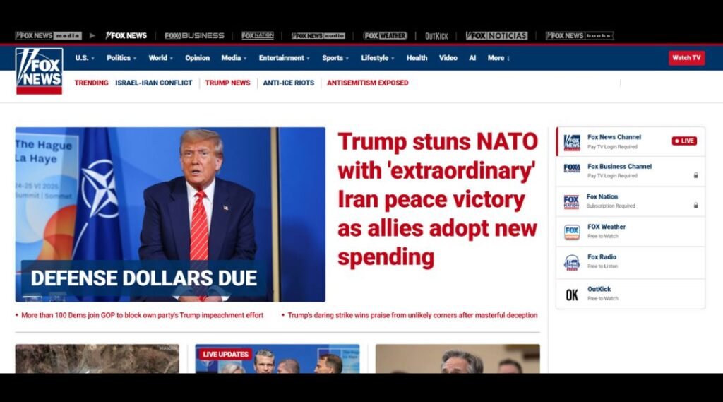
Fox News doesn’t ease you into the day—it throws you right into it. The homepage is bold, headline-heavy, and built for attention. From breaking political stories to viral videos, the layout is packed with content that’s loud, fast, and designed to grab your eye (and maybe both eyebrows).
Everything about the site pushes immediacy. Headlines are big, colors are high-contrast, and there’s always a video just a click away. Whether you’re interested in national politics, opinion pieces, or trending cultural moments, the sections are clearly labeled and easy to jump between—no guesswork required.
What’s consistent across the board is the tone: strong, direct, and unapologetically pointed. The site speaks to its audience with confidence, using language that’s meant to make you feel informed—and maybe fired up.
For readers who like their news with an edge and a fast pace, Fox News delivers exactly that. It’s less about easing into a story and more about diving into the middle of it. Not subtle, not slow—but definitely hard to ignore.
7. Times of India

The Times of India website is busy—but purposefully so. It reflects the pace and variety of life in India, with headlines covering everything from politics and business to Bollywood and cricket (sometimes all on the same scroll). If you’re looking for silence and white space, this probably isn’t your stop.
The layout packs in a lot—breaking news, trending stories, live updates, videos, and opinions. It’s fast-paced and content-heavy, but the sections are clearly labeled, helping readers jump straight to what interests them. Navigation may feel a bit crowded, but once you get the rhythm, it works.
What gives the site its energy is the blend of hard news with lifestyle and entertainment. Serious headlines sit alongside astrology, viral videos, and celebrity updates. It’s part newspaper, part town square.
While it might not win awards for minimalism, the Times of India doesn’t pretend to be something it’s not. It’s built for a wide audience with wide interests—delivering variety, immediacy, and a constant flow of what’s happening right now. Whether you’re skimming or diving deep, there’s always something new waiting just below the fold.
8. Infobae
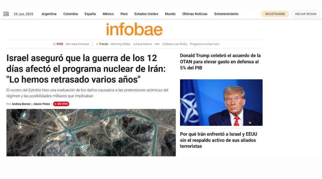
Infobae delivers news with energy—and lots of it. The moment you land on the site, you’re met with bold headlines, eye-catching images, and a feed that moves fast. It’s a layout designed to keep readers scrolling, clicking, and staying updated on everything from global headlines to local politics and pop culture.
The homepage feels dense but intentional. Top stories are placed front and center, followed by a wide range of categories: economy, sports, opinion, and more. It’s clear that the site is built for readers who want variety and don’t mind a little sensory overload along the way.
The tone leans toward direct and dynamic. Articles are easy to scan but packed with detail when you need it. Infobae doesn’t waste time—it gets to the point and keeps things moving. And with a strong presence in Latin America, its regional focus adds depth you won’t find on broader global platforms.
Infobae’s strength is in its momentum. It’s fast, it’s current, and it’s always on. For readers who like their news fresh, frequent, and full of action, it definitely delivers.
9. Corriere della Sera

Corriere della Sera blends tradition with urgency. As one of Italy’s most respected news outlets, its website reflects a classic journalistic style—layered headlines, tightly packed content, and a front page that feels like a modern-day newspaper, but in digital form.
The layout is dense but deliberate. You won’t find oversized headlines or endless white space here. Instead, there’s a steady rhythm of articles, categories, and opinion pieces that reward focused readers. From politics and economics to culture and lifestyle, it’s all just a scroll away.
There’s also a strong visual presence—photos, videos, and bold fonts help guide attention across the screen. And for those who like structure, the clear sectioning makes it easy to jump from national news to international updates, or from breaking stories to in-depth features.
While the site can feel a bit busy at times, it matches the pace and energy of its audience—readers who want more than just a headline. Corriere doesn’t just deliver news; it offers context, commentary, and continuity, all in one place. It’s serious journalism served with unmistakable Italian flair.
10. Marca
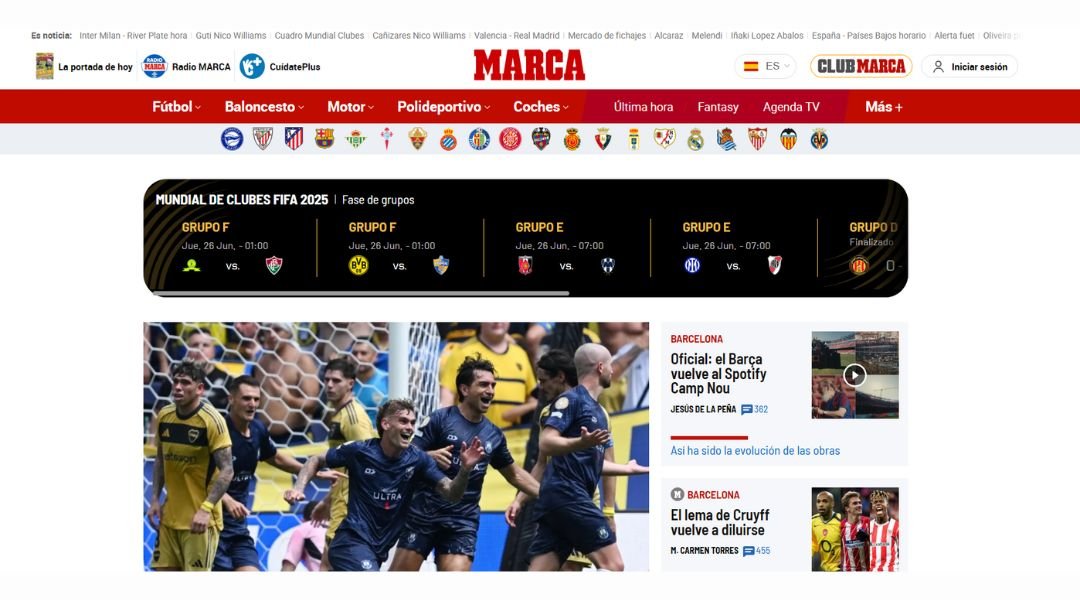
MARCA doesn’t tiptoe around the action—it jumps right into it. As one of Spain’s leading sports news sites, it delivers updates with energy, color, and zero hesitation. The homepage is packed with headlines, scores, transfer rumors, and everything in between. It’s loud, but in a good way—like a stadium on match day.
The layout leans into bold visuals and rapid-fire content. Football (of course) takes center stage, but there’s coverage across sports: basketball, tennis, F1, even eSports. If it moves fast or draws a crowd, it probably has a spot on MARCA.
Navigation is quick, though the sheer amount of content can feel like a full-time job to scroll through. Still, it’s clear they know their audience—fans who want updates now, opinions strong, and photos big.
MARCA’s style is part reporting, part adrenaline. It’s not pretending to be neutral on big match days—and that’s what keeps fans coming back. Whether you’re following La Liga drama or checking a live score from your lunch break, MARCA brings the game to your screen with all the noise and passion you’d expect.
11. UOL
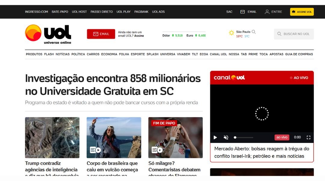
UOL is one of Brazil’s largest news and content portals—and its homepage makes that immediately clear. It’s packed with stories, videos, sports highlights, entertainment updates, and more, all layered in a busy but functional layout. Think of it as the digital version of a bustling newsstand: there’s a lot to look at, but it’s organized enough to keep you scrolling.
The site covers everything from breaking news and finance to gossip and game scores. While the design leans toward dense, it’s built for speed. Headlines are punchy, images pop, and the content is updated constantly, giving visitors a reason to come back often—sometimes multiple times a day.
There’s also a strong local focus. UOL doesn’t just report on global issues; it speaks directly to the Brazilian audience with regional stories, voices, and cultural context that international platforms often miss.
Yes, it’s fast-paced. Yes, it’s packed. But for readers who want variety and volume—without needing five different apps—UOL delivers the full picture in one place. A bit loud? Maybe. But never boring.
12. AS
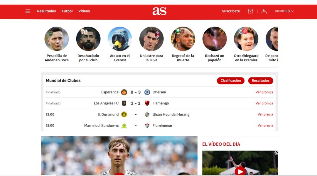
AS.com brings the energy of the stadium straight to your screen. Focused heavily on sports—especially football (yes, the global kind)—the site delivers nonstop coverage with bold headlines, dynamic visuals, and a layout that feels built for fans who want updates fast and often.
From the moment you land, you’re in motion. Live scores, transfer news, player stats—it’s all packed in, but surprisingly organized. The homepage balances breaking updates with feature stories and opinion pieces, offering depth beyond the scoreboard.
Navigation is quick, and the site leans into its strengths: football, La Liga, and international competitions. But you’ll also find solid coverage of other major sports like basketball, tennis, and Formula 1. If it’s competitive, AS is likely covering it—often with a Spanish perspective that feels authentic, not forced.
The tone? Passionate but focused. It speaks to fans, not analysts, and that’s exactly who it’s made for. AS.com is the kind of site you refresh during a match and revisit afterward for reactions, highlights, and a little debate fuel. It’s not just about reporting the game—it lives and breathes it.
13. Globo
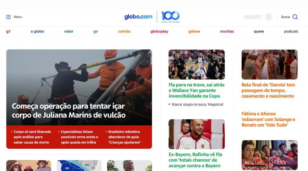
Globo.com is where Brazil’s fast-paced media world lives online—and it doesn’t waste time. The homepage is a colorful mix of headlines, video clips, sports updates, and entertainment news, all packed into a layout that feels busy but purposeful. If something’s happening in Brazil, it’s probably on this front page already.
What makes Globo stand out is its range. You’re not just getting news—you’re getting football scores, celebrity gossip, soap opera recaps, and streaming highlights, all in one place. It’s a digital buffet for the curious, the casual scroller, and the news junkie alike.
Despite the volume of content, the site is easy to navigate. Sections are well-marked, and major stories get top billing with eye-catching visuals and bold headlines. It’s loud—but in a good way.
Globo.com is clearly built for readers who want everything in one spot, without bouncing between sites. Whether you’re here for serious updates or lighter content, it delivers quickly and confidently—with a splash of Brazilian energy that makes the experience anything but dull.
14. VNExpress

VnExpress delivers news with speed and structure, making it one of Vietnam’s most trusted digital news sources. The homepage is packed but organized, offering a quick glance at top stories, trending topics, and local developments—all without overwhelming the reader.
The layout is practical. Headlines are brief, visuals are well-placed, and categories like Business, World, Lifestyle, and Tech are easy to navigate. It’s designed for people who want their updates fast, whether on a coffee break or during a commute.
One thing that stands out? The mix of local relevance and global awareness. From Hanoi traffic updates to international economic shifts, VnExpress strikes a smart balance. And for readers outside Vietnam, the English edition keeps the tone clear and accessible.
While the site is content-rich, it doesn’t rely on gimmicks. It focuses on readability and reliability, which makes it a go-to for both casual readers and serious news followers. In short, VnExpress feels like a digital newsroom that respects your time—offering substance over noise, and clarity over clutter.
15. People
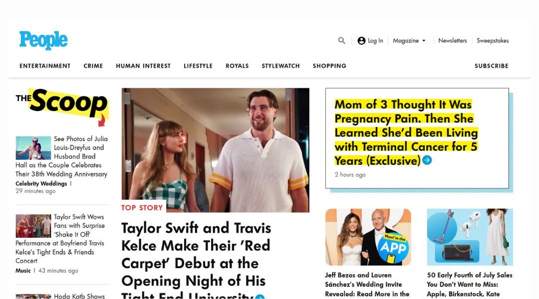
People.com is where celebrity news meets lifestyle updates—with just the right mix of sparkle and substance. From red carpet photos to personal stories that feel refreshingly human, the site delivers entertainment in a way that’s quick, engaging, and surprisingly organized.
Right from the homepage, bold headlines and glossy images pull you into the latest celebrity buzz. But it’s not all glitz. Mixed in with A-list updates are real-life stories, inspiring interviews, and trending moments that remind you why people—famous or not—are endlessly interesting.
Navigation is fast and visual. Whether you’re browsing for the latest on your favorite star or checking out style tips, the site makes it easy to bounce from one section to another without feeling overwhelmed.
There’s a lightness to the tone that works well. The writing is fun, a little cheeky at times, but never careless. It keeps things moving while giving just enough detail to satisfy curiosity.
People.com knows its audience. It offers a daily dose of fame, fashion, and feel-good content—with a design that keeps things scrolling smoothly and stories that keep readers coming back for more.
16. AP News
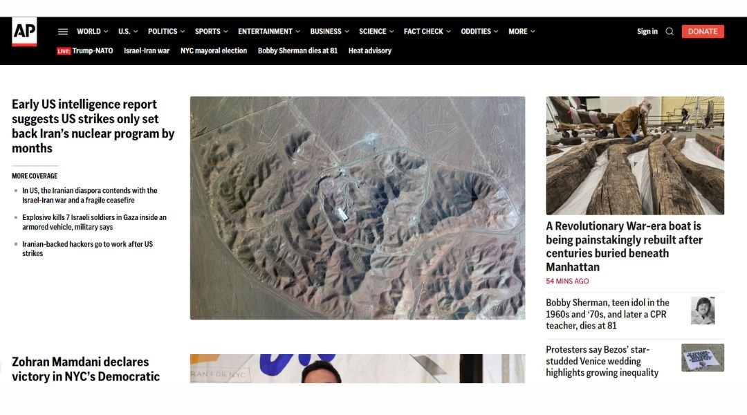
AP News delivers the facts with no extra frills—and that’s exactly its strength. The website feels like a digital wire service: clean, direct, and built to inform. Headlines lead, images support, and the writing stays focused on what happened, not how you should feel about it.
The homepage drops you right into the headlines without any fluff. Stories are listed with clear timestamps, short intros, and a steady stream of updates across politics, world news, business, and more. There’s no dramatic layout or autoplaying video—just news that respects your time.
What’s especially refreshing is the neutrality. AP doesn’t dress things up or down—it presents the news and lets readers take it from there. For professionals or readers who want updates without distractions, that simplicity goes a long way.
The design mirrors the content: no-nonsense and organized. Easy to scan, easy to trust. AP News may not be flashy, but that’s kind of the point. It’s a reliable source built for people who want just the facts, as fast and clearly as possible.
17. NBC News
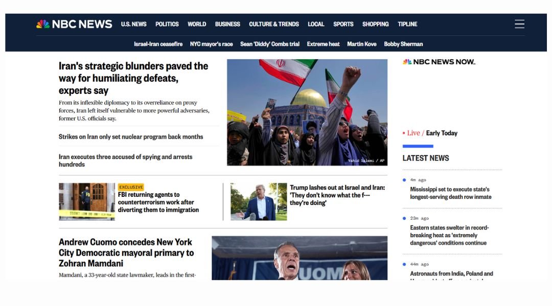
NBC News strikes a balance between urgency and depth. The moment you land on the homepage, you’re met with bold headlines, high-impact visuals, and a layout that clearly prioritizes what’s happening right now. It’s fast-paced, but not overwhelming—a digital front page built for scanning and scrolling.
The site leads with breaking stories and big national topics—politics, health, tech, and social issues all get solid real estate. But just below the surface, there’s space for more in-depth features and investigative reporting. You can get the gist in a few seconds or stick around for a longer read—your call.
One thing NBC does well: it integrates video without making it the whole show. Clips support the content instead of hijacking it, which is refreshing. Navigation is straightforward, and the mix of serious coverage with lifestyle and opinion pieces gives the site a well-rounded feel.
Overall, NBC News delivers a clear message: stay informed, stay moving. It’s designed for readers who want reliable updates without sifting through clutter—and maybe a video or two while they’re at it.
18. Reuters
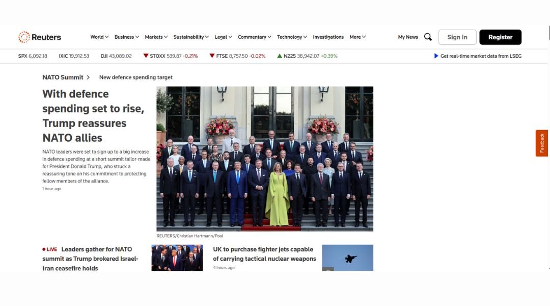
Reuters doesn’t waste time—or space. The moment you land on the site, you’re met with headlines that get straight to the point. No fluff, no hype. Just the facts, and fast. It’s the kind of site built for people who want the news before the meeting starts, not during lunch.
The layout is minimal and efficient. Headlines are bold, summaries are brief, and the navigation is clear. Whether you’re after global markets, politics, tech, or business, you’ll find what you need without clicking through a maze. The tone is consistent—neutral, objective, and calmly authoritative.
Unlike more dramatic news platforms, Reuters avoids heavy visuals or emotional language. It focuses on clarity and credibility. Even the colors are muted, putting attention where it belongs: on the content.
For professionals who want to stay informed without the noise, Reuters delivers. It’s clean, fast, and all about accuracy. In a digital space full of spin, Reuters feels like a straight-talking reporter with a deadline—and that’s exactly what works.
19. USA Today
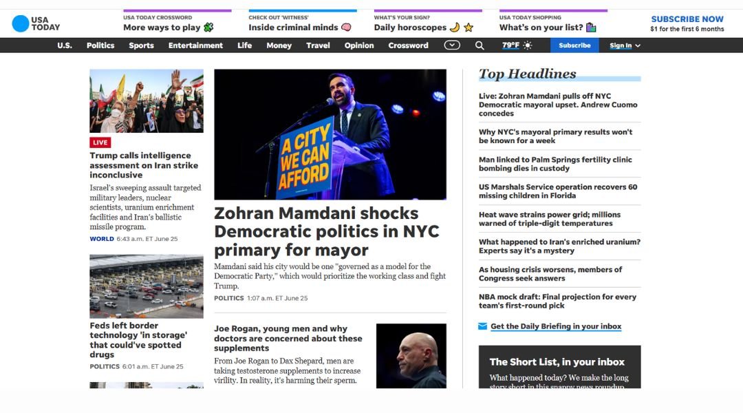
USA Today’s website is built for speed and variety. From breaking headlines to trending TikTok stories, it covers a little bit of everything—and does it with a layout that’s fast to scroll and easy on the eyes. Whether you’re catching up over coffee or killing time between meetings, the site gives you plenty to skim without making you dig.
The homepage is packed, but not overwhelming. Bright visuals, bold headlines, and snackable summaries guide you through news, sports, entertainment, and lifestyle updates. There’s a clear focus on accessibility—content loads fast, and sections are well-labeled for quick jumping.
One thing USA Today does well? Balancing national news with lighter, people-first stories. It doesn’t shy away from hard topics, but it also knows readers like a bit of relief between the serious stuff.
It’s not the place for deep investigative reporting, but that’s not the promise here. It’s a daily briefing with personality—designed for readers who want the highlights, the human stories, and maybe a few viral moments along the way. Fast, friendly, and refreshingly easy to navigate.
20. ABC News
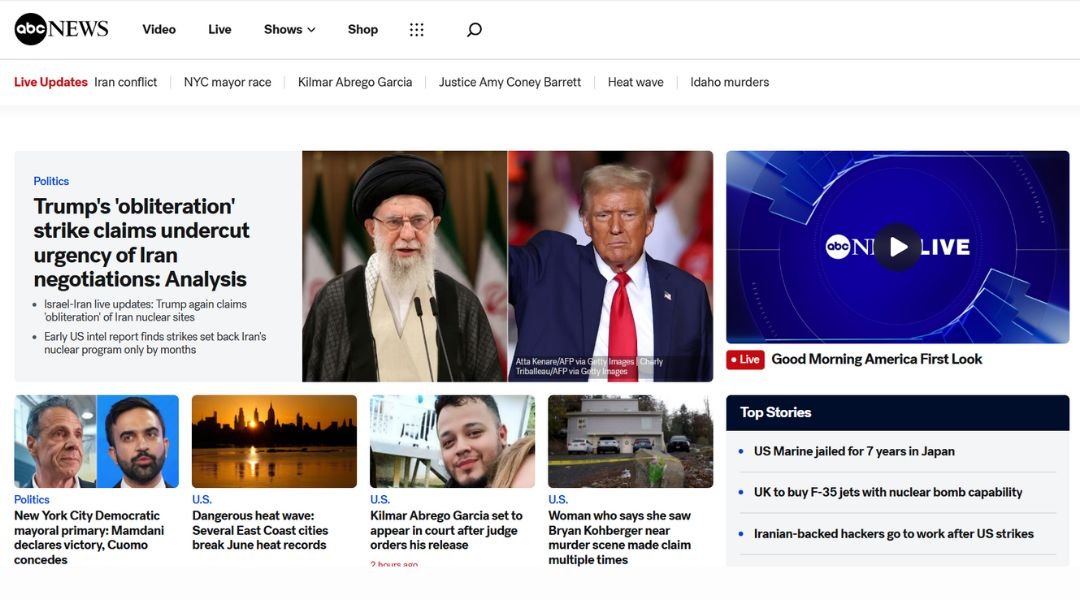
ABC News brings energy to the screen—lively visuals, headline sliders, and a mix of video and written content designed to grab attention fast. It’s a site that knows its audience is busy, likely multitasking, and in need of news that’s both digestible and dynamic.
The homepage feels like a live briefing. Top stories get visual priority, while trending topics, interviews, and exclusive clips are easy to spot. Video content takes center stage, backed by short summaries for those who prefer reading over watching (or just forgot their headphones).
Navigation is straightforward, with categories like U.S., Politics, Health, and Entertainment lined up clearly. And the site does a good job of balancing serious reporting with lighter segments—think breaking news one moment, celebrity updates the next.
ABC News keeps things moving without sacrificing clarity. It’s fast, clean, and broadcast-friendly, just like its on-air identity. For readers who want up-to-date information with a touch of variety—and maybe a breaking headline or two before lunch—it delivers.
Conclusion
After reviewing these 20 examples, one thing is clear: a great news website doesn’t just report—it delivers. Fast-loading pages, clean structure, and smart design help readers get the facts without the clutter. Whether you’re building a newsroom site or just looking for layout inspiration, there’s something to learn from each of these. My advice? Keep it sharp, keep it honest—and make sure your readers can find what they need before they finish their coffee.


